
Well, this is a fine start.
If images don't load, try using that "show image" thingie. Angelfire, as you may recall, always idolized XOOM.
Well, this is a fine start.
![]() Yes, very much so.
Yes, very much so.
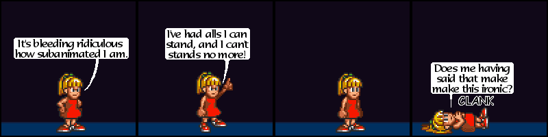
This character, called "Roll" for some reason I know isn't worth sharing, is only seen very briefly in the video game, and has one hand up in a very "oh dear" sort gesture. Not owning any dresses like that, I just assumed the part concealed by the hand was all red, but later evidence showed that I should have made some kind of straps instead. I guess this is important, or something.
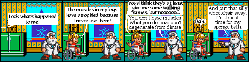
Note my utter lack of robot soundy words for the similarly inactive Dr. Light to say. And see the first of many Maniac Mansion backgrounds. They didn't look that good to begin with, but resizing them to meet the aspect ratio somehow made them look worse. Despite that, the "bah" frame was probably my favorite of anything that I made for umiliphus. Umiliphus... I suppose the comic wasn't called Umiliphus. My name's not Umiliphus. But then, it's not Volcabbage, either. I wish it was. Perhaps some day it will be. And then you can laugh.
But the comic never had a proper name, one to surround with some funny-maybe-once idiotic character montage scene at the top of every page. Ehhh. After I sent the first comics, Anez asks "So what name should I put on these?" And I chose the name I had given to my most recent Unforgiven character, because of undue paranoia. Bob and George is a high profile website, see, and I didn't want anyone who knew of the name "volcabbage," as in, maybe one of the people who I share a compuserve account with, who see that name every time they want to use compuserve, finding out what I'd been minimizing the windows of every time they entered my vicinity. And that's giving them a lot of credit. They'd be flattered if: 1, they could find this, and 2, didn't realize that great amount of credit I gave is only "great" relative to the amount I've given them in the past, which is not any, as none of them have found this, out of maybe 7 google results, all of them my doing. Yes, I realize 1 and 2 void each other. I always catch my contradictions. And I'm not going to do anything about it. I suppose that would be my "thing," wouldn't it.
Bah, my outfit has been found out. But not in that way, and still, after I posted that. So. It's still true. You're still morons. You.
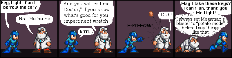
I always thought Megaman's gun fired potatoes. Apparently it doesn't.
Most likely.
I actually lost this one, but I got it back. It would seem.
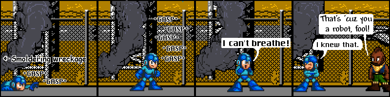
Wreckages tend to smolder.
I made different smoke for every frame. Why?
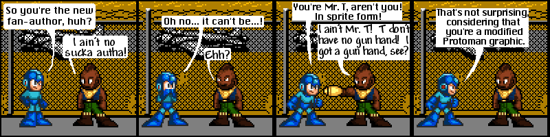
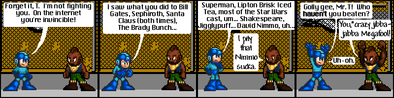
That is a really bad Mr. T. I admit it. Not that I really had anything to do better than.
Also, a rare sighting of "ehhh" without the third H.
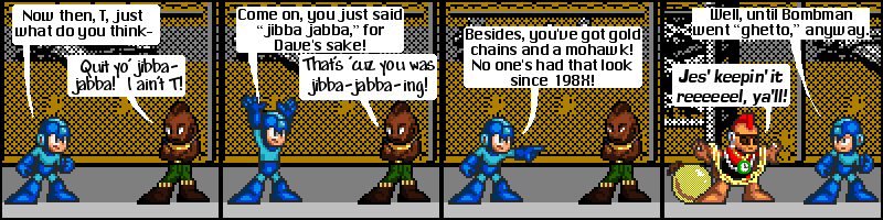
No one ever keeps it fake.
"Bomb Man" is just Megaman edited very poorly to resemble... Bomb Man. Fortunately, the very yellow jewelry type pixels cover it up somewhat. Note also the gold bomb and my attempt at a 6x6 Flava Flav clock.
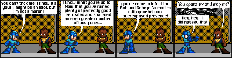
Speaking of overexposed...
I swear I didn't find that site until right after I made this, like, minutes. The asterisk originally referred to a note very much like this one.
David Nimmo made one of the few Mr. T vs... websites in which Mr. T was not victorious.
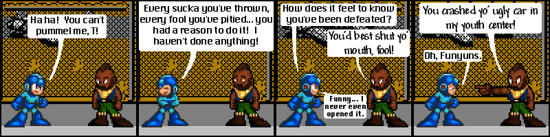
A youth center with an airplane.
This background is from Rush 'n Attack, which for years I thought was Russian Attack, and for all I know people were intended to think it was. It doesn't look that good, but at least I didn't have to resize it.
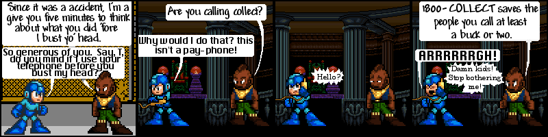
This reference aged better than I thought it would. Mr. T appeared in a serious of promotions for the oft-prank assisting 1800-COLLECT. They actually were still running when these comics were reposted in October of 2002, over a year after they shouldn't have been made. Figure out for yourself whether I meant the comics or 18OO-C0LLECT advertising shouldn't have been made.