


As the internet’s first, foremost/only authority on Moraff’s Dungeons of the Unforgiven, I felt it prudent that I should also have the foremost/only unofficial terrible illustration of it.
That secret of mana picture did not quite sit well with me. In fact i never finished articulating specifically how it did not. This here i probably also could have done better, but nobody else would have tried at all! And the chance that this will completely make sense to anybody is also almost nonexistent, which I can live with, because when I try to be understood, people find a way to understand the opposite and I spend hours trying explain what I meant and by the end nobody really cares. It is more efficient to start there!
I still managed to push out a small novel’s worth of moping text about it, and so I have pushed that even further! As much as bimshwel.com is at home written on restroom stalls, the website is not meant to function as a thought toilet.

I have now at last updated all the comic pages 34-69. That does not seem like a big deal, but as I was doing it and it went and onward perpetually for six months after I resumed the task last year, it certainly required a big deal of effort. And it does not feel done yet! I have these notes to myself right now
53 nemitz’s queue still needs to be drawn in, plus the ceiling lamp
63 needs to be extended to fill the page borders
64 the bridge frame looks dreadful
67 68 still have problems
68 says “urkel” (ehhdit: it now says “grakpazirs” and I have to hope I remember to change all instances of that and then again if I think of a better name, and I could hardly do worse except to revert it)
But it is done enough to show here, because otherwise another mopey entry was going up, and nobody has time for that.
see here, for the first time since 2011, maybe, whenever I STARTED redrawing everything, there is no separation between old and new versions. There is also a completely new page, now 53, that attempts to cover up some inconsistencies in elpse’s character without it being terribly obvious that it exists for no other reason. 34, which formerly was new, set up some of that. A sequence that was formerly on three pages is now on four and is more coherent. Ideally, once I get the new books made and put this mess into my stack of finished messes, I will become more coherent. The story is still boring but the IMPORTANT thing is that I will no longer be working on it! And ideally will never have to draw that ugly bed room again, and if I do it will NOT be between very old pages in which I had obsessive compulsively, slowly, drudgingly, kept details consistent and outlined, necessitating that I then resume doing the same on the new insert page to make it not seem excessively out of place. I can go back to the front with the part that I think is more interesting, and pog willing I will have a book version of THAT by 2028.
Not surprisingly, the automated comic page displaying system that I implemented a few years ago to make things easier was more difficult to update everything on, but it did not take six months. And so the first part of the second part of the first part is there.

As a child (despite the maturity level I exhibit I am in fact quite older than that) i loved looking at pictures of castles and thinking about them, and for most of my life it bothered me that i could never draw them however hard i tried. now I realize I can, so long as I keep them implausible. I made this “quickly” in the past two hours so I would have something to upload this week. Practicality and scale were not major concerns.
I am not totally sure what this is, but it is the most sincere drawing I have put on the internet in some months. It needs some more creatures, but I could add creatures all night, and I am already committed to adding unnecessary details forever to a more pressing project.
more about indiscreet of mana. Or I suppose anything about it because it appears that the image links were broken the whole time!
I do not like “fan-art” as a genre. I do not like what it has done to people, and to the economy of artistic recognition. People find out they get disproportionately more encouragement just copying stuff that is already popular than thinking for themselves, and then forget how to think, or never learn to do it at all.

This was even before tumblr and my first attempts at conventions; at the few art events I attended, there would always be some dork who only drew disney characters and I didn’t understand why that was fair, nor how that was particularly interesting to the “artists.”
I made a considerable list of copyrighted characters that I COULD draw if I ever felt the need to copy someone else which would be more interesting to me, since nobody else ever draws them. It would not make me a more creative person, but it would provide some dissent in the fanart miasma. Much of my life has concerned itself with dissenting in areas where I cannot possibly make a real difference. It is silly, but it is an important silliness to me.

I even “know” the main artist/designer of Gobliins and Woodruff + the Schnibble, Pierre Gilhodes, perhaps my most significant living artistic influence, in facebook, but I don’t speak French and have never attempted to communicate with the person, and drawing his old dumb characters would be the perfect way to get his attention if I am going to be drawing other people’s old dumb characters anyway. So how did I come to make a scene from a property I have seen countless derivations of?

I had started this on April 6 2017, apparently the same day my father was hospitalized, when I was also, already, sicker than I recall ever having been, which I suppose could account for my unusual change in subject matter, and I put it away when, in a clearer state of mind, I wasn’t really sure why I was drawing it. But more recently I was looking for some drawing I could finish to place on the internet in a desperate grasp at attention, while my ongoing project on-goes without my having anything coherent to show for it. I saw this and forgot why I had STOPPED drawing it, suddenly taken by the idea of getting easy approval via one of the rare things I like that is still popular. Forgetting that the people who make it still popular are not actually as numerous or influential as they seem, and that I still need to get over the barrier of my having drawn it.

Yet inexplicably the final appears sparse and incomplete to me, and only now do I see the intense perspective flaws. This is why most of my drawings have flat perspectives and flagrantly unrealistic backgrounds. It is harder to see when those have gone horribly wrong and easier to fix when I do notice! I spent a number of hours trying to fix this after the stuff that was important was already set in place and somewhat unremarkable.

Additionally, I didn’t realize that the chubbier child, Elliott with two Ts, was supposed to have an overbite until I had already committed to most of that, and it never looked quite right again after the point where I “fixed” that.

As I sought the non-existent source artwork, I inadvertently learned of a 3d Secret of Mana “remake” and I have to say that is completely and wholly unnecessary, especially after Sword of Mana, the remake of SOM’s predecessor Final Fantasy Adventure, and perhaps my single most complained-about video game, though not necessarily in public. I wish the Square people would remake something that didn’t quite work, like Sword of Mana Secret of Evermore, or localize something that was never released in the US at all, like Romancing Saga or even Seiken Densetsu 3. Or better yet remake every mana game AFTER secret of mana, because as best as I can tell, none of them worked. Or betterer yet stop messing with old games and make a new game that uses a similar interface and graphical style, and acknowledge it is a ripoff but that the 1990s aesthetics have validity, and that without the data storage and processing limits of the 16-bit systems you can do better things with the style than were previously possible.
I kept this part out of the first post because once I mentioned sword of mana I realized I had eh over 1100 screenshots with mostly annoyed comments on them, and wondered what and how much I should say about it here now to sum up my gripes, but didn’t have the desire to deal with that at the last update.

But I don’t want to deal with it now, either, since Sword of Mana fills me with a passionate, disdaining ennui.

and fixating on specifics endlessly means I miss the point and spend ages getting nothing of importance done!

I checked and could not find any drawings, official or otherwise, of the two kids who let the Secret of Mana hero just fall down the waterfall, then run off and tell nobody, and are ANGRY when he survives. With friends like that, I am not surprised he starts slaughtering little yellow legless rabbit-things the first chance he gets.
I made this a bigger job than it needed to be, for something so stupid, and I screwed up much of it, but it is good practice, I have to hope. I am not terribly fond of it but I don’t have the energy to create and post something better, and the last brief entry I posted due to a lack of energy apparently didn’t work at all so this is here to distract from that. I meant to get into detail about what I screwed up in this picture, why I drew it to begin with and also show the basest sketch of it but somehow the topic turned into other Mana series games, namely Sword of Mana, which always leads to angry run-on sentences and precisely the sort of thing I am incapable of writing at the moment in a way that is the slightest bit amusing, so I will cross that bridge when I come to it and hopefully not be disappointed by the adventure that ensues once I fall off of it.

Why does the father of sword and sorcery look like the father of tommy guns and bootlegging?
The answer being the hat.

oh beets, there is that gosh darn honey mace again.

Going back a bit more beyond last week’s very important matter, there was a point in history during which the Honey Nut Cheerio Bee threatened to dump a jar actually labeled “honey” on to the cereal. Which also never happened even one time but I assure you it is closer to the truth than the dumb magic wand. I presume the wand was substituted because contemporary people believe they are more “sophisticated” than the people who came before them. Honey out of a jar? Like no way broseph, that’s PROCESSED FAKE GMO CORPORATE NON-ORGANIC honey! I only eat fake processed gmo corporate non-organic honey on my cereal when the corporation shows me a picture of that honey coming out of some stupid slimy striped thing on a stick.
Personally, I am more concerned about where those nuts are coming from. And where they are going, I suppose, since it isn’t into the bowl.

Grape gimpity the bee looks like it is in a cult. The wand touched the bee’s tiny insect hivemind and shorted it out.

Now that it has cracked, psychologically, it has fled society, leaving the cursed staff behind to corrupt a new generation. I would be concerned for the bee’s safety if I did not typically want it to die.

alright, it has returned and now it thinks it is batman. good work. And the stupid wand is back in business!
Looking closer it becomes apparent that Bee does not wear the full costume, so it must have some inkling that it is not batman. Although if its queen has been murdered that would explain its sudden lack of purpose and need of a new identity. A queenless hive will only produce male bees, who do not do any work, and this signifies the upcoming collapse and death of the colony. For a long time the honey nut cheerio bee believed its spokesperson job constituted work, which made it confused as to whether it was male or female. The Bat-Man persona may be an indication not of insanity, as I initially suspected, but of acceptance of its nature and purpose at last. Nonetheless that wand is stupid and has NO purpose.

Although, although: what IS a male bee’s “purpose?” None but to mate and die immediately afterward, with its endophallus action being so powerful as to paralyze the male bee and throw it backward, with no guarantee the queen was even able to receive the ejected fluid. Perhaps the wand has nothing to do with honey, but is a means to artificially inseminate queen bees with no harm brought to the initiator. Though the bee may be overconfident, choosing specifically NOT the clothe the one pertinent region of its body. Almost as if daring people to attack and attempt to make the bee mate with them. And beyond man, to bat-man specifically, it may be the case that Bee, knowing male bees lack stinging apparatuses, has equipped itself with compensatory measures, but preferring not to kill foes outright, and scare them into not attacking at all if possible. Though it may have gone too far in imitating Bat-Man since the cape is certain to, if not get tangled in the wings, certainly prevent them from working.
What is important is the bee is dangerous.

This picture is not technically relevant but I placed it in my folder for non sequitur website images in September 2006 and I do not think it is ever going to be totally relevant to anything.

On a side note, apart from my very important and focused discussion with myself, General Mills hired TWO artists of whom I am meant to have heard, judging by there being a pair of signatures beside it, to draw the bee for this box, and yet they, two people, with a corporate review board scrutinizing the job it at ever step, positioned the glove reaching out to strangle me so that one of the bee’s eyes is partially obscured, making the facial expression look screwy, even beyond the insane open-mouthed faces of agony I have already come to associate with modern incarnations of old cereal mascots. This is NOT an aesthetically functional art job. Apart from that, the detail level is about the same as the usual non-signatured bee so I am not totally sure why they bothered, apart from to make me feel compelled to write about it almost a year later, to keep me from writing about something much more significant and uplifting,

like winning the heart of the one you love through your barnyard vocalizations.

This picture is a LIE. that is NOT who makes these, and the honey nut cheerios wand is NOT employed in the process.

The assembly line of workers who make the Lindor lumps probably look more like this, if we assume it is not entirely machine automated.

But since you brought it up, this this this THING, this striped lump on a stick, is ALSO a lie. Who, that buys honey cereal, even knows what that honey rod is SUPPOSED to do? It may “bee” beyond our ability to understand.

Honey Nut Chex is slightly more honest about it. The magic wand exists but it is just lying on the table unused, making a mess. It looks as if it has been murdered.


I have additionally observed that generic store brand honey cereals are only allowed to use the magic honey wand if the multinational brand doesn’t want it. Assuming my web host’s recent unannounced, extortionesque demand that I pay an extra $40 annually to obtain a “security certificate” for a totally invented, unsupplied non-reason and firefox’s subsequent sabotaging of my site’s functions has not damaged my ability to display the images, seen here are Food Lion Honey & Nut Tasteeos and Stop & Shop Honey Crunchin’ Oats. They can’t call it BUNCHES, but they MUST say something that rhymes with bunches, or else people will notice the ugly generic store brand label.
Also I acknowledge that the latter picture is from 2008 and that Stop & Shop has a much better store brand logo now, as can be seen on this page about Shop Rite, which, admittedly, makes every aspect of Stop & Shop appear superior. Firefox thinks it needs to prevent me from logging in and viewers from commenting to keep this website from being relevant, but that was never a risk.

That of course assumes “relevant” is a word that has an identifiable meaning. The one expert on what is relevant to me does not disclose the criteria nor the option to even know what has NOT been deemed relevant so that I may gain insight into the system or check its accuracy, only that this is so very important that material may be visibly not in ANY order. And then they are put into a different order after they have been seen, so that a specific one will be hard to see on purpose a second time. The people in charge maintain order by PREVENTING order. The fact that I know my next post is also going to be about honey nut cheerios suddenly seems uncommonly disciplined and of great magnitude. Yes I suddenly feel very important and well prepared to face the year ahead.

That will be all. Good day.
2017 in pictures


I am Feb up with your behaviour


June never said I needed to mess with every month’s name


Desi Arnember


If anything else happened, it probably was not important.
Don’t see also: 2016 in pictures
potatoes potatoes potatoes potatoes potatoes potatoes potatoes potatoes potatoes potatoes potatoes potatoes potatoes potatoes potatoes potatoes potatoes potatoes potatoes potatoes potatoes potatoes potatoes.
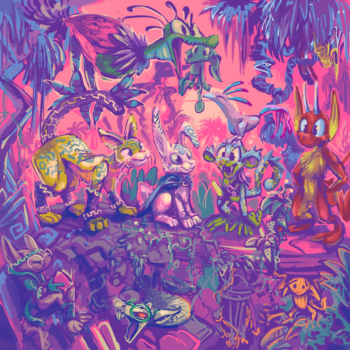
a drawing i started absentmindedly while my niece Violet was climbing on me, which limits the range of things I can work on, since Violet may want to bang on buttons or scribble something pink at any moment. This was never at risk of becoming WORSE.
I like to think the lower right one knows what it did to deserve that, but I have been so absentminded lately, I possibly forgot to inform it.
But why must NEMITZ be there, approving? the world does NOT need nemitz approval! Nemitz is also disproportionately larger than the other figures. Classical art analysis would indicate this to mean that nemitz is the most important person in the scene, and I absolutely assure you that is NOT the case, even in a case where nobody is important. In fact, especially so.
This is hardly a great illustration; it is extremely regressive, composition-wise, with all the figures on the same two dimensional plane
but the comic book matter is yet ongoing, continuing to consume much of my not-necessarily-wasted time, and the commissions I do (more than I exhibit here) remain somewhat homogeneous, and so I feel a need to show this thing that asserts I am not the person I look like I am if I only post commissions. People reached the exact same wrong conclusions about me in the past when I only made personally-directed stand-alone “art”work like this, as now when I rarely do, but now I have more of those people reaching. Which is “good” since it means more money and marginally more influence for me, provided I do not express any opinion on anything, which I accomplish by avoiding learning about anything that was made recently unless I have a connection to it which predates social media, such as star wars, or I learn about it off the internet, such as who Aunt Bee hated. I also have to avoid talking about my avoidance and what led to it because I start writing more or less the same manifesto that I have posted here repeatedly since whenever people started using tumblr, and I do not have the energy to make it funny to me anymore. I don’t think it much deserves the help, either!

I assure you this comment is just as weird when not removed from its original context

Well that just seems rude!
Also: I initially included the full view of this object and talked about it more and it wasn’t funny. This also isn’t funny but it is a better value.

I drew this on a whim back in October. It felt unfinished but I posted it anyway o the deviant art website because I am obsessive compulsive and “need”ed to upload something that day and had nothing else prepared.
Which is ludicrous because I am taking just as many pictures of just as much dumb stuff, if not more so, than 13 years ago when I probably updated this most often. But cataloging it seems less and less possible, and less worth the trouble since nobody reads anything that isn’t text captioned in a video anyway, even if the video is just still images. As if reading is hard unless you can only see ten words at a time, and then you can spend 6 minutes on one paragraph. That picture has no words at all which theoretically makes it easier to read. These words are not the image’s and they resent the implication that they do not belong to themselves.
Another ten+ year old lingering matter:


from that page, this to this. As with my last such comparison, the actual changed page has not yet been uploaded, since that seems to require a different mindset than working on them does, and the work is not finished! I hope to pog I do something about that ugly carpet. And I said not long ago how unimpressed I was with “*gets popcorn*” as a response to rambunctious activity. I did try to draw the plant thing from the initial image looking at a map to indicate it was confused at being in the wrong version of the picture, but then that means you would always need to have seen the old version of the page to “get” the new one, and the whole point of the new one is to let the old be forgotten, and also then that means I would always need to have the old one available somewhere, and for THIS? Ridiculous. Also its body makes no sense so I couldn’t actually draw it in a way where it looked like it had a map.
You will believe I can spend longer on one frame than some people do on entire comic books, and then spend as much time writing about it. This requires that I accept most “24 hour comic book day” offerings as entire or books, which I generally do not, but the statement felt superficially profound when i thought of it.
The old drawing of course looks more consistent with the style I was using in less-altered frames, more effortless and un-self-conscious, but I am too eaten by obsessive compulsion to handle this in another fashion.
I am sick to agony of Mario, Sonic and Link. In ten years Nintendo went from a video game company to a religion. In all honesty I never need to play Street Fighter or Mortal Kombat, the series alluded to in the preceding frames, ever again either, but I don’t know anybody who lives their life around homaging those games. Perhaps they exist but I do not know them. Oddly enough, my initial Zelda 3 reference was itself a protest to indicate my dislike for Zelda 64, which was by then nearly ten years old and being lauded by not-yet-religious nintendorks as the pinnacle of human accomplishment. And I STILL protest that, but Aganhim is not iconic in the way that Link is, so somebody might just think this means I drew any old weird Link variant with a generic wizard. Neither is especially funny to me, also, unlike the Kombat and Street fighting allusions in the other frames. However I “needed” the replacement to also include a wizard who uses lightning and a hero who uses a sword. Even though I ultimately totally redrew them both. But if I changed the layout, that potentially meant I could change the entire page’s layout, and if I did that I might as well NOT have a page full of irrelevant video game references, but I didn’t want to spend two more weeks on this.


Regarding my replacement, Final fantasy fandom IS overdone, but not to the same degree that anything first party Nintendo is, and certainly not with dumb old Golbez or Cecil. Although the TROUBLE with drawing any Final Fantasy playable character is that the version in the game is different than the far-from final one in the concept art. And in the case of Cecil, also substantially different from the one in the DS Remake.


Cecil even looks different from concept art to concept art because Yoshitaka Amano never adds keychain trinkets and circus stripes the same way twice.
also: there are two different flamboyant dark-armor people shown in these drawings and neither is Golbez. They are irrelevant to the present matter!

Also I OBJECT to the DOPE EARS on that one’s helmet.
It seemed most sensible to match Elpse to the Cecil that I recognize, but in fact that looks almost more like the Actraiser hero when drawn in here, and somehow it mutated into this gaudy mix-match that is not quite any version of Cecil. But whatever, Golbez, by virtue of being 50 feet tall, is sufficiently detailed in sprite form for my imitation to be identifiable and Elpse does NOT look like Link, apart from my forgetting to change the dingle-ball that I had attached to elpse-link’s hat, which arguably fits in better here. I would have liked to put a Shining Force allusion in there, but none of the prime antagonists use lightning, plus quite honestly the demonic character designs are too on-the-nose for this, and this is not about my favorite video games, besides; bubble bobble, hinted at two rows down, sure isn’t. This page is about whatever I was thinking ten-or-more years ago except for that one thing that really bothered me which had to go, and so it did.

you don’t know the half of it, buddy! To think I didn’t draw elpse in Tellah garb because I thought it would look too weird. (Also Golbez is afraid of Tellah’s Meteo)

If I lived in Japan I would be even more confused since the sword-wielding homecoming queen hero on the game’s box has had his colors swapped around to an even more extreme degree, likewise with his two companions, and the two people following THEM are generic nameless wizards that you merely encounter loitering around various places. I have NOTHING to say about the bird.


the back of the box, as well as that of the “easier” rerelease from a few months later shows this non-accessible party lineup against a monster groupings from the Mt. Hobs stage against the inside a town background. In fact the players and their positioning is identical to this other rumored fake screenshot.
Presumably the idea was to not spoil certain aspects of the characters’ identities. Yoips I WISH marketers took that approach more often, especially with the way Star Wars junk is promoted.


Slain: ONE golbez
For goop measure, here is Yoshitaka Amano’s Golbez concept art, which the version put in the game is about as consistent with as anybody could hope for in 1991, apart from the sprite artist just having to say screw it and force in the appearance of feet and not translating the arms to semi-profile view very well. I never even noticed the feet until maybe ten years after the first time I saw this. I always imagined golbez was floating and turning, casually pointing a finger at his enemies while turning away because he knows they are already done and he has more pressing business elsewhere, rather than just standing there rubbing his wrists together. This gameboy advance version is slightly condensed compared to the original super nes version, so golbez almost looks like he is posing in a bad rap video or doing the macarena.
In any event I think we have seen the last of Golbez for a while.


I had much amusement from this box back in 2006

I must say they were a lot more entertaining before Grimvald quit the group.


in other 2006 news, my web page about the Super NES game Whirlo remains comatose.


Three 100×100 pixel icons for Sherymon.

One more for beepy isopod plushcub.
Anything else I am doing right now is boring and not worth mentioning. I know because I just typed it all out and it sure was! I am not going to post something long and negative again unless it is negative in an interesting way or I forget that I said this. Of course I believe I have said that before and forgotten it.

even Superman sometimes forgets that there are thousands of other garishly-dressing idiots with super powers on his version of Earth and also the simultaneously existing alternate versions of earth that also have alternate versions of him on them. And also to put on a shirt, or to NOT wear glasses and a goshdarn belt buckle identifying his alternate identity when forcibly evicting trees from his property.