|
Newest pictures! 2009 pictures 2008 pictures Oh, and this, too. And this? Not comics too? (yes) Oh, such silly pictures. From 2010 or later. Most of them depict the characters or concepts of others, I fear.  Special Dorklivery Eh so two people expressed a willingness to see this lamentable lump of imagined existence again and at least one of them meant it so now everybody has to suffer. The time now is to make a decision. It is too late to change your address.  Ecclesiastrophe June 04, 2011 Ayato drew a dope once (I do not advise this). He has additionally drawn many great things which were not dopes. Lovely backgrounds, also! Not like this. I'm not sure where this is supposed to be. I initially was thinking of some space shippy sort of environment like Ayato often produces but it wanted to look more like a Romanesque era church that was converted into a shopping mall and then into an Amiga game. The orange creature is an upright walking wolfish being with the appropriate name of Lupine and the grey creature is a space alien called Scott. Although I suppose they're both space aliens because I've never seen either of them around here. With that in mind I don't know what Scott is at all. My drawing was supposed to be quick and thoughtless, because I don't have time to do substantial things these days. Unfortunately, I spent that time on it anyway and so the thoughtlessness became glaringly apparent, but perhaps that is appropriate given the presence of the blue unmentionable in the lower left. The dope is so dumb that I typed "right" instead of "left" the first time. How dare it make me do that? It is drawn to and in places where thought does not occur. Ayato remarked "somehow I think Scott and dopes would get along all too well." I don't know what dopes are anymore than what Scott is so perhaps they are both dopes. One just happens to be better drawn than the other. Don't need no pair-a-dopes.   Flush with Pride April 23, 2011 So, I found a curious image of a piece of waste being flushed down the toilet lying around in the coffee shop the other day. I have no idea where it came from, but I thought perhaps you might want a copy of it for some reason. It seems like the sort of thing you'd enjoy. - Karaboudjan Morrismorrow "Buckety" Gibdos III This is a colored and disgustingly over-processed version of a drawing that I did for another person during the 2010 anthro-con-vention of Pitt's Burgh, United America. However, I was not actually within the convention premises and the recipient just happened to live in Pittsburgh and was not attending the event at any point. Then this might have been weird! Lest I seem hypocritical for denigrating a toilet enthusiast and then posting this, I point out that he draws/arranges for others to draw things on toilets and I have drawn something in a toilet. Far less gross. That signature in the corner is probably unnecessary.   Hope is plummeting Would you believe it, hope is still coming. When shall it arrive? And then where is it going? I worry about who gets hope next. This is a most worrisome gang of hope. The creature wearing a track suit is sort of awkward, but the race occurs in August which is a time to be awkward while wearing a track suit. I think this far superior to the picture I made last year, as far as it not being boring goes. However, it is terrible in the aspect that so many of these idiots are cheating and also that they are idiots. I would like to put some green in here, but I am told this is the ideal amount of colors for shirt-printing. However, this is the internet and not a shirt. That explains why I had such trouble ironing it (That joke isn't funny unless you say it in a Groucho Marx voice (and sometimes not even then)).  Dorkitectural Enginerding For the birth-day of the person whose fault it was, I updated this image. I hope you do not mind seeing it again, in the event you have seen it before. The idea is to make her sick of seeing it. To offset the new addition character being better drawn than the rest, I gave it messed up proportions and put it in a position that unbalances the composition.  Pier Depressure I enjoy rain and misty voids. I'm not certain the protagonist here necessarily shares my view, for it seems to have brought an umbrella. My favorite part about using photoshop is that it doesn't ask you what the eep you're thinking when you accidentally initiate the "revert" command. It has enough respect for me to know I would never do something so silly.  Toast for the Scumbags I think I've been putting too much effort lately into pictures only a few people would like. To rectify that I've put too much effort into a picture no one would like. I've never been that happy to see burnt bread in my entire life.  Yokels My pictures have way too many clouds in them. I wondered why I hadn't colored anything like this in a while. Then I remembered. I am sensitive to imagery depicting harm coming to eyes, and seem to have become moreso between when the pencil drawing happened and when I made it computery, because I recall trying to insert additional cheek shielding, but I failed.   Aftermath of Ohmageddon How ever did this happen? Not the depicted incident, just that I finally got a picture here without a certain annoying red imp in it and another red imp shows up. I owed a thing to Matugi anyway, I think, but really he is a nice fellow who is well deserving of anything. This took far longer than it ought to have because perspective is my nemesis. nemitz is also my nemitsis but we aren't talking about that. I have great fondness for unfortunate imps, evidently. Well!  I didn't think to mess with the colors until I had already declared the thing finished. I like the next-to-last one best. This is probably an important point in time, as the things I did after this were considerably more likely to have messed up colors in them than previous stuff had been.  Please Stay on the Line Orange and blue? Who'da thunk it? Yes, but see, this time there is green, also. We don't get great cellular telephone reception here by the water for some reason. Also, I suspect this fish is not authorized to wear a hat with so many ridges. Alsoer, those buildings are supposed to be in the distance, but you are welcome to believe that the foreground creatures are directly beside them, if that lets you like it better.   The Justice Meep Hey, these colors again. in actuality I made several pictures between this and the next one, and only one of them was also colored like this I considered The Terror of Kraptonite but it struck me as a tad crass and probably not an original wordplay. "Diptonite" also goes unused because I don't know that anybody uses dip as an insult outside of some Garfield comics from the 1980s that I read as a child, and as long as we're going the 1980s I should give batman a crescent moon shaped head and call this "the terror of Mactonite." Feel free to suggest a better title. You could scarcely do worse! The person who requested this (rather a few years ago, I should say) is not fond of Superman. However, I find some of her preferable characters highly questionable! A thing much like the archery picture in that I spent a great deal of effort on it which is not at all evident and features a minimum of silly imps (the minimums is ONE). And hey, these colors again. I'm not entirely sure how the Bat-Man beat Superman here, but it also seems possible to me that Superman merely gave up to protect himself from further bowtie related abuse. Yes I've seen Dark Knight Returns. 
 Inferiority Mail June 17, 2010 This was not intended to rip off the color scheme of the famous "HOPE" poster, although with the way that oil leak is going it might as well. Everything is hopeless with nemitz around. I went to a frame shop once (because I didn't want to go twice) and every color limited thing in the place was like this.  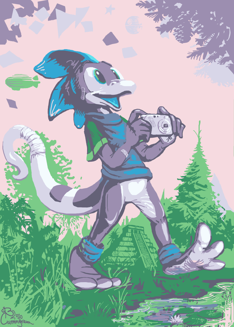 Tragic Liztake June 10, 2010 The human responsible for Koshizu likes to take photographs of things. I think she should instruct her pointy-headed protege to pick up a different hobby, though. I deliberately limited the colors in this for alleged stylistic effect and tried to keep myself from correcting every blemish because I don't need all these silly animal people thinking they matter to me, particularly when they're content to waste my effort of making them look nice by stumbling into lakes and canyons and such.   Solidorkity June 03, 2010 They stand together against unknown challenges. There is no symbolism. The light and dark separation is purely for aesthetic value. I tried putting the plants and the acropolis thing on the "good" side and the evil power plant thing on the "bad" side, but it didn't work. I like pipes and scaffolding. What can I do? Also, I should really consider making "elpse" (the green creature) be skinnier, also have fur, or wear clothes, or something, simply because I'm generally at a loss as to where muscle definition is supposed to go on body types that don't exist. And on ones that do, also. I have tried to figure this stuff out, but I generally end up more confused or worse. "Muscle" is one of those words that is dangerous in image search engines. Fairly late in the process, I amended some wrong hands. However, they were more aesthetically functional the old way! Alas. Stupidly enough, I had made them "accurate" in the original sketch and then couldn't figure out what was wrong with them when I went over the picture more recently and so "corrected" them to be wrong. Yes I can see you're enthralled by this story. Also the whole time I had this on other sites only one person commented on the fact that these idiots are standing on railroad tracks. Which would be understandable usually, but I tend not to make company with a subtle bunch. Like I might draw spaghetti and that would be the point, and thus not necessary to point out, but inevitably somebody would say "lol spaghetti." If that doesn't happen then I probably failed! And in fact it didn't happen because the person who did mention the tracks was sensible and well-spoken. I can't believe people sometimes. 
 Umby Ridge April 29, 2010 It is a regrettably widely-perpetuated myth that deserts do not receive much rain. For the title I also considered "Desert Storm" and "Fall Festival," but they didn't sound stupid enough when I said them.   Imminent Self Defense Science Fox is a person who exists and once was keeper of the bird creature. The other one is entirely my fault, but that doesn't stop me from berating it. All the same this is the only picture I ever made with colored pencils that actually looked nice once the computer had eaten it so that much is special. I wonder where the physical matter which together comprise this drawing is now.  Bouldertash Preemptive revenge. It seems to be a picture for TITASH. It is based on a true story, in the aspect that it is true I made this. It looks nice if you zoom out and squint. I like the rock. I'm not sure it's big enough, though.  2009 pictures 2008 pictures Oh, and this, too. And this? someplace else entirely. |