October 8, 2021
10-16-2021 1201am: i thought i would make a quick video for today/yesterday so of course it isn’t quick at all but it is already late so i am not going to not do that to save time either.
//////////////
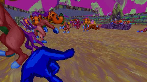
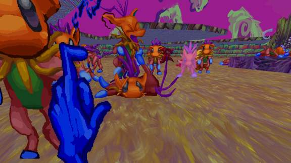
the new snikpel graphics seem to be “working.” there is still plenty to do, though!
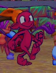
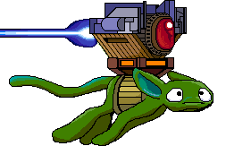
for example something urgently needs to be done about THIS.
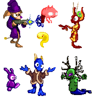
these monsters I still have yet to begin redrawing/redesigning. I forgot I made so many of them! the nemitz and lope became too specific of characters since I originally inserted them into this mess and no longer seem functional in these roles, particularly since they condone dopes so much.

the new pog can walk at least, and doesn’t need to do much more than that, mercifully.
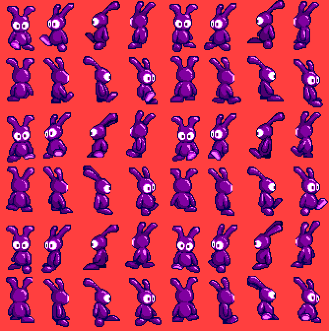
only five angles now but I do not think the asymmetrical highlighting was necessary.
There is something very determined and stupid about the old version that I still like, particularly on the east-facing angle,, and maybe I shall use it as a base for another imbecile eventually. Because why would I allow for the possibility of this ever being finished?
4 Responses
RSS feed for comments, for they hunger.
This here`s me trackback!
Leave a comment. If you want to.

pindomomo sez:
it’s quite a sprite upgrade for dear old pog! Those bits of blue & orange along the outside edges is an interesting design choice, and I guess that’s to keep a large group of pog enemies from visually blending together into one overlapping mass of purple blobs and eyeballs :v
Frimpinheap sez:
I thought having the additional colors would make the graphics look less “flat” and vintage super vga-ey. I noticed when drawing the snikpels that if I had the up and down sides of the “feathers” be the same shades of purple then they looked ugly, but only as I was nearing the end so for the moment only the pain and “death” frames reflect that. So far in execution it seems to work, or at least not be worse than the old way, which is to say I don’t notice it. But it isn’t really SUPPOSED to be noticed. It is supposed to be less jarring and noticeable than color repetition is. that is why the under-side of the foot in the middle left of the first screenshot is oddly blue-greenish right now.
the tedious part now is to make a “light map” or whatsit for the explosion frames so that each doesn’t become uniformly bright. I also did that for the eemp (strange-walking beast that fires from its ears and kicks when close) monsters’ eyes. it requires making a duplicate of each individual sprite in all greyscale, with the parts that should be bright the closest to white.
Dhraiden sez:
Soldiers of Fortune for SNES is, indeed, a pretty cool game.
Those purple things I’m going to see walking along the tops of things everywhere, aren’t I
Frimpinheap sez:
I want to have a switch that summons a large toad to eat an obstacle and then escape through the ceiling, simply as an excuse to have a british-accented voice announce “toad activated.”
there are likely to be purple things in all places simply because I like using purple so much.