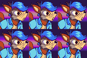
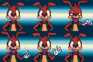
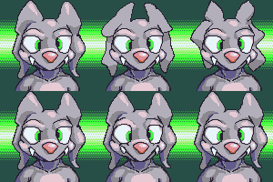
Three 100×100 pixel icons for Sherymon.
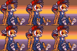
One more for beepy isopod plushcub.
Anything else I am doing right now is boring and not worth mentioning. I know because I just typed it all out and it sure was! I am not going to post something long and negative again unless it is negative in an interesting way or I forget that I said this. Of course I believe I have said that before and forgotten it.
![There is NO ONE IN THE WORLD that can force Clark to comb back that stupid dangling bit of [blue] hair.](/puy/clarkforgets.jpg)
even Superman sometimes forgets that there are thousands of other garishly-dressing idiots with super powers on his version of Earth and also the simultaneously existing alternate versions of earth that also have alternate versions of him on them. And also to put on a shirt, or to NOT wear glasses and a goshdarn belt buckle identifying his alternate identity when forcibly evicting trees from his property.
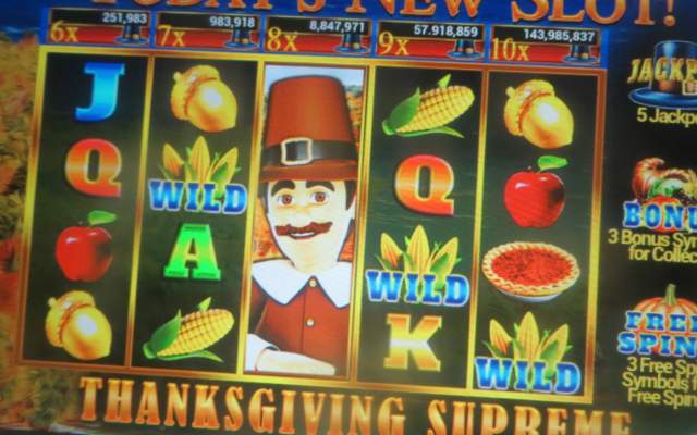
The only thank-giving food I like better than acorns are preschool magnet letters.
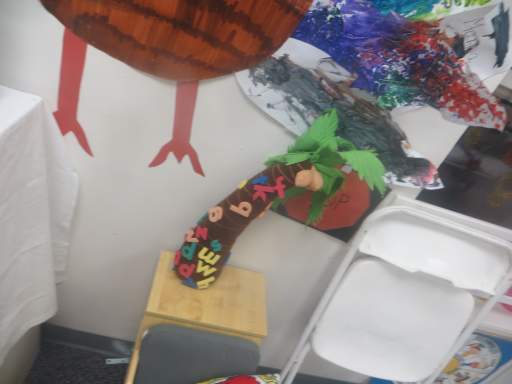
I am thankful that they grow on the same tree.
The animation I posted previously got way out of hand. As did my text description of how that happened. Neither of those should surprise you! However, it became somewhat inflammatory and it seemed unfair to have accompany a piece that I was paid for and was not hideous.
my usual method of illustrating is somewhat sculptural. I add material, subtract it and smush it around, until the shape looks correct, and only then fill in small visual details. Some things may be a bit off until the very end, but the important matter is that the ideas and gestures and all are clear early on, so that the buyer can trust me (or I can finishe me) to finish the piece. At the example stages of this animation, I operated in a similar fashion, which was not good!
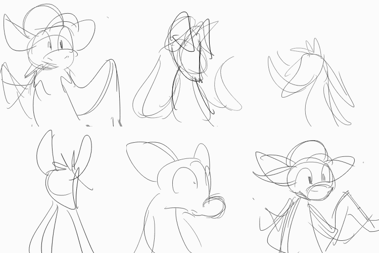
I prioritized making sure the sequence was legible, and not that all details were accurate or that shapes were consistent, saving that for later. But in animation, every object needs (at least to me) to flow into the other. Having the flow function before the details are correct is minimally meaningful, because every instance of any detail may need to be altered, and that may change how it moves. For example, if one aspect, such as the wings, is the wrong size or shape, that would require much correction, and may even need new frames. But if another aspect, such as the ears, were already correct, adding in new frames may mess with their flow! AND getting too strict with the flow in some places may disrupt areas where it had previously been casual (and already approved of by the instigator, Goldquiver, mind you), such as the leaf-arms. When I added the spots toward the end (and Goldquiver had already not cared that I hadn’t included them), their movements were very smooth from frame to frame, and suddenly the casual leaves were unacceptable to me! But moving the leaves meant messing with the area where I had lain the spots. AND I had already drawn the shading on top of it, so the shading had to move
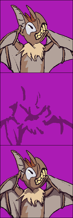
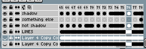
Oh yes, the shading type is new. For each individual frame, another layer is above it with translucent shadows. In the past animation I always shaded directly on the base drawing. I thought this would be faster! However, I had already, for clarity, used two different shades of green to differentiate the sides of the leaves, so some point there are competing shadow methods!!! oh! And it still does not look as natural or tight as adding it directly, since I tend to refine the edges while shading, and I would use all included colors in order of their values. In aseprite, the software I used for most of this, adjustment layers function independent of the set color palette. Which looks more “realistic,” since the shadows fall consistently, but cartoons are not supposed to be realistic, and pixel art looks more competent and orderly when the colors are limited and used to maximum efficiency. The dark brown that covers the light brown is not IN the color palette, so I cannot use it in a full orderly value sequence!
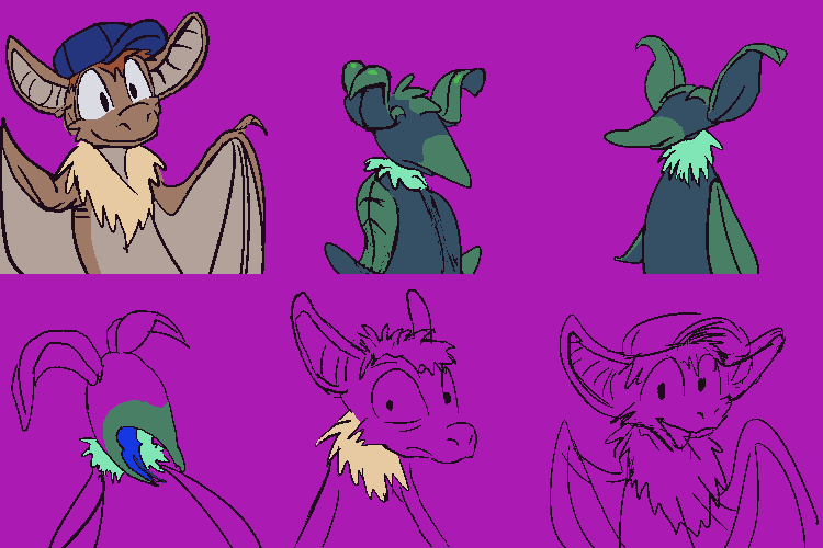
At this stage from 5 days before I declared it “done,” and probably a week before I was actually done with it, I had already started to color it, even though the details were not all in. Unfortunately I often cannot see if something is wrong or correct until after I have begun coloring it. A pruhfeshinul animator might tell you that after the first version of the sequence you need to make a fully realized sketch version, and ONLY after that do you go BACK to the first frame again and put definitive lines on that. I never do that! I always think it will take too long!
Or they might tell you something else entirely; I only knew one person who worked in animation, and could not find steady employment or just hated it and didn’t actually draw all that meticulously since MOST cartoons are ugly these days since they are all designed by people who can’t draw at all and I think that person works at a pet supply store and likes it better. As much as I complain about them, I still find illustrated animal folk easier to deal with in my own home than real ones.
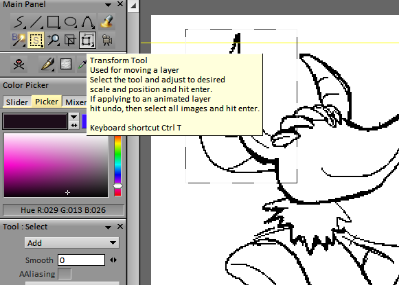
I had, for this animation, been testing an unusually-designed bit of software called Tvpaint. Its animation mode is great but everything else is weird, like arbitrarily so. It is designed, or rather “developped” by French people and more importantly, probably in Linux. Linux software is unintuitive since the programmers think they are “avante-garde,” which is French for annoying on purpose. TVPain’s selection tool is separate from the well-disguised selection movement tool, making movement a sub-function of “transform” rather than transform AND move sub-functions of selection, even though you can’t transform without selecting first, and you cannot select with the transformer!
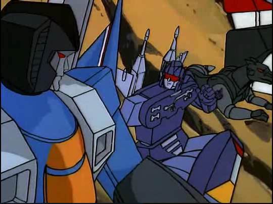
Hey! I am saying BAD things about you! I am NOT complimenting you! Vous ette un homme ridicule! (Oui vrai)
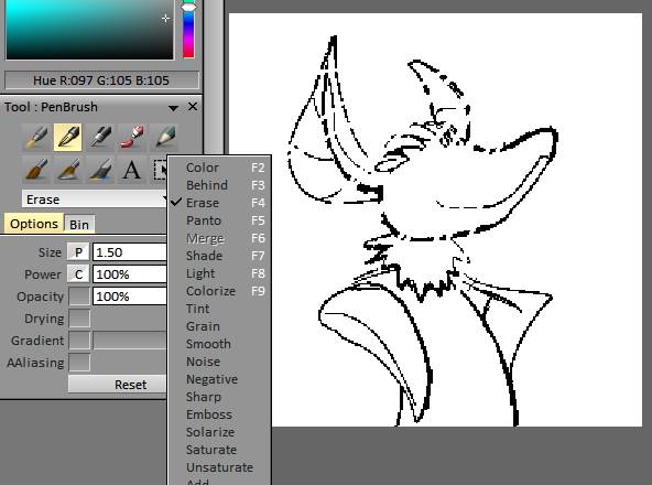
And Tvp has “Erase” as a toggled mode on drawing tools instead of a dedicated tool which covers more ground than drawing tools, which I have only seen prior in Krita, which is also for Linux. Imagine if you used a pencil and the eraser was also sharpened to a point. You would have to trace your wrong lines exactly to remove them. I have used Krita, since somebody once gave me a Linux computer with Gimp installed on it, and Gimp is worse than that, unless you want to draw stuff that looks like velvet. Krita is good for drawing but laughs in your face if you want to correct a mistake.
Also I am still using computers from that person and I like those computers but I find linux to be very silly.
TVPaint additionally has its view-adjustment mode require you to press ALT instead of SPACE, contrary to everything else ever made, including Krita and Gimp, and it cannot be changed to space. I can assign something else to space but there is no point because I am just going to do it by accident when trying to move the view because I forgot I have to press alt. But TVPaint’s animation mode is good, though it is not designed for making GIFs, so I had to export it to Aseprite for coloring. Aseprite is not good for detail correction, since it has no tablet pressure sensitivity! And the wings were full of details! Oh oh oh!
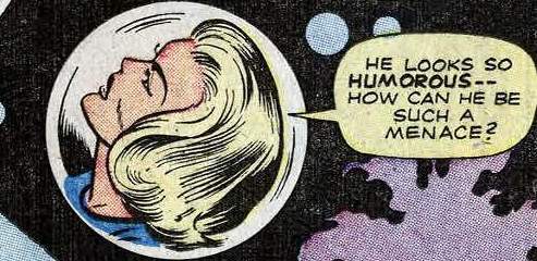
But every challenge is an educational experience. Requests like I have had in the past should be easier by comparison, since I know yet more mistakes to avoid. Or perhaps people will continue to ask me for more complicated things, which would also be good, since completing them means I have become more capable. And if nobody asks for anything that is also good since I have loads of other things to do! I shall have the last laugh whatever the case!
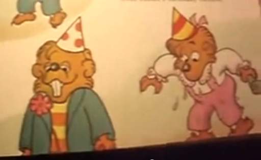
I actually like TVPaint better than a program highly recommended among the people I sort of know but don’t talk to me that I don’t talk to called “Toon Boom,” and I like TVP better first of all since it doesn’t have “boom” in its name, which is a sound effect that should never be used as a word except to describe the sound-effect unless you are a scumbag.


Krippendorf, if I had actually BOUGHT the thing I would be furious (except you can’t buy it because it is subscription only).
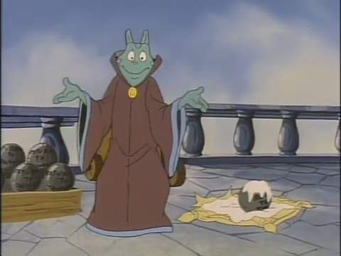
Anyway, overall I think it went well!
Although another program called “Opentoonz” with a Z is totally free and has a similarly incomprehensible interface, and that also makes me angry. It makes me almost as angry as a slinky with one coil section that is off for no knowable reason and that can never be corrected.
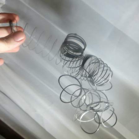
So i have to do this to it and make it a total loss to stop from spending hours absentmindedly fiddling with it and making no progress. Software with no physical component that I can download for free legally repeatedly gives me no such luxury!
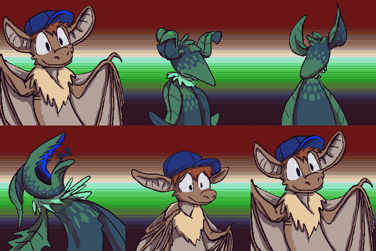
A commission animation “icon” for goldquiver, showing a bat creature which transforms into a plant creature, and then back again, and then unback again, and on like that for a very long time. Feel free to wait.
I have proved with my comic pages that I can spend a week and show very little. With this I dedicated to show even less happening!
They ALWAYS smile at the end. They NEVER think whatever painful thing they just experienced will EVER happen again, no matter HOW many times it repeats. Fools!
This website has not been very fun lately! It takes too long to write fun things, and then miserable bits always creep into them. And I have made no further progress on the automated “store,” and wonder if I will. I have difficulty focusing on things for which I cannot constantly have results to look at. It does not feel like my “destiny.” When people try to get me to write “a children’s book,” that does not feel right, either.
Apparently amateurish looping animations of other peoples’ characters is my “destiny.” Or maybe that is a non-destiny less apart from what is, and easier to justify and manage the short term effort in.

for scraner, this happy, dorkular figure, with an ear that I was told looks like a feather but is not a feather. It has difficulty fitting in due to its unusual appearance and acts out in a sometimes inappropriate manner in an attempt to get attention. Unlike other recent “icon” commissions, this was drawn in Flash SWF format, and it certainly looks like it was.
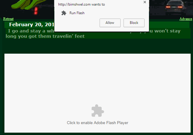
Yet I have to display it as a gif with three times the file size and reduced color fidelity since modern browsers are increasingly hostile toward efficient vector-based drawings — in fact SWF means “small web format” — blocking them by default and requiring manual, two-step permission to show one, from viewers who might assume anything blocked by default with no explanation is inherently dangerous. Mobile systems never even bothered to implement support for swf. It is 1996 technology, after all. So instead we use gifs, which are from 1987. Where were these pocket overprotectors back in 2004 when every corporate website was using SWF to play obnoxious laggy noisy pop-up videos without permission? Now that big money scumbags are done with them, NOW we get to acknowledge that creeps can embed viruses in them.
Now that I am the last creep using them. Now that I have a computer powerful enough to actually have a animated flash swf open on a page without everything else getting screwed up. Now that I have stopped posting links to my website on forums full of people I would actually want to inflict viruses on were I competent to insert one.
We can all agree that punches to bow tie meeps would be highly inadvisable to block, in any decade.