I am too mentally ill to make comics. Usually, on the internet, being mentally ill is good for comics, if you are mentally ill in a relatable fashion and it manifests in such a way where you don’t care how shoddily you draw. It may even be the case that the WORSE you draw, the more liked you are. Or if you are ill to such an extent that you have no idea you are and are extremely prolific in that. I have an illness of indecision, inability, hyper-awareness of inability and regret. Nobody on earth has any need for that manner of illness.
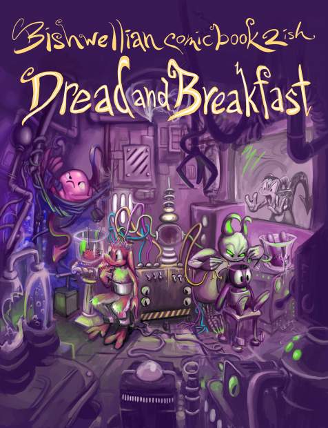
After relettering, respacing the same dialog boxes and redrawing the same negligible details ad-implausium I finally sent off the comic book order a few days ago. I won’t see them for a month but I sure can’t change them now! Consequently it is imperative that I do not look at any of the page images that I sent before the books get printed and sent to me. Or even after that point, just to be safe.
Ironically, the main person whose off-hand remark about the first book, that I should consider using fonts, looked over one my next to last proof copy inside a dark restaurant and said it was much easier to read the dialog, which meant I had done enough that I could stop, but I did not stop! I am like the text grinch; my scrutiny over my handwriting’s legibility grew three sizes that day when it was criticized. However instead of becoming a hero to the town i became a total outcast since I needed to scorn all other activity and contact so I edit speech baubles for months. Of course Madison Connecticut town would prefer not to have me in it so that suits them.

the first version of this cover image appears as the inside back cover of the first book, which was printer in 2016. Up until the most recent proof of book 2, this part of the image looked JUST FINE to me. But the night I was preparing to send the final set of updated pages, suddenly it did not! The line of motion was inconsistent with the image around it, and the bug was not sourced at all. I thought I could draw it better than that, and I did, but it still was not good enough. I remembered I had some insect references I had used recently, so I used them again and got a yet better looking bug, but I decided those were not good enough because all my references showed bugs not in-flight. And were moths, anyway. It is already bad to use a standing bug as reference for a flying one, and using a moth as a reference for a fly is worse! Amateurish! I found a very good fly reference! But the angle was wrong. And was perhaps too detailed! It looked too aggressive, too fast, too big (this version was not preserved so it is not in the montage). The viewer should be able to see the wings, not the legs, much less six multi-jointed legs. But I couldn’t just NOT include the legs because then it looks like I don’t value accuracy. I made it smaller and blurrier, so there still ARE legs but only really visible if it is your destiny to make sure that I gave the fly legs. but at some point the details stop being distinguishable, since there are too many of them. The first bug looked gentle, which is funny, and the simpler design reads more easily, since it is a very small creature in a very small part of the image! I decided to try a proper flying moth reference but none of them looked like what I wanted. I went back to the fly, simplified it a bit, so I could make it let smaller. Being too realistic can harm the joke, anyway. But what even IS the joke?
The “joke” hinges on it being obvious that pog has no brain, and something flying out of there implies that the space is empty because i don’t know why but it does.
Suddenly I had to think about it, and I didn’t see any logical reason why a fly indicates an empty space, which means it must be based on a stereotype or a cliche which has become far removed from whatever base sense inspired it. I could not even remember where I first saw an example of a fly coming out something empty, but for some reason knew it was probably a wallet, so I looked that up, and while I gained no insight as to WHY, i learned that it was in fact supposed to be a MOTH coming out of wallets specifically. Since I have already moved the logicless stereotype from its roots, which are purely symbolic, changing the insect type also cannot be done! It would HAVE to be a moth! *I* had been misled because the cartoon in which I observed this, presumably Pink Panther –based on most the panther’s situations are instigated by him being a lout and him specifically therefore needing a host of ways to indicate a lack of money without speaking– of course didn’t care what the bug looked like and nobody else, the entire staff of the cartoon, the production company, the distributor, the networks which aired the cartoon decades later, cared either, and nobody watching it did, including me.
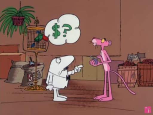
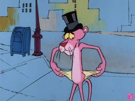
Well maybe it was a garfield comic. That much is irrelevant! What matters is that drawing a generic unsourced bug is a-ok when thousands, millions of people are going to see it. But when only me and maybe 14 other people are going to see it, such negligence is UNFORGIVABLE.
Now please try and imagine that with 40 images I will probably have this sort of stupid problem over and over on every one of them. I am a very sick person. I need to make a full print book order not because anybody else wants these books, only so that the production of the books no longer holds me irrationally captive.
Anyway, I went back to the moth version. A miracle occurred so that I found it acceptable, as awkwardly posted as it was, with the matter of the motion trail still not resolved, so I saved the image, reduced it to the print size, collected it with the other pages I was uploading, into a 167 megabyte zip file, started uploading it, went to the bathroom. this was approximate 3:38am. I was misled, however. The tyrant was not satisfied, it just had changed its focus. I began to panic because I considered that I had, during this session, because I was zoomed in and having problems with everything, also absentmindedly applied a cartoon-derived stereotype to the left-inside of pog’s space (vertical lines) to imply it was metallic. Even though the inside of pog is NOT metallic and if I wanted it to look metallic I should not rely on hacky shortcuts anyway.
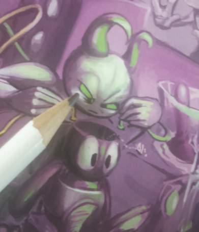
Even though it does not matter because this is an area smaller than the tip of a pencil. Without using the toilet I came back down, cancelled the upload, made a very minor alteration, exported the image again, checked that every other image was the right size, made a new zip file, and began uploading that again, and then I realized I had made the alterations WITHOUT reverting the image to its full size! Which means if I at this point decide to go back and change it again, as looking at this has made me sincerely, profoundly, want to, since I am now VERY conscious of the light colored streak on the right-inside of the space, I will have to first blow up the pertinent region and then draw over it to make sure it is a full fidelity image, even though is almost 0 zero chance across my lifetime or anyone else’s that there will be any need for a full resolution version of this picture, and then once I do that it may not necessarily have the desirable qualities of the pre-blown up and redrawn version.
And
and
and
nobody on earth will know that I did or did not do it!
An update for august 31:
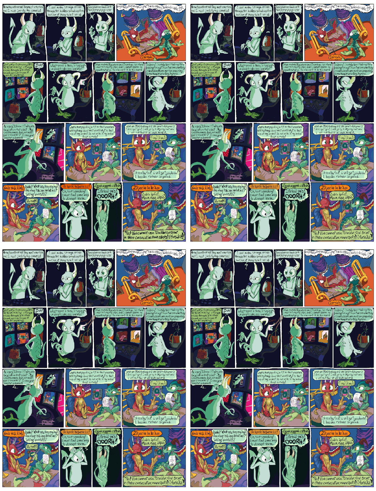
Here is or should be a big slow-loading gif which shows a vague version of the state of one page at the time of each of the three example prints and the final print (which does not yet exist). All of them AFTER incessant pre-print redrawing, remember. The point is that after waiting several weeks, I looked at every part of every page, three times, saw something incredibly minor, after I thought I was done, and had to open it back up again. On only nine of the pages I restrained myself from making more changes, even though I wanted to! The point the point the point is that I lost my mind and have evidence. I did not regain my mind, I simply was too tired to meet its demands.
Observe that the upper and lower left frames were changed with each printing but other places changed fewer times. This means I was able to look straight at something, on paper, think it was acceptable (after having looked at it prior to then numerous times across years and thought it acceptable), then look straight at it again at a later point and find it inexcusable beyond all reason. This means there could have been fifth, and sixth, and seventh prints, and I could still find fresh problems, just on the dumb letters. Letters too close together, too close to the bauble edge, WORDS too close together, veering too much up or down, not aesthetically balanced within the bauble. At no point, after no period of time, can I look at what I made and be satisfied with it. Even when logically I know that the longterm benefit of spending more time on it, rather than on anything at all else, no longer exists. Not only am I too mentally ill to make comics, I am too mentally ill to read comics.
And in the lower right can be observed my attempt to amend a minor legibility error by rewriting the dialog in a new temporary image layer above the base layer, but forgetting to delete the letters on the base layer before merging the temporary layer into it, and then forgetting to look in that space again until after the book was printed, thereby creating a MAJOR legibility error that would be impossible to overlook! This means that for each subsequent print I needed to look at every space of every page to ensure I had not committed that error anyplace else, even though such investigation would increase the possibility of me finding and obsessing over yet more imaginary problems. And then I ended up doing that in at least four other places anyway.
Seeing this gif now, it bothers me that I made kumquat’s dialog green-tinted when kumquat is out of view, against a non-tinted room. This is confusing and makes it look like elpse is talking. I thought, for years, and then afterward, it is quite obvious from context and precedent who is speaking, but people always find a way to miss all my points, so they could well claim to be confused. But if they are confused by that then they couldn’t possibly understand anything else, so I leave this green. But I will go back to the first fear, and have to explain to myself why this fear is unjustified, repeatedly. I know this is not entertaining. I need to make this understood as clear as I can make it so that in the future I can refer back to it rather than attempting to explain it again!
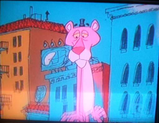
OH the windows and other details on the buildings are misaligned, the design on the billboard is indistinct, there is a little black speck just under the right side structure’s roof, the eyebrows float off the panther’s head and that hat is WAY TOO SMALL! How did this cartoon get made?
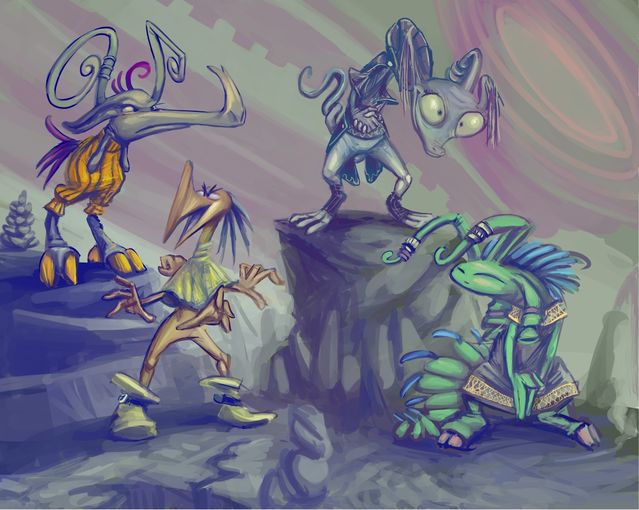
hastily detailed and colored editions of yet more hastily drawn sketches of dork creatures who will probably not be seen again!
And I did this because I am too out of my mind to prepare proper text entries and I am writing those pretty much for myself at this point anyway, my tastes and criticisms having almost no foundation in reality or contemporary society, or even outdated society that is so in a socially acceptable manner. Yet nonetheless I crave superficial internet attention because my next exhibition for real people is still two months away from now. Being ready for that means not spending ages making stupid stuff that I cannot show there! I must be able to make stupid stuff very quickly.
The greyish colors are a consequence of me drawing directly over a crummily-lit and blurry camera-phone photograph of the pertinent sketchbook page. I used to have a good, proper digital camera, but I need to replace it five months ago. The grey seemed at first like it was working. Of course part of slacking off well is creating the appearance of working. My life is an exemplary example of that.
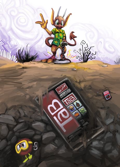
nemitz strikes it rich with a metal detector. it must be assumed that the metal detector is borrowed or stolen. and also that nemitz will be quite glad to dig that thing up and will offer to split the prize with anybody who helps.
A picture that I liked as a sketch, but could not fill in with enough details that I liked it finished. This contrasts with what usually happens, when I ruin the picture by trying to insert so many details that I overwhelm both the image and myself, though a point could be made about the incredibly large distraction on the lower left. That makes the tiny little distraction on the lower middle right seem too small, and not providing adequate counter-balance. But the nonsense objects I would generally fill space with, such as pine cones and pumpkins are already featured, and at a yet smaller size, on the vending machine’s buttons. Worse still, neither of the allusions inherent in the external objects is organic to me. I played the video game Dig Dug early in my life, but too early in fact to remember what the primary monsters looked like and I never came back to it until now. I had to look up both that thing’s appearance and even how the game works. Additionally, I do not think the Atari 2600 game “E.T. The Last Dinosaur” is any worse or dumber than the average bad atari 2600 game. I inherited a 2600 unit and a collection of game cartridges, including Dig Dug, from my cousins when they obtained a Nintendo Ehhh System. They probably had about the average assortment of games, including Adventure, Missile Command, Mario Bros and whatnot. There were a few that I could not make sense of but that could be attributed to my lack of age and experience at the time. When I got to emulating the 2600 system, however, the complete collection of roms included loads of terrible, obscure games that even as a moderately old person I could hardly figure out. Those likely comprise a majority of what was available for the 2600. ET only differs in that its cartridge was produced in great quantities. But I never had one!
Although I distinctly recall, in the game Pitfall, the character would be destroyed regardless of what point it attempted to jump across the alligators, and people still swear that was a “classic.” And I never found joy enough in emulating 2600 to do it more than once in ten years, and consequently the emulators I have for it don’t even work anymore, and I don’t feel like getting them to work just to provide another illustration for this website update.
I believe it is fair to blame nemitz for all of these things.
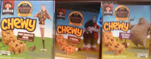
this sums up why i do not like or even think about the hotel transylvania film series enough to have previously acknowledged it. My picture is terrible and compiled from several terrible pictures since I did not want to look like I was photographing it, and also the stop and shop granola bar shelf is arranged like a mosh pit but this is all it deserves. “it” being just another bland story of pixar-derived normal boring people with a single unusual trait that happens to manifest itself in appearance + celebrity voices. Legally Adam Sandler still has more than enough money to be considered a celebrity and is not at risk of being called an actor. In fact the “moral” is probably don’t judge a book by its cover! Maybe the MONSTERS are not the REAL monsters! Like every computer movie that has ever come out. in fact pixar has a series that is literally also “monsters” that are just like “us.” And also the Addams Family did that half a century ago and the Munsters even used Frankenstein. I don’t know why the Sony corporation didn’t just brand Hotel Transylvania a Groovie Goolies reboot. I didn’t think Underdog had enough name recognition to justify a 3d animated point-missing remake, and the Goolies have even LESS.
Anyway I thought there was no idea to start with, but by 2018 they have run out of no ideas since the third installmeh has a “everybody takes a trip to the beach” theme, which puts it into Brady Bunch territory. That is even the premise of the third The Chipmunks bad computer animated movie. Apart from the mummy, these characters aren’t really recognizable as monsters now. They just look like slobs.
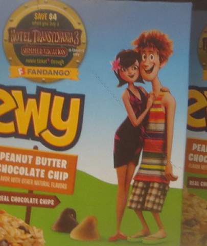
I might have thought the right side one was Shaggy from Scooby Doo if I did not see the Hotel Transylvania logo and there being a woman attracted to him. in fact there is a Scooby Doo “movie” called The Reluctant Werewolf in which Shaggy gets transformed into a werewolf and gets taunted by recycled Groovie Goolies animation.* he even has an inexplicable female companion named “Googie” whom to my knowledge was not seen prior to then nor afterward (and isn’t seen here either). I remember watching it at the age of 6-9 on the USA network at my grandmother’s house since she had cable. It took about two hours. The running time was insane for something that dull and crummy. And I watched it anyway because kids have no taste. The left character here, I guess is just some lady. These people are PERSECUTED just because they’re MONSTERS even though they keep up with contemporary American fashion and gender norms.
Or maybe these two are the “normal” normal people that are supposed to be like the viewer’s avatar, who start off AFRAID but realize eventually that some business man/ trophy hunter / scientist nerd is the REAL monster, even though they are the people actually making the movies. the trophy hunters are doing it in a sexual sense but otherwise there is no difference.
(then I drew this) I don’t know. and i can’t tell. And once i can’t tell, what even is the point? “it’s what’s inside that counts!” that’s true! as long as you are completely ordinary and submissive to commercialism inside, be as garish as you want. Eat up –it’s on food, even– the fake politically correct morality of the moment.
I don’t even know if Hotel Transylvania 3: Die Darkman Die came out yet, maybe it even came out last year; these things are preservatived enough to be legally edible for several years.
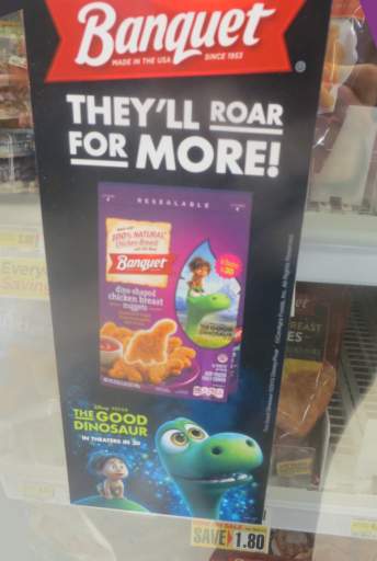
here is The Roughly Adequate Dinosaur branded consumable material in shop rite in 2017 despite a visible copyright notice identifying 2015. Of course to be fair it IS at Shop Rite. You can tell it is Shop Rite because there are bright yellow labels that say “SAVINGS” on items which are not actually on sale. And you can tell I took this picture two years later than the date on it because I just typed text saying so.

(emphasis mine)
what on earth is “spooky” here? The five smoke stacks on the ship in the distance? The unsupervised child playing on a stack of abandoned cargo? That Quaker uses the iconography of a health food company while selling candy and corporate propaganda? I buy granola bars because I want to eat chocolate chip cookies and consider these marginally less detrimental to my well-being.
this is from the quaker website because the box with these characters on it was sold out when I finally decided to take pictures of them, not considering that I would postpone finishing what I was writing for another three weeks and would have ample time for the store to restock them even though I never finish one of these in under a month anymore.
*I mis-remembered this; recycled Groovie Goolies animation appears in a 1984 episode of The Let’s Go Ghost-Busters which I also have seen, but the production on Reluctant Werewolf is so shoddy and 1970s looking that this is plausible enough to leave in with a disclaimer. I was surprised just now to read it came out in 1988!
I have also been told by my own nagging need to sabotage my efforts by looking things up, that the completely ordinary looking woman here is Dracula’s daughter and the conflict is more of an obnoxious sitcom sort of deal with Dracula being overprotective of his daughter from this human who isn’t even a vampire and hanging out with his oafy friends who can’t stand their nagging wives. The nagging wives bit is extrapolation by me based on them being portrayed by Fran Drescher and Molly Shannon, them being absent from the plot description and my memory of commercials for Father of the Pride (that page is from 2004, when my parenthetical asides spanned whole paragraphs watch out). I was thinking: more Shrek, with all the annoying Saturday Night Live crummydians in the place of actors but really it’s more Shrek 2, with annoying pop singers added in to raise the marketing value among kids who aren’t yet old enough to think they are smart because they watch Saturday Night Live. In any event everybody’s just a slob at the beach by now and that means this completely ordinary-looking woman standing in direct sunlight is supposed to be a full-blooded vampire, so plainly it doesn’t matter that she IS a vampire. They probably try to play it like “look at this allegory about social harmony ho ho ho we’re so positive and messagey even though we just likened Jews to vampires.” Mel Brooks was even hired to voice Dracula’s father in the sequel (but not to write the screenplay). What’s even the point of calling him “Dracula” at this point? Dracula is only interesting because he does evil things while seeming pleasant and welcoming. A Dracula that is just an average nice guy –Adam Sandler isn’t a credited producer or writer but his wife and his daughter portray his wife and his daughter so one assumes he dictated how his character came across– and doesn’t kill people to keep himself alive or even kidnap them just to amuse himself isn’t Dracula!
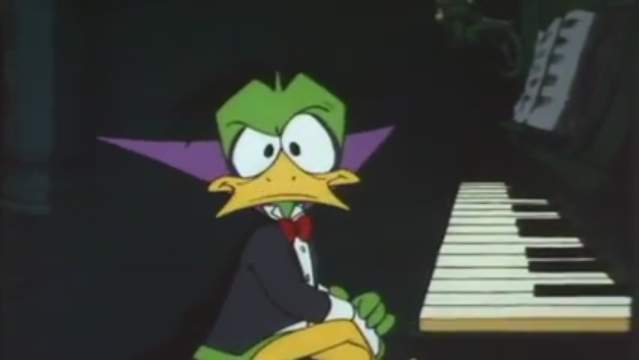
It isn’t even Duckula because Duckula’s attendants legitimately want Duckula to start killing people, are disappointed when he doesn’t, and he is usually suffering most of the time. It’s more like Count Chocula: The Movie, especially considering the sugar-loaded rubbish component. Everything I see about Hotel Transylvania makes it seem like it is only as interesting as a two hour episode of Scooby Doo. Which regrettably is enough.
this trashy video is meant to display some stupid yellow creature that throws a bowling ball, but since I have not yet made level spaces well suited to that, I ended up using non-ideal sample areas that happen to also be the ugliest areas i have yet made.
I am quite sad to say that as lame as i imagined this looked, i imagined i was exaggerating to try and set myself up to feel better when it actually does not look so bad, but this does in fact look quite bad. even in these brief samples meant to display a single object, that I admittedly have not yet made appropriate landscapes for, I see an inordinate number of unchanged graphics from the original Doom game and amateurish non-original game graphics that I mean to remove.
The original “plan” called for the bowling imps to be placed beside stacks of bowling balls but I discovered that it did not look terribly “wrong” for them to just grab the balls out of the ground so that is how things presently are.
I show it here because I spent so much of the last two weeks getting this to work that I have nothing else to show! it feels like too mundane a creature to spend that much time on, but the time has been spent. I drew it throwing the ball from 8 angles, when most people would just do five, even though that motion takes 15 frames. and STILL is somewhat jerky. that is 15×8, 120 frames, not including the just standing there and “hey stop shooting me” frames, ALSO drawn from eight angles instead of five. I merficully allowed to accept a single angled “death” animation because it just turns into globs that would not necessarily be noticeably not rotating when walked around.
None of the monsters die, they just fall over and look sad, unless they melt. The few non-goop monsters that actually can bleed still have their eyes open when they get disemboweled. I want to hurt them, not to kill them. I want them to think about what they did.
i made this one into a goop monster that melts rather than an “organic” one that simply falls over and looks sad since it is uniform of color and unclothed which suggests goop compatibility, even though I only have three non-goop ones so far, and two, based on lope (pathetic blue lizard) and nemitz (incorrigible orange imp), have to be redrawn to NOT look like them since the theme has become more specific than “weird junk in doom” since I first implemented them roundabout 2003-4ish,, and I cannot imagine lope being any good in a fight anyhow, assuming it would ever be even willing to fight. Also, chronologically speaking, nemitz should not be present at this point. Yes you will believe I have a serious timeline for this “story” even though it is ludicrous broken garbage that will always be somebody else’s game even though I guarantee you I wasted more time from my life than id software collectively did while developing doom and the predecessors it follows from. I MUST justify the time spent, by spending yet more time on it. I might have justified this paragraph better by actually including those two IN the video but I mean to assure you that they are nearby since I can hear their noises.