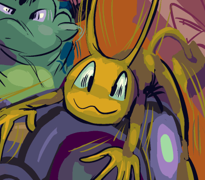
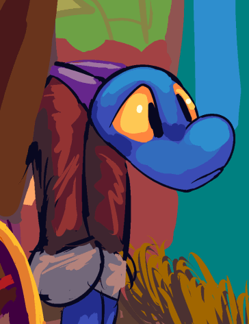
page 48 of the bimshwellian comicoid.
the gnomes are regrettable but elpse was pretty regrettable for a long time and now I find it very amusing. The colors on this page at least are nice. i think they are nice!
i worried that the “kaiser monarchs,” the motorcycle gang-like assemblage the gnomes belong to was among my least inspired groups of characters, and maybe i was right because i just learned [thursday] that the ill-fated pixar film onward also features a “pixie biker gang” similar in appearance and presumably to some degree in behavior to the gnome collective. I look forward to people talking to me like I ripped that off in a few years.
ehhh my approach is still probably awkward and contrarian enough to not retroactively be construed as a rip-off of that by people who need to see everything i make in terms of recent media they consumed. Due to various factors including a worldwide pandemic that you may have heard about coinciding with its theatrical release, “onward” may also be one of the least-seen pixar films so i have even less to worry about. Even though the more people think i am inspired by recent media the more they accept what I do so perhaps I should encourage them to think that but I don’t like being liked like that!
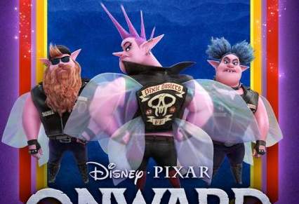
my gnomes are more awkward than onward but at least I like them. I don’t like these at all.
According to this blurry picture and I didn’t want to go searching for more, “pixie dusters” is their name. Whereas i thought a gang name that directly alluded to my characters being gnomes was too on-the-comically oversized nose. However they like butterflies and “monarch” is a powerful-sounding type of butterfly, and then kaiser because i thought kaiser helmets were really funny for a bunch of years, hence the name.
I got to thinking about onward because i inadvertently read that pixar had paid whoever owns dungeons and dragons now to use a Beholder in the movie in some capacity, which made it necessary for me to skim its synopsis to be certain it wasn’t just doubling down on the wreck it ralph formula, but I think instead it is just quadrupling down on the pixar formula, which is essentially the same thing but the characters have smaller eyes and ugly little footless stump legs and prefer annoying existing songs to ones that they sing themselves. Prior to then i had seen pictures of the main characters and thought they looked sort of like greegorp and lactorp, the pointy-ears imbeciles from my beet cartoons but had no reason to presume the behaviors were similar.
LATER ON in the one other picture I saw, it became apparent to me that one of the characters is holding a drink bottle many times larger than itself, which would indicate the creatures are rodent-sized, which would make them QUITE different from my gnome gang. I would question why something that could fly would need a motorcycle or how at that size it would get one. you can’t just say “oh magic” to explain that because nothing else about it is magicy. I would accept and grant credibility to the gang if they mugged Runaway Ralph and Stewart Little during the film because disney can buy and use just about any character they want in any way they want but that would still only get vehicles for two of them.
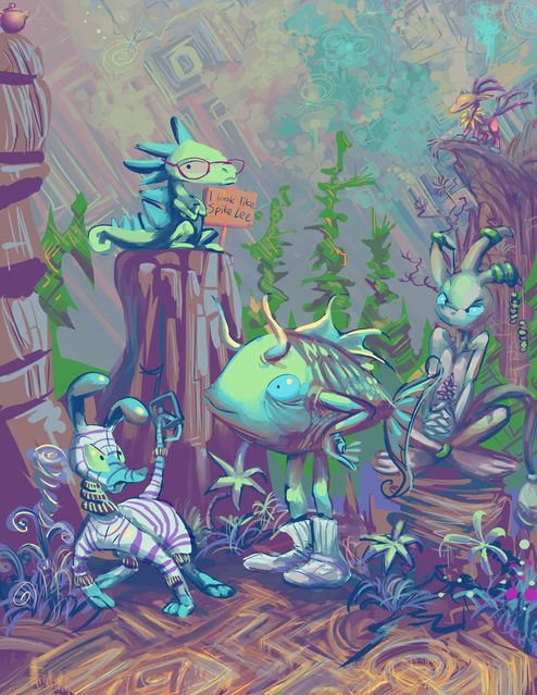
an attempt to convert some creatures of that sketchbook page into a remotely coherent composition. It did not work! But I felt artistically fulfilled for a few hours.
the website that links to is evidently not being used to its greatest potential by me but it seems to function in the capacity of displaying my only just slightly edited for the purpose of clarity scanned sketch book pages without me feeling self-conscious about the minimal level of value they seem to be perceived as having, which I have been unable to accomplish on other trendo sites.
the green thing did not initially make any statement about its appearance nor even wear glasses but I could tell it thought it looked like spike lee. Initially the words just floated beside the creature as if it was dialog but I do not think that is aesthetically functional in this sort of image, but fortunately it seemed plausible that this creature would have a sign made with this pronouncement written on it that the creature would pose in this presence of.
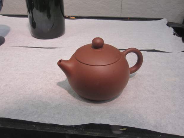
In the upper left is an incredibly corny looking, tiny dopey teapot that was a recurring element in the painting classes I had when pursuing a largely superfluous bachelor degree. I could tell the teapot was profoundly proud of itself and that it thought it was the honorable Horace T. Teapot. it probably also has a sign announcing that just out of the frame. It might as well be wearing a bowtie. You could probably make ONE cup of tea in that dumb teapot. I have NO idea what it is so proud of. I thought for certain I had explained all this years ago but apparently I did not which is why the world is in such a dire situation.
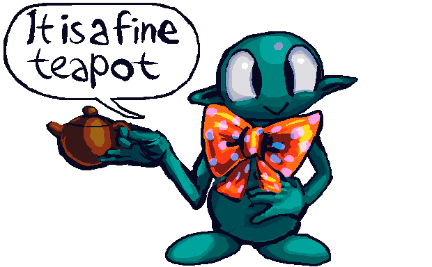
this about sums it up
oh fleeps I never made a website entry out of this
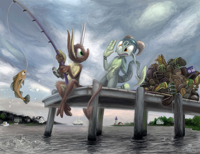
Obviously we are collecting boots today. I don’t see how you could have POSSIBLY messed that up. Hey, fool! We are not catching fish here. And yet you caught one. You couldn’t even catch cholera by ingesting the Vibrio cholerae bacterium, and still you caught a fish. Good job. “Good” as in “opposite of good.”
Atrocious. Typical nemitz move.
tennish years later
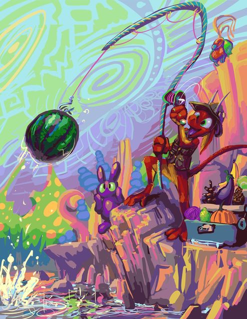
nemitz (orange imp) seems to be improving mitz skill at fishing. improved for nemitz, i mean. Presumably elpse (green imp) has something better to do. I hardly think there could be anything worse to do.
meanwhile I have I have not gotten much better at drawing!
page 3-47 of the bimshwellian comic strip. a huge hard to draw waste of space but possibly the last page that will take place in this parking lot! Now instead of a difficult to draw background I have an impossible to draw object that is simultaneously foreground AND background.
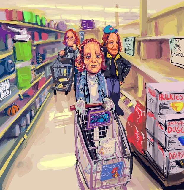
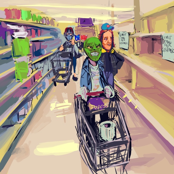
I fear this mask business may be getting a bit out of hand
the original “plan” for this included additional mask-types but at that stage it looked to me more like a bad local mural or the cover to an issue of Cracked magazine than something that was supposed to be taken less-than-seriously. i laughed while making it but sometimes that is an instinct-like reaction to things that i am really worried about not being funny, like some previous images related to halloween, bad geico advertisements (all of them are bad) and my experience at the louvre museum.
The worst thing about the version I decided on is that after I added the dope on the shelf on the left I didn’t want to crop it out even though the composition works much better with that mostly empty space removed and EVERY composition works much better with dopes removed. Theoretically the older version is superior on account of lacking dopes, apart from the cart advertisement seeking to raise awareness of them, but ultimately it is ugly and trying too hard. The final version tries a more appropriate amount.
