most of a certainty you will not be able to read this comic strip without clicking on it to enlarge it. Do use that information to your advantage when deciding whether or not to click on it.
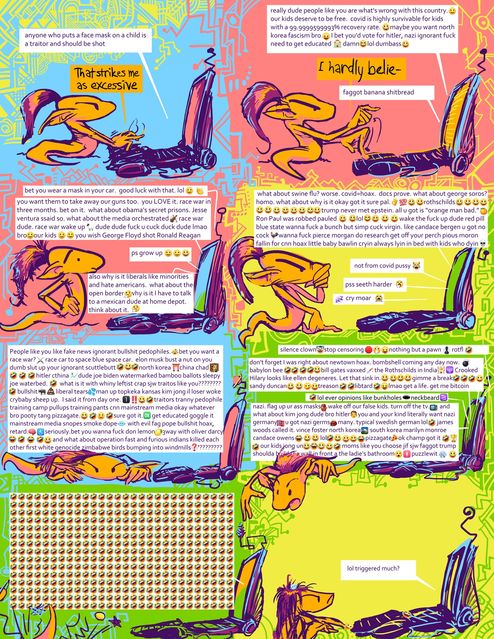
My mother notified me of her alarm at the swear words in this. Indeed I don’t like them but at some point amitz its production I stopped noticing the vulgarity since I find hostile emoji usage (especially with blue used to color bodily liquid sources) so much more offensive. I realized recently it has been twenty years since I first observed an association between jerks in arguments and using smile icons to show how NOT SAD they were, plus enough typed out laughter abbreviations to be mistaken for a batman villain, appropriately enough on the DC comics message board, albeit the Mad Magazine section of it. I wondered how best to commemorate that and what I did probably wasn’t it.
in order to further facilitate not-reading, clicking on the following image will do nothing:
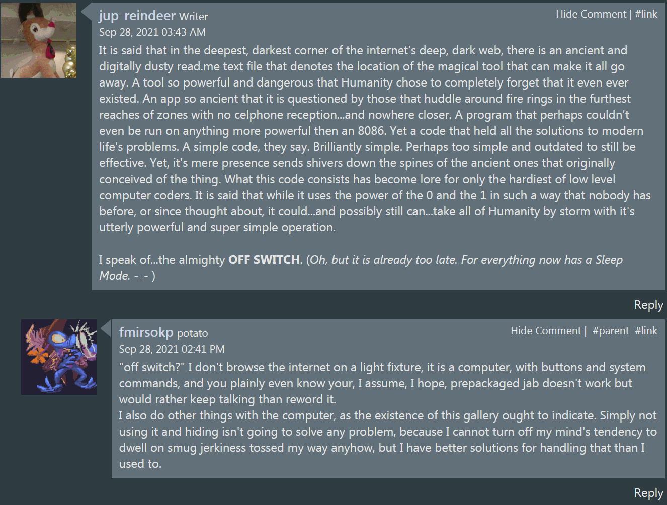
people talk trash about facebook when they aren’t on it, but I didn’t get any condescending comments about the comic strip when I posted it there, only from someone on an embarrassing “furry” website I really should have given up on ages ago who has no business talking down to anybody. but to be fair my reach on facebook is less than if I stood outside my house holding up the computer with that image displayed on the screen until the battery emptied out.
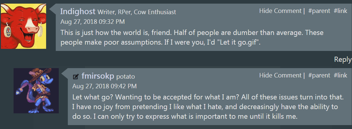
Another of my observations is that self-identified “furries” who are also self-identified “writers” tend to write the worst things [that don’t have smiley faces and lols in them].
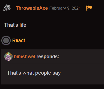
that doesn’t mean it’s good!
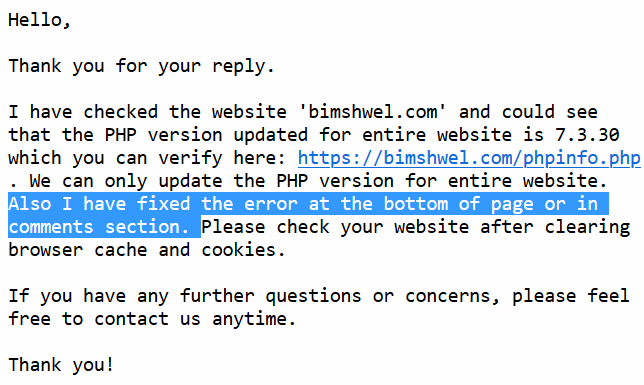
a helpful person from my web host asmallorange was able to, as far as I can tell, alleviate the total breakdown afflicting the “art” gallery website subsection. It will probably break again if whatever broke it this time happens again, and it well might since I still don’t know what broke it this time, but for the MOMENT it is unbroken. a different person with a different approach took on my comment form issues:
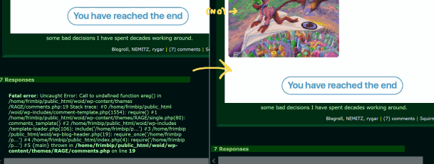

That is certainly different! I looked around, the only file that seemed to have been altered was “php.ini,” which I had not noticed there previously, but inside it was only
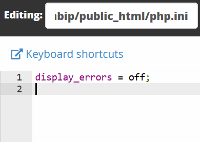
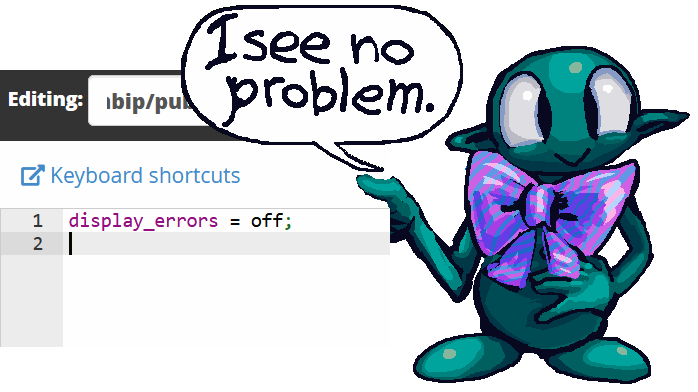
fix errors by hiding anything that has an error in it, ungenious! I should have suggested that when I had my car brakes checked the day before.
Admippedly the brake check and pad(s) replacement cost me more than the web hosting does in four years and the car people weren’t able/going to fix another problem in the catalytic converter without doubling the price and implementation time it was originally expected to be.
from that perspective my not getting the assistance I required from this source makes sense. Thus I would prefer the support person to have said “it isn’t my job to fix your code even if it isn’t your fault your code broke,” rather than “magic! all better! happy now.” I would still complain but it would be a more evolved complaint. I am an idiot about php but that doesn’t mean I am simply an idiot. Whatever does mean that is much more complicated to hide.
und so today I “fixed” the comment form by replacing the troublsome “ereg” with the somehow less objectionable “preg_match”… I found another person’s webpage indicating that I should do this weeks ago, but it includes so much extraneous information that I figured there was more to it than I could grasp and didn’t mess with it until I had checked on the possibility of undoing whatever caused this mess. Unfortunately this present comment form doesn’t alternate the colors on each comment anymore. Or did I never get the color alternating to work to begin with? Or that stopped working at some other point? I can’t remember. Whatever I have now at least is better than the default comment form and heaps better than having an obnoxious error there, and yes it is even better than there simply being nothing at all because the error got hided.
why am I able to see this?
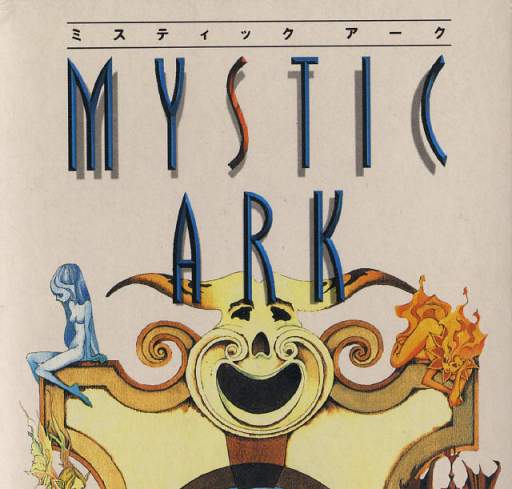
Howdy. Mystic Ark here. But you can call me Mark. Now i know what you’re thinking: “hey you’re not THE mystic ark, you’re just some weird giant face above a doorway on the box art.” that is true, but it still synecdochely makes me THE face OF Mystic Ark. And now you’re probably thinking “okay whatever synecdochebag” which shows even more ignorance on your part since synecdoche isn’t actually pronounced like that! But we’re getting off-topic. In fact I hadn’t even introduced a topic because your presumptuous arrogance prevented me from doing so. you know what, I don’t even want to talk to you.
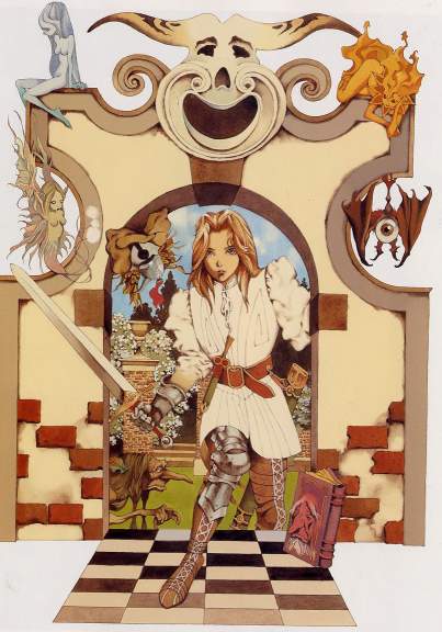
You can talk to that tiny lady coming through my doorway to stab you. what that’s a man? man. I can never tell with Japanese sword-grasping hero types. Yeah I came out (not the GAY way, I’m no homo) in 1994, it was WEIRD for men to wear skirts, okay? In my personal opinion men belong in trousers and women belong in the kitchen, ha ha know what I mean? Now don’t ask me what the game Mystic Ark is about, I don’t speak foreigner. I got to the part with the kitty pirates but couldn’t figure out where to go next. Too bad I never met any of those naked little fairies on my shoulders phwoar know what I mean? Wha? there’s been an English translation patch since 2009? Well of course I didn’t know that, I’m a goldurned FACE on a gate. I don’t get out much. Also I don’t support copyright infringement. If you downloaded a Mystic Ark rom I WILL send our lawyers, with swords, through my gate, to get you, and if you patch the rom with unofficial content that’s even illegaler pal, in which event you can NOT be my pal. You can’t even be my NTSC. ha ha ha yeah too inside, I know. You don’t get to laugh because you aren’t my pal. In fact you can’t even call me Mark anymore.

hey calm down, Kitty P! Like take a chill pill homeslice, know what I’m sayin’? Because I sure don’t know what you’re sayin’! Fa ha ha. This is the best entry ever on this website.
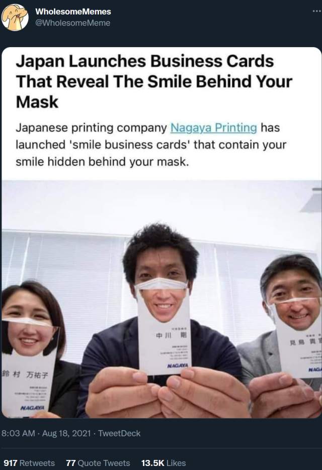
This isn’t wholesome, this is loathsome. I hate any company trying to turn a profit by selling cutesy pandemic-complacent garbage. To be fair almost everything on the wholesome memes page is cutesy and or complacent but I think this one is excessive. Even the specific wording “the smile beyond your mask” puts me off. What kind of weak-willed subjugated dork would buy this?
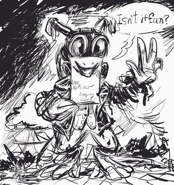
eh it’s no one I admit to knowing.
ALSO the most recent comment gidget on the sidebar is still broken and the actual comment display is still ugly. I expect they will be for a while!
//////
9-10-2021 yeoiks the artwork posting sub-website is even totally broken. What HAPPENED here?
9-5-2021 3isham oaf now the comments aren’t working? I don’t expect them but I happened to glance down there on another entry that already had some and nothing but errors there. what a dumb few weeks!
///////
9-5-2021 329am the comments work now but they are in the ugly default style since I had to copy code out of the “default” theme that updated itself during the overall wordpress “update” that I didn’t want but thought would fix the site when it was broken, which it didn’t even do! hopefully I can work out the syntax of whatever “ereg” got replaced with since that suddenly being “deprecated” is what broke the comments form and have slightly-less-ugly comment boxes again but I am tired and have other things to do! and I just noticed another broken thing in the side-bar. beets
///////

this is one of the more eerily fake-looking “photographs” I have encountered. Have you ever seen water which looks like this? The blue is as if somebody dumped a load of toilet bowl cleaner pods upstream. This looks like an amateur colored pencil drawing or a video scene from a playstation game. This looks like the ghost of deceased water.

i tried turning it grayscale and and the substance still looked like glowing crest toothpaste more than water, particularly on the left. which makes me more inclined to believe this picture initially had no water in it, rather than more naturally colored water. and yet where it makes contact with standing water on the lower right looks real. the web page it came from only identifies it as “free stock photo” without any context of where it might have been taken or what was done to it.

the links at the side of the page indicate that for a fee you too can try to put water where it doesn’t belong and color it unnaturally. I don’t know why you would, what satisfaction you would get from making an ugly fake scene from elements of real ones, but other people are already doing it and likewise looking to charge for access.
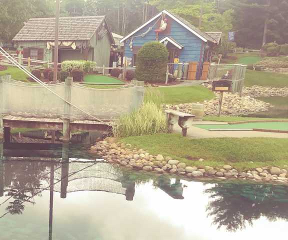
even the blatantly blue-dyed water at one of the numerous inexplicably pirate-themed miniature golf courses I saw in Queensbury, New York didn’t look that queentoony.
this PHOTOGRAPH is terrible; I may have taken it from across the street or behind a fence. it was the same day as this borage. I didn’t use this photograph in fact because the result wasn’t as cartoony in the picture as it was in person. Stock photography vendors clearly see this as a pressing problem.
AND I was looking up pictures of water tumbling down mountains because to make a long story spork i couldn’t solve my computer problem with what I ordered and waited for, so have ordered and need to wait for something else. Consequently I am still using the backup computer, and consequentlier STILL haven’t finished that rygar picture, of which a tiny, almost irrelevant part of the drawing features just the category of scenery that I was speaking of, and consequentliest I wanted references for it.
for really no good reason I thought I should try and incorporate less-cartoon-looking scenery even though every figure amidst the scenery is exactly as cartoonesque as in the dumb nintendo game. ultimately it comes down to I never developed an instinct for what corners of realism can be cut and still have a corny fake drawing represent the real version. this applies especially heavily to blue-colored water which always looks bad and fake to me except where it naturally occurs.


Notice how the recent changes don’t improve the image but does make the characters present that are more important yet that I have not gotten around to checking on now look worse than before compared to the increase in background detail.
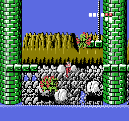
I thought I wasn’t doing justice to THIS. Even though the whole reason I like Rygar imagery is because of the specific weird, often stupid look it has. Why shouldn’t I interpret it literally? The answer to that doesn’t matter since I already didn’t and am more likely to spend another day working around a bad decision than revert it.

some bad decisions I have spent decades working around.