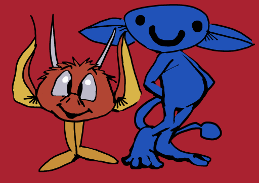
A clear sign Big-Y is a Connecticut and Massachusetts-only supermarket; if Kroger or Food Lion had a Kids Fruit Club that would be cited as proof of child grooming and republican governors across the nation would race to issue condemnations of it and proactively try to pass laws against it
naturally just [yesterday] I saw this
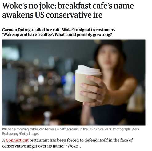
which IS in Connecticut, but the ludicrous conservative backlash to the name led to a bigger back-backlash that gave the store so much business that it ran out of stuff to sell. In Florida or Texas it might have had angry protestors outside demanding that the employees release fictional juvenile hostages and then a week later everyone inside and out would have covid.
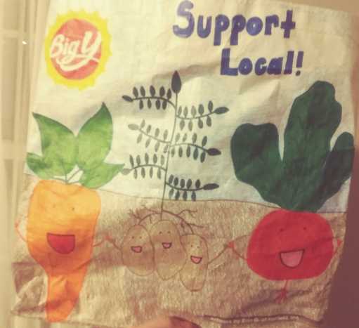
still I am concerned that Big Y is getting so comfortable with these mutants

and worse, the mutants are getting comfortable themselves.
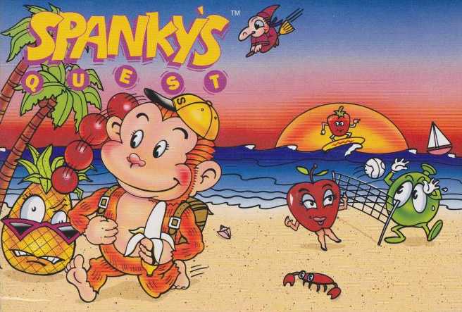
why don’t we just throw a beach party for them!
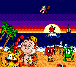
this is beside the point but I am fascinated that this game’s title screen is a redraw of its weird box-art; generally Japanese video games with weird United States box art don’t have their title screens updated to match it, except to alter logos. Also despite the weird cropping to allow the text to appear the picture overall looks less weird. although the tree is duplicated, the texture on the sand is questionable and the banana looks amidst a prophylactic demonstration, the artist treated the sun as a light source rather than another piece of fruit, and the figures themselves look less like there is stuff wrong with them, which to me is of foremost importance.

especially THIS creep, that looks less like it is surfing than “he went that-a-way!”ing while squatting behind a stair with bacon on it. Someone even thought it was good enough to put on the side of the box as well! It was not. There (here) it appears to be concerned about trademarking but unable to leave its post plugging a dike leak.
It might help to contrast this with the original Japanese box-art that is strikingly dissimilar to both its own title screen and this, but I decline to on account of it including a depiction of the grapes-themed boss foe that I find aesthetically unpleasant for reasons that are beyond the scope of this web page. Additionally that Japan Super Famicom box-art is dissimilar to the Japan game boy version’s box art, which would need to be contrasted with the fact of US editions of both using the same box-art despite differing in-game character designs, thereby explaining why the monkey only has a conspicuous tail in one of them, and all of these factors combine to really not be much help at all. Is there any expert in the field who COULD help?
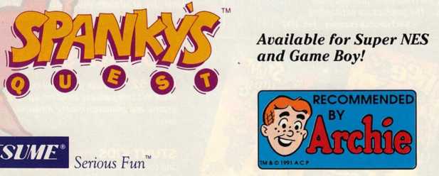
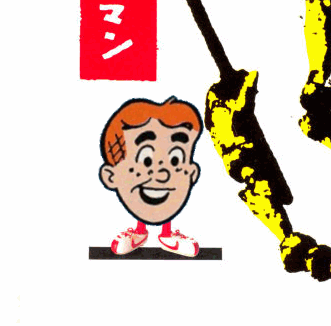
oh WHAT?! I had no idea. Years ago this appeared on the zany video game quotes website, and I never knew or asked where it came from. I ASSUMED the graphic was for something remotely archie-related; the Archie Comics company published works on a few topics that weren’t strictly archie themed, such as ninja turtles and sonic t hedgehog. I didn’t guess it was in a video game magazine advertisement for a property other than those two, certainly not the monkey vs evil fruit game. Factually the sonic comics did not appear until after this but I had to look that up. I should not have had to look that up! This should never have happened! Had Archie been pondering video game comics before Sonic or does it merely mean Archie recommends throwing basketballs at food that has limbs and faces? Do I and Archie actually have common ground? What horror! Looking up the phrase “recommended by archie” now seems to indicate this endorsement was not offered to other products. Consulting the site’s founder likewise indicated the same source and that he had even scanned it himself.
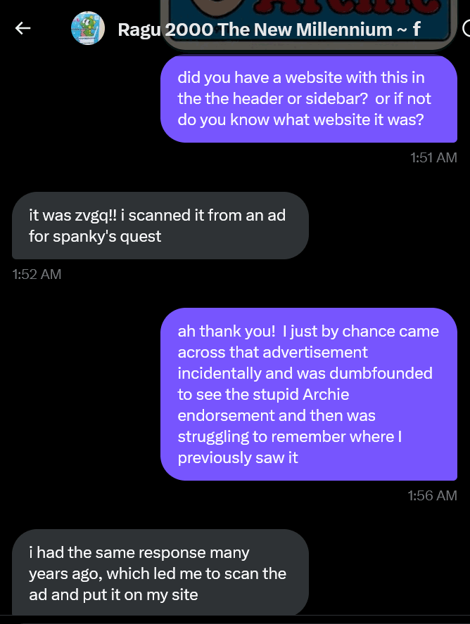
and that is what me asking about it looked like. I did not really ask at 1:51am, however. Why is the time zone incorrect? And why did I think I needed to prove that I asked about this?
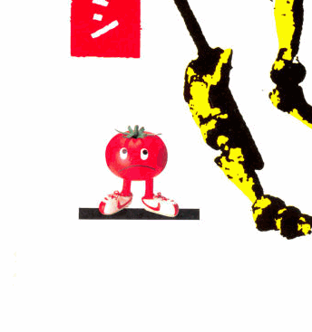
all in all a very stressful day! I had other pictures of stupid limbed fruit to show but now I am just upset.
Now I am more upset!
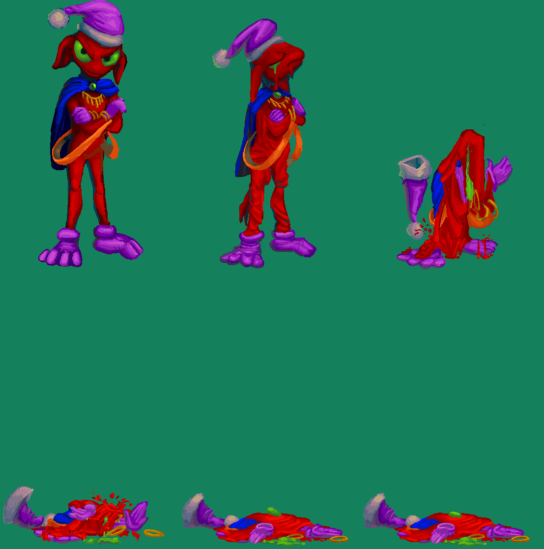
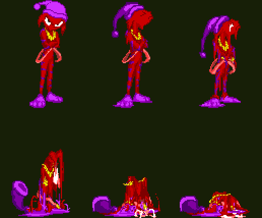
an eccentric imp melts, in 2023 and 2004. I do like the stripes on the 2004 version of this animation, but I also repeatedly didn’t notice that I forgot stripes, which happened with the same sort of stripes on elpse back when I first started coloring in the comic strip pages. if I would have the patience to draw stripes on all the other sprites of this thing. is also uncertain.
The old version also simply has purple hands and feet rather than wearing purple gloves over them as, for now, the new one does. Surprisingly, it is easier to draw those melt since the form does not need to be consistent between frames. Since I didn’t draw this from eight angles, however, switching the gloves to hands shouldn’t be as big a deal as some previous not big a deals ended up being.
That trick I was so proud of on the linked page, to put all the angles in one image, made the game too slow, trying to load them all at the same time, so I had to re-insert them all separately anyway. I might have mentioned that before, but I immediately forget what I saw after saying them. That is part of the point of saying things, for me, to get them out so I stop thinking about them and can think about other things. But that does not prevent me from beginning to think about them again in the future! At best I can send them to the back of the queue.
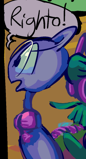
page 3-57 of this
once, if ever, I sort out also what the gnomes in the apartment and kumquat outside are doing round-about this point, this may be a higher numbered page. for now i have a fairly loose mental grasp of what is going on since I jump between so many slow, uncompletable projects, so I need to follow this thread in a fairly linear manner to have any control. I know enough that it doesn’t risk tangling with the others for a while. the next two pages are likely to be mostly yelling over a telephone and elevator usage. Those were not in the plan, so I ought not try to manage several additional plans with additional unplanned nonsense simultaneously.
I also should finish uploading pages from the shoddier comic strips. I say that now because I do not expect to do that now.
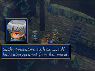
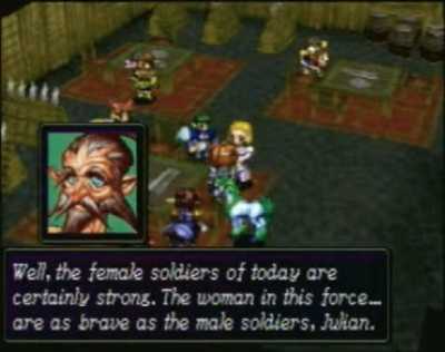
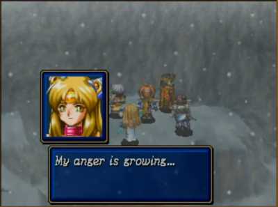
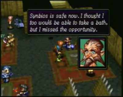
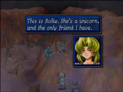
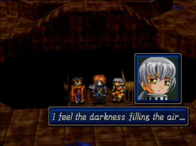
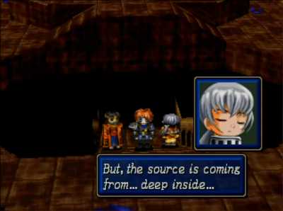
I don’t know how much to attribute to the original script, the unofficial translation or the artwork, but Scenario 3 of Shining Force III is rife with incel energy
To clarify, this game and Shining the Holy Ark use the word “innovator” to refer to a person who has special powers granted by otherworldly “spirit”s, the portrait artist(s) seemed to favor half-closed eyes and the unofficial translation was done by nerds still playing a dorky old sega saturn game 20 years after it came out.
And I wish I could have been one of those nerds, to a degree, it but I just never had time to, and worried I would be overwhelmed by the apparent complexity of it relative to earlier games in the series, so I eventually gave up on the idea of me doing it any time soon and just watched videos of other people playing it (while I attempted art-work) to satisfy my curiosity about it as best I might.
But now I realize it fundamentally does not change a whole lot from its predecessors. But still by very nature of being a cd console game coming out in the wake of Final Fantasy 7 everything takes longer to load and longer to show. I regret missing out on the one time my ancient habit of leveling up EVERY hero regardless of apparent inferiority would actually matter, but really it doesn’t matter very hard; one battle in each of the first two “scenario”s requires that you send a backup group apart from your main force of 12 to a different location.
also the pictures with the pink-nosed weirdo are blurrier because the less-blurry shots are from play-throughs by people who changed the names of the primary heroes Synbios, Medion and Julian. If the pictures were from me playing the game I would also have changed the hero names but I wouldn’t change them to normal people names like internet dorks generally do. Synbios at least is a goofy enough name that it looks like something I would come up with.
And i NEEDED several different people’s videos. The game has an immense quantity of dialog, video people seem to skip most of it, but the blurry person put up videos exclusively of dialog. Another video person played it properly and efficiently but skipped a great amount of optional material and had an annoying habit of talking over the video about stuff that hadn’t happened yet, while a yet different player didn’t talk and accomplished all tasks but didn’t necessarily play fair either, so I wanted additional perspective on encounters that seemed too easy. And I still screwed that up because I didn’t want to see really important battles done easily first, but then the guy who played properly would still find some excuse to give away needless plot details. But I didn’t want to mute the audio either because sometimes he said interesting things, and I also didn’t THINK of that until late in the process. oh oh ohhhhhhh! what a cruel life.
2022 in pictures.
this really isn’t necessary since I already made a video and most pictures that would be rightly eligible for this entry tended to be bunched into a single entry in a single month. The video also was not necessary and so i am doing this anyway.
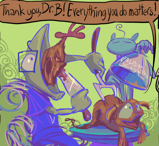
january
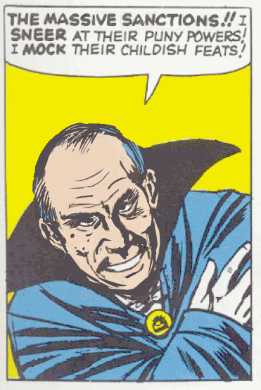
february

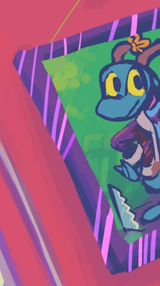
march

april
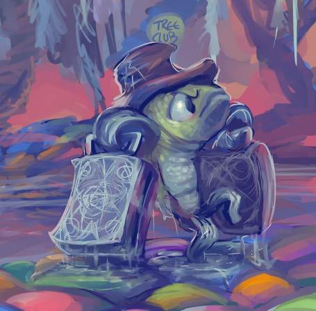
may
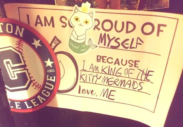

june
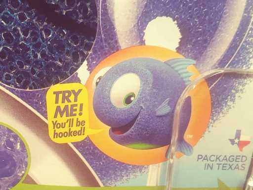
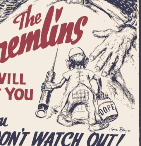
july

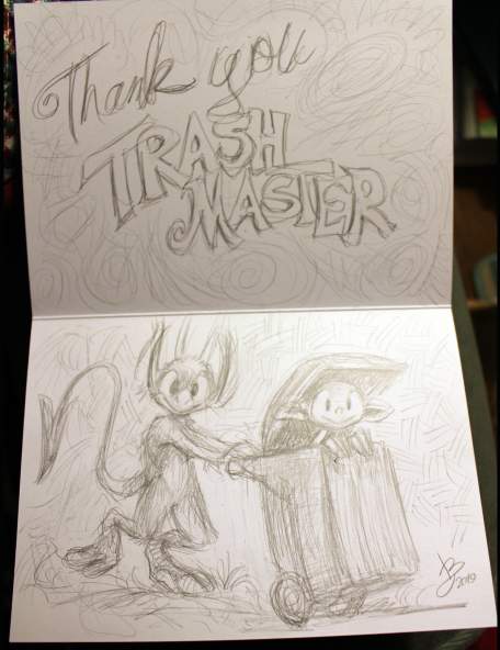
august
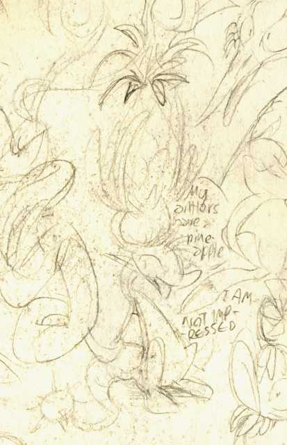

september


october

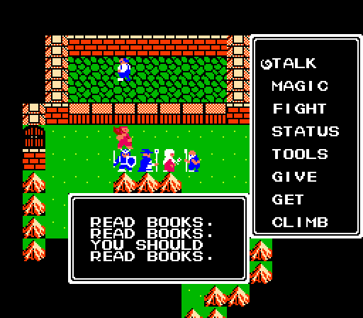
november
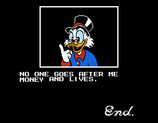
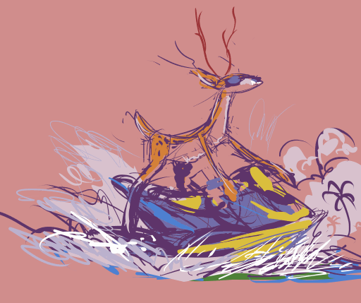
december
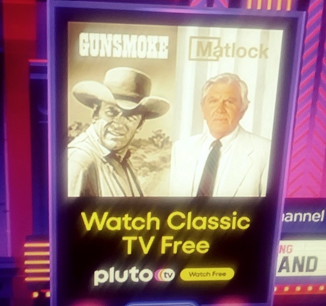

that just about dumbs it up.
a video of pictures I made last year set to some suspicious music.
I hope you hate pine cones, since three or four of these pictures don’t have one.
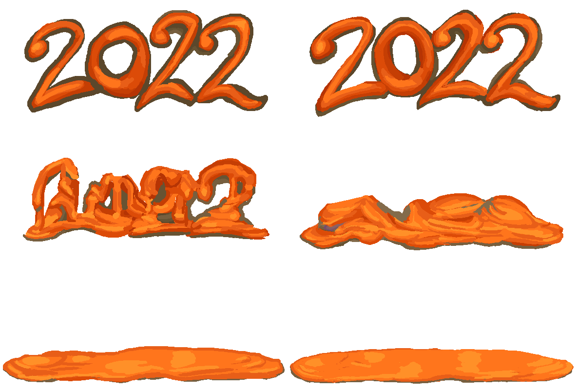
It took a ridiculous amount of time to make this considering that it is 95% comprised of stuff I had already made. My trashter plan to display gzdoom-engine material from within the gzdoom engine rather than as gifs of the source material did not help like I thought it would. I opposed gifs since while I design the graphics grouped, I have to separate them to put them into the game, and I refine them after separation, so I didn’t want the less-refined versions. and some pieces, like the launched yeep parts mentioned (but not yet drawn and so not shown) previously, were separate to begin with. howEVER, since I draw the stuff at ten times the 1993 game’s resolution, and my computer is less than top-of-the line, those graphics need to be reloaded each time the game is started, and then I am having it load extra graphics and generate extra objects on top of that, IN ADDITION to me running video capture software, which means loading all that tomfoolery in an extra window while simultaneously saving a copy of it all, the game can’t help but choke up for a few moments when stuff is exploding. and SO I spent an extra day, two days? trying to reduce that, just a few seconds of the dumb video. And I already spent an extra day drawing all those dumb letters and setting up the circumstances under which they appear and explode. originally they were to use the same explosion frames as the launched yeep globs, hence my using the same colors, but those explosions looked too uniform, unless those were themselves launching more globs, but more globs meant more lag. and SO i drew EXTRA explosions for the letters I and O that would prevent them from needing to launch globs.
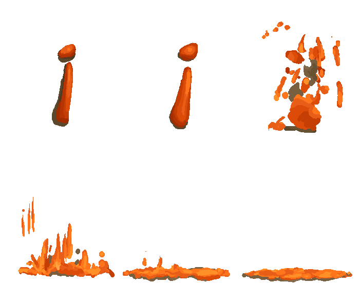

but that still means loading extra graphics so it doesn’t reduce THAT much lag. I also had the letters L and F turn into I and G into O as they explode, and that still wasn’t enough! For the yeep section near the end, I had all the pertinent graphics pre-load before I started recording, but that wasn’t an option with the letters because they FALL FROM THE CEILING as soon as the level starts. I COULD have preloaded all the graphics if I had thought to suspend the letters on disappearing floors or had them teleport into the room, but I was too busy to be thinking! I also forgot to set the level to change the colors to something other than orange, so that the aftermush looks less like a nickelodeon logo family reunion but if I had, I would probably still today be trying to optimize or fix it in some way and I am glad to not be doing that.
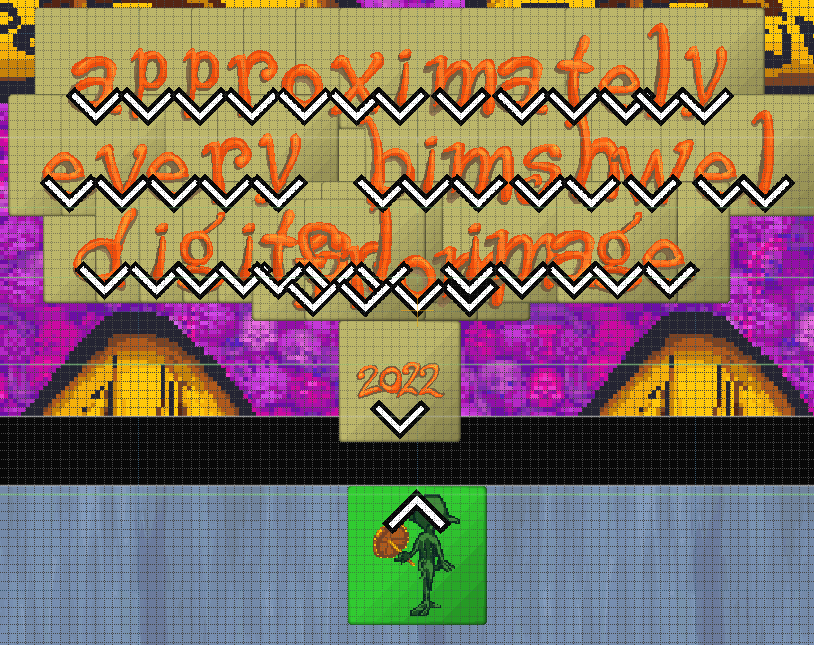
I can’t even show this picture without needing to explain it. the level editor shows a 2003 dope rather than a 2018 dope because it assumes the player character uses PLAY-named sprites, but the newer dopes have DOPE-named sprites, and I simply never took out the old sprites. the weird background is irrelevant; it is the first graphic in the definition file, since for some arcane reason that graphic shows up invisible in the game, but not in the editor. I needed it invisible so that the background shows through it. there are other hacky ways to make the ground and walls invisible but everything I do is already hacky so I preferred something that worked consistently.
these are off-center relative to the player character’s viewpoint because they seemed to my own viewpoint to be showing up offcenter when I placed them IN the center. However by the time I made the video that seemed to no longer be the case but I was too tired from the endless re-records hoping for less lag and more interesting random splat locations, then inserting that into the video, cropping out the wrong takes, then moving it to the front, then dumping it all that since I wanted to go back and change something else in the setup and then need to re-record again, that I left the positions alone.
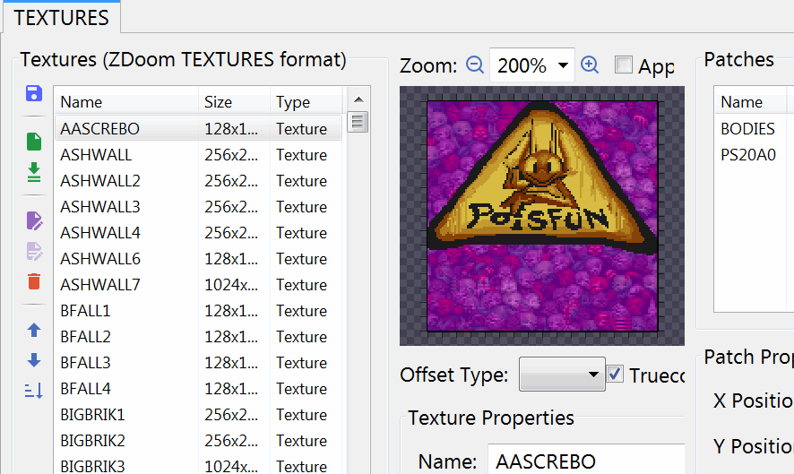
“AASCREBO” will go to the top of most lists. It is not necessary for the list to be alphabetical, but I was trying to amuse myself. Regular Doom2 calls it
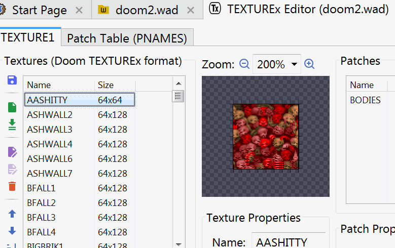
which I dislike seeing in the list, and regular regular Doom calls it
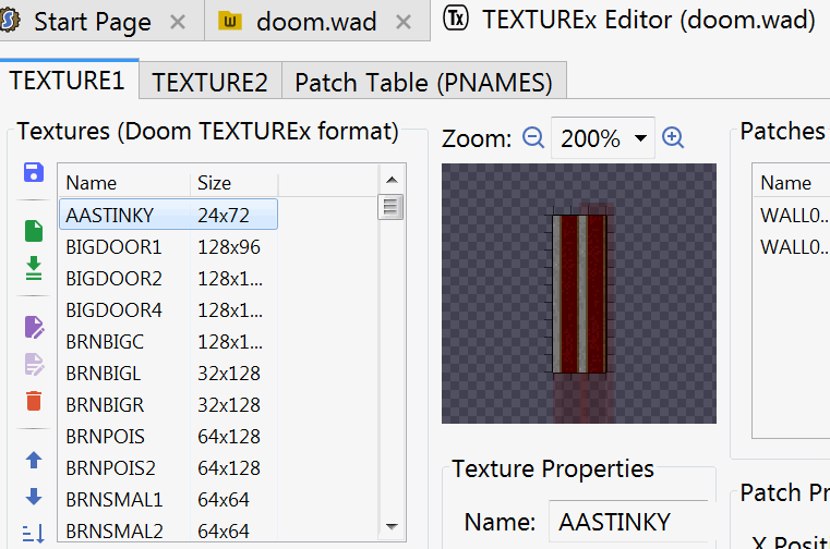
which I hate even more, and not just because the base-2 display system means you aren’t actually ALLOWED to make 24-length wall textures! Even if that worked it wouldn’t work! screbo is stupid garbage that nemitz says, and I had already changed the poison logo to feature nemitz, so it fits. I placed it over the pile of skulls that is shown by default after coloring them purple. I don’t want any of the base game’s graphics in this, even edited ones, and nemitz endorsements of rubbish are anachronistic within this project’s complex chronology of being set before nemitz, but as noted previously these don’t actually show up! but even THESE are a problem since floor graphics are backwards on the ceiling. If I want to control invisible objects that it is possible to move beneath, I risk seeing not only a backwards S but a backwards nemitz inside the level editor’s 3d view mode. What could be worse than that? I probably won’t find out until I try to make next year’s video.
and after all that, I today realized: the ORDER of the primary content is terrible. It starts on a snake comic strip that nobody cared about and then ends on generic wall textures that nobody SHOULD care about. I should have started and ended on stuff with meaning. I too more concerned with irrelevant nonsense to consider the marginally more relevant nonsense. There is probably an important life lesson there but I am too concerned with complaining to process it right now.
