Ah ha and this here is the original vector source of the tou yube video. I did not bother to make a fancy “loading” graphic since the knowledge of how to make them only temporarily took residence in my mind twelve years ago but I assure you it has the capacity for movement after a wait that on most modern internet connections will not be as insufferable as it would have been twelve years ago. And otherwise you can “save as” it and suit yourself that way.
It is not nearly as strange as it ought to be for something that barely makes sense, but it is fun to look at, and not very long. Rewriting it to make sense was not an option since I do not know how to make sense without copious dialog, it seems. I personally think it makes more sense than the film Eraserhead and is over a heap of a lot faster, and people love that miserable thing, so mine is valid to a degree.
Also, while reassembling the sound outside the animation Flash software, since flash’s export functions are inadequate for anything practical and always require post-production, I saw to it that the volume level did not enter the red zone at any point. However, I did not check the volume relative to any other noise-making process inside my computer machine and consequently it seems rather loud. So please be aware of that.
“Snakes” since several years ago I wanted to make a demonstration animation in a hurry, and I figured finishing something that was fairly easy in 2012 would be yet easier than that in 2016, and would not delay other matters much, and therefore was eminently worth doing. Despite being completely wrong, I made similar equally wrong estimations on several other projects that I let distract me from THIS one between January and this present point, not all of which reached displayable levels of functionality. And now that I am here, with one more that IS, it does not feel as nice as I thought it would, but it is better than I felt yesterday.
It is fun to look at.
Not for ME, now that I am unable to make alterations, and thus more able than ever to detect errors that require correction, but theoretically other humans might find value in it. Goop night and good muck.

It is fine to experiment with ideas whose relatability or comprendability are uncertain, but do not commit to laborious coloring methods for them. I just got through saying not to tighten the humor out of the artwork, and then went and did something that is almost as bad.
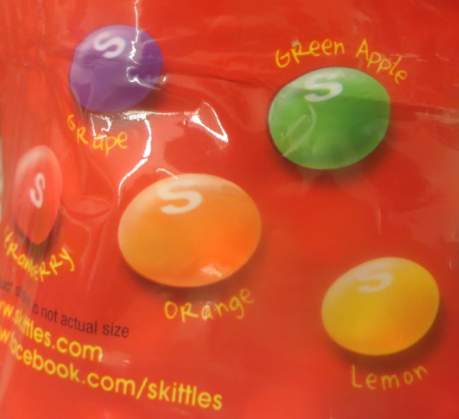
The Donut Trump Skittles story is a ruse to distract from the real insult that Skittles at some point replaced good old lime with an awful apple flavor.
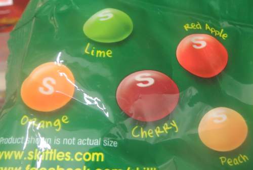
And if you want the lime flavor, you need to buy a bag that ALSO has a lame apple flavor in it. And Death too, apparently. Combined with the orange that’s two duplicate flavors and one flavor that should be in the red bag in the green bag. Inexcusable! Some brands of gummy bears did the same thing, which I complained about years ago, possibly pre-bimshwel. Back then I had real problems. I would still be furious if I had not at some point decided that I like having teeth and stopped eating gummy bears. But that does not help with Skittles since I prefer to swallow them whole rather than bite them, and so having no teeth would actually aid in the process. You might argue that I could keep one tooth and still prevent myself from chewing. However, then I would come across as quite foolish.
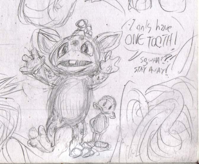
And I say all this as somebody who eats apples but does not eat limes. I rely on cheap fictional representations to fill the void. You might as well replace the yellow lemon flavor with a french fry flavor. Although if you are in the candy business and want to use that idea I will gladly accept royalties, and then I will be able to afford something with actual limes in it.

Apparently we have to re-live the Jonbenet Ramsey story now. Last year we did the OJ Simpson story again. I suppose next year it will be Princess Diana and Monica Lewinsky again, then Macarena, whatever mass media tragedy is next in line to have a twentieth anniversary. Believe it or don’t, every one of them WILL at some point. And nobody the whole while will question why this is necessary or acknowledge that we just did this the year before. Can we get these stupid 1990s remakes out of our systems now? Toss in Y2K, Verne Troyer, Jar Jar Binx, whatever you have to do. You already had your chance to try and convince me I cared. I don’t want to be reliving Jay Leno monologue jokes for the next twenty years while simultaneously being expected to give a pumpkin about the latest sass-loaded personality-free multimillionaire who isn’t old enough to remember any of those things.
Additionally, yes, I know this television machine’s aspect ratio is horribly off. I was not in this house while its original control device still lived and don’t know what atrocities were inadvertently committed with it. My feeling is the less of its contents I can see, the better. A pity we can’t cut off 10%-100% of all the audio also.
The next thing I post here will be intended to be less depressing than this!
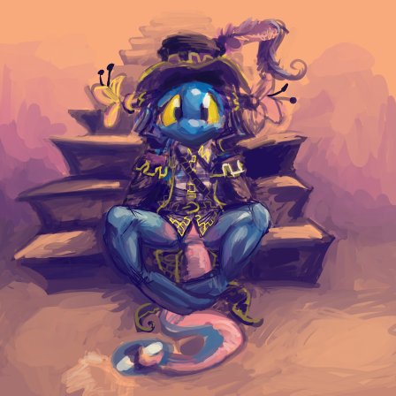
Especially if it comes at the expense of a fictional large-snouted-being’s depressing incidents.
You know what’s great about insurance ads? Instead of talking about their products they recycle old gags and they never get old even if they fixate on it for 30 seconds, 70 times a day for six months.
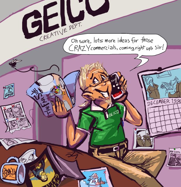
I tried drawing this person as a 40+ish year old man with a black 1980s-looking mustache but then I felt sympathy for him, which was not the point, but I couldn’t get a clear idea what stereotypical person I was angry at, so now I am not sure what it is. But I sure dwelt on this stupid thing for long enough. I need to have this away from me more then the execution needs to work. this is the sort of thing that would probably have been much funnier if I had drawn it as obnoxiously as possible in ten minutes.
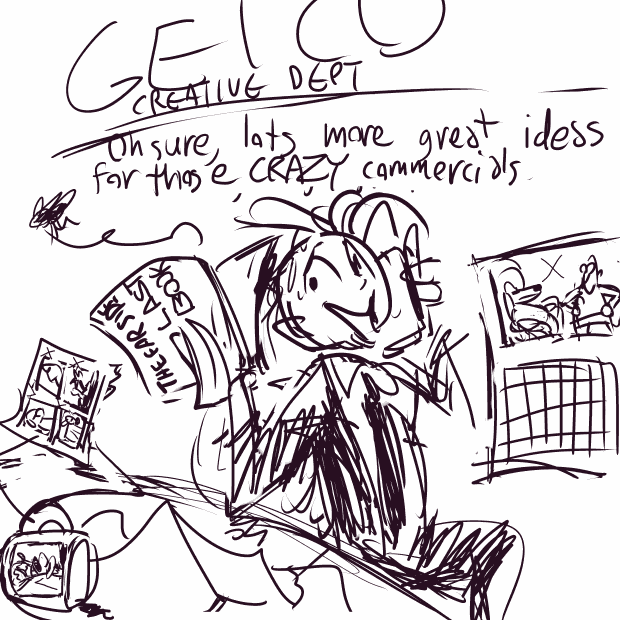
Here is my base sketch to establish the concept. If I had drawn crude impressions of the idea of far side cartoons rather than directly sourcing specific ones and put blatant stupid labels on the books like “FAR SIDE LAST BOOK” instead of trying to use real covers that plenty of people familiar with The Far Side would not necessarily recognize. The cruder way it is plainly a joke, without being stated as such, and I can not be held deeply accountable for it. The eyes look less creepy because that is the natural, unnatural size I draw them at. I would not feel as ashamed putting this out somewhere and having it be ignored. The more accurate and specific something is, the harder it flops if some aspect of it is wrong. That is why John Callahan, a quadriplegic cartoonist who couldn’t draw worth a basket of tumbleweeds but was free from obsessive compulsive fears had a career and I probably won’t ever. I probably won’t die at the age of 59 from complications of a botched bedsore surgery either, but I have 26 years to dwell on what a rude thing to say that is/also become quadriplegic.
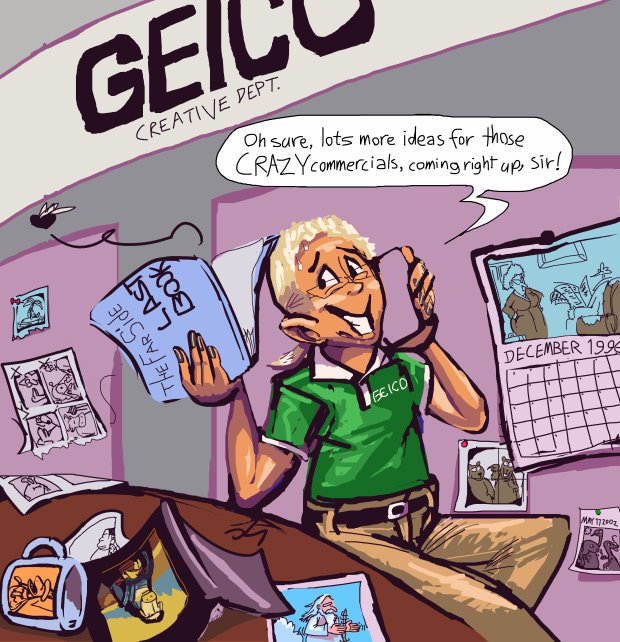
In fact that “FAR SIDE LAST BOOK” was one of the last things I changed; since I used a real cover on the other, less focal book, having the one in the center be generic looked lazy. I worked harder to make my joke less funny because I apparently would rather not look lazy than be funny, even though trying to be funny is the whole point of doing it to begin with, and it was only just barely funny. And I KNEW that but I couldn’t stop myself.
As the tentatively final version is, somebody could point out “ah HA, geico put out an ad specifically referring to a problem invented by contemporary phones, which cannot possibly have come from The Far Side.” or “ehm excuse me that is NOT the real far side panel that was used for December on the 1996 wall calendar.” I showed this to my older brother, who I only see twice a year, and whose approval I am desperate for, because he was my first idol and my last idol that still talks to me (Zartan come back, I forgive you, I forgive everyone), but who won’t look at anything I do unless I specifically show it to him, and he asked “DO they do that?” As in: DO the geico people steal old Far Side gags? Like he thought I was making a sincere political statement with this. And I had to say some waffly nonsense like no, but sort of I suppose they could maybe, like with the parrots and Tarzan and Marco Polo in the pool, you know? I felt like a profound moron.
Nobody cares that gary larson’s dinosaurs all look generic and unscientific because he doesn’t draw elaborate shading and scales and muscles on them like i would try to.
This is how autism affects me. I cannot take hints, and nobody takes mine, so I need to be as specific as possible. But I do not have the manual dexterity to be specific beyond a certain point so everything i do turns into uncanny valley mush. And by dwelling on this so hard I am doing the same thing I accuse geico of doing (outside of airing the things repeatedly forever)
Someday I will write a great book about how not to screw up. I will spend years on it, and all the advice in it will be the opposite of whatever you should do.
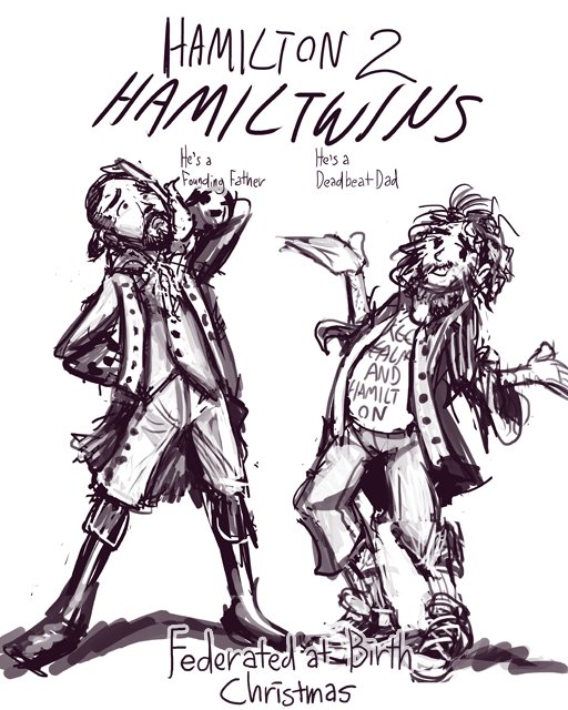
Here is another example. My plan was to post this on all the usual totally redundant websites with a heading in the vein of: “the REAL reason he quit the show.” Being as vague as possible, and likely not quite communicating my point, because I always over- or under-do all things. Goopness grapejuice I’ve even digressed and overdone my story about how I overdo things.
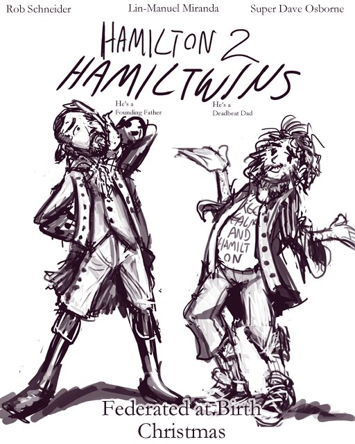
I didn’t finish this. I noticed that once I added the font it wasn’t funny to me anymore, even though the font is approximately what it ought to be. Because once the lettering is solid, the drawing looks unsolid, but the whole is solid enough that I start to wonder: why is a Broadway show using a movie poster? Is this a movie sequel TO a Broadway show? Why would that be the case? Who specifically does/should this second person look like? Is it funnier if he is billed first? Do I need to add a background now? What sort of background would it have, and would it match the anachronistically dressed person or the historically dressed person (with anachronistic hair that we don’t talk about)?
HOWEVER, this was ultimately a positive step, since drawing this turned the Hamilton guy into a joke to me, so now when I, inevitably, see him, I think it is funny rather than annoying. I can coexist with him.
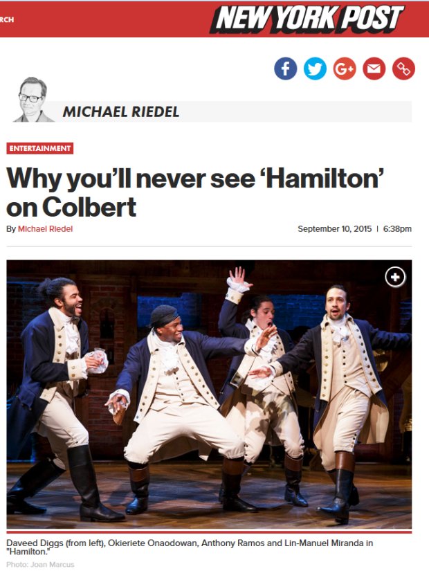
I no longer need to seek refuge in the bizarre alternate universe this New York Post headline is from in which Stephen Colbert doesn’t mention Hamilton at every opportunity. Broadcast television is still dead to me, however.
Also, I went to look up lyrics for a different show on some stupid broadway site that I didn’t realize was covered with graphics detailing all the awards hamilton (and flippin dippin RENT) had won, but when I saw they used this exact same dorky publicity shot it just made me laugh.

But then I got annoyed again when I realized Hamilton Guy also had the same approximate run of credits in “In the Heights” which I had not prior to then considered or cared if it had won anything.
Also that site is trash since it didn’t have lyrics, but the link that I THOUGHT would lead to them just went to a page to BUY tracks on i-tunes, which presumes both that I will suddenly spend money without having planned in advance to do so and that I would willingly introduce parasitic organisms into my operating system other than the 24 gigabyte folder of every pathetic redundant cash-in gameboy advance rom ever released.

And THAT was already on the hard drive when I got it! I swear. Somebody else specially installed, on my request, a 1 terrorbyte drive in the computer I bought from him, in place of the 320gigabyte drive it otherwise would have had, and perhaps he was trying to show me that I didn’t need half as much space as I thought I did by half-filling it with nonsense that I still haven’t totally sorted through (I am kidding, it was only one tenth. Come back Pez, I forgive you).

Going back to the anachronistic facial hair, I can understand if the first guy just looks like that anyway, but why does the second one, taking over the role, ALSO need to have that “I forgot to use a napkin after I ate a chocolate doughnut” beard? Alexander Hamilton didn’t look like that! He also didn’t rap or refuse to be photographed in poses that don’t make his pants look as tight as possible either, so I should excuse other fantasy aspects, but I never considered that the appearance was deliberate, like when there is an anime about Julius Caesar or something and all the men look like Sephiroth and all the women look like Sailor Moon. Also all my Japanese cultural references stop at 1997, you know that. Sometimes I wish my American ones did, too!
page 17, part 3 of that. I like the newer page-display system better now than I did when I first made and didn’t use it, and am more comfortable linking to pages on it now, but am not yet certain what I should replace the “that” page with.
This is another “experiment” in layouts that anyone else would have assumed was already long since proven. It still feels like cheating, to me. Even though it was just as much effort to complete as usual, and there was not a way of shoving in the next four frames that was pleasing to me, pacing-wise.
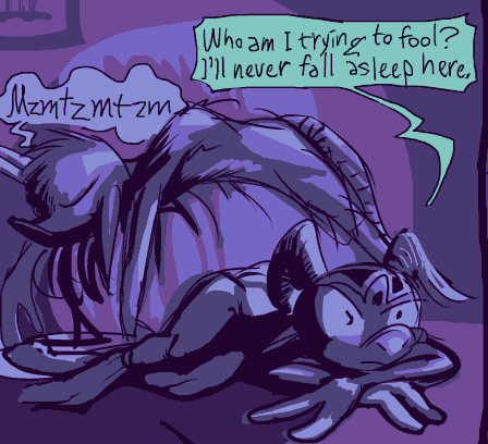
Obviously! Turn that thing off!