
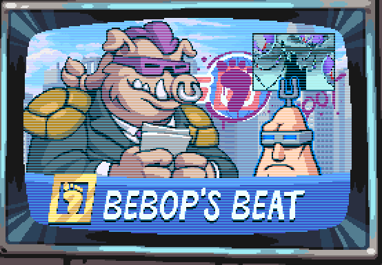
ceptin about us bein intelligent dis is nuttin but typical lamestream media propyganda. what about dem supa toitles? I seen em everywhere I go. dem reptilians is runnin da government and deir vermin buddies is runnin da media which is how come you don’t see it on tv cept what they want ya to see em. Tink about it.
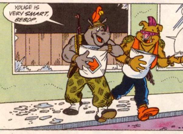
Dese glasses aint just cuz I can’t see real good. Dey mean I know a ting or two, which is how many eyes I got.
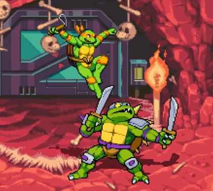
what about toitle on toitle crime? dat’s never on da news. it really carapaces me off if you’ll pardon my french but I don’t know why dey is eatin frogs and snails and mustid but not toitles.
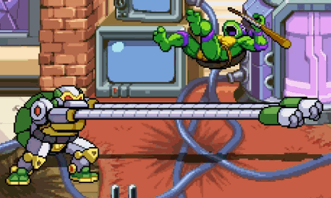
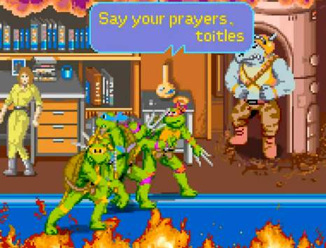
and toitles don’t say no prayas, even when you ask em to nicely when you gonna shoot em. Dem toitles is godless dirty communists. real dirty. i seen em comin outta da sewers all da time. And you nose i can smell em.
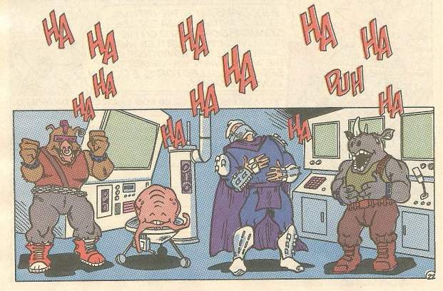
huhuh I made a funny
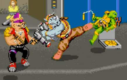
dem toitles did pizzagate too. youse oughtta google it. deyse all homophiliacs. dats why you don’t see no goytles. huhuh. just dat reporter lady and I hoyd sheza lesbean and den dats beastyalities oddawises. I bet dem toitles would be gettin abawshuns if dey knew how. Dats why we gotta repeal roe vissis wade. Did you know roe is a some kinda egg? And who hatches from eggs? Toitles! And wade is when they gotta go on duh scale cuz of all dem pizzas.

in summaryation deyse nuttin but criminals. dey is been groomin kids wif deyre violents and nekkid consumerisms and voter fraudulents since ah HMMMM when was dat?

sound familiuh? Good night.
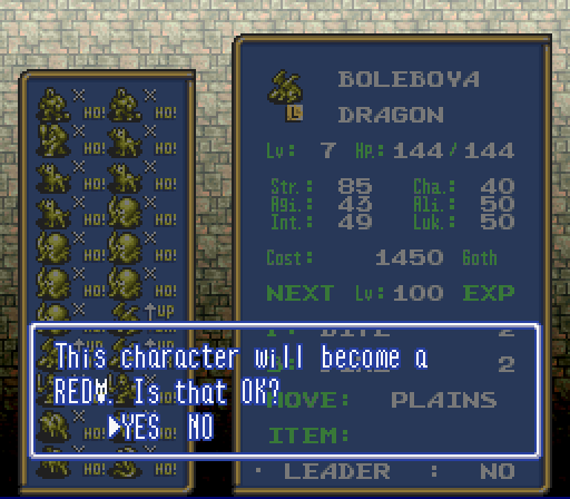
Somehow it is hilarious to me, in the video game Ogre Battle, that lacking space to spell out “red dragon,” owing to differences between Japanese and English writing systems, the localizers opted to just include “red” followed by that dopey dragon face icon. They could have written “R.DRAGON” and everyone would have known what it meant! But THIS I can’t take seriously! I am only thankful that the regular dragon at least spells the word.
curiously the game’s font has been extracted and uploaded to this page, which I know because for some/no reason I was LOOKING specifically for that specifically to see if that silly dragon head icon is included, and it is NOT, even though the actual game rom’s graphic data
puts it right after the letters, which I determined using Tile Layer Pro. YES i used rom hacking software i haven’t touched in nearly 20 years just to get a clean look at that stupid icon since I haven’t actually played this game. I don’t play video games anymore, generally; it takes too long. Now I watch other people play them –as it happens, Ogre Battle is one of the rare games where my participation is nearly as active as the actual player’s– to keep me from checking my messages every 7 minutes while i try to draw things, or to keep me from considering that my body is past its prime and I am tumbling toward death while I walk in circles in the basement here trying to burn off calories from all the garbage I eat since eating nonsense is the only thing I enjoy and I still delude myself that I can eat it at the same rate that I did back when I played video games and hacked roms and not suffer ill consequences. Then i realized other people for whatever reason have placed downloadable save data for Ogre Battle there so I can in fact take a proper game screenshot rather than blurry ones of youtube videos.

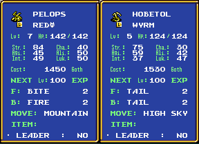
what REALLY makes me mad, is this dumb “wyrm” that has a lower level and lower just about everything else, and LITERALLY ALL it can do is exhibit its dumb tail at foes, and it DARES to try and charge MORE goth money than a REAL dragon.

just LOOK at how STUPID that is! they have sharp teeth, they have FOUR sets of claws, fairly pointy wing-ends, the chance at dignity of NOT having a dopey lizard head icon in their fighting class name, and THIS is what they choose to do! and they are QUITE proud of themselves.
that is like the kind of attack “lope” (the annoying lizard from my comic strip) would do
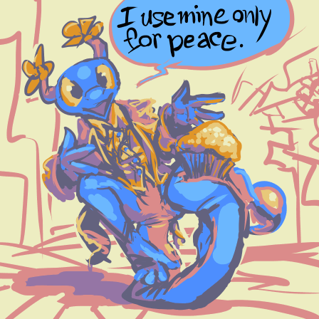
ARRRRYRHGHGHGHJ I am leaving before this gets ANY stupider.
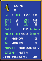
I already left! This is someone else’s problem!


one of these is from 2004, the other is from a bit more recently. The usual story applies to it: I expected a certain difficulty level and it became exaggerated beyond what I could handle, foremost on the least important sections. the front view (1), the most important and most likely to be seen view, was easy. side-front (8, gets mirrored to be angle 2) was a bit harder, then side (7 (no not THAT side 7 (don’t worry if you don’t know what that is)))was horrible, and side-back (6) was a disaster. in part because I kept trying to match it to 7, even though 7 was horrible. i ought to have drawn over angle 8, but i didn’t because i was using the OLD old old 2004 version as a base, even though the old version’s angles matched even worse. i was even conscious of how poorly they matched at the time. although looking at that again did at last convince me to add stripes. Thankfully stripes have not been a disaster yet, though i have not tried to draw them on the copious amount of earlier redrawn sprites of this… thing. My best decision over the 2004 version is blocking the back muscles with that pathetic half-cape. I didn’t know how to draw back muscles then, and I STILL don’t. This new edition of the monster is old enough that I no longer recall if that was why I added a cape, but there do not appear to be other conceivable justifications.
angle 8 actually doesn’t have the far hand out far enough; trying to match angle 6 to it also held me up somewhat. Since it doesn’t look BAD on angle 8 like it does on 6 i don’t NEED to change it.
no I sure don’t.
please do not make me change it, me.
the fool (that I drew, not me) yet has no proper pain frames; in the past this motion was used both for a close-up attack and a non-violent reaction to experiencing violence. For the moment that shall continue as I am rather worn out from the length of time necessary to draw it. Going forward, assuming I am not cursed by a being beyond my comprehension to remake my own old unreleased material for the remainder of my lifespan, I want to include more expressive characters, but that will require fewer moving parts. even minimally detailed ones like this become a problem when there are so many pieces. If this gets any more frames I hope they will have the courtesy to be non-rotatable!

although mercifully and surprisingly these are still in stock so perhaps I should order one. Gosh I’ll SAVE so much MONEY!