I have this picture open in another browser tab. I keep forgetting about it and then making very alarming laugh-noises and exclaiming “Iron Eagle!” in an increasingly high pitched voice when I unexpectedly find it again. It is the video cassette box art for Iron Eagle III: Aces,
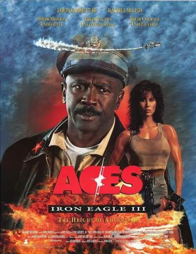
akadaka Aces: Iron Eagle III
and sometimes just
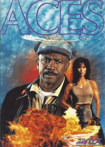
ACES when for some baffling reason we want to pretend there weren’t two warning shots before this one.
I am told that this larger edition of the picture was for the original theatrical advertisement poster, which also means that after two whole Iron Eagles this was still able to get itself into theatres. I can’t think why it was cropped for the video release. The more picture I see, and the less obscured it is by lettering, the better it looks and the less cheap its 1992 pre-Photoshop effects look. Photoshop existed in 1992 but I doubt the people at fault could afford it or internet to pirate it on at that time. At best they hired someone who was really good with scissors to make a collage.
In fact I went to a school called Aces at one point and I tell you this picture just about sums it up. That is not true, but maybe when I am yet older and do not quite remember, this explanation will suffice and I will not investigate the matter more deeply.

I attended in a hope to provide challenge for the staff, because as anyone in the field will tell you, sometimes teaching is way too easy. I know some of you like your cinnamon and bucket challenges, I prefer the Iron Eagle challenge.
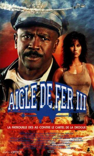
What intrigues me so about this situation? Is it the enormous, legless man floating/propped up behind the tiny woman? Is it the man’s goofy facial expression and Lipton tea officer hat? Is it just the name “Iron Eagle” combined with my knowledge that he IS Iron Eagle because his colonel hat has an Iron Eagle on it? That real colonels actually have silver eagles, but this guy is so corny that he only gets a rinkity dinkity eagle made of a much cheaper metal? That the series is named after him even though he wasn’t actually the main character of the first volume? He looks so concerned. Like he just realized he is Iron Eagle and all the ramifications that involves. That was a magical period; there were two iron eagles already, and you wonder “where can it go from here?” never realizing you’re not even done yet;

there’s still Iron Eagle: on the Attack yet to be made and released. Do you grasp that? It hasn’t even been MADE yet. Iron Eagle is STILL in active production. ANYTHING can happen. Plenty more iron, plenty more eagle still to come.
Only ONE MAN will suffice! Who is it? Iron Eagle! It is no longer a remark on the unlikelihood that he would be promoted to general and receive a non-bird for his hat; by this point it is HIS NAME. Don’t tell me everyone in the movie calls him “Chappy” (because that would mean you had seen the film and have a more important destiny than reading dumb web pages) to me he is only Iron Eagle.
As before, it was initially presented as a non-numbered original production in the apparent hope of appealing to sequel-snubbers, with the marketers eventually having to admit, yes, this IS Iron Eagle IV, so that sequel enthusiasts could figure it out.
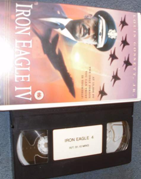
And if Roman numerals are too highbrow for you, we’ll put a regular 4 on the
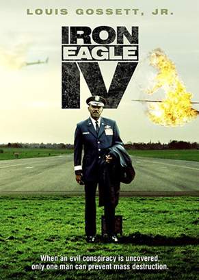
You can tell Iron Eagle IV and Iron Eagle on the Attack are the same movie because the ONE MAN tagline is unchanged, even though in both cases Iron Eagle has visibly failed to prevent something from blowing up while he poses for the picture. Maybe he wants to make sure we understand: He IS Iron Eagle, the one man, and until we meet his demands, things are going to be pretty lousy.
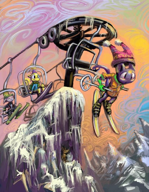
Imagine if you were at the top of this structure here and you saw those dumb smiling meeps coming toward you constantly. You would agree they deserve this.
Especially that yellow one. That thing really is too dumb to live. Why? It is not a dope. It is not biologically required to be that stupid. There is no excuse for it existing. History is shown that the worst that will happen is that it will become concerned or mildly sad by falling, but probably abruptly resume smiling as soon as it is able.
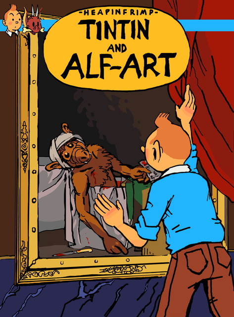
Unbeknown to all but the most studied bande-dessinee scholars, Hergé had several unfinished stories in progress at the time of his death. This one is somewhat lesser-known than its similarly-titled companion.
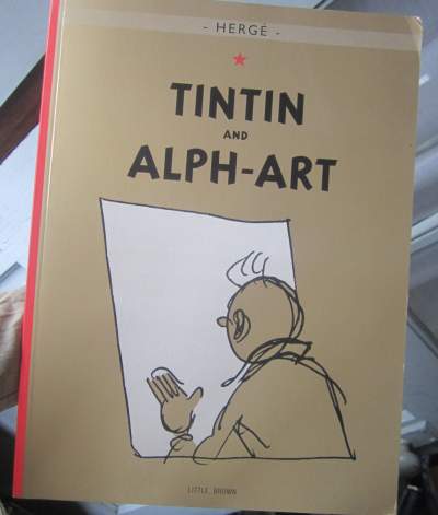
I explained my own joke there because apparently there is very little cross-over in public awareness of an incomplete Belgian comic book published 50 years after the series’ hey-day and 1980s American puppet-based situation comedies. Who could have guessed? I usually make sure to pick only the most recent, popular topics for mashups, like screaming scruffbags + everything to maximize my potential audience.
I wanted to use a painting that people would recognize that would look extra stupid to have ALF in it, but which was not Mona Lisehhh. I have little doubt there was some ALF-related promotional material at some point which used that one. Tintin has already had a seen-from-behind run-in with it, anyhow. Death of Marat may have been a bad choice, though, since the painting is recognizable through its use of shadow, which Tintin books are not!
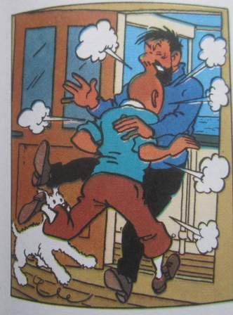
Also: in the final completed story, Airjay changed the sort of trousers that Tintin wears from a strikingly outdated style
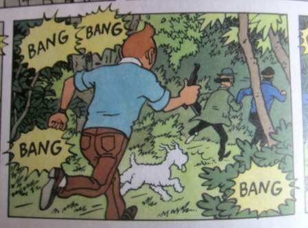
to another that is presently strikingly outdated but less recognizable, and seemed looking to continue this trend in the book after it. I thought I should be consistent with that based on the premise that the thing I made up was from the same period, but with just the upper portion visible and from the back it looks odd. I point this out because AAAAAAAAAUUUUUUUUUURRRRRRRRRRFFFFFFFFFFGGGGGGG I’VE BEEN TINNED!

Apparently I had “published” this at some point prior to completion and not realized it, since the primary clue is that the word “publish” has switched to “update” in an inconspicuous location. Since it was necessary to edit an older entry that I linked to, I had been using the update button on that one, and so probably mistook the publish button on the new entry for the update button it did not yet have, when I should have clicked on “save draft,” which is in a different place, even though it has the same purpose on a non-public entry as “update” does on one that is visible, on which the old save button vanishes. Does that make sense? No, it does not!
Anywuh,

breaking news [a week ago]: arbiter of notability has opinion on arbiter of history.
Jimmy Wales is the founder of wikipedia, the encyclopedia that anybody can put an article on that any administrator can delete on the grounds of it not being “notable.” Proof of notability is typically determined by appearances or references to a topic in advertising and cartoons. So if you want to make something notable, rob a bank and buy an ad on a cartoon that wikipedia administrators watch. Or go back in time and insert it into an obnoxious compuserve chain letter from 1993.

The only arbiter I trust is Bjorn Skifs,
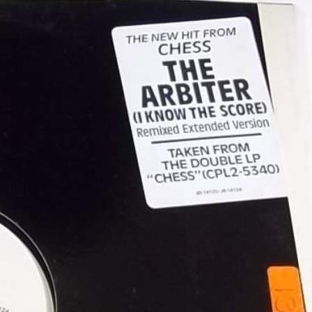
for, you see, he knows the score.

Skifs only became the Arbiter in 1984, ten years later, and it did not bring him the same level of recognition due to the song being less horrible. By then he had spent most of his Hooked on a Feeling money on extra zippers, height implants for his boots and one night in Bangkok, so his powers of arbitration were kept under control.
But now, with his old song in a hit movie, he must be getting big royalties. I estimate that every time an advertisement for the film airs on television, Bjorn Skifs gets one cent. By this point he probably has enough money to see the movie for free. Maybe even a 3d screening. How is that fair? He thinks he is such hot stuff now, we will probably never get rid of him.

Oh, OH, like this is my fault? What a trick! Now any time I walk near a brick building I need to worry that Bjorn Skifs will be lurking about in a camouflage brown 1970s suit, ready to step out of a doorway with just one leg so I need to slightly adjust my path to get past him. And fleepsy forbid I want to go IN that doorway, right? You think just because you won the second annual Karamelodiktstipendiet (Gold Neckerchief) that you can do this to me? I am not going to stand for… what? Oh gosh. Oh dear oh gosh

With no one left to arbitrate our dispute, I had no choice but to do as Bjorn Skifs demanded, and take advantage of his sporting head start to seek safety. At some point I managed to lose him, by running past a building made of concrete, and took refuge in my stylishly dilapidated 1920s apartment for several days. I think… yes I think it is safe to go down now. He would have gotten me by now, surely, if he was going to.

And then Bjorn Skifs murdered me. The end.
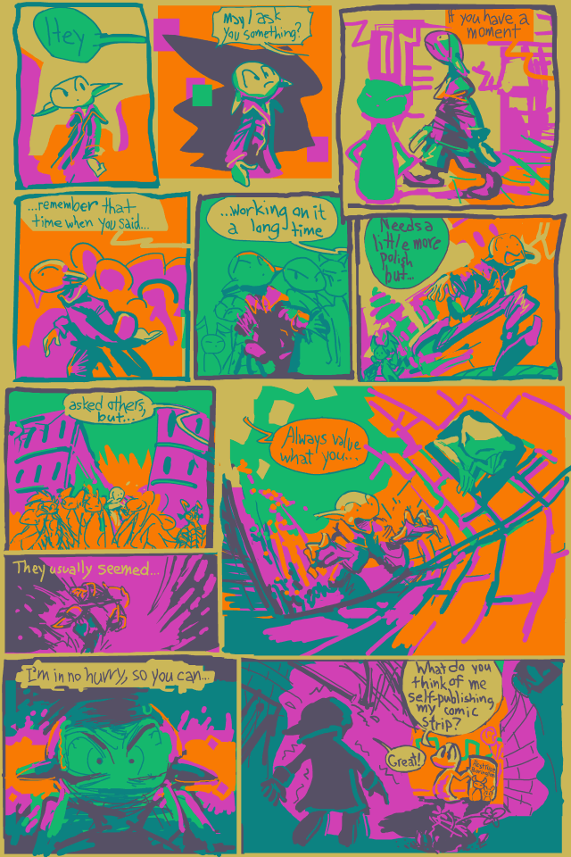
It is one of my long-held personal beliefs that if you need to ask others if you should take on a creative endeavor, then you probably should not. Additionally, if you ask anyway and people make every effort to not give you a clear response, then their answer is “no” but they think you are too emotionally unstable to handle criticism or dissuasion. They may be right, in which case I will resent their positions of superiority and continue making uncomfortable liars of them.
I proceed despite all evidence implying that it is a terrible idea. This can mean two things: I am a visionary individual, destined for great success, or I am truly insane and destined to lose much money and what little optimism I had left for my creative endeavors. Perhaps it is not surprising that the box office record-breaker Delgo looks like what would happen if I paid a “serious” artist to draw an elpse.
![investors who put up 40 million dollars for this: the [magic floating] yolk's on you!](/frab/magicyolk.jpg)
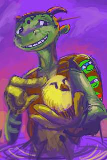
People didn’t believe in that property either, and it went on to earn a historically low amount of money. It shows that if you believe in yourself and persevere amitz adversity you too can get the world to mock your life’s work. I feel motivated to one day produce an even bigger disappointment than the character I at one time called “the unnatural clone baby of Abe from Oddworld and Jarjar Binks.” (That is slightly more apparent through the “leather pants with bare feet and vest” aesthetic that is not evident in the picture I used here and I am not going to look up another and risk having to draw another elpse that creepy this soon)
True, worse movies with uglier characters that cost twice as much to assemble have stolen billions of dollars from customers but they had corporate backing every step of the way, which is apparently the sole valid factor. Delgo is a rare example of a computer animated horror getting precisely what it deserves and for that it should be recognized (even if it is mistakenly recognized as elpse). Is it wrong for me to desire recognition?
Whatever happens, the ambiguity that surrounds everything I do will dissipate at last. (Which therefore means I will never actually get to that point).
I must do it, even if only to crush the desire to do it. My goal was always to print the comic. That is why I forced it into such a rigid shape all these years. Despite all the printing I have done for non-sequential “art” pictures, I never considered how inappropriate my colors were until recently. Typically the printout maintains the relative contrast pretty well. The only problem is that it often seems too dark, and I hate having to guess at that sort of thing. Different printers or softwares convert my frightful RGB computer colors to CMYK ink colors differently and I can never know how it will go, and the employees working the printers often seem to know less than I do, and unmistakably care less than I do.
I considered that the faded colors I get when vectorizing my old, low resolution drawings in Adobe Illustrator is probably best to not rebrighten too much over, since the reason they are being faded in the first place is because Adobe Illustrator only uses CMYK ink colors. Paint Shop Pro, that I draw the comic in, only uses RGB, meaning the color gets converted three times before the end and sure to be degraded considerably, but effect of the final degradation will be less extreme and easier to predict. Some of my pictures are garish anyway, but I do not on my own think to tune them down, ordinarily. The colors that are ugly on a computer are often impossible to reproduce in ink! My creation is literally too abominable to exist.
It is apparent between 24 and 25 that much less redrawing is being done on the updated pages, than in the past, perhaps less than is called for. I underestimated my ability to find something ugly. Printing in color is expensive, so I will probably just do the first 32 pages for the first book attempt, which gives me a functionally arbitrary stopping point. Once I get there I will look at it as a whole for the first time and fix the art up better, within reason, provided I can afford reason and the printing costs. The text needed to be completely redone, however. It flagrantly crossed barriers and performed unorthodox actions, and I risked it being more interesting than the characters.
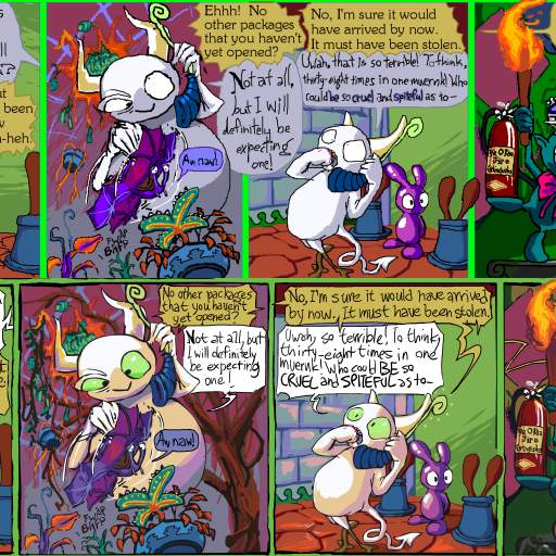
It probably is not any easier to read now, but if you glance or squint at it, it seems like it would be if you looked closer.
But why would people pay money for a comic strip they can get for free on the internet? I do not know! But apparently some people do. I know that when I have, at stupid art shows, shown people printed out samples of the comic, and they seemed interested, and I told them they could find it on the website, I never heard from them again. This then also knocks out another excuse. It will be there in front of them, to not buy or care about instead of not buying or caring about my art prints. With just the prints to sell I feel silly, since I would not buy art prints myself. But comic books, I have bought a few of those, willingly, usually. Eventually people will have no choice but to admit they think I am marginally talented and delusional. Victory at last!
