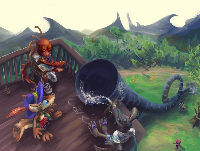
a gift commission from a person called RelaxingDragon1 to a person called QuentinCoyote (but drawn by me) featuring a stylishly-hatted individual also named Quentin Coyote at a somewhat less stylish location, pondering whether a round trip is in order.
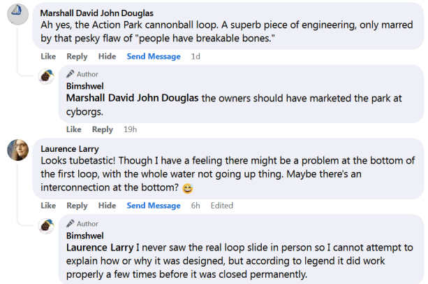
truly divisive, replies to this picture on various websites have run the distance from figuring I don’t know about the slide and explaining it to me, talking about it like everyone knows about it, and explaining to me that the slide absolutely could not exist as if ’twere my idea, sometimes immediately beside each other.
If the scene looks barren of attractions and unlike a proper amusement park, I should clarify that the real Action Park that I was instructed to evoke did in fact look like this, at least as best I could tell, since I was unable to turn up a photograph of the ostensibly notorious loop slide from any beneficial angles.
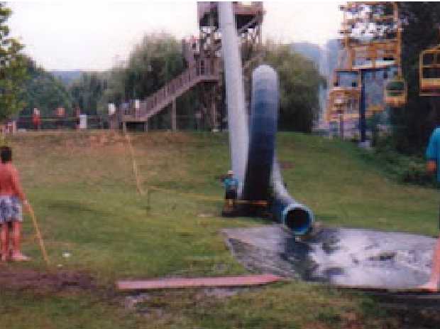
At the end of the slide was what appears to be a piece of dark plastic or rubber in a shallow hole, with water running off into the grass, which creates an unpleasant marsh like environment, which is why that helpful plank has been placed beside the plastic. Truly, no expense was cared. I don’t know how the water gets up to the top of the slide platform to go through the tube; a garden hose seemed a reasonable guess, given the production quality. I probably should have made the ski lift chairs bigger but than I would have had to actually detail them and I wasn’t asked to draw them, much less paid to do so! Yet I felt inclined to make this as accurate as I was able to until late in the process, by which point the only area that felt safe to mess with was the mountains and to a lesser degree the trees, since the best way to do that would have involved having them not be green, which seemed somehow less appropriate than faking up their shapes did.
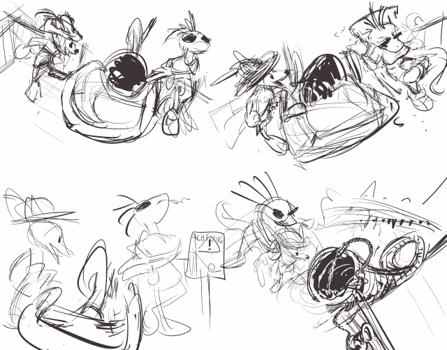
I personally thought it was funnier for the protagonist to approach the slide willingly and smiling, but humor is subjective and not always beneficial to horror narratives. I do wish however that I had remembered about that “achtung” sign idea; I only remembered it just now when I sought these early sketches. I had at one point meant to incorporate it into the setup that was eventually chosen, since I don’t like all the plain unadorned brown and troublesome straight lines here, which are a natural byproduct of me having no intuition or references for a wooden structure I have only seen from the side in tiny, pixelated photographs. a few more props could make the space more interesting without requiring unremarkable fake trees. I also finally see that my difficulty with the perspective on the slide that makes it look more like an enormous shofar than a tube of consistent circumference was that I didn’t diminish the shadow beneath it as it went up. Ewps. The ride attendant was also supposed to be wearing sunglasses, and those DID look like sunglasses at one point but I failed to notice when my layer shenanigans left them no longer doing so. Maybe I will fix such issues if I ever feel sufficiently wronged by the owner of the hat-wearing figure here. Unfortunately he didn’t ask me for the picture and never watched any of my pages, meaning he can’t unwatch those pages either, so I would have to direct both of us quite out of our ways to facilitate all that, which means even more extra work! oh
No comments ever.
RSS feed for comments, for they hunger.
This here`s me trackback!