My layouts are typically boring. they should probably stay boring. I observed a bunch of batman comics with very “dynamic” layouts and individual pages were often impossible to see immediate logic in. I found out who won the fight when there was a pile of bodies on the ground or batman on the ground. Outside of fights it was mostly narration. Why don’t I just read a real book, then? Because that would take longer than 15 minutes.
I put too many gnomes into Fringo’s gang. For the chase portion, instead of looking at who I had already drawn inside the bar, I just made new gnomes. and yet i had difficulty deciding who was holding the weapons (my layout from months ago just showed hands) and feared I might have to draw up a new one or bring another out of the bar, which I did not want to do because there are already too many there. I didn’t want to have one of the wimpy gnomes holding the key, since it’s a BIG key. the satyr seemed a good choice, since they love their secrets, but since that one expressed dissent I don’t think it would brandish the item so quickly. also I am sure somebody would appear to tell me that satyrs are associated with drunkenness and I would be a fool to pass an opportunity to incorporate something-to-do with liquor. maybe a shot gun that fires shot glasses or something stupid like that. stupid is the goal.
I spent an hour looking up names of famous goats, frogs, cows and whatever but couldn’t come up with anything I liked better than “lamb chop” that also seemed like Fringo would say it. “mold-covered hamburger” didn’t quite fit the emotional context or the space and “puke minotaur” also didn’t fit the space. The space was set initially with “moldovan.” “Capricorn” didn’t seem insulting but “crapicorn” seemed out of character. I like “sagittarius” but then it just looks like I messed up and if I were lacking for true errors then I could get through the text portion of these updates much faster.
I did not know how to draw bicycles before this section, and as it has progressed I somehow got worse at it than when I started. Hopefully I will never have to draw them again but unfortunately I like the gnomes. Maybe they can get a van to travel in.
If I start describing myself as “creator of comic BIMSHWEL” will it trick people into thinking I am legitimate, and therefore gain the attention of people who demand advance guarantee of legitimacy? I do not need to disclose that it is not a job anyone else was vying for.
RSS feed for comments, for they hunger.
This here`s me trackback!


Something that eats cabbages and doesn't mind not having any friends sez:
Well, whaddya know? Gnome gangs sometimes do good deeds after all. Perhaps we judged them too quickly. Ah, but what bliss it must be to have never seen a dope before…
Concerning the layout, I agree that some degree of simplicity is a good thing, and attempts at excessive dynamism can indeed most readily lead to confusion above all else. However, varying up the number and size/shape of panels a bit as you do here (and possibly even to a slightly greater extent) is general a good idea, as the flow of the comic does seem to have suffered a touch in the past due to attempts to force the action into the four-rows-of-thee-or-four-panels format. This can even have an effect on the writing, as your unfortunate inability to fit what was by far the best insult listed above into the available space illustrates. In any event, a layout that exhibits some flexibility without becoming so free-form as to cause confusion is probably the ideal to strive for; whatever else, the layout should always serve to enhance the flow of the action and dialogue, and never impede it, whether this be due to it being too loose or too restrictive.
NPC ABC sez:
Satyrs are associated with drunkenness. How dare you pass up a chance for a legitimate shot-gun. I wish to recommend the name of Shrek, the wooliest sheep who ever lived, but I worry readers might associate the green ogre with that namesake. Also it was a sheep. Sheep are no goat substitute.
I think you’re on your best when you use as much space as you need to frame a scene. The big panels help for dynamic movement, and they help show off the background to keep trap of where in the world they are. And you did a great job using tiny panels with Nemitz’s daydream and reveal in 25-26-27. Very sweet panel.
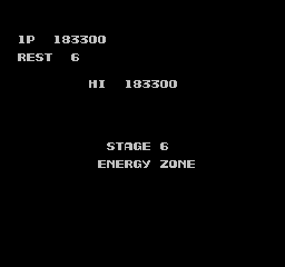
I remember when I found your comic when it was called Energy Zone. To this day I’m still figuring out how the term plays with the story.
Heapinfrimp sez:
It was my belief that “real” cartoonists (meaning the type that wrote in languages I couldn’t read) drew each half of a page on its own full sheet of paper and then combined them with one above the other, so that is what I have been doing since page AZ or thereabouts, which limits how things can travel across the center. I don’t know why I took so long to push against that, considering how long I have been complaining about it. This time I managed one element that crossed the divide, but you can see it is a sparse element.
What I can do is draw the full page, smaller, on a single sheet and then enlarge and add detail to it after scanning, as I am no longer using real ink and the physical media’s involvement is increasingly trivial. Keeping my format rigidly adhered to something I don’t understand is something I might claim not to understand if I saw it employed by somebody else. I think pencil’s involvement is yet important, however, perhaps, alas. As is keeping it at a size that is close to consistent with the paper it can be printed on.
Energy Zone is level 6 in the NES port of Contra. I must have played through the game within the past five years and curiously begun laughing when I saw

that one time (out of 100 others across 2X years) and declared it appropriately daft to name this nameless thing for some period.
I noticed that as soon as I stopped mentioning shrek the movies stopped getting made, so I choose not to mess with that, or anything with a similar name.