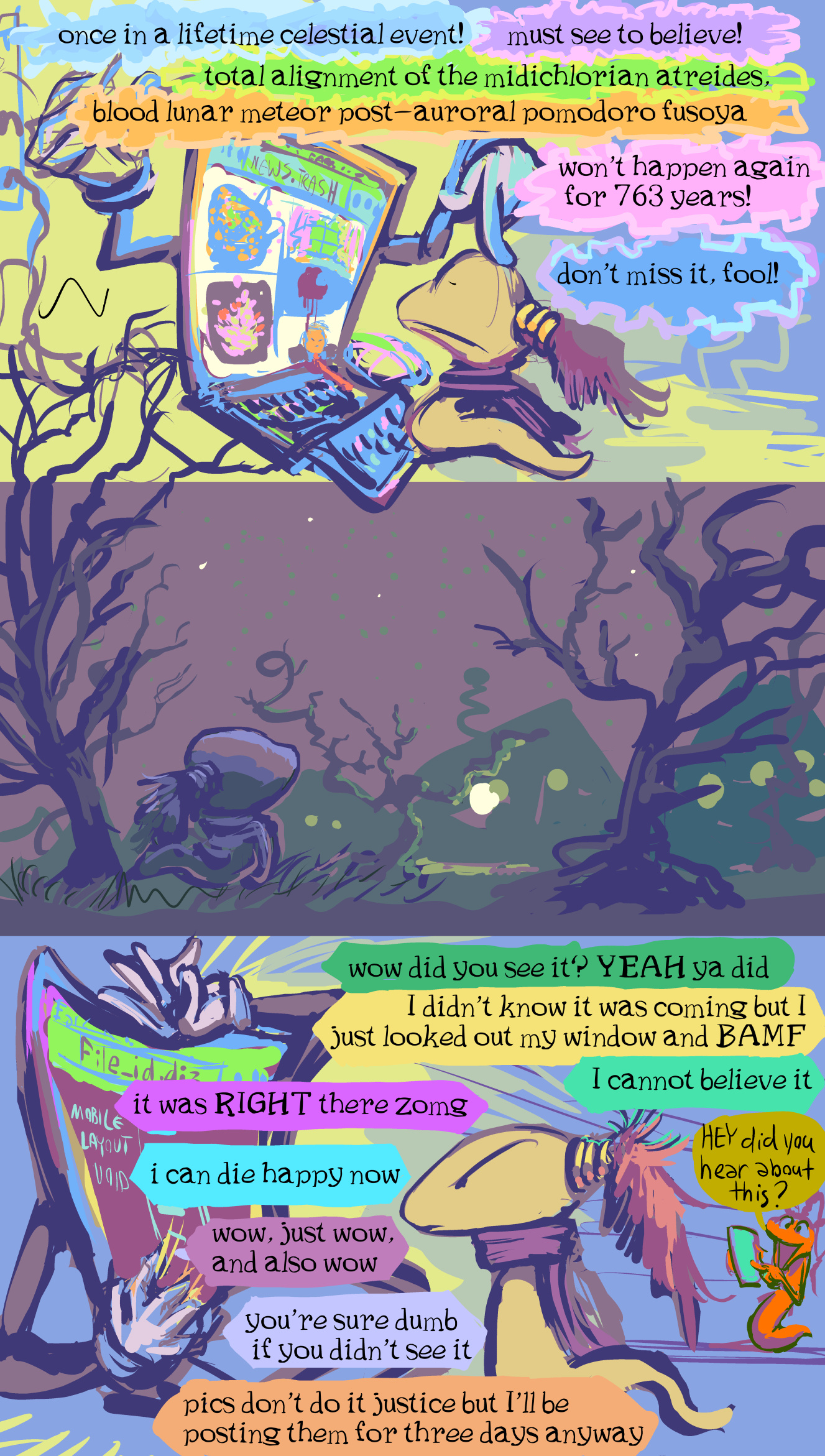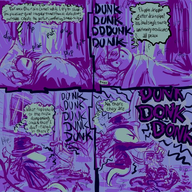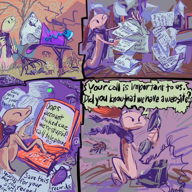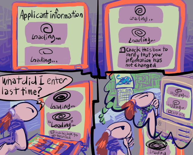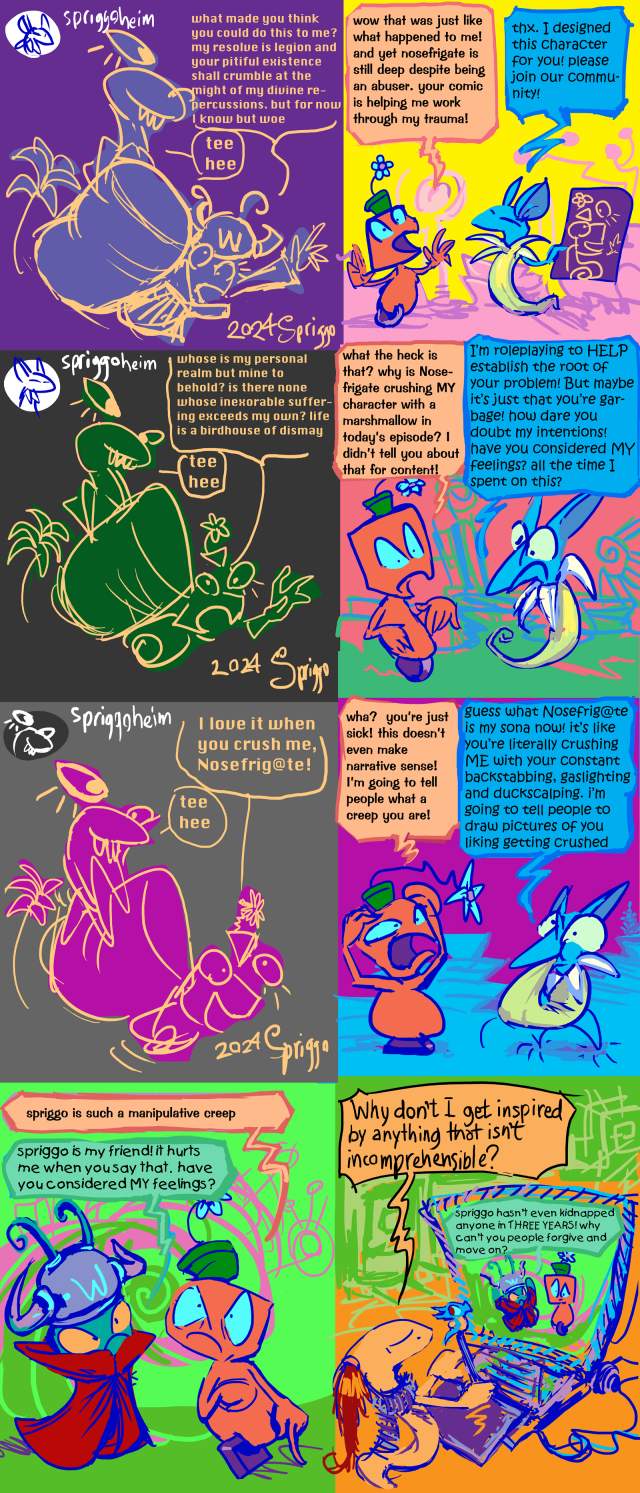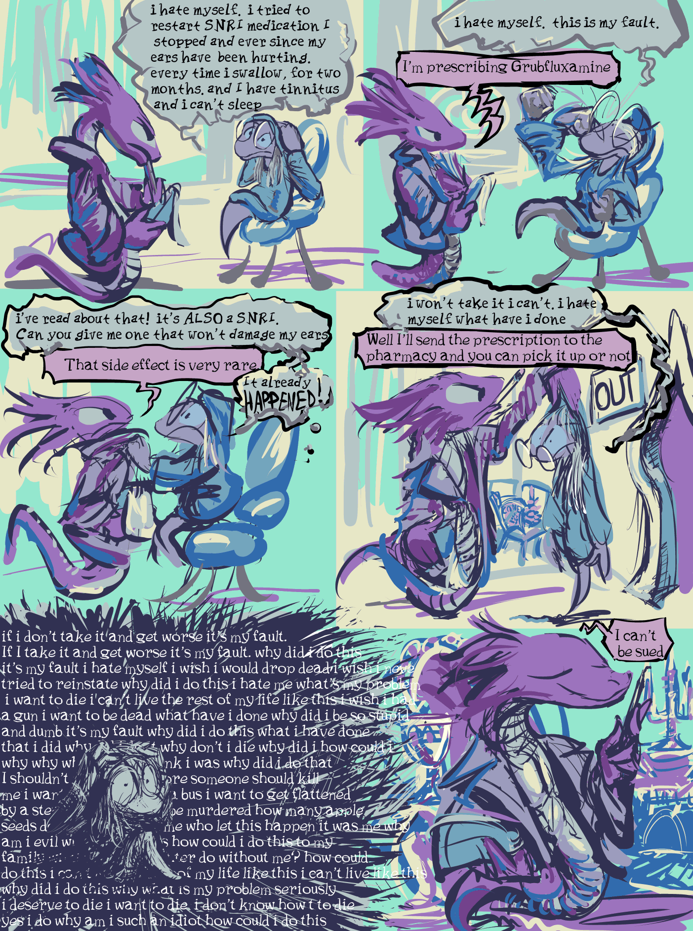
based on something that happened actually to someone other than me. Somebody who didn’t trust doctors in the past due to legitimate bad experiences more recently had issues discontinuing a medication at the same time as getting caught up in a misinformation vortex meant to discredit scientists so to funnel support toward republican political candidates with no regard for people who actually need help and aren’t ever going to vote for scumbags, now distrusts doctors harder than ever and keeps getting worse mentally due to not trusting doctors so to get help with the medication issue but then also cannot be guided out of that due to continually getting stuck with doctors who seem less than trustworthy. In fact it is rather an ongoing matter but i think, i hope, the worst is over with, so i can justify posting the comic strip in the absence of anything else remotely coherent.
Now I need to take this computer apart to try and replace the “thermal paste” within it due to my other ongoing crisis that people getting paid loads of money could have prevented and saved trouble for countless common folk but didn’t. If I succeed at this I still will only have scrappy website updates but will have a substantially reduced chance of blowing up the computer and setting my home on fire if I ever get back to attempting to create better updates.
/////////////////////
ah nope, worse than ever. i definitely have to pay somebody to fix it or buy another one now. which i partially expected but i was never psychologically prepared to deal with. taking that thing apart and especially putting it back together, then dismantling it and remantling it again and only getting this is more than i can do a third time and potentially STILL get… this. plenty of videos showing how to take everything out but you are mostly on your own when it comes to putting stuff back in.
most of your screws are just not in or the wrong place. one is wrong and ruined and unremovable and thus the power port will forever after be lopsided AND i didn’t even need to remove that one
the screws DO NOT WANT to go back in. they want to stick to my fingers. they want to fall into different places and roll around unvisibly. they want to get stuck sideways and then fly to oblivion when freed.
and after all that, when it simply shuts off after a few seconds, it gives no indication of what thing that i did wrong was the culprit. I have been doing things wrong my whole life, possibly even beans on toast, i can’t work with something that needs all things done correctly.
i have my data, but i can’t do anything with it on this crummy backup computer that i bought for my mother that my sister then commandeered. it has TWO (2) usb ports, and i need 3, for mouse, keyboard, and tablet, not counting the one connected to the
![you're making beans on toast REALLY wrong[ly]](/rew/drivetoaster.jpg)
hard drive toaster thing. and i also “have to” go on a week long “vacation” and nothing is less relaxing to me than being stuck in some other place on someone else’s conditions and not about work on my personal stupid nonsense. there certainly isn’t time to order a new machine then and i don’t trust any place to fix this fast and not charge moreforfeoieroufreefropfrupidorfrupefrupefrupelope
was trying to use ptm 7950 instead of paste like reddit dorks insisted was better the problem? would it be working now if i had just used paste? is someone that i pay $200+ just going to use paste? I don’t know. any time i open it up another screw goes missing and every time i have to reconnect the blorks to the wifi card i think i lose a year off my life.
i swear this comic strip is not about me. I have ISSUES but they aren’t new or freshly medicated.
/////////////////////
ah! it lives! I had not screwed the fan in tightly enough. One of the guides I looked at warned against screwing the fan in too tightly and as usual i drew the wrong conclusion from advice that i probably would have been fine without receiving. Good thing i dared to look back inside; i almost had a nervous breakdown when i resigned myself to using GIMP on a backup computer for the next twoish weeks. How do I move a selection? I don’t know! I thought just KRITA made that stupid. I am glad it doesn’t have to be my problem.
I don’t know if i actually solved the INITIAL problem of overheating but i seem to have alleviated the apparently more serious problem of me touching the computer inappropriately. It has more screws outside of it than in and the keyboard is on my bed since I got tireder and tireder of hooking stuff like that back up just for nothing to happen. Ideally I will sort that out before getting on an airplane because this thing presently looks almost as dangerous as four ounces of water with its insides and wires exposed.
and my mind state is like I have been “away” from using the computer for a week or longer when it was just a single day. Maybe this is a sign of mental illness. I will add it to my collection
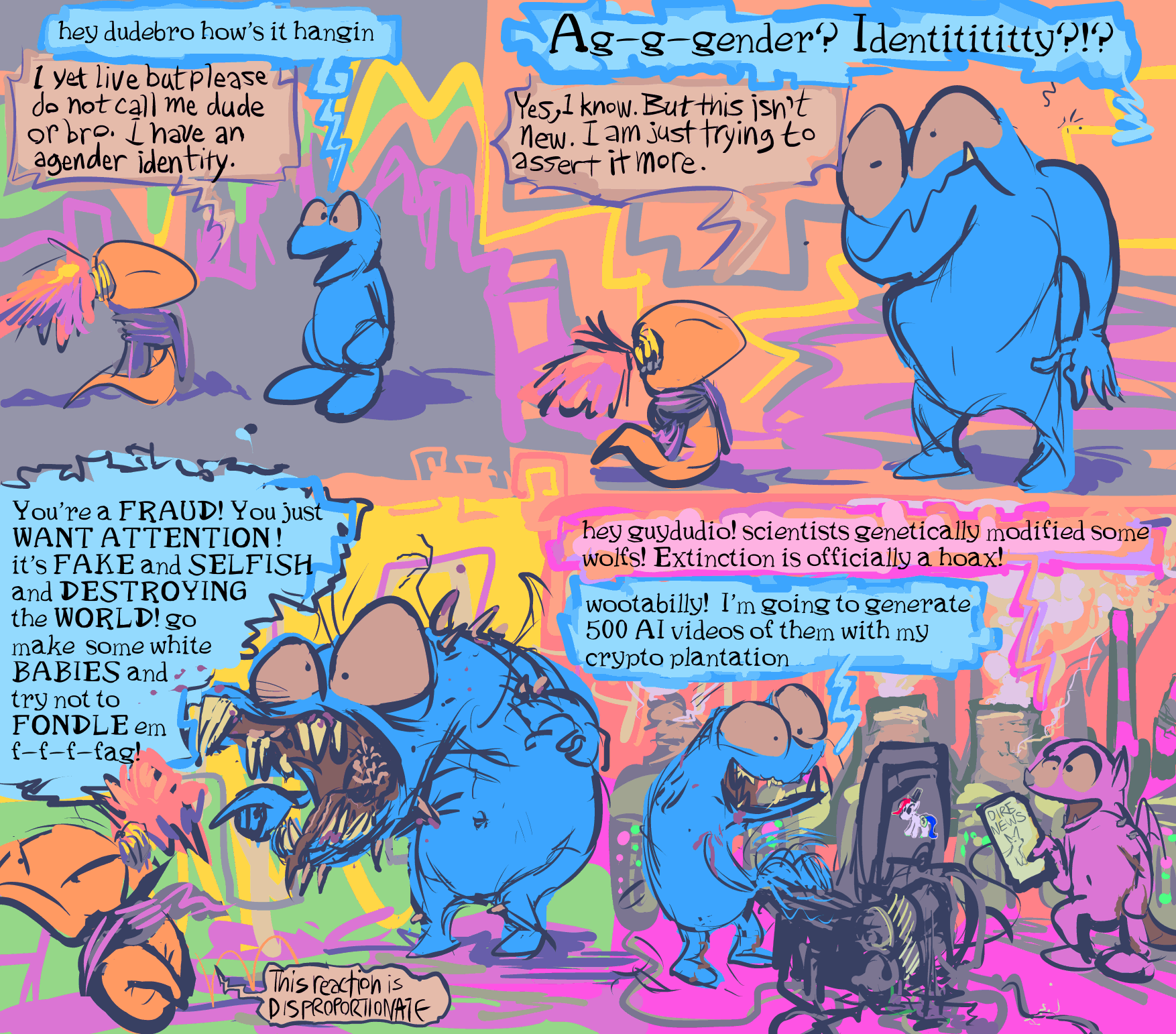
this has not literally occurred, at least not in this exact manner, but mostly because I know people react this way and I generally do not want to make my dumb problem into someone else’s bigger problem with me, however ridiculous the thought process behind it is. i do not believe i could ever say “i have an agender identity” aloud without putting an insulting inflection on it. nonetheless that is something which i WANT to express.
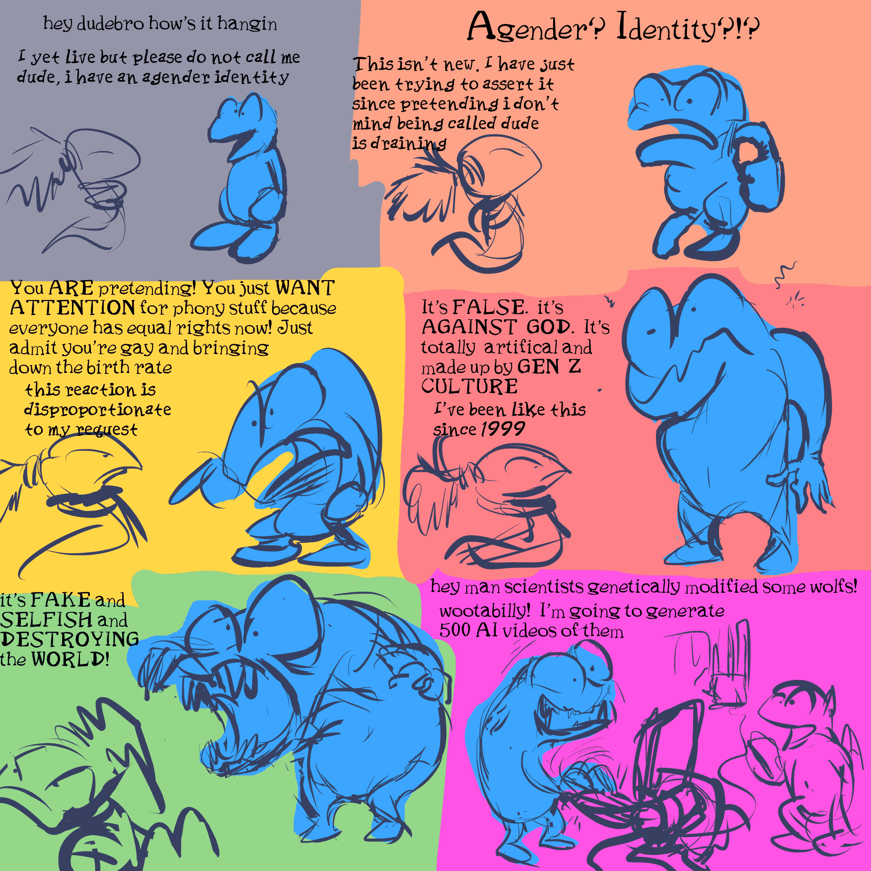
This previously featured additional dialog that i worried was excessive. And so i removed it, but i still think about what i removed. i like some of the dropped poses and some of the dropped dialog isn’t even redundant with what i have put in past annoying pathetic snake comic strips.
too many dumb snake comics these days. i have let the dedicated side-site for them fall out of date again (now amended), and still without investigating the elephantitis of its navigation links (still still)
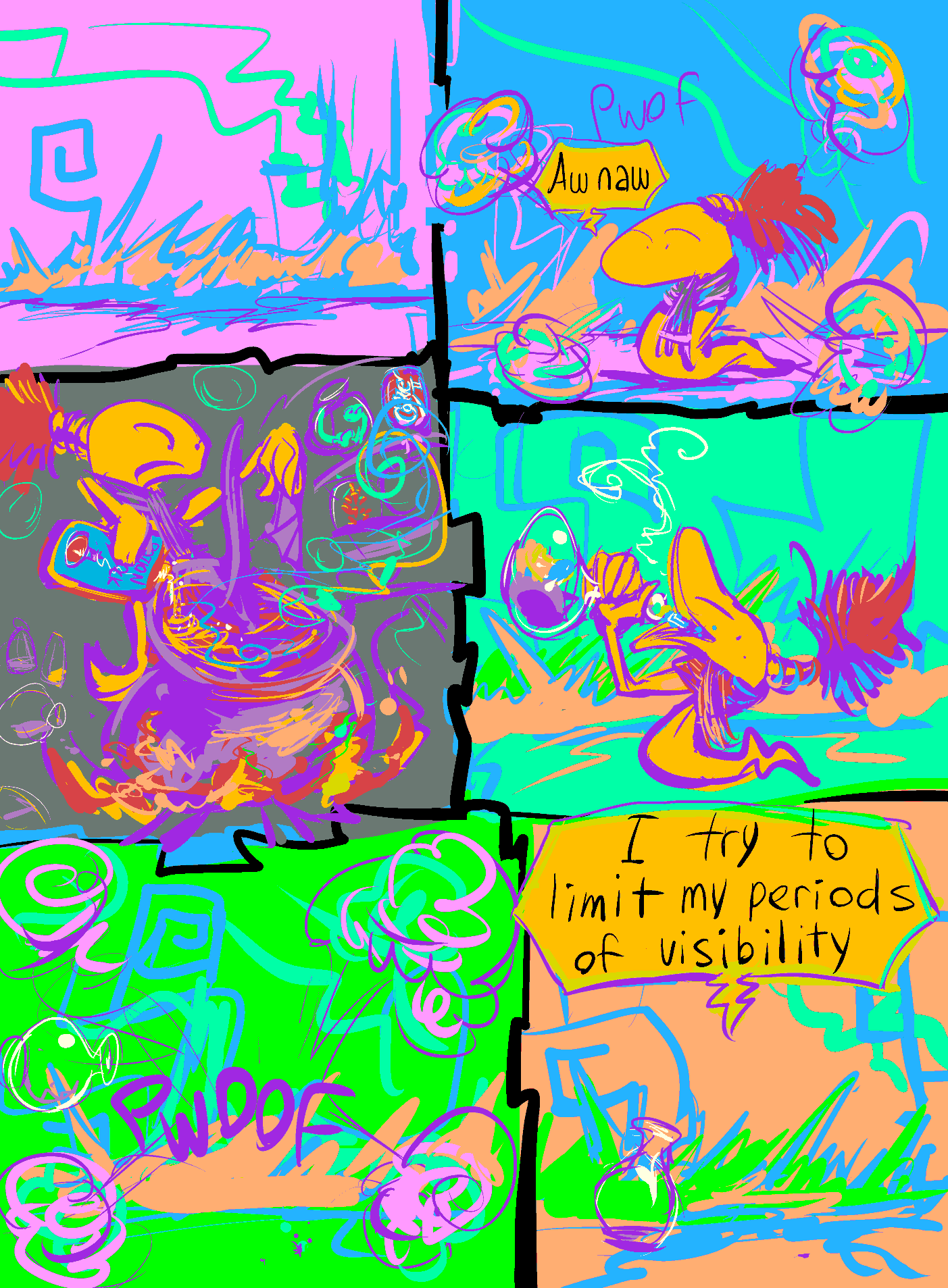
march 31 supposedly was “trans day of visibility,” and as it usually goes I did not know there was one or that it was coming, and so was unprepared.
I also do not know if i properly qualify as “trans” but i absolutely have trans-like issues via preferring ambiguity, on account of not believing that i would be accepted as a full trans person, which a good many people and systems who don’t know me [and a few who sadly do believe that they know me would] still scorn me for, and i also hate to be seen, perhaps in large part due to those issues, so here comes this
on further reflection it isn’t all that different from this idea except i spent substantially less time drawing it and no longer share a bathroom with other people’s toothbrushes
Today’s might have communicated its message better if i showed the creature driving and going to a store to obtain the potion ingredients and emphasizing how it fares poorly when seen amidst doing that, but I have shown that before also! It didn’t communicate its point well but they never do. I would almost hate to break from tradition if I knew how.
several page bits of this
the comic strip prologue sketched in 2016 i finally took the effort to sort out and place in the actual comic strip section
there are probably yet details to be cleared up on it. Do let me know if anything seems particularly objectionable and I will be sure to leave it unchanged.

page 4-1 of this. fewer panels than on previous pages, which seemed necessary to have the fewer, consequently larger panels that are here make any sense due to how many characters I found it necessary to cram into them. They may not make MUCH sense but I have options for dealing with that once I figure out how at a later point without having to disrupt the layouts of subsequent pages as was usually the case with altering earlier sections in the four row format.
The next page will probably also be like this one, as I initially set them up as a single four row page, but after that i have no idea about the shape of to any degree, including the future of the pointy pog-lookalike whose origin is in my terrible old 1995 comic strip. i needed something to incapacitate the gnomes here but did not decide what until i drew it, as the “plan” only concerned the aftermath of them being incapacitated, not the incapacitator.
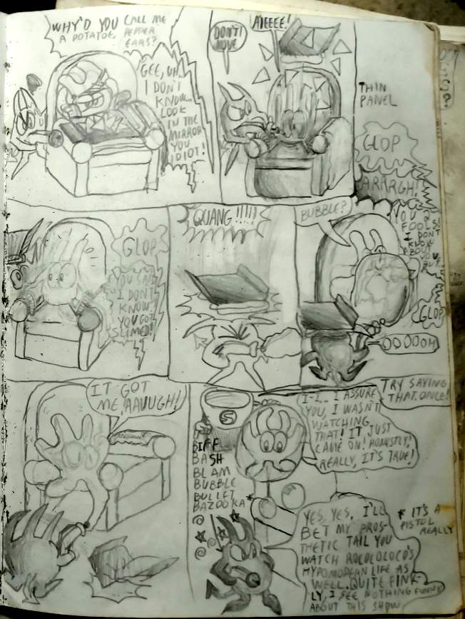
the first frame (of the new page, not the grey mess above here that I cannot attempt to explain) also made me consider that i showed a bunch of “gardening robots” an entire numeration ago but never bothered to draw in any garden.
I was gladdish to see that apparently i did bother to add in some mild shrubbery at whichever page this is but i have no recollection of intending that as the “garden.” Brubaglid, the landlord or custodian or angry parking lot person of otherwise non-specific role could simply have a screwy concept of what a garden is but the presence of numerous robots should at least suggest some task for which they are used, however poorly.
i also never drew the robots again. i intended to have a scene where they had a meeting and complained to each other about their circumstances but i either never wrote it down and forgot it or wrote it somewhere that i never found again.
I drew them in here, THEN remembered that they would still be broken so I removed them, THEN i saw that one of them escaped mostly intact, so that one I unremoved. But it ends up being so small here that its nature is unclear.
Anyway brubaglid may go around to other properties than this one and may have more robots than the ones elpse damaged, so so so so sudio i hate that song. I heard that at the supermarket once in 2022 and it is about 95% studio production. A towering heap of 80s noises and reverb effects loudly fighting each other trying to cover up a terrible song. I was offended by what utter dreck and a waste it was. Phil Collins contributes almost nothing to it. Any name brand dorko singer could take his place there. And the album cover is literally just Phil Collins’ face. Not even his whole head. It should be producer Hugh Padgham’s fingers and a bunch of dials on the cover. And the SINGLE cover is literally the same picture of a face again with different text and with the face colored blue, as would eventually occur to any mass of body parts that you severed from the circulatory system. Friggidee diddledee feep.
ADDITIONALLY I have crammed in some vegetation here and augmented at least what was on the linked old page. i can’t do anything about the pages in books that have already been printed though knowing me i will probably attempt to update them to some degree regardless, even though the shape of the building also changed and maybe the less i try to retroactively bring into coheesion, the more what I don’t bother with is excusable.
The important thing is that I got this out before the year changed. I don’t have time to think about why that is important. Now I have ten days to make a dumb video that hopefully amounts to more than the absence of what I didn’t do this year, and will still take longer than that even if it amounts to less.
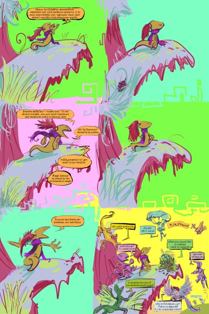
more of this is absolutely what everybody wanted.
it is not a complete waste since the seeing what complainers fixate on can help me to know what I am unclear about and what they absolutely will never accept any level of clarity on. Which still accomplishes nothing long term but it momentarily satisfies my curiosity, potentially. So it is probably only about 85% waste.
speaking of cults,

Why? Tom Cruise isn’t French and he definitely isn’t an olympic competitor. He is an actor who pretends to do amazing things but in actuality is the top spokesman for a billionaire cult that actively harms its own members and tries to destroy former ones who speak about it. I realize that describes all billionaire cults but the important thing is that Mr. Cruise represents one, not which,
page 3-“54” now of the bimshwellian comic strip.
most of june twelfth was spent adding in pog and yibrick to the frames where I had not yet determined what they were doing. I thought about kumquat trying to shove yibrick in where the dope was and yibrick objecting but it did not work with any of the views of kumquat already there. this backup strategy does make me consider that yibrick’s “hair” was added primarily as a thing by which to grasp the ball-like creaturoid.
this page shows the back door, which is why the colors are different. i have done a horrible job keeping up with my various changes to location designs since I often draw something with a plan the first time, put more thought into it the second time, forget about it, and then look up the first version as a reference when I draw it a third time. at that point I may have been sick of my past self and decided to simply show another side of the building that I could not contradict a previous edition of.
the characters are more important, so naturally i spend even less time designing those.
june 13: I should have another comic page update at some point this day. it has a lot of stuff wrong with it and i should have prepared something else instead of thinking I could get it out yesterday. fortunately I do this for free and nobody except me looks at it until I announce it elsewhere so failing my imaginary deadline also does not matter to anyone except me. What is your problem(s), me?
///////////////////////

page 3-pre-65 of the bimshwellian comic strip
i forgot that i wrote this before posting the most recent page. it needs to occur at some point prior to that. There is also another to be displayed immediately after this one but evidently not to be finished immediately after and thus it is not here and there is for now a gap in the revised numbering.
i additionally need to do something about the gorf gnome pages ago reporting the location’s address as “dumpling and drab,” as that would seem to indicate a place on a corner, which this structure is not, and already was not before I wrote that. the building’s name could be “dumpling and drab” but if i am going to name buildings i might possibly be able to think of a better one than that. But I also thought the same about the possibility of naming me the humanoid mutant “bimshwel” after this website url and so put off doing that for years and eventually went with bimshwel anyway. The important thing is that Richard Krippendreyfuss is no longer at the top of this page.
oh fleeps I forgot that there are two extra pages with kumquat that I MEANT to draw and add in somewhere before this point. so I will definitely have to do that and amend the page numbering accordingly. OR show it later as a flash-back scene but i never established that flashbacks exist in this story except briefly and narrated by a character and this part isn’t that. I could NEVER make this comic strip as a profession.
another bit to mention, when rendering this page, the first order of business was to check the previous page these gnomes appeared on, 3-49, so i could be sure of what lines from the script they had already said, and i found their dialog quite hard to read. i recall being concerned about its legibility before but i am surprised now that I then allowed it to be that bad if i was concerned about it. and it got WORSE across just the eight frames on 3-49. Thus I spent some time fiddling with that and it SHOULD be improved now, but i initially drew that page AFTER cleaning up text on older pages than that, at LENGTH, for printing. how could i still produce such unreadable letters and leave them that way?
in editing that text i have forgotten whatever distinctions i originally intended for the two gnomes’ letter styles, but legibility is probably more important than that. As long as the speech container baubles are distinctly colored and or clearly identify which figure is meant to be emitting them it isn’t necessary for the letters to look different in each.
ANYWAY

page 3-65 of that is tentatively the last page of this section and available. this page has loads of problems but seems legible enough for the moment.
ironically elpse could probably join this club since biv also hates dumb little critters yet loves clobbering [th]em, but alas is cursed by looking sort of like them, and by occasionally getting followed by the worst of them
i identified “rootkit and pipkin” a few pages ago without having a plan for what they looked like or what they were going to do, though the essence of this scene has been around a while. i have also an old idea of an antagonistic duo that are always referred to as a pair despite one of them only ever standing around and doing nothing, maybe not even speaking, but I am not sure if this is the place to use that, if anywhere there is. that is the real reason the last frame is vague; I am not 100% certain of what figure is being shrouded there. i HAVE sketched the next page with one in mind and this shape presently correlates with that, sort of, but I might change it!
I think you will definitely need to click on this in order for the text to be legible. apologies for not making it permanently unlegible!
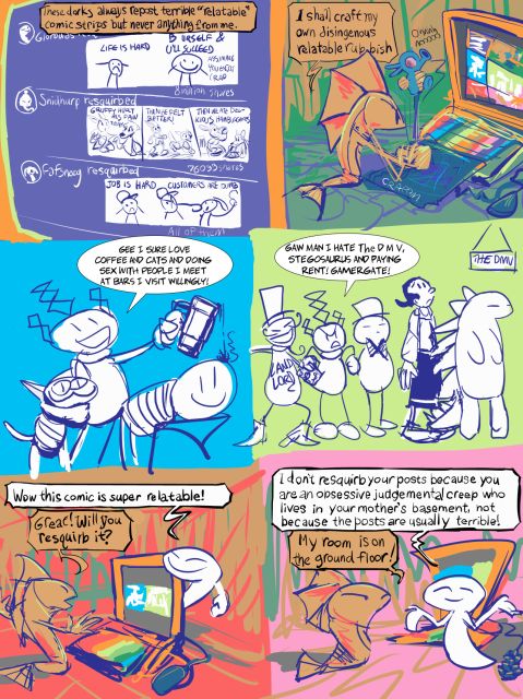
when I show nonsense like this, it is crucial to not make viewers uncomfortable and think I am looking for [ity compliments or trying to intimidate them into sharing posts that they don’t want to, and resenting me, since the character in these dumb comics on many occasions shares my experiences but is not meant to “be” me. As much as I have dwelled on why they do or do not, I have never asked somebody to share one of my posts! And I do not reckon I will. Hopefully changing the character to the jerk fish form I have used a few times before limits that somewhat. I only call its usual shape a “snake” because before I did people would call it a worm, and worm is an extremely vague animal name. Earthworm seems to be implied, which is an entirely different phylum from snakes and other commonly anthropomorphized animals, lacking what we think of as faces and limbs entirely, and non-annelid “worm”s are even further from that, and I am not comfortable with that manner of inaccuracy.
also the “normal” comic strip has not been cancelled. I do not know that I have ever cancelled anything. except for minor works like “goldilocks and the berenstain bears” which only existed on school computers when I did not have a home computer, I have been thoroughly unable to cut my losses in life, creative-ish or elsewise or elpsewise (though never nemitzwise since nemitz is highly foolish).
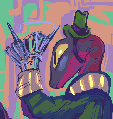
page 3-64 of the bimswellian comic strip. the last row likely requires more coherence and hopefully it will be within my power to give it some before anybody sees this. but greeps it would sure be nice if I got stuff right the first time and also that trusting in obscurity giving me extra time to fix problems wasn’t the only thing that allowed me to meet imaginary deadlines.
at what point does it become 4-1? i am uncertain. i might need to show the next page checking back in with the gnomes in the apartment first. as usual, as always, i am not entirely sure what is coming next, but now that i have passed through i think the last of my 10 plus year old semi-scripted sequences I am less sure than before even. There are still some semi-scripted sequences but they are merely 10 minus years old.
