
finally back to lerd,

another of the very old 2003 monsters, redrawn at ten times the size with slightly more competent animation.
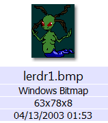
marginal progress, major reminder of how stupid my life is, which I do not need, because I do not forget.
the movements of the tail appendage do not match on each angle, but they do not have to, merely not look terrible, and only the back facing one does, along with the arms, that look more like a low-impact exercise than a motion to pull the body along a floor but it looks better than the old version, to me, and inside that game the old one looked fine so I will be impressed to see how this ends up being worse.
the mid-section is a different color now but I can palette-swap it to green in-game. And I can also NOT palette swap it to green, in case you were wondering why I’d bother to discolor it at all. the colors only need to be distinct, not specific.
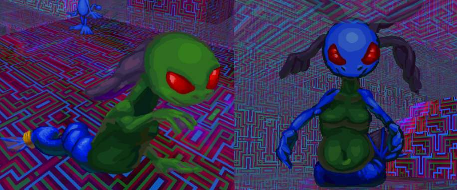
keeping the color zones distinct and mapped to indices on the game’s 256 color “palette” means they can be changed separately from each other, to colors which are not necessarily on the palette but for the purpose of preparing this example quickly they are.
There was never a reason for lerd having four breast orbs before, as it only had two arms. maybe it looks unique but I don’t want people to think I have a fetish for bare cartoon breasts considering how much other fetishy junk I have attached to my name in the intervening years. ALTHOUGH if, as today’s commenter suggests, having just two makes the problem worse, I can change them back or try something else entirely.
i will start the next non-snake comic strip page next. probably. you might think i have spent some of the long period since posting the most recent page figuring out what is going to appear on the next page but you ought to know me better than that!
RSS feed for comments, for they hunger.
This here`s me trackback!

SoupColor sez:
Original lerd was definitely one of my favorite old sprites you did.
The remake looks good but I don’t know about the breast changes and the discolored crest.
Makes it look more like an oddly well endowed cartoon character rather than a freaky frog mermaid thing.
I’m not sure how to describe it but it having just one pair of breasts is somehow more weird to me, like they seem more so unnecessary than before.
For the old one the 4 added a real freakishness to the character that I think worked well with the whole design overall, but now it just feels weird to look at.
I think it reminds me of how weird it is when anthropomorphic animals wear pants, in the sense that they feel more “naked” with them on than without them.
Sorry if this sounded too negative, I still think its a good remakes as pretty much all of them are.
Glad you’re still working on this!
Frimpinheap sez:
thank you for the backfeeding! so far that is all I have received. I was thinking more of somewhat flabbed pectorals than “breasts” on this version, at least by the time i got to the side angles but admippedly I do not have experience with depicting that and I can certainly change any part of this at any point.

and the color is changeable within the game, as I perhaps did not explain coherently.
keeping the color zones distinct and mapped to indices on the game’s 256 color “palette” means they can be changed separately from each other, to colors which are not necessarily on the palette.
Prescription Potatoes Pinged With:
[…] lerd again, this time to amend its aggressive motions. i like blue electricity better but i do not want to use the same palette section as the tail segment, EVEN though I will probably need that split off into separate object(s) like with the move around frames. I would prefer to set all color changes on the main object (the lerd’s body) since additional objects created by it (such as its projectiles and its trail of body parts) can inherit its color swap settings, and thus i will only need to designate one color change for each base lerd type. I need at least two lerd types; one that crawls on land and one that hides underwater and jumps out like a seaworld captive to throw abuse and then promptly resubmerges. And later a third that, more like a Hexen stoker, never leaves liquid and uses a more powerful attack that also doesn’t, since I presently don’t know a way to have a creature check what sort of floor it is on before attacking, but i CAN set a creature to not leave the floor it is on. It is probably possible to issue a floor-check command but it isn’t necessarily necessary that I know how to do that at this juncture since I don’t even have the main two that I DO know how to make implemented yet. And then like with the jumping fyip I will probably come up with a buggy half functional way of doing it, then ask for help on the zdoom forum and get an embarrassingly more efficient way that actually works explained to me by someone else, assuming north america hasn’t melted into the sea by the time I get around to that. […]
it which kindly observes sez:
Greetles! I hope this finally begins my series of waiting comments. I’ve happily followed your updates over the year.
([jokingly] The mover at top seems to have bear a few colors of Elpse, Lope, and Nemitz!)
To this one, one of the finest improvements between lerd motions former and now is how readable its body contours are, especially from the back. It creates an engaging contrast with the round and relatively simple head. I’m also pleased with with your choice to ornament its tail.
> Do those “caudlets” (*silly, improvised term for caudal jewelry) audibly jingle during play?
This lerd also sustains dangerous mien despite having to lug itself about as it does.
In my viewing experience, a lot of tailed, apodal, humanoid, critters appear grafted together because of how abruptly their tail and torso textures meet, but your combination of similar and complementary colors makes it look much more engaging than what I often experience.
The longer I watch its motion cycles, the more I become impressed with the flow of motion through its tail and back. Your animations have a lot of incidental movement that strengthen them. I find the tail coil in angle 2 and active tail wrinkles in 5 are especially commendable! They makes the lerd’s tail not seem like a pair of bound legs as it can in some other creatures I see of this shape (though there’s fun and humor to derive from either approach.)
I also love how capable you seem to be of overlapping forms and shapes. The straight fore and rearward cycles wouldn’t look as nice otherwise.
I don’t want to prolong this comment too much more for your sake, but I’m really pleased with the tile patterns in those two game environment screenshots.
What a bewildering mix of colors and forms!
(I hope this comment doesn’t duplicate itself)
Frimpinheap sez:
I added a jingling sound for the imps that have bells so that would also be possible for these, though I have not added any new sound effects for them since redrawing them.
I dislike mermaids or nagas that just have two human legs fused together because the fish end is supposed to be a tail, not merged legs. I particularly hate when butockal imagery is placed on their back sides, when an actual fish or snake would have related functions at the front. Though I will not be dealing with that either way.
most of the monsters look silly so maybe I felt it important to have a few that are moderately menacing.
flow is important to me on these, perhaps because every other sprite-based “3d” game I have seen as well as their addons have shoddy or choppy animation.
I used that pattern on the environment tiles here foremost because the game engine generally paints textures backwards on ceilings, which can become apparent in cramped zones, and it is almost impossible to tell that is happening with this one.