i don’t know if this is funny at all –possibly this video showing the individual parts used to assemble the kraft mario bros macaroni commercial accompanied by a completely deadpan voice naming each of them is funnier– and the script is so old that bob hoskins was still alive when i first wrote it, and screwing with cdi cartoons was old then, yet i still would think about this in 2025, so i had almost no choice but to deal with it
the one person i have had any comment from about this so far seems to think it is not screwy enough, perhaps needing more repetitive editing and speaker-wrecking volume. I am not looking to compete with or join with people who engage in or enjoy that. A bit later a second comment simply announced “gay” and I can’t quite manage that either. There hasn’t been a “community” yet whose rituals I was able or willing to imitate well or long enough to belong among them. As usually is the case, i just like a few specific components, in this case imitating the mario actor’s voice and stupid written correspondence, and stuck with that. i do not have any more “videos” “planned” so presumably i will find worse things to do with my time again.
another video mix of sega genesis voices and arguably relevant pictures that absolutely has a reason to exist. People kept asking me to make a video like this for dynamite headdy or sonic cd so i did it for gley lancer

i regret that i had to remove this picture. There isn’t time to read the text on it which is the main reason it is funny to me. back when the genesis fan-translation came out i had never heard of monster world 4 and i must have tried to look up information about it but it was only in japanese, and i ran this page through google translate, and fixated on “you will defend with the shield.” you WILL. you have NO CHOICE but to DEFEND with THE shield. Don’t try to get out of this responsibility
The “doodily doodily doo” came from some “sprout” machine preloaded with stupid videos produced by the same company that my niece was carrying around 7 years ago, and that i probably meant to put in a ristar-related video and then simply forgot about when I actually made a ristar video, so now it gets to make even less sense than it would have otherwise.
this is just the sort of non-divisive, clear-purposed thing i need to put on my you tube page after inexplicably reaching more people than usual with the last one
unfortunately this still isn’t as funny to me as a regular insultinator but i had to see it to know.
The GALL of that DUMB little machine calling anyone else “obNOXious” makes me laugh just to think about. i tried to imitate its inflection as much as possible but it does not suit some of these words. By the end it turned into something that wasn’t quite anything, as often occurs.
An earlier version of this just showed pictures of that one person’s hand pressing the buttons and then two other dorks holding the things up while pressing buttons but i could not get a reply from one (the other had seemingly been missing for quite some time) and once i replaced that person i decided to replace all the stolen clips except for the initial one that establishes how the actual device works. i never got a reply from that person either but since I have only stolen video of his hand i am less paranoid about causing problems.
I also did not in my requests clarify that I don’t actually think these are good or valid insults. Because i thought it was obvious. Even though I consistently and constantly overestimate anyone’s ability to have any idea why I do anything. Especially just the sort of people who would think these insults were good would also think a machine which emits such insults would be good.
And stupider me, I forgot that there is an actual doom level with a large iconic object that shouts something weird then shoots out monsters that most casual players of doom would be familiar with, and I could have just pasted the insultinator graphics over that, though it wouldn’t have hitler sky visible. Ideally the hellknights’ lawyers won’t send me any threatening letters about this like the last time I deployed sky hitlers.
will 2025 be better? I set the bar low in 2024 to guarantee it. In fact it may be lower than I expect since the video stops hard at 1 minute whenever i try to test to make sure it uploaded properly and that i didn’t accidentally break something right before the final save.
I will probably be having that stupid music echoing in my mind for the next few days. the dopey sound effects help a bit but I only added those in the last few hours and almost certainly in excess.
I suspect i used that “title” line already but if I did it was before 2006 and who cares if I don’t?


flopping lerd. compare to

the old version from 2003 that I only drew quickly from the front and never gave further thought to.
for as big a time destroyer as this was, i rather like some of the results, including the facing away angle (the lower right sequence here), which i almost never like. Its arms seem to diminish at the end since wide “corpses” never work very well, especially ones that spin as you move around them.
hopefully the hardest step of this deceptively difficult to draw monster is concluded with these. obviously I will still touch it up at length after separating it into separate pieces for each angle and will probably have to separate the bodies from the tails again, and an additional frame between the first and second ones may need to be created, but unless I have forgotten something, which I quite well have, this is the hardest part of the most complicated legacy monster redraw sequence concluded. I still have yet to redraw any of the “spof” monster because I never definitively concluded what it should look like rather than nemitz, but its own defeat merely involves it falling over sideways. its gruesome “explode” destruction is more complicated but i spared myself from multi-angling any monster explode or melt animations so far, so my obsessive compulsion will likely not force me to think I have to start then, if I even think that monster is necessary.
it occurred to me that dopes, meant to be the primary figures, do not have any non-melt, non-explode decimations, nor do fopes or yiths, and I do not at present think they need any. Why did I think this thing did?
also I seem not to have designated a website entry about the fope melting or apparently anything do to with fope but it does melt.
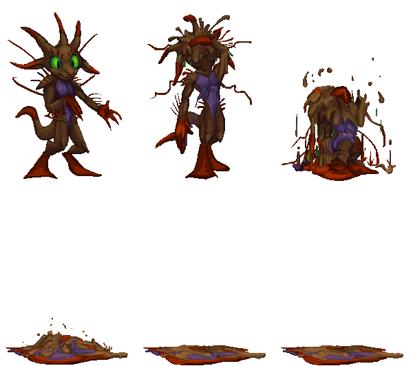
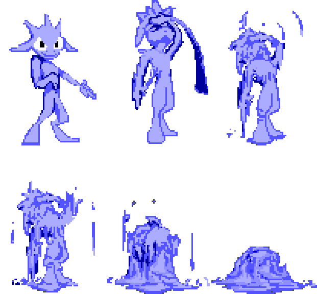
indeed

lerd again, this time to amend its aggressive motions.
oh boats; my most recent edits to angle 2 fixed some unusual erratic movements but I realized afterward that i was meant to leave those movements in place and just draw them better, to imitate the lunge of angle 3. whoopth. i may have to put them in as they are and see which looks less awkward to decide which to change to match the other. or just leave them alone since nobody who isn’t me could possibly care.
////////////////////////
i like blue electricity better but i do not want to use the same palette section as the tail segment, EVEN though I will probably need that split off into separate object(s) like with the move around frames. I would prefer to set all color changes on the main object (the lerd’s body) since additional objects created by it (such as its projectiles and its trail of body parts) can inherit its color swap settings, and thus i will only need to designate one color change for each base lerd type. I need at least two lerd types; one that crawls on land and one that hides underwater and jumps out like a seaworld captive to throw abuse and then promptly resubmerges. And later a third that, more like a Hexen stoker,
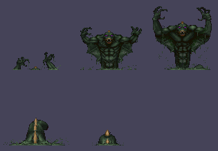
never leaves liquid and uses a more powerful attack that also doesn’t, since I presently don’t know a way to have a creature check what sort of floor it is on before attacking, but i CAN set a creature to not leave the floor it is on. It is probably possible to issue a floor-check command but it isn’t necessarily necessary that I know how to do that at this juncture since I don’t even have the main two that I DO know how to make implemented yet. And then like with the jumping fyip I will probably come up with a buggy half functional way of doing it, then ask for help on the zdoom forum and get an embarrassingly more efficient way that actually works explained to me by someone else, assuming north america hasn’t melted into the sea by the time I get around to that.

historically it has been able to launch two wimpy projectiles from its hands on that “ball” frame. It would also, and still does, throw a single larger shot when it crosses the arms. throwing magic out of your hands or mouth is not original, but from head protrusions is less common. i decided thus that i should have the twin shots launch directly from the electric appendages (using additional frames that are yet less complete than these) rather than the hands. Arms needing to cross in order to launch a blast is also unusual so I kept that. it is still dumb old doom engine which is inherently limited to stuff that has since been done in thousands of other games but i aim to do my best with the fate i have set for me. even if it kills me, though i won’t know if it has done that until probably right before it does.

also i call the hexen stalkers “stoker” after how kan naito pronounces “land stalker,” because I think dumb things are funny. and more recently after how the 1999 playstation port of final fantasy 5 supposedly refers to the wendigo monster, because this wiki proclaiming that fails to explain that stoker means stalker, not wendigo, since the later localizers opted to change the name entirely rather than correct the silly romanization of the original name that was simply a Japanification of an english word.

but admittedly it is easy, 25 years later, to look back and say OBVIOUSLY this naked blue horned steroid man with a club is too busy jumping stupidly and tickling his arms to waste time wendigoing about stoking, and I envy the optimistic ignorance of those days somewhat.

finally back to lerd,

another of the very old 2003 monsters, redrawn at ten times the size with slightly more competent animation.
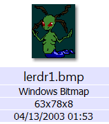
marginal progress, major reminder of how stupid my life is, which I do not need, because I do not forget.
the movements of the tail appendage do not match on each angle, but they do not have to, merely not look terrible, and only the back facing one does, along with the arms, that look more like a low-impact exercise than a motion to pull the body along a floor but it looks better than the old version, to me, and inside that game the old one looked fine so I will be impressed to see how this ends up being worse.
the mid-section is a different color now but I can palette-swap it to green in-game. And I can also NOT palette swap it to green, in case you were wondering why I’d bother to discolor it at all. the colors only need to be distinct, not specific.
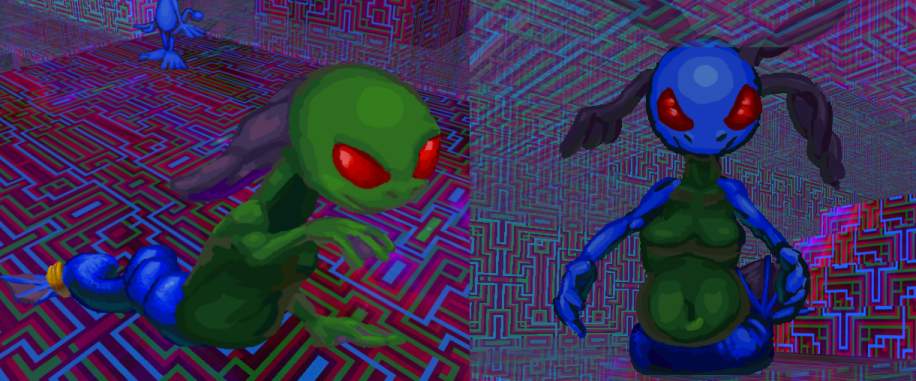
keeping the color zones distinct and mapped to indices on the game’s 256 color “palette” means they can be changed separately from each other, to colors which are not necessarily on the palette but for the purpose of preparing this example quickly they are.
There was never a reason for lerd having four breast orbs before, as it only had two arms. maybe it looks unique but I don’t want people to think I have a fetish for bare cartoon breasts considering how much other fetishy junk I have attached to my name in the intervening years. ALTHOUGH if, as today’s commenter suggests, having just two makes the problem worse, I can change them back or try something else entirely.
i will start the next non-snake comic strip page next. probably. you might think i have spent some of the long period since posting the most recent page figuring out what is going to appear on the next page but you ought to know me better than that!
really stupid idea i had years ago but only believed i had the means to execute this year and it still took longer than was remotely reasonable.
years before that I messed around with ripping my own spc music out from super nintendo games, and observed that I could play save states from the emulator “zsnes” as if they were spcs, even though sometimes there was stuff wrong with them, such as tunes playing with the wrong instruments loaded. That is is how I ended up with the screwy mario paint music which reminded me of dopes. somehow or another i ended up with a version of this options screen tune from the super nes game sparkster which only had this single sound channel active, and it made enough of an impact on me that I continued to dwell on it for long afterward. I thought for certain it must be an error, but the snes plugin for winamp allowed me to disable individual sound channels on a properly created SPC of the tune, and indeed that corny organ is in there just like that, buried under the audible instruments. I hadn’t run winamp in years but I had to dig it out again to export the different layers of the tune for this dumb cartoon. Imagine, if winamp had only been more shoddily coded and unwilling to run on windows 7 this whole mess might have been prevented.
the yeep and meteor were added late when I realized someone might assume this was just a dumb loop of the first pose and turn it off early if I didn’t show something else non-cyclical happening. they need to see that it is a dumb longer sequence than that.
but i also have to consider the organ grinder’s situation: you are trying to encourage people to give you money but then some dumb DOPE comes along and starts doing some STUPID DANCE. it is hard ENOUGH to attract customers when your only skill is spinning a handle to make corny music come out of a box, but NOBODY is going to come with a DOPE there, even WITHOUT the horrible dance.

what are you looking at? me? do you think i am going to bail you out of this? it is not my fault that the music is corny and decided to degrade to its base corniness. if YOU choose to degrade and TRANSFORM into a regular dumb old corny animal that should not be my problem.
some bits i forgot to check on until just now, not worth mentioning since I can fix them silently later. the point of this was to change things that other people WOULD notice.
I think it is superior to the old version, though possibly only because it is a substantially less compressed video. back in 2006ish I considered it secondary to the swf version. now websites will not play the swf version at all so this is all there is
and even the swf is huge now due to all the “brush” lines in it rather than the ugly “pencil” lines with bucket fills from before.
I fixed some of the issues but then I remembered that I need to re-match the beet herald (internally known as “lactorp” but i never truly decided on that)’s mouth to the re-recorded audio even though some of those mouths I only drew a week ago since the replacement “it’s heeyah”s I only recorded this week.
LATER! I made more changes, including text outlines like the other two videos. There are still some pencil-tool-drawn objects remaining, maybe they can stay. but after repeatedly being disrupted by hearing it I realize I need to re do the voice right before “come look, come and see” again. It no longer sounds like greegorp, the character with big glasses, but it doesn’t sound like this character looks, either. oh what a life, oh what a house.
yet later i recorded it to sound more nasal. I hope that is all.
beet 2, again, with marginally redrawn visuals that took much longer than is justifiable for the level of evident difference, with very quickly altered audio that is substantially more obvious
possibly not quickly enough, since though I changed my mind about some of those percussion effects, then my electricity went out in a storm so i could not post upload a video at all and the sound program fl studio responds yet less favorably when my computer machine only feeds it battery power.
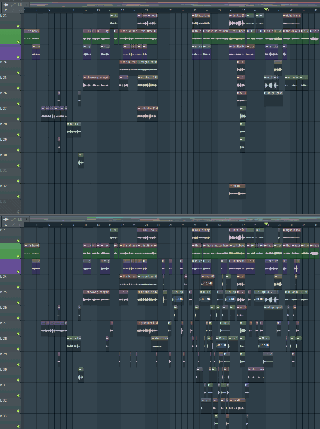
this gif attempts to show the state of a largely empty section of my music compositional space in the 2017 version of the music versus the 2024 version of the music. The only thing limiting me from piling in even more was me subconsciously not wanting to go beyond the vertical extent of this space and thankfully I did not think about it hard enough to consider: I can extend this space infinitely. Most critically affected seems to be the “they come from far off distances part” because I must have thought the singing sounded worst there, and so as much distraction from that as possible without blocking it entirely (or singing it better) seemed to think it was in order.
I could add proper sound effects to the cartoon but it seems like i would rather add every drum noise possible to the music, with my typical level of organization. since I am just dropping them on the time line rather than assigning them to a drum slot, it is difficult to keep track of which ones I have used, and likewise difficult to control them if they turn out to not be in the composition’s best interest. if I can’t quickly find one to replicate I will often just add a new one from the collection of 5000 or so that I downloaded back in 2015. Ideally I would use my own recorded noises, since I have just as many or more of those but since those aren’t integrated into the flstudio interface and my hard drive is organized worse than this timeline I generally give up searching after adding in about 3 of them. Very likely I could have them integrated into the software but aRRRRRRRRRHHH I’VE BEEN PEGGIOED
it is the beet 1 cartoon that really needs help, and especially to have its comically low-resolution youtube edition replaced –at the time it was the most I could upload on my crummy internet and I encouraged people to watch the native vector infinitely upscalable SWF flash video instead and HAW HA HWA that used to be possible– but I had wanted to reupload this one since the original export had some idiotic setting applied accidentally that for whyever reason I needed years to notice. i could have simply disabled that setting but I seem incapable of doing anything simply.
a video of every drawing from 2023. naturally i spent more time making the title animation than assembling the slide show, which itself took several days because there is apparently no program that can batch export .clip files and the keyboard shortcut for exporting singular files in xnview hasn’t worked the last few versions. Also thanking people who gave me three to eight dollars altogether and then were never heard from again and who won’t see this video ought to alienate the last few people who have made prolonged attempts at supporting me in more meaningful ways who didn’t get thanked in this video. It ought to but since none of the names are legible due to flash animating this more slowly than it appears when output most of the time and the screen being packed with irrelevant junk, some of which appears in FRONT of the names, so I hope you can enjoy this curious mess of unreadable scrolling letters.
oh! the music was mostly made in 2004-2008. It was chosen for this due largely to the length and the fact that it had not already been used in a video. Then mostly “today” i tried to rehabilitate it with drum noises, more midi trumpets and a conclusion, then also an introduction due to the extra time from the conveyor belt animation, and I swear curse and profane that it sounded REALLY nice five hours ago, when I was listening to individual parts of it through one ear bud while sharing a room with wrestling documentaries and legendary zelda tears on a moderately sized television box before going outside to do an improper superstitious year-switching ritual in honor of a dead person whose incorrect version of the ritual is inexplicably important to me to keep repeating even though it hasn’t yet worked. although since I keep doing the ritual I don’t actually know what would happen if I DIDN’T do it. I certainly won’t suddenly not have poisoned a coherent fake sitar tune with fake trumpets and sound effects
AND SO after sleeping i reduced the volume of the new trumpets and corrected one minor animation matter that I kept dwelling on, and so now THIS version is roughly adequate.
yes indeed i cheated ANOTHER update out of this same thing!
i suppose that is that for now. Unless it isn’t. It could be worse. Which I know from wanting to fix something wrong with it every time I look at it and that one component subsequently being less wrong the next time I look at it.
which also means I am impossibly critical of part 2 now. i had already started on redoing part 1 but had not expected to feel that way about both of them. 2 does have to be reuploaded regardless since the one I posted a few years ago inadvertently had some awful interpolation filter on it (placed on -every- video piece by unchangeable default, alas) that fades between EVERY frame and inadvertently makes the whole thing look like a $1 “digitally remastered” public domain cartoon dvd. somehow I only NOTICED that last year, and seemingly only considered “hey i can turn OFF that dumb filter and REPLACE that” within this week.
I changed the fake ending because I didn’t want a piece of someone else’s video within one of my “important” videos, but weird 1960s Harry Secombe pickwick may yet return the next time I have difficulty deciding what part of my candles to set on fire.
ah ha! sound effects it could use. but i cannot spare 2 or 3 more days of putting them in and constantly noticing more visual problems for the time beaning.
and a third: this may result in the sparsest “year in pictures” yet but i WILL get that dumb cartoon out. or outer than it was. I finally got annoyed enough at the beet beast’s flat face to try and make it more angular. i may have subconsciously been channeling kumquat when i should have been thinking about more of a rotund lope. maybe i was sub-subconsciously averse to that since I still have not concluded or explained the rotund elpse in the comic strip for the past few years / hour of comic strip time.
///////////////
and a second updirt: i underestimated how treacherous the larger character’s whiskers have been. the rudimentary way I have them drawn the first 30 seconds look more like “whiskers” but less like whatever weird bulb-ended things I decided to draw them like in the later 30 seconds more recently. And now I must choose one!
///////////////
indeef, now that I am looking at the animation from even two years ago it confounds me that i ever thought it was acceptable! even on the easy-to-draw purple imp, some of the movements are awful, and I have no choice but to improve them. I wish that meant I was good at animating now, but it only means I was worse at animating before.
///////////////
more of this. it feels to me like cheating to use this as an update since the effort I put into cleaning the animation and backgrounds is mostly obssive compulsive in nature and impossible to discern unless you have been seeing the dirtier yet once-acceptable contents constantly like I have. AND i still need to apply that habit to whatever perceptive dirtiness may have accumulated since the last time I had the first half open for editing.
as possibly previously mentioned, I needed to separate 3beet.fla into two files some time back, since it was taking prohibitively long to make saves, with auto-saves a particular nuisance but that I did not dare disable since flash has historically been the most crash-prone program I use as of 2006 when I stopped being able to use Ben Morris’ Doom Construction Kit in after I switched to a windows xp computer and could no longer use dos applications except through emulation and decided I finally needed to learn how Doombuilder worked.
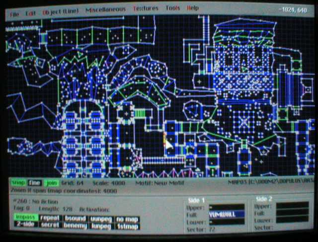
goop lorp was that 17 years ago?? how old AM I? And this level still isn’t finished.
I definitely need to re-record the audio, even if it is destined to eventually be re-recorded by someone else because the line “roundabout this time” especially sounds bad. I don’t have underbreathed enunciation issues when I practice singing it in the bathroom so presumably I could do it better now. i could even just re do that part and paste it in where it belongs. But I haven’t yet because audio editing requires, from me, a different state of mind than tedious image editing does, and asking other people to record is several layers worse. But I try to optimistic; I always believe a situation can get worse.
11-23-2023
oh nuts I totally lost track of what day this was updated. i had best force something out
////////////////////
yes this again, but now all its movements are filled in! not all fully shaded and I would like to make them look more cohesive and fish-like, but for now i can focus more on the beet crony. and also displace that text heap from last week that was not meant to be such a heap or have a week’s worth of prominence. i occasionally worry that this blue creature looks too much like the gobliins 2 character winkle even though i feel like i have considered and dismissed this before. i don’t want it to be yellow because then it looks related to the larger creature. green and red feel too generic, though. meepwhile grey and brown are too boring and orange simply doesn’t suit it.

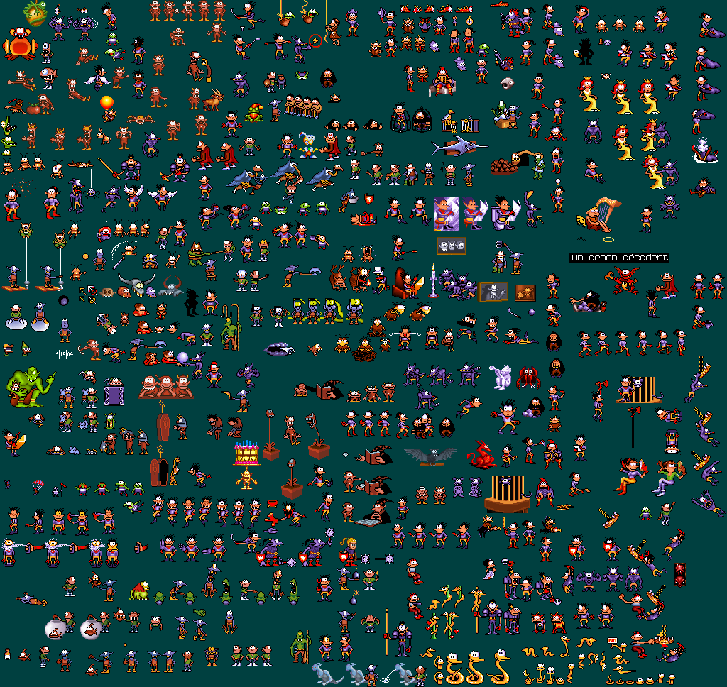
winkle has a similar skin tone, head point and sharp nose, although its nose is not a beak, it lacks a tail and wears clothing. winkle has a mischievous nature and of the two heroes is the one more likely to annoy another character and be physically abused on account of it. Although the frog in my example yells at both of them. I used to collect sprites from this game a long time ago in windows 95 before the dosbox emulator existed, and goblins 3’s odd use of the video mode made them too scrambled to grab when windowed, but the collection was one of few pictures I accidentally deleted! I attempted to remake it via proper screenshots once I knew how to do that but I did not feel as inspired and consequently it is lacking in gobliins 2 poses.
indeed
Another scrap of beet beast animation. I believe I am more than half done with this creature and after that theoretically progress could be if not faster at least more linear, with fewer multi-layer characters using multi-layer furniture that they are both in front of and behind. This seems a bit out of synchronization with the audio. as long it is out of synch consistently, moving it back in is simply a matter of dragging rectangles on a grid. the bootleg sony vegas that I use for video assembling –crucial, since the flash video data is presently in four different files, and two just for this part– tends to stutter at the start of clips so it is hard to match video to audio with precision without a few tries.
HM and that black spot in the center I thought was on my screen when I first noticed it a few minutes ago but evidently it is in the video! I wonder when it appeared. I hope it doesn’t mean what it does in Treasure Island, that pirates are coming to murder me, because I don’t want to die with my bedroom so untidy.