
a potential design for new potential business cards. Alas, I know nothing of business, and my card attempts reflect that. I subconsciously channeled this ancient, totally unusable design:
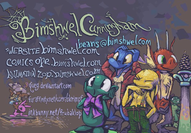
Both are way too busy but they are at least honest. If I delivered a simple, efficient, graphic designy card it would be a lie because that is not the sort of product I produce. I was hoping the old card design would be conspicuously less legible by comparison to the new one when reduced, but alas they are about the same! I never used it as a card, but I did expand it vertically to use as a sign at some event about which there is little positive to say. [email protected] is the same email address I had then; anything @bimshwel.com gets forwarded to me but I have difficulty deciding on what placebo [email protected] to give myself.
This one is from 2011, long enough ago that I thought inkbunny would ultimately be something I could admit to having an account on, and was willing to put money behind promoting my use of. If you are unfamiliar with Inkbunny, good. All you need to know is that it does not allow Toothcup.

That it does not allow Toothcup, capital T, that is actually one of the things it has going for it, and that many of the people you will deal with wish that were not the case. If you do not know what toothcup is, good. All you need to know is less than I already told you.
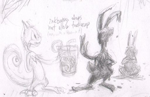
These days I will not put any of them on my card, which is in fact the very reason I chose horrible “names” like “queg” and “skrimpf” to begin with: so that nobody could connect them to my legal horrible name. I chose queg so nobody would know I had a deviantart account, and then I chose skrimpf so nobody would know queg was using furfaninity. I chose frubaklop because I had lost control of my life and figured there was no sense in hiding anymore.
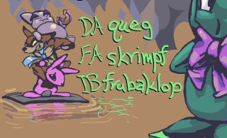
For a brief, notorious period, and it must have been brief because it looks as if even at the time I was uncertain whether I should keep the website names vague so as to avoid outing myself all needless-like, I thought I was comfortable, and I cursed myself for choosing names nobody would ever look for me at, and now I am grateful again. This is my place and these are my people so I should not deny it, I seem to have thought. Those are not my places. I mention them here specifically because I thought it would be sufficient to stop using those names and websites to make people stop identifying me with them, which was not the case so I will say it here: please do not ever call me skrimpf, unless you are deliberately trying to irritate me, which is a valid pursuit, but better you do it on purpose than by mistake. I do have http://bimshwel.deviantart.com/ , which queg forwards to, but “DA” is still fundamentally a fanart porn site, like the other two, that I will always be marginalized on [for not drawing or appreciating fanart porn], and I prefer to be marginalized on my own terms. However, such websites are a bit more social than my heap, here, so I keep on with the one I am least embarrassed about overall.
At this point in the original manuscript I digressed into several paragraphs on identity and denial that were beside the point and tone, and were keeping me from finishing this, even though I only came to post the one picture! They have been removed for now. Indeed I am as messed up inside up as my card is outside. Why pretend? Why try and trick somebody into hiring me based on something that is uncharacteristic of what I can deliver?

Because otherwise I will not be hired! The first cards I actually had printed were very sparse, since that was, is the only way I could have control of the situation.
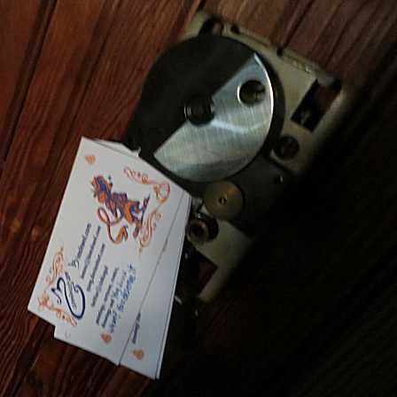
Control, such as with my broken, spring-based mechanical heating control panel, which these cards were useful for regulating the strength of during our six months of winter. I discussed a key design aspect in more detail here, but the blank space after “and” was so I could write something different on each card, such as “intrepid tortellini,” “raisin toads,” or “no dopes,” because I am not satisfied unless I make a hassle out of everything. The foremost one here says “you know what, you deserve it.” I can say that because you are here now, and therefore on some level you do.
RSS feed for comments, for they hunger.
This here`s me trackback!


Indighost sez:
Great! I love all of them.
I, too, have found that despite wholly embracing cheeseball culture, I still cannot remotely admit to association with any of it in person, any face to face interaction, else I be marginalized. So I conceive it as instead a dark conspiracy which is better masked from simpler minds.
Indighost sez:
Are you completely sure you have not been trained in graphic designs? Looking at those cards makes me feel tingly and excited about social synergies, joint venture opportunities and project plan initiatives.
Frimpinheap sez:
My point was that I feel marginalized on the websites because I do NOT embrace the culture; I am appreciated only as a diluted, fringe version of what most people are looking for but I suppose the feeling can go in either direction.
I made the design for the real cards during a graphic design class, but the teacher preferred pre-computer-aided-design methods that I have no ability with. Any time there is measuring or cutting I am going to be, again, at best, second-best, and probably not even that.
Indighost sez:
Thank you, I understand you a little better now.
Also, I googled Toothcup and my day has grown stranger as a result. Thank you again
PurpleSpace sez:
Is one small business card enough to contain the majesty of the pinecone? My mother would collect pinecones to make some sort of decoration with them which she has never really gotten around to making.
chesse20 sez:
nice good high quality content business card to get LARGE money from business investor maybe?
Frimpinheap sez:
The only people getting money for these cards work at the print shop I sent the pdf to! Also, I saw what you did the other day and I assure you nothing will come of it!