This is a major matter I have been occupied with the past half year. Major in the sense that it eats much time, not that it is important.
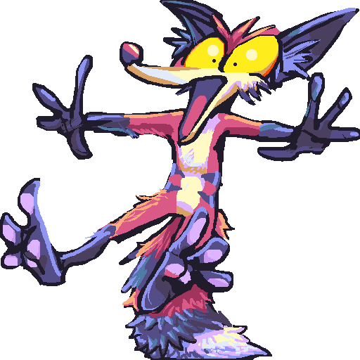
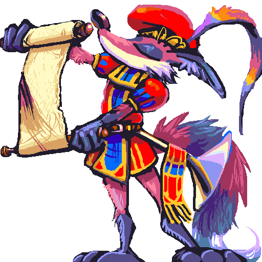
These depict a creature named techno made up by a person most recently called beepysopod.
Although I have offered to make drawings for money for years for, this is the first one I have received consistent interest in from other people. And that is because while there are many, many amateur artists on the internet who are more technically skilled and/or more visible than I am, or just plain not as angry as I am about the wrong things, most of said persons are terrible at pixel-level artwork. A few people are better, but not enough of them are to totally crowd me out like usual. Or being better leads them to other opportunities so that they are no longer available for small time work.


The prevailing mentality is that it is just a regular drawing done at low resolution, or with a 1-pixel wide outline. And again most buyers cannot tell. And most people in general do not care about pixel art in 201
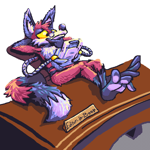
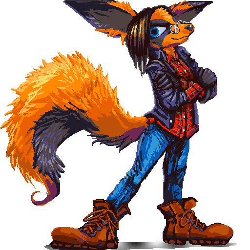
A FEW people do interpret this as useful and unique, however, such as the owner of the rightside figure, Fallenfolf, and here we are. I of course have known I am “good” at this for many years; there was a time when there was no way to draw on a computer EXCEPT zoomed in, using a mouse. But back when there was real NEED for this skill, in 1996, I did not know anybody. And I still don’t know anybody, so here we are again. Although now I have the scrap of legitimacy that makes people willing to pay me scraps of money to make them, although generally the people who buy from me do not know anybody either, which keeps me available for scrappy art work and the game from breaking. Can you imagine if I did something meaningful with my life? It would be a disaster. My entire personality draws from my life being a joke. Anything I do right is inspired by doing things wrong. If it were possible for me to predict what would go right, I would only do right things, and therefore do them even worse.

Anywhy, what changed was the introduction of the Telegraph messenger service. You might have heard of it, that is the one Islamic State militants use to coordinate their attacks since the story is that Telegram does not track its users. Which also means paranoid furries love it. One of telegram’s major features is “stickers,” 512×512 pixel images any user can shove at any other user. Many people will draw these in exchange for money. Usually poorly-drawn and scaled down heads making idiotic exclamations are preferred. The beeply isopod person happened to ask me for some, but without specifying that they be poorly drawn or disembodied heads, and I took it upon myself to draw them at the actual display size, since, you know, I COULD, and I offered that person five examples, all of which I was asked to complete. Ever the shrewd business-thing, I did all five for free, then three more for free even as I found myself increasing the detail level, uncertain at what point it was no longer experimental and that I could guarantee a consistent level of quality. After this point a single person asked to pay me for one, and I set the rate at $20, because that was about as much as I could imagine somebody paying me.
AND I promoted it with this specific image, because it was the best of the group, even though it was also the most difficult and time-consuming one of the group and under no circumstances would I feel adequately compensated to draw a prop more complex than the character I was requested to draw for less money than I could get a good pizza with in this miserable overpriced town.
Yes that ought to solve all my problems. But it did not because as I sold more, I kept increasing the complexity level, which people didn’t even know they were getting, and didn’t necessarily want, either, because it did not necessarily work!
At this point I only look greedy, which is fine because I need to scrap the “one price for whatever you want” system and put a cheap rate on the cheap drawing and a higher rate on a better-produced item. But I cannot easily do that because
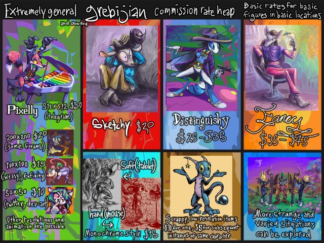
I only allotted that much space for pixel junk on this garish chart, a chart which was already agony to cram as much junk into as there is. Because I thought people would ignore the garish chart if it was not orderly and its sections evenly distributed. Every picture is a distinct element, and text is on different layers, so that I could change the examples and what my name was based on what website I posted this on because I do in fact have dumber names than bimshwel that I do not want to have used interchangeably with it, since the other mes make even worse things. Then I had to remember to swap all those details around again when I adjusted the price on the one thing people bought. Which I eventually forgot to do, which is why this one says “grebij” on it.
And I only have the stupid chart at all to makes things easier! Because if I write out what I am charging in text form, with multiple examples for each category and descriptions of what each category involves, people don’t read it and just ask me directly, and then I cannot remember what I wrote and risk giving even wimpier prices.
If somebody refers directly to the chart, I know they have already seen and accepted my prices and at least are not going to try and pay me less than that.
Except for one person who did but if you are reading this then it wasn’t you!
I often do not realize what a sad state I am in until long after issuing a price estimate. Because I cannot well start working on something, then give a proper estimate, and risk having the other party say “ehhhh no dice.” Or worse, try to pay me in dice!


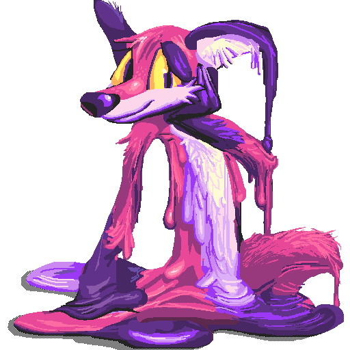
Observe that these are considerably more tightly-drawn than the first five, and more effort was taken to prevent and remove glaring edge artifacts. It SEEMS like I have done something properly while planning to, which should disprove my earlier theory. Since I made the first group without thinking, they came out rather simply and everybody was pleased. But these I obsessed over, without only minor practical improvement. Although I did not knowingly change my method; I merely paid more attention to it.



These ones, for a Scoots-Buragi, who saw the previous group and wanted a similar meltitude, were a bit loose again, but with all the stripes in there I thought it was justified. The ends still taper to 1×1 pixel points occasionally. Thankfully this did not, as some animated work last year did, endear me toward people who thought that I must surely have the same erotic fixation on masculine figures melting as they did, but I continued to have buyers anyway. So I seem to be coming out ahead, for once.
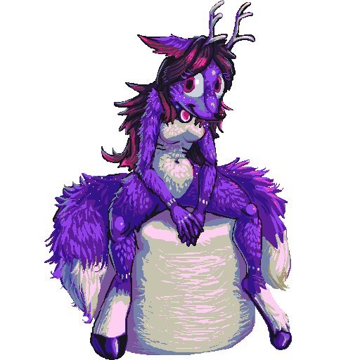
In fact they may have endeared me toward a dear, Kait Foxdear. That is dear in the precious sense, hence an A, even though the creature has deer components. The world is quite complex. This drawing is tightly rendered anew, and I kept the colors under control. Except for there being some bright green pixels stuck to the edges that I literally did not notice and remove until I went to write this website entry. wh-wh-whoopth.
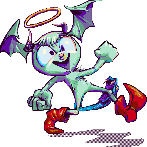
For one HellBaby-From-Hell, this one came out almost TOO easily, so that I felt like I must have done something wrong, and so I got the details even tighter.
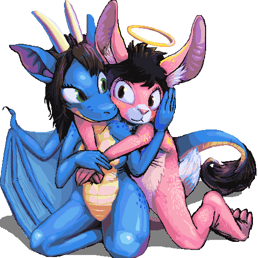
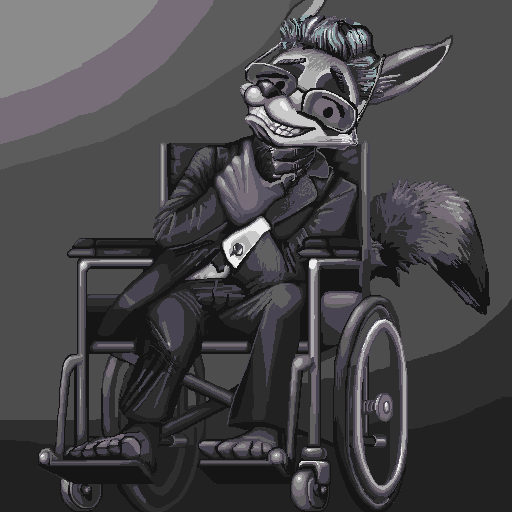
Which then totally spoiled me for these two, the first for Trufours and the second for Relaxingdragon (obviously, Relaxingdragon requested the raccoon person), whose subject matters were considerably more complex than the Hell-Baby’s. Finding a reasonable point at which to stop was impossible for me. Everything was drawn at 1 pixel and I put no limit on color density, although the latter party requested that I limit the hues, and consequently I thought it prudent to fill in the transparent sector with other grey tones. But then that destroyed its ability to be used as transparent imagery! Also, [depressing digression]. However, ultimately only two people really need to like any of them, right? Me and the recipient. But I also need other people to keep wanting them. Theoretically these are the best ones I did, but they are NOT because I beat the energy out of them.

This one, ostensibly a gift for somebody named Doomdweller from another called Syrenti, I was amidst while wondering why the last two were less good, and finished while realizing why they were less good, rather too late to do it differently!
This gives an idea of the tedious process. However, I made this video BEFORE I realized I had slipped into an undesirable way of doing things; I only thought to record it because I thought I was finally doing something properly! Alas, I can only be right by accident and I lack the resources to record my entire life. A pity, I would love to see a 3 minute video of me not messing up so I could determine what that looks like and try to be more like it.
I think everybody would like to see that.
RSS feed for comments, for they hunger.
This here`s me trackback!

Indighost sez:
I kinda think you should charge $100 for these, they look real good and I haven’t seen anything of yours that turned out real bad. (Although perhaps some did, and you threw them away before anybody saw.) That said, pricing is probably more about popularity than anything else.
Miscellaneously, do you “use references” when you draw weird creatures, or no?
Frimpinheap sez:
The latter ones certainly felt like they were worth $50, but they did not look that way, to me, but for anything I charge what I think people will pay! As I have had seven buyers total across a year and none at all for a month I do not think I could get away with asking for a-hundred.
I use references when I draw real things or somebody else’s characters. I needed rather a few to get the wheelchair correct, quite apart from the difficulty of getting it exact, as I forgot my pixel technique demanded, and will be wary of volunteering mechanical objects for inclusion in the future. nemitzes are not real and my fault so I do not need to make references for them. A creature of mine that I have not drawn recently I ought to look back on the last drawing of first since I often forget to include something.
If you asking if I use references of real things to inform my fake things, that would certainly be a good idea but for most of my history I have not and I fear that it shows! I have lately tried to figure out how vertebrate back muscles are laid out, in particular for the creature elpse, but had little success with that.
Purplespace sez:
I recently got Telegraph so I could talk to the one person I know that uses it. Your coloring looks very in depth!
Anonymous sez:
Thanks again Frimp!
Randomly, could you make a post about the announcement of the new DuckTales cartoon and what you think of the art / casting / etc? I think you’re generally a fan of duck tales and other duck related items if I recall correctly?
https://www.youtube.com/watch?v=No64mMVfnxU
Indighost sez:
Oh by the way, this is me.
Frimpinheap sez:
I find real ducks amusing, but cartoon ducks tiresome, since so many people thoughtlessly imitate the disney style without for a moment considering interpreting ducks for themselves.
I did like the Ducktales cartoon when it came out and I was 5 years old, maybe, and for a while after that. I have not made a serious attempt to evaluate it as a whole since then, and I believe I have mentioned it but once on this website in 2004, so I am curious from what you estimated my opinion of it one way or another!
However, my latent opinion of it is that is probably overall less idiot-aimed than a majority of disney products released in my lifetime, and not in need of being done again, for it certainly was not perfect either. I thought the remake video game was totally unnecessary, and that was only refining something that could be seen as potentially benefitting with a refining, with the original voice cast involved, with appreciation given to the original’s music. So I definintely think a new cartoon with the same premise as an old one with the intent of replacing it is extra, extra unnecessary. I have no interest in any remakes at this point, as I mentioned in a recent previous entry. If they want to do ducktales: 20 years later, or 20 years earlier, or even 20 days later, that would be new. Redoing it to be trendier and more contemporary is not something that I need in my life. I don’t like being reintroduced to old characters as if they are new, and I don’t like being expected to recognize them as if they are old when they are supposed to be new, either. There are so very many things I do not like!
I appreciated the Star Trek remake movie because it was in continuity with the original tv show, in a sense.
Based on what you link here, I appreciate that the art isn’t 3d, although it still has that ugly angular look that I have hated since they made tarzan.
I like that the triplets are distinguishable, but I hate their voices and characterizations; it drips with internet twit appeal. They don’t sound like ducks, they sound like scumbags. So it just seems like Donald talks that way due to a rare disorder. Quite plainly I hate the way “humor” is written for animated cartoons in the latter two thirds of my life and I probably will for quite some time.
This Scrooge McDuck more resembles the original Carl Barks version (or more likely Don Rosa’s idealized imitation), but who really cares? Conspicuously this is aimed at people who remember the 1980s show, they sure won’t. The art looks like a comic book, but not a Carl Barks book.
The character that I presume is Webby is probably meant to seem more empowered-femaley than the original due to being less conspicuously pink (though a skirt has been added) but it is not my place to say if that is good or bad since I already don’t like the way the male counterparts are presented, without any socio political standpoint.
But ULTIMATELY what I think doesn’t matter since I do not have control of a television set and Disney channel advertising would kill me; I am not in the target market for this. Indeed, if I had any suspicion that I would be likely to see the program in full I would not have viewed a trailer for it! Everything looks terrible in trailers.
I could make this a “proper” website post but I want very badly to be less boring!
Indighost sez:
Thanks for your thoughts. I think it was your old post about Don Rosa, a person whom I did not know existed until I learned about him from you that made me think you’d have an interesting perspective. I do like how you use few angles in your own doodles.