I am too mentally ill to make comics. Usually, on the internet, being mentally ill is good for comics, if you are mentally ill in a relatable fashion and it manifests in such a way where you don’t care how shoddily you draw. It may even be the case that the WORSE you draw, the more liked you are. Or if you are ill to such an extent that you have no idea you are and are extremely prolific in that. I have an illness of indecision, inability, hyper-awareness of inability and regret. Nobody on earth has any need for that manner of illness.
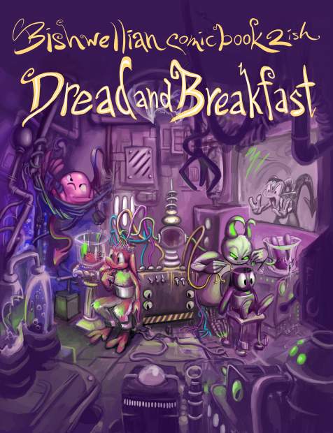
After relettering, respacing the same dialog boxes and redrawing the same negligible details ad-implausium I finally sent off the comic book order a few days ago. I won’t see them for a month but I sure can’t change them now! Consequently it is imperative that I do not look at any of the page images that I sent before the books get printed and sent to me. Or even after that point, just to be safe.
Ironically, the main person whose off-hand remark about the first book, that I should consider using fonts, looked over one my next to last proof copy inside a dark restaurant and said it was much easier to read the dialog, which meant I had done enough that I could stop, but I did not stop! I am like the text grinch; my scrutiny over my handwriting’s legibility grew three sizes that day when it was criticized. However instead of becoming a hero to the town i became a total outcast since I needed to scorn all other activity and contact so I edit speech baubles for months. Of course Madison Connecticut town would prefer not to have me in it so that suits them.

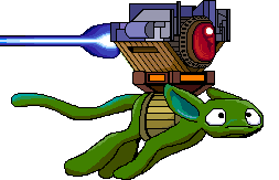
the first version of this cover image appears as the inside back cover of the first book, which was printer in 2016. Up until the most recent proof of book 2, this part of the image looked JUST FINE to me. But the night I was preparing to send the final set of updated pages, suddenly it did not! The line of motion was inconsistent with the image around it, and the bug was not sourced at all. I thought I could draw it better than that, and I did, but it still was not good enough. I remembered I had some insect references I had used recently, so I used them again and got a yet better looking bug, but I decided those were not good enough because all my references showed bugs not in-flight. And were moths, anyway. It is already bad to use a standing bug as reference for a flying one, and using a moth as a reference for a fly is worse! Amateurish! I found a very good fly reference! But the angle was wrong. And was perhaps too detailed! It looked too aggressive, too fast, too big (this version was not preserved so it is not in the montage). The viewer should be able to see the wings, not the legs, much less six multi-jointed legs. But I couldn’t just NOT include the legs because then it looks like I don’t value accuracy. I made it smaller and blurrier, so there still ARE legs but only really visible if it is your destiny to make sure that I gave the fly legs. but at some point the details stop being distinguishable, since there are too many of them. The first bug looked gentle, which is funny, and the simpler design reads more easily, since it is a very small creature in a very small part of the image! I decided to try a proper flying moth reference but none of them looked like what I wanted. I went back to the fly, simplified it a bit, so I could make it let smaller. Being too realistic can harm the joke, anyway. But what even IS the joke?
The “joke” hinges on it being obvious that pog has no brain, and something flying out of there implies that the space is empty because i don’t know why but it does.
Suddenly I had to think about it, and I didn’t see any logical reason why a fly indicates an empty space, which means it must be based on a stereotype or a cliche which has become far removed from whatever base sense inspired it. I could not even remember where I first saw an example of a fly coming out something empty, but for some reason knew it was probably a wallet, so I looked that up, and while I gained no insight as to WHY, i learned that it was in fact supposed to be a MOTH coming out of wallets specifically. Since I have already moved the logicless stereotype from its roots, which are purely symbolic, changing the insect type also cannot be done! It would HAVE to be a moth! *I* had been misled because the cartoon in which I observed this, presumably Pink Panther –based on most the panther’s situations are instigated by him being a lout and him specifically therefore needing a host of ways to indicate a lack of money without speaking– of course didn’t care what the bug looked like and nobody else, the entire staff of the cartoon, the production company, the distributor, the networks which aired the cartoon decades later, cared either, and nobody watching it did, including me.
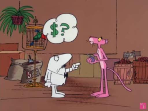
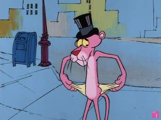
Well maybe it was a garfield comic. That much is irrelevant! What matters is that drawing a generic unsourced bug is a-ok when thousands, millions of people are going to see it. But when only me and maybe 14 other people are going to see it, such negligence is UNFORGIVABLE.
Now please try and imagine that with 40 images I will probably have this sort of stupid problem over and over on every one of them. I am a very sick person. I need to make a full print book order not because anybody else wants these books, only so that the production of the books no longer holds me irrationally captive.
Anyway, I went back to the moth version. A miracle occurred so that I found it acceptable, as awkwardly posted as it was, with the matter of the motion trail still not resolved, so I saved the image, reduced it to the print size, collected it with the other pages I was uploading, into a 167 megabyte zip file, started uploading it, went to the bathroom. this was approximate 3:38am. I was misled, however. The tyrant was not satisfied, it just had changed its focus. I began to panic because I considered that I had, during this session, because I was zoomed in and having problems with everything, also absentmindedly applied a cartoon-derived stereotype to the left-inside of pog’s space (vertical lines) to imply it was metallic. Even though the inside of pog is NOT metallic and if I wanted it to look metallic I should not rely on hacky shortcuts anyway.
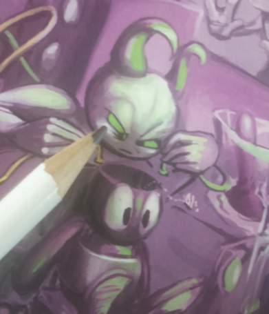
Even though it does not matter because this is an area smaller than the tip of a pencil. Without using the toilet I came back down, cancelled the upload, made a very minor alteration, exported the image again, checked that every other image was the right size, made a new zip file, and began uploading that again, and then I realized I had made the alterations WITHOUT reverting the image to its full size! Which means if I at this point decide to go back and change it again, as looking at this has made me sincerely, profoundly, want to, since I am now VERY conscious of the light colored streak on the right-inside of the space, I will have to first blow up the pertinent region and then draw over it to make sure it is a full fidelity image, even though is almost 0 zero chance across my lifetime or anyone else’s that there will be any need for a full resolution version of this picture, and then once I do that it may not necessarily have the desirable qualities of the pre-blown up and redrawn version.
And
and
and
nobody on earth will know that I did or did not do it!
An update for august 31:
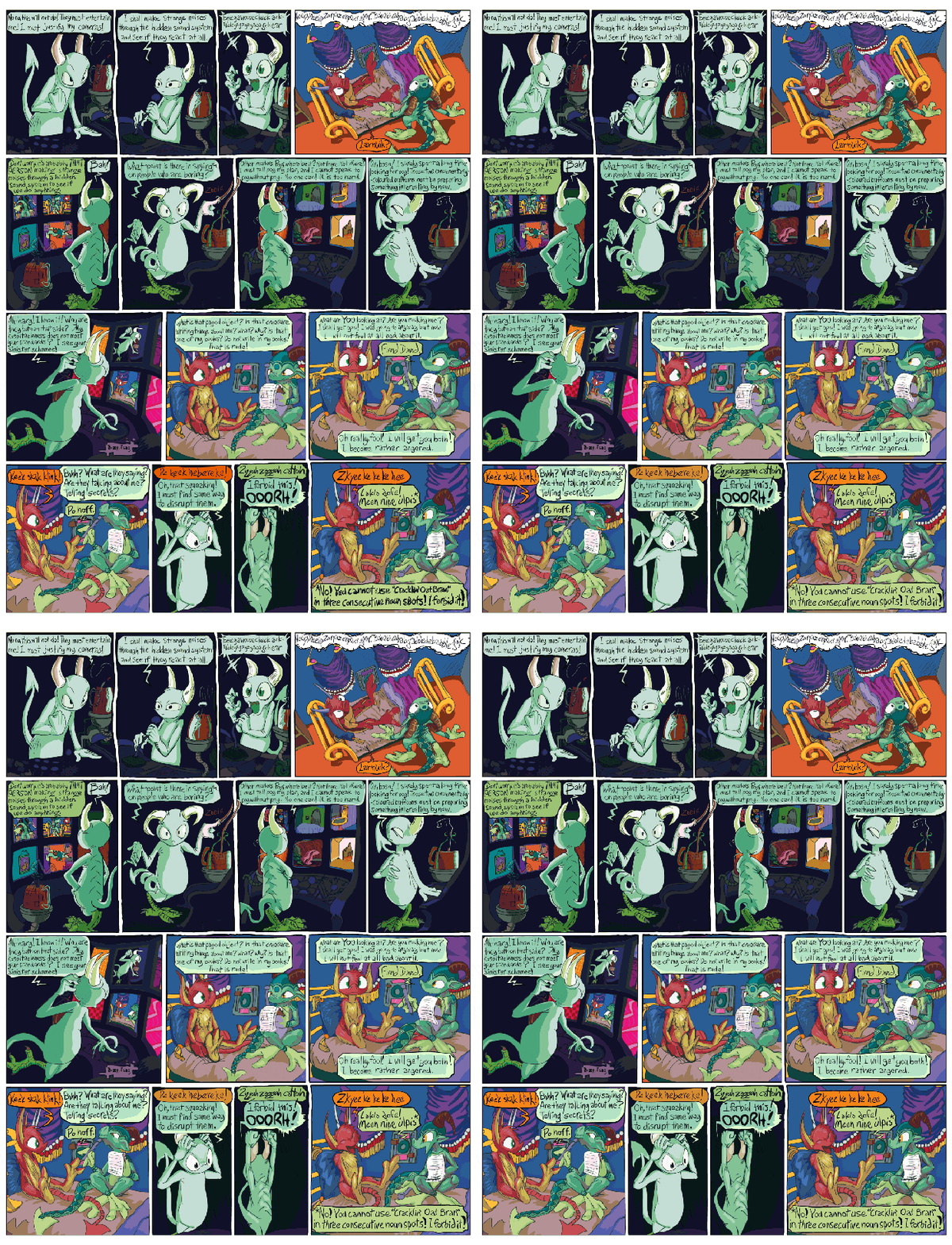
Here is or should be a big slow-loading gif which shows a vague version of the state of one page at the time of each of the three example prints and the final print (which does not yet exist). All of them AFTER incessant pre-print redrawing, remember. The point is that after waiting several weeks, I looked at every part of every page, three times, saw something incredibly minor, after I thought I was done, and had to open it back up again. On only nine of the pages I restrained myself from making more changes, even though I wanted to! The point the point the point is that I lost my mind and have evidence. I did not regain my mind, I simply was too tired to meet its demands.
Observe that the upper and lower left frames were changed with each printing but other places changed fewer times. This means I was able to look straight at something, on paper, think it was acceptable (after having looked at it prior to then numerous times across years and thought it acceptable), then look straight at it again at a later point and find it inexcusable beyond all reason. This means there could have been fifth, and sixth, and seventh prints, and I could still find fresh problems, just on the dumb letters. Letters too close together, too close to the bauble edge, WORDS too close together, veering too much up or down, not aesthetically balanced within the bauble. At no point, after no period of time, can I look at what I made and be satisfied with it. Even when logically I know that the longterm benefit of spending more time on it, rather than on anything at all else, no longer exists. Not only am I too mentally ill to make comics, I am too mentally ill to read comics.
And in the lower right can be observed my attempt to amend a minor legibility error by rewriting the dialog in a new temporary image layer above the base layer, but forgetting to delete the letters on the base layer before merging the temporary layer into it, and then forgetting to look in that space again until after the book was printed, thereby creating a MAJOR legibility error that would be impossible to overlook! This means that for each subsequent print I needed to look at every space of every page to ensure I had not committed that error anyplace else, even though such investigation would increase the possibility of me finding and obsessing over yet more imaginary problems. And then I ended up doing that in at least four other places anyway.
Seeing this gif now, it bothers me that I made kumquat’s dialog green-tinted when kumquat is out of view, against a non-tinted room. This is confusing and makes it look like elpse is talking. I thought, for years, and then afterward, it is quite obvious from context and precedent who is speaking, but people always find a way to miss all my points, so they could well claim to be confused. But if they are confused by that then they couldn’t possibly understand anything else, so I leave this green. But I will go back to the first fear, and have to explain to myself why this fear is unjustified, repeatedly. I know this is not entertaining. I need to make this understood as clear as I can make it so that in the future I can refer back to it rather than attempting to explain it again!
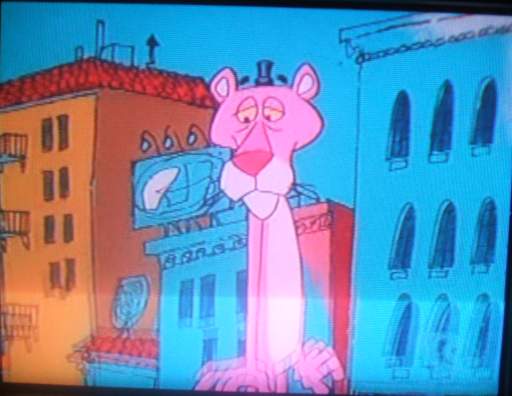
OH the windows and other details on the buildings are misaligned, the design on the billboard is indistinct, there is a little black speck just under the right side structure’s roof, the eyebrows float off the panther’s head and that hat is WAY TOO SMALL! How did this cartoon get made?
RSS feed for comments, for they hunger.
This here`s me trackback!

ilou sez:
well, illness acknowledged, even if not thereby abated, i at least am very happy that the next volume of the B.shwell comic shall soon be a printedly perusable object! it is my favorite comic and the elpse-and-nemitz-in-kumquat’s-compound is my favorite part so far (though i love the hospitarium segment approximately equally).
you can see when an artist has lived in their work, and it’s that quality that endeared your work to me ever since i first happened upon it. there’s vitality in the details.
Frimpinheap sez:
Thank you for saying so! My hope lies in the few people who do take an interest finding it to be a memorable interest. I cannot say this is my favorite part, but I have had a great amount of time to become very displeased with it. I do believe it is better now than it was ten years ago.