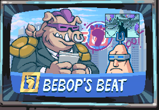
ceptin about us bein intelligent dis is nuttin but typical lamestream media propyganda. what about dem supa toitles? I seen em everywhere I go. dem reptilians is runnin da government and deir vermin buddies is runnin da media which is how come you don’t see it on tv cept what they want ya to see em. Tink about it.
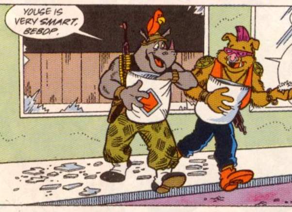
Dese glasses aint just cuz I can’t see real good. Dey mean I know a ting or two, which is how many eyes I got.
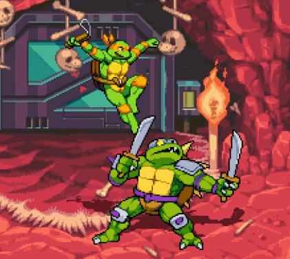
what about toitle on toitle crime? dat’s never on da news. it really carapaces me off if you’ll pardon my french but I don’t know why dey is eatin frogs and snails and mustid but not toitles.
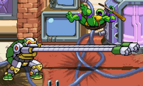
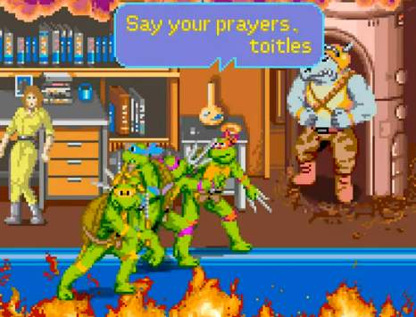
and toitles don’t say no prayas, even when you ask em to nicely when you gonna shoot em. Dem toitles is godless dirty communists. real dirty. i seen em comin outta da sewers all da time. And you nose i can smell em.
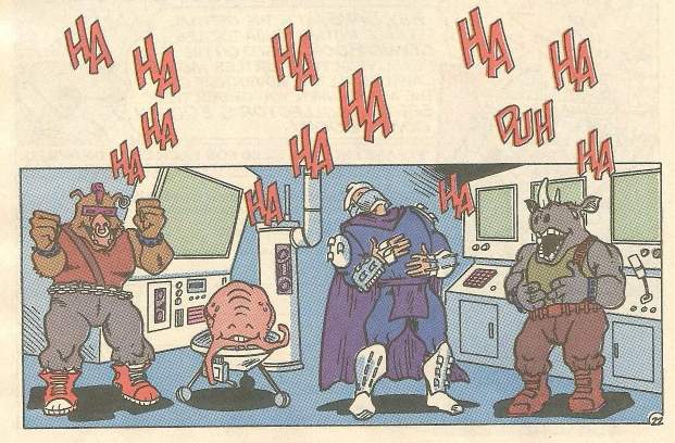
huhuh I made a funny
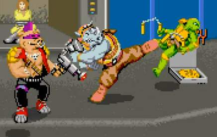
dem toitles did pizzagate too. youse oughtta google it. deyse all homophiliacs. dats why you don’t see no goytles. huhuh. just dat reporter lady and I hoyd sheza lesbean and den dats beastyalities oddawises. I bet dem toitles would be gettin abawshuns if dey knew how. Dats why we gotta repeal roe vissis wade. Did you know roe is a some kinda egg? And who hatches from eggs? Toitles! And wade is when they gotta go on duh scale cuz of all dem pizzas.

in summaryation deyse nuttin but criminals. dey is been groomin kids wif deyre violents and nekkid consumerisms and voter fraudulents since ah HMMMM when was dat?

sound familiuh? Good night.
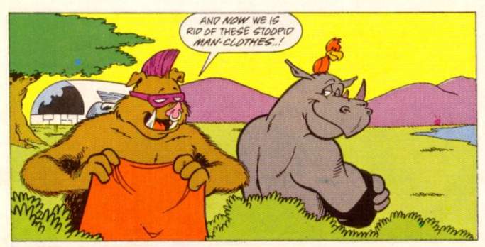
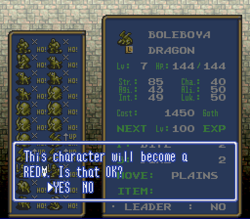
Somehow it is hilarious to me, in the video game Ogre Battle, that lacking space to spell out “red dragon,” owing to differences between Japanese and English writing systems, the localizers opted to just include “red” followed by that dopey dragon face icon. They could have written “R.DRAGON” and everyone would have known what it meant! But THIS I can’t take seriously! I am only thankful that the regular dragon at least spells the word.
curiously the game’s font has been extracted and uploaded to this page, which I know because for some/no reason I was LOOKING specifically for that specifically to see if that silly dragon head icon is included, and it is NOT, even though the actual game rom’s graphic data
puts it right after the letters, which I determined using Tile Layer Pro. YES i used rom hacking software i haven’t touched in nearly 20 years just to get a clean look at that stupid icon since I haven’t actually played this game. I don’t play video games anymore, generally; it takes too long. Now I watch other people play them –as it happens, Ogre Battle is one of the rare games where my participation is nearly as active as the actual player’s– to keep me from checking my messages every 7 minutes while i try to draw things, or to keep me from considering that my body is past its prime and I am tumbling toward death while I walk in circles in the basement here trying to burn off calories from all the garbage I eat since eating nonsense is the only thing I enjoy and I still delude myself that I can eat it at the same rate that I did back when I played video games and hacked roms and not suffer ill consequences. Then i realized other people for whatever reason have placed downloadable save data for Ogre Battle there so I can in fact take a proper game screenshot rather than blurry ones of youtube videos.
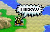
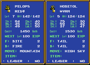
what REALLY makes me mad, is this dumb “wyrm” that has a lower level and lower just about everything else, and LITERALLY ALL it can do is exhibit its dumb tail at foes, and it DARES to try and charge MORE goth money than a REAL dragon.

just LOOK at how STUPID that is! they have sharp teeth, they have FOUR sets of claws, fairly pointy wing-ends, the chance at dignity of NOT having a dopey lizard head icon in their fighting class name, and THIS is what they choose to do! and they are QUITE proud of themselves.
that is like the kind of attack “lope” (the annoying lizard from my comic strip) would do
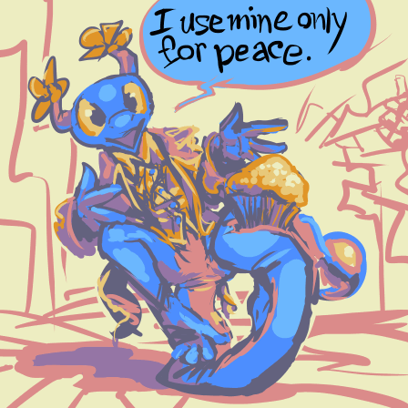
ARRRRYRHGHGHGHJ I am leaving before this gets ANY stupider.
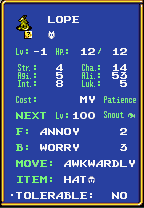
I already left! This is someone else’s problem!

A clear sign Big-Y is a Connecticut and Massachusetts-only supermarket; if Kroger or Food Lion had a Kids Fruit Club that would be cited as proof of child grooming and republican governors across the nation would race to issue condemnations of it and proactively try to pass laws against it
naturally just [yesterday] I saw this

which IS in Connecticut, but the ludicrous conservative backlash to the name led to a bigger back-backlash that gave the store so much business that it ran out of stuff to sell. In Florida or Texas it might have had angry protestors outside demanding that the employees release fictional juvenile hostages and then a week later everyone inside and out would have covid.
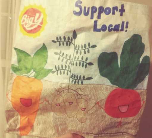
still I am concerned that Big Y is getting so comfortable with these mutants

and worse, the mutants are getting comfortable themselves.
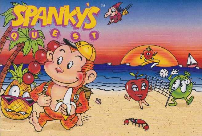
why don’t we just throw a beach party for them!
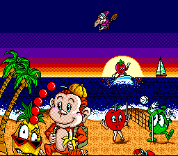
this is beside the point but I am fascinated that this game’s title screen is a redraw of its weird box-art; generally Japanese video games with weird United States box art don’t have their title screens updated to match it, except to alter logos. Also despite the weird cropping to allow the text to appear the picture overall looks less weird. although the tree is duplicated, the texture on the sand is questionable and the banana looks amidst a prophylactic demonstration, the artist treated the sun as a light source rather than another piece of fruit, and the figures themselves look less like there is stuff wrong with them, which to me is of foremost importance.
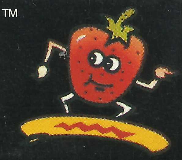
especially THIS creep, that looks less like it is surfing than “he went that-a-way!”ing while squatting behind a stair with bacon on it. Someone even thought it was good enough to put on the side of the box as well! It was not. There (here) it appears to be concerned about trademarking but unable to leave its post plugging a dike leak.
It might help to contrast this with the original Japanese box-art that is strikingly dissimilar to both its own title screen and this, but I decline to on account of it including a depiction of the grapes-themed boss foe that I find aesthetically unpleasant for reasons that are beyond the scope of this web page. Additionally that Japan Super Famicom box-art is dissimilar to the Japan game boy version’s box art, which would need to be contrasted with the fact of US editions of both using the same box-art despite differing in-game character designs, thereby explaining why the monkey only has a conspicuous tail in one of them, and all of these factors combine to really not be much help at all. Is there any expert in the field who COULD help?
oh WHAT?! I had no idea. Years ago this appeared on the zany video game quotes website, and I never knew or asked where it came from. I ASSUMED the graphic was for something remotely archie-related; the Archie Comics company published works on a few topics that weren’t strictly archie themed, such as ninja turtles and sonic t hedgehog. I didn’t guess it was in a video game magazine advertisement for a property other than those two, certainly not the monkey vs evil fruit game. Factually the sonic comics did not appear until after this but I had to look that up. I should not have had to look that up! This should never have happened! Had Archie been pondering video game comics before Sonic or does it merely mean Archie recommends throwing basketballs at food that has limbs and faces? Do I and Archie actually have common ground? What horror! Looking up the phrase “recommended by archie” now seems to indicate this endorsement was not offered to other products. Consulting the site’s founder likewise indicated the same source and that he had even scanned it himself.
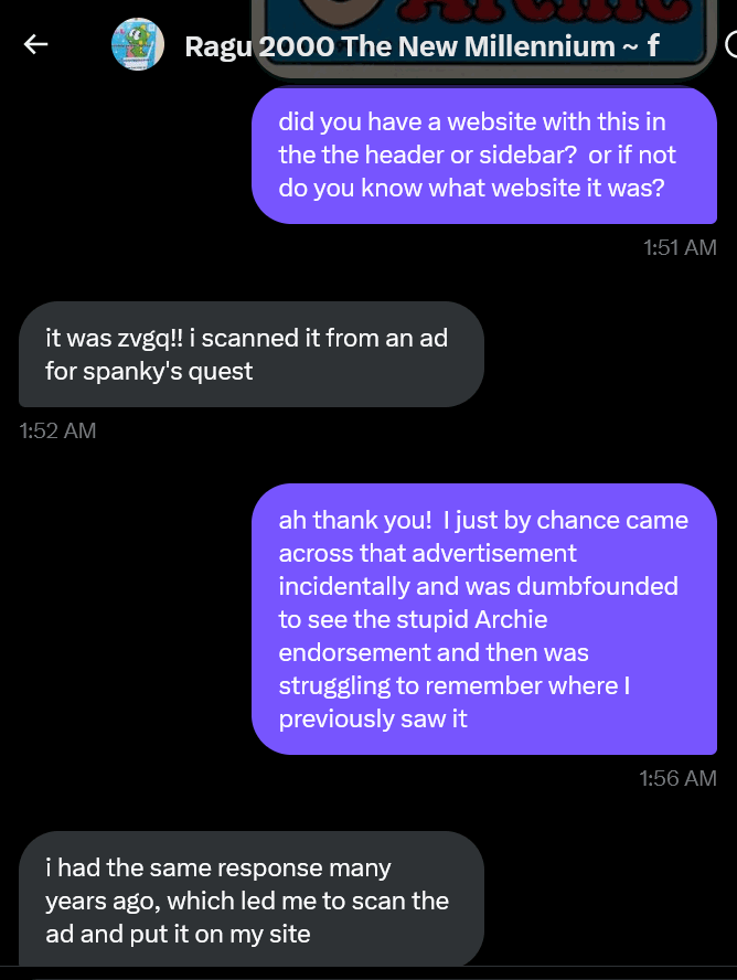
and that is what me asking about it looked like. I did not really ask at 1:51am, however. Why is the time zone incorrect? And why did I think I needed to prove that I asked about this?
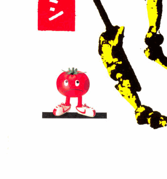
all in all a very stressful day! I had other pictures of stupid limbed fruit to show but now I am just upset.
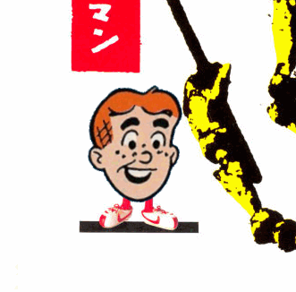
Now I am more upset!
A strange vision from my child-era that returns too often, in the Police Academy cartoon series, which existed, at one point the weapon-enthusiast Tackle Berry participates in a typical mishap and gets a toilet plunger stuck over his mouth, preventing him from explaining the incident
n the next scene he was alone in a dungeon, just wearing underwear, possibly the only time he ever appears sunglassless, with a dorky smile, talking to a rat, and there the vision ends. I had NO CLUE then why imprisonment and your clothing confiscated was appropriate punishment for getting a plunger stuck on your mouth, and I still don’t, but it left in me a lingering fear of irrationally humiliating punitive measures
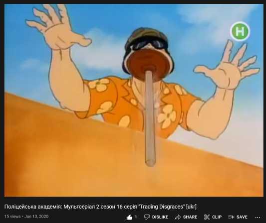
And I FOUND the episode, and the moment I remembered, but only dubbed into Ukrainian! So I can SEE what happens but not grasp the context, though I may possibly prefer this to the original audio otherwise.
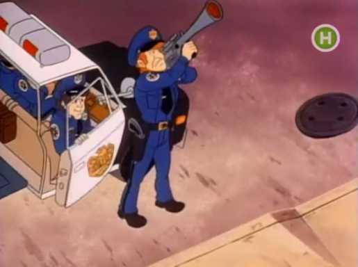
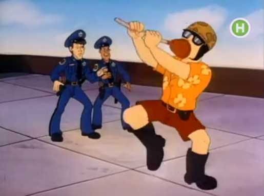
It seems as if the evil special guest police-academite’s master plan is to shoot Tackle-BARRRY, as he pronounces it, with a plunger-launcher, and the good terrible cops arrive to try to prevent it from happening, and once it does happen they give up attempting to help, as if not having a plunger on his face was Barry’s only claim to freedom.
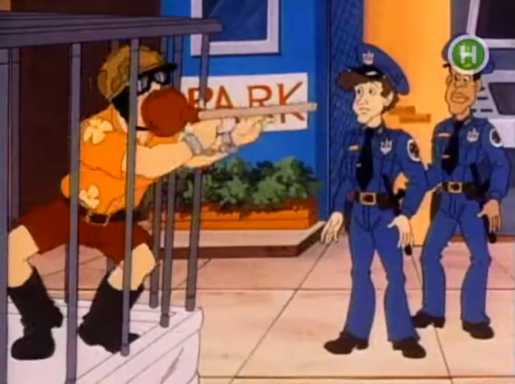
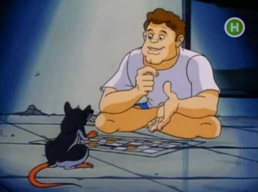
It does reveal that Tackleberry is offscreen placed into a cage on a pickup truck, after being plungered, but still has the plunger while in the cage, plus handcuffs, outside the bars, which meant he was in the cage and no longer a threat before he was cuffed, and therefore probably wasn’t a threat to begin with, and isn’t wearing a police uniform, so there isn’t official regalia to strip him of before sending him to prison
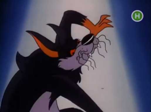
possibly to hell, if this frightful pointy-edged dog-nosed micro demonspawn is any indication, and therefore there is NO reason for his clothes to be off. It makes even LESS sense than my memory! As this video was uploaded in January 2020, I am surprised Vladimir Putin didn’t cite Ukrainian possession of bio-suction based armaments that incapacitate peace-keeping forces, remove their clothes and eventually cast them into the realm of eternal torment when justifying the Russian invasion this year.
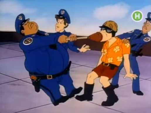
The more I review and think about the footage the more it looks like Tackleberry is imprisoned, potentially damned, exclusively because of the plunger. Or worse, because his comrades couldn’t pull the plunger off his mouth. I don’t know why that’s a crime but it isn’t even his fault! Meepwhile nobody is shown escorting him off the roof or putting him in the cage, and the ones who failed to remove the plunger just watch him get driven away in the truck cage. I am left to think they caged Berry themselves after realizing they couldn’t remove the plunger and risked similar measures for continued defiance. But once Berry is in the dungeon with his unholy familiar the plunger is gone and he seems much more content. Maybe it is an enchanted plunger that cannot be removed unless your clothes come off with it. I am really not getting the closure I wanted on this.
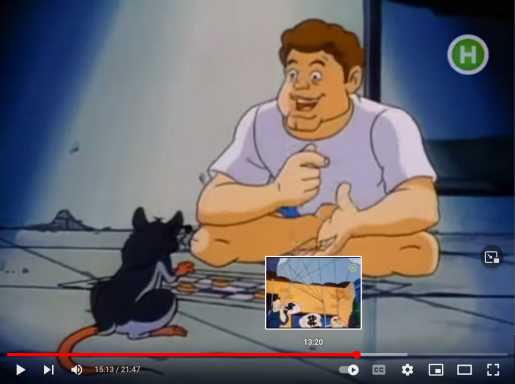
Additionally, mostly unrelated, I can see in the little preview, and am un-inclined to view full size, BIG dollar-sign-symbol cash sacks but in at least one shot the animators casually mirrored one. It isn’t a photography error, like the cels were wrong-side-up, or a region-specific matter, like DiC inverting shots of school bus doors in Sailor Moon, since the other $ is normal. It just means the key animators at the east Asian animation studio that would have done most of the work on a show like this weren’t familiar enough with dollar signs to see when one was flagrantly incorrect, and the grunt animators who had to draw all the individual frames and color them in weren’t paid enough to point out a problem like that in the event any of them noticed. In fact the employees who change the signs at the New Haven Connecticut Popeyes and Walgreens can’t even be trusted to put the dollar sign up forwards 100% of the time. It just is not a priority for a lot of people.

I can’t find/am afraid to find photographic evidence, but here is a 2013 dairy queen sign with a backwards N. Not only that, the Ks are upside-down. I can’t believe I don’t have friends with my superhuman powers of fault-finding.

according to my file names , this is the other side of the sign, with the same backwards N! And YOU might say this is more than likely the same side of the sign, so I shall point out that the B is ALSO upside down, but only on ONE side!

ha ha HA! Ha, ha ha HA, ha HA ha, hee ho heh.
Getting back to the main digression, I do not believe the surprise backwards S front and center on a television screen is what traumatized me into fearing the shape and being wary of non-backwards S-es with certain types of curvature and thickness, else that would be what I remember.
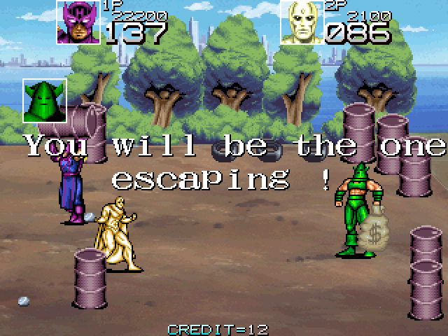
It was often hard to track specifics of thin moving shapes like that on blurry cathode ray screens, at least for me, which is why I never noticed the one Whirlwind carries around when running to the right and THROWS at the heroes as a weapon in Captain America and the Avengers even though I played that game every time I saw it, and that was released three years after the Police Academy cartoon supposedly started airing, and hopefully also after it had stopped airing. In fact I never noticed until today that Whirwind isn’t even really carrying the bag so much as having it glued to one of his fists. The backwards bags in the cartoon were bigger but I probably didn’t have cable at the time and potentially saw it with staticy signal distortion over it. This is important.

some things are more important, though.
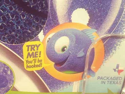
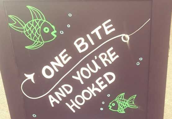
I saw these both in the same store on the same day last month, and must say I am concerned about multiple talking fish encouraging me to get hooked, an event that is often, eventually, fatal for them.

look at this, I couldn’t find any REGULAR-sized hooks down at the local pirate supply store. Where is the public outcry like there was for mcdonalds? It just isn’t safe to get snagged on this.

less so on this. these people are encouraging ADDICTION. While bible dealers encourage bible addiction, crack dealers also encourage crack addiction, and nobody ever brought a loaded tommy gun to a swap meet because they thought other people didn’t believe in crack enough. say what you will about illegal drug merchants, but they only kill their own customers and competition. If one of them started a lobbying firm or got into the supreme court the only thing they would try and make illegal is other dealers’ drugs.
it isn’t supposed to, it is a joke.
that’s the whole point, it is absurd. I am saying something absurd to highlight a common non-“absurdity” that I think ultimately is just as bad.
SHUT UP SHUT UP SHUT UP
but you’re also obsessively trying to win conversations that don’t matter so your victory is trash
I suppose you can take smugger satisfaction in knowing that nobody can be as annoying as the ones I make up; the real person was doing it for months and you only just started!
it isn’t as depressing to be annoyed by fake people and I can also control when they stop talking

it isn’t! but it evidently it is preferable.

I would be thankful the character is not a fish, but I am not thankful for whatever Gustav Klimt-style horror it is.
2-2-2022 oh beets I had some incomplete code in here yesterday, but now I don’t!
///////////////////
A lot of dead celebrity news lately. I assume they are dropping all the time and I merely rarely learn about them until afterward or don’t know who they are.
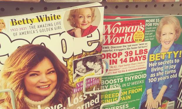
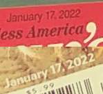
I learned a lot from Betty White, primarily that Woman’s World goes to press further in advance of distribution than People does

hm WELL I can admit when I’m wrong!
then was Bob Saget’s death

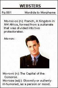
I evidently saved this on july 26 1999, from an already concluded photograph editing contest I saw on some America Online page, possibly. The stupid face manipulation was always funnier to me than the context. I remember I would show this to my sister to get strange reactions.
I believe the “ha! ha!” is meant to be pronounced like an early south park or simpsons parody of Saget, who force-laughed in doubled bursts of “huh!” but i like imagining it being more like The Count from Sesame Street. Not empty and phony, but legitimately entertained, just in the manner of a vampire who likes sequential numbers too much.
I also have this gif from the same contest. It doesn’t amuse me nearly as much but it does hearken back to a more innocent time when people had no idea how to save images properly.
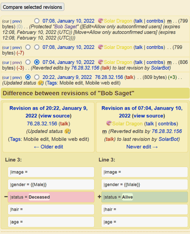
while trying to determine what show the “huh!” Saget was from, I ascertained that while Saget may merely have been MENTIONED on the Simpsons, the simpsons wiki administrator still considers him an important enough figure to the franchise that he has a mortality box, for which harder evidence of his demise is required than “news” that it occurred for the box’s status to reflect that. or maybe

this seems an odd length to go to cope with that.

Our hearts go out to the entire Loaf family
I felt bad about this remark for some reason and followed it up by saying:
I don’t consider a death at 74 years after achieving enduring multi-decade success without any major scandals to his name to be as tragic as they come so I figure he can handle a stupid joke at his expiration’s expense. I didn’t feel any better even though that is true! It doesn’t help that reports of his death consistently cite his appearance in Rocky Horror Picture Show as a defining moment in his career even though it only lasts about three minutes. Did none of these writers see Spice World? Meat Loaf is all over that, even if his character avoids being murdered off-screen.
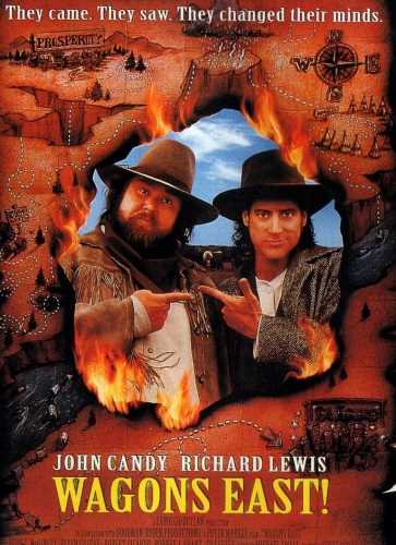
the next night one of my subconscious dreams involved me discovering an elaborate Doom engine total conversion based on the 1994 historical drama Wagons East Exclamation Point, best known for being so bad that John Candy dropped dead before filming had wrapped.
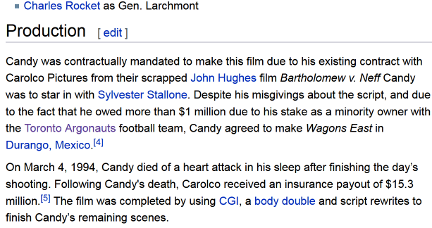
wikportedly, Candy disliked the script but agreed to appear anyhow as he was one million dollars in debt and still under contract from a previous, presumably better film that was cancelled. Ironically, the movie company got $15 million life insurance money. THAT’s a tragic death!
and Carolco STILL filed for bankruptcy the very next year, despite having released the most successful action movies of all time up to that point.
something I didn’t considering until I cropped the above image, Wagons East also featured Charles Rocket, a former Saturday Night Live actor best known for getting fired from the show for cursing during a sketch about someone having shot him, and then decades later slicing his own throat, subsequently only getting a 3 second silent still image tribute on the program, which presumably had never invited him back for any of its incessant self-indulgent tributes to itself but had mocked his existence at least once during the period when I was watching it. That’s also pretty tragic! Despite having a major role in Dumb and Dumber, a very widely known Jim Carrey film. Fellow comedian Richard Jeni appeared in another 1990s Jim Carrey stega-hit, The Mask, and also killed himself, with a gun. Jim Carrey is one of the highest paid actors of all time and still living, and I don’t know that he made any comment about either of those deaths.

oh alright that explains it, nevermind!
shortly afterward I learned of Louie Anderson’s recent death. I felt bad for him so I made no jokes about it! I made plenty while he was alive. Not here, though, apparently. The closest I appear to have come was trying to put him in that “Hamiltwins” image but not being able to get the drawing to look like him, and casually citing his name in 2014.
not long afterward I saw news about Neil Young and assumed he was dead. He isn’t dead, just having a quarrel with spotify.

why is anybody surprised that a company which can afford to pay for the right to distribute so much commercial audio is turning a massive profit and in the business precisely to do that? it should only be a shocking revelation when one does NOT put money first.
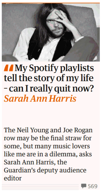
oh give me eight breaks. spotify didn’t invent music nor the concept of listening to it. what happened to all the ipods and pandoras and whatnot that were so faddy with visible people before this? Who was buying new albums on vinyl records in the 21st century if not them? Why would any “music lovers” let someone else decide what music they get to hear? Because the harder someone wants you to know how great their taste in music is and how REAL they are because they like music, the dumber and phonier they are.

I presume this is just the sound of somebody splashing in a bath tub.
ohhhhhhhhhhhhhhhh busy busy busy busy. there is an animation layout that I meant to exhibit here at this point, which theoretically should have been fairly quick to do on friday evening, but i can’t decide what a figure should be doing during a certain line and so the task has become prolonged. all tasks become prolonged but i cannot always anticipate the reason.
///////////////////////////////////////
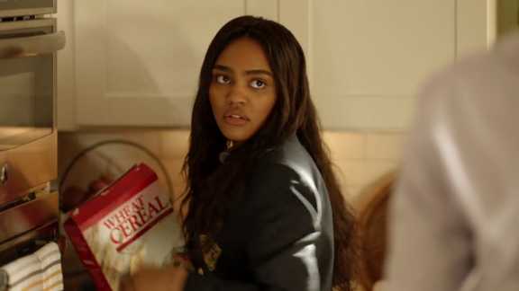
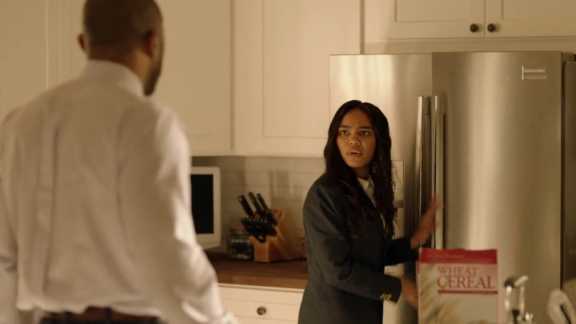

i can’t stand the shameless product placement on CW’s Black Lightning
At night I watch television with my mother. That is just my life now. It is less depressing than being alone or being beside someone watching bad phone videos for 2-4 hours every night. In a sense it is not much different to how things formerly were with my father (my mother would usually be alone during that), but we are not limited to whatever is on at the moment on bad basic cable and try to ensure we only watch something that both of us want to see. By this point we have largely run out of shows to which that statement applies so something only need be tolerable now. and so
Black Lightning is true to its DC comic book roots, in that every few episodes it seems like a different writer takes over and disavows whatever the previous writer was just doing, but the next writer may bring it back up again, possibly with something about it different that I am not supposed to notice and probably wouldn’t if I was actually watching these at the weekly intervals they were originally broadcast. It also has that annoying habit that media from the past 10 years does of assuming any moronic post on a “social media” platform is automatically “viral” and known to everybody, including one boasting of the physical prowess of the second hero character, Black Lightning’s daughter Thunder, despite her not actually having appeared in public or taken on the name yet, which can’t even be blamed on writer swapping because that happens later in the same episode and prior to then Black Lightning had forbidden Thunder to do that.
In addition to being Thunder, she also is a full time medical student, a volunteer doctor, beats up drug dealers under an additional alias “Blackbird” and then has time to go to parties and be condescending toward her younger sister, who we took to calling Lil Stormy both because of how stupid it sounded, matching her inexplicably bratty behaviour, and also because she didn’t come up with an alternate name for herself until the final episode of season 2, which was the redundant and confusing “Lightning.”
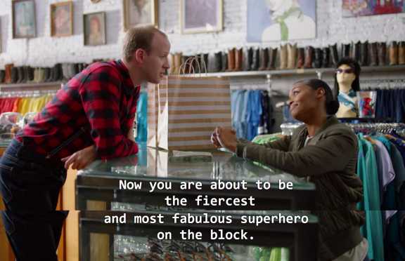
Unless we include Thunder’s few appearances in a blue and red outfit assembled at a local shopping mall in full view of customers or at least a very nosy mannequin, directly assisted by a stereotypically gay store employee who is never seen again despite being given the name Ben in the captions and getting a hug from Thunder as if they are the closest friends, which would mean Thunder’s identity isn’t a secret and she can easily be arrested and prosecuted for destroying a statue of Confederate General, which appeared on The News as soon as it happened. The News seems to be the only television program available in Freeland, so perhaps I shouldn’t be surprised that the bar for viral videos is so low.
An excursion to the mysterious far off nation of South Freeland where segregation still exists and all the white people have super speed granted by their brain-washing, intuitively-named leader “Looker” in season 2 seems to be the most extreme example of a rapidly introduced and dropped storyline. I assumed it was just there to cover up the going nowhereness of an earlier storyline about “pod children” but the pod children situation is resumed as soon as the Looker situation is concluded.
I don’t much mind that the white characters are mostly 1-dimensional and cartoonishly unkind, rigid and dopey (though my mother does) because the one “good” white guy Gambi is so frustratingly perfect and good at everything that the bad ones can seem like a relief and I find them amusing. Gambi gets uptight when Black Lightning talks about killing the villain, Tobias, because that’s not what heroes do! Gambi himself murders nameless cronies by the hearse-load every other episode but conveniently avoids shooting anyone that is actually in charge of anything. He also uses conventional firearms despite designing and crafting weapons and other devices that defy the laws of physics casually in his spare time.
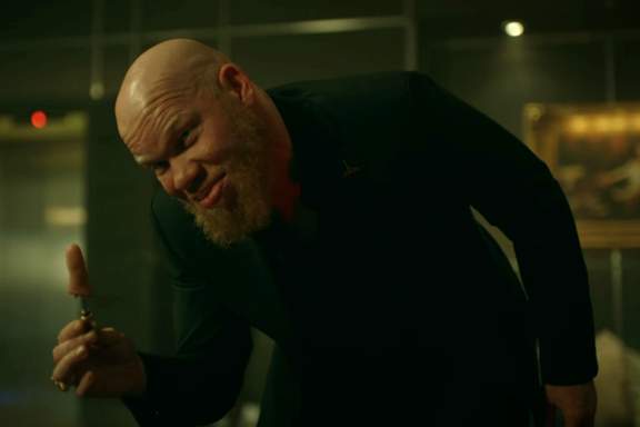
Tobias is my favorite on account of being the only major recurring character on the show who doesn’t get offended if somebody makes a judgemental remark, which about 80% of the remarks are since that’s what network television thinks social conscience is. Tobias does beat people up and shoot them, but I can’t confirm he has directly killed more people than Gambi has, and they are usually people in his own employment, which greatly limits the expansion of his enterprises. Tobias ALSO makes frequent judgemental remarks but, again, is the only character that doesn’t look like he about to cry when he does so, because he is the only character that realizes he doesn’t actually exist and so is free to be unrealistic in more enjoyable-to-watch ways.
Regarding Black Lightning himself, his secret identity Jefferson Pierce should be REALLY obvious. He has the same agenda and talks to the same people in and out of costume, often the same night, and the costume itself is not that effective. He wears goggles but no helmet and is the only major character with a beard apart from Tobias who is frequently stated to be albino and thus inadequately “black.” The costume also glows in the dark and has an incredibly slow and loud self-propulsion flight system and it is confounding that nobody who wants to kill Black Lightning is able to follow him or track him down.
I suppose he IS unique among DC heroes, not for being black so much as actually wanting to make a difference when not in costume. He is willing to let Jefferson get fired from his job so Black Lightning can actually protect people whereas I can’t imagine Clark Kent ever letting himself get fired without quickly conceiving a ludicrous counter scheme to get himself rehired so he can continue publishing stories about how great superman is.
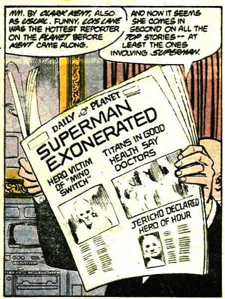
Still I think it is a good hero and villain show. It is an atrocious social/family drama which takes itself so seriously that the suspension of disbelief necessary for the ridiculous supernatural hero action to gets shattered constantly, With 3 super powered characters in the same family, 4 if you include the mother, Lynn,’s super sanctimony, that do whatever they want but also get furious and broody each time another one does it, and then each individually whines at Gambi afterward, it can seem like a never ending Saturday morning cartoon public safety announcement segment. Full of pouting, preaching, bad morality, offense-taking and “storm”ing off (oh ho ho), but so was Seventh Heaven, which ALSO aired on the CW channel and for ELEVEN years and people PRAISED it for being “positive” so I am willing to believe it is a network mandate that all shows with a family have to be as annoying, anti-entertaining and fake as that one.

Or maybe I just would rather believe families like that are fake. And despite repeated allusions to “real world” violence and injustice against black people, the heroes and Gambi regularly, consistently break the law and utilize what is essentially magic to get their way (usually to cover up the criminal deviance of Lil Stormy) and are ludicrously wealthy. I suppose anyone in the DC universe who isn’t heir to a throne or billionaire fortune is considered proletariat.

oh cow! a free trial ON THEM! DISNEY is PAYING the FEE for you! except it isn’t, it has billions of dollars and could still turn a massive profit if it offered this streaming service for free. and every other service that charges gives you a MONTH free trial. it is the mark of a true price gouging monster giving you less than half as much and still presenting it like a favor. maybe the logic in the board room was that a consumer could theoretically watch all the original content in a month and dump the service without paying anything. right as you could with netflix or hulu, which are known to have loads of new shows but few good ones;
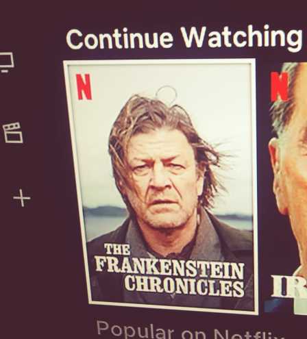
even Nick Nolte’s mugshot has its own show on Netflix, for example, and they still stay in business, very good business. this, like EVERY other thing the disney company has done in my life time and before, is inherently hostile to buyers and uses its inescapable socialized influence on children as leverage to force parents, and you can see below that the box text addresses “parents” directly, into paying through the nose and any other accessible orifice. disney has a CENTURY’s worth of its own content plus the loads it has acquired in the past few years that now can’t be gotten anywhere else, plus multiple generations of wealthy imbeciles who shill its properties at every opportunity without any compensation, and still wants to use this “look at how we’re losing on the deal” marketing. Look I am so angry I don’t even care that somebody of approximately equal mental function to myself brought froot loops into the house.
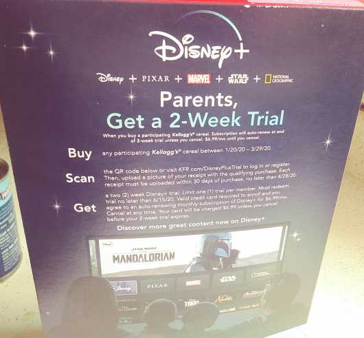
the back of a cereal box has never been the place for literary excellence but as a child I reckon I could think of few things less interesting than a big AD directed at my parents. I am no toucan sam apologist but the bird has some interesting colors.
The box doesn’t actually say what the monthly charge IS, another sign of a shifty, shifty business, so I had to look it up on my own, which means now every robot tracking me knows I willingly looked up information on disney plus and will gladly interpret that as me approving of it and a sign that it needs to shove more disney plus ads at me since plainly I am not getting enough unsolicited information about it.
The cost per month turns out to be is $6.99, which doens’t seem too bad, but Hulu’s lowest rate is $5.99. Although with tax that now comes to 6.37. Hulu of course has advertisements, but the point is mootly since disney doesn’t NEED ads since it OWNS everything it broadcasts, and furthermore ALSO owns hulu. This IS an improvement from ye olde disney channelle which DID have repetitive shrill ads for disney products and nothing else, even during programming designed to not have commercial breaks, but i suppose they figure with a slightly less captive audience who pay specifically for the access they can’t get away with that as easily.
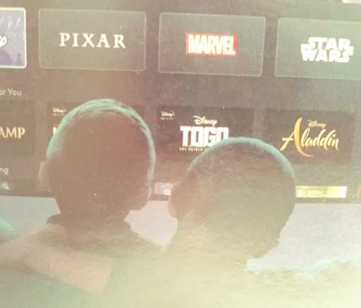
Immediately beneath Marvel Logo, the Series, is something called “togo.” am i really to believe disney has made a feature about Duke Togo, Golgo 13? Or is it a documentary about Togo, the African country where nemitz rigged elections? I don’t know and I aim not to know.
but ONCE AGAIN i looked it up anyway!
apparently Togo is about a real sled dog named Togo, and its primary reason for existing, as best I can tell, is to finally stick it to Balto, the also real dog who did slightly less than Togo in the same historical event but got more credit and inspired the Balto film series which while worthy of derision is notable for being a rare, presumably lucrative talking dog franchise that Disney does NOT own or get any money from, which they just aren’t having, here OR Togo.

i am not convinced that kid on the right is one of “The Original Harlem Globetrotters.” Something about him tell me he never won a basketball game by cheating or solved a mystery with scooby doo.
listen, this is a team which names bill cosby , henry kissinger the pope and the third-to-latest pope as official members.

this kid is no pope. consequently i conclude that he is no trotter of globes. I bet he doesn’t even trot mercator projections. In fact neither of the people pictures look old enough to be a pope or a cosby so presumably both have only joined the team recently.

speaking of kids that aren’t popes, These kids all have the same face, are not behaving in a safe manner, and the two in the middle aren’t even in seats. I presume these are actually demons in the shape of children who have been tricked and led inside what they believed was a bus by a wizard who sealed them there and now they smile and tell lies to try and convince you to let them out. Their transformation is incomplete as evidenced by their malformed limbs not yet being proportional to their heads. Do not be fooled! Do not buy their sun butter! For one thing, flavor cannot be delicious. FOOD that HAS good flavor IS delicious. Typical dumb ignorant unholy non-pope imps.
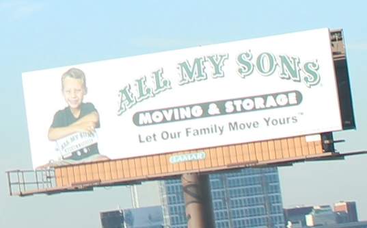
speaking of children that aren’t wizards, I don’t want these little kids trying to move my furniture and apart from that it concerns me that a sign board has sired or given birth to human children. This is even weirder than that narnia book about a horse that has “his boy.” from the perspective of somebody who is probably never going to read any narnia books beyond the experience alluded to in that link
promotion is not one of my primary skills! In addition to the readily apparent failings I neglected to say the times, 12-6pm, and to clarify that the “west campus” is not in new haven like the rest of yale but in west haven, though the text alludes to screwiness of the location and perhaps presumes people will use their personal machinery to look up the location like I had to. however, generally I assume that nobody I have access to on the internet has physical proximity to anything I might be doing so I only mention it at all out of anxiety over having been too busy preparing for it to show anything more interesting than mentions of it.


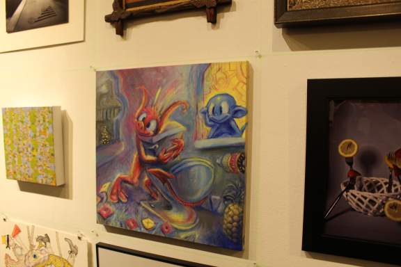
I hated this event but I did enjoy seeing people having serious conversations while nemitz was hugging a toilet behind them, which is probably the only thing I liked about this event the past four years.
This event being the annual City Wide Open Studios “member show” at Artspace in new haven, a location within 20-30 minutes of moderate car driving from where I am usually. Being a member just means you paid $90. I point this out becomes occasionally somebody wants to congratulate my involvement but honestly truly all it requires is 90 dollars and being able to get there to sign some forms. A few hundred people have 18×18 inch items set up on grids where almost nothing stands out and then every person is crammed into the floor space so that no valid human interaction can occur. I primarily paid for access to the actual personal large scale art exhibition I will be setting up at another location, yet still forced myself to give this one more attention than it deserved, except for in 2017 when I just reused 2015’s painting, an act which nobody else seemed to notice or care about.
I speak about this so negatively, you may wonder why I am involved at all, and that is because the $90 also gets me a room for two days at the Alternative Space Weekend exhibition which is in a different place, along with a generous assortment of those few hundred others and so far I have found that worthwhile. The painting of course doesn’t get to go there since it is for the member show, which is in a different place, and it is a weird size, too small to impress or control detail the way I like to, so every year I think “next year I won’t bother” but 10 months later when I feel like less of a wreck I think “eh it wasn’t THAT bad, was it?” and do it again. Maybe by “publicly” stating that I won’t, I will prevent myself from doing so. Although knowing me, I already did that and merely forgot. Although if I knew me better, I would not forget things like that. I should spent more time getting to know me.
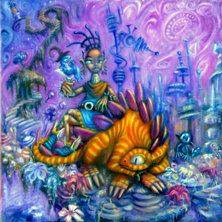
in 2015 i tried to impress with my painting skill.
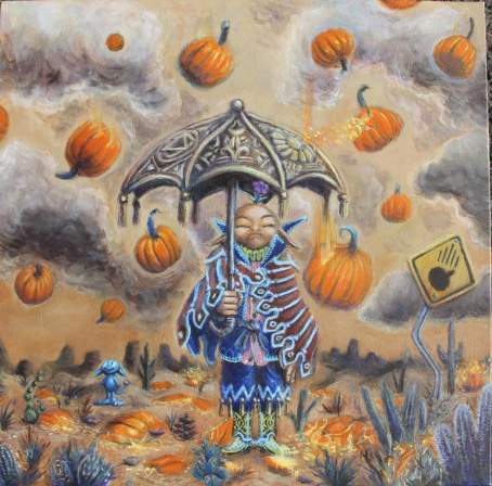
in 2016 i tried to impress with a picture that I know people always liked the digital version of.
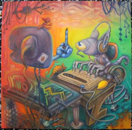
in 2018 i tried to make them laugh.
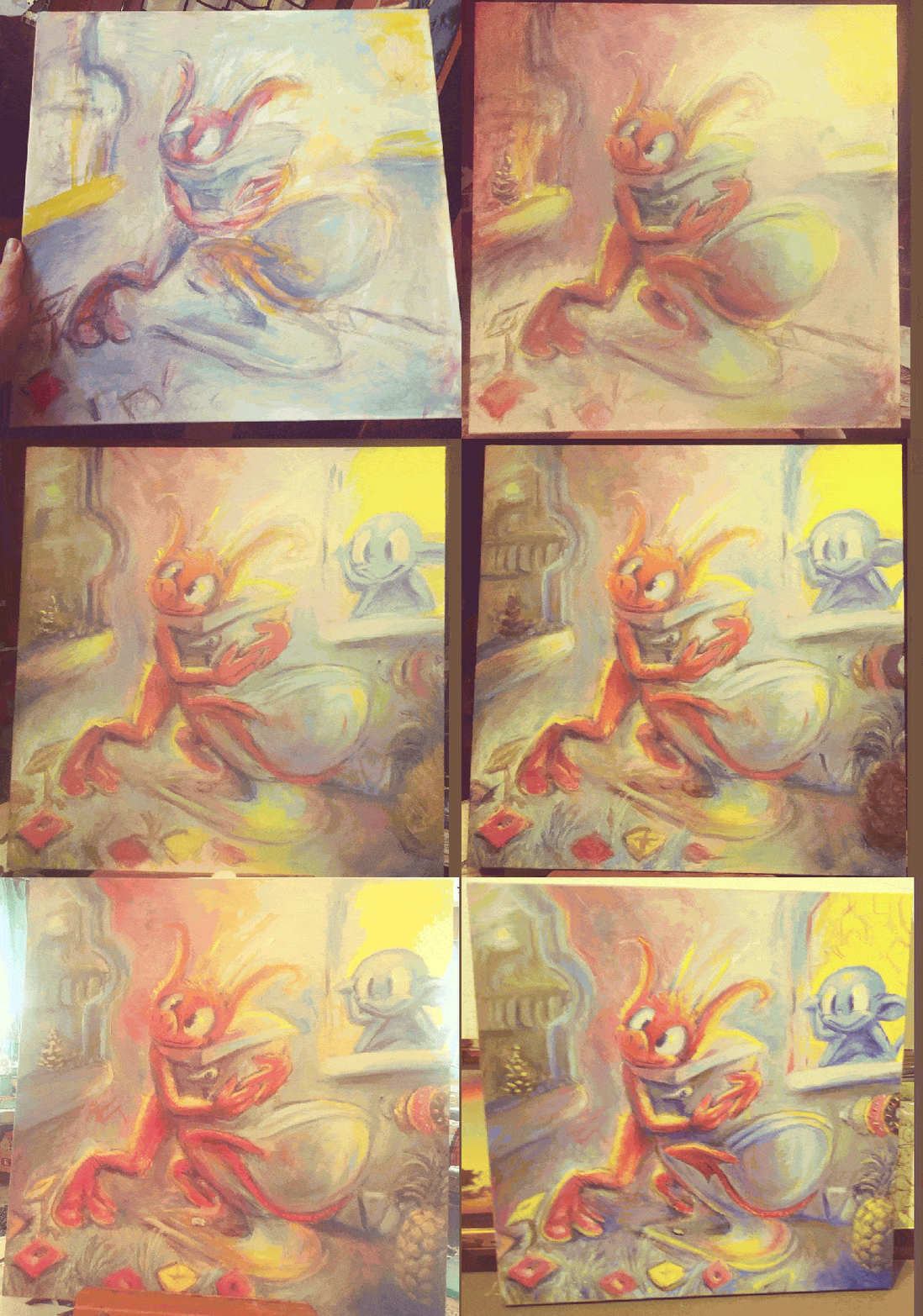
after failing to feel like I had been successful in the previous endeavors, this time I set out to annoy them,.
This is not finished to a degree that I like but considering that I did it between a friday the following monday night (the deadline) the time seemed relatively well spent; the fastest I had pushed one of these out and been done with it prior to then had been two weeks! If the crummy compressed gif works properly, it will be evident that nemitz (horrible red imp) was simple to paint, as I expected, but despite having the original quickly-done digital version as a guide I still misplaced the elements and had excess space on the right to fill, and made that harder than it needed to be!
Since almost all of my art is digital and NONE of it is optimized for a square… even though it used to be sometimes but I discovered none of the printing options I had access to favored squares, and likewise nobody sells hangable objects I could put a print into which would fill 18×18 inches well anyway, AND that I am useless at measuring, cutting, mounting and what-have-you, I have to seek out special 18×18 inch canvases and paint on them in my tiny little space which is not suited to painting. The nice acrylic paint I bought on past occasions which inexplicably is served in little toothpaste tubes almost all dried out.

However, the cheap 89 cent walmart paint rigid tubes i bought in 2008 for a terrible mural still worked just fine. What I found easily was lacking for a few colors, true red and something close to brown, primarily,

so I supplemented them with my 4.9-year old niece’s presumably equally cheap paint.
As noted, a few hundred people participate in the city wide open studios mess each year. Considering that I have to explain to each and every person I know each and every year that the painting I am working on is NOT for my actual art show I definitely wonder how other participants go about the matter. If not for the fact that it temporarily increases my scrap of legitimacy in the eyes of family members who do not consider digital art actual art (unless it is done on an apple brand i-pad by someone they know better) and by extension my scrap of self-worth, I really have no reason to bother! Also, the parking in New Haven is awful.
This time the dropoff deadline was 5-8 instead of 2-4 or whatever it was in the past. I figured after the designated “rush hour” of people leaving new haven, it would actually be easier to get into, but I did not consider that an even greater number of people from outside quite willingly go into it and take all the parking spaces within walking distance to this dump. I could probably handle even that but my inexperience parallell parking led a bystander that I initially considered helpful to offer to guide me through it. I forgot that helpful-seeming strangers are usually pushy nutworks who aren’t open to the idea that they aren’t helpful.
Go in backward instead of forward, yes, helpful. Wait for this car to pass before backing out every single time a car wants to pass: obvious and not helpful. calling me “dude” when you aren’t hulk hogan and “chief” in a manner apart from its historical function of acknowledging somebody of superior rank: not endearing. telling me “maybe you shouldn’t be driving that car then” when I am unable to keep up with his rapid “turn the wheel [this way]” commands because it got stuck for the first time ever because I guess it doesn’t like to be turned that much that often: I hate you. Reaching your hand through the window into my* car to point at [what I can’t remember or guess]: I’m leaving so I don’t start screaming at you. There was a less convenient street I could check for spaces which by that point seemed really convenient so i drove most of the way around the utterly 1-way block and went there instead.
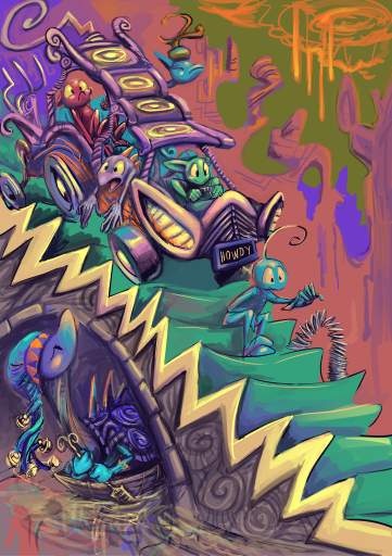
The secret to driving well is to not be stupid or angry.
on that page
older version
very older version
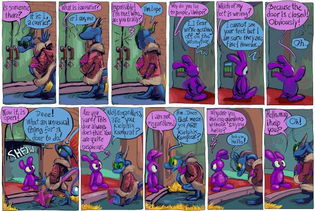
what better way to honor the recently ceased publication that was one of my major influences in artwork and comic strips than by removing the most blatant reference to it?
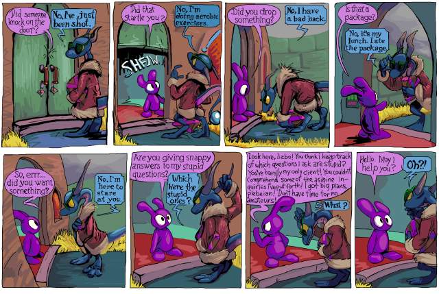
I wanted to renovate the text on a lot of older pages because somebody who doesn’t actually care about the comic that i inexplicably wanted to and thought that I COULD impress with a printed version of it, casually suggested to me replacing the hand-drawn dialog with fonts, not aware that I had taken considerable effort replacing fonts with hand-drawn letters. It prompted me to obsess beyond any past level over the legibility of the text in the second book. And I thought while I was at it I should deal with this old thing.*
I have seen some people (other than that one) in person enjoy this section, after being indifferent to the first few pages, but while it works for pog, overall it is terribly out of character for lope, especially when i introduce the concept that without its hat the pitiful lizard will not take bold action. I had worried about this prior to the first printing in 2015 but eventually decided it did not matter. However the more i saw it the more it mattered to me! At last year’s alternative space weekend art show, I was telling people who laughed at that page that it was out of character! As if I didn’t WANT them to like that page. Soon they will not be able to! Ha HA! That means I win!
And then for christmas last year a different person who I don’t know offered the first criticism of that page, which was enough to finally inspire me to remove it. But looking now I see that he is only criticizing the number of exchanges and not the logic of that sequence of exchanges! The person also called the package “the MacGuffin,” kumquat “the main antagonist,” and pog “his side kick” even though each of those takes longer to type and say in addition to being less specific, and maybe I should not give too much weight to what he says, positive or otherwise. But something good came of it which is what matters [if i am a reasonable person, which i am not]. Also up to that point I always thought of kumquat as the protagonist of that section. Being told the opposite does not mean I have to change anything but it gives me rare insight into how other people might interpret a work that I wrote so long ago that its content has become in part abstract to me. Except on this one one part that I specifically worried about. It works better in an inconsequential pencil drawn comic strip made without a plan, before the lizard was assigned a personality or existence outside of that minor role.
I also ended up having to remove a view of the door that I really like, in the frame where pog says “did you want something?” but obsessive compulsion of course has made this a referendum on the artwork as well as the text so I end up changing a whole bunch of pages, again, I may [mentally un]well end up replacing a blander view of the door on another page with this one.
On a later page pog alludes to one of lope’s comments, saying “didn’t you eat the package?” which i now also had. I like that line; it only works BECAUSE the question and answer part is so inappropriate. Outside of that interlude it makes no sense for lope to claim to have eaten the package, and it is possible to imagine that you only imagined seeing lope say that, or retroactively interpret that as a silly thing that didn’t “really” happen, like when I show inanimate objects talking or transforming between panels, and directly acknowledging that sort of thing is an act that characters apart from pog could not commit without being distracting, and now pog cannot even do it! Tragic!
I have a personal “rule” that no significant part of this comic strip should be dependent on a person’s awareness of other media. On a much later page, elpse mentions “an ethnic sidekick from a lame Indiana Jones ripoff,” in foreground dialog, but no other character acknowledges that elpse said that and it has no bearing on anything else, though I still may drop that line when I get to reworking that section simply on the basis of my personal assessment that the indiana jones series is rife with lameness and unoriginality already and more importantly my not wanting to imply that elpse, it of green and greenish skin, has a perspective on what is and is not ethnic in movies that don’t even exist where it comes from, EVEN THOUGH to ME it is obvious that the INTENT of the line is to have be implicit that the ethnicity of the sidekick is relative to the protagonist, which in the case of Indiana Jones is definitively established, ethnicity and protagonistship both.
Howdy.
*And also replace every instance of “keilphix” with “kielphix” since the second way implies a more accurate, kielbasa-like pronunciation even though i no longer like that name at all and have shown kumquat being annoyed by it on newer pages, which of course means it cannot be changed! Even though only a few pages earlier lope announces that it changed its name from scragthrax so it seems like I am being redundant by having two characters that dislike their given names. However, lope, who is a little bit like me, definitively changed its name, whereas kumquat, which is much more like me, would not commit to doing so, and I likewise have not! ALTHOUGH kumquat lives outside of the law of any remotely functional society and really could call itself whatever it wants, but I only need to think further than hypothetical people who might criticize the comic strip, not ahead of myself thinking ahead of myself. But I will anyway so in four years I will probably change every pertinent page again to have an entirely different name than kielphix and also have kumquat not be annoyed by it.**
**Howdest.
Did I have a broken video here for the past 5 days? I thought I switched it to one hosted on my own space but I must not have saved that. Whoooooopth.
////////////////////////
A person identified as pinderhooks recently alerted me to this. Somebody uploaded the full film without permission from the copyright holder Pulse Distribution and I then likewise edited it without permission from that person.
“Hercules” is a low budget cartoon from 1997,that probably has only about a standard tv time slot’s worth of animation which is stretched, sometimes painfully so, out to 48 minutes so it can occupy an hour block and present itself as a feature film instead. I assure you, the cutting room floor was EMPTY. Everything they had went in here and it still wasn’t enough. Consequently its most striking feature is the profoundly horrid editing; at points there is up to 12 seconds of no/barely any motion before something happens. It has a look like it is animated by the company which did robert smigel’s “saturday tv funhouse” cartoons with assistance from the cdi-Zelda gang for closeups. The only indication that you are seeing the film as intended and not an insulting edit like this one is that the music keeps playing and playing and playing unbroken. I really should have had the sound muted while making this since that dorky trumpet fanfare is haunting me now
I watched it once and had the terrible idea to cut out and assemble all the stupidest parts. Completely on a whim when I have obligations stacked higher than the person who storyboarded this I decided to spend several days making a cheap movie that nobody cares about look even cheaper and less worthy of interest. I initially endeavored to maintain the spirit of the original cut when altering the film but when it came out to over ten minutes, nearly a quarter of the full film’s running time, I wondered if it would even come across that I didn’t extend the length of those scenes myself, and in the event of such a perception, why had i chosen the most boring parts to do that in? Somebody thinking sensibly could probably get this under nine minutes but every time i go looking for stuff to cut out i remember another thing from my initial viewing that might be worth squeezing in there. Somebody wishing to only show everything important and not waste time could probably get it to five minutes.
At times the film resembles a bad stage play, in which actors struggle to remember their lines or read off of cue cards. I wonder if the dialog was recorded live, like an old popeye cartoon, with the actors watching the cartoon and waiting for the right time to say lines, but with a considerably lower production budget and no ad-libbing. At one point you can even hear a character, the boss hydra head, start to say “oh shut up” while the character is off-screen, then seemingly realize it, and wait for the scene to change to complete the line. It is not in this edit; eventually I considered that the significance of that would not come across due to all of my deliberately bad editing.
There are a few moments which could be seen as vulgar and uncharacteristic of what I usually produce but once they suggested themselves to it seemed pointless to not use them. They are vague and might not be apparent anyhow.
I do not actually hate the film, even if Hercules himself is dull and conspicuously beardless, since the primary marketing strategy for this sort of product was to get their product mistaken for the disney version, even if the actual content is quite different, and that second fact works in its favor, I think. Apart from calling every character by their Greek names except for Hercules, but that convention predated Disney’s version. Eurystheus’ voice amuses me. There are numerous bits of weird animation and dialog that I like just as they Are. The film is broken and confused, and I relate to that. It screws up and skews the myths but not to the banal extent that disney did. Hercules, as a “hero” who murdered hundreds of people, including his first wife Megara and their children, and had considerably more male lovers than female, chief among them Iolaus, his companion in this film and nephew (and also recipient of Megara as a re-gift-wife in versions of the story in which Hercules only kills their children and not her), is never going to be a g-rated 1990s role model for children. Hercules’ murderous fit of madness is actually alluded to in this film but you only see a ruined city and it is said that only one person was killed, and that person is not even really dead.
Everything i know about the disney version is from contemporary advertisements for it and a description of Danny Devito’s character that I read on a burger king cup around that time (as with the nuggets, Burger King didn’t bother to not give the cartoon-branded products to regular customers) and what I read on wikipedia just now, but I know it depicts Zeus as monogamous and Hera as Hercules’ biological, non-hating mother. Zeus’ infidelity to Hera and Hera’s utter hatred for Hercules is at the very core of the Hercules story. And making Hades the easy bad guy dumps all nuance of just what the god of the underworld is. He isn’t Satan: he does not buy souls, he doesn’t trick people, He isn’t evil, he just happens to preside over the dead. The Greeks had this idea millenia before mopey nerds started obsessing over the idea of misunderstood sad monsters. Mopey nerds who of course only consider the disney versions of anything so they think this concept is new. Hades does covet the souls he has and takes revenge when people try to cheat death but all the gods are covetous and vengeful. Anyway Hades does not appear in this Hercules film so that is unimportant.
why did the people who did graphics for 8 bit games think this looked good? it didn’t!
have you ever seen a drawing by a small child, where most of the background is white but then suddenly there is a strip of blue across the top? this reminds me of that. but i excuse that. to them, the sky is blue, and the sky is UP. anything beneath that varies.
But an adult getting paid shouldn’t think like that. Hey, the sky is not suddenly weird and different after you go up a certain height! the fact that they almost always happen right at the top of the screen makes them much worse. It seems like that is the end of the universe. most likely this is only done because that is the only way to ensure, in games with only one background layer, that the lines never collide with background objects that need to have consistently colored backdrops. Usually the player character can’t get all the way to the top of the screen so there wouldn’t be objects up there. But that doesn’t mean it looks GOOD!
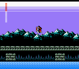
Konami’s castlevania 2, my first encounter with lines. they contribute to the creepy atmosphere, I would say beyond anything else. The secondary title is “Dracula’s Curse” and I consider the mysterious appearance of the lines to be the primary indication of the curse.
It is a more extreme stylistic liberty than anything else in this game. castlevania 2 is supposed to be totally serious, and that effect is so strange. Thankfully Simon Belmont is never at risk of touching the lines. Then he would truly have no hope.
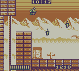
Aw naw! In Castlevania: the Adventure, for gameboy, Christopher Belmont can indeed TOUCH the lines, and live! However his sluggish pace and awful controls may be indicative of lines-poisoning.
from this page
“the iconic two-color sky gradient. Just wonderful.”
the only definitive evidence I can find of somebody acknowledging it is sedate and positive. Where is the outrage?
Yes sure that guy makes almost three thousand dollars on patreon and i do less than fifty but that is because i am saying what others dare not.
Does it look like a gradient on certain televisions? do the light and dark, at varying levels, blend to look more like the blocks common in early snes games? that was never my perception. It was always just LINES to me.
The fact that nobody else noticed the lines or mentioned how creepy they were also amplified my fear of them. When only YOU are scared of something, that makes it scarier, since you get no sympathy or protection.
Lines were even on the konami BOXes of this period. In fact I could only hold one of these boxes in such a way as to not touch the lines. Maybe the effect was chosen to give the label art a feeling of urgency and dread.

I presume jack gets jumped by werewolves if he takes too long to putt.
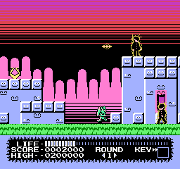
monster party had some of the most egregious lines of any video game, even if they are all seen before the second level. You would need to torture yourself to get to the second. Of the three credited graphic artists, mobygames (which is ALWAYS right) suggests only one worked again, Taka Saito, who next toiled on “The Adventures of Gilligan’s Island” and THEN stopped. while the adventures of gilligan’s island lacks the lines, it also lacks any adventures on the part of the island.
I first encountered Monster Party when a rare instance of child-hud era friend whose house I visited regularly had rented the game and all I noticed or remembered about it was the creepy lines, the unintentionally (presumably) creepy background music and how impossible control it looked. I do not recall attempting to play it or being offered the option; it may just have been present incidentally. This was the same friend with whom I co-created Joey and Ian Gettin’ Dead, about our two younger brothers, and it is entirely possible that Joey was using the game and and only gettin’ dead in the context of the game’s terrible controls and the low threshold of abuse that corresponds with the onset of what is commonly considered “death” in video games.
I was quite surprised years later to see monster party mentioned on the internet with regard to how zany it was and how heavily censored it was from the japanese version. I couldn’t believe people had really gotten past the first level, much less willingly sought out alternate versions of the game in which to do that again, and had anything to say about the whole thing unrelated to the lines.
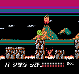
this is similar to monster party’s; gratuitous and coming out of black, but i don’t mind it as much here, possibly since this game is actually fun and has good music.

megaman 3 has this intermission screen but it is balanced out by having lines going the opposite direction so the effect seems more cylindrical and not implying that they are representative of the sky.
and so after 3 games safe comes megaman 4 aka megadope, a terrible graphic hack of megaman 4 that I made for no reason at a time of my life when I did a lot of things for no reason, unlike today.
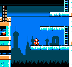
the lines are so intense that even megadope won’t smile at them.
Bear in mind that on an actual 1970s-80s television screen wouldn’t necessarily be able to see to the actual borders of the display. That generous area of uniform color at the top in a lot of these here might be in practice much smaller.
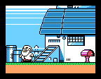
megaman 5, dr right knows something terrible is about to happen since LINES have attacked his home. although these lines appear in the middle of the SCREEN, the introduction sequence crops the view to just the middle of the screen and the lines are still at the edge of the visible zone! And the “generous” area I alluded to is not allocated here because it is not meant to be seen!
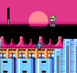
megaman 6 brings back the lines yet again but finally puts them in the middle of the viewing area where i can handle them. it still doesn’t make SENSE since the only things that should be black in front of it would be scenery at the horizon which the sun would be setting “behind,” which i suppose would be the rocks but they are separate from and beneath whatever is black here.
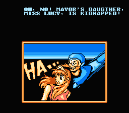
this isn’t a megaman game at all, it is an unlicensed chinese game about a little guy who throws boomerangs that they pretended was megaman to try and trick people. in which event i would ask why not just use the full megaman game if you undervalue your own work so much but whatever the case, there are those lines.
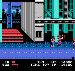
actually I like the one in double dragon since it simulates a perspective and uses its whole, limited space. only by chance does it go to the top of the screen.
double dragon uses it in all 3 nes games, but each example is unique and artistically done. Even double dragon 3 which is terrible in every way. other games will reuse the lines across large spaces in a manner similar to each other.
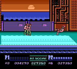
not as interesting but at least the presence of the sun implies a reason why the sky color would shift considerably in a small area.
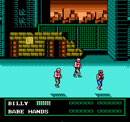
however these look like apocalypse lines since they go into black. the sky above a sunset is not black!
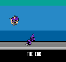
darkwing duck! ending. These at least are neutrally placed and have more than two colors.
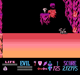
not on the sky, but needlessly near a screen border. as a small child i did not understand what this weird substance was that kuros could walk on but be damaged by. but it didn’t matter since you have unlimited “lives” in this game. as a slightly less small child i realized it was lines and became more afraid of touching them than the meager damage penalty could bring about.
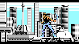
Power Blade! It of course gains its energy through power lines but THAT is not what i meant! Also the lines blatantly go behind a non-rectangular object which means they could have been placed further down in the image so they looked less creepy.
a brief collection of games that use it more neutrally
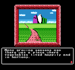
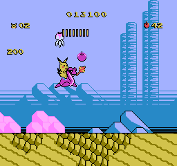
princess tomato’s very first scene. fairly tame! really not threatening at all, but I sure REMEMBERED this was here for years after seeing a picture in, again, nintendo power magazine. I remember thinking it was a racing game at first.
adventure island 2 has lines going UP. when i saw pictures of this in nintendo power magazine it bothered me but i can handle it now
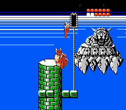
rygar falls somewhere in the middle because the lines are scary, and it goes into space, and I was terrified of this screen, but I was creeped out by the weird face foremost. I didn’t even realize it had a body. I would see it when i closed my eyes. I was SCARED of that thing. As for the lines they go into white, and then abruptly to black, and it is just strange.
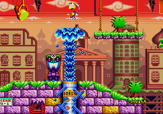
dynamite headdy uses lines extensively, but they are often dithered which makes for a less harsh effect. Even when they aren’t, there is lots of other stuff going on and there are always intermediate colors. the clouds being larger above the lines creates a mild perspective effect which make the lines seem more like curving of the atmosphere above us in the distance than the end of the world immediately in front of us.
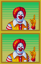
treasure land adventure also uses many lines but that is far from the only unsettling thing going on
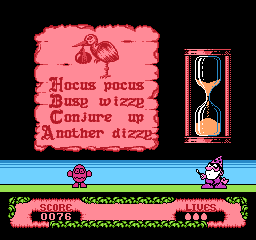
fantastic dizzy. terrible game. don’t believe british 1980s computer nerds. they are sick. everything in the game maims dizzy, you only get 3 “lives” in which to win a game as long king’s quest 5 with as fragile a hero without saves or even intermediate goals to use as personal concepts of progress. these creepy lines, mercifully on this slide puzzle screen only, are about the only thing that WON’T destroy dizzy.
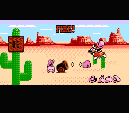
right near the edge! why? and this is a game that otherwise uses its colors really well to add a lot of detail to a fairly simplistic world.
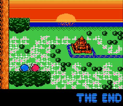
adventures of lolo 3, also from the Hal Laboratory company. They used their mad science to devise a way to put the sun BEHIND the lines. It actually comes down from the top of the screen and the lines never change where the brightest point is nor move aside to let the sun in front. The neat effect of the water starting to reflect the sun as it appears closer is meaningless because the lines are so incorrigible. They really have to go.
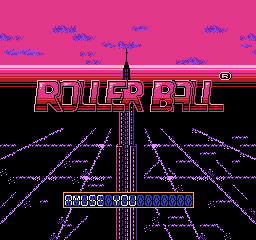
Yet another from Hal, Rollerball. This one is really odd in that the upper edge of the lines leads to a color that matches one of the interior colors, so possibly this is supposed to be the edge of the horizon, yet it couldn’t be because the vanishing point is about midway up the second R in “roller.” The only conclusion to be made is what I have been saying all this while, lines are bad news.
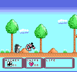
this is the very first stage. unlike monster party, this is supposed to seem welcoming. there are animals out to destroy mickey mouse but you aren’t supposed to be afraid of them. not yet anyway.
this game was localized as “Kid Klown in Night Mayor World” since it was published by Kemko and Capcom had exclusive rights to release disney video games internationally at the time.
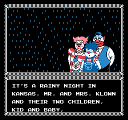
there is something deeply wrong when you have a story about a kid who is a klown, with a k, from a FAMILY of capital k-klowns and i still find horizontal bands of dark blue more upsetting.
Kid Klown is also noteworthy for having loads and loads of intermission text which doesn’t explain any of the things that need explaining.
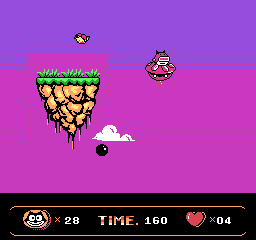
a very capable alternative to lines oddly enough occurs in a bootleg felix the cat game. Which is not to say this game is good or that there aren’t better things that could be done with all this space.
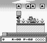
mickey mouse again! and not even the same developer. Mickey’s DANGEROUS Chase by capcom. Which I also only know about from nintendo power
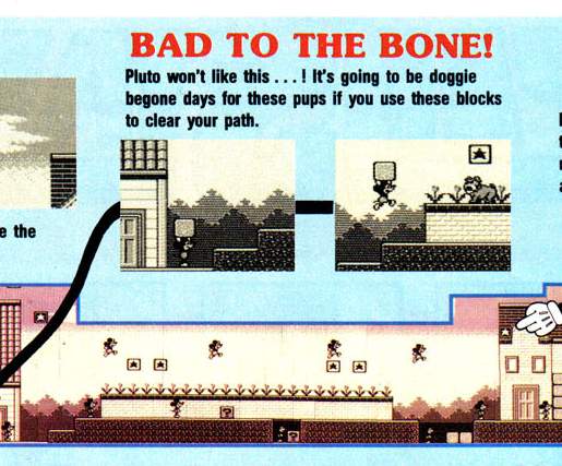
i couldn’t figure out why that effect was in some screen shots but not others. now i see: the screen scrolls up to gradually reveal it as you progress, which is unsettling in its own way. even though these aren’t LINES, the color difference is high and this really doesn’t belong here. the presence of the word DANGEROUS in the title (and apparently only in the US release) and the blood-like red tint may also have had subconscious effects on me.
also unsettling, nintendo gives full maps for the first, easiest, self-explanatory levels and wimpy paragraphs for stages you might actually need help in.
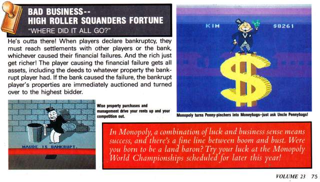
scrubbo in the same issue, this i totally forgot about. Again not lines but creepy with the same intention. It looks like the monopoly guy is about to be abducted by aliens or crushed by a meteorite, nevermind the trauma caused to anybody in those barely visible purple houses in the distance who would see an enormous self-illuminating BACKWARDS DOLLAR SIGN. Also Nintendo Power gave six pages of coverage to this.
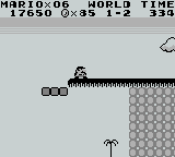
this can’t be too far a drop since there is a little tree down there. surely it would be SAFER to go that way!
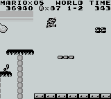
but the lines abruptly end so they aren’t real, right?
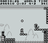
I am uncertain if these are supposed to be lines with the same intention. while this is indicated to be outside, there is a pattern ABOVE the lines.
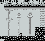
also an earlier level uses the exact same 8×8 pixel tile as something like a support beam for a fancy place that is plainly meant to be INSIDE. Lines have no power inside.
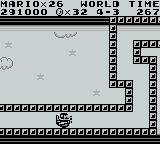
oh no more creepy lines, undeniable this time, going into BLACK, consuming the clouds, and i have to TOUCH them! Or Mario does. I sure am glad I am not mario.
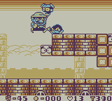
Always the ne’erdowell, Wario tortures a creature by making it touch the lines.
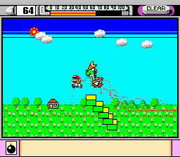
In the demonstation mode of mario paint you can see somebody CREATING the lines! Somebody making the deliberate decision to add this. And that may be the only super nintendo game i have seen it in, at least as far as the creepy top-of-screen usage goes
The mario paint example is curious because it shows the sun amidst darkening. would the sun not cause a lightening?
a number of staff was shared between mario paint and super mario land, super mario land and wario land, but nobody was on all three games and I would be reluctant to point at any specific person for this.
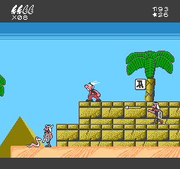
the first two game worlds do an admirable job of recreating the sort of skies that uderzo put in actual asterix comics then suddenly in egypt it gets this hokey effect and bright turning abruptly to dark. instead of creating a feeling of vastness it is an eerie claustrophobia. and look at all that grey space at the bottom edge of the screen wasted! if they put that ABOVE the lines and made it the darker blue it would… STILL be too dark but it wouldn’t be as much of that weird edge effect. They also could have opted for a more subtle color changing effect across a larger area.
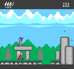
here earlier in the same game, that is actually pleasant and one of few things in the game to evoke the source material and not just look like a quick cheap crummy licensed video game created by a company chosen because it was European and no other reason (“Bit Managers” in this case). Ironically it is a possibility that a similar cloud formation was the original visual inspiration for the lines, which i say based on having seen even more line-like clouds and wondering if those were the inspiration for lines.
I will say that a co-founder of the Bit Managers company, Alberto Gonzalez, did ambitious and well-programmed music on the better but still horribly misguided super nes game “Asterix and Obelix” that they also developed. He was uninvolved with the first Super NES Asterix game which seems to be based on the same design document as the nes one with additional questionable decisions but at least lacks the lines.
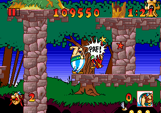
In the interest of making this more confusing, here is the superior if still impossible Asterix and The Great Rescue on the Sega Genesis, developed by Core Design, better known to people other than me for making the Tomb Raider games. This uses sky-lines but in a relatively innocuous manner. Don’t tell anybody I rented this in 1992-3ish and couldn’t get past the second stage because I didn’t know you could make little platforms appear for jumping on.
It also has better music than a crummy licensed Europe game deserves, and I can’t think why the followup Asterix and the Power of the Gods is full of dinkity synthesized awkwardly looping covers of public domain cliche “classical” dentist office music beyond that somebody found out they gave a crummy licensed Europe game better music than it deserved. That apparently is the power of the gods.
lines in real life:

chocoteague virginia, the shadow on this boat railing

mystic connecticut: look at this orange arrow on a sign

deviantart user domobot posted this image. similar to mario paint there is a sun but the light part is NOT radiating out from it! Also the creature appears to be wearing the legs-sticking-out-of-the-ground from the Monster Party screenshot
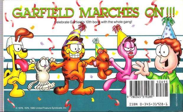
garfield makes it big, back cover. This is also the same book that featured the inexplicable traumatic head-first dropping garfield horrifying cuckoo clock reaction. (the linked page describes another instance of it happening and then briefly mentions garfield) Garfield is suffering from a similar ailment to the batman bee, in which oversized eyes enter into space conflicts and the artist doesn’t care, resulting in sketchy facial expressions. Arlene can wear the hat properly. However Arlene also suffers from shoddy tsereotype design traits and i presume the hat doesn’t want to mess with them. Also troubling and artist-not-caring-related here is that most of Jon’s body is missing. The other characters have their feet below where Jon cuts off so it isn’t like they reached the edge of the document space. I presume his body was sliced in half by the bar code sticker and the blue substance is actually his alien body matter spilling out and creating the lines as a punishment against humanity, until crummy merchandise and eventual braindead hipster memery could grow into adulthood to avenge him.
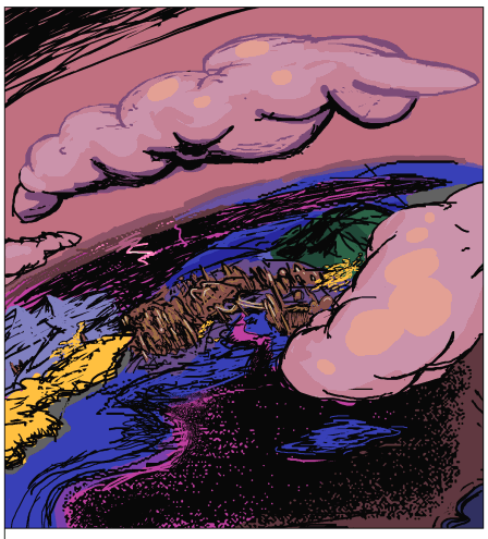
I found this in another terrible comic strip, thankfully i cannot remember which but whoever is responsible for it ought to be in jail.
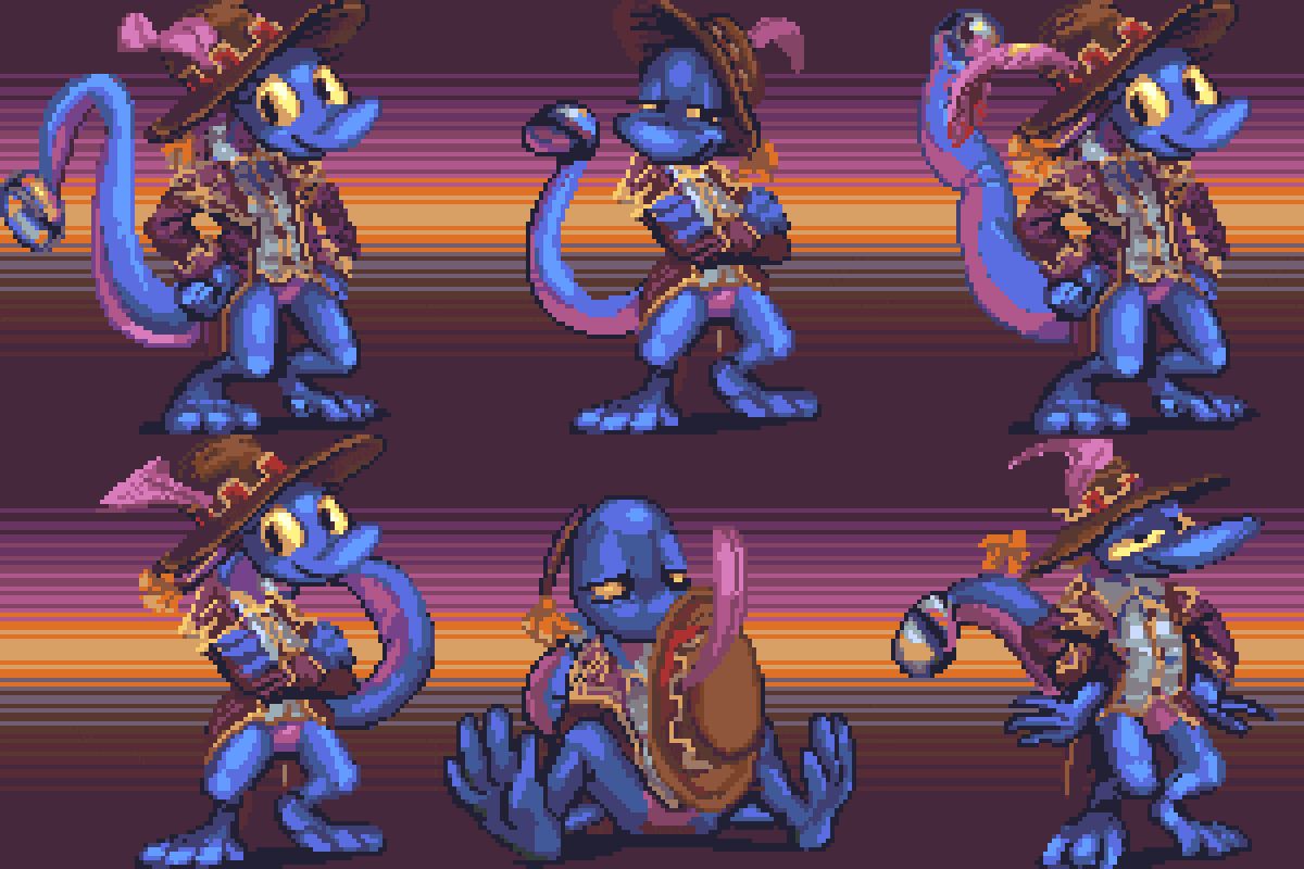
there may be many people who need to be in jail but i would at this time request separate jails.
