the NEXT page should be available before july 19 ends, but I also thought that about July 15, which is why I didn’t say anything.
//////////////////////////
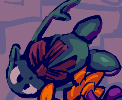
page 60 of this
possibly you will be disappointed but it was necessary. I can change the specifics at a later point (as I apparently have done with the scenery in this room numerous times), and to a degree before the next page. somebody I last saw 11 years ago and who no longer exists in any form I am aware of told me never to show this but
that person later also sternly reprimanded me over tumblr for my complaining about excessive quantities of unremarkable nearly identical fanart units and built a shrine to a team fortress 2 character in its home and so I generally do not regard its opinions highly
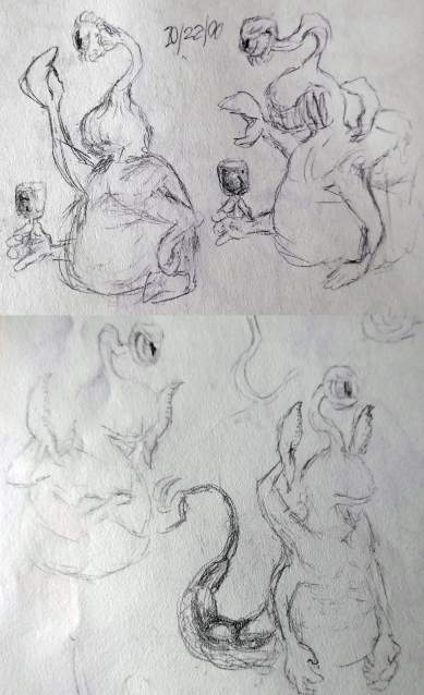
the “original” design for this character, when identified internally as “pico de gallo,” before I decided on traits that will not be evident until the next page, called for it to have a single eye stalk. However now that Gidjmerg exists and also has a single eye, even stalkless that makes them seem more related than they are. It was also rather bulky but it looks too jabba the hutly the way I tried and decided against here. apart from any of that I don’t want to add more characters that are hard for me to draw, however infrequently they will be seen.
this character didn’t necessarily exist in the old comic strip that kumquat’s ancestor and pog came from, but I also remember drawing it holding a doom chaingun back when I thought that was a “cool” thing to draw. Almost as much as holding a wine glass, even though I had no desire to drink wine and 20 or more years later I still haven’t.

I also drew proto-kaklabesk holding a wine glass, in one of the very few surviving fragments from my earliest doom edits, which is perhaps why I ended up putting its weaponry in the same category. I couldn’t find the chaingun drawing in this sketch book, but I did find numerous pictures of
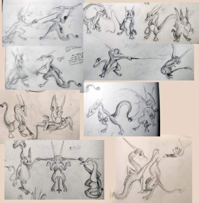
proto-lope physically assaulting nemitz which hopefully is all the information you need about how my thinking has changed since then. I can’t say nemitz doesn’t deserve it but lope simply isn’t that dangerous.
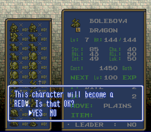
Somehow it is hilarious to me, in the video game Ogre Battle, that lacking space to spell out “red dragon,” owing to differences between Japanese and English writing systems, the localizers opted to just include “red” followed by that dopey dragon face icon. They could have written “R.DRAGON” and everyone would have known what it meant! But THIS I can’t take seriously! I am only thankful that the regular dragon at least spells the word.
curiously the game’s font has been extracted and uploaded to this page, which I know because for some/no reason I was LOOKING specifically for that specifically to see if that silly dragon head icon is included, and it is NOT, even though the actual game rom’s graphic data
puts it right after the letters, which I determined using Tile Layer Pro. YES i used rom hacking software i haven’t touched in nearly 20 years just to get a clean look at that stupid icon since I haven’t actually played this game. I don’t play video games anymore, generally; it takes too long. Now I watch other people play them –as it happens, Ogre Battle is one of the rare games where my participation is nearly as active as the actual player’s– to keep me from checking my messages every 7 minutes while i try to draw things, or to keep me from considering that my body is past its prime and I am tumbling toward death while I walk in circles in the basement here trying to burn off calories from all the garbage I eat since eating nonsense is the only thing I enjoy and I still delude myself that I can eat it at the same rate that I did back when I played video games and hacked roms and not suffer ill consequences. Then i realized other people for whatever reason have placed downloadable save data for Ogre Battle there so I can in fact take a proper game screenshot rather than blurry ones of youtube videos.
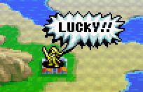
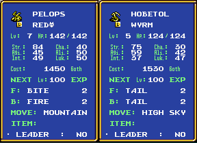
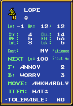
what REALLY makes me mad, is this dumb “wyrm” that has a lower level and lower just about everything else, and LITERALLY ALL it can do is exhibit its dumb tail at foes, and it DARES to try and charge MORE goth money than a REAL dragon.

just LOOK at how STUPID that is! they have sharp teeth, they have FOUR sets of claws, fairly pointy wing-ends, the chance at dignity of NOT having a dopey lizard head icon in their fighting class name, and THIS is what they choose to do! and they are QUITE proud of themselves.
that is like the kind of attack “lope” (the annoying lizard from my comic strip) would do
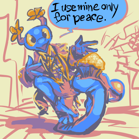
ARRRRYRHGHGHGHJ I am leaving before this gets ANY stupider.
I already left! This is someone else’s problem!
4-28-2022 340am: a very stupid week. the video is ready-ish but the website post attempting to justify it isn’t and thursday is going to be as messy as it is thurs.
///////////////
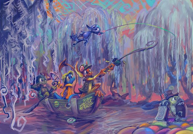
looks like a good day to stay inside
as is generally the case with these, you may click at it to attempt to load a larger version if you are into that sort of thing.
I made this with a mode in the clip stupido paint program that remembers every single stroke I took which allows it to create a time-lapse video of the construction. Unfortunately this feels very watery in the wrong places and rather incomplete, but I am not capable of making it more complete at the moment, so I wouldn’t want to exhibit such a video for any other purpose than to show the bizarre non-linear way these things come about. Nonetheless I shall, but I haven’t yet!
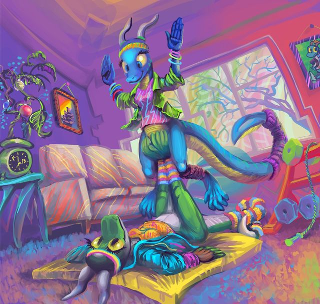
a robision, possibly finished, but not necessarily. for Grom-PE (keeper of the blue lizard) and Casas (with regard to the green, and who may also have drawn the pose sketch and later showed me what furniture should go where), because that is in fact the most coherent thing I have this week that I might exhibit here without needing to explain it further. In which lizard people do something strange, because lizard people rarely do anything sensible, if their choice of frameable folk did not make that clear.
not surprisingly a number of the “free sketch” recipients from a few years ago eventually lost interest in what I was doing apart from free stuff, or never had it to begin with, especially when I was unable to reciprocate such an appearance of interest. Obviously I am not entitled to attention but my sensitivity to the matter defies the obvious. Since I already had the poses and colors laid out it seemed worth the bit of additional effort to change the characters into my own morons, thereby letting me upload them to try and get attention a second time and also receive a spiteful catharsis that a reasonable person might not have thought necessary.
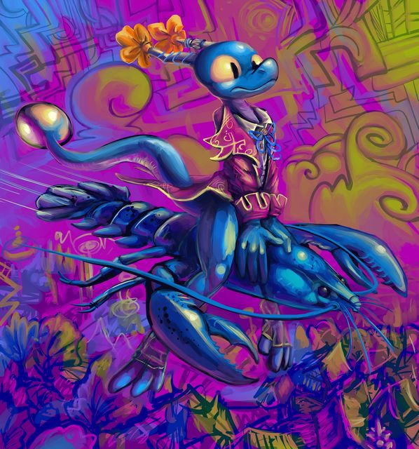
a lobster which looks to be pretty good at what it does is ridden by a lizard-like being that is objectively terrible.
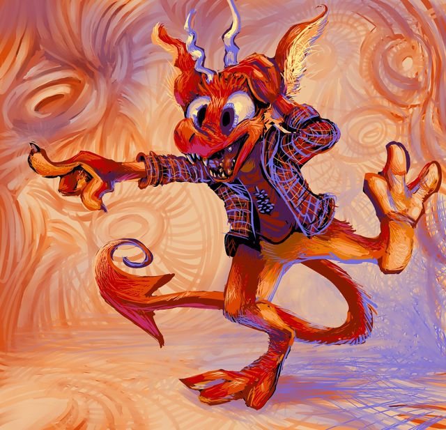
nemitz don’t forget that for every finger you point there is eh one other finger pointing back at you.
that dreadful mitz was also in this group. nemitz is a functional substitute for most dork anthropomorphs that stand around pointlessly and smiling since that is what nemitz does best.
I started to explain why none of these have elpse in them and it got surprisingly complicated so maybe I will get to that next time, which typically means “save that part elsewhere and forget about it and probably be better off for having done so.”
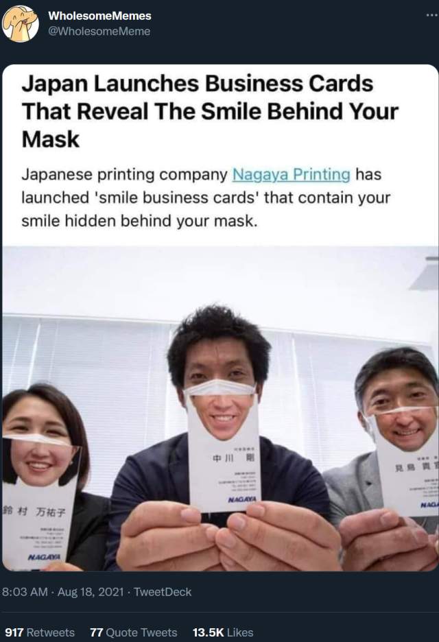
This isn’t wholesome, this is loathsome. I hate any company trying to turn a profit by selling cutesy pandemic-complacent garbage. To be fair almost everything on the wholesome memes page is cutesy and or complacent but I think this one is excessive. Even the specific wording “the smile beyond your mask” puts me off. What kind of weak-willed subjugated dork would buy this?
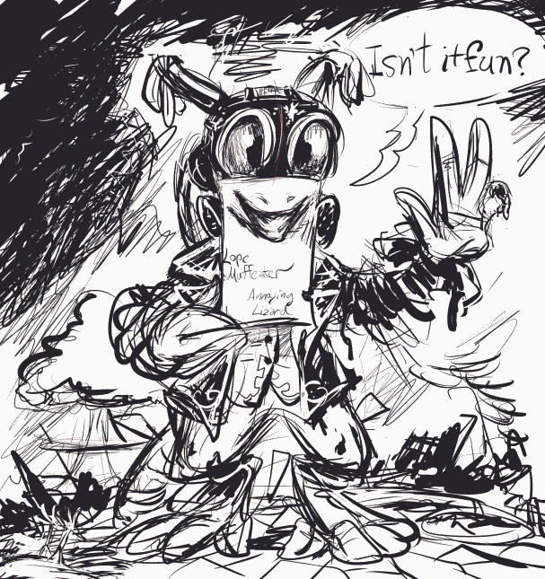
eh it’s no one I admit to knowing.
ALSO the most recent comment gidget on the sidebar is still broken and the actual comment display is still ugly. I expect they will be for a while!
//////
9-10-2021 yeoiks the artwork posting sub-website is even totally broken. What HAPPENED here?
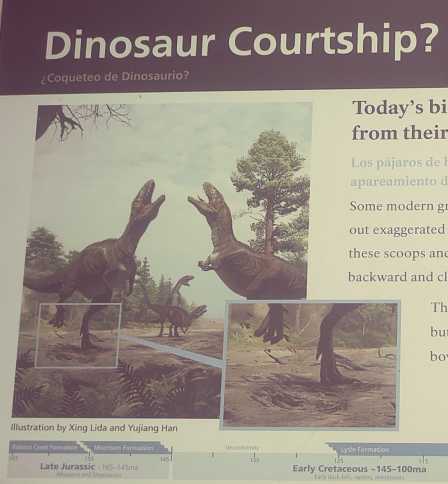
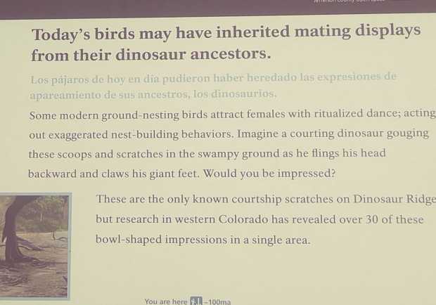

ABSOLUTELY NOT.
I am TIRED of DUMB LIZARDS stOMPING all over the place doing TERRIBLE DANCES and shoving their STUPID FEET into my business thinking that they are talented and welcome.
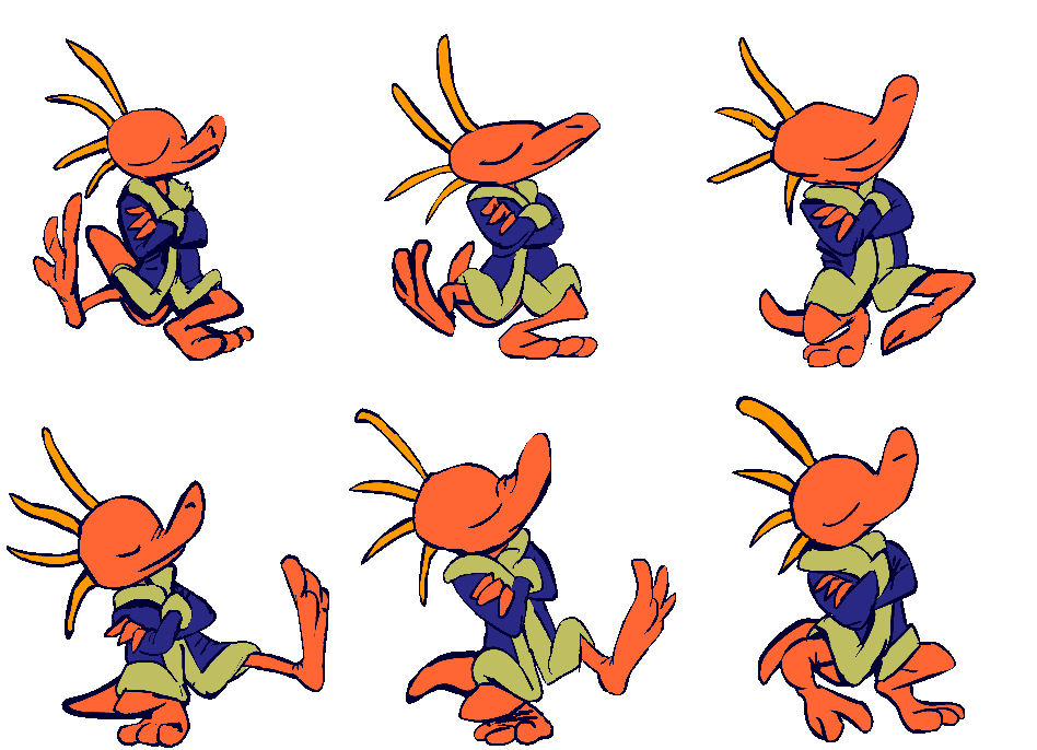
They aren’t!

AND that stupid box highlighting where the feet are is quite stupid enough without the zoomed in shot of it. Who do these reprobatiles think they are? I am fortunate I haven’t ever had to deal with-
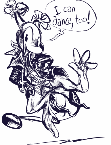
ARRRRRRRRRRRRRRRRRRGGHGKGKGKGJGFheap
bimshwellian comic strip page 3-44 featuring some rare views of the weird tv thing here, one more component of the room “designed” on a thoughtless whim that has continually thwarted my ability to draw this room without a hassle. Followed up by characters designed on a thoughtless whim
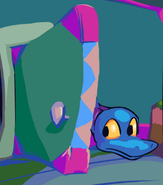
page 3-42 of the comic strip. I fear this may have been the longest delay between two pages that was not due to me slacking off. And not a whole lot happens on this one!
on that page
older version
very older version
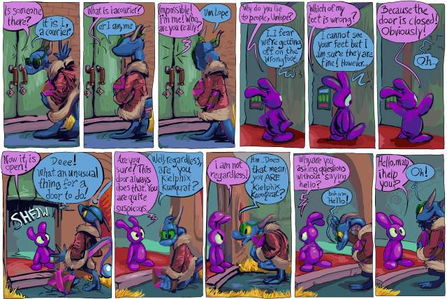
what better way to honor the recently ceased publication that was one of my major influences in artwork and comic strips than by removing the most blatant reference to it?
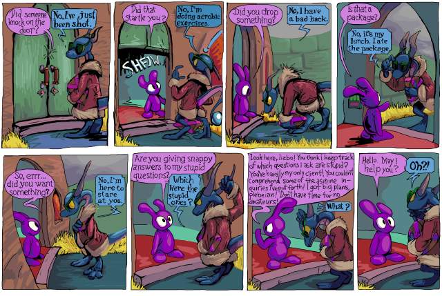
I wanted to renovate the text on a lot of older pages because somebody who doesn’t actually care about the comic that i inexplicably wanted to and thought that I COULD impress with a printed version of it, casually suggested to me replacing the hand-drawn dialog with fonts, not aware that I had taken considerable effort replacing fonts with hand-drawn letters. It prompted me to obsess beyond any past level over the legibility of the text in the second book. And I thought while I was at it I should deal with this old thing.*
I have seen some people (other than that one) in person enjoy this section, after being indifferent to the first few pages, but while it works for pog, overall it is terribly out of character for lope, especially when i introduce the concept that without its hat the pitiful lizard will not take bold action. I had worried about this prior to the first printing in 2015 but eventually decided it did not matter. However the more i saw it the more it mattered to me! At last year’s alternative space weekend art show, I was telling people who laughed at that page that it was out of character! As if I didn’t WANT them to like that page. Soon they will not be able to! Ha HA! That means I win!
And then for christmas last year a different person who I don’t know offered the first criticism of that page, which was enough to finally inspire me to remove it. But looking now I see that he is only criticizing the number of exchanges and not the logic of that sequence of exchanges! The person also called the package “the MacGuffin,” kumquat “the main antagonist,” and pog “his side kick” even though each of those takes longer to type and say in addition to being less specific, and maybe I should not give too much weight to what he says, positive or otherwise. But something good came of it which is what matters [if i am a reasonable person, which i am not]. Also up to that point I always thought of kumquat as the protagonist of that section. Being told the opposite does not mean I have to change anything but it gives me rare insight into how other people might interpret a work that I wrote so long ago that its content has become in part abstract to me. Except on this one one part that I specifically worried about. It works better in an inconsequential pencil drawn comic strip made without a plan, before the lizard was assigned a personality or existence outside of that minor role.
I also ended up having to remove a view of the door that I really like, in the frame where pog says “did you want something?” but obsessive compulsion of course has made this a referendum on the artwork as well as the text so I end up changing a whole bunch of pages, again, I may [mentally un]well end up replacing a blander view of the door on another page with this one.
On a later page pog alludes to one of lope’s comments, saying “didn’t you eat the package?” which i now also had. I like that line; it only works BECAUSE the question and answer part is so inappropriate. Outside of that interlude it makes no sense for lope to claim to have eaten the package, and it is possible to imagine that you only imagined seeing lope say that, or retroactively interpret that as a silly thing that didn’t “really” happen, like when I show inanimate objects talking or transforming between panels, and directly acknowledging that sort of thing is an act that characters apart from pog could not commit without being distracting, and now pog cannot even do it! Tragic!
I have a personal “rule” that no significant part of this comic strip should be dependent on a person’s awareness of other media. On a much later page, elpse mentions “an ethnic sidekick from a lame Indiana Jones ripoff,” in foreground dialog, but no other character acknowledges that elpse said that and it has no bearing on anything else, though I still may drop that line when I get to reworking that section simply on the basis of my personal assessment that the indiana jones series is rife with lameness and unoriginality already and more importantly my not wanting to imply that elpse, it of green and greenish skin, has a perspective on what is and is not ethnic in movies that don’t even exist where it comes from, EVEN THOUGH to ME it is obvious that the INTENT of the line is to have be implicit that the ethnicity of the sidekick is relative to the protagonist, which in the case of Indiana Jones is definitively established, ethnicity and protagonistship both.
Howdy.
*And also replace every instance of “keilphix” with “kielphix” since the second way implies a more accurate, kielbasa-like pronunciation even though i no longer like that name at all and have shown kumquat being annoyed by it on newer pages, which of course means it cannot be changed! Even though only a few pages earlier lope announces that it changed its name from scragthrax so it seems like I am being redundant by having two characters that dislike their given names. However, lope, who is a little bit like me, definitively changed its name, whereas kumquat, which is much more like me, would not commit to doing so, and I likewise have not! ALTHOUGH kumquat lives outside of the law of any remotely functional society and really could call itself whatever it wants, but I only need to think further than hypothetical people who might criticize the comic strip, not ahead of myself thinking ahead of myself. But I will anyway so in four years I will probably change every pertinent page again to have an entirely different name than kielphix and also have kumquat not be annoyed by it.**
**Howdest.
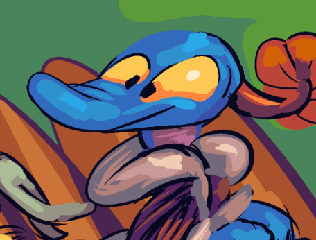
comic page 3-38 of that is here. As usual I expect to clean it more later.
This is the fastest I have gotten a new one out in quite some time, but of course hardly anything happens here! And worse, there may seem to be a bit of a time anomaly since nemitz seems to be very nearby on the previous page, yet is unseen by elpse on this one, but I did not explicitly indicate how far away nemitz had gone. But this will always be confusing, i fear, but I have been majorly confused by less excusable things than this in Tintin and even Garfield comics and people who hate those comics don’t over this.
amitz this page i realized that the building i have been drawing behind the fence has a largely different design (although still a bland rectangle) when i have drawn it visible from the “street.” as that design appears in the first printed book i wonder if i will make myself change the views of it here in section 3, prospective book 5 (or 6?) or just the one view of it in section 1 and hope that nobody who got one of the first printed books cares that much. hm i suppose i will go with whatever takes more work and provides less benefit.
the same section 1 view and also a section 3 view based on it show that building as being much too far from the fence for elpse’s second-biggest fan (after the dope) to have such a good view of the proceedings. unless it is actually a very large creature roughly twice the size of elpse. but i like the idea of it being meeply. also i implied it was afraid of having nemitz thrown at it ON THE VERY SAME PAGE. which means AT LEAST the blame for screwing this up is on the me from a few years ago who drew the buildings far apart AND then indicated they were actually pretty near each other. Although the blame for shifting the creature’s window considerably further from the back of the parking lot goes to the more recent me. But a meep like that may be friends with and have access to the apartments of other meeps. That blue character is very important because apart from its remarks i have thoroughly run out of background “gags” for this scenery.
Another matter: if I were a more vulgar person I could show lope “disposing” of the toilet paper note after eating all the muffins in the first section. But I do not like to think of anybody using toilet paper in that “world,” especially “clean” characters like lope. I think toilet paper (and toilets) are funny in appearance and name but not in their function. There is stuff wrong with me!
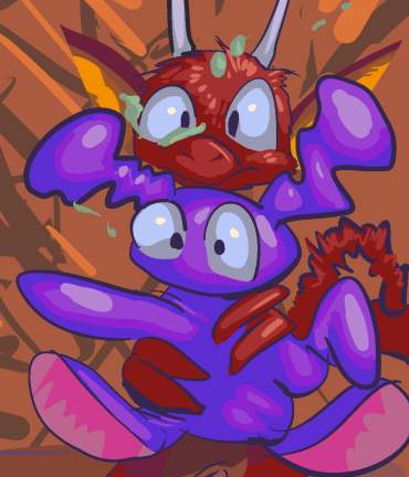
page 34 of part 3 of that dumb old comic strip.
I probably wrote more text about this page than any other and feel like showing less of it than ever!
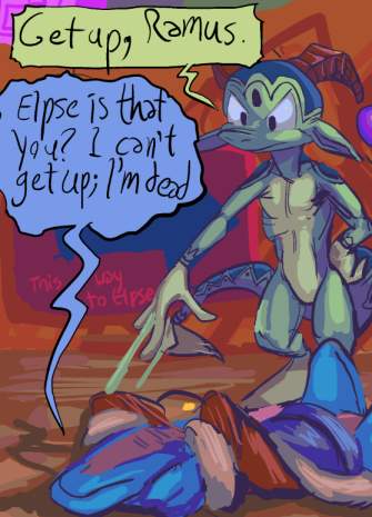
this script is so old, elpse initially said “get up, ramus.” Ramus is a character from the video game Lunar Silver Star Story Complete Absolute Total, who is unprepared for the life of a video game hero and gets knocked down a lot. lope was also initially quoting ramus’s “blarrrrgh.” I played Lunar Silver Star, in 2006, and last mentioned it, specifically with regard to Ramus, in 2007. I don’t remember if I wrote this part of the script then but I was certainly un-old enough to think I could put an obscure exchange like that in here and have anyone know what it meant, even though I didn’t actually post a screenshot of Ramus saying “blarg” anywhere because I didn’t think it was an interesting-enough line for that, so it most certainly was not interesting enough to allude to out of context nearly 12 years after the game was already a 7 year old remake of a game from 1992 which wasn’t even particularly innovative THEN. Also the one time a voice actor says his name it is pronounced “ray-mis” and I always say “ram-us.” I made myself obsessed with Lunar because I knew, at that time, other people who had been obsessed with it when they were children and I thought they would link to my website if I liked the same stuff they did. If they read my comic strips in 2006 they certainly don’t now! Probably.
Oddly enough one of them specifically denigrated the game Breath of Fire in favor of Lunar and I said nothing in its defense even though I legitimately liked Breath of Fire and still like it better and I don’t know that I have mentioned it even one time in the half-my-life of having this website. I don’t even have any screenshots from it since I last played it before I made this website or meticulously documented everything I did.

Literally the last time I played it, my computer had an MS-DOS based infrastructure. Three to four times as much time has passed since I last played it than had passed between the last time I played it on real hardware and the first time I played it in an emulator, which I thought at the time was a long time!
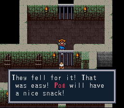
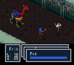
I may even have stolen pog’s name from it! Although I only remember being surprised to see the name in the game years after stealing it if I stole it, not actually doing so. All this is not to say I resent Lunar –I was able to make a forced infatuation be sincere back in 2006– or that Breath of Fire isn’t made of problems that only a childhoodded fixation can disregard (and I may resent BOF instead for making me steal POG from it), but of all the things I make, the bimshwellian comicoid least of all I ordinarily wonder who I am trying to please with it and why, but today I did!
Also lope being felled occurred, initially, during the altercation with the robots, but when I got to that point I decided the robots should just get beaten up without doing anything. Inexplicably I liked the dialog enough that i contrived a way for lope to fall down in the same spot at a later point, and now that is a permanent part of the “story.” i only removed the ramus line literally on february 22 2019. Or rather made a copy of the dialog bauble and moved it to another layer and turned it unvisible in case I wanted to bring it back (and look, I just did). I had drawn it in knowing it didn’t belong there but not feeling like dealing with it. Thankfully I still think it is funny that lope is pitiful and a substitute line easily suggested itself, so this is only a major problem with regard to me knowing i cannot be trusted and that i will probably be 60 years old before i get through the entire script as it is now.
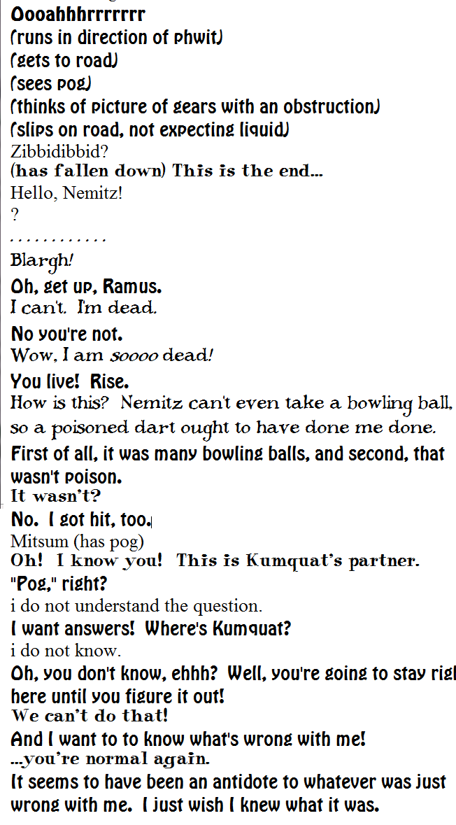
Of course, as I indicated, much of what goes on is NOT in the script. i get to a point and i change it, sometimes significantly; initially nemitz was intended to capture pog out of view, but when i got to this point I thought it would be funny if elpse’s goop fell on nemitz, so then elpse had to run off and capture pog itself, and that gave me an opportunity to acknowledge the dope still exists and also exhibit pog’s unusual attitude toward captivity.
But I do not want to drop anything I think of for any reason and so try to think of in-character ways for them to behave illogically to accommodate script pieces that are no longer relevant. In this case, lope thinking that the goop-covered nemitz is a ghost (and at the same time avoid saying “I’m soooo dead”). From a long term stand point, do I really believe that lope really believes that ghosts are real or that itself was well and truly dead? I did not think about it that deeply. But I knew “wow I am sooooo dead” is obviously not how lope talks by the time I got here, even when I still thought elpse might call lope “ramus.” I wrote that so long ago I did not have a solid grasp of how lope talked or just how foolish it was and in what ways. But NOW I wonder: does lope live in constant fear of death and undead spirits? What occurred to make it be preoccupied with that? I know, or think I know, that nobody is going to DIE in this comic strip, and have worried about my ability to introduce matters of consequence as a result, but I did not want to face the issue on the big punchable nose either, since it is too permanent an occurrence to add on a whim unless you are making something stupid like Dilbert that isn’t supposed to be consistent or not contradict itself. A hypothetical future version of me with a clearer mind may think a character death is necessary or even devise an alternative that is not strictly “death” as it applies to real people but without relying on conventional cartoon judeo-christian afterlife tropes that have no business applying to dumb old lope who I won’t even let have a christmas tree, or even some of the other innumerable copout ways American comic books have, often on whims, undone once-significant or equally whimly deaths. And that version of me would then also have to determine if there are supernatural forces which have interest in or authority over death and life. The present me is not qualified and so should avoid topics which lead to that one!
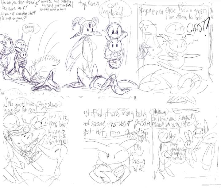
additionally lope’s new comment about ghosts agitates pog, who now has no reason to be this bored by the dialog. Fortunately pog has a looser concept of reality than lope so I do not need to wonder about why it is afraid of ghosts.
Pog’s boredom complaint came about because consistently in this section of the comic strip i have worried that i had more dialog than interesting visuals could be made to accompany. But again and again, and indeed again, had to strain to cram in all the visuals i came up with. However, now a script revision that I added due to the boringness of the script was made irrelevant by a future revision. That is so convoluted, crowded and broken I am surprised now that I didn’t keep it in!
Beyond all that, this page is one that is very hard to get working without layout swapping or dialog bauble stem crossing because there are so many characters stuffed into it. Ordinarily you can switch around where characters are to facilitate better dialog flow by zooming in, zooming out, or going to the next page, but I don’t like doing those things! i had in fact gone to a bit of trouble to switch the layout already; initially the viewpoint matched the previous pages, with the dialog positioned to suit that, and then I realized that would mean drawing the back of this parking lot 12 more times and I didn’t want to. I didn’t want to draw this side either but it at least is plainly a different page.
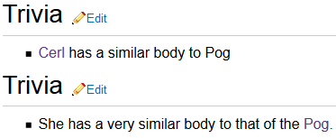
I should just put the word “trivia” at the top of a page every time I am conflicted about the overall relevance of its contents.
This looks familiar. I thought it prudent to find a way to make this look dumber so I could post it on faceboof, where animated gifs are justifiably not permitted.
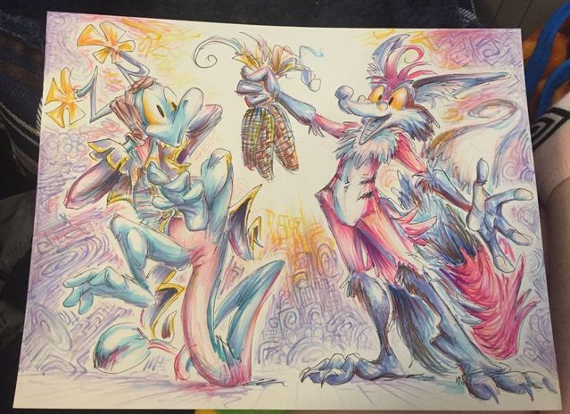
Through my illicit use of wimpod‘s markers, a mildly inaccurate Techno (pinkish bipedal raccoon-fox-person robot) wards off an incredibly inaccurate lope (pathetic amphiboid) with the power of corn. If ever you wonder why all my internet-displayed art is digitally created: otherwise it takes twice as long to make and looks like I have twice as many mental disorders as usual. Which is probably more accurate, but concealing them is the first thing I ever did right! However, after I die from a dope overdose, these ought to be worth almost half as much money as my prints, which counts for something (between $5 and $7.50).
More distressing than the length of lope’s legs: my initial twitter post said “a mildly inaccurate Techno wards of an incredibly inaccurate lope.” I assure you Techno is not the ward of lope. Lope is not fit to be the legal guardian for a potato.
One final matter: can you find the pine cone in this picture? Secret hint: I drew it after this photograp was taken, so you cannot!
Concurrent with the 512×512 pixel matter, I offered drawings at smaller sizes, with 100×100 resolution being the most common request. I did not realize what a big deal it was to be able to draw like this until I realized how many people could not. Eventually they started paying me to do it. Not enough that I could feel like I had done something with my life, but at present I can buy more pizzas than I can eat, which feels important.
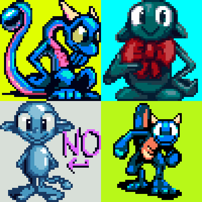
Icons that I initially used for myself. None is especially excusable.
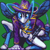
Fastest gun in the wasp, November 2013
A character called Miso for a person called Miso but who presumably does not look like this, stuffed into a tiny 100×100 pixel box but not at all deterred. This was before I gave people many/any options so theoretically I could come up with a better pose than this.
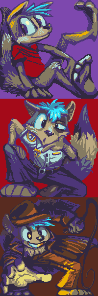
You shall meet with my raccs, 2014 or sooner
Relaxingdragon wanted these at some point. Rare examples of the 200×200 size, which is still small enough that I do not totally lose my mind with it, although I did not develop the habit of losing my mind on pixel-level work until 2016, so that may be a presumptuous statement.
Icon see you’re upset June 9, 2016
pengosolvent recently inquired about a new representative 50×50 pixel symbol but something alarming has occurred. These are smaller, only 50×50 pixels, because the deviant-art website restricts user representations to that size. And I drew four because I usually give people 2-4 different layouts to choose from, but need to color them in, to some degree, for them to be legible, and on this occasion colored in all four fully without being asked to.
The pickax papers, December 17, 2015
A newer Miso, also for Miso. I had been asked to make an icon similar to the old one, and took that as permission to be equally boring with the poses. And again I could not restrain myself from finishing all example versions! The upper left is the one we went with, and therefore it is slightly more “finished” than the others. Appropriately enough it is considerably more proud of itself. The creature this is derived from is called a tawny mining bee, and I took THAT as permission to add mining implements, including an all important flannel shirt, even though those are more stereo-type associated with logging, because it seemed unlikely somebody would send a logging bee my way any time in the near future.
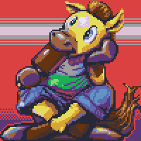
Clippity-clopsicle October 20, 2016
For kinn-katze, a horse creature named Ryno ponders something likely unrelated to being named after a different species, since that is the type of thing you generally have to sort out early in life.
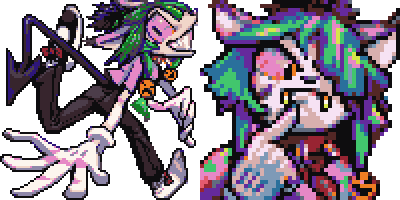
who do lu think lu are? November 17, 2016
100×100 and 50×50 pixel icon robisions of a flagrantly asymmetrical creature called Lulu known to Fairyartery
I just realized I use that “finger touching mouth” gesture way too often. Although I always give people the opportunity to request a different gesture!
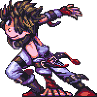
is that who i think tiz December 8, 2016
Ah yes, ’tis Tiz, from something called Bravely Second, for boooey.
After this I decided every icon I make should have something resembling a backdrop, even if the buyer personally uses a version that doesn’t, because some sites are very stupid about transparency. And some sites aren’t but stuff looks bad on them anyway, hint hint.
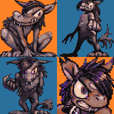
robb from the pix to give to the four, December 22, 2016
a hoofless yet horsely creature named Robbie, unrelated to Ryno’s horsely creature, in fact for boooey again. The hair changes its mind based on whatever eye it feels is more fashionable to show at any moment. Also, after examining the previous two items, it became conscious of the possibility for vision problems resulting from prolonged obscured vision of a single eye.
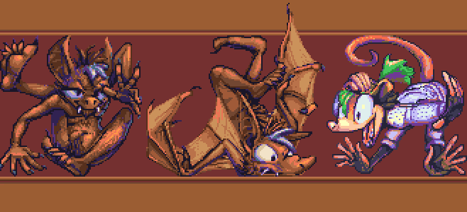
hotel kotel holiday inn, January 5, 2017
for Kotel First is a bat creature also called Kotel, with and without wings, and a more opussummy figure called Obeah whose enthusiasm has been taken out of context to pertain to the winged bat’s error, potentially a consequence of trying to escape from a 100×100 pixel space.
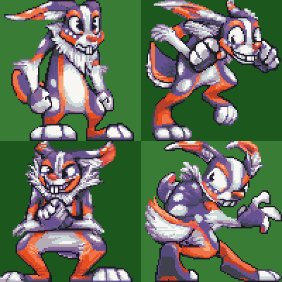
therefore four hares, January 19, 2017
100×100 pixel icons of a hare creature named Lewis for Arito, who was pleasant to work with; I wish I could say the same for this devious dirt-dweller.
After THIS point I realized that flat colors were inadequate for “something resembling a backdrop.”
A progress video of a sort, showing approximately how I colored this
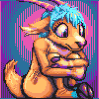
goat tell it on the mountain, January 26, 2017
A goatly creature called Lutka, pixel-styled for trufours. Seems to be having a rough day.
![MUST... DRAW... [most]... TEETH....](/puy/xiueh6.png)
let that synx in, January 26, 2017
another pixel drawing for :icontrufours: of Xiu, who is a synx, and apparently there are more synxes in the world than I thought! Initially there was somebody called Chimerasynx who came up with and drew these things and they have no spines and can twist in silly ways and have more teeth than is reasonable, and at some point they got franchised out, I suppose. This one looks friendly enough, fortunately.
I hope you are not getting sick of these; there is another bigger one coming!
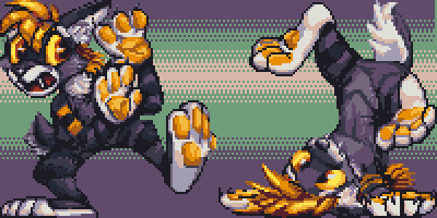
well-financed flop, February 2, 2017
More pixelry for arito, this time of Shani, an apparently easily-worried saber cat. Plus a rinkity dinkity background I added quickly at the end for reasons already cited! Of course I don’t have a video showing this, the one part people have expressed to me sincere bafflement at how to produce.
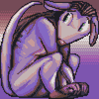
do the rat thing, February 16, 2017
For kjorteo. There looks to have been some disconcerting events recently! And then this happened.
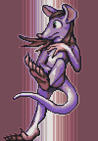
rats and beans, February 16, 2017
also for kjorteo, whose requests’ shape necessitated separating it from the other one! This looks to be alarming news for the protagonist. Although clearly it had been seen from quite a way off!
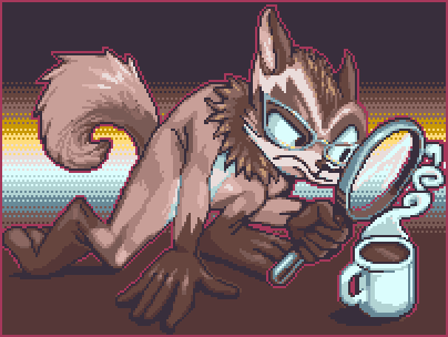
tanuki tea look-see, April 20, 2017
For perikaryon, showing a raccoon-dog investigating a hot drink. It is probably coffee but there is a chance it is tea. Possibly there is a better tool to use in determining the drink’s nature.
Amitz all this people started asking me for animated icons, which take 4-8 times as long to make, but I can charge 3 times as much for them without potential buyers recoiling in horror and abandoning the idea! That is real progress. Still less time than it takes to put one of these website entries together, but nonetheless I am done with this one for now, and hopefully for some time afterward, and so I shall exhibit those here on another occasion.