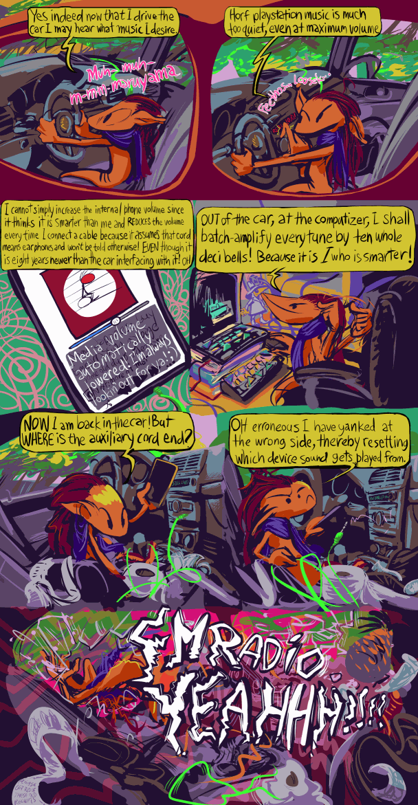
I personally liked it better in a square layout but then i had too much extra space to fill, and social media websites are lamentably kinder to vertically elongated images. i initially planned it with two additional frames that i realized were irrelevant, and then thought of a new one to add in, but that still messed with the negative space. in fact i could probably still eliminate three more to aid in clarity for anyone, probably most people, who have not had this particular problem.
I found that when i tried to invent a car suitable to the creature’s proportions i lacked the skill to make individual parts of the control mechanisms apparent as what they were intended to represent, and so used direct photograph references. the more realistic car may produce an amusing contrast relative to the blatantly fake driver, anyhow.
RSS feed for comments, for they hunger.
This here`s me trackback!


Prescription Pudding Pinged With:
[…] buttons simultaneously, and the volume buttons no longer functioning, a development without which this unnecessary comic strip would not have been necessary. it will still TAKE screenshots but only when it feels like doing so. […]
the sound of serpents | borticulture Pinged With:
[…] brief website entry now i need to obsessive-compulsively add these links to all of them? […]