September 12, 2023
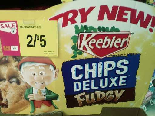
no thank you
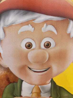
this generation’s mascot scientists face a complex issue: how can they improve upon the previous generations’ creepifying efforts? Every benign forgettable character from the 1950s that hasn’t been excized has already been over airbrushed and 3d rendered and sapped of all remotely organic elements. What possibly remains to be done that can make them worse? the keebler company, a wholly owned subsidiary of the Kellogg company, decided to have the creepler elf give up its long standing sideways glance in favor of a horrifying straight ahead stare.
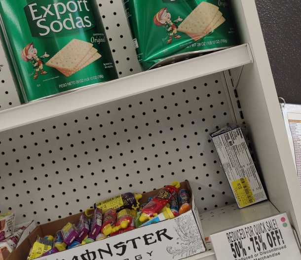
here, at the same store, in a picture taken AFTER the previous two, is a vintage keebler elf on
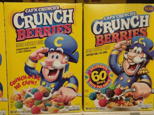
captain crunch, a long time veteran of my posts fixating on the packaging of products I do not buy, doesn’t look quite 3d rendered but mysteriously rather like an attempt at a two dimensional drawing OF a 3d rendered captain. the question here: is the box on the right the previous design or the aftermath of people seeing the box on the left and filing complaints?
another possibility: the left side character is actually a different Captain. Consider that he needs to order himself to crunchatize himself even though all crunch scholars know that “he” has done that already. However, the management saw
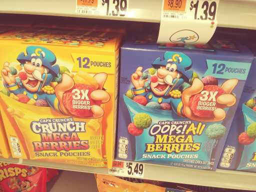
“oops! All Mega Berries” and finally realized the previous Captain Crunch had been all these years filling boxes with his personal berries (and donuts) on purpose while trying to pass it off as production errors. but as is too often the case, the corruption goes all the way to the top. Or to slightly below admiral, anyhow. The yellow box does not even bother to say “oops!” I never accepted the oops but its absence shows that the captain believes he is entitled to all berries, and his hubris level has become uncontainable. On that note, he ran out of cereal containers, and had to put the berries into little pouches instead. What would have been next? “oops one berry in a thimble” ? That Captain had to GO. Perhaps the previous elf has also been replaced for the same reason.
Now I have to go as well
3 Responses
RSS feed for comments, for they hunger.
This here`s me trackback!
Leave a comment. If you want to.

The Peebler Pelves sez:
Oh yes, that’s pretty awful! Such a creepy, soulless stare. At least the 3D Cap’n Crunch is merely a worse version of his same design, but that Keebler Elf box art is just completely weird and offputting. It’s crazy how companies keep doing this with their mascots, just completely removing any of the previous versions’ appealing visual design, and any sense of liveliness or shall we say “warmth” from the characters.
Frimpinheap sez:
They don’t do anything without considerable market research indicating it is a good idea. But is it the market or the researchers that are insane?
Muhka sez:
That elven creature’s face is very small, it looks like a republican imp.
Of course it is owned by Kellogg!
Now everything makes sense.