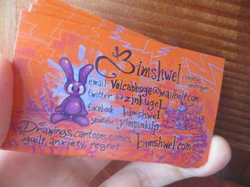
I never changed the front page of this website to be general purpose and remotely respectable, like I implied I ought to a year or comparable period ago. However, I have added dumb trendy social meddlesome icons at the top of the page, thereby making it less respectable, in a quick hackly attempt to have the page not be immediately confusing to people to whom I swindle into taking my bizmitz cards.
Now somebody else’s corporate trademarks are all over my page. I feel like a nascar driver. Except I am not getting loads of money. But I am not having to drive nas cars either, which is a bonus I did not foresee.
The icons are terribly ugly, and since my design sense, and more importantly my css skills are terribly lacking, all I can do is place the things in a row. If you have good design sense you can get away with terribly ugly. I have tried to get away for years but they just keep coming.

Also, with disrespect to the business cards, on the same day I changed my twitter account name from zinkugel to bimshwel. I already had a bimshwel, on which I only posted what I felt were respectable things. Since that amounted to very few things, I printed the other name on the cards, so that a person who checked might be disgusted but at least not assume I had abandoned it. But now if they check zinkugel they will get nothing, since I thought it would be confusing and non-intuitive if I simply changed the former bimshwel into zinkugel. It is now “bimshwelcomic.”
Additionally, I had not wanted there to be two bimshwels and then a yimpinkilp. There would need to be at least 3 out of 4 as bimshwel. Just 2 looks bad. I have momentary flashes of design sense if they make my work harder and prevent me from getting results. I feel like the more stupid websites there are, the fewer people I know on any one of them. So now I have to put the exact same thing in 17 different places, to reach about 12 people. And of course the more time I spend doing that, the less I can concentrate on production of the things I am showing. So it seems like I am getting more and more enthusiastic about worse and worse things. Which would be great, if it were true; gushing about garbage is how you make friends in ternet, but in actuality I am just tired. No time to rest! However, for once this means safety conditions will improve because my “job” is to draw unfortunate beings getting hurt, and if I cannot do it well, everyone’s health should improve.
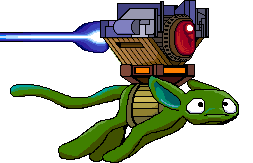
I was going to have the icons hanging from the inside of this moron’s wing-skin, as if it was trying to sell the things in violation of law, but I have no idea how to make individual parts of a picture clickable. Image-maps are a nightmare of 1990s era html. What I can do now is make separate images for each (like I have done) and enter x and y coordinates for each of them (but not their entire areas as I would need to with an image-map), and then figure out how to make them not jump around separately at different screen resolutions. But they would have to be very tiny, wouldn’t they! And that smiling big-snouted fool would need to be terribly prominent on my page. Although I like the idea of such useless trinkets being offered by such a clueless individual. Hey dork, nobody would EVER pay you for those stupid icons! And it would keep on smiling.
RSS feed for comments, for they hunger.
This here`s me trackback!


Indighost sez:
Is that pinecone legit?
Frimpinheap sez:
There is no such thing!
Purplespace sez:
Quality pumpkin, straight from Peru! Of course, I would have no objections to purple flying lizards being prominently displayed.
Frimpinheap sez:
It probably cannot fly being weighted down, especially if I swap out the traditionally low-wight pumpkins with high-density, heavy icons. Those things are like lead.