April 1, 2020

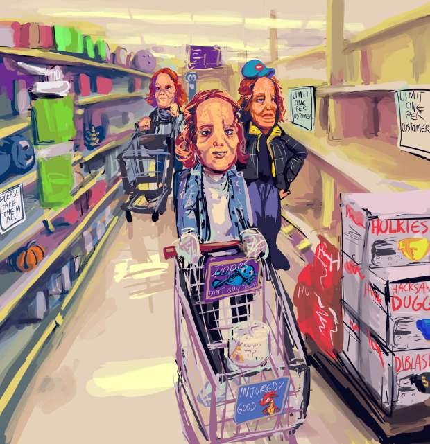
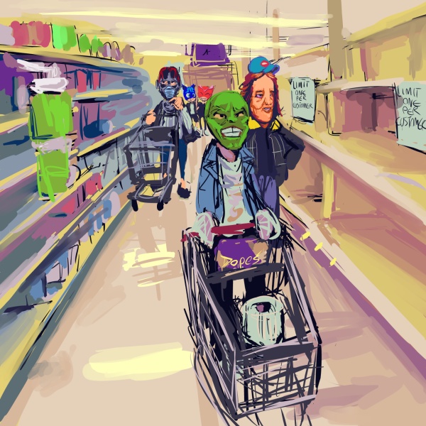
I fear this mask business may be getting a bit out of hand
the original “plan” for this included additional mask-types but at that stage it looked to me more like a bad local mural or the cover to an issue of Cracked magazine than something that was supposed to be taken less-than-seriously. i laughed while making it but sometimes that is an instinct-like reaction to things that i am really worried about not being funny, like some previous images related to halloween, bad geico advertisements (all of them are bad) and my experience at the louvre museum.
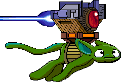
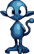
The worst thing about the version I decided on is that after I added the dope on the shelf on the left I didn’t want to crop it out even though the composition works much better with that mostly empty space removed and EVERY composition works much better with dopes removed. Theoretically the older version is superior on account of lacking dopes, apart from the cart advertisement seeking to raise awareness of them, but ultimately it is ugly and trying too hard. The final version tries a more appropriate amount.


No comments ever.
RSS feed for comments, for they hunger.
This here`s me trackback!