February 15, 2022
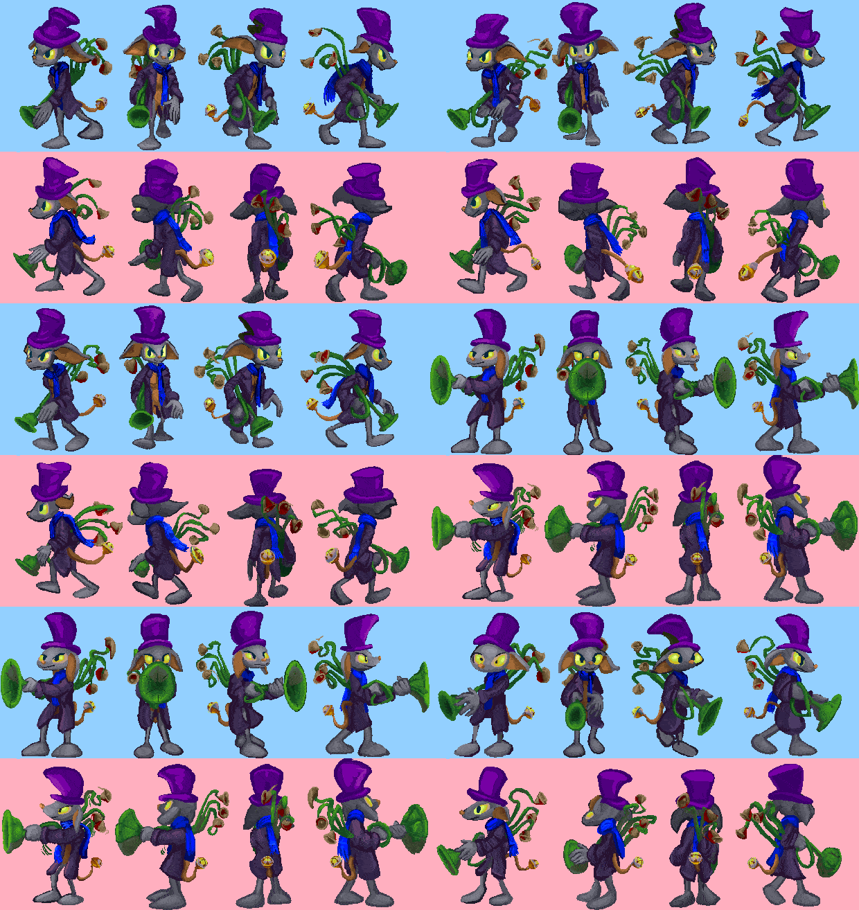
this idiot again. still not done, even with these frames, with additional motions yet to be started on, but I am no longer concerned that the object being carried is too boring or looks too much like I think it looks like a gun. A trumpet plunger with bells or hershey kisses hanging off the back is indeed preferable, yes.
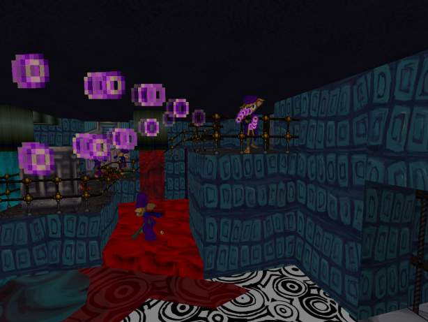
I presume the fired-out bits will be similar to the old version, but I think that every time and change my mind after I already started trying to keep it like the old version.
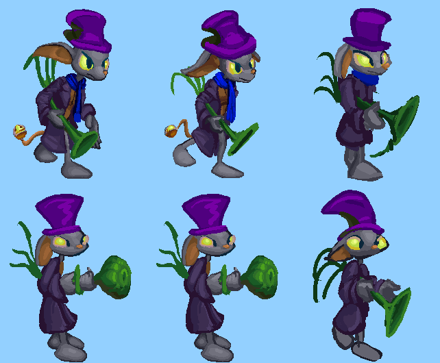
An earlier attempt that is less like a plunger but I was concerned it might instead be compared to a body part popularized in a famous Kurt Vonnegut illustration.
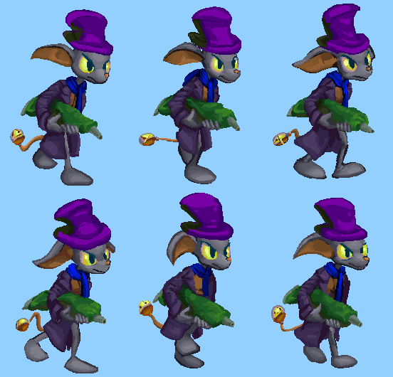
holding a frosting tube
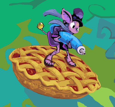
like I drew in cholesteronslaught (except too small and not riding a pie) after making the very old sprites, but then forgot about until after I had already started on the new sprites. this looks alright for the moment but I would need to redraw the arms for every angle, rather than creating a stringy monstrosity that needs to be drawn around the arms and that unlike a tube has no real world counterpart so that I can never know if it really looks correct or doesn’t and may spend an indefinite period trying to bring to that point.
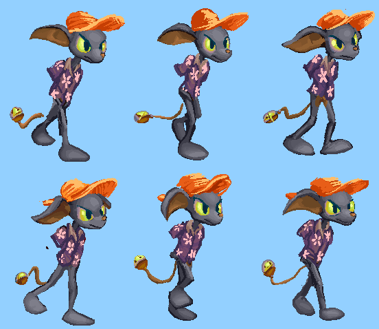
armless (and yet toeless) variant, wearing something more like what the less violent, tattooed version of this creature had on in my december 2006 website header, and as is typical i didn’t bother to consult what that was since I was surprised to see that I included such a classy flower all those years ago when I finally got around to checking, and I only checked so I could have the correct link to it.
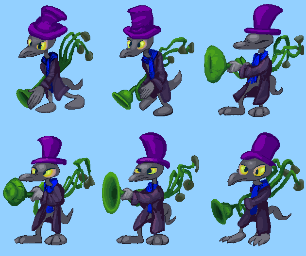
the first head variant. i thought i could include a leg variant also, that makes the creature slightly shorter. Neither really works! If you look closely, I mean. Most people never look at anything closely, but I cannot help doing so. I can try and fudge their positions in the sprite assembler but if nothing else and I can’t ultimately recycle any parts inside the game it is a foundation for a separate idiot. what is the fun of giving two different foes the same weapon? because they aren’t meant to be different, they are meant to be of equalish rank but look different despite that.
The line weight looks different simply because my drawing tablet of 4.6 years told me last night that it was done so I did this up to now with a mouse again. I’m worried this might actually look better and I have made things worse by freaking out so much lately when the tablet increasingly refused to work without being done, so that I needed to stop and restart the whole system, wasting time and rage in the process, but for any other sort of drawing the non-rodenty way is preferable.
20 Responses
RSS feed for comments, for they hunger.
This here`s me trackback!
Leave a comment. If you want to.

5 sez:
I actually enjoy the earlier version better (the one without hershey kisses on it). It looks simpler (by which I mean it easily expresses what it is meant to be) and less tacky, where as the the hershey version looks very strange in motion and is a bit confusing, which is not that great for a fast paced shooter. Also I was not aware toes were exclusive to short lizard folk. I would also like to say I am very excited about this project as it is shaping up excellently, perhaps you should attempt selling it on steam or Itch.io if possible.
Frimpinheap sez:
Thank you for expressing an opinion on this; I definitely don’t get too many! I will definitely observe how this looks in motion before going back to the other since this is more in line with what I want.
the possibility exists to have the creature carry different types of armaments in different spots, likewise to eventually give it toes.
I don’t know why anyone would pay to play this nor have a clue how a person goes about getting involved with skin-irritating water vapor but the possibility is a motivation behind me eschewing the use of borrowed resources and seeking to remove the legacy ones currently in place.
Anonymous sez:
The game/mod runs on GZDoom yes? I do believe that a .wad file packaged with GZDoom can be sold on steam as long as all the sprites and assets are yours/you have the consent of the original creator. But you should probably contact someone who has experience with selling GZDoom games on steam, like the creator of the game “Hedon”. This is their twitter https://twitter.com/hedondev. Regardless of what you think, due to the new found popularity of such shooters I do believe that a bit of money can be made, hell I’d buy it.
5 sez:
Due to my incompetence I forgot to write my name on the comment above, apologies.
Frimpinheap sez:
I would say you still haven’t quite written a name but I knew it was you! I am fortunate to not need to write a name since I have the only official “account” on this website and can edit comments to have any name I want in the rare event I happen to be logged out entirely.
This is a long way from being finished but any time I work on it, it gets slightly more done than it was before, ehhh, and I suppose it will look slightly less like “yes this is doom with different graphics” than that linked project does. Assuming many people want a gzdoom project that doesn’t; I have certainly found plenty on the official forum who won’t acknowledge anything that doesn’t fit the mold. and so thank you again for doing so!
Frimpinheap sez:
OH did you just mean you like the gun without bell-shaped things on it, but not necessarily the bland pipe version from the previous post?
5 sez:
I would say I like the bland pipe version a bit better yes, I just don’t see a need to have it twist the way it does with the bell version, seems pointless (I mean this for the bells as well), the only thing I would do is extend the pipe and leave it at that. Granted these are really fine details at this point and aren’t very critical, by which I mean none of these options are bad, I just really like to look at the details personally, honestly you should do what you feel is best, I feel simplicity is better under the context of a first person shooter since the game is fast paced and both the player and the enemy will be moving so the player might get confused at what they are looking at if an object (in this case a weapon) is too needlessly complex, I would urge you to see your sprites through the eyes of someone playing the game (someone who benefits from instant feedback), not through the eyes of someone carefully examining the sprite.
Frimpinheap sez:
The pace isn’t necessarily all that fast, and the visual density may read a better in non-gif form since I have to reduce it quite a bit for the website. Or it might be a confusing mess! I will see about trying it out today. I dwell incessantly on how what I do is perceived, which is why I have taken such interest in this criticism.
KynikossDragonn sez:
Just wanted to chime in on this discussion that I never really felt ANYTHING about this project is “fast-paced”, I’ve been under the impression this is more of a “first person graphic adventure” or “interactive art piece” more than a constantly SR50’ing UVFast frag-fest.
Not everything in G/ZDoom needs to be “fast-paced”! There’s a few much slower and more engaged things on the engine, like the survival horror “Total Chaos” for example.
Frimpinheap sez:
Well I will see what happens. The pace has really not been sorted out since so many of the elements are yet to be solidly put in place. Some parts MAY be fast, I do not know! The production sure hasn’t been, but one benefit to working alone is that I can change absolutely anything that isn’t working, though improving some may not necessarily be within my means.
5 sez:
Oh yeah KynikossDragonn you are absolutely right, apologies if my perception is poor but due to the variety of enemies in display (like the bowling imp which is honestly my favorite) I always perceived this as being a fast paced shooter, I do no think this is a unreasonable thing to perceive, I would also like to say most would perceive it that way. Personally if I were to make a scene based bizzaro exploration based game I would go all the way and replace the player’s weapons with either nothing or merely tools for interacting with the environment. That being said in the case of this project it does not seem like it was ever taking that direction, the reason being is to me it seems like the enemies are designed to be just that – enemies and pretty clever ones at that. Really I do like them, the bowling imp is an excellent area denial tool for level design, the pink sort of boss creature I find genius with how it interacts with the seemingly passive pogs by throwing them, which can then even be parried and sent back to it, this (perhaps hitscan bullet shooting?) creature is also perfect at being a nuisance in the background while the player is dealing with the melee and projectile enemies. What I am trying to say is that the enemies are designed to be seemingly very agressive, and even the none agressive ones like the Pogs exist to be used in agression, pack that with the fact that the attacks these foes dish out ask for the player to be quick on their feet + the fact that there is many enemies on the screen at once in large areas makes me think that this is in most ways designed to be a fast paced shooter, not saying it objectively is but just saying that the design elements are there to support my argument. Of course, feel free to shape this project as you wish, but the way it is now I feel most will perceive it as I did now, and most will likely be interested in it for this reason. I would also like to add that I don’t mean to downplay the importance the art style of this project nor to say it doesn’t matter, actually it is the main appeal to me but that doesn’t mean I didn’t find the enemy design (as listed above) to also be genius, I am somewhat confused said design isn’t meant for a fast paced shooter. Lastly I will add that no matter in which direction you wish to continue the project in I will still follow it since I do so enjoy what you did so far, perhaps the best advice I can give is “keep doing what you’re doing” which might seem oversaid but honestly the game should have no consistency issues if you just keep doing that.
Frimpinheap sez:
I suppose some parts may be faster than others! I may have been thinking “relatively less fast” since I recall being bad at playing post-doom first person view games back in the days when I tried.
Frimpinheap sez:
my initial in-game test reveals that the bells ARE distracting even to me, but for the moment only when the creature turns between two angles, I expect because on some angles I haven’t changed the hershey kiss things into bells yet so there is an abrupt color difference, and on some I haven’t drawn them at all. But I won’t know for certain if they can work until they match.
more concerning is the slow-down that I assume is a direct consequence of packing all 8 angles into one image, but I don’t know yet if that is something which will be a major issue since it goes away after maybe 10 seconds and doesn’t happen again until the game is restarted.
5 sez:
The slowdown (I am assuming loss in fps) can be attributed to many different things but I am doubtful it is because of the 8 angles.
You mentioned that the slowdown happens again when the game is restarted, I experienced similar issues when running 32 bit games on a 64 bit version of Windows 7, so if you are using a 32 bit build of GZDoom this might be the issue, which personally I would not find concerning if that is the case.
Also I would say to me it is not too noticeable that the bell thingaroos are unfinished but maybe subconsciously that is why I found them a bit confusing, anyway thank you for looking into this as much as you did!
Frimpinheap sez:
I probably talk too much! With this monster and also the purple-gloved red creature immediately before, I created the sprites differently; I imported full “sprite sheet”s so to speak for each animation frame into the wad, literally the source that the gif is made from, and used the texture feature to isolate individual angles from them. both seem to create this slowing down issue, whereas previous high resolution monsters where I separated all the angles before putting them in the wad, the old fashioned way, don’t cause such an issue, at least not so noticeably. BUT I also inadvertently made these last two monsters at a larger size, so I must find some way to check on that being a factor also. there is always something going wrong that seems to be besides the point!
5 sez:
I doubt the large resolution of the sprites is causing the slowdown, from what I know GZDoom is pretty good at coping with detailed sprites, unless your PC hardware is insufficient which I doubt as GZDoom is not very demanding, so I would suggest you try separating the sprites first as this is more likely causing the issue.
Also I do believe that the wordiest comment in this thread is by me so surely the title of too much talker should belong to myself.
Frimpinheap sez:
yes I was saying I think them all being together is the issue. But it was worth a try.
There was probably a longer comment over there but since there are rarely many, if any, it is not a matter that is contested.
are you that m da m person from twitter?
5 sez:
Yes I am this person although that “name” has hit it’s expiration date for some time now and I don’t know how to change it! So I do prefer 5 although it isn’t much of a name, It’s also worth mentioning I first found out about your stuff when a fur affinity pal commissioned you.
I must say that boredom drives people to do strange things like use twitter but at least your tweets are somewhat interesting unlike the “hot take horde” twatter usually is!
Anyway you can have the title of talk too mucher, for now. If you really want it that is, I still deserve it for my ability to say lots to of stuffs that don’t actually mean anything but I am feeling charitable today.
Prescription Pudding Pinged With:
[…] pumpkins are not welcome here Retreat February 21, 2022 Who Changed Me into a Jellyfish Like […]
Prescription Pudding Pinged With:
[…] another of these. It took longer to make than was justifiable, and i will definitely avoid spinny motions for […]