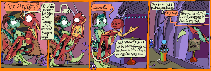
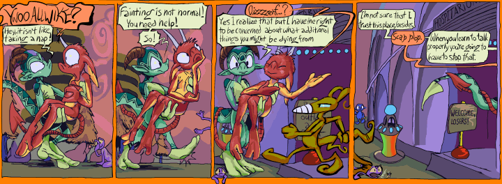
this is the dominant project of the moment. Trying to make awkward comic strip pages from ten years ago look slightly less awkward by surgically extracting as much of the rigidity, bad mouse-done “ink”work and bad anatomy out of them as is feasible by some arbitrary point that is likely still too late to get new books printed by when I want to have them. My anatomical rendering skill and general awareness are still terrible but I am considerably less likely now to commit to a weird guess. This example shows some unusually bad dialog flow, which is why I chose it, even though it is not one of the problems I cited. This is also a problem! There is no sense in mentioning it twice!
Ostensibly it should not be that hard but there are a few hundred drawings in here, if i estimate 13 panels per page and 30 pages it comes to 390 which is likely a bit low. Also I “have” to separate the panel boundaries and word baubles –in the event it isn’t necessary to rewrite the text entirely, which is frequently the case with elpse, or redraw the bauble shape, which I do for pog and nemitz since I decided that less serious characters have less serious bauble shapes after this point– to maximize my ability to correct awkwardness on them, which is also a bigger job than it would be to a reasonable person. In 2009 I obsessive compulsively used hard black for all outlines and more shading than was called for, so getting the components separated is tedious but necessary for reasons too tedious for me to explain. what it amounts to is that I have a heirarchy of sicknesses and in order to live with the chief sickness I must endure some less prodigious sicknesses that both necessitate that I do strange needless work and that I do the work very strangely, to a needless degree. A long time ago I was proud of the fact that I could arrange and complete these things all on one digital layer. Also of using pure black for all outlines and text. Now I definitely wish I had not been so insistent on those things!
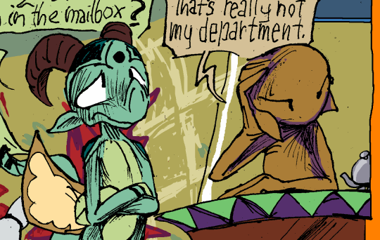
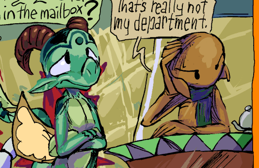
Why did i think it was a good idea to use solid line shading on skin? I imagined it would blend into a smooth grey but in the end it looks like a bunch of scratches. It looks good on wood. I felt so empowered to be using real ink from real pens at that I thought it could solve all of my problems! It looks better than my bad mouse pretend ink but then I kept adding more and more of it so it was still a mess. page 20 has some particularly bad examples but I have not gotten to altering that one yet! But I “need” to make a website update today so this is that.
RSS feed for comments, for they hunger.
This here`s me trackback!

Wizpig sez:
No one’s supposed to remember me! I’m even less well-known than that proto-cutesy-version of Conker who nevertheless still saw the light of day in a Game Boy Color Game everyone’s forgotten!
Frimpinheap sez:
I only learned about you perhaps a week ago so it was not necessary for me to remember you for very long!
Prescription Pudding Pinged With:
[…] required surprisingly little art editing, compared to the previous two books anyway, beyond the difficulties I already alluded to. The editing at THIS point is tedious but not difficult. I seemed to reach a […]