several page bits of this
the comic strip prologue sketched in 2016 i finally took the effort to sort out and place in the actual comic strip section
there are probably yet details to be cleared up on it. Do let me know if anything seems particularly objectionable and I will be sure to leave it unchanged.
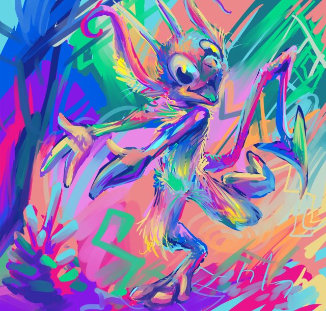
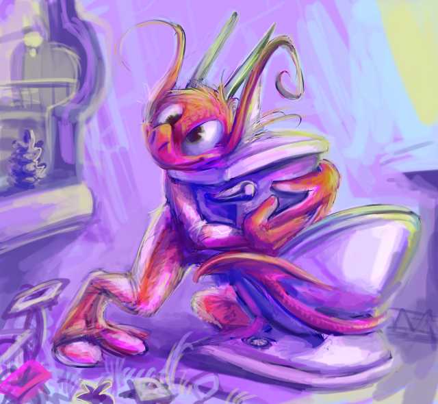
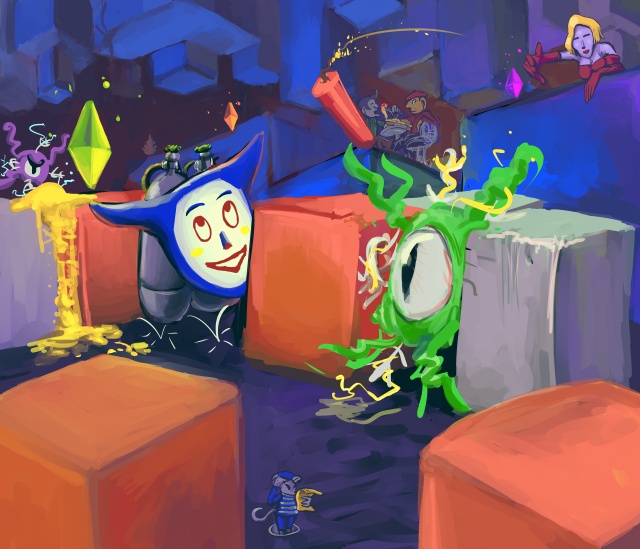
an unusually hued nemitz wants to show you this pine cone mit found but you don’t have to look at it

Plus a few differently rendered variants, just to be extra annoying. The fool seems unaware that the pine cone escaped amitz this.
or that is what i said on my instant grampage.
it was in fact drawn different ways in an attempt to explain, more coherently than in the past, to people who want to buy drawings from me, what styles I can draw them in. However nobody has asked for one since then, which leads me to suspect that people have interpreted that as me only being able to draw nemitz, and not even consistently. TYPICAL nemitz skulduggery. I also didn’t mention it on my instant gram page because my mother sees that page and whenever I mention selling dumb drawings within her range she wants to help by telling me about Jobs, most recently sending me a link to a dubious advertisement for free instant high paying Jobs testing software that are actually just introductory seminars that try to sell you access to more seminars. Nobody who does buy drawings from me comes from instagram anyway. I don’t know WHERE they come from, quite honestly. Canada, maybe. I always complain about doing them anyway, and I have other things to do! It isn’t surprising I don’t have more customers. I am uncertain to what degree that is deliberate self-sabotage. nemitz however is conspicuously, consistently blameable, which I would thank mit for were that good rather than a deferment of bad. argf now I am conflicted again! About whether it being nemitz’ fault rather than mine is good! I can’t believe nemitz would wage psychological warfare against me! And yet it is so awful that I feel like I ought to believe it, so I am conflicted about that as well! But that does not contribute to my well-being at all! I should shove nemitz into a well. But then there would still be five nemitzes left, so I would have to shove them into different wells to ensure that the well remained unobstructed and that they did not pile up in such a way that the top most mitz could escape and seek a means of rescuing the others. I really do not deserve problems like this.
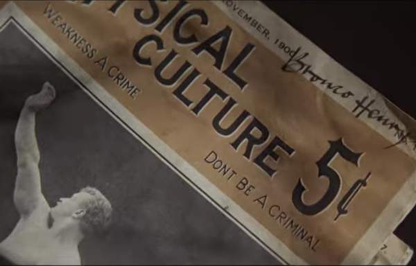
breaking: Netflix announces prequel streaming series Dogtales: The Legend of Bronco Henry to debut in 2023. Viewers will meet new friends as well as a few familiar faces in the exciting and uplifting latest chapter in the Power of the Dog universe, or “Doggoverse” as it is sometimes affectionately known, with all the fun and adventure they’ve come to expect early next year.
2019 in pictures
ja

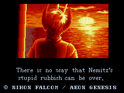
fuhhhh
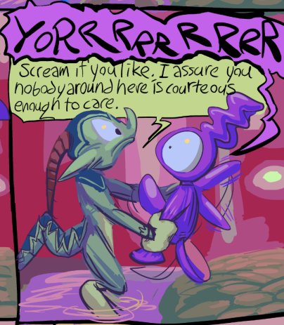
merrrr
ayyyy
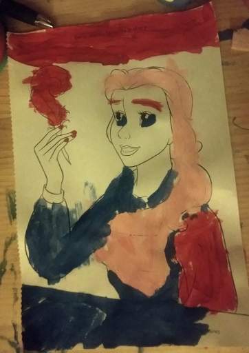
mohhhh
junnnnnnnnnn

jooooooool


awwwwwwwwg

sehhhhhhhhhh

ock!

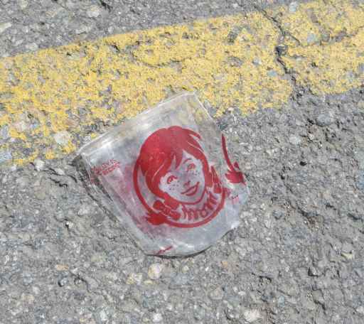
nuv
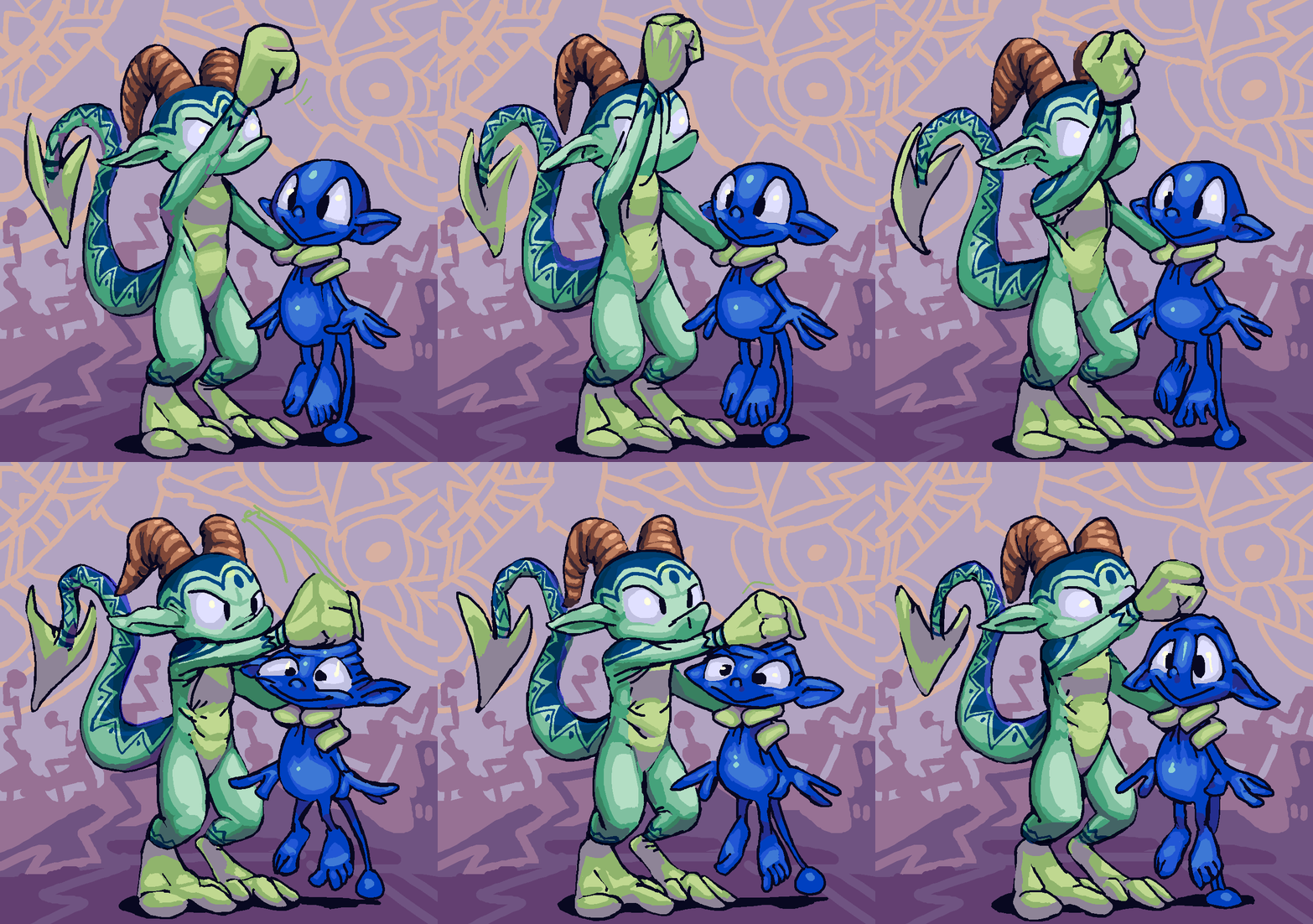
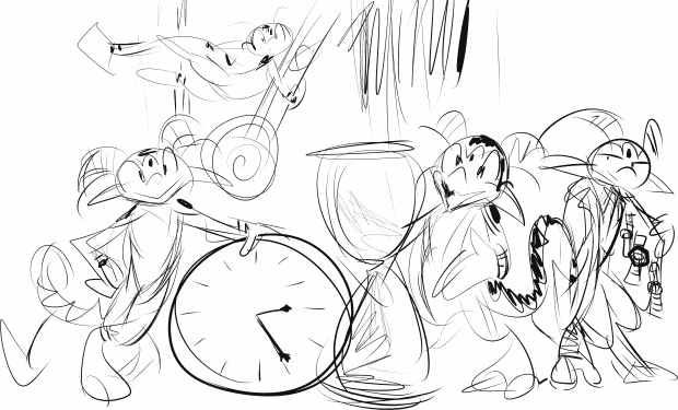
dic

that was almost everything which happened in 2019; stupid ones are not included here.
10-23-2019 is anybody still out there? no? I am going to get back to updating this anyway, but I was curious. I have only had things to say recently that transition into bitter related topics, and generally nobody else has a taste for those, nor should they, and those take a long time to write, besides. when I am slightly less paranoid about pressing deadlines, real and imagined, I can potentially write something that is angry in less of a sad way again.
i left that up for two weeks because anything in the running to replace it that I could have posted fast without saying something inflammatory would have been worse.
…………………….
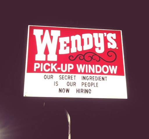
I wonder why they need new staff
This was in Guilford Connecticut. at first I thought this was too much and had to stop there to take a picture of the sign on my way back, and at that point it occurred to me that this is probably in fact a gag to get exposure and of course it got me to stop when i would not otherwise have.
Supporting the “gag” explanation, I have seen the exact same text highlighted as unintentional humor in the context of fast food restaurants several times in the past, but the improperly attached G at the end is throwing me off.

deliberately searching for the text showing up wendy’s repeatedly speaks even more to it being marketing disguised as incompetence.

I clearly remember very similar text appearing in a Burger King advertisement that was reproduced in National Lampoon’s True Facts: the book, published circa 1995, and it looked like its initial publication greatly predated that of the book. And at a later point somebody sent it to Jay Leno for his Headlines sketch under the pretext that they had found it in the wild themselves rather than in a book that was specifically showcasing inadvertent silliness correctly assuming that tonight show staff would not know or care. On another occasion Jay read aloud some ridiculous Dan Quayle quotes that were in fact deliberately ridiculous fake ones printed in Mad Magazine a decade prior to then. However, the “now hiring” is new and I have only seen it in the context of wendy’s signs, and never on wendy’s signs without that part so I must conclude that it is intentional.
I would have believed these were fabricated images made by a “meme generator” that allows people to easily customize fake sign text had I not encountered one in person. indeed the middle sign on my montage heap I was unable to find without additional obnoxious no-joke-is-too-obvious meme text slathered over it which is why it is cropped so strangely.
the incorrect G on the guilford sign indicates somebody was following orders and poorly rather than executing their own idea. Or maybe the latest order is to screw up at least one letter since meme generators usually do not supply incorrect letters.

however, on another occasion in 2014 somebody, perhaps the samebody, mistook a dollar sign for an S. Or perhaps the letter box only comes with two Ses. Or perhaps this means to subtly mock the Michael Jackson estate that in 2014 still owned the rights to the Beatles song catalog and could demand royalties on mere usages of the terminology “strawberry fields” even though there is no reason this would be called that if not for the Beatles song continuing to be considered part of public consciousness. The secret ingredient message also only includes two Ses so that may be more probable.
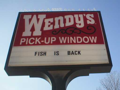
I still prefer the enticing mystery of “FISH IS BACK” (which also only includes 2 of S) Where had fish gone? Why is it back? Did it succeed on its mission? Does it intend to make us miserable since it failed?
according to legend, outside the north haven wendy’s i witnessed a sign advertising their Frosty product but had spelled it as “fpofty,” which had such an effect on me that someone I knewish online nicknamed fr0sty I had taken to calling fp0fty but I never told him that. I spent longer than was reasonable last week trying to find that picture but couldn’t which may have contributed to the frustration inherent in that last mess I posted. I only turned up a shot of the same location’s sign from a later point by which time they had found the R but lost the F while they set about advertising jalapeno presco chicken.

Wendy’s seems to occupy quite a bit of space in my mind considering I don’t ever go there. Not just because I haven’t forgiven them for replacing Roy Rogers in Connecticut (though I haven’t), also because the price of their food has doubled in fifteen years so its only real appeal is being less shoddy than the relatively still cheap McDonaldses in towns like these that lack Burger Kings, and presumably that setup suits them both.

Somebody on the deviantart website has already conceived of the public representative of that collusion without realizing it.
flurk I was in Liverpool England for ONE day in June and saw about three burger kings, and that is not a nation that takes kindly to additional claimants to the throne.
Incidootily, Taco Bell now longer has cheap in its corner either. For a while it was possibly to find combination Taco Bell/Kentucky Fried Chicken stores, but all I know of eventually dumped kfc, and I presumed that was because you could get a taco for 89 cents but the cheapest single item of chicken was three dollars. However, on my most recent occasion 9 tacos cost me about $17, the same as an 8-piece bucket of chicken, that would take me twice as long to eat, be much less complicated to order and whose contents it would not be necessary to thoroughly confirm the accuracy of before I leave the establishment. But there isn’t either of those in guilford so the topic does not usually come up.
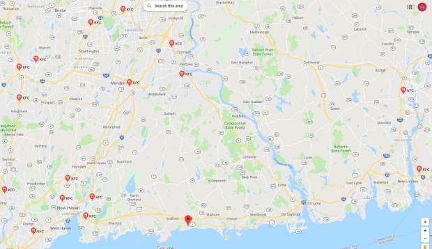
in fact there is a magical barrier along interstate highway 91 and a weaker one across i395 further east that keeps kentucky fried chicken out of any place that I would feel like driving to under ordinary circumstances. The i395 one is weaker because the eastern half of connecticut is a miserable clam chowder framed picture of boats magazines about lighthouses white baseball hat wealthy boron retirement community that I stay away from anyway.

is this funny to you, wendel?
why did the people who did graphics for 8 bit games think this looked good? it didn’t!
have you ever seen a drawing by a small child, where most of the background is white but then suddenly there is a strip of blue across the top? this reminds me of that. but i excuse that. to them, the sky is blue, and the sky is UP. anything beneath that varies.
But an adult getting paid shouldn’t think like that. Hey, the sky is not suddenly weird and different after you go up a certain height! the fact that they almost always happen right at the top of the screen makes them much worse. It seems like that is the end of the universe. most likely this is only done because that is the only way to ensure, in games with only one background layer, that the lines never collide with background objects that need to have consistently colored backdrops. Usually the player character can’t get all the way to the top of the screen so there wouldn’t be objects up there. But that doesn’t mean it looks GOOD!
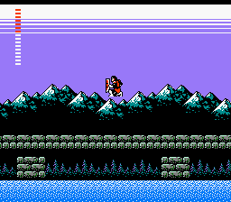
Konami’s castlevania 2, my first encounter with lines. they contribute to the creepy atmosphere, I would say beyond anything else. The secondary title is “Dracula’s Curse” and I consider the mysterious appearance of the lines to be the primary indication of the curse.
It is a more extreme stylistic liberty than anything else in this game. castlevania 2 is supposed to be totally serious, and that effect is so strange. Thankfully Simon Belmont is never at risk of touching the lines. Then he would truly have no hope.
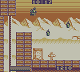
Aw naw! In Castlevania: the Adventure, for gameboy, Christopher Belmont can indeed TOUCH the lines, and live! However his sluggish pace and awful controls may be indicative of lines-poisoning.
from this page
“the iconic two-color sky gradient. Just wonderful.”
the only definitive evidence I can find of somebody acknowledging it is sedate and positive. Where is the outrage?
Yes sure that guy makes almost three thousand dollars on patreon and i do less than fifty but that is because i am saying what others dare not.
Does it look like a gradient on certain televisions? do the light and dark, at varying levels, blend to look more like the blocks common in early snes games? that was never my perception. It was always just LINES to me.
The fact that nobody else noticed the lines or mentioned how creepy they were also amplified my fear of them. When only YOU are scared of something, that makes it scarier, since you get no sympathy or protection.
Lines were even on the konami BOXes of this period. In fact I could only hold one of these boxes in such a way as to not touch the lines. Maybe the effect was chosen to give the label art a feeling of urgency and dread.

I presume jack gets jumped by werewolves if he takes too long to putt.
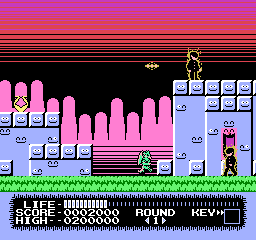
monster party had some of the most egregious lines of any video game, even if they are all seen before the second level. You would need to torture yourself to get to the second. Of the three credited graphic artists, mobygames (which is ALWAYS right) suggests only one worked again, Taka Saito, who next toiled on “The Adventures of Gilligan’s Island” and THEN stopped. while the adventures of gilligan’s island lacks the lines, it also lacks any adventures on the part of the island.
I first encountered Monster Party when a rare instance of child-hud era friend whose house I visited regularly had rented the game and all I noticed or remembered about it was the creepy lines, the unintentionally (presumably) creepy background music and how impossible control it looked. I do not recall attempting to play it or being offered the option; it may just have been present incidentally. This was the same friend with whom I co-created Joey and Ian Gettin’ Dead, about our two younger brothers, and it is entirely possible that Joey was using the game and and only gettin’ dead in the context of the game’s terrible controls and the low threshold of abuse that corresponds with the onset of what is commonly considered “death” in video games.
I was quite surprised years later to see monster party mentioned on the internet with regard to how zany it was and how heavily censored it was from the japanese version. I couldn’t believe people had really gotten past the first level, much less willingly sought out alternate versions of the game in which to do that again, and had anything to say about the whole thing unrelated to the lines.
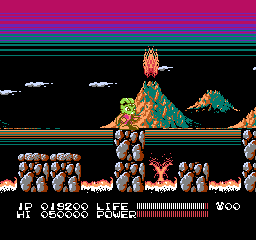
this is similar to monster party’s; gratuitous and coming out of black, but i don’t mind it as much here, possibly since this game is actually fun and has good music.

megaman 3 has this intermission screen but it is balanced out by having lines going the opposite direction so the effect seems more cylindrical and not implying that they are representative of the sky.
and so after 3 games safe comes megaman 4 aka megadope, a terrible graphic hack of megaman 4 that I made for no reason at a time of my life when I did a lot of things for no reason, unlike today.
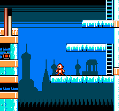
the lines are so intense that even megadope won’t smile at them.
Bear in mind that on an actual 1970s-80s television screen wouldn’t necessarily be able to see to the actual borders of the display. That generous area of uniform color at the top in a lot of these here might be in practice much smaller.
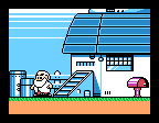
megaman 5, dr right knows something terrible is about to happen since LINES have attacked his home. although these lines appear in the middle of the SCREEN, the introduction sequence crops the view to just the middle of the screen and the lines are still at the edge of the visible zone! And the “generous” area I alluded to is not allocated here because it is not meant to be seen!
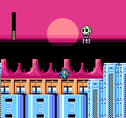
megaman 6 brings back the lines yet again but finally puts them in the middle of the viewing area where i can handle them. it still doesn’t make SENSE since the only things that should be black in front of it would be scenery at the horizon which the sun would be setting “behind,” which i suppose would be the rocks but they are separate from and beneath whatever is black here.
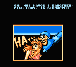
this isn’t a megaman game at all, it is an unlicensed chinese game about a little guy who throws boomerangs that they pretended was megaman to try and trick people. in which event i would ask why not just use the full megaman game if you undervalue your own work so much but whatever the case, there are those lines.
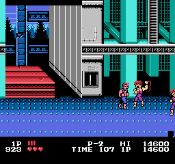
actually I like the one in double dragon since it simulates a perspective and uses its whole, limited space. only by chance does it go to the top of the screen.
double dragon uses it in all 3 nes games, but each example is unique and artistically done. Even double dragon 3 which is terrible in every way. other games will reuse the lines across large spaces in a manner similar to each other.
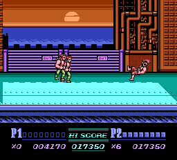
not as interesting but at least the presence of the sun implies a reason why the sky color would shift considerably in a small area.
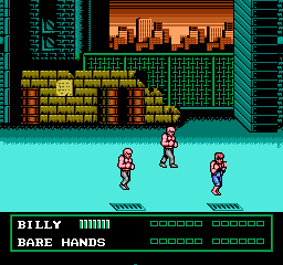
however these look like apocalypse lines since they go into black. the sky above a sunset is not black!
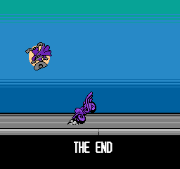
darkwing duck! ending. These at least are neutrally placed and have more than two colors.
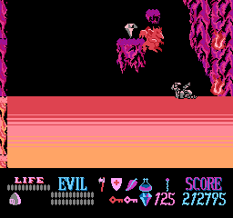
not on the sky, but needlessly near a screen border. as a small child i did not understand what this weird substance was that kuros could walk on but be damaged by. but it didn’t matter since you have unlimited “lives” in this game. as a slightly less small child i realized it was lines and became more afraid of touching them than the meager damage penalty could bring about.
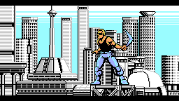
Power Blade! It of course gains its energy through power lines but THAT is not what i meant! Also the lines blatantly go behind a non-rectangular object which means they could have been placed further down in the image so they looked less creepy.
a brief collection of games that use it more neutrally
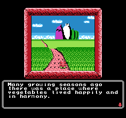
princess tomato’s very first scene. fairly tame! really not threatening at all, but I sure REMEMBERED this was here for years after seeing a picture in, again, nintendo power magazine. I remember thinking it was a racing game at first.
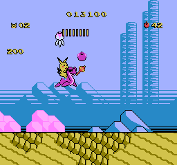
adventure island 2 has lines going UP. when i saw pictures of this in nintendo power magazine it bothered me but i can handle it now
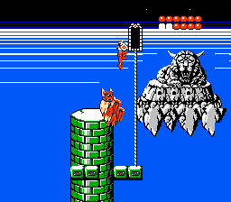
rygar falls somewhere in the middle because the lines are scary, and it goes into space, and I was terrified of this screen, but I was creeped out by the weird face foremost. I didn’t even realize it had a body. I would see it when i closed my eyes. I was SCARED of that thing. As for the lines they go into white, and then abruptly to black, and it is just strange.
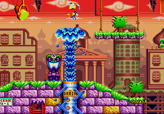
dynamite headdy uses lines extensively, but they are often dithered which makes for a less harsh effect. Even when they aren’t, there is lots of other stuff going on and there are always intermediate colors. the clouds being larger above the lines creates a mild perspective effect which make the lines seem more like curving of the atmosphere above us in the distance than the end of the world immediately in front of us.

treasure land adventure also uses many lines but that is far from the only unsettling thing going on
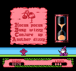
fantastic dizzy. terrible game. don’t believe british 1980s computer nerds. they are sick. everything in the game maims dizzy, you only get 3 “lives” in which to win a game as long king’s quest 5 with as fragile a hero without saves or even intermediate goals to use as personal concepts of progress. these creepy lines, mercifully on this slide puzzle screen only, are about the only thing that WON’T destroy dizzy.
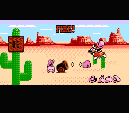
right near the edge! why? and this is a game that otherwise uses its colors really well to add a lot of detail to a fairly simplistic world.
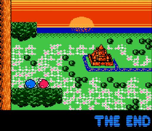
adventures of lolo 3, also from the Hal Laboratory company. They used their mad science to devise a way to put the sun BEHIND the lines. It actually comes down from the top of the screen and the lines never change where the brightest point is nor move aside to let the sun in front. The neat effect of the water starting to reflect the sun as it appears closer is meaningless because the lines are so incorrigible. They really have to go.
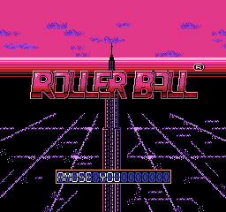
Yet another from Hal, Rollerball. This one is really odd in that the upper edge of the lines leads to a color that matches one of the interior colors, so possibly this is supposed to be the edge of the horizon, yet it couldn’t be because the vanishing point is about midway up the second R in “roller.” The only conclusion to be made is what I have been saying all this while, lines are bad news.
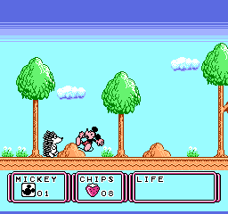
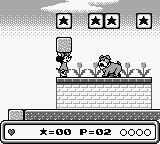
this is the very first stage. unlike monster party, this is supposed to seem welcoming. there are animals out to destroy mickey mouse but you aren’t supposed to be afraid of them. not yet anyway.
this game was localized as “Kid Klown in Night Mayor World” since it was published by Kemko and Capcom had exclusive rights to release disney video games internationally at the time.
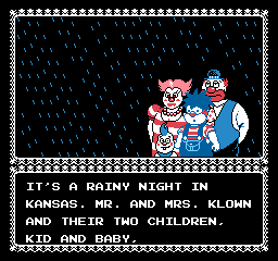
there is something deeply wrong when you have a story about a kid who is a klown, with a k, from a FAMILY of capital k-klowns and i still find horizontal bands of dark blue more upsetting.
Kid Klown is also noteworthy for having loads and loads of intermission text which doesn’t explain any of the things that need explaining.
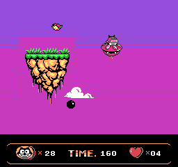
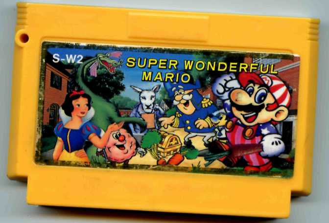
a very capable alternative to lines oddly enough occurs in a bootleg felix the cat game. Which is not to say this game is good or that there aren’t better things that could be done with all this space.
mickey mouse again! and not even the same developer. Mickey’s DANGEROUS Chase by capcom. Which I also only know about from nintendo power
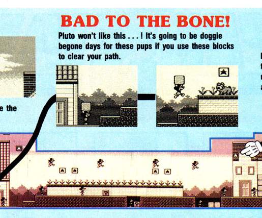
i couldn’t figure out why that effect was in some screen shots but not others. now i see: the screen scrolls up to gradually reveal it as you progress, which is unsettling in its own way. even though these aren’t LINES, the color difference is high and this really doesn’t belong here. the presence of the word DANGEROUS in the title (and apparently only in the US release) and the blood-like red tint may also have had subconscious effects on me.
also unsettling, nintendo gives full maps for the first, easiest, self-explanatory levels and wimpy paragraphs for stages you might actually need help in.
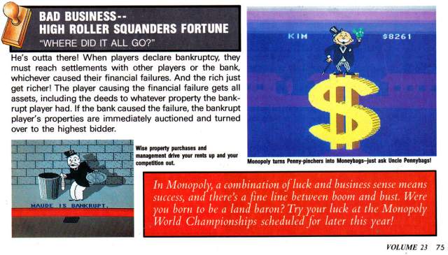
scrubbo in the same issue, this i totally forgot about. Again not lines but creepy with the same intention. It looks like the monopoly guy is about to be abducted by aliens or crushed by a meteorite, nevermind the trauma caused to anybody in those barely visible purple houses in the distance who would see an enormous self-illuminating BACKWARDS DOLLAR SIGN. Also Nintendo Power gave six pages of coverage to this.
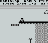
this can’t be too far a drop since there is a little tree down there. surely it would be SAFER to go that way!
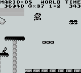
but the lines abruptly end so they aren’t real, right?
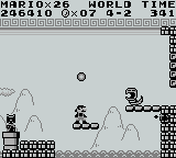
I am uncertain if these are supposed to be lines with the same intention. while this is indicated to be outside, there is a pattern ABOVE the lines.
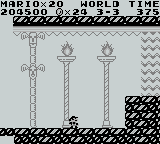
also an earlier level uses the exact same 8×8 pixel tile as something like a support beam for a fancy place that is plainly meant to be INSIDE. Lines have no power inside.
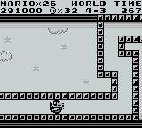
oh no more creepy lines, undeniable this time, going into BLACK, consuming the clouds, and i have to TOUCH them! Or Mario does. I sure am glad I am not mario.
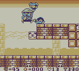
Always the ne’erdowell, Wario tortures a creature by making it touch the lines.
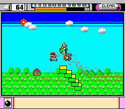
In the demonstation mode of mario paint you can see somebody CREATING the lines! Somebody making the deliberate decision to add this. And that may be the only super nintendo game i have seen it in, at least as far as the creepy top-of-screen usage goes
The mario paint example is curious because it shows the sun amidst darkening. would the sun not cause a lightening?
a number of staff was shared between mario paint and super mario land, super mario land and wario land, but nobody was on all three games and I would be reluctant to point at any specific person for this.
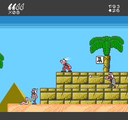
the first two game worlds do an admirable job of recreating the sort of skies that uderzo put in actual asterix comics then suddenly in egypt it gets this hokey effect and bright turning abruptly to dark. instead of creating a feeling of vastness it is an eerie claustrophobia. and look at all that grey space at the bottom edge of the screen wasted! if they put that ABOVE the lines and made it the darker blue it would… STILL be too dark but it wouldn’t be as much of that weird edge effect. They also could have opted for a more subtle color changing effect across a larger area.
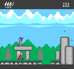
here earlier in the same game, that is actually pleasant and one of few things in the game to evoke the source material and not just look like a quick cheap crummy licensed video game created by a company chosen because it was European and no other reason (“Bit Managers” in this case). Ironically it is a possibility that a similar cloud formation was the original visual inspiration for the lines, which i say based on having seen even more line-like clouds and wondering if those were the inspiration for lines.
I will say that a co-founder of the Bit Managers company, Alberto Gonzalez, did ambitious and well-programmed music on the better but still horribly misguided super nes game “Asterix and Obelix” that they also developed. He was uninvolved with the first Super NES Asterix game which seems to be based on the same design document as the nes one with additional questionable decisions but at least lacks the lines.
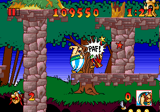
In the interest of making this more confusing, here is the superior if still impossible Asterix and The Great Rescue on the Sega Genesis, developed by Core Design, better known to people other than me for making the Tomb Raider games. This uses sky-lines but in a relatively innocuous manner. Don’t tell anybody I rented this in 1992-3ish and couldn’t get past the second stage because I didn’t know you could make little platforms appear for jumping on.
It also has better music than a crummy licensed Europe game deserves, and I can’t think why the followup Asterix and the Power of the Gods is full of dinkity synthesized awkwardly looping covers of public domain cliche “classical” dentist office music beyond that somebody found out they gave a crummy licensed Europe game better music than it deserved. That apparently is the power of the gods.
lines in real life:

chocoteague virginia, the shadow on this boat railing

mystic connecticut: look at this orange arrow on a sign

deviantart user domobot posted this image. similar to mario paint there is a sun but the light part is NOT radiating out from it! Also the creature appears to be wearing the legs-sticking-out-of-the-ground from the Monster Party screenshot
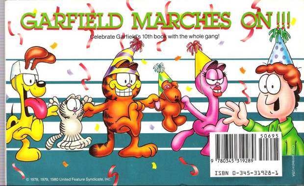
garfield makes it big, back cover. This is also the same book that featured the inexplicable traumatic head-first dropping garfield horrifying cuckoo clock reaction. (the linked page describes another instance of it happening and then briefly mentions garfield) Garfield is suffering from a similar ailment to the batman bee, in which oversized eyes enter into space conflicts and the artist doesn’t care, resulting in sketchy facial expressions. Arlene can wear the hat properly. However Arlene also suffers from shoddy tsereotype design traits and i presume the hat doesn’t want to mess with them. Also troubling and artist-not-caring-related here is that most of Jon’s body is missing. The other characters have their feet below where Jon cuts off so it isn’t like they reached the edge of the document space. I presume his body was sliced in half by the bar code sticker and the blue substance is actually his alien body matter spilling out and creating the lines as a punishment against humanity, until crummy merchandise and eventual braindead hipster memery could grow into adulthood to avenge him.
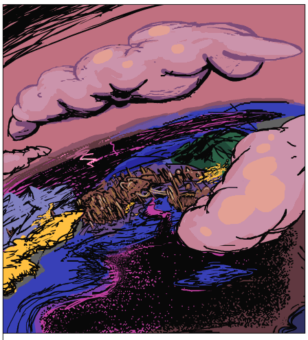
I found this in another terrible comic strip, thankfully i cannot remember which but whoever is responsible for it ought to be in jail.

there may be many people who need to be in jail but i would at this time request separate jails.
Another ten+ year old lingering matter:
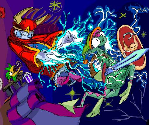
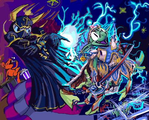
from that page, this to this. As with my last such comparison, the actual changed page has not yet been uploaded, since that seems to require a different mindset than working on them does, and the work is not finished! I hope to pog I do something about that ugly carpet. And I said not long ago how unimpressed I was with “*gets popcorn*” as a response to rambunctious activity. I did try to draw the plant thing from the initial image looking at a map to indicate it was confused at being in the wrong version of the picture, but then that means you would always need to have seen the old version of the page to “get” the new one, and the whole point of the new one is to let the old be forgotten, and also then that means I would always need to have the old one available somewhere, and for THIS? Ridiculous. Also its body makes no sense so I couldn’t actually draw it in a way where it looked like it had a map.
You will believe I can spend longer on one frame than some people do on entire comic books, and then spend as much time writing about it. This requires that I accept most “24 hour comic book day” offerings as entire or books, which I generally do not, but the statement felt superficially profound when i thought of it.
The old drawing of course looks more consistent with the style I was using in less-altered frames, more effortless and un-self-conscious, but I am too eaten by obsessive compulsion to handle this in another fashion.
I am sick to agony of Mario, Sonic and Link. In ten years Nintendo went from a video game company to a religion. In all honesty I never need to play Street Fighter or Mortal Kombat, the series alluded to in the preceding frames, ever again either, but I don’t know anybody who lives their life around homaging those games. Perhaps they exist but I do not know them. Oddly enough, my initial Zelda 3 reference was itself a protest to indicate my dislike for Zelda 64, which was by then nearly ten years old and being lauded by not-yet-religious nintendorks as the pinnacle of human accomplishment. And I STILL protest that, but Aganhim is not iconic in the way that Link is, so somebody might just think this means I drew any old weird Link variant with a generic wizard. Neither is especially funny to me, also, unlike the Kombat and Street fighting allusions in the other frames. However I “needed” the replacement to also include a wizard who uses lightning and a hero who uses a sword. Even though I ultimately totally redrew them both. But if I changed the layout, that potentially meant I could change the entire page’s layout, and if I did that I might as well NOT have a page full of irrelevant video game references, but I didn’t want to spend two more weeks on this.
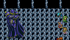

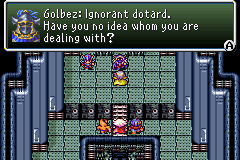
Regarding my replacement, Final fantasy fandom IS overdone, but not to the same degree that anything first party Nintendo is, and certainly not with dumb old Golbez or Cecil. Although the TROUBLE with drawing any Final Fantasy playable character is that the version in the game is different than the far-from final one in the concept art. And in the case of Cecil, also substantially different from the one in the DS Remake.
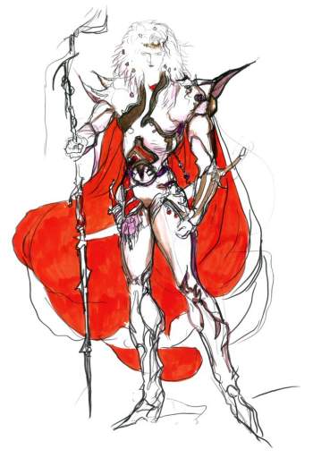
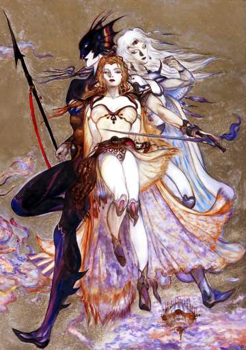
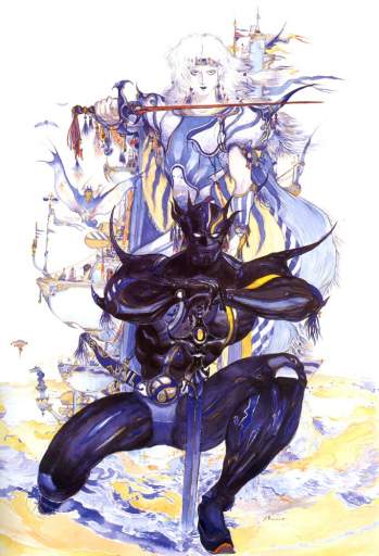
Cecil even looks different from concept art to concept art because Yoshitaka Amano never adds keychain trinkets and circus stripes the same way twice.
also: there are two different flamboyant dark-armor people shown in these drawings and neither is Golbez. They are irrelevant to the present matter!
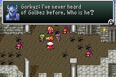
Also I OBJECT to the DOPE EARS on that one’s helmet.
It seemed most sensible to match Elpse to the Cecil that I recognize, but in fact that looks almost more like the Actraiser hero when drawn in here, and somehow it mutated into this gaudy mix-match that is not quite any version of Cecil. But whatever, Golbez, by virtue of being 50 feet tall, is sufficiently detailed in sprite form for my imitation to be identifiable and Elpse does NOT look like Link, apart from my forgetting to change the dingle-ball that I had attached to elpse-link’s hat, which arguably fits in better here. I would have liked to put a Shining Force allusion in there, but none of the prime antagonists use lightning, plus quite honestly the demonic character designs are too on-the-nose for this, and this is not about my favorite video games, besides; bubble bobble, hinted at two rows down, sure isn’t. This page is about whatever I was thinking ten-or-more years ago except for that one thing that really bothered me which had to go, and so it did.
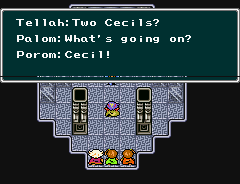
you don’t know the half of it, buddy! To think I didn’t draw elpse in Tellah garb because I thought it would look too weird. (Also Golbez is afraid of Tellah’s Meteo)
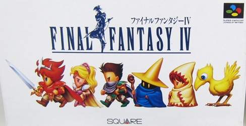
If I lived in Japan I would be even more confused since the sword-wielding homecoming queen hero on the game’s box has had his colors swapped around to an even more extreme degree, likewise with his two companions, and the two people following THEM are generic nameless wizards that you merely encounter loitering around various places. I have NOTHING to say about the bird.
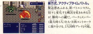
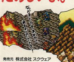
the back of the box, as well as that of the “easier” rerelease from a few months later shows this non-accessible party lineup against a monster groupings from the Mt. Hobs stage against the inside a town background. In fact the players and their positioning is identical to this other rumored fake screenshot.
Presumably the idea was to not spoil certain aspects of the characters’ identities. Yoips I WISH marketers took that approach more often, especially with the way Star Wars junk is promoted.
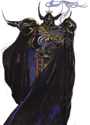
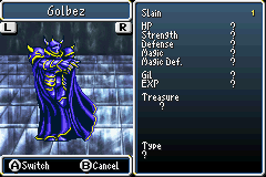
Slain: ONE golbez
For goop measure, here is Yoshitaka Amano’s Golbez concept art, which the version put in the game is about as consistent with as anybody could hope for in 1991, apart from the sprite artist just having to say screw it and force in the appearance of feet and not translating the arms to semi-profile view very well. I never even noticed the feet until maybe ten years after the first time I saw this. I always imagined golbez was floating and turning, casually pointing a finger at his enemies while turning away because he knows they are already done and he has more pressing business elsewhere, rather than just standing there rubbing his wrists together. This gameboy advance version is slightly condensed compared to the original super nes version, so golbez almost looks like he is posing in a bad rap video or doing the macarena.
In any event I think we have seen the last of Golbez for a while.
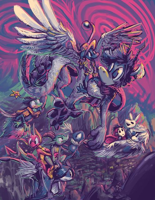
Flight of the Irritator
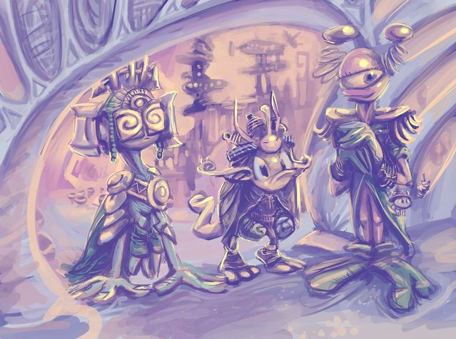
An art swap with the mysterious and powerful Kiki of tsukurikake.com, who has very elegant and varied characters. Unfortunately, my own encourage foolish behavior!
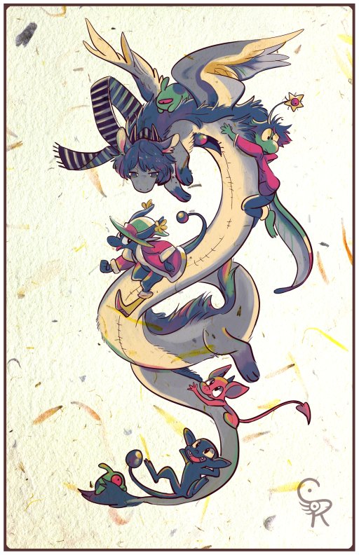
Kiki’s highly elegant picture. Also, the associated twitly and patreon pages. I do not have a patreon page! I already put everything I do on the internet for free and even that is a hard sell!

I may have made too big a job of it! But I like making complicated scenes. Lately I have not had an excuse to spend this long on one thing. Some people seem to have appreciated it.
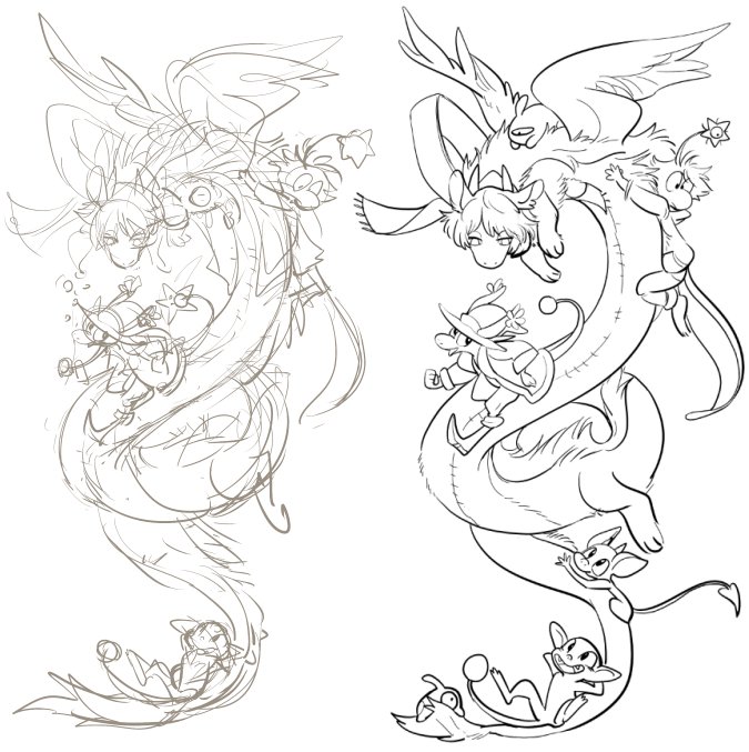
Somewhere amitz the process I became aware of Kiki’s sketch and lineart. Notice how they are totally to the point, not inclined to doubt themselves, despite a growing number of uncalled-for stowaways.
Really, I should have kept mine as it was, and made it a relaxing matter. However, since mine had only two characters, I became determined to match or exceed the number of seen here! But the composition I already had did not allow for it, which required expanding and breaking its flow somewhat. At that point obsessive compulsion was totally in control. Not only had my characters encouraged foolish behaviour, they got ME to do it. Typical nemitz nonsense.
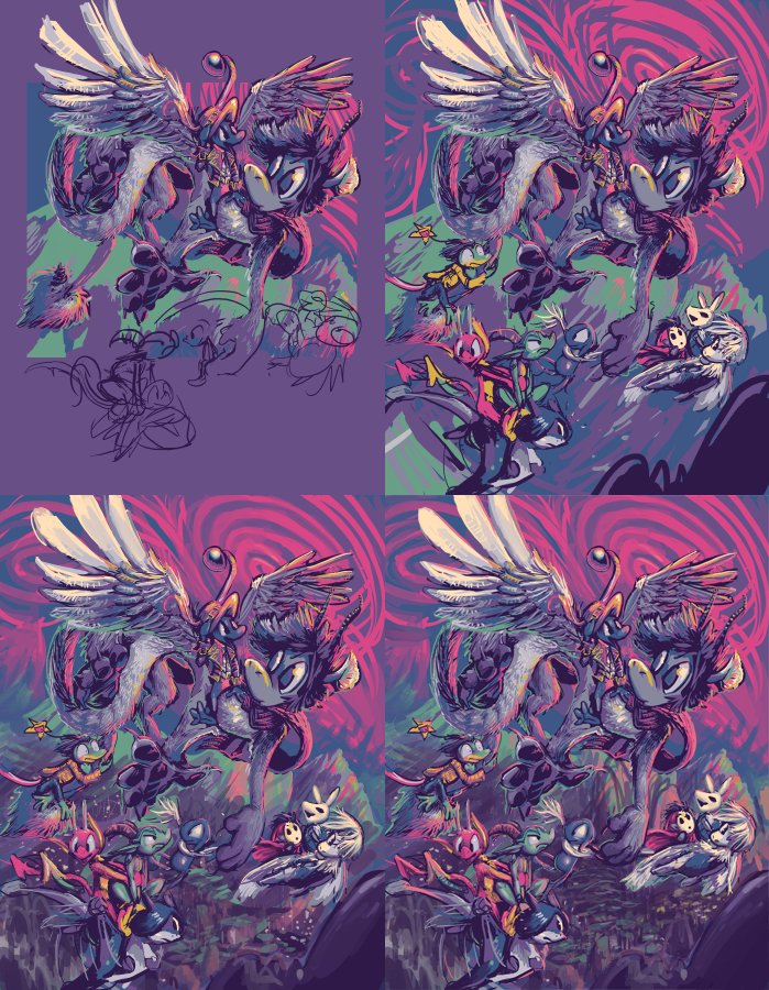
Generally, the blended color is more appreciated by general audiences and easier for me to do, but on many occasions I think the solid way looks better. In recognition of a previous swap, I tried to do it again. Ultimately it is most important what the specific image recipient thinks. Alas, I lacked the patience at post-expansion to keep up the hard color application, but that is minimally evident when the picture is reduced for internet display, and all or most seems to work out. And so, if you or someone you know or someone who knows you would like an art trade picture like this, please tell me next year!
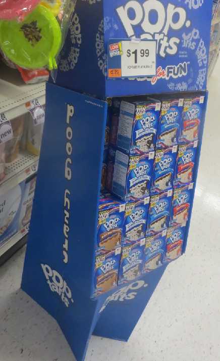
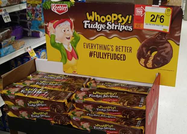
a special message from pop tarts: poob hzej). #poobtarts
I was reminded of this when earlier today I saw somebody link to a glowing brown swirl of lines subtitled “poob” in arial font with no context

and that is comedy now.
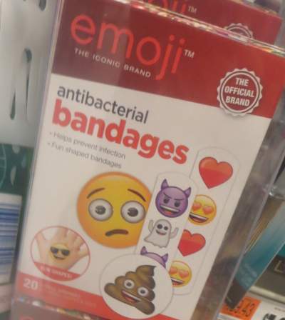
And big business, and not in any way indecent to display in public.
Somehow i do not associate wet lumps of excrement with disinfecting a wound. Or really anything that I want in my life or the life of anyone with whom I have contact. Also, the excrement has a mouth, which indicates it can eat, and potentially produces its own excrement. And it is very enthusiastic about something, presumably that.

Oh well pardon emojME. I didn’t REALIZE that I was dealing with a BRAND. My problem all these years was assuming that being iconic meant you were instantly recognizable and did not need to inform people that you were. Even though I am Bimshwel, ribbtly-acclaimed creator of Bimshwel, the iconic brand of comic strips, greeting cards and self-destructive political commentary, I am too beloved and ubiquitous to concern myself with how anybody else perceives anything. Such as, for example, grotesque drawings of fecal matter on my website. Nonetheless I would like to discuss topics apart from fecal matter, also.

Lighter cat litter! This just looks like you put less of the same stuff in the same box and raised the price.

I do not understand the incentive to purchase this. And there is ample space on the front of the box to make anything resembling a case for it. This is literally dirt for cats to drop emojis in. It should not be mysterious. Lighter weight is not intrinsically more desirable or a sign of better technology, like on a laptoob computer. If the box is just as full as before, that means you actually made the product less efficient! It is not as if this awkward huge box would occupy less space in my house.

Although I do not understand the difference between “neutralizes odors” and “neutralizes odors GUARANTEED,” either. Are you permitted to advertise that your product does something which you would be surprised if it did? And the light litter doesn’t even suggest that it MIGHT neutralize odors, it just is light. Hey it does a terrible job and you get less than half as much in the same container, but the container is SO easy to lift!
The guaranteed product notes that it ATTACKS the odors before neutralizing them. The three KEY odors, sure to join the pantheon of other famous trios amidst the likes of musketeers, tenors, blind mice and mile islands. The non-guaranteed peasant pebbles only neutralize (without undue aggression) odors of fecal and urine style. What is the THIRD odor? The smell of ghosts so you don’t notice your soul leave your body as you consider that purchasing cat dirt has become a major decision for you?
I acknowledge that I mentioned worrying I didn’t have a soul due to other factors recently, but if it checked back in between then and now it most of a certainty has left for good by this point.

The vertical chart suggests the additional odor is that of ammonia, but my understanding was that the smell of ammonia was part of the urine smell, so it still only neutralizes two smells, guarantee notwithstanding. And then part 4 is just the clump power, which the other 2-flavor cat dirt also has, but hesitates to assign a number to.
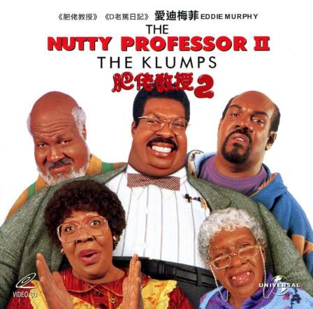
Our greatest, nuttiest research professionals agree that two is the limit.
/////////////////
Spacko noted in a comment that the cat food and cat litter are made by the same company, which means they have a vested interest in keeping the box-filling going two different ways and may have their resources spread too thin to exercise proper quality control in any one field. It occurred to me that the Purina company was also responsible for the all time mail order video game classic Chase the Chuck Wagon.
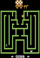
What if Purina’s entry into the cat litter business is just a ruse to dispose of extra wide pixels made from liquidated Chuck Wagon cartridges? The “lighter” variant is literally the lighter colored pixels which of course are far lower in amount, hence their increased price.
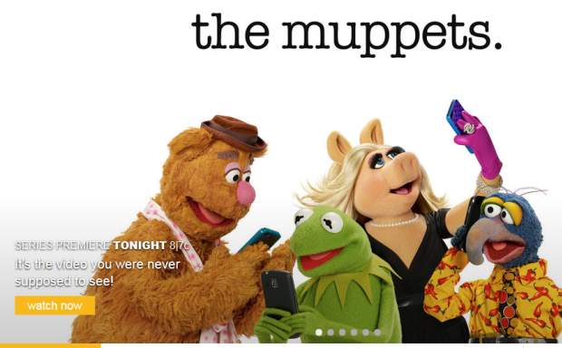
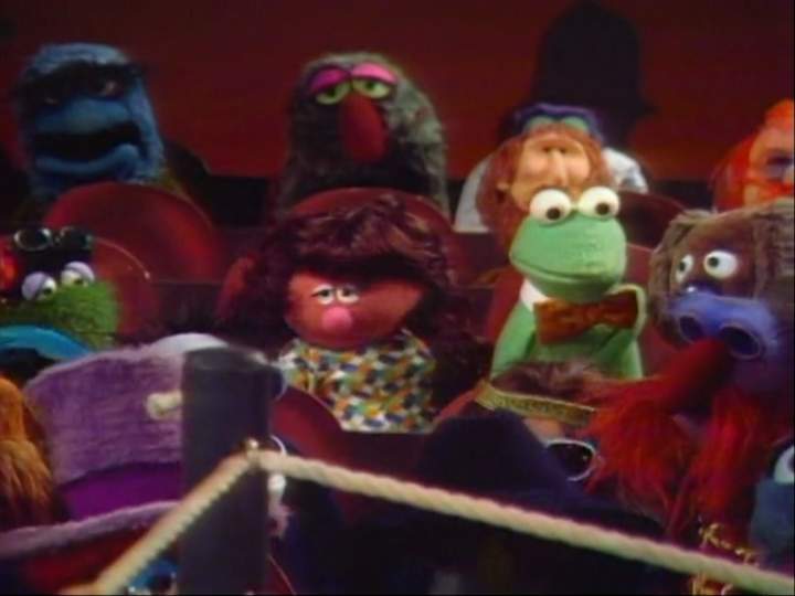
If I was never meant to see these muppets, why are they being given a prime-time network television space?
I overheard a promotion for this program going on like “It’s the muppets like you’ve never seen them before!” Except I HAVE seen them before and they actually looked rather a bit like this. I do not like the “ooh yeah these are the GROWN UP muppets that are scumbags and talk about sex! They take pictures of themselves!” And then is a clip with Kermit saying in a bro voice “what can I say, I’m attracted to pigs.” Like we need to turn them into proud jerks to make them marketable, but different than the original sense that they were proud jerks in, since the initial appeal of muppets was that they were kind of pathetic and usually messed up at what they did.
I do not think sleazy Kermit devalues the original, and it may even be the most potentially lucrative decision. I just personally think it is unfortunate. Fortunately, ads also like to lie and imply that a minor uncharacteristic aspect is the most important thing or happens in a different context than intendewd because people who make decisions based on ads usually have terrible judgement, and may be more likely to continue watching a misrepresented program than somebody with good judgement. In my case, I have enough television already. If these are not my grandmother’s muppets then I will have to accept that I am a grandmother now. We already have “dark” or skeevy muppet parodies like Avenue Q and Meet the Feebles, and then every amateur video featuring a puppet ever made. Give a series to them if that is important to you.
However, I did witness the recent muppet program. It was not bad. But it was not scandalous or raunchy or whatever. I am glad it isn’t, but I wish we did not have to present it like it is to get dorks who watch ads to watch it. The promoters want me to believe there is some controversy over Kermit the frog dating a different pig muppet than before, and people who buy into that rubbish then have counter-outrage over misogynistic remarks made by internet users toward the new pig. But I saw the show and the whole point is that the seriousness of it is ridiculous. The “attracted to pigs” line that makes Kermit seem like a creep the way the ad frames it, as if I am meant to think Kermit is a cool ladies man dude, is actually designed to make Kermit seem like a dork for trying to sound like a cool ladies dude man talking like that.
This is not a revolutionary, earth shaking presentation, but it does not have to be; just by being a bearable puppet-based program it is unique. In fact the 1976-1981 Muppet Show was never canceled; Jim Henson just wanted to go make terrible movies with serious muppets instead. As far as I am concerned there has never been a definitive referendum on whether the muppet formula was working. There was the Jim Henson Hour in 1989 which was cancelled while Henson lived, but it suffered from my never having heard of it. And then Muppets Tonight which aired on flippin dippin Disney channel in 1997, during the period when it was transitioning from a pay-network to basic cable and consequently replacing its 60 years of high budget material shown ad-free with made-for-tv movies about kids with secrets who lie to their parents about it with 6 totally unnecessary commercial breaks advertising junk from the company that made the shows per hour.
Also I have not seen The Dark Crystal and it might well be just the sort of terrible that I appreciate.
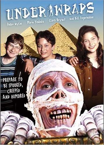
But I am very discriminating with my terribles.
With all that said, I stand by, and if necessary on my earlier statements that I do not need new tv shows in my life and hope to not get stuck watching this one until such time that I decide I wish to. I like that DVDs and illegal filesharing give me some level of control of this.
Why can we not stop to appreciate the fact that we can watch any movie we want or listen to any music we want? VHS tapes were frustrating. FM radio was awful. I like being aware of that. “Binge-watching” is the only way to keep up with all the new junk. Buy everything and watch it all at once. Do not act, do not think, just watch junk every day. There will be more new junk before you finish! Watch faster! Then watch somebody play all your old video games! Then watch somebody play all your new video games! Then watch somebody draw fan art of the game! Then draw fanart of the dork playing the games! Then subscribe to this exclusive pay-per-view fanart feed! Subscribe to everything and pay money forever! You can never stop watching or paying!
Hey I came into possession of a divvid featuring episodes from the program called Breaking Bad. I watched two episodes in succession and had to stop. I felt like a slug. My thinking: if I bought copies of all the trendy tv shows and watched one episode a night for a year I would never run out.
I like having that option, but dislike being forced to use it. And people who are even more impatient buy all the pay-tv channels that this stuff debuts on, and then assume that everyone else does. Hey did you catch the new Game of Thrones? No, because I don’t buy that channel and didn’t watch the old ones either! I didn’t pay for the Disney Channel either! My experience at some better-off relatives’ house showed that the pay version was preferable, but I still would not have paid for it.
Howdy.

As I suggested a few years ago, my experience with hotel morning food has not generally been positive. I never had a free complimentary continental breakfast where I imagined I might pay for the service were it not free. I like orange juice, in differing doses depending on the quality, and muffins (not as much as some people), but doubtlessly this is covered by the room fare to some degree and therefore not truly free, and I have need for the presumably more expensive items that are usually not included anyhow.

Yar ho har tee hee har, a waffle machine! Waffles are good, right? I liked the freezer-borne Eggo variant of my bygone days slightly less than Pop-Tarts, but those were not FRESH BAKED! Apparently you can call something fresh baked when the waffle batter itself is prepared, probably from a frozen mix, and dispensed sickly from a tube, because I put the sickly batter into the machine and oversee its operation myself. You get to lie to me about freshness and give me an errand at the same time! How fresh.

Notice that illustration for steps 1 and 2 on the diagram are exactly the same, so that without another person demonstrating I might think I only need to turn the device part way. That is not the case. Thankfully there was another waffle machine beside this one, and another person came along to use it properly without any confusion whatsoever before I had stood in front of this one for four solid minutes waiting for it to do nothing.

The more detailed instructions provided by the hotel also only show the machine turned part-way. The WORDS say to turn it all the way, but gosh I’m only standing here for three-and-a-half minutes while my machine does nothing; I don’t have time to read all that. And if I had, I might have reached the end and noticed the word CAUTION followed by no more information, suggesting that the person writing the instructions succumbed to the force being warned against prior to finishing the warning, and I would have departed the premises with haste and cowardice.
But in my ignorance I persevered and opted for an undersized waffle. A waffle is the sort of food object that I need to look at before I commit to eating a large quantity of and also if I messed up the construction, I would not force myself to eat as much damaged food. My personal rule is that I must eat anything I make myself as long as I can do it without vomiting. Some part of me hates the other parts. I must work to thwart it without directly opposing it.

With that said, looking at this makes me sad in a way that a full waffle would not, regardless of whether I wanted to eat it. With THAT said,

These waffles should not be served on polystyrene plates, for I might confuse the two and bite the wrong one. My presumption is that the waffle is at least digestible, or capable of being expelled without uncommon internal damage.
It occurs to me that waffles are the sort of food that people get accustomed to covering with other gooply materials that are easier to make and of more uniform flavor. Therefore I am more likely to be victimized by a bad waffle. I am not an advocate for meat as a necessity at all meals, but in this case bacon would be essential to make this pleasant, since I dislike goop. Sausage is also acceptable under some circumstances.

not all circumstances. A self-serving station providing these materials was present, though I did not take a picture of it at the time, but its appearance was similar. I overheard a child’s voice speak nearby: “it looks like barf.” Again, not in all circumstances! Certainly, if you consumed it, your future barf would be similar in composition. But I suspected I could not eat it without vomiting, which would violate my earlier rule in addition to proving right the child I just corrected. I am a person of honor.
On future days of my tenure, solid sausage objects occupied the space of the barf-alike. I thought they were decent and functional but this website is no fun if I have a good time of anything. Website overrides honor. It is much better if I do not eat.
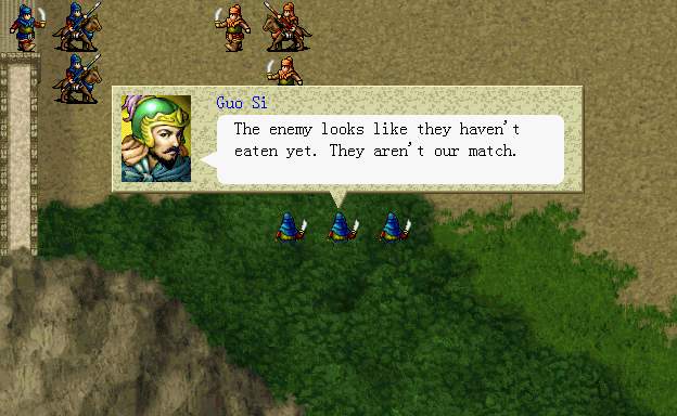
Better for my enemy! Oh were I only not so particular about food! What a hero I would be.
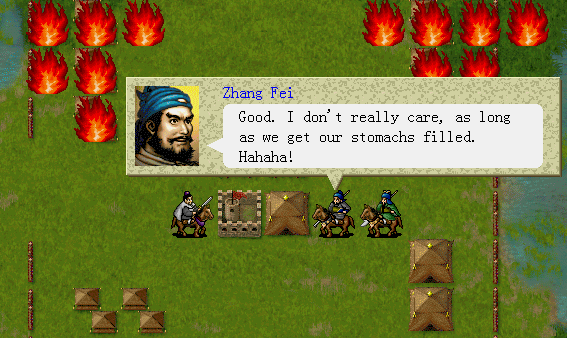
You know what, laughing at me doesn’t help. In fact it is quite hurtful. My self-deprecation is in jest and not an invitation for you to join in!
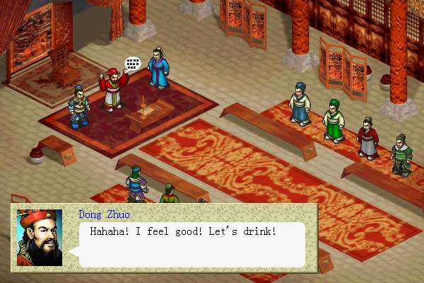
Oh how can I be cross with such a jolly fellow? I always have such a great time with drunk people and am sure history will regard him highly. When you have a name like “Dong” you have to be a nice guy to get through life or else you turn into somebody who digs up the bodies of people you don’t like so you can break their bones and toss them into the street.

I am sure it was a very pleasant and well-tended park!
I never liked the idea of a “blog.” Being the ugly contraction of web log, I dislike the idea talking even when there is nothing to say, just for the obsessive-compulsive sake of being able to say you said something every day. Supposedly it helps maintain interest in viewers. That is how so many bad comic strips thrive. That is ridiculous. I would never say something every day if I had nothing to say. And I would not do it today. Not any sooner than I would draw something if I had nothing to draw, right?
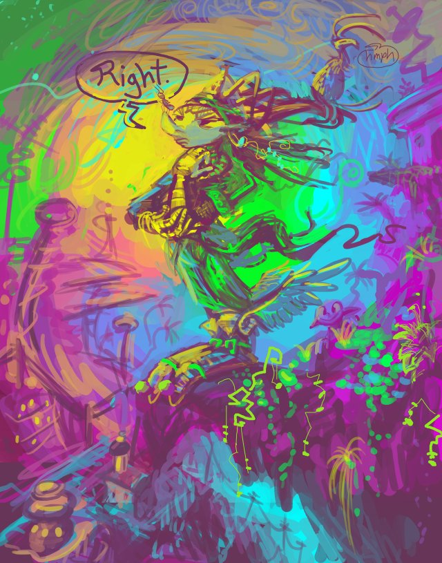
Do not live by someone else’s rules for no reason. You just waste everyone’s time, including your own, when you could be doing something great. Do not expect daily posts here!
Another art show. A semi-mandatory and non-merit-based senior student art exhibition at Southern Connecticut’s State University’s Earl Hall’s Hall-Way non-gallery pedestrian space, Wednesday, at 7pm. Despite being a hallway it is an improvement on my previous gallery zone, which was a cramped office floor in a multi-purpose building (though it at least had carpeting and was in a part of town with fewer reports of armed robbers who have eluded apprehension).
I assume nobody will see this prior to then, and nobody who could have gone will ever see it, and so there ought to have been no reason to announce it, but I felt a nagging need to, and so that is what I have done. Once this is done, I can get back to…regular annoying educational matters that have nothing to do with art. I don’t actually get to leave until May, and instead of leaving I will just be staying in one place more frequently.
I am required to hold a “reception,” and I spent far too many dollars purchasing bad snacks (I only buy good snacks for myself) because I kept thinking things like “well maybe somebody likes cookies but not THIS sort of cookie,” because, historically, lacking any social abilities, my primary reason for attending parties has been to eat awful things, and too often the arrangers did not consider what awful I would want to eat. So instead of using the opportunity to take proxy revenge on people who were never aware I existed through providing snacks nobody -except- me would want to eat, I swallowed all the guilt and anxiety without chewing and will probably choke on it. I hope to have a more coherent writeup of the circumstances in [some point later than a month from now], because I need to make clear that this is not a personal accomplishment. I do not know how to relate to successful people and would hate to lose my own support.
In any event (but this one specifically) I should be full of stories afterward, unless I faint, in which circumstance the story will be more interesting and mercifully briefer.
I do have pictures of promotional imagery, but I also want to go to bed at some point this week.
Please do not congratulate me. I don’t expect that from you, certainly, but from my experience people enjoy not just bragging about good stuff that happened to them but then rollicking in expressions of approval from others for having done a thing that was already personally satisfying. Why don’t you congratulate me when I mess up? Because it will seem sarcastic. And I implied this was a mess-up, didn’t I? (yes) Right so it all works out.
Even if it weren’t, every bum in this degree program has to or may do this. It is not a recognition of any accomplishment beyond consistently paying money that I borrowed to this dumb school and not being quite so dysfunctional that I was prohibited from the right to give it [someone’s] money. The exhibition counts as a 1 credit “class” which I also pay for. So here I am legitimately attempting to raise awareness in some highly improbable hypothetical attendees.
Anyhow, I am still behind on acknowledging birthday greetings. Indeed it is probably best not to acknowledge me in any form that I can reciprocate but appear to have chosen not to if I fail to.
Ideally at some point in the future I will have an opportunity that occurs at a place and time where I can do something with it, and making a mess of that will be an all new experience.
-=-=-=-=-=-=-=-=-=-=-=-=-=-=-=-=-=-=-=-=-=-=-=-=-
It has concluded. Nothing awful occurred, but it didn’t accomplish anything, either. I am used to that, but I prefer to accomplish nothing and not quite commit atrocities in my own home without spending any money.
I was working on an update for Friday, November 9, but then I spilled soup.
=======================================
I look forward to being kept from making regular, satisfactory updates by stuff that matters.
====================================

Willie Wafer is a scumbag.

Willie Wafer is incontinent.

Willie Wafer does not respond well to criticism.
I “upgraded” word-press, the system which this website would function through if it could be said to do so. In fact I did this back in January and said as much at the time, but not in the proper entry body, but rather above that of another site entry, because I only intended it to be a brief notice, but then I wouldn’t stop talking and it occupied too much space. Since the primary intended matter of that bimshwipe took place in the past I decided that combined with the message from the present the piece then overall required time travel in excess of what was reasonable to make sense of. I corrected the problem immediately but I had to go forward a month to pay back the deficit.
What had prompted the word-pressure was when some alien being called “malware blacklist” called my email to congratulate my website for getting on the list, and warned me that my outdated copy of WordPress was a “high” security risk.

I was slow to notice because it is routine procedure for parties to occur without my knowledge, and if I find out there’s been a second it’s generally in my emotional best interest to remove myself from the flow of information entirely. I would elaborate further but then this would be pushed back to April, so I did the upgrade. I wasn’t allowed off the list but I did get to break several administrative functions, which is always exciting and cathartic.

Additionally, the tacky presenting imps now float above their bases. I don’t suppose they look any less dignified than before but they do seem less deliberately placed so they will have to go. Away. They had to go anyway, I suspect. Considering that the next-to-last specific comment regarding their presence that I recall receiving came from someone who has not spoken to me in nearly a year they’ve probably been up there for longer than necessary.
An add-on which is designed to remove garbage comments which would not work without me upgrading now works at last. However, the upgrade also broke the thing which allows me to open entries to comments which I had closed, because all the comments coming in were garbage, which amounts to the same thing, except if the add-on doesn’t actually work than I can’t close anything new either.
Although since that happened and I wrote about it in January it seems to have been repaired, you don’t know that, and in thatever situation the imps still float.

There were always measures in place to control the word waste generated by pressing them, but the old measures became self-conscious about me calling them out on some of their idiosyncrasies. Like that whole “not working at all” thing. Like that time some dubious unfiltered ad robot comment got this site permanently placed on a malware blacklist. Apparently undoing a press only leaves those in charge depressed.

To remind folks that it was trying very hard, the system would occasionally distract humans from commenting using the following alert.

Which worked out very well because occasionally is more than sufficient to cover the frequency with which I am worth talking to. I saw it myself when attempting to test the upgraded situation, and I said to me This explains a lot, and yet I know less than before. Prior to now I’d only encountered stories of this helpful notice’s existence. You may assume any error page that isn’t a depressing shade of green or that lacks any flippant text has eluded my ability to discover, much less rectify the cause of, for what nothing that’s worth.

Looking through my files now I definitely wrote an alternate version of that message in the pertinent file but this ever so helpful upgrade must have overwritten it and been so proud of the deed that it also decided to make the page appear more often.

I also evidently changed another message that I never even encountered. I doubt I’d be here to tell this story if I had.
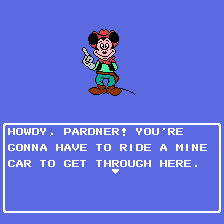
And don’t you think I’d leave if I could?