




May 7, 2026
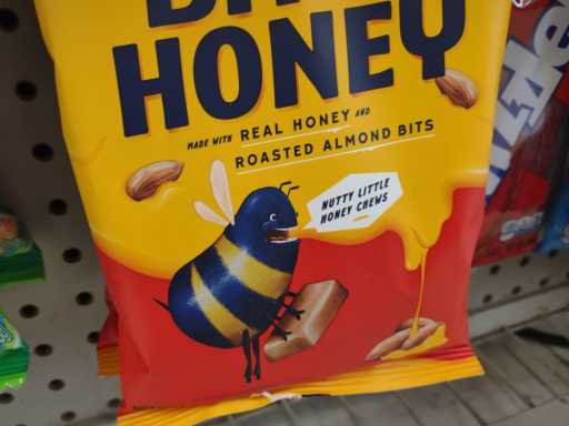
i saw this while shopping. i don’t know if it is the WORST marketing character i have ever seen but it is the worst one i can remember right at this moment. definitely, probably, the worst one that used to be bearable.
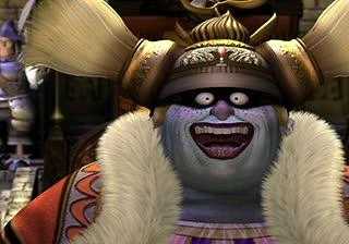
At least Queen Brahne in Final Fantasy 9 has a weird sort of elegance to go with the disproportionate eyes and mouth and the player is meant to be unsettled by this appearance and not in favor of what this character endorses.
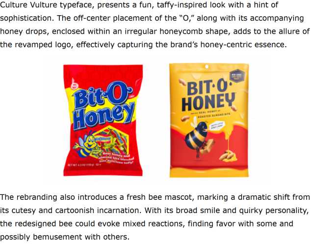
even the soulless marketing website wanking out over this megabland packaging redesign struggles to be positive about the shodawful ai meme hellscape mascot change
admittedly i have never bought bit-o-honey but i was never bothered by its presence until now. i remember years and years ago honey nut cheeriors cereal having a bit-o-honey sample bar hidden inside the box somewhere because i don’t know why, and me and my older brother both desperately trying to claim it just because children are easily impressed and made greedy for flashy nonsense even though i didn’t even like honey nut cheerios themselves. The presentation of the box’s “prize” made me see it as desirable. If it looked like THIS i wouldn’t want to go near it. and maybe in that moment that would have been preferable since i don’t believe i actually got to have the thing.
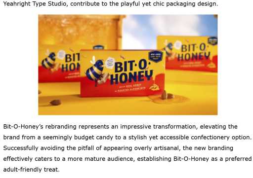
part of the shill page’s point is that the rebranded product seeks a more “mature” audience but as an adult sized person i STILL don’t want to go near it and only did so in order to capture evidence of it. this appeal is “mature” in the sense that a child wouldn’t pretend something horrible was good simply out of spite for another party that they dislike for a stupid reason.
The product has changed ownership a few times and right now it is owned by the spangler candy company which also makes “necco wafers” and artificial-banana-flavored “circus peanuts” and they just want the world to be worse i suppose.
in fact i apparently mentioned bit o honey and necco wafers in the same statement when declaring which bad candy my niece did NOT get on halloween a few years ago, not even aware that they were by then on the same side and uglier than ever.
even the computer generated “whammies” from the 2002 todd newton version of Press Your Luck weren’t as corporately ugly as this because whammies were ugly to begin with.
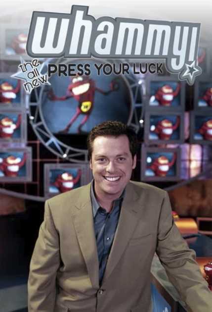
though arguably the sterile set design is inferior to new bit-o-honey at least retaining bright red in its background. I can SEE the horribee in front of it whereas the bland whammy, bland set and bland todd tend to bland blend into each other.
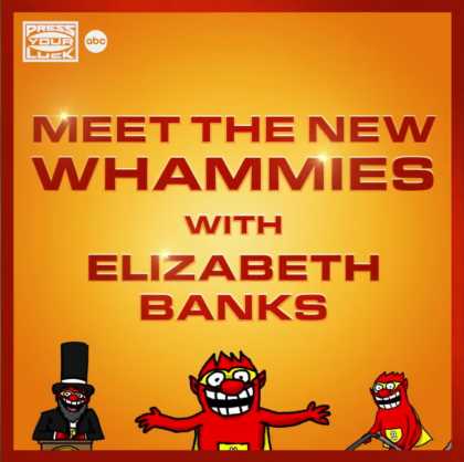
i am impressed that disney-owned abc found something i would less like to meet than the deedles. and this also foreshadows old bit-o-honey being reintroduced in 2040 and hopefully I will have better things to do by then than write a web page about it.
No comments ever.
RSS feed for comments, for they hunger.
This here`s me trackback!