


a third moraff update.
i did not mock-up demonstration scenes this time since it takes too long (it shouldn’t but i do everything the wrong way) and is not relevant to the final product; i only needed them to summarize what i was doing otherwise so i will ideally not make any more of those. also i haven’t drawn new walls yet, because the regular game just palette swaps the first set of walls so if i simply interpret again i will have nearly the same walls i already made so marginally more thought may be in order if i don’t just swap in more graphics i already made for “watch out for dopes”
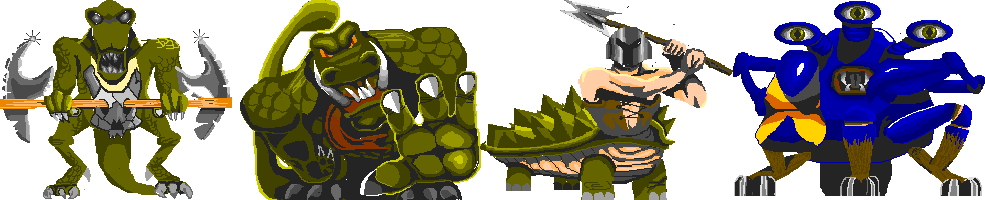
for section 5 we have
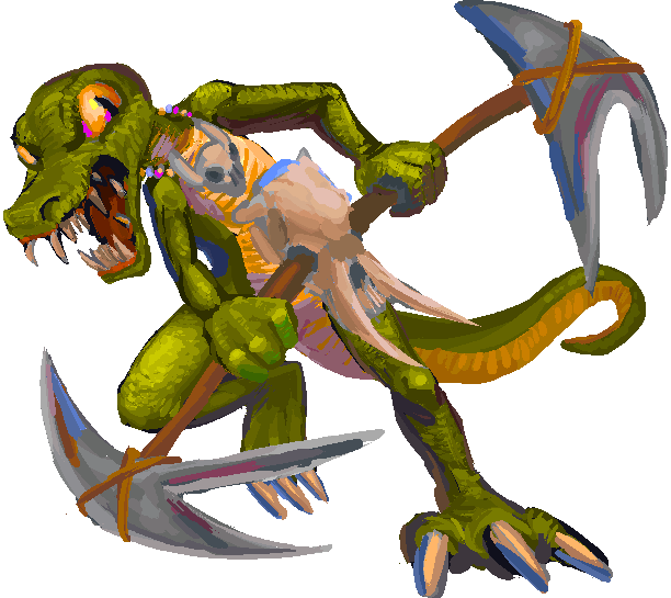
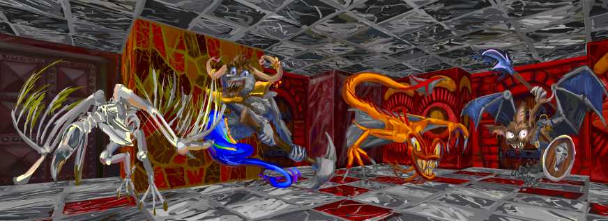
monster 1 troggisher’s weapon makes no sense and i wondered if i should change it so it made a slight bit of sense but i was eventually reminded of a totally impractical 1990s star trek weapon called bat-leth that klingons use to show how manly they are, since i guess if you can win a duel with a terrible weapon more likely to injure yourself than your opponent that proves you are the best in a totally irrelevant category within a society that has phasers and photon torpedoes. And i wondered if the original troggisher’s implement was inspired by that. still it might be worth turning the skull around since that will be more identifiable as a skull even though its horns will then only serve to make the implement more difficult to use. one person did suggest that the skull was actually the creature’s clothing and the weapon was actually two axes that just due to awkward image composition appear to be stuck in the skull’s eye zone, and even in that scenario the axes are not being held in a way conducive to using them
i was surprised to look at the original palette values and see that they are perfectly yellow, equal parts red and green. i interpret them as slightly green and presumably most people do. so i left them the same on the troggisher, just with some intermediate values. but since the new game is not palette limited except for the color cycling affect i can make the other locals have different greens. i don’t know who if anyone is going to play this dumb game long enough to see module 2 but i keep going because there are five!
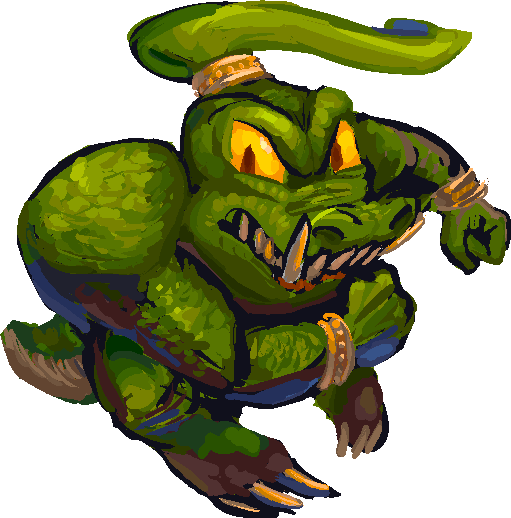
monster 2 dozard does NOT have a green protrusion on its head originally but it looks enough like it does that it seems a shame to not include in a pose where the tail would not have a chance to give the same impression. also potentially this helps it look less like a donkey kong country adversary.
the pose calls out for an embarrassing tattoo but the game has retained the trait where monsters randomly decide to be backwards so it would be limited to symmetrical letters or symbols.
dozard is classified as an “armored” rather than high attack power monster but apparently the armored ones do have slightly elevated hit strength relative to “average” monsters, though they lack a few speed points. which thus makes a running pose inappropriate but maybe it doesn’t run very far
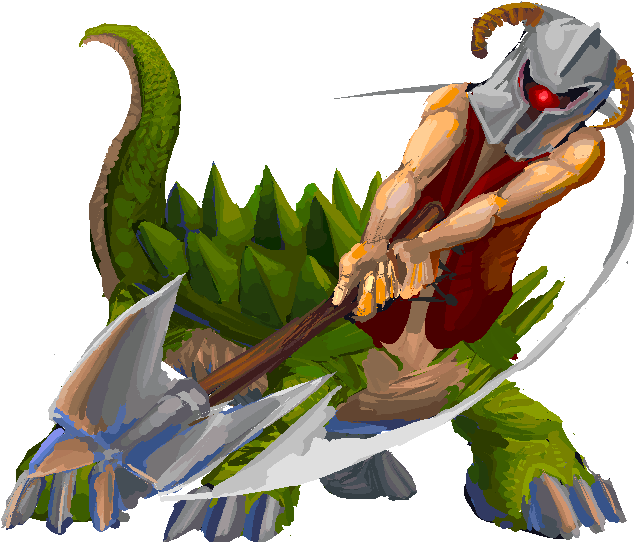
curiously, monster 3, the torman, the only character in the game with a face-concealing helmet, is not given a high armor rating. nor a high strength and certainly not a high speed rating, I thus made it look more powerful and faster than the other three.
and also i am terrible at drawing muscles. that isn’t new but hopefully in the intended context that will be minimally evident. ironically i could probably alleviate this slightly by drawing more armor on them.
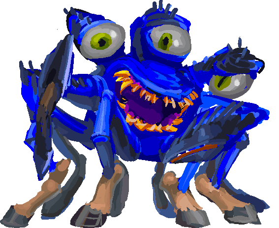
something was telling me to give monster 4, the crab-horse-spider, a buck-toothed smile and i eventually realized i was thinking of the awful crab beast from moana. i had earlier kept worrying it was looking like something from monsters incorporated but couldn’t pinpoint the character since i have somehow never been in its presence.
i have no tolerance for “coming of age” “uuuughghh this is SO unFAIR!!!” disar and pixney mopey-smug-mopey-smug tweens arguing with family movies they have been cranking out endlessly since the lion king, but i also don’t like their movies that aren’t that but came out within this same period apparently, and i feel like my niece has watched all of them in front of me (except the monster one i guess). i don’t blame little mermaid for that since it wasn’t so much copying a formula from an earlier disney movie though i still don’t want to see that again much less hear its songs again.
i also saw the cinema preview for the moana remake that is evidently SO redundant that even disney cult shills old enough (meaning my age or greater) to be permanently set in that can’t see a reason for it to exist. there is so much computer imagery the only apparent difference is that Rock “The Dwayne” Johnson actually had to go to a film set, and SUPPOSEDLY at one point there was a plan to just make an artificial intelligence puppet out of his face and superimpose that on another actor and HE WAS FINE WITH THAT IDEA.
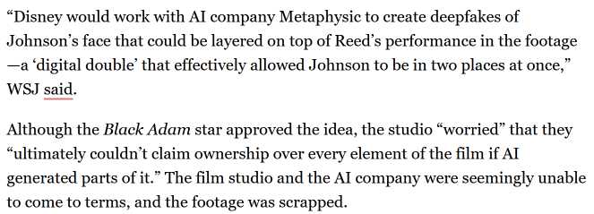
the only reason it didn’t happen was because disney might not legally “own” that. can you imagine a world where disney can’t just own everything? The procedure being horrifying to think about and likely also to look at and wasting an obscene amount of electricity and water to make this ostensibly pro-ocean movie did not enter into the matter.
also that article does not actually explain who “Reed” is and I wish i were able to not notice things like that when they pertain to topics that i greatly desire to not know or care about.
Anyway this crab-horse-spider doesn’t remind me of moana now beyond it reminding me that it used to remind me of that.
yes apparently that is all for now since this is essentially half of a patreon post i just made and i have to tell myself that the ten subscribers are actually getting something exclusive and not just giving me money out of pity without necessarily looking at what i upload or caring if they are getting significantly before anyone else does.
another moraff update.
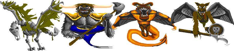
the were rat bat looks like it has fake wings held on by shoulder straps but upon close examination that might not be the intent, nonetheless i went with that. my first sketch gave the bat legs instead of arms since a slightly less fake bat would have wings as its forelimbs, but there is another bat in module (episode) 2 that has legs and is less well drawn so i will wait for then to take excessive liberties. i was already messing with the vulture. feathers are not bones but according to a morbid image search withering ones can apparently be found still stuck to vulture skeletons, either because they don’t rot the same way as flesh or just nothing wants to eat them. in my endless wisdom i depicted the OLD version of the vulture’s head on the ratbat’s shield. the shadow variant is stored as a separate image so i have the power to give that an appearance distinct from the regular ones and maybe i will give that the more pterodactylyian traits of the original. but i also have at least 72 more monsters to draw so i should perhaps prioritize that
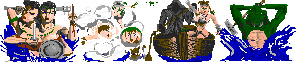
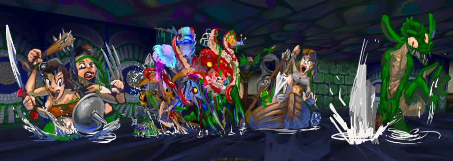
i started on a watery graverd –all these years i thought the name was graveyard and wondered why it was being spelled graverd in the game text development spreadsheet and also in the several years old gamefaq –that despite including contributions from me as “porticulo” i apparently never read completely since the project leader Jimbly forwarded me to it when i asked a few questions about game mechanics– but looked at my very old screenshots and it plainly says “graverd.” perhaps moraff erd in spelling it that way to begin with but i will likely never know and in any case that is its correct spelling now.
i started on a sentence about watery graverd but my digression was catastrophic. the drawing i started on also was in different ways. a comment i got a few days ago that the akismet spam detector helpfully prevented me from seeing until the commenter told me specifically two days later that it had left a comment that never appeared and i went to search for and forcefully appear it after i had already drawn my initial version suggested that what i was interpreting as antlers were actually meant to be arteries, and i wondered if maybe rather than being incomplete and awkward it really was intended to look like that. i am not fond of vestigial heads but i decided to try a “creature” comprised of other creatures stuck together, which didn’t work very well but looks better than what i already had,
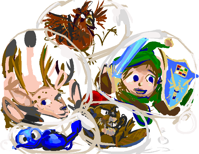
although replacing the inadvertent smiley face with a blue dope was inspired and it is always a shame to NOT beat up dopes. maybe if i draw alternate variants for shadow monsters i will also draw variants for non-shadow monsters and the dope will return to have revenge enacted upon it.
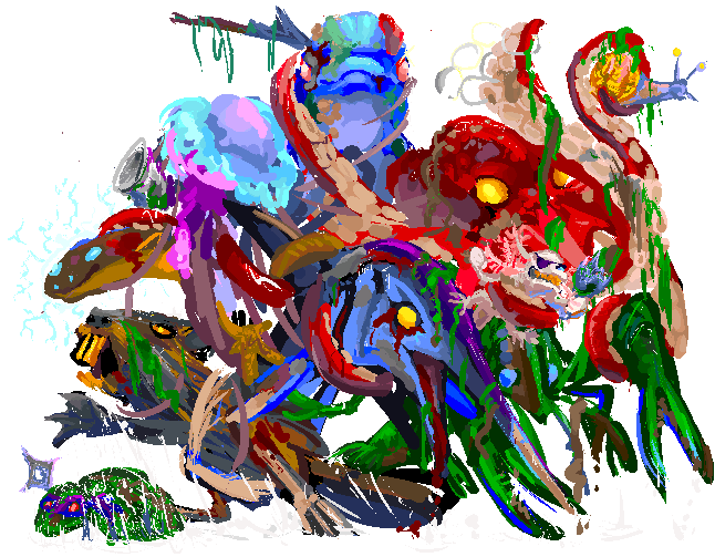
the new version is still a mess and matches the old description of a being that “evolved directly from the rivers” better than then new one written by a mysterious entity called Merlin thast refers to “a menagerie of drowned corpses” since presumably a few of these would have had difficulty drowning, but it IS possible to look at this drawing and mostly determine what the individual pieces of it were intended to be. since i think the remake will only be available in the full version a hypothetical player will probably be in the place where you actually see these for less time than i needed to draw it. the full graphics is 2586×2014 and at least on my screen looks slightly better in the game than in this website sized gif.
in moraff’s world all the undead or demonic-looking creatures drain levels if they hit you but dungeons of the unforgiven makes no such effort at consistency, with the vulture of death in section 3 just being “fast” so me making the watery grave[ya]rd into a zombie mass that shouldn’t be a problem. although the best way to do that is to have it dripping with seaweed, and in the final section 20 the level drainer is a mass of sentient seaweed. and then the dorky crocodile with a hammer or axe is the evil level drainer instead. i think it would be logical to swap them but that would be the first logical event to occur.
even without the sea weed it looks rotting and wet, like a shoe that tried to walk through a puddle too deep for it. my drawings often look like this when i spend too long trying to fix bits that aren’t working and usually it works against them but for once dripping and disgusting is the intention, even if this was accomplished inadvertently. this looks like the weird soup a roommate once made with ingredients from the asian grocery store and then left on the stove for three days without saying anything about the soup or him leaving for three days. i swear i mentioned him on this website before because i distinctly remember including a lemur’s head to conceal the identity of the person in the photograph i showed but i cannot now prove that this happened and i would prefer not to dwell on that at length.
both merlin and jimbly have met steve moraff but i do not believe he was asked for insight on specific creatures, and i do not know if he gave instructions as to how the things were to be drawn either, so a few of them being utterly dissimilar to the originals is probably not of great importance. I have also been informed that he was shown one or more of my web pages but i do not know which ones or if he was exposed to any of the text. it seems likely that he does not care a whole lot one way or another so long as the finished product with his name and ownership implying apostrophe-s is not outwardly objectionable.
the “she demon” has for now marvel wolverine style claws. the original when closely examined seems to have a single knife attached in a similar position but the drawing always casually looked to me like “i’m stabbing my own wrist” and i didn’t necessarily want two single straight blades and then a club in the same drawing. better to have three distinct objects. the sword i drew actually has a CURVED blade but from this angle it looks like it isn’t. whuipth. i can potentially make the second head look less like phil and lyll’s mother from rugrats but up to this point i was more worried about the bubble fiend.
ironically the flooded zone of the original game probably inspired my ultimately unrealized attempt to make similar sorts of areas in the doom engine in pretty much every level i ever tried to construct, but always having difficulty figuring out why the water never looked right, and eventually becoming keenly aware that water just doesn’t look blue except in large bodies that are open to the sky, and now i am in a spot where i cannot proceed unless i commit to it looking blue and opaque in an interior space. whatever i came up with for free with wimpy technology somehow looks better than our government got for 14 million dollars but that isn’t necessarily saying much since they have spent billions on worse.
beyond THAT to create the effect that the water is not just a floor moraff had stretched the walls vertically so that the lower portions get cut off and then drawn over the edges in blue so that they would superficially appear to be actually the edges of the floor that isn’t supposed to look like a floor. no evidence exists now but i recall copying THAT also but i was trying to match it with doom’s own “nukedge” and “blodedge” textures that are supposed to look stained with toxic waste or blood rather than make the floor look bigger. and i did it in BRIGHT blue since my water texture (which does still exist because it was alphabetically earlier and so got on to the iomega zip disk before the last time the computer agreed to finish booting into windows 95 but is not relevant) was lighter blue so it would match the bright blue waterfall i also drew. oh the thought of it is uglier than the watery graverd. the present “couple from hell” i have up there DOES look light-blue stained because i drew that before i drew the water and initially would have matched with the more saturated light blue and i tried to fix it and i have gone back to take that screenshot about 12 times and it might come down to i put out this web page today or i fix that graphic and i don’t want to work on the web page tomorrow unless it was posted yesterday and the most nagging thing wrong with it is actually wrong with something outside the web page that is not at risk of being seen by anyone else for a few months probably. That might be comparable to the amount of viewers i get on the web page but the point is to talk myself into posting the thing, not whether anyone apart from me ever finds out.
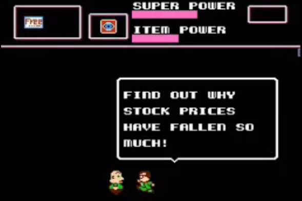
thankfully i have more important things to worry about
you were probably unaware that an authorized unofficial remake of moraff’s dungeons of the unforgiven is in progress, and you very likely didn’t know that game existed in the first place. most people probably don’t, and so as the one person on the internet to have uploaded a medium level effort tribute drawing for the game, i turned out to be the obvious choice for game artist in the absence of a budget with which to hire a real one.
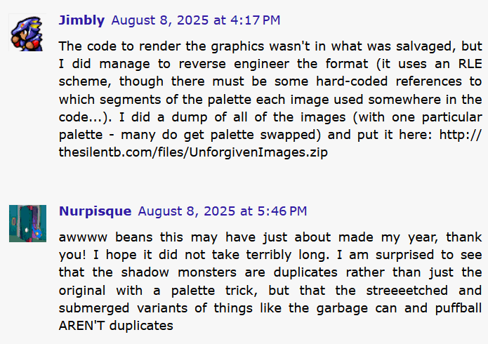
in fact i had an earlier run-in with the project leader last year and attempted to write a website post about it, but it was mostly pedantry about the game’s source graphics that i never got around to uploading the pictures for. and now i have to be even more pedantic than that in order to make sense of what i will be redrawing.
I am meant to not show screenshots of the actual game in its present form but i CAN show my own contributions and I have other methods available with which to accomplish that
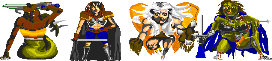
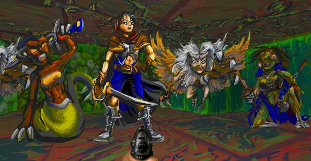
Although i have been encouraged to take liberties, i do not want to totally disregard the designs of, at least, the well drawn ones, allegedly by a long lost individual called Logan Gilbert. i presume much of the awkwardness was due to trying to maximize the viewing area they appeared in, since only one monster can be directly in front of the player, and also getting 32 colors total to use at any one time since Moraff needed to also reserve 16 ega colors, 16 wall colors, 16 floor colors and 176 ridiculous color-cycle highlighting colors. I started out trying to be fairly accurate with my recreations, particularly on the harpey whose frightful intensity i have always appreciated despite it being one of the easier monsters to defeat, but maybe it is better to ease into my sort of erraticness anyway. the green creature “sustrontima” looks less correct than the other three but its dorky joviality amuses me.

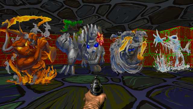
in section 2 i made even less effort to be accurate. i figure somebody who cares about this game and wants to see the original poses will simply use the “classic” graphics and i will have wasted more time than usual for less reason than usual, as usual.

it was only amidst this project that i became aware of the deformed hay-stuffed hand hanging off of one of the knives hanging off the sustrontima and was not sure if i should include it but it sounds like i should so i will add that later. I also considered the similarity of this appendage and its tool of choice plus the mysterious yellow lines falling out of it to some of the details on
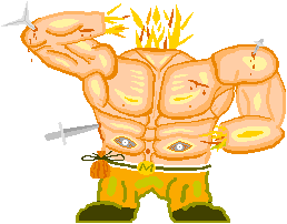
my favorite least favorite monster, the flaming idiot, who INDEED has lost one or more hands. i will at some point have to redraw this thing also, and i suspect i will be considerably less accurate than i have already been.
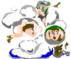
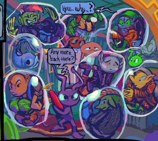
this is another one i have been dreading having to redraw, by the better artist, even. it is called “watery graveyard” and i was never quite sure what precisely its illustration is OF
it looks sort of like two humanoids and a cat or beaver stuck in bubbles, plus something ELSE. but what IS that??!
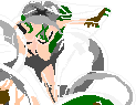
the two human like shapes are already vague and the left looks like it has antlers or french fries coming out of its head, and i suspect the illustrator was given very few colors to sort this out in, so whatever i was supposed to see is even harder to see than it initially might have
The upper right piece looks sort of like a griffin claw but then what is on its head? a flower? that turned grey due to a shoddy palatte? with frog legs coming out of it? but the lips of the one of the identifiable entities are also green and probably not suppose to be so maybe the frog legs are supposed to be red and something else. bacon?
i wonder if the flower thing is even maybe the watery graveyard’s “mouth” and the nearest shapes make no sense because they are being consumed. but i always figured it was something unseen within the water, capturing creatures with bubbles. if it is a flying mouth it could do this anywhere

THIS part looks SORT of like a malevolent face but it is uncharacteristic of how logan gilbert draws faces
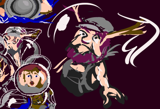
maybe it is even a stereotype of an early 1900s irish immigrant who works at a foundry or something and also has weird antlers
oh no i just realized i already spent several weeks this year drawing that
i must escape!
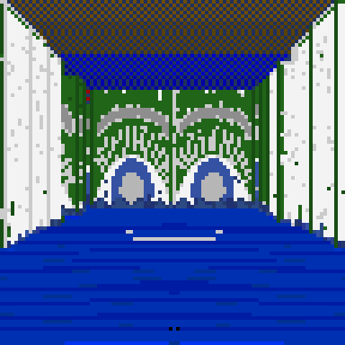
i also just realized i have another unfinished moraff post from 2018 which intended to end like this
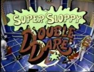
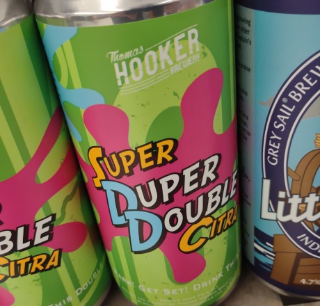
I assume this similarity is deliberate but i do not know why it would be. i never watched double dare and thought “i really want to put that into my mouth.”
this similarity i assume is not deliberate
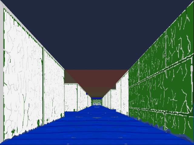
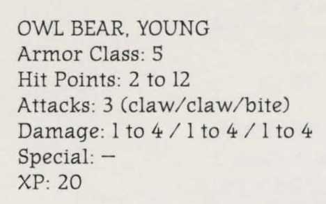
thank pog somebody scanned this book and put it on the internet; i was suffering mentally more than usual after spending an hour getting to this spot in the game from my nearest save-state and seeing the text say
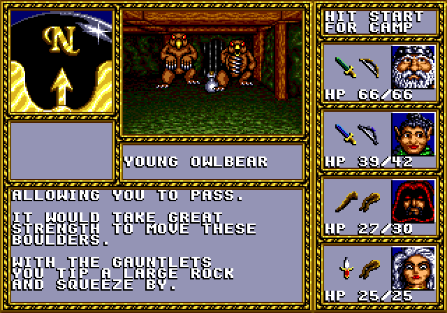
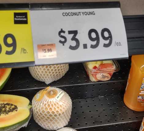
“young owlbear” when i was CERTAIN it had always said “owlbear young” and that was the main reason the coconut was funny to me. I must have spent a lot of time doting on the generously oversized and overinformative instruction heap. it probably gave away TOO much of the game but sega genesis users in my home were more than capable of being terrible at it anyway and needing to develop sort of cheaty strategies to get through it.
if i couldn’t verify this i might have had to tell the story of how my younger brother (yes the alex jonesy one) while driving an automobile wanted to play audio off of a neil young cd he had just purchased but only at that point realized he had somehow bought a neil diamond cd instead and rather than returning it to the store for a refund or exchange he simply threw it out the window.
I also was particularly afraid of owlbears a long time ago.
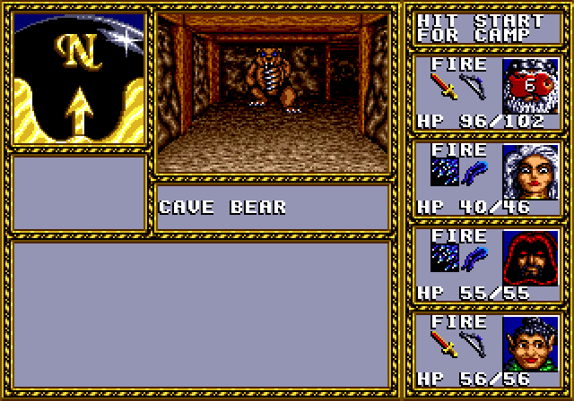
Not CAVEbears, which use 80% of the same graphic tiles, have more hit points and do more damage and don’t have comma young versions that are easier to beat, but ALSO don’t have huge insect eyes and owl beaks of no practical value above standard bear facial features.
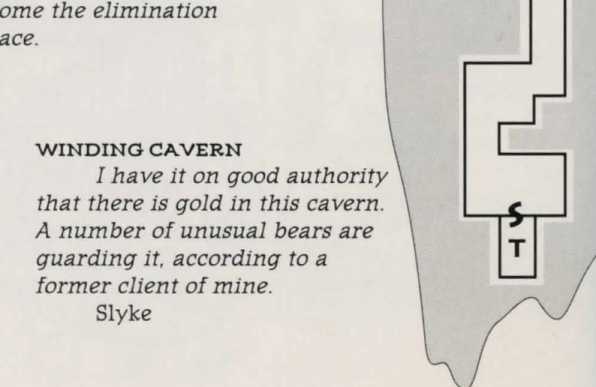
the authority can’t be THAT good if “unusual” is the best adjective it could muster. An unusual bear would be green or wear a silly hat! it would NOT have a beak!
and it is funny to consider that they are only 40 pixels tall since the first person view ends up filling most of the screen with a text descriptions of stuff the game isn’t prepared to show. Monsters also float around in space instead of standing on the ground, which has the unsettling effect of making them MORE scary. They are like foam dinosaurs in a bathtub. Which yes indeed at one point of my life i was legitimately terrified of inadvertently touching. I like that as scary as the tiny bouncing owlbears young were they could not touch me. That was an adequately immersive experience. Although this now reminds me that i had to stop playing Puggsley’s Scavenger Hunt because it creeped me out so much to see the float-bobbing rubber ducks hit a wall and abruptly reverse and start float bobbing in the opposite direction without being animated to turn around even though video game monsters have been doing that for most of their lives. Similarly with the leaves in the tree level of Prehistorik Man, even though they work much the same way as the raccoon leafs in super mario bros 3, i guess because they are larger and keep getting tossed back up instead of falling off the screen. borf i should not write this sort of thing at 3am now i won’t be able to sleep, thinking about those creepy self-mirroring leaves and ducks that apparently remembering being afraid of foam dinosaurs that bouncing owlbears remind me of remind me of.