Is this site still here? I could have sworn I threw it out last week.
>>>>>>>>>>>>>>>>>>>>>>>>>>>>>>>>>>>>>>>>>>>>>>>>>>>>>>>>>>>>>>>>>>>>>>
I honestly have no idea sometimes.
>>>>>>>>>>>>>>>>>>>>>>>>>>>>>>>>>>>>>>>>>>>>>>>>>>>>>>>>>>>>>>>>>>>>>>
I think this is boring, but I already told somebody I’d write about it, and now I have to.

A few people seemed to think I had missed the point of a ubiquitous trend in internet advertising which I have complained about recently: that the things are supposed to be ugly. I believe now that there is no point to miss, and the absence of one is what worries me. It is true that I did not consider that the ugliness may be deliberate, but now that I have, I find it yet less forgivable.
The New York good ol Times website, which apparently doesn’t force me to log in anymore but still uses crazy click-tracky urls, had a story about the weird ads over two years before I could no longer contain my indignation. Yes, the ads get people’s attention. So does murdering them and/or wearing a suit made entirely of pizzas. Not all attention is good. And unless they’re from Sbarro there’s a good chance you ruined those pizzas.
Of course, that’s just the lower m’bills gang; the “get ripped” people are probably ripping off (oh ho) the proven winner. And so the thing that was unique five years ago is now irritatingly common in addition to sickeningly unsightly. In that not-mine article, the company also claims credit for the “click the icon representing your state” series, which I hate more than most other things. That one was so ugly it literally made me itch. It was like Chakan. The fifty tiny icons with state abbreviations on them presented as kernels of corn or large eyed ladybugs, bobbing around at the same time. 100 creepy eyes really close together and instead of mouths or pincers they had pairs of letters. It made me ill, as well as my computer, which struggled to render so many separate objects at the same time in a flash file. If my computer could vomit, I’d wish it wouldn’t.
So, anyway, ads are ugly, and they know it, and they like it.
Across six decades, television ads evolved from happy-go-lucky-go-shoppy hokeyness to cynical, market-researched “yeah, no…” scrumsack panderthons, but they’ve always been selling a product or a service. Even the Angry Gumball. I’ve been on and off the internet for over ten years, and banner ads have always been surreally disgusting and they’ve never had much to offer beyond vague schemes. Fill out this survey and win! Hit the monkey and win! No, forget that peef, you ALREADY won!

They don’t even bother with an asterisk most of the time. I don’t understand them and I don’t trust them. When similarly shifty operations like Cashcall show up on television, they resemble banner ads. Somehow, there is a lucrative category of customer who can be brought in entirely through blind curiosity over an ugly thing. This is not surprising; I never seem to get over it, but since the early 90s, cartoons have gotten uglier and uglier (or stayed as ugly while ones which were less ugly deaded out), and more and more kids have grown up watching more and more ugliness. They have been bred to be fond of the repulsive. The fact that anybody can be persuaded to drop dollars like this sickens me. It’s like in a feel-good-movie-of-the-year where some idiot will be taping triscuits to his socks or something and a billionaire happens to be passing by and says “that’s just the sort of ingenuity I’m looking for! Come work for me! Here’s $50000 regardless!” Why I oughtta!
While lover-my-bills actually does have a thing that it does, which is referring people to companies which in turn pay that website for the referral, I naturally assume the recommendations are less than the best possible advice and that LMB is more likely to refer to companies that pay it more for referrals. In part because its method for drawing customers is insincere, in part because it’s on the internet. The internet, where you can get music, movies and 600 dollar software for free, but actually attempting to pay somebody for something can cost you your live’s monetary savings because you paid the wrong people (or merely because your credit card was compromised when the 973rd “insecure connection” warning your computer didn’t bother to show you actually meant something). Which is a stupid generalization, and probably one that has been made before. Lowermebills probably isn’t a scam, but it acts like one, and actual scams act like it. I can’t myself conceive of how a nice looking advertisement for that company would look, though. They either have to be the ugliest or not succeed, because all they’re selling is dubious advice. It’s not my job to investigate what services are legitimate and which aren’t. There are places you can get information like that, and you should, if you give the slightest consideration to giving credit card information to a site you came to through a non-sequitur advertisement designed by first-graders.
The American Family Publishers were notorious for informing people that they “may already have won” millions of dollars as a way of enticing those people to buy trashy magazines through the mail. Do you know what happened to that? People sued the company out of existence because it was LYING. Publisher’s Clearing House was worse, but it scammed a lot more people, and so the amount that didn’t bother to sue it back collectively still bought enough magazines it didn’t want to keep the company in business. Or something. I read the wikehhhpedia page about a year ago so don’t use me as a source when you write a research paper for your sweepstakes studies class. People could have avoided being fooled if they’d paid more attention, but it never occurred to them that in this country there were large groups of people actively working to scam them out of their money. These days, of course, that happens on a much grander scale with companies scamming the government itself while simultaneously convincing the same government to pass more and more laws that allow bigger and bigger scams. And so compared to that, a decade’s worth of colorful flashing lies controlling the internet doesn’t seem as bad. That doesn’t mean I’m going to stand back and watch them flash and lie without a fight, either.
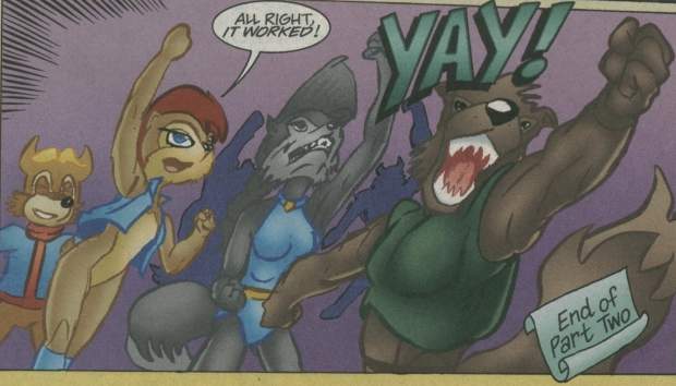
I’m glad uh someone believes in me.
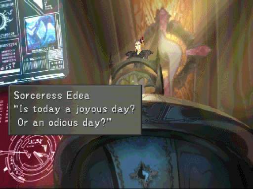
If you have a PROBLEM I’d appreciate if you’d just say so.

What does THAT mean? Is it some sort of a warning? Or a threat? Arb, I hate not knowing!
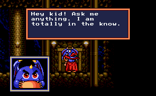
Renk, I have to talk to some dumb monster now? Forget it, I don’t WANT to know!

I said I don’t want to- oh fiddle dee diaper.


ifihadjo sez:
Your observations are spot on. Another disturbing image regularly used by petrol companies is the huge head tapering down to a small body – a product of an ultra-wide angle lens or long term exposure to gasoline fumes who knows. All this grotesque advertising is truly astonishing. Somebody had to pitch it to a room full of suits. Oh to be a fly on that wall . . .
Garfield sez:
Let’s challenge.
(Orange you glad I didn’t say “The Mondays sucked”?)
Rabivit sez:
Iffy:
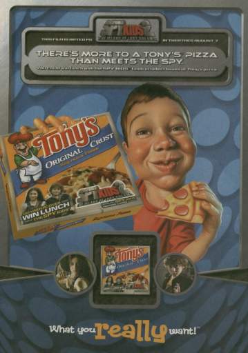
I like those really creepy Drew Friedman-esque airbrush kids you see on boxes for board games and whatnot. Don’t you?
Garfy:
I WAS until you said it anyway. Do not tease me with what I cannot have!