another redrawn comic page. Much more orderly dialog than before! And no bauble stems that cross each other, although a few routes are lengthy, which perhaps some day I will decide is even more distracting. Yes yes I do like how the wordage and containers are laid out here. How did i ever think that old way was acceptable? Even if the last seven days of effort gain me no scrap of respect from one other person, I like having so many neatly-arranged colored sentence boxes.
Originally, on this and the next page I just colored under the pencil drawing, with a few touchups, to speed things along, since it was taking me weeks to do them the other way. But I had to do this one like that anyway! Oops. But this only took one week. So with about ten weeks left in the year, I should be able to get the second book printed, provided I do no other things. However, I have to do other things. Gosh I have to get up now to dump extra water into an electric cat water dish that starts to make weird noises if the water goes over a certain point that becomes closer to the brim of the dish as the filter breaks down and needs replacement. But I don’t know where you buy the filters, so I have to order some more, and I don’t want to register my own email address with any of these dubious pet supply websites, identify myself to marketers as a pet supply buyer thereby sentencing myself to junk email about pet supplies until the earth crashes into the sun, nor pay the shipping cost on this that probably exceeds the posted $7.99 price of replacement filters. Because I hate having cats and hate spending my own money on them. But nobody else will do it even though it is presumably for another human’s sake that cats continue to be kept on the premises. So imagine that every aspect of my life is like that. Outside of these lovely dialog containers. I have brought them under my control.
I cannot recall previously being this aware of how absurdly large i had drawn elpse’s feet.
page 18 of part 3 of the bimshwellian comicoid. This sure took long enough to get to, and finally resolves a matter that has been up in the air for too long. And now I must go back to the past to rework old pages because it was my intent last year to have the second small book version complete within this year. I have within this year tended to a number of long postponed matters, and ordinarily would consider that justification for postponing a less postponed project, but I actually printed inside the first book that the next one was “Available 2016″ so that makes it closer to law. Even though I added *hopefully” afterward. Hopefully does not mean “no self-imposed psychological consequences for failure!”

It is fine to experiment with ideas whose relatability or comprendability are uncertain, but do not commit to laborious coloring methods for them. I just got through saying not to tighten the humor out of the artwork, and then went and did something that is almost as bad.
page 17, part 3 of that. I like the newer page-display system better now than I did when I first made and didn’t use it, and am more comfortable linking to pages on it now, but am not yet certain what I should replace the “that” page with.
This is another “experiment” in layouts that anyone else would have assumed was already long since proven. It still feels like cheating, to me. Even though it was just as much effort to complete as usual, and there was not a way of shoving in the next four frames that was pleasing to me, pacing-wise.
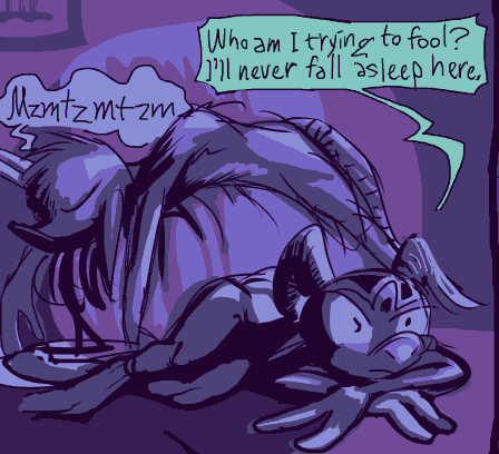
Obviously! Turn that thing off!
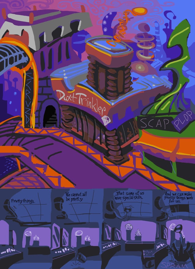
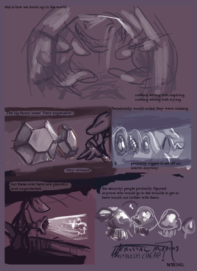
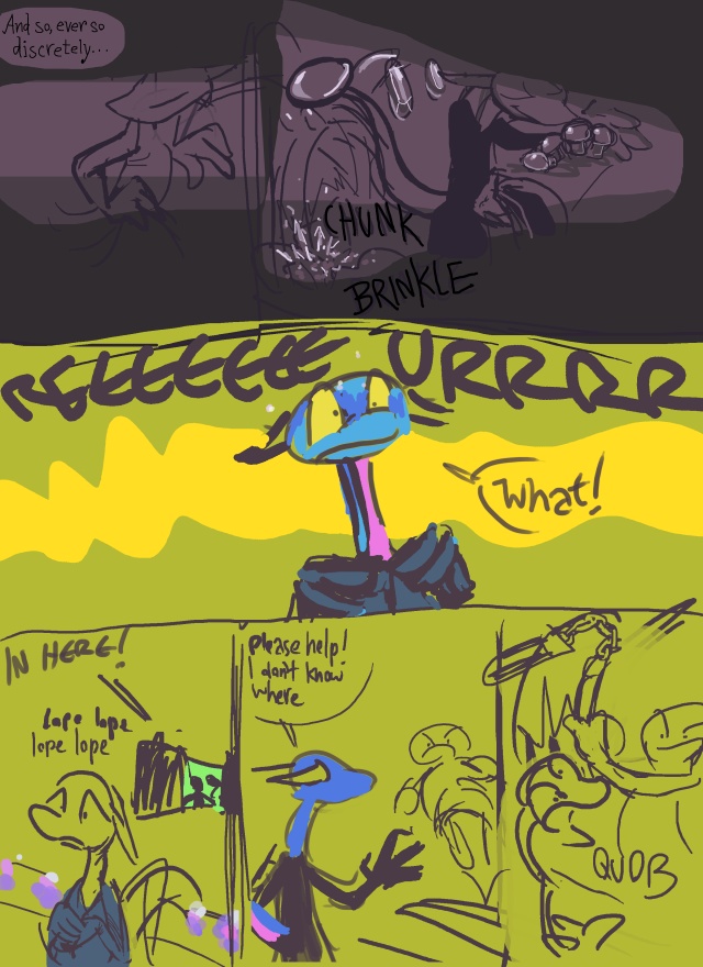
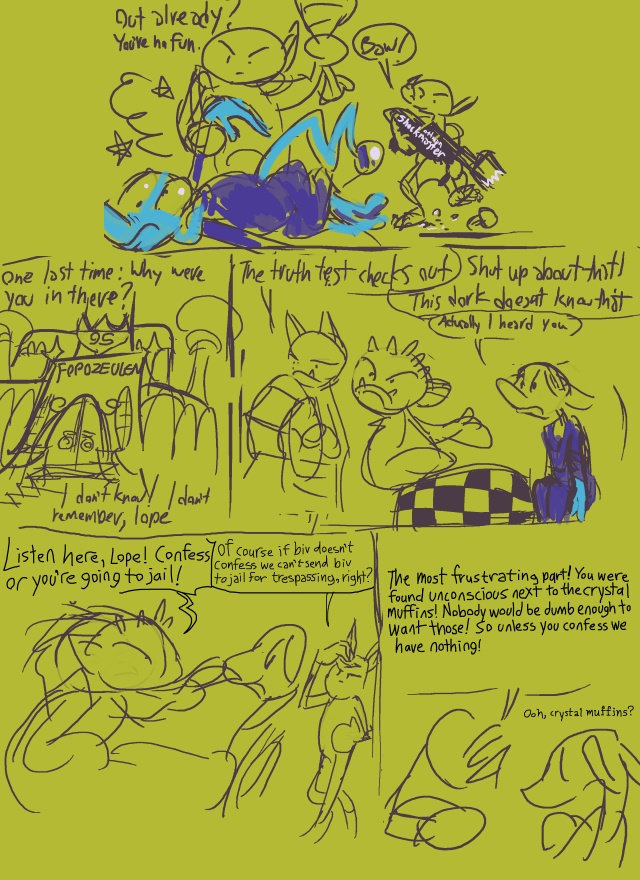
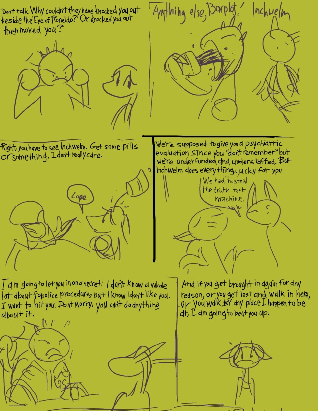
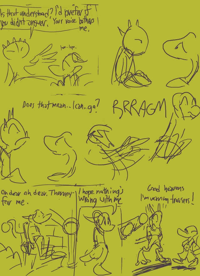

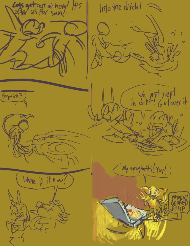
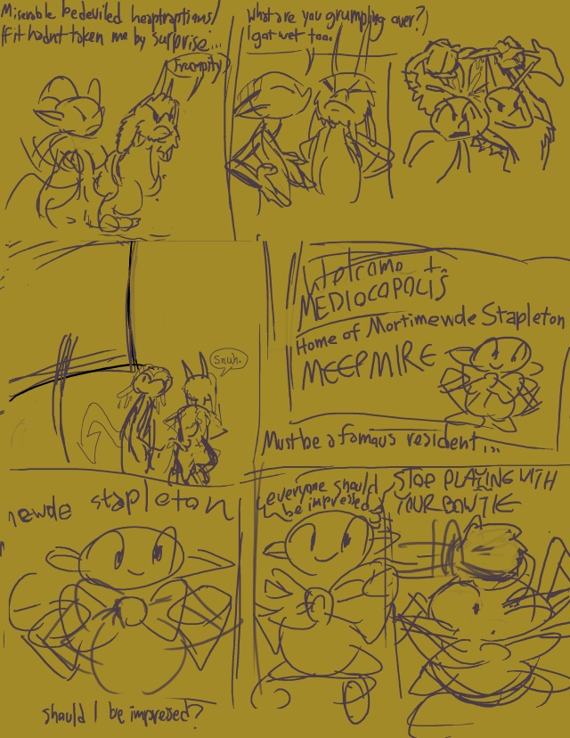
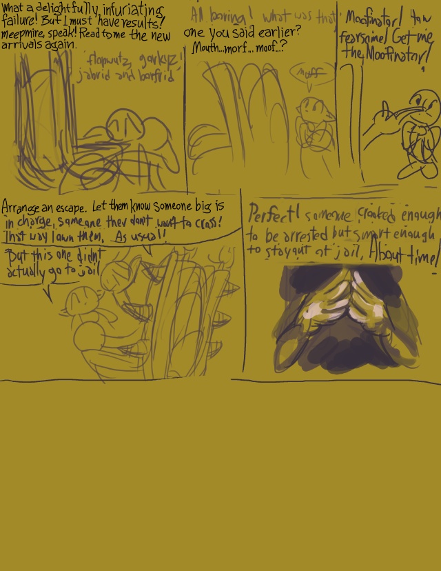
Comic prologue sketches that I planned out in April 2015 and then was prevented from working on further due to [factors]. This is not complete, but the next “new” page in the amateurlog alludes to one aspect of it so I think it important to show. There is another portion with lope that I wrote out but did not yet draw anything for, and from the look of things I did not deduce how this transitions into the first kumquat scene, which starts with a view of space. My “plan” was to append this section, when completed, at the front of the comic book combining both of the first parts, even though I have not exactly established “demand” for more comic books except possibly with the very few people who already bought a book whose entire contents would be reprinted therein.
However It seems right now that whatever manner in which I throw to the current first page will imply that kumquat is on a different planet from what I have just shown which is not the case. Even if show a scene ON another planet as an excuse to cut back to this one, there is no excusing such a drawn out sequence to return to a place we were just at, except as a joke, but it is not the joke I set up. Although the “joke” I DID set up regularly confuses people, so I might do best to produce an alternate “first” page entirely.
Keeping it will necessitate an explanation for something that was only there because I thought it would be funny unexplained, and that can only function in such a way at the very beginning. There are so many bad web-comics that try to look like they’re loaded with depth by starting with a show of space and dopey narration about goddesses or whatnot. I do not necessarily like a dumb old jewelry store as the very first page either, but nothing at present is holding me to that. Except for me spending several days last week specifically drawing and detailing that so it would not just look like I dumped a bunch of hopeless sketches here.
I am also uncertain how jarring or obvious the shift in layout from 3 to 4 rowas will be, and so I might distract from that by having a totally inexplicable shot of space occur at the same time.

I suppose I can change it into a “museum of obscene opulence” to give a slightly higher quantity of gravitas to the opening scene. Although I might recycle the space introduction despite its alienating effect and have a pre-prologue kumquat scene, in which event my concern about the dumb jewelry store will be less troubling. But then I will need to devise a new exterior of kumquat kompound scene and I hate drawing that thing. And there are only so many ways I can since I need to conceal that all the houses are connected until the page where the lizard drives away from them. I do a very good job making more jobs for myself.
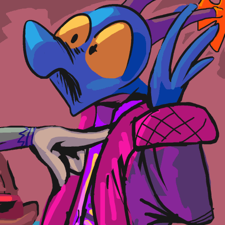
page 16 of part 3 of this.
wordy! But then something will [almost] happen on the next one.
this proves I can make a page in one week. It does not prove that i should.
It may be worth shuffling the bubble-detector side non-plot. I planned it to match a specific range of events but as usual I underestimated the space I needed for what I planned, and added extra junk that I did not plan.
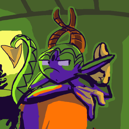
page 15 of part 3 of that old thing. Cramped again, but since I did not hold myself to an ink drawing before I figured out the dialog, it is cramped in a less dysfunctional manner. In fact there were 3 extra frames that I sent to the next page to free up space on this one, which would have been great had I not then I drawn three new frames to go between the ones that were left.
I am concerned that this flashback is more interesting and less restricted than the “main” “”story,”” with all its vague bullet points in the future and the past, whose integrity must be maintained through excessive dialog to remind everyone that I remember everything. But that is perhaps the real heart of elpse’s urgency: get out of boring buildings and go somewhere, to stop talking and start solving things. Although if that were true, why would it spend three pages introducing new matters to solve?
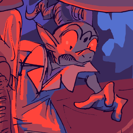
The primary trouble here is that I never fully determined what the space orb actually looks like close up. When making this page, I tried a number of different ways once I got to the frame with the door, hoping to come up with something better and retroactively apply it to the similar frame from the previous page, and none were good when it came to trying to add a technically feasible or aesthetically functional door. I had the same problem with the awkward stair substitute on page 6. I just plain don’t know enough about real things to design good fake ones. I once knew somebody who never practiced at art, but was obsessed with military technology (and military life in general, after he was kicked out and dumped into a civilian life he no longer understood after being too injured by the thing he did understand) and consequently was good at designing and depicting non-existent mechanical things. Of course being obsessed with military anything is going to be bad news in some way but it turned out to be a more functional bad news than the ones I contributed.
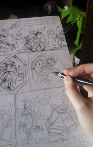
In case you could not tell, and you probably couldn’t, I had reverted to using ink on page 12. Midway through page 13, however, my old inkwell pen, the one I could locate of the two I own, stopped dispensing ink properly (and “properly” was rather erratic) and I had to switch to one of my disposable pens, whose stock I have not replenished or even assured was present in more than five years. Disposable pens create a more consistent, and predicable result, but also one that is considerably less striking. But ultimuttley it is irrelevant, as i have re-reached the re-realization that while I appreciate the look of well-applied ink, I am never going to be exceptional at applying it. And also that every time I use ink, quite apart from the quality of the things I can draw, that complicates completion of all the things I cannot draw, since I can only fully construct them digitally after scanning the paper, which means, first of all, that they will not HAVE the ink aesthetic, and also that the space is already determined before I know how much space I actually need, which will result in considerable fiddling about with things that are already tightly crammed together which won’t necessarily look correct if made less or more tight than that to accommodate phantom page characteristics. Unless I only put easily-drawn things on the page, which I shouldn’t do, because easy pages are boring. Their descriptions are briefer and consequently less boring on account of me not complaining about how hard to make they were, but any reasonable person would skip this part!
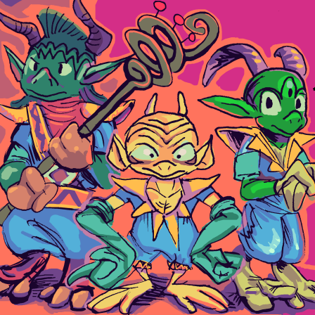
page 13 of part 3 of the bimshwellian comicoid.
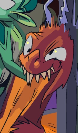
An educational page. Though it makes me mad that all those bootleg elpses are pretending that they are not elpse.
Not surprisingly, I could not conceptualize the full level of detail I wanted, despite having “written” this section years ago, until I already had it drawn and the text spaces fixed in place.
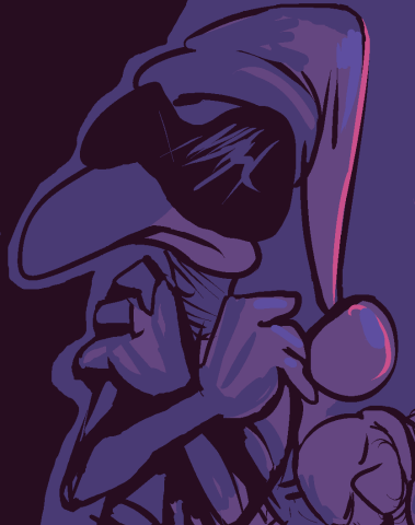
that this appears so soon after another my debuting a “story” about pointy-eared imps stored in cylinders, is a coincidence; that concept is from 12 years ago. I am just not very creative!
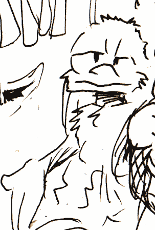
page 12 of part 3 of this
I like the colors on this page even though they are lifted directly off of previous pages where I was less taken with them.
I must say I am continually disappointed with how relatively reponsible nemitz is turning out to be. Although consider that it acts like a buffoon when it enjoys something but suddenly acts like it is smart when elpse does something stupid. Typical hypocrite mitz.
I have blatantly ignored where that circular table was on previous pages. I am not Herge or Don Rosa, I can get away with that.
Don Rosa once drew some Scrooge McDuck comic scene from two different angles in two different stories since one involved time-traveling to the other, and he made a special point that all the bricks and incidental background details were consistent even though almost nobody would check on that. I am the sort of person who would check on that, but regrettably also the sort to hope nobody else would check on it.
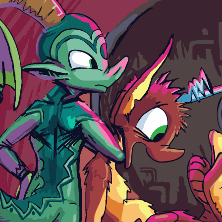
page 44 of re-text-sorted that
I feel bad erasing elpse’s face spots because they did work at first, but I quickly stopped drawing them, and over time the shape of elpse’s head changed and the spots did not fit as well. They were supposed to semi-circle from one point on the forehead bands to the other.
I used to want to also change kumquat’s computers all into space-wasting mainframe things, but I suppose here the whole room is supposed to be one. Generally I think modern tiny computers are less visually stylish, and show even less invention on my own part to include them. And this comic strip in general, especially this part, is very domestic and mundane. The one thing I am glad I did, even though it only is seen much later, is showing the money as little balls of fuzz instead of coins or shiny objects. But maybe little trinkets as currency is even mundane. Maybe currency is mundane. Maybe hands and faces, maybe all chordate features are mundane. Maybe words and emotions and time are mundane! Honestly, you need to lighten up.
But I ALSO don’t want to spend so very much time on stuff that I drew ten years ago. I would rather write new stories than alter old ones in superficial ways that take me forever for some reason. And that makes these write-ups less pleasant as well. What I can do, without making things harder, is remove thought baubles that do not accomplish anything. Sometimes it entertains me to have the characters say simple things in needlessly verbose ways, but sometimes it is just more words. Elpse initially thought “makes me mad” in the lower left frame. But elpse is obviously made mad! Many things cause this. It would be more noteworthy for elpse to thinkly proclaim “does not make me mad!” But elpse is becoming mad here, so no such negative negativity will be exhibited.
I also want to have elpse say “oh my squash” where once was said “oh my gourd,” since I imagined “oh my gourd” is too overused as a joke phrase, and squash additionally serves to hint at elpse’s affinity for pumpkins, but that appears to be an equally common joke phrase. Oh my scrod is less so. Of course scrod has no sway over elpse’s actions so this may be due for yet another alteration before I produce the printed edition. I will not keep you posted.
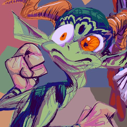
page 11 of part 3 of the bimshwellian comicoid one of these panels is going to give somebody terrible dreams. That one, perhaps?
I tried a different technique to get the page done faster. As usual, it did not work, but life is all about messing up things in different ways! in fact i tried it years ago and it didn’t work then, either and I gave up after three pages, but I thought I might be better at it now. I am, but it still doesn’t work!
Generally, I draw each full page on two sheets of 11×17 inch bristol paper, paper that is really too nice for what I am doing with it, especially now that I am not using fancy ink pens. I decided to turn one sheet sideways and just draw the full page on one. Which sort of worked, although I was not able to scale down my thoughts, which means I drew at nearly the same size as when I had twice as much space, and suddenly nobody has feet. I also decided to try and work with my pencil drawing directly instead of completely drawing over it in solid digital colors, which did not work.
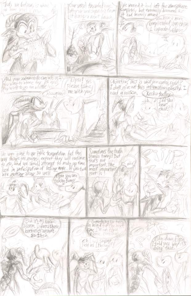
preserving pencil shading does not work unless the page proportions and layout are exact or very close to the finished, and you are sure enough of it that you do not need to add many things in layer. And then you need to draw confidently and consistently With the amount of digital alteration and clarification that comes standard for you, this way is never going to work.
Also, one sideways bristol sheet, at 11×17 inches, is not proportional to two non-sideways bristol sheets. At 17×22, they scale to 8.5×11, the size I print it, which is so convenient a coincidence as to likely be intentional. 11×17, however scales to 7.1×11. So even if I had everything right, there would still be space on the sides. With all that said you must be thinking I am out of my mind to have thought this would work. And yet THAT is the part that ALMOST worked. Pencil without ink, however, is a proven method, plenty of artists do it, and the well-known Disney company animated numerous feature films like that before two dimensional media was outlawed. I am just not good at doing things that work!
Why are my comic posts always so pessimistic? This is my favorite thing to post! I can’t believe they would do this to me! I hate these posts!

I suspect this might be funnier without the fourth frame, which makes it sad. Somebody else suggested it was better without the fifth. So I compromised and ruined it twice by including both.
It has the potential to be accurate but for the moment it is not.
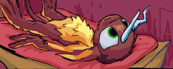
page 43 of part 1 of the bimshwellian comicoid, partially redrawn, from that. Alright, I spent a few days on this, can you even tell? I keep thinking “i can reuse the old parts that work and correct the things that don’t” but if I change one part I have to change the whole thing. I had solid lines and colors, but I did NOT know how I thought monster imp legs worked. And I didn’t know how the fleshy non-bone side of arms worked. I still do not know but I am better at faking it. It may be enough to make the text stop infringing on the frames it does not originate from. But if I go in there to fix one thing, I inadvertently start looking for others.
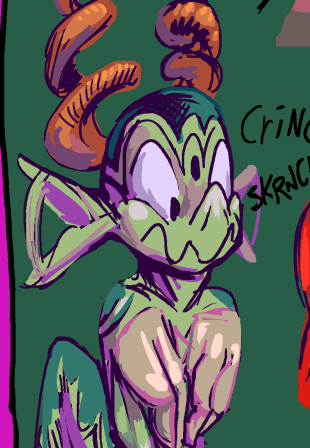
I am not even going to pretend I know anything about cooking. I think it might push this series more in the direction I want it to go if I am honest about what I do not understand, also.
I should also be honest that I am terribly amused when somebody gets poked in the nose.
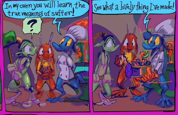
And initially the item was square-shaped and being removed from an oven, and I like this dialog line better with “oven” in it, but since I didn’t at any point show it going into the oven, I could not make that work with the pot I have already shown being fixated on. It shouldn’t even be important enough to mention but I literally have too much anxiety to sleep lately over dumber things than that. The fact that I did not previously draw an oven into the same room was thankfully of less concern to me.
Also I keep forgetting to mention that the first book can be bought from here. Or rather I wanted to make a longer post about it, but I also wanted to wait until after I made another post explaining that weird “maybe I’m a lion” post, so that they are buried together, and I have been unable to find a shovel big enough.