


9-5-2021 3isham oaf now the comments aren’t working? I don’t expect them but I happened to glance down there on another entry that already had some and nothing but errors there. what a dumb few weeks!
///////
9-5-2021 329am the comments work now but they are in the ugly default style since I had to copy code out of the “default” theme that updated itself during the overall wordpress “update” that I didn’t want but thought would fix the site when it was broken, which it didn’t even do! hopefully I can work out the syntax of whatever “ereg” got replaced with since that suddenly being “deprecated” is what broke the comments form and have slightly-less-ugly comment boxes again but I am tired and have other things to do! and I just noticed another broken thing in the side-bar. beets
///////

this is one of the more eerily fake-looking “photographs” I have encountered. Have you ever seen water which looks like this? The blue is as if somebody dumped a load of toilet bowl cleaner pods upstream. This looks like an amateur colored pencil drawing or a video scene from a playstation game. This looks like the ghost of deceased water.

i tried turning it grayscale and and the substance still looked like glowing crest toothpaste more than water, particularly on the left. which makes me more inclined to believe this picture initially had no water in it, rather than more naturally colored water. and yet where it makes contact with standing water on the lower right looks real. the web page it came from only identifies it as “free stock photo” without any context of where it might have been taken or what was done to it.

the links at the side of the page indicate that for a fee you too can try to put water where it doesn’t belong and color it unnaturally. I don’t know why you would, what satisfaction you would get from making an ugly fake scene from elements of real ones, but other people are already doing it and likewise looking to charge for access.

even the blatantly blue-dyed water at one of the numerous inexplicably pirate-themed miniature golf courses I saw in Queensbury, New York didn’t look that queentoony.
this PHOTOGRAPH is terrible; I may have taken it from across the street or behind a fence. it was the same day as this borage. I didn’t use this photograph in fact because the result wasn’t as cartoony in the picture as it was in person. Stock photography vendors clearly see this as a pressing problem.
AND I was looking up pictures of water tumbling down mountains because to make a long story spork i couldn’t solve my computer problem with what I ordered and waited for, so have ordered and need to wait for something else. Consequently I am still using the backup computer, and consequentlier STILL haven’t finished that rygar picture, of which a tiny, almost irrelevant part of the drawing features just the category of scenery that I was speaking of, and consequentliest I wanted references for it.
for really no good reason I thought I should try and incorporate less-cartoon-looking scenery even though every figure amidst the scenery is exactly as cartoonesque as in the dumb nintendo game. ultimately it comes down to I never developed an instinct for what corners of realism can be cut and still have a corny fake drawing represent the real version. this applies especially heavily to blue-colored water which always looks bad and fake to me except where it naturally occurs.


Notice how the recent changes don’t improve the image but does make the characters present that are more important yet that I have not gotten around to checking on now look worse than before compared to the increase in background detail.

I thought I wasn’t doing justice to THIS. Even though the whole reason I like Rygar imagery is because of the specific weird, often stupid look it has. Why shouldn’t I interpret it literally? The answer to that doesn’t matter since I already didn’t and am more likely to spend another day working around a bad decision than revert it.

some bad decisions I have spent decades working around.

a picture that truthfully I cannot work on for the moment since my regular computer has taken ill and my regular image editing software objects to me trying to use it on a backup computer

but you probably won’t notice a big difference between this and what I hope to make it into once I can open it for alterations again. And indeed the website has also suffered a bizarre injury I yet do not understand. I was thinking about replacing the creature getting punched in the face with a nemitz suspiciously soon before this all broke down, however.
936pm EVIDENTLY the mere presence of an irrelevant index.html in the publichtml folder was screwing it up. It had been there since 2007 and not been an issue until the wordpress update, and I only updated wordpress since something totally unrelated was broken, since I couldn’t tell WHAT was broken.

I had to ask someone at my web-host to get this sorted out.

Their site also doesn’t work. on their TWITTER page they have a different, newer chat link than is on their actual website that I erroneously assumed would get priority.

which also doesn’t work.
I had to ask directly, at which point I was suggested to do some silly things that didn’t work, and then took it upon myself to try in another browser.
A very stupid day!
Once that indork was gone the thing read index.php properly and loaded the site once I removed the word “beans” from it. I only added “beans” earlier in the day to see if that would do anything, which it didn’t, until the index.html was gone, at which point the beans generated an error, but a proper responsible error that identified itself instead of unplugging everything and going to hide. WHICH is probably just what nemitz would do. Or more likely nemitz would stand there being proud of mitself. Even if rygar never gets around to punching mit I stongly advise anybody else to.

a rather alarming series of email messages from an old foe. what could they portend?

a peculiar delivery seeming to correspond with the e-mail, but evidently from someone else.

oh no! RYGARRRRRRRRRRRRRRRRR! (the book)
Plus his assistant Rygarrrrrrrrrrrrrrrrrr Junior.
to be clear, this guy looks like he is SAYING “Rygar,” I do not have official documentation proclaiming that he IS Rygar, but that seems like something Rygar would say if he spoke in words rather than disapproving game-over jingles.
I hid the smaller Rygar object that I thought was simply a little card with a picture of Rygar on it, because why WOULDN’T there be such a thing, in a stupid place before I went shopping last week, wondering how it would be received,

and it was stuck to a car when I returned. Which is probably for the best because I might never have realized it was a sticker otherwise, and if I had I might have perpetually imagined a superior place to attach it was yet to be revealed, and kept it unjustly out of public view.

The important matter here is that somebody did indeed write a book about Rygar and I bought one. FINALLY a book I can read in public, or at least keep at the ready to show how intellectual and absorbed I am until someone gets close and realizes it is about RYGAR. It is the perfect conversation starter, or if necessary conversation concluder. Perhaps Rygar was Ender’s game all along.

apart from providing more information than any sane person could require about rygar, it is also an effective tool for reminding various people you may know in your own life what rygar has done for them and how much worse off the world could be were Rygar not there to throw his trash can lid on a string at angry turtles.

as the back of the box states, now rygar is battling evil EVERYWHERE. I challenge you to identify a location not covered by that statement.

I became aware of the book when some months ago the author Brian Riggsbee asked if I would like to contribute this piece to the book, which was initially drawn in order to accompany my comments on the Rygar Racing phenomenon that is sweeping the one youtube video I saw several years ago. I certainly was not going to say no. I did however say just about every other thing I could think of about Rygar, and the author at one point thought he might be able to include some of those in the book, but I didn’t realize what a graphic-design intensive tome it would be, so I can understand why space for unplanned contributions from people nobody has heard of, especially ones which don’t take the subject matter seriously, would be at a premium.

It takes devotion to list factual information in the form of this CORNY rygar tower, complete with the creepy lines, those dopey gremlins AND the stupid island up there. I wish every book I bought had Rygar graphics incorporated into its layout. Although in fairness, so far every book I bought this year has. It reminds me of the magical, tragical period when I changed this website’s appearance every month.

Unfortunately there is no DOOR floating there with a ROPE going up to it, but considering how uncommonly tall this variant of the tower is I can excuse Rygar for not reaching the top and playing the dumb bagpipes yet.

excuse me the INSTRUMENT. You are never going to achieve your dream of hosting Jeopardy(!) with that “please be less specific” attitude.

it appears without context, and I wonder if it might be better for that. I WANT somebody to look closely at this and realize that it isn’t quite what the text says it is.
Initially I was a scrap miffed to have my picture that, contrary to what it may seem, I DID think about and work hard on, appear between several examples of people who just pasted or recreated existing sprites for easy internet forced retro-stalgia points, one of whom apparently SELLS them on merchandise by the hundreds through etsy as if that is “legal”. On closer examination the Kari Lyn sprites are retouched as if for a sega genesis release in the vein of Megaman, the Wily Wars and there is purplish gradient lighting on the scenery, neither of which are my particular cup of beans but I can consider some thought went into the presentation. And I don’t know enough about Mine Craft to say if creating an enormous Rygar even with instructions is a simple task, especially with a name like “Slugboi,” meaning a man who has not grown to maturity with the further physical and academic deficits of a slug, but I like the idea of it being visible to other players who weren’t expecting it. ALTHOUGH I think a wise adventurer should always allow and be prepared for such a possibility, but whatever the case people are celebrating the legacy of RYGAR who do not necessarily need to.
I still seem to take umbrage with the collage-person presenting the sunset mountains as awkwardly symmetrical. Maybe the lighting, at least for a still shot with no scrolling, matches where the sun is better, but it could have been done in a way that didn’t look folded down the middle. And besides the foreground pillars AREN’T mirrored to match the sun, even though by being far apart than the mountain graphics it would be less noticeable if they had been! OH!

It reminds me when doom add-on authors would make the sky repeat like that since they couldn’t be bothered to match the edges of the graphic they wanted to use or because they are afraid of the doom engine’s sky-mirroring bug

in fact it may be ideally suited for that!
And anyway having my drawing in that position DOES help it show how I used the sprites for inspiration. Anyone who wondered why I would elect to show the right-most Rygar in such a stupid running pose need merely examine the image before mine to understand that ah of course, Rygar ALWAYS runs like that.


However the left-most Rygar may be in an unorthodox position because the in-game Rygar simply recycles the jumping pose for using the rope-attachment item,

and it only occurred to me this very week that the developers may have intended that to be not a hat but a hand-held object, and the pose may indicate a raised arm. Which is still impractical but a helmet wouldn’t hold up its wearer. UNLESS rygar has the arm up to grasp the helmet. The fact that in some stages he is content to walk into an instant death pit instead of grabbing the rope is just more proof nobody needs that Rygar’s ancient methods are mysterious and not always meant to be understood by us. I always thought of it as a hat because my cousin Patrick told me the item was “The Mickey Mouse Hat” and the game never definitively stated that it was not a hat, and so I continued believing it was one long after I became skeptical of Tecmo deliberately violating one of Disney’s most sacred copy rights. This is Argool, not Etsy! Shirts may not exist here but there are laws.
I was so CERTAIN it was a hat
that I prominently featured it in my extremely important hat video. I have to believe that if it wasn’t a hat the Washington Post would have awarded me four out of four Pinocchios by now, and then I would have had to replace Rygar with Pinocchio, and I can assure you that Pinocchio is battling evil in relatively few locations, and even a dedicated team of four would have trouble covering as much ground, much less groundless areas using their less-adequate hats.
Patrick also told me those red gargoyles in the tower area were “the guy who flies with his pants on” and I believed it, because why would such a guy fly with his pants off? Pants don’t always restrict wings the way shirts do, or would if they existed in Argool, anyway. You need not remark upon the great number of beastly creatures I have illustrated engaging in activities without proper clothing on because I never show them flying!
In those days I knew little of Rygar and readily accepted whatever I was told. But even in 2021, with a scandalous expose at last in print, there are a multitude of facts about Rygar that nobody knows.

For example, were you aware that Rygar started a deviant art account in 2002 and never used it at all? Undoubtedly he has the power to have illustrated the whole book himself but recognized that deviance is a step removed from evil and Rygar will have naught to do with that apart from battling it, but he reserved the account anyway so that no impostor could sully his good name. Or even his less-good name, Steve. I wish I had realized this back in 2010 when I was dwelling in New Haven and would occasionally place take-out orders at Modern Apizza under the name of Rygar. I could claim I assumed the pizza was a new kind of diskarmor but that would be disingenuous.
OR perhaps by being an undead warrior from millennia ago Rygar simply couldn’t figure out how to log in. You know, old people and computers and all.

I wish I had prepared a more interesting illustration (and incorporated more details from the official concept art items), since I certainly drew plenty of boring stuff (furries) for less interesting projects (getting $30) in the time between when I learned of the book and when it went to press. And I already had plenty of old, stupid rygar sketches which I had even scanned and uploaded to a page I don’t talk about earlier the same year in case I or anyone else needed them, and somebody making a rygar book and telling me about it so that I could contribute a drawing is undoubtedly the closest that would ever come to happening! However late last year I was very concerned with moving out of my old residence, which took months to execute on top of the years already spent nudging that process along, and by the time that was settled I figured the book was already being finalized and I didn’t have time to bring anything elaborate to completion.
This may be more important to me than is reasonable!

I am glad to know I am in good company.
Despite primarily talking about ME, I do think that all in all it is a fascinating, well-designed book that I might have even bought if it didn’t have a picture that i made in it and I appreciate that Brian Riggsbee permitted that to occur! I could probably write a book about Rygar, and it would have much less justification to exist than this one, and it is fortuitous that I shall devote that energy into other endeavors.

some of which may even have nothing to do with Rygar.

The might of his diskarmor ranks second only to his guiltarmor.
why did the people who did graphics for 8 bit games think this looked good? it didn’t!
have you ever seen a drawing by a small child, where most of the background is white but then suddenly there is a strip of blue across the top? this reminds me of that. but i excuse that. to them, the sky is blue, and the sky is UP. anything beneath that varies.
But an adult getting paid shouldn’t think like that. Hey, the sky is not suddenly weird and different after you go up a certain height! the fact that they almost always happen right at the top of the screen makes them much worse. It seems like that is the end of the universe. most likely this is only done because that is the only way to ensure, in games with only one background layer, that the lines never collide with background objects that need to have consistently colored backdrops. Usually the player character can’t get all the way to the top of the screen so there wouldn’t be objects up there. But that doesn’t mean it looks GOOD!

Konami’s castlevania 2, my first encounter with lines. they contribute to the creepy atmosphere, I would say beyond anything else. The secondary title is “Dracula’s Curse” and I consider the mysterious appearance of the lines to be the primary indication of the curse.
It is a more extreme stylistic liberty than anything else in this game. castlevania 2 is supposed to be totally serious, and that effect is so strange. Thankfully Simon Belmont is never at risk of touching the lines. Then he would truly have no hope.

Aw naw! In Castlevania: the Adventure, for gameboy, Christopher Belmont can indeed TOUCH the lines, and live! However his sluggish pace and awful controls may be indicative of lines-poisoning.
from this page
“the iconic two-color sky gradient. Just wonderful.”
the only definitive evidence I can find of somebody acknowledging it is sedate and positive. Where is the outrage?
Yes sure that guy makes almost three thousand dollars on patreon and i do less than fifty but that is because i am saying what others dare not.
Does it look like a gradient on certain televisions? do the light and dark, at varying levels, blend to look more like the blocks common in early snes games? that was never my perception. It was always just LINES to me.
The fact that nobody else noticed the lines or mentioned how creepy they were also amplified my fear of them. When only YOU are scared of something, that makes it scarier, since you get no sympathy or protection.
Lines were even on the konami BOXes of this period. In fact I could only hold one of these boxes in such a way as to not touch the lines. Maybe the effect was chosen to give the label art a feeling of urgency and dread.

I presume jack gets jumped by werewolves if he takes too long to putt.

monster party had some of the most egregious lines of any video game, even if they are all seen before the second level. You would need to torture yourself to get to the second. Of the three credited graphic artists, mobygames (which is ALWAYS right) suggests only one worked again, Taka Saito, who next toiled on “The Adventures of Gilligan’s Island” and THEN stopped. while the adventures of gilligan’s island lacks the lines, it also lacks any adventures on the part of the island.
I first encountered Monster Party when a rare instance of child-hud era friend whose house I visited regularly had rented the game and all I noticed or remembered about it was the creepy lines, the unintentionally (presumably) creepy background music and how impossible control it looked. I do not recall attempting to play it or being offered the option; it may just have been present incidentally. This was the same friend with whom I co-created Joey and Ian Gettin’ Dead, about our two younger brothers, and it is entirely possible that Joey was using the game and and only gettin’ dead in the context of the game’s terrible controls and the low threshold of abuse that corresponds with the onset of what is commonly considered “death” in video games.
I was quite surprised years later to see monster party mentioned on the internet with regard to how zany it was and how heavily censored it was from the japanese version. I couldn’t believe people had really gotten past the first level, much less willingly sought out alternate versions of the game in which to do that again, and had anything to say about the whole thing unrelated to the lines.

this is similar to monster party’s; gratuitous and coming out of black, but i don’t mind it as much here, possibly since this game is actually fun and has good music.

megaman 3 has this intermission screen but it is balanced out by having lines going the opposite direction so the effect seems more cylindrical and not implying that they are representative of the sky.
and so after 3 games safe comes megaman 4 aka megadope, a terrible graphic hack of megaman 4 that I made for no reason at a time of my life when I did a lot of things for no reason, unlike today.

the lines are so intense that even megadope won’t smile at them.
Bear in mind that on an actual 1970s-80s television screen wouldn’t necessarily be able to see to the actual borders of the display. That generous area of uniform color at the top in a lot of these here might be in practice much smaller.

megaman 5, dr right knows something terrible is about to happen since LINES have attacked his home. although these lines appear in the middle of the SCREEN, the introduction sequence crops the view to just the middle of the screen and the lines are still at the edge of the visible zone! And the “generous” area I alluded to is not allocated here because it is not meant to be seen!

megaman 6 brings back the lines yet again but finally puts them in the middle of the viewing area where i can handle them. it still doesn’t make SENSE since the only things that should be black in front of it would be scenery at the horizon which the sun would be setting “behind,” which i suppose would be the rocks but they are separate from and beneath whatever is black here.

this isn’t a megaman game at all, it is an unlicensed chinese game about a little guy who throws boomerangs that they pretended was megaman to try and trick people. in which event i would ask why not just use the full megaman game if you undervalue your own work so much but whatever the case, there are those lines.

actually I like the one in double dragon since it simulates a perspective and uses its whole, limited space. only by chance does it go to the top of the screen.
double dragon uses it in all 3 nes games, but each example is unique and artistically done. Even double dragon 3 which is terrible in every way. other games will reuse the lines across large spaces in a manner similar to each other.

not as interesting but at least the presence of the sun implies a reason why the sky color would shift considerably in a small area.

however these look like apocalypse lines since they go into black. the sky above a sunset is not black!

darkwing duck! ending. These at least are neutrally placed and have more than two colors.

not on the sky, but needlessly near a screen border. as a small child i did not understand what this weird substance was that kuros could walk on but be damaged by. but it didn’t matter since you have unlimited “lives” in this game. as a slightly less small child i realized it was lines and became more afraid of touching them than the meager damage penalty could bring about.

Power Blade! It of course gains its energy through power lines but THAT is not what i meant! Also the lines blatantly go behind a non-rectangular object which means they could have been placed further down in the image so they looked less creepy.
a brief collection of games that use it more neutrally

princess tomato’s very first scene. fairly tame! really not threatening at all, but I sure REMEMBERED this was here for years after seeing a picture in, again, nintendo power magazine. I remember thinking it was a racing game at first.

adventure island 2 has lines going UP. when i saw pictures of this in nintendo power magazine it bothered me but i can handle it now
rygar falls somewhere in the middle because the lines are scary, and it goes into space, and I was terrified of this screen, but I was creeped out by the weird face foremost. I didn’t even realize it had a body. I would see it when i closed my eyes. I was SCARED of that thing. As for the lines they go into white, and then abruptly to black, and it is just strange.

dynamite headdy uses lines extensively, but they are often dithered which makes for a less harsh effect. Even when they aren’t, there is lots of other stuff going on and there are always intermediate colors. the clouds being larger above the lines creates a mild perspective effect which make the lines seem more like curving of the atmosphere above us in the distance than the end of the world immediately in front of us.

treasure land adventure also uses many lines but that is far from the only unsettling thing going on

fantastic dizzy. terrible game. don’t believe british 1980s computer nerds. they are sick. everything in the game maims dizzy, you only get 3 “lives” in which to win a game as long king’s quest 5 with as fragile a hero without saves or even intermediate goals to use as personal concepts of progress. these creepy lines, mercifully on this slide puzzle screen only, are about the only thing that WON’T destroy dizzy.

right near the edge! why? and this is a game that otherwise uses its colors really well to add a lot of detail to a fairly simplistic world.

adventures of lolo 3, also from the Hal Laboratory company. They used their mad science to devise a way to put the sun BEHIND the lines. It actually comes down from the top of the screen and the lines never change where the brightest point is nor move aside to let the sun in front. The neat effect of the water starting to reflect the sun as it appears closer is meaningless because the lines are so incorrigible. They really have to go.

Yet another from Hal, Rollerball. This one is really odd in that the upper edge of the lines leads to a color that matches one of the interior colors, so possibly this is supposed to be the edge of the horizon, yet it couldn’t be because the vanishing point is about midway up the second R in “roller.” The only conclusion to be made is what I have been saying all this while, lines are bad news.

this is the very first stage. unlike monster party, this is supposed to seem welcoming. there are animals out to destroy mickey mouse but you aren’t supposed to be afraid of them. not yet anyway.
this game was localized as “Kid Klown in Night Mayor World” since it was published by Kemko and Capcom had exclusive rights to release disney video games internationally at the time.

there is something deeply wrong when you have a story about a kid who is a klown, with a k, from a FAMILY of capital k-klowns and i still find horizontal bands of dark blue more upsetting.
Kid Klown is also noteworthy for having loads and loads of intermission text which doesn’t explain any of the things that need explaining.

a very capable alternative to lines oddly enough occurs in a bootleg felix the cat game. Which is not to say this game is good or that there aren’t better things that could be done with all this space.

mickey mouse again! and not even the same developer. Mickey’s DANGEROUS Chase by capcom. Which I also only know about from nintendo power

i couldn’t figure out why that effect was in some screen shots but not others. now i see: the screen scrolls up to gradually reveal it as you progress, which is unsettling in its own way. even though these aren’t LINES, the color difference is high and this really doesn’t belong here. the presence of the word DANGEROUS in the title (and apparently only in the US release) and the blood-like red tint may also have had subconscious effects on me.
also unsettling, nintendo gives full maps for the first, easiest, self-explanatory levels and wimpy paragraphs for stages you might actually need help in.

scrubbo in the same issue, this i totally forgot about. Again not lines but creepy with the same intention. It looks like the monopoly guy is about to be abducted by aliens or crushed by a meteorite, nevermind the trauma caused to anybody in those barely visible purple houses in the distance who would see an enormous self-illuminating BACKWARDS DOLLAR SIGN. Also Nintendo Power gave six pages of coverage to this.

this can’t be too far a drop since there is a little tree down there. surely it would be SAFER to go that way!

but the lines abruptly end so they aren’t real, right?

I am uncertain if these are supposed to be lines with the same intention. while this is indicated to be outside, there is a pattern ABOVE the lines.

also an earlier level uses the exact same 8×8 pixel tile as something like a support beam for a fancy place that is plainly meant to be INSIDE. Lines have no power inside.

oh no more creepy lines, undeniable this time, going into BLACK, consuming the clouds, and i have to TOUCH them! Or Mario does. I sure am glad I am not mario.

Always the ne’erdowell, Wario tortures a creature by making it touch the lines.

In the demonstation mode of mario paint you can see somebody CREATING the lines! Somebody making the deliberate decision to add this. And that may be the only super nintendo game i have seen it in, at least as far as the creepy top-of-screen usage goes
The mario paint example is curious because it shows the sun amidst darkening. would the sun not cause a lightening?
a number of staff was shared between mario paint and super mario land, super mario land and wario land, but nobody was on all three games and I would be reluctant to point at any specific person for this.

the first two game worlds do an admirable job of recreating the sort of skies that uderzo put in actual asterix comics then suddenly in egypt it gets this hokey effect and bright turning abruptly to dark. instead of creating a feeling of vastness it is an eerie claustrophobia. and look at all that grey space at the bottom edge of the screen wasted! if they put that ABOVE the lines and made it the darker blue it would… STILL be too dark but it wouldn’t be as much of that weird edge effect. They also could have opted for a more subtle color changing effect across a larger area.

here earlier in the same game, that is actually pleasant and one of few things in the game to evoke the source material and not just look like a quick cheap crummy licensed video game created by a company chosen because it was European and no other reason (“Bit Managers” in this case). Ironically it is a possibility that a similar cloud formation was the original visual inspiration for the lines, which i say based on having seen even more line-like clouds and wondering if those were the inspiration for lines.
I will say that a co-founder of the Bit Managers company, Alberto Gonzalez, did ambitious and well-programmed music on the better but still horribly misguided super nes game “Asterix and Obelix” that they also developed. He was uninvolved with the first Super NES Asterix game which seems to be based on the same design document as the nes one with additional questionable decisions but at least lacks the lines.

In the interest of making this more confusing, here is the superior if still impossible Asterix and The Great Rescue on the Sega Genesis, developed by Core Design, better known to people other than me for making the Tomb Raider games. This uses sky-lines but in a relatively innocuous manner. Don’t tell anybody I rented this in 1992-3ish and couldn’t get past the second stage because I didn’t know you could make little platforms appear for jumping on.
It also has better music than a crummy licensed Europe game deserves, and I can’t think why the followup Asterix and the Power of the Gods is full of dinkity synthesized awkwardly looping covers of public domain cliche “classical” dentist office music beyond that somebody found out they gave a crummy licensed Europe game better music than it deserved. That apparently is the power of the gods.
lines in real life:

chocoteague virginia, the shadow on this boat railing

mystic connecticut: look at this orange arrow on a sign

deviantart user domobot posted this image. similar to mario paint there is a sun but the light part is NOT radiating out from it! Also the creature appears to be wearing the legs-sticking-out-of-the-ground from the Monster Party screenshot

garfield makes it big, back cover. This is also the same book that featured the inexplicable traumatic head-first dropping garfield horrifying cuckoo clock reaction. (the linked page describes another instance of it happening and then briefly mentions garfield) Garfield is suffering from a similar ailment to the batman bee, in which oversized eyes enter into space conflicts and the artist doesn’t care, resulting in sketchy facial expressions. Arlene can wear the hat properly. However Arlene also suffers from shoddy tsereotype design traits and i presume the hat doesn’t want to mess with them. Also troubling and artist-not-caring-related here is that most of Jon’s body is missing. The other characters have their feet below where Jon cuts off so it isn’t like they reached the edge of the document space. I presume his body was sliced in half by the bar code sticker and the blue substance is actually his alien body matter spilling out and creating the lines as a punishment against humanity, until crummy merchandise and eventual braindead hipster memery could grow into adulthood to avenge him.

I found this in another terrible comic strip, thankfully i cannot remember which but whoever is responsible for it ought to be in jail.

there may be many people who need to be in jail but i would at this time request separate jails.

Rygar Racing, the sport of kings.

I realize Rygar is technically a princess by virtue of his tiara and improper to be wagered upon by a king in most contemporary constitutional monarchies, but times were much tougher in his day. And for that matter, days were much tougher in his time.
Additionally, in this case it refers to non-kings playing the video game rygar against each other in a race to completion of it. The crowds have turned out in great numbers to view the splendor of its spectacle.

How much do I have to pay the “games done quick + 2016” people to STOP playing rygar? They could be DONE with it far more quickly.

And I say this as somebody who owns a framed copy of Rygar. I know what it is capable of. The frame is not for ITS protection.
I have a cruel, stupid life. Somehow or another I was informed in advance that the Rygar match would take place at approximately 8:30am beastern irregular time, and I became fixated on the idea of reporting this, on twitter, live as the event was in progress, which meant violating my sleep schedule in a most unfortunate manner, to wake up at 8am, like a person with a life, to do a largely lifeless thing. However, what sleep I had was restless and filled with made up mental images of rygar-playing. Which is to say, I had a dream about watching somebody else play Rygar. Could my existence be any more empty?

When I awoke I saw that the event had been rescheduled. At this point I ascertained that the effort put into keeping matters on schedule was faulty, and after several days of doing games quickly, but slightly less quickly than anticipated, everything on the list had been bumped forward four hours. Even to get one’s self psychologically prepared for Rygar that seems high. I had earlier noticed that posted videos were consistently a 3-10 minutes longer than the estimates, but I wasn’t expecting 4 whole hours to go missing. And they hadn’t:

I checked back around the 12:40ish adjusted start point, got my computer in the mood to watch videos, and then realized that the times had reverted to more or less what they were the first time I looked, which was by now four hours ago. I had, earlier in the day, forgotten that on the previous day’s visit to the Rygar schedule, I had only temporarily enabled scripts on the website, since I hate, and always have hated, when videos automatically try to load, which a video streaming website of course will want to do. It had not struck me that one of the scripts might have been adjusting the schedule to reflect my time zone, despite the considerably more dinkity, glitched font that replaced the fancy one when I saw the incorrect time. I am accustomed to living with broken things (in part from growing up with the likes of Rygar), and so do not necessarily assume somebody else’s thing looking broken is a cause for investigation.
To summarize, I dreamt about Rygar, woke up early to watch Rygar, and then missed it, and I felt bad for missing Rygar, and had to wait two days for the Rygar to be posted in non-live form, and somehow made it a matter that took me a week to get around to writing about, rather than just making a few brief statements within the limited window that somebody else might care. And the truth of the matter is that my internet is too crummy to facilitate live-streamed video anyhow, and trying to process it often knocks my computer unconscious. I literally have no reason to live. Which makes my life a curiosity worthy of study and consequently worth continuing.

With that said, the fact that one of these people is simply called “darkwing duck” while plainly being a man [playing RYGAR] is terribly amusing to me. Also, I don’t know which of them it is. What a scary thought, to be in a room with a man named Darkwing Duck and not even be able to determine who it is. If your NAME is Darkwing Duck and people call you that in public, you ought to at least be dark, have wings, or be a duck. It was my belief that the internet nickname concept broke down in person; nobody should be able to use such varied, ridiculous names with seriousness when all the people they address look and behave fundamentally the same. I realize this is hardly original observations; the laughing at of nerd gimmicks executed in public was a staple of comedy television prior to nerds having loads of cash and becoming higher in number than not-necessarily-nerds. I further acknowledge that nobody on television has or will ever talk to me, while with nerds it is still possible, and I stand to gain nothing by attempting to irritate them. But the overall message of this bimshwel posting is that I do not do things for “reasons.”
A few years ago I sneered at the idea of paying somebody else to play video games (and other stupid things disconnected from value or necessity), but years before that I proposed paying people specifically to play really poorly-made video games well, so that the general population unable to devote their lives to enduring such abusive garbage could still fulfill any curiosity that the game’s existence might bring forth.

In that case, Battletoads. Of course it was bloody boring and I never posted it, and apparently erred in assuming that the Battletoad authors knew the correct names of Double Dragon enemies; the guy with the gun is actually named Willy, and I only know that from reading, within the past three months, another internet account of somebody complaining about the Battletoads game getting the gun guy’s name incorrect. Which, by the logic I was using in 2005 or thereabouts, makes weblog writers more qualified to design Double Dragon games than the people who were paid to make Battletoad games for several years. Also apparently there is a different Double Dragon guy named “Will” who has neither a machine gun nor a Y, and BT+DD also identifies him as “Lopar,” without considering that is just “Roper” again Romanized differently. I now know far, far too much about this.

They at least wouldn’t be able to point to this old magazine contest and say “blame whoever won that! It was their idea!”
But that is all well because I would hate to have paid somebody ten million dollars to do it when I could just get a whole bunch of other people to pay another organization entirely considerably smaller sums.
In this case now, game-quality is not a factor and the players do not keep the money, but the important thing is that they play exceptionally well. They are not regular dorks running a game at an average, unrehearsed pace, or worse, complete schlubs running a game for the first time and putting forth no effort but assuming their poor playing is inherently noteworthy.
Having said that, I have little interest in seeing a game I have not myself used being played very well, because I will have no concept of the challenge involved, how big a deal it is to have the challenge averted, how many of the original obligations are being skipped entirely, and, perhaps most importantly, the feeling of having a personal investment. The Quick-Game-Doer videos, specifically the one for Final Fantasy Threex, is often accompanied by viewer comments like “I’ve never played this game before and I’m so glad to see it” which seems to me the worst way to experience it first. The player is running from every encounter, skipping all the dialog, and you can’t hear any of the music, which is some of the best there is for the Superb Nintendo system, and just generally doing nonsensical-looking things that you would never do when playing properly. And also there are hundreds of videos already online of any of these games but especially this one that you could watch, some that aren’t even nonsensical, if you have such an ancient unfulfilled curiosity, why do you need somebody else to dump it in front of you? Sometimes they accompany this with a donation, so the totally stupid comment gets read during the video. It is like eating dessert before dinner. Except you are watching someone else eat it. And paying to influence what fork they use. For example, the background graphic is determined by which gets most money pledged to it. And the competing categories accumulate over thirty thousand dollars. From about 20 different people. Not quite ten million, but still more than that singular aspect is worth. And then people re-donate to bring their preferred image back into control. I believe in charity, but knowing what motivates people to part with their money is a form of illogic I will never be in accord with.
I like to think that my life has more meaning than that of the sort of person who can toss a thousand dollars at dominance of what appears behind the mostly skipped-past text, for charity or otherwise, but I haven’t successfully procured so much money that I CAN toss a thousand dollars away. I could go to the bank and get a few hundreds but I would have to tie them to strings before tossing them so that would they be assured of coming back. Most of these people that I laugh at for devoting themselves to frivolous matters are getting loads of dollars with apparently enough time left over to watch other people play video games all week in. Maybe not Rygar, but there was also an Ironsword race.
And even with fore-knowledge a good game-showing can be frustrating, if a specific area that I would like to see executed skillfully is skipped in pursuit of the most efficient route to the primary game objective. And so it is almost better to see a live run of a game compared to an ideal take from something the person has recorded multiple times, since I can see how a good player recovers from error.
And specifically with regard to the “race” videos, I watched a few, and they were ultimately not so interesting, since both players were pursuing the same path, using the same glitches and exploits. Very little was improvised. When one player got ahead, as a result of an isolated random obstacle or one the other messing up, they stayed ahead. Much like a running race, I suppose. And so you can get a better sense of full completion, exploration, and the consequences of failure by watching a schlub’s video, but that will take them far longer, hours, days, to accomplish, they’ll usually be talking over it, and you can’t interact with them, and you are living through someone else doing something you could do yourself and feel less dirty for the time spent on it. It is not like tennis where you need a special huge setup, a human opponent in close proximity and the capacity for physical exertion. If you have two working phalanx digits, you have the capacity to play Battletoads poorly.

Thankfully, future generations will never have to.

Hail, cousin. I am a noted expert on the american footed ball. Behold my official league logo shirt that I wear in public alongside other league enthusiasts! Hooray for this sporting event! I am greatly fervid that one team wins while another does not! With such camaraderie and physical conditioning on display in each, how could I choose but one? Hooray for athletic competition! Hooray for the institution!

I am a woman! Sorry, girl! I spend time with men I mean guys! I am also excited about leagues! I exclaim with great glee. It is significant to me that the players move the celebrated lemon-shaped object in one direction or another! Hooray for the human spirit that lets a group work in accord toward a common goal!

Hi ho dear brethren, I am of the negro race. Or as you might say in more colloquial language, a colored man. I do on occasion look beyond my race association to engage in fond fellowship with default-raced folk while I celebrate the state of this noble league! Up pastime! Up sport! For what is life but a drawn out game in the great metaphysical sport of existence?
And up the number 00! It shows my well-rounded “O”penness in interests and also assures ease of reuse if an alternate configuration of this scene requires that I face the opposite direction.

Hooray for franchise approval in general! And hooray for Light Budweiser specifically!
All kidding aside the figure on the left looks more like he is in pain from stepping in a mousetrap than pleased with the spectacle he is witnessing.

Or maybe he is concerned that Rygar has found his island.

Also, a thank-out to all my new rygar alert subscribers.
I don’t understand how people can reserve scorn for Justing Beepy Eeper when that “catch a grenade for ya” guy is still on the loose.
======================================
Perhaps you have wondered what, apart from my championship ego-mania and being the first person to ever have a relationship go badly have prevented me from maintaining a regular update schedule. And perhaps not; I’ve had quite enough of it.

It started out easily enough. I was to create a “series” of painted images with some sort of unifying theme. I couldn’t think of one in the time I was given because it coincided with the inadequate time I was given to do several other tasks I wasn’t qualified for. I decided to show a pointless creature going on a pointless journey, which would make the lack of a point the point. I was not enthusiastic about that idea but also figured that I could change my mind and construct a point while I was making the first. I could not.

The second image is a version I made on the computer first to assist in making the first actual painting, so in fact this came first but I chose to show it second. It occurs to me that I have referred to this image and the third image, the second painting, as simply “the second,” and that is most confusing. Ah fiddlesticks.
People on the internet statistically liked the fake unfinished one I did in a few hours about as much as the real one that I did across two weeks, but as the fake one is more directly compatible with the internet, and I’m used to not being impressed with what people on the internet are impressed with anyhow this is probably a personal triumph. Though I say “people on the internet” with a derogatory implication I am obviously not talking about you. You’re so pathetic I know you couldn’t handle it.
Nonethefewer the painting looks nice enough in person. Impressive considering that at 24×18 inches, it was four times 11×9, the size I’m used to not being comfortable working at. It even merely looks like I didn’t feel like mixing paint, rather than my having no idea how to do it.


The specifications of the second image are the same, apart from being perpendicular. I do not feel this functions as well, overall. I am accustomed to making pictures with horizontal orientations, two dimensional layouts, stage perspectives, in deserts, that have nothing to do with the pictures that came before them. I am accustomed to snow but not recently. The only things I was comfortable with were the balloon and the goat, those being the most out of place elements.
The biggest difference between this painting and the first is that regardless of art website approval points nobody but me cares about the first actually looks better than the grubby computer version I made to assist in the painting’s creation. Assisting its superiority was that I was so preoccupied with inventing a resolution to appear in the next painting that I forgot I didn’t need to compulsively obey the pixel arrangement. I made it to help and now it’s just being a jerk. Also I never arrived at a resolution.
This painting I did not even want to go to the trouble to scan in 5 parts. That does it slightly better justice than digital camera interpretations, but I do not feel it is entitled to justice. It is a reprobate ne’erdowell. I didn’t want to scan it until I had fixed the parts that I didn’t like, but once I had done that it would be another month before I could place that into the scanner without damaging one or both. Though I can’t say that neither deserves it.
Initially I wanted a sunset, but then that would mean the figures would be backlit, which I imagined was undesirable. So I had to depict the side of the sky opposite from a sunset, the boring side. It being still pinkish but less interesting. It didn’t occur to me that sunlight reflects, rather powerfully, off snow-covered surfaces, and further that nobody cares what direction cartoon characters are lit from. Also that this goat is in fact a sorceror of black magic who is immune to light sources.
The picture on the whole needs more “light.” However, at the time, I lacked the time to give it light before I started the third painting. Now I have the time but despise the deed. Anyway here comes another.

This one, thankfully, benefut a great amount from the scan procedure. I again tried to take photographs of it, but the noirish-mixture reacted to light in a consistently inconsistent manner apart from the other colors. However, the bland uniformity it takes from the scan isn’t so splendid either. Alas, lamentation, woe and whatnot.
Since it was supposed to be a “series,” and I knew I had no goal, the only way to grasp at cohesion was to put as many elements as possible in all three images. By the third, this largely prevented me from including anything else! Yet it is clear that I tried. It’s clear I tried because I said I tried and if I was going to lie about myself I’d tell better ones than that.
And now I’m annoyed at myself for not working the goat into this one. The goat seems reliable.

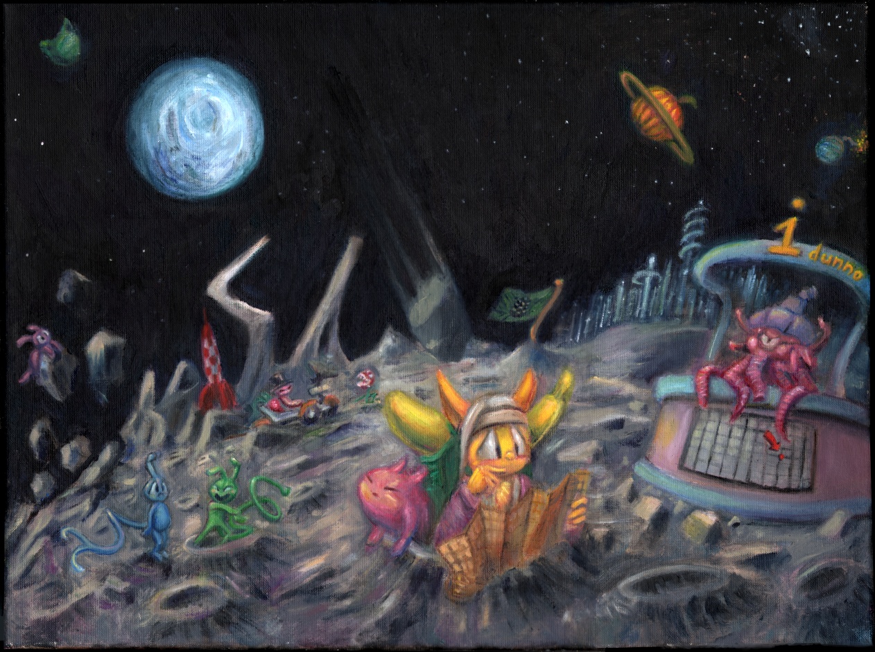
Aw beets you know you’ve run out of ideas when you have to put your dorks in space. Even the Leprechaun and the Critters didn’t take their pointy-toothed ghostly floating heads there until their fourth respective, respectable films. I can at least assure you that my fourth and fifth paintings are already “done” and neither conspicuously takes place in The Hood.

Oh now we’ve done it. Wonderful. My paintings officially remind me of Rygar. Now you know the real reason I’ve been depressed the last few weeks.

Moon scenes work when they are desolate and peaceful. My paineding is incapable of being peaceful because it is full of little objects of all different colors (and also that honorable faceless warriors the likes of Rygar are unemployed during peace time). The lighting doesn’t make sense because I imagined most of the light was coming off the earth-like planet orb, and so the shadows should go away from it. Yet if they did then the foreground figure would, once again, be backlit which wasn’t what I wanted. My solution was to light the characters from the front and the terrain from the back. Which isn’t a solution at all because it just looks like I have no idea how light works. Rather, I have a weak, ineffectual grasp. And yetter if the Earth is lit that’s only because the sun shines at it, and the earth’s light is a mere reflection, so in fact the shadows should be reversed. And yettest to face the sun directly while in the minimal lunar atmosphere would be painfully blinding and there’s no way this creature can read its map. Yes that’s supposed to be a map. Although it is lost so clearly it cannot read its map. Conclusion: This isn’t one.
As for the sky itself, again realistic references were a problem. None of them showed any stars. None of them showed any galaxies or color variation. The stuff that makes space fun to look at. The stuff that makes space fun to fill!

Here is a photograph of the stupid moon car taken on the moon. Very grey, no stars, no atmosphere, painful unfiltered light, obscure shadows.

Here is a crummy online representation of a painting that somebody more competent and compositionally imaginative than myself made prior to technology allowing cameras to go to the moon to take photographs from on it. Lots of stars, reasonable light, lots of shadow, lots of temperature. If I’d looked at this kind of thing instead of photographs I’d have done fine.

In fact I DID look at made up silliness but only for the sake of copying and didn’t consider the thought involved in the collective context within which I located the object to be copied. So I’m a hypocrite and a lousy copier. I’m also a terrible dancer.
Fahhhb. And for all I know this kind of thing is more accurate anyway and the cameras just mess stuff up when used outside on sunny days.

In which event my painting is still true to life. Life is often disappointing.

except when it’s worse.
Which being consistent with my expectations is not a disappointment at all and therefore not an exception. Which means Windows 95 isn’t going to lock up today, which is very good news, considering that I’ve already condemned myself to Rygar dreams after I post this.
One thing that I think is neat about last.fm, the website which was the topic of this post before it got too long and stupid and I had to remove the actual informative information from it to keep the length reasonable, are these little biographies that show up when I listen to music that I’ve liked for years but never gave much thought to the creators of.

I learned, for example, that before he become a game music composer, back in his younger days as a consulting detective, Koichi Sugiyama developed some solid theories linking video to the death of the radio star.

Later in life he of course went on to be Barack Obama.

Aw ban, that guy has so many albums of the same corny Dragon Warrior tunes, because people buy them. He must be rolling in dough. I, meanwhile, often find myself rolling in dopes. Yes that’s the only reason I mentioned it.

Although now I have decided that also I object to dumb Healie playing drums. Healie is like a floating dope with no torso or nose. Dopes often forget to have arms, so this seems like the next [totally il]logical step.

This puts me in a tough position because healers also remind me of c3po, who is my personal hero in life despite being a robot and not actually alive and not actually existent, but I stand by my principles. Healie cannot stand by its own principles because it has neither principles nor legs to actually stand with.

I’m not here to do things Healie would like! My parties are swingin’ occasions and healie isn’t welcome at them.


(who himself overcame the adversity of not having a face), and daring to go on quests wearing bright pink armor and refusing to shave his purple mustache, but Healie tries too hard to gain favor, and quite pinkly I find it sickening.

Excuse me, Ragnar’s party obtained the gold? As I see it, there’ll be no divvying of this plunder at journey’s end motel*.


Well now you’ve done it: you’ve emboldened Healie to commit the ultimate treachery: transforming into a skeleton. A jogging skeleton. You know you’re an inefficient being when becoming a skeleton enhances your skills. That is, if you are competent enough to know things.

we needn’t encourage this sort of behavior!

Now I just feel inadequate. I am blue with envy. I would be green but thankfully I’m not yella.

Although for some people being yella is the least of their problems.
===================================================
Sunday, the twenty-ninth: It is against my personal principles, but I am going to try and do something productive tomorrow.
Right, so I saw that avatar movie. I wrote something pretty mundane about it but I discovered I referred to it in what I wrote about another movie I saw more recently so I may as well put it here. Unless you have a better idea. If you do you’d better tell me quickly! No, too late. I doubt I’m the first person to make an Ultima joke in reference to it, so may I please be the last?


I like weird looking plants, but they are nothing new to me. I growed up seeing them all over the place, in a very similar context: inside big rectangles I could not enter.

Rygar had floating islands, Chrono Trigger had floating islands, Legend of Dogoon that I SLAMMED last week (in February) had floating islands. I like floating islands but James Cameron didn’t invent them. I found the Spindizzy Worlds more engaging than Pan Dora. It may have helped if my glasses and / or left eye had been calibrated properly; the whole film was blurry. I could see layers, but they were like viewmaster layers; some things stood out but they stood out by uniform amounts, and if they were near an edge of the screen they looked weird. Also, no attempt seemed to have been made to compensate for the darkness caused by the polarizing lines on the spectacle lenses; everything was just a little bit dark. No, excuse me, not EVERYthing…
the bright green EXIT signs on both sides of the screen were at full luminance and at least one was visible to me the entire time. Also, lights on the floor and behind me to the left.
The presentation itself was alright. Nothing that will change my life or that I’ll always remember. As any amount of people have mentioned the story and the characters are nothing new. The angry guy among the pure people who hates outsiders for good reason but that has to be proven wrong is especially played out, to me, though I must admit I liked that character better than some others. You can’t go wrong with bad science men vs good forest men. Maybe I’ll have an easier time siding with the forest men when they’re not all enormous, hostile Captain Planets.

I don’t mind the navies as long as they are presented exclusively as space aliens, with no allegorical implication that everybody would be better off living that way. The na-vi have no art, no individuality, no curiosity for that which they do not know. That suits them fine, but it does not suit me. Although that’s just as well, as anyone with a physical or mental defect is liable to be beaten to death or left to starve in a culture like that.

I think the 3-d may actually have detracted from the experience, to me. Without that I could have viewed the thing at full brightness, without stupid glasses, and without the picture being blurry. I found myself wanting to close the less accurate eye, a lot. A question struck me: do I normally do that? Do I view most films with the less good eye closed? Does being prevented from doing that for fear of losing part of the “experience” actually do more to ruin things for me? If I closed my left eye, the right’s vision was clear (but dim). I could have watched the whole movie like that, but I kept hoping I’d suddenly figure out a way to make the full picture less blurry, and so I kept both vision orbs in use for nearly the entire time. I’ve long suspected my actual vision was less than perfect with regard to things lining up in both eyes. If I really pay attention to a thing, I notice that there are two slightly different versions of it front of me. I assumed that was normal. Maybe it isn’t! It works alright for me, because I know nothing else, and nobody has suggested that a certain aspect of it is supposed to be a certain way (aside from when I’ve been accused of being colorblind), because it’s normal and nobody thinks there’s anything to say about it. However, once I start looking through a preconfigured mode of alternate vision, my alternate mode of function becomes clear. I may need to have a special corrective monocle made for myself that I only use when viewing three-dimensional films. I can squeeze my less good eye a certain way to make it focus properly, but I fear that will damage the thing further, and the eye is difficult to access with a plastic frame in the way, besides.
The film was filled with scenes – more than I can remember seeing in any other film – that I have watched – whose only purposes were to show off stuff. Unfortunately, if it looks blurry to you it gets annoying and you want it to hurry up and be done. Don’t you understand, I WANTED to like that. I wanted it to be the greatest thing I’d ever seen, but it wasn’t because I’m a broken human. I am doomed to enjoy less things than others and to be alone while I do it. This makes me sad.


And so I saw the dragon film. I don’t think I told you about the time I watched avatar, so I posted my contextless summary above here… The 3d worked better for me this time because I was closer to the screen, but it still wasn’t perfect. A pity I couldn’t get an imax screening. One person at whom I described my D-related woes after both these movies responded both times “you might need glasses.” Well I was already wearing glasses, they were just dorky 3d glasses. As for NORMAL spectacles, I don’t NEED them if the only thing I can’t see and only on one side properly are 3d movies that use the polarization method. And besides either way the thing would still be dim the whole time.
I noticed that the main human, Wesley or Herbie or whoever his name was didn’t have perfect teeth. Obviously the fat frubby Scotch Norsemen who comprised the bulk of the figures in the movie wouldn’t, but I was surprised that the thin characters were allowed to get away with it. They also were allowed to get away with talking in standard American accents. I’m not about to accuse that overweight people are intentionally made to look funny and sound funny in comparison to “normal” thin people because I honestly didn’t consider that until now and look we’re not even half way through this. So I’ll just imply it for the moment.
The movie did its job. It developed characters, it featured non-developed semi-characters which could be merchandised, progressed plot and waited to bore out most of its plot holes until the height of tension, when I would feel least inclined to consider them, and such and such. It did this without any pop culture references or overt sex innuendo and kept bad-smell-based “humor” to a minimum, which I didn’t know was allowed in animated movies these days. At least nothing bad enough that I felt compelled to make a note reminding myself to complain about it. And so I will complain about another thing.
The music was nice. A pity, since I’d have love to watch this in silence with closed captioning rather than hear the voice acting. Maybe I can get a version dubbed into Chinese with English subtitles. The technology exists, though it needs work before it can be employed without launching abysmal internet memeys. The kid, what was his name, Danny or Milo, he sounded completely bored the whole time, even when he was doing stuff that had my eyes been properly configured to see through 3d lenses would look fairly exciting.
One thing I like about watching cartoons from other countries is that there’s very little chance half the characters will sound like people from Saturday Night Live or Glee or whatever dominant white-people entertainment was hot at the time they were cast. Just in the previews I heard Mike Myers, Eddie Murphy, Steve Carrell and Jack McBrayer, and I saw Will Ferrell and Tina Fey’s names threatened in letter credits for something or another that I was too busy cringing at to hear the vocal accompaniment to. Three minutes into the actual movie, which was a good 45 minutes after I entered the theater, hey here’s a fat dwarf who sounds like Craig Ferguson, who never even worked for NBC. All these people are on or have been on major tv shows. They’ve made their money. Why do they agree to go along with this? None of them are voicing the characters; they’re just talking in their normal tv voices so that I recognize them. It’s nothing new but I’ve always hated it and I still do, whether they’re people I dislike or the alternative. I merely resisted any pressure to go and see one of these productions until now, and the previews tend to be targeted at whoever the audience is expected to be, in this case children, accompanied by adults, because every movie has to be at least PG, thus more ugly computer graphic movies, thus more boring human voices coming out of bright and shiny animate people. “But Mike Myers is doing an exaggerated SCOTTISH accent and he is CANADIAN!” but even that’s a Scottish accent he’s done before this role, and if we pretend he hasn’t, Shreck trash alone has made it more ubiquitous than his actual voice, and this voice has been imitated by people in other movies (this one, for example) and terrible gum commercials.
In the credits for what I did see, I was informed that Kristen Wiig had talked for someone or another. She was also on Saturday Night Live, and while I was able to find some sketches she was tolerable in before I stopped watching, there was nothing remarkable about the way she spoke. I certainly didn’t hear “her” when I heard the voice in the movie. I just heard A voice that I didn’t much care about, whoever it was. Why cast someone like that? Another character was Jonah Hill, and instead of thinking “oh Jonah Hill I like him in contemporary emotionless stoner movies that are utterly disconnected from this” I spent the entire movie trying to figure out if it was Jack Black, who would also have been distracting. However, I shouldn’t have had to think any of these things because the character was neither of them.
Every movie advertised in the lobby was a remake or a sequel. Again, nothing new, and again nothing I’m content with, either. The one thing that is new is that I neglected to bring my camera into the building and so have no dark and/or blurry pictures of unnecessary things. The previews that I alluded to reflected my lack of excitement or mere optimism for things to come. As these tend to come in superficially similar pairs (Bug Life and Antz, Shark Tale and Finding Nemmy, echt), two of them movies were about “so bad, I’m good” bootleg I M Meens without Warwick Davis in them. One was a blue alien (who ever heard of such a thing?) that reminded me a lot of that horrible alien that gets beaten up by the dogs for crashing into the fire hydrant, except instead of being typical and uninteresting for three minutes we get, I assume, thirty or so cycles of it. These clods have nothing on The Smoggies. Also, please don’t make a Smoggies movie.

The color in these computer movies is always the same. Everything is perfectly lit. The rate of movement, the force of gravity and pacing and such are also always the same. I feel like I’ve seen all these places before. Much like with video games, once they went “3d,” –in the rendering, not necessarily the projection– particularly after 256 color palettes were dropped, everything looked monotonous to me. Plus most of the plasma and spread orb guns turned into regular dumb old army guns. Yes, sure, all ye olde Hanna Barbera street corners looked the same and one Disney castle courtyard is like any other, but I challenge you even to identify but a graphic department by its backgrounds these days, much less a specific film (and if you can give me a day or so to acknowledge it because writing this made me tired). And while they’ve had 14 years to find an appealing way of showing computer cartoon humans, nobody’s done it yet. I hate their big chests and little legs, but I also hate them with realistic proportions. I hate them with huge blobby heads, I hate them with conservatively sized mannequin heads. I hate them with little eyes really close together, I hate them with big eyes that allot space for a nose. In short, I hate. I also hate in long. I’m just as bitter and unpleasable as I ever have been, but I’m getting more specific. Once I’ve identified every problem I will bring my findings before the council and they will abolish things I don’t like.
After a decade and a half of solid regurgitation of stuff from before we’re now starting to re-puke up the stuff we already puked up and re-ate. We’ve already HAD a “new” nightmare on elm street. We’ve already had a “next” karate kid. Toy Story 3 reminds me too much of The Brave Little Toaster for comfort. To be fair, I am rarely comforted by brave toasters of any size, nor little toasters of any demeanor. Even when they have wings.
I am in the process of re-evaluating some of the stuff that I allowed myself to be revolted by in the 90s now that I see it under attack by forces yet less meritorious, and this does, alarmingly enough, include that blasted toaster. I also have it on no authority less than a youtube comment itself that some of the toaster people went on to be involved with the Pixar people, but that doesn’t make the Toy Story any less creepy than it ever was. This one has Kens and Barbies in it. Although the apparent Mattel buy-in likely spares us any overplayed “Ken is a closeted homosexual with no genitals who doesn’t realize he’s gay because he’s the only man in town but he couldn’t act on his urges even if they became relevant” jokes, I think the writers should have the right to include such things should they deem it prudent, rather than to be bound by strict licensing codes of conduct. And you know me well enough to understand that I’d find a way to be annoyed even if Mattel granted Pixar a temporary “Ken is gay” license because I already implied I was comedically disaffected by that. I may just be annoyed at the money flow involved, and it goes both ways, surely, with getting existent products into works of fiction that serve to promote them without doing anything that a free non-licensed stand-in couldn’t. Although in this franchise the stand-in itself would be marketed as an original product and I don’t think I could take that, either. I don’t find “toys doing stupid stuff” funny unless they’re MY toys and I’M making them do the stupid stuff, besides.

You think I have any control over this??
We’ve already flipped and dissected every “stupid,” “hokey,” or “sincere” thing about our dominant consumer generation’s youths. My mother was 35 when that The Brady Bunch movie came out. I’m no fan of the Smurfs, nor was I ever, but I’d love another 8 years to not have Hollywuh pretend it knew smurfs were stupid all along and act like that’s news to ME. It could even be argued, by me, regardless of anything to base it on, that the avatarts were space smurfs who just happened to be bigger than Gargamel. Frimbip, Robot Chicken’s been showing action figures acting uncivilly toward each other ever since Seth Green found web pages from 1998 and realized he could rip them off for free but get paid for it. MacGuyver doesn’t even get THAT honor; it gets, “MacGruber,” a movie about a one joke non-parody of itself, with its origin, shockingly enough, being Saturday Night Live. That may even be a less reprehensible approach, but I’m far from optimistic about it.

I personally can’t stand the Robot Chicken mouth(s), particularly the banana shaped tooth kayak that shows up in every character’s talk cycle and

the bright white square teeth that they alternate scenes with depending on circumstances I don’t care to investigate. Yes, I pay way too much attention to the teeth of animated characters. It’s obvious more time is spent matching the mouth to every syllable than any other aspect of the animation, so who can blame me for noticing? I meant that for this series specifically but it’s true in general. Also, the low-budget amusement which should come from such apparently cheap production values is rent asund when they incorporate realistic explosions, bullet physics and blood (and there’s usually blood). Clearly somebody is spending thousands of dollars on this junk and should be held to higher standards than you-tubewits. Robot Chicken is the inexplicably legalized, advertisement selling television equivalent of bootleg Calvin shirts. Except it actually had a bootleg Calvin sketch, except Calvin was actually called “Calvin” and was a murderer and nobody cared. If I put a picture of Calvin acting in a comparatively courteous manner on this website that I do for free, however… again nobody will care because the Universal Press Syndicate gets its property violated a lot more often than the Shipyard Brewing Company does.

That is, I expect whoever is selling bootleg calvins out of a not necessarily mobile storefront on a main street in the nation’s capital is getting taken down before I am. The only reason Eli Co didn’t thank me for alerting non-yacht owners to the existence of their product is because when we spend $3.50 on 12 ounces of soda we expect to get six cans of it.
Thinking back… Starsky and Hutch, Miami Vice, Inspector Gadget, Dukes of Hazzard, Underdog, The Cat in the Hat, Land of the Lost, Bewitched… has there been one year since this rue wave started that there hasn’t been a nationally distributed hip, new, cynical, utterly off-the-mark take that ultimately nobody cared about on an old concept? (And how many of these had Will Ferrell involved? (the last two (if we don’t include Curious George, which I didn’t get the impression was cynical (oh (yes (stop it (when I feel like it (how about now (I’m considering it)))))))) Even the “original” new movies are full of this intolerable attitude. “Guys, guys! Nah. Nih-nah. Nah, ya caaaan’t… nah. Yeah, no…” I’m tired of every movie having Hal 9000 in it. The movie Hal was IN didn’t have as much Hal in it as one Ben Stiller movie despite being an estimated 4 days long and Hal being the single most referenced concept about it. Nobody ever says “hey, remember that movie where the guy floats through space silently for 30 minutes and then turns into a baby for no reason?” Besides the point.
Nobody can crash into a wall, fall off a bicycle, slip on a potato or otherwise suffer a public indignity without this type of character providing an understated “ooh, ouch.” or “gotta hurt.” “Awkward.” “Busted.” If THAT jackass can tell it hurt, shouldn’t I also have the right to? This is why people [on internet forums] hate Garfield. Garfield tells us what’s funny about something kwazy in the most disinterested way possible. Looking DOWN on me for finding humor in the writer’s work. DARING me to laugh at it. You thought THAT was funny? That ain’t NUTHIN oops out of space. I do this sometimes, but I don’t have an editor, much less a staff of them plus ghost-artists who can redraw a joke that I messed up by liking it so much that I couldn’t RISK you not getting it, even at the alternate risk of making you hostile toward it.
Even the music in these things tends to be judgmental. It likes to stop abruptly when something deliberately stupid occurs. “A little help…?” It’s not enough that the character failed, the soundtrack has to let me know a failure occurred by itself failing. It’s just like a “record scratch” sound effect except the sound people finally realized that by pretending they used analog sound equipment they implied that non-digital technology was adequate and the companies pushing expensive new projectors and audio systems on all the theaters wouldn’t like that. At least somebody finally cleared all the crickets out of here.

I tell you, those things are malevolent.

I’m afraid we have to go with your first response.
However, I did see the “Hairspray” movie, actually in a theatre, back in July. For some reason it included a preview for the Underdog movie, which I had complained about extensively several days prior. I immediately typed a sternly worded complaint –yes, right there, in the theater, on my pocket typewriter– about it again but couldn’t stand redundancy and so here it is now.
7-29-2007
See? I included the date. That proves it.
In Hairspray, I appreciated the absence of actual songs from the 1960s. Nothing ruins my day like Paul Revere and The Kingsmen and the whoever did that dreadful yak song. All in all in, considering how much I hated the old Hairspray when we watched it at my uncle’s house like three times, this was shockingly bearable. Re: John Travolta: I realize the importance of having a man fill a woman role that was originally done by a man, but “they” ought to have found someone who could sing properly as a woman. Obviously I’m not really here to whine about this.
I’d like to see a remake of Brigadoon with more of the stage version’s songs in it and a proper ending. I don’t know if the omitted songs were any good, just that the movie I saw seemed like it could have used some more songs, most definitely at the end. I also think Van Johnson should have danced more than once, but that’d be unlikely in a remake since he’s 90 years old.
But ehhh…
The latest Underdog movie preview made the exact same clips look worse than ever. I’m addressing this subject again because the last time I was so mad that I forgot to make sense. The Underdog people don’t have an excuse for not making sense because they’re clearly all very proud of themselves.
What is it about dogs that brings out the schlockiest scripts, scummiest screenplays and corniest concepts in people?

And why would Jason Lee, who at one point looked as if he could have had a semi-respectable comedy film career, accept such a job if he knew the sort of sub-Growing Pains material he’d be working with? I know it’s a dog-eat-dog business, and one can’t assume one will ever be offered so much money again, but in this movie it would be a dog-eat-cat business. That’s the kind of material we’re dealing with.
There’s something about computer graphics that makes something awful twice as awful. So combining that with the dog problem is of course, not so much a recipe, but definitely a Hungry Man XXL microwave instructions for failure. You need to use the convection oven! Alas, few people see the logic of eating something out of a little cardboard box if they have thirty minutes to spare. I’m sure in my younger days I could have parlayed that remark into another anti-underdog simile, but I’ll leave it as it is for now.
The same day as that, I saw a television spot with the second newest* old standby of moron movie marketing, scripted fake out-takes. Oops! The trained dog we dub words over later messed up his line! Even though we recorded all his lines months ago and use computer tricks to make the dog’s mouth appear to move! Where’s my 1950s clickboard? Oh, it’s in this truth.com ad.

Anyway:
Who in the creative club speaks up and says
I could understand if this was a plot to sell off unsold junk manufactured in the 1970s or lousy dvds -I wouldn’t like it, but I’d understand it- but Disney has no claim to that. Increased awareness of the old product is not a goal. What is the goal? Could someone tell me what the goal is? Is it to make me so nutso that I strangle someone and get sent to gaol? Well, no one spells it that way anymore. Get with the program. Take a chill pill. Like, talk to the hand. You go, girl! D-d-d-d-don’t go there!
*I believe the process through which the words comprising dipshank critic blurbs appear on signs or are manipulated by characters in actual movie footage came just a bit later. I don’t know why anyone would want me to think the actual scenes look like that, but I don’t know why they do anything. Thankfully, Underdog hasn’t gotten much praise. It would have told me if it had. International markets may not be so fortunate as I, however.
Also, Daddy Day Camp and another Veggie Tales movie which I hope is only the second. Did I come to see Hairspray or retardo spray? Are these really targeting the same audience? These make the Stardust and Charles Bartlett previews look watchable. But I know they aren’t, and I won’t.

I will, however, advise Anthony Michael Hall to sue for dork infringement. I assumed it failed quietly and went away, but supposedly this movie’s release was merely delayed until February, so in all probability I’ll have to deal with these awful ads again. Beh. I can’t even manage a bah. I’m too weak.
Much like Are we Done Yet (which you may well be asking by now, and no, we’re not), the sequel to Are We There Yet, Daddy Day Camp’s demographicites are so witless they can’t even be trusted to count up to two. Or maybe it’s the screenwright who can’t. It’s hard to tell. This movie features mullet-centric jokes. I’ll grant that mullets are kind of dumb, but they’re not nearly as hilarious as the billions of jokes about them which have accumulated on the internet in ten years seem to think. Mullet jokes are the absolute hackiest rapiest ugh yon abe nab it short-circuited my brain. Maybe now I can write the next sequel!

A Veggietales movie. But what the help are Veggietales? Aside from a few rare spots for their other movie, I’ve never seen them anywhere. They’re a product of the modern Disney commercialism that keeps their absolute worst output invisible to anyone who might potentially warn the intended victims how stupid the things are. But they aren’t made by Disney. I don’t know who they’re made by. All I know is that I hate that person. The rumored heavy bible content isn’t even a factor. That’s how terrible veggietales are. What are they for? They’re not even “cute.” Their noses are too big and their eyes are too close together. I doubt, if they were real, anybody would want to eat them, either.

And this, it claims to be something like “the greatest vegetable movie of all time.” Ha ha, right? Except Attack of the Killer Tomatos was a tremendous success (I think) that plenty more people know about. Everything in this preview made me mad.
The subtitle is The Pirates Who Don’t do Anything, and already we know we’re in for a good time. Of course they don’t do anything; actual pirates rob, kidnap, rape and murder. They’re just bad news in general. Totally inappropriate for most children films. Besides, they need arms for all those things. Not that there isn’t rape and murder in The Bible, and we’d never selectively ignore, edit and otherwise remake The Bible and continue calling it “The Bible” to meet our particular indoctrination/marketing scheme, would we? That would be distorting God’s Word and

apparently there’s nothing wrong with that.
Or there are things wrong with it, but not the ones I suspected.

Also, they tend to latch onto unusual phrases or specific visual bits more than any intellectual matter behind the content. My imagination was captured- held hostage even, by the “Disney Classics” logo on a particular copy of Disney Robin Hood that my mother used to continually rent for me. There was another copy with a different Disney Classics logo that I didn’t like at all. I possibly demanded the tape be exchanged for the other. I was also fascinated by the FBI warning which occurred first.

I must not have been alone, because about 50 people downloaded the sequence from “retrojunk.com” and reuploaded it to… some other site and got congratulated for it as if they’d accomplished something. There’s even a big enough audience that it’s worth adding extra, irrelevant, garbage website logos to. I hate many people. Do you have any idea what an accomplishment it is to have me staring directly at a Disney notice of intellectual property, after mentioning Underdog, at that, and be complaining about something else? Remind me to explain that sometime.
Most importantly, that fascination of mine did not transition into a fascination with a more realistic, less abridged Robin Hood. My mother, bless her Dodge Aries, bought me a big purple Robin Hood book with pictures and stories and everything, but I was disappointed that the people depicted weren’t stupid cartoon animals. Let’s hope Disney never makes a bible movie. Though I admit Disney’s Bible has a wonderful blasphemous sound to it.

We wouldn’t want to work toward lengthening those attention spans, would we. No no no, it’s much easier and more lucrative to pander to every stage of spoiled bibly brattitude.
This here is actually an abridged version of an abridged version. I’ll never understand why people think small children need totally different things than slightly less small children. We give them special dumbed down bibles, stupided up cartoons, sapped around video games, even dumbed down food, eeeven though its all dumped down in the end regardless. And the original stuff isn’t all that smart. I don’t think I ever ordered a “happy meal,” but it’s not like normal chicken mcnuggets come with fois gras and vodka. When I was six years old I played grubbish old regular mildly violent Rygar, not Lil’ Rygar presents: L’il Rygar and Gruffy Adventures: My First Day of School: the Search for Rygella’s lost Bike Helmet. Because they didn’t make trash like that in 1989. It would have been Rygar and Son, but Rygar wasn’t a cartoon and so was exempt. But I was just trying to make a point. You don’t need to analyze everything I put here. Geesh. Chill out, man. Mellow out, dude.
We (“we” being me plus at least one other person) went through a few Nintendo Entertainment Systems in the old days. All the dust particles that built up due to the machine’s cartridge door being held open by the object also holding the game down because the spring-lock was broken probably did not help. Lincoln logs, legos, Sega Genesis games, many items held the honor of this holding. Various “game cleaning” devices may also have found at last a legitimate use in this role.
The games themselves similarly suffered. There were some, like Air Fortress, which always worked, either due to disuse or simple irony, but the older ones were a different delaware. I actually had mapped out in my mind which glitch patterns and colors meant Legend of Zelda was how close to starting up properly. A blank blue screen was bad. That was the furthest from function. I knew when it started being gray and occasionally showing white dashes it was almost working. The NES we got later, unfortunately, defaulted to a blank grey screen so it was really hard to know how much more blowing needed to be done. We had to replace the first NES, as I said, because its spring-lock broke. Its door had also broken, but that didn’t really matter since that wouldn’t stay closed while the game was being held down. Though the second’s spring also broke, we were cautious enough to see that the door remained intact. By that time we had moved on to leaving control devices in stupid places and letting them get stepped on. Big kid stuff. (that’s noise)
Good old Legend of Zelda. This was the version without the “hold reset or lose data!” warning.

This warning was added to the later issues of the game without the gold cartridges, which has me mystified, as it doesn’t look at all expensive to have produced. All the more mystifying is that the absense of silence, which is also golden, ought to have resolved any budgetary issues. Perhaps this is golden wisdom.
There were some graphic errors with which the game was playable, like vertical white lines, and others which I knew not to bother with, like the horizontal orange lines which gradually spread from the upper left corner to cover the whole screen. My cousin Patrick called that “the ozone layer,” and I never questioned it. I don’t think I ever questioned a thing he told me, even though 53.7% of it was rubbish, and that’s a bit more than half. I believe it was from a friend of his that I learned the “blow in the cartridge” trick. You know, that great trick that never worked one time. We did that for six years.

It’s impossible to say to what extent this sort of thing contributed to my lifelong fear of being sent to prison. Incidentally, Patrick also told me that the creature with wings is named The Guy Who Flies With His Pants On. It makes sense; why fly with your pants off, if you have pants?
Different games had different diseases, but all suffered from the ozone layer. It is a good thing I never heard that aerosol sprays “depleted ozone” until later, as I would probably have found myself emptying those directly into cartridges in lieu of plain inefficient mouth-driven air and thought myself quite clever. Mmmm.
Sometimes there would be “good” lines at the start, but then ozone would slowly start sneaking in. Of course I was always in denial about it. I would pretend not to notice it, and hope that it would go away. Alas, ozone is all around us, and is in all places at all times, so it really cannot go anywhere. Even if it could, Ozone Road was a mere two blocks from my place of business, Olympus Battling business, so its fearsome layer could return before long. It did.
There was a period when I was just grateful to get a certain intendo tape, as the people I liked less liked to say more, working for a few minutes. There was one Metroid password that I entered so many times that I actually memorized it and no longer needed to consult the birth certificate or Abraham Lincoln autographed picture I had written it over. It wasn’t even a good password. I think it had one energy tank and fifteen missiles, in the second part of Norfair without the high-jump boots.

BOOTS, I said! Why, in a situation which involved boots, and you had space on the screen to print “boots,” would you not do so? I guess I’m just old.

Newer Legend of Zelda cartridge side-by-side with picture I found online of older Legend of Zelda. Obviously taken by an amateur, who set it up in an environment with minimal light reflection or whatever, so the precious metal exterior just resembles plastic painted to be a goldish color.

Newer Legend of Zelda side-by-side with earlier picture I took depicting itself and gold cartridge picture. Despite the tape issue, not I nor anyone I had or yet have met called these things “carts.” I remember getting an occasional issue of Electronic Gaming Monthly magazine between 1992 and 1996 and wondering what video games had to do with driving around in little mechanical cars or transporting groceries.

I also wondered if Mike Weigand was really a Battletoad.

How Blackthorne could be “game of the month” in any situation had not yet occurred to me to ponder. I mean, you can’t even draw your gun when climbing up a ledge. I hate that. For shame!
Oh, and Gary Coleman did own an arcade at the time this magazine was printed, but I assure you Mike thought he was being every bit as hilarious dropping the name then as he would today.