Another ten+ year old lingering matter:
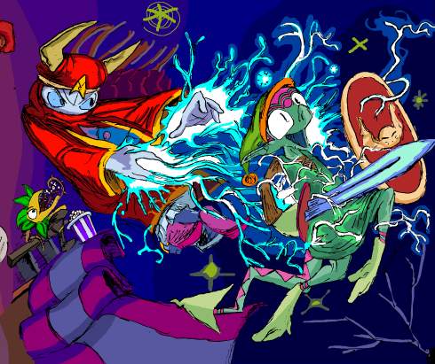
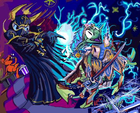
from that page, this to this. As with my last such comparison, the actual changed page has not yet been uploaded, since that seems to require a different mindset than working on them does, and the work is not finished! I hope to pog I do something about that ugly carpet. And I said not long ago how unimpressed I was with “*gets popcorn*” as a response to rambunctious activity. I did try to draw the plant thing from the initial image looking at a map to indicate it was confused at being in the wrong version of the picture, but then that means you would always need to have seen the old version of the page to “get” the new one, and the whole point of the new one is to let the old be forgotten, and also then that means I would always need to have the old one available somewhere, and for THIS? Ridiculous. Also its body makes no sense so I couldn’t actually draw it in a way where it looked like it had a map.
You will believe I can spend longer on one frame than some people do on entire comic books, and then spend as much time writing about it. This requires that I accept most “24 hour comic book day” offerings as entire or books, which I generally do not, but the statement felt superficially profound when i thought of it.
The old drawing of course looks more consistent with the style I was using in less-altered frames, more effortless and un-self-conscious, but I am too eaten by obsessive compulsion to handle this in another fashion.
I am sick to agony of Mario, Sonic and Link. In ten years Nintendo went from a video game company to a religion. In all honesty I never need to play Street Fighter or Mortal Kombat, the series alluded to in the preceding frames, ever again either, but I don’t know anybody who lives their life around homaging those games. Perhaps they exist but I do not know them. Oddly enough, my initial Zelda 3 reference was itself a protest to indicate my dislike for Zelda 64, which was by then nearly ten years old and being lauded by not-yet-religious nintendorks as the pinnacle of human accomplishment. And I STILL protest that, but Aganhim is not iconic in the way that Link is, so somebody might just think this means I drew any old weird Link variant with a generic wizard. Neither is especially funny to me, also, unlike the Kombat and Street fighting allusions in the other frames. However I “needed” the replacement to also include a wizard who uses lightning and a hero who uses a sword. Even though I ultimately totally redrew them both. But if I changed the layout, that potentially meant I could change the entire page’s layout, and if I did that I might as well NOT have a page full of irrelevant video game references, but I didn’t want to spend two more weeks on this.
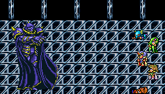

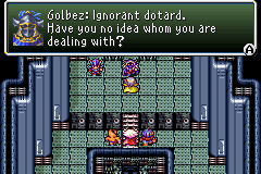
Regarding my replacement, Final fantasy fandom IS overdone, but not to the same degree that anything first party Nintendo is, and certainly not with dumb old Golbez or Cecil. Although the TROUBLE with drawing any Final Fantasy playable character is that the version in the game is different than the far-from final one in the concept art. And in the case of Cecil, also substantially different from the one in the DS Remake.
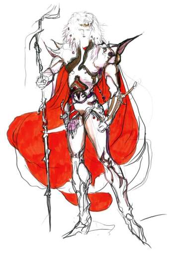
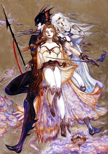
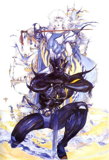
Cecil even looks different from concept art to concept art because Yoshitaka Amano never adds keychain trinkets and circus stripes the same way twice.
also: there are two different flamboyant dark-armor people shown in these drawings and neither is Golbez. They are irrelevant to the present matter!
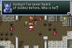
Also I OBJECT to the DOPE EARS on that one’s helmet.
It seemed most sensible to match Elpse to the Cecil that I recognize, but in fact that looks almost more like the Actraiser hero when drawn in here, and somehow it mutated into this gaudy mix-match that is not quite any version of Cecil. But whatever, Golbez, by virtue of being 50 feet tall, is sufficiently detailed in sprite form for my imitation to be identifiable and Elpse does NOT look like Link, apart from my forgetting to change the dingle-ball that I had attached to elpse-link’s hat, which arguably fits in better here. I would have liked to put a Shining Force allusion in there, but none of the prime antagonists use lightning, plus quite honestly the demonic character designs are too on-the-nose for this, and this is not about my favorite video games, besides; bubble bobble, hinted at two rows down, sure isn’t. This page is about whatever I was thinking ten-or-more years ago except for that one thing that really bothered me which had to go, and so it did.
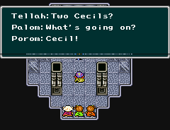
you don’t know the half of it, buddy! To think I didn’t draw elpse in Tellah garb because I thought it would look too weird. (Also Golbez is afraid of Tellah’s Meteo)
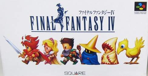
If I lived in Japan I would be even more confused since the sword-wielding homecoming queen hero on the game’s box has had his colors swapped around to an even more extreme degree, likewise with his two companions, and the two people following THEM are generic nameless wizards that you merely encounter loitering around various places. I have NOTHING to say about the bird.
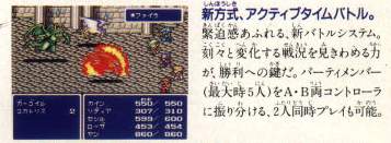
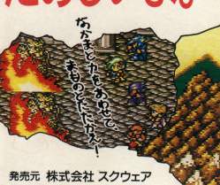
the back of the box, as well as that of the “easier” rerelease from a few months later shows this non-accessible party lineup against a monster groupings from the Mt. Hobs stage against the inside a town background. In fact the players and their positioning is identical to this other rumored fake screenshot.
Presumably the idea was to not spoil certain aspects of the characters’ identities. Yoips I WISH marketers took that approach more often, especially with the way Star Wars junk is promoted.
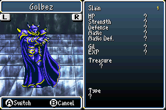
Slain: ONE golbez
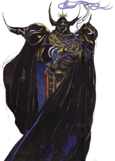
For goop measure, here is Yoshitaka Amano’s Golbez concept art, which the version put in the game is about as consistent with as anybody could hope for in 1991, apart from the sprite artist just having to say screw it and force in the appearance of feet and not translating the arms to semi-profile view very well. I never even noticed the feet until maybe ten years after the first time I saw this. I always imagined golbez was floating and turning, casually pointing a finger at his enemies while turning away because he knows they are already done and he has more pressing business elsewhere, rather than just standing there rubbing his wrists together. This gameboy advance version is slightly condensed compared to the original super nes version, so golbez almost looks like he is posing in a bad rap video or doing the macarena.
In any event I think we have seen the last of Golbez for a while.
RSS feed for comments, for they hunger.
This here`s me trackback!

Indighost sez:
I never knew you were such a big Final Fantasy fan.
Frimpinheap sez:
The most recent new non-remake I have fiddled with was released sixteen years ago so there is little impetus for me to express the interest!
I did have a spree of final fantasy 8 related websitery in 2016, but it primarily concerned my disappointment.
Charmlatan sez:
The Super Mario Club will hear of this!
Purplespace sez:
The elpse is very happy to be zapped!
Dhraiden sez:
I am fan of Amanaon’s work – it would look quite lovely hung up on parchment and framed nicely. Although I never sense any urgency from his works – antagonists and protagonists seem like they’d ruther show us the soles of their snazzy boots and just float ethereally than *do* some villainy (or heroicness).
Frimpinheap sez:
I think Amano is more about getting the energy and ideas out than ensuring they contribute to a cohesive whole in any way. I appreciate that, I used to fill sketchbooks in that way, and miss being able to do so. I am fairly certain that Ultros was an inconsequential background element in a drawing of Terra and Chupon that the other designers thought was striking in appearance.