


because this is what i have this week

another old thing being redrawn, and as usual I cannot help making the job more complex than it needs to be. I have “designed” the new version to have separate parts that can be customized, possibly including species/racial traits, though i have not made any alternates for that yet. note, however, the present lack of toes that allows me to later give more than that. which I tell you to note because in fact I almost don’t, so maybe i won’t bother adding any. the way sprites get clipped to the ground, depending on what settings “players” use, which I have no way of predicting or controlling, they may never see the feet at all anyway!

the hat, jacket and scarf currently are separate, though there really is no reason to have the scarf without the jacket, and this particular hat complements them, and I might do well to merge them all and have any replacement outfits be complete in themselves (in frap on january 20 in the a m I did so and have updated the gifs from what was here previously). “complete” in a partially dressed sort of way, I mean. ironically, parts that get covered, like the arms, I drew in more detail than the toeless feet that don’t.

the old version, from 2003, has not aged as poorly as some others, and unlike a lot of 4 frame doom monster animations, actually looks like it is walking from the side angles. at least inside the game it does. Right here it looks like it is dancing poorly to whatever music you have playing, and if you aren’t playing any then I imagine the creature looks even stupider.
the new “gun” is simple since I am not really any better at creating convincing imaginary guns than i was in 2003, considering how easily this one is mistaken for a mario pipe in its present state and placeholder color, but i also think i might give a custom embellishment even to that. BUT considering the way it is held more or less requires this shape and likewise precludes the creature carrying a differently shaped object i might save myself some effort to merge?? I think I accidentally uploaded an incomplete version of this text since I remember removing that sentence since it was redundant and went nowhere, yet here still it is.
OF COURSE at this point i have evaluated the idea of guns in this “universe” more so, and imagine that they should be rare, so should a creature so numerous that i want to give it customizable features so as not to appear TOO monotonous, have guns at all? or does these not being very powerful guns excuse their proliferation?
I had also in the past resolved to entirely remove any monsters from the comic strip, such as lope and nemitz, since they are too conspicuous to have hundreds of violent clones, yet I left in pog, and obviously the dopes. A version of this thing does appear over there, and exhibits no aggression whatsoever. However it appears quite briefly, and was never important enough to have a name, and it is almost less “real” of a character than the [gz]doom one is. despite rendering its bell in greater detail than required, I abstained from drawing its forehead tattoo, which you will find is present any other time I have posted drawings of it, and maybe that particular variant belongs to a cult that preaches non-violence, but perhaps also encourages some worse activities, such as delivering unmarked packages, tolerating bow tie impeciles or having toes.
a full year of disasters packed into two minutes
circumstances have inadvertently conspired to prevent this video from happening, and they may have had the right idea!
like last year I was too busy to finish the music until right when I needed it and consequently it was again not finished in a mentally sound manner. Indeed I didn’t know if I had any heretofore unused music at all TO finish and try to use until two days ago. which shouldn’t be important since it is just supposed to be a video video, but the less important something is, the more important something is.

this sure took a while to make! too many moving parts for this many angles. no more ribbons on these weirdos. hopefully anything else I need this one to do can be done in three or fewer frames per viewpoint. My hopes are typically misplaced.
in fact these angles don’t match very well and there is a hard break between front and back views rather than them being evenly spaced from each other, but that is unlikely to be evident in action, and unlike most things that are unlikely to be evident in action that I want to fix, this one I cannot fix so I must accept it or even better forget it!

The hat is put into the “game” separately from the rest of the body, and, due to a frustrating oversight, the shadow for its hat also. however, the discovery that I can assemble individual sprites without needing to separate them by angle after drawing them greatly cuts down on the time necessary to insert all these dumb little things and simplifies the process of updating those graphics if I see something fixable other than what I already said I couldn’t. Having the hat separate –I determined it was the element most feasible to keep separate, the shadow issue not withstanding– allows for the creation of an alternately-powered hatless or alternately-hatted version, once I draw another set of hats. or

this might be TOO stupid.

Having this settled for the moment I hope also to have another comic page completed before the year ends, because it would be depressing not to. it may also be depressing to do so by virtue of containing the virtually virtueless meepmere along with a pathetic lizardoid that isn’t angry at meepmere, but not to the degree that a dope with a recycled hat doing the world’s stupidest dance is.

pog explodes. must be tuesday.
unlike the case with the walking animation, I have no difficulty letting go of the old version
here is an attempt at a video showing what this looks like. A particularly annoying sound effect in there, which has been there since always, that I never realized was annoying until I put it into a video is presently meant to only play a third of the time but I don’t hear its two partners in here at all.
i neglected to show how easy it is to get trapped by the pogs. that should have been the main idea; why bother shooting them otherwise? in fact they DO destroy the player right after the first clip cuts out. why did i cut that out? I don’t remember, but it would take another twenty minutes to put that back in and I need to go for a walk outside good night. maybe i will put up a better video later!
the snikpels are unusually aggressive for a doom-engine monster. in the final “game” I won’t put so many of the shooting type into the same room. probably. This isn’t a real level anyway; just a test zone because none of the existing levels were designed for… well none of them were designed.
I THINK i can make the explodo-pogs create a circular blast impression directly on the floor, drawn as part of the floor, rather than a distracting sprite, but I haven’t attempted that yet. that is why I don’t like to make videos; there is always something that isn’t ready yet that I feel like is just about to be ready! Also the video capture and video editing softwares fight me every step of the ways, and they usually win, but I don’t ever remember that they are going to do that so that is not an effective method of discouragement.
///////////

yes I can in fact make them leave a mark on the ground but it doesn’t work pleasantly on inclined floors. it stops in the up direction and floats over the down direction, both looking silly and allowing other objects to be partially underneath it. from what I understand “flat sprites” simply don’t work on ramps and probably won’t ever. Ramps are a novelty anyway and I usually prefer the orderly appearance of stairs!
//////////
10-17 456pm also it seems that the microphone i have been relying on the past few years no longer functions, and I don’t know if that is because its function has been compromised or because computer manufacturers became prejudiced against microphones that aren’t attached to “headsets” and made them much more difficult to get working. I bought some weird port merging device which allowed the microphone to work on the previous computer but as this machine is newer it may have awareness of my present method and require a different purchased object to get past the latest unnecessary obstacle. unfortunately basic functionality is a bit more than a novelty!
844pm jeepers big animated gifs sure are rough on my slightly older computer. I forgot about how insufferable this used to be!
///////////////
8-25-2021 353pm and TODAY my proper computer’s battery is dead and it won’t start even on direct electricity so now I need to deal with all that involves. My hard drives are fine, just impatient.
////////////
8-24-2021 1149pm hello this site wasn’t working at all, giving the “apparently that’s not allowed” error when i tried to access it or any other page around 11:27. for a few minutes? a few hours? days? I have an important rygar update but it won’t be feasible to present effectively in eleven more minutes. that is just how things are these days!


snikpel the snokpeal runs in five directions, gets hurt from 8 and then flops over in a needlessly difficult to draw fashion from 8, because that is what I drew happening the past week. The angles aren’t evenly spaced but they follow from the standing pose well enough and ideally nobody will spend much time walking around staring at the “corpse” to check on how consistent the angles are. I made the little orange bits that splash off dissolve instead of stay on the ground anyway, as much as I hate to remove any detail, since those would definitely mess with a coherent rotation.
I also expect to draw it flopping over in a less complicated manner because I already drew the legs for that in an earlier botched version of this flop. Like seems to be usual, I make something more difficult for no real reason on a whim and commit to finishing it rather than cutting my losses once I realize I have made it harder. there may be yet more defeat types related to the more upright agony poses, because my life has no meaning.
actually getting these sprites all into the game and programmed to appear properly will probably also take more days, and I still haven’t given it attacking frames! in fact the original low resolution snikpel from 2003 simply played its running frames out of order for attacking and “dying,” with a single flat on the ground pose.

some of the fun of a game like this is beating up dumb little beasts and having goop fly out of them so I ought to have at least one melting animation also. I would like to have little marshmallows fly out of it when it takes a regular hit, but that stuff is even harder to control than my ability to not do needless things. I am fortunate I still haven’t made myself give toes to these things.
I had terrible tools then and was much more easily pleased. I have not yet become displeasable enough that I force myself to properly animate the “pain” sequences; i can make them jump in the air when hurt as I did with dopes and wah beasts previously, but after excusing this awkward full rotation flop it may be more difficult than previously to not excuse any additional tediosity. So many of my endeavors end in flops that maybe it was inevitable that I would make flopping a full time endeavor for my-self.
I was stabbed in the left shoulder today and so far all I have to show for it is this shoddy video of the shoddy video on display at the place where it occurred.
The only good thing about this is that since it is government and local whoever made this was probably paid little to nothing for it. OR some money laundering firm was paid way, way too much for it.
there is a belief among some highly dubious people that the only thing stopping us regular folk from getting vaccinated in larger numbers is a lack of empty, cutesy encouragement from casual acquaintances and commercial entities.

A frame isn’t going to ‘inspire’ anybody. They either want to be vaccinated and are waiting or don’t want to be vaccinated and would need a chain of miracles endorsed by current US president and alt-right pope Trump to change their minds and still might not if they hear George Soros got a vaccination too. In fact this sort of wimpy-appeal peer pressure is much of the reason they are so obstinately anti-everything courteous. You need to employ sarcastic macho bully smirkle-jerk peer pressure to convince them to get vaccinated, and you won’t, because those are the people with a financial stake in sowing distrust for science and or social decency.
If the latest center for disease control guidelines stating that masks are no longer necessary after vaccination aren’t in error then that is all but validating anti-vaccine, anti-mask advocates who said it wasn’t necessary to begin with since the plandemic was started on purpose by China and also a hoax and imaginary. Just because the new mask rules only apply to people who have been vaccinated and only two weeks afterward mean nothing because you can’t distinguish those who have from who haven’t without enacting the sort of measures that Trumpian sorts have been warning their congregants about “liberals” imposing ever since ever. Even if there was a vaccine to help prevent further ideological disease you would never get anyone who needs it to take it. I suppose that gets a bit into the same sort of realm as people with autism objecting to it being called a disease and not wanting it to be “cured.” Which is ironic because anti-vaccinators believe it would be totally eradicated by not vaccinating anyone against it.

Also, my profile picture has a dope in it and at best will only ever inspire any friends to re-evaluate our friendship. I would approve of framing this only in the sense of blaming the dope for someone else’s crime but there are few crimes it is smart enough to plausibly be accused of doing, apart from possibly acting as a consultant for the decision to implement animated anthropomorphic vaccine bottles, in the form of not saying “no” when asked if it was a good idea.
I other newts I have yet to experience any negative side-effects from either vaccination dose, even though I have seen remarks and memery bordering on fetishization of the idea of experiencing such effects. And I certainly had people worrying on my behalf about the immediate consequences of my second dose. Having to drive to, from and in Old Saybrook on multiple occasions has been the worst of it, and was so before I even got the shot. I think a lot of this is like msg-paranoia, in that the more people fear it the more susceptible they become to it. Which is preferable to fearing the vaccine entirely I suppose. Being afraid of dumb things and expressing those fears makes people feel important and helpful, I suppose.

I do not at this time require the assistance of cowboy birdmen.
I do have a bit of a headache, which IS one of the stated side-effects, but headache is also a side-effect for everything else, among them typing in a bright white text window in an otherwise unlit room for several hours. I also have more vaccine-related remarks and pictures to show and hopefully won’t.
//an addendor, I have had a steadily increasing ache in the targeted arm, and did also the first time, but I consider that less of a side than a direct effect of having a metal spike plunged directly into a muscle.
///addenorior: almost immediately after disabling the computer and going to my bed (an actual bed as of early march and I am yet uncertain if I prefer it to the mattress lump) I developed fever-like symptoms, but nothing I would have mentioned under ordinary circumstances. Including vague, uncomfortable body temperature and dreaming about lying in place precisely where I was while thinking about lying there, at best, and otherwise believing I was in an incredibly tedious factory facility dedicated to endlessly sorting the contents of my nasal passages. I was several times jolted awake by the imagined sound of non-existent text messages. Now six hours after the initial illness I feel relatively un-ill, and my arm doesn’t even ache anymore. However I am re-experiencing a general difficulty sleeping that was occurring months prior to the latest shenanigorps and is closer to being a matter of personal concern. Now I just want to eat until I get tired enough to fall asleep again and ideally do so properly. I won’t but I sure could.
numerous misguided illustrations from 2020 and at least three guided ones in video form. Please accept my condolences if you recognize them all. I do not believe that there is any single website on which every one appeared.
I completely forgot to make a “2020 in pictures” post because I suspected a video like this would be slightly more striking, and when I did one last time I didn’t get it out until january 6! finding 12-24 static pictures shouldn’t take me longer than part of one day, so it will probably be ready by January 4 at the latest.
i sped up tedious or extra embarrassing items but I have not knowingly excluded anything apart from numerous frames from beet cartoon part 3 because many are not “finished” and if they were this would essentially be that video instead of this one.
In 2020 was the conclusion of my first botched free “sketch” giveaway and the entirety of my second, which means possibly the most amount of other people’s characters I have drawn in one year, and I do not intend to do that a third time. I am curious as to if that means I will have fewer illustrations overall in 2021 and more other types of works, or if I will simply glop up more needless illustrations of my own marginally thought out concepts as a consequence of fearing i will be forgotten if I do not post at least one finished dumb picture every week. Smart pictures are unlikely.
The music, something is missing in the second half that will give it the depth I desire, but the conclusion after that point only works by accident and I am not accustomed to committing accidents on purpose and it is only necessary to be endurable, not “good,” so that will need also to wait. I do not know for certain that I ever got covid but I am plenty sick of hearing this dumb tune for the time being!
ehhhhdit: yes it looks better after today’s alterations but I feel uninclined to replace the video right this moment!
///////////
a fairly annoying video. i under-estimated how noisy it would be, since I had increased the frequency with which they make noises in order to ensure they were making noises at the correct times, and then only recorded in rooms that contained about fifty of the dumb things. particularly the ignoble noise they emit after being defeated is conspicuous here, playing at intervals of 8 to 64 game-time units rather than 256 to 1024, and one of the sounds it can play is louder than I thought it was.
because the sounds themselves were recorded between 2003 and today, in sometimes less than adequate accoustical circumstances, because I couldn’t find the thing that lets me use a microphone with this incredibly shoddily designed combined earphone/microphone port, or it was before I had a microphone at all. I have both now, thank you, good luck.
I will hopefully give them a means to explode when hit with exploding objects since that they lack one here doesn’t seem at all fair.
this thing isn’t finished; it can’t yet be attacked, however desperately it deserves to be, and oh! I now hear microphone noise in one of the “wah”s, but I thought a quick video would be fine. as is typical, 37 different things are wrong that aren’t even relevant, so the “quick” part has gone on a considerable while, because grapety purple everybody inside the computer needs to be the center of attention and can’t just do what they are supposed to. these noseless idiots screaming at me are pleasant by comparison. I also can’t tell if my internet is terrible right now or this new version of OBS that captures off center and can’t be edited in my outdated bootleg version of scony vegas outputted an INCREDIBLY watery video, with increased video resolution and quality being the sole reason I am attempting to use a newer screwier OBS over the older one that is much more agreeable. I couldn’t do more than 1024×768 but at least I didn’t need a snorkel to look at it.

this link is copied off my pay-treon page and I am concerned its “token” will expire and it will stop functioning in the intended capacity
tentative gz-doom walking frames for a creature deliberately resembling ziv (orange lope-like lizard) from the airplane cartoon fragment. actually creating this scene in the doom engine, the thing that the cartoon was originally created to prevent me trying to do, seems like it may yet be necessary, but also possible with developments from the past few years, and regardless of whether my doing that is feasible i took it upon me to make isolated walking sprites for the lizards. or one of them, anyway. even though they are identical apart from their head protrusions and snout thickness i believe i will not be able to recycle their bodies. But only one actually “walks” during the scene. everything else i will probably have to import just as it is and use it only for this, awkwardly, frame-by-frame. I swear that almost makes sense in the context of gzdoom.
these colors are not quite accurate, deliberately, because it is presently mapped to the in-game palette, which I can replace ranges from within the “monster” definition data. the palette is stupidly designed, with the darkest oranges separate from the lighter ones, but the reds are all together, so replacing reds is easier than replacing oranges. Had my initial goals been grander and more focused I would have designed my own palette possibly but that is not how things worked and fortunately they are no longer incredibly relevant apart from how i go about replacing its ranges.
even though the dork is supposed to be orange, i don’t necessarily want it to be doom-palette orange, and if i want to place other generic lizards elsewhere that have blue or yellow skin this will make that simpler. Its spines are orange because i was not expecting to care about those but oops i did. it might need some tail points also but the original lacked them and they did not seem to be a priority.
despite my having drawn these with those dopes‘s frames as a guide this still took much of two days. were i a real artist i could have used a 3d model i already made and just loosely drawn over it and have been done in maybe four hours. I did not make a video with this because now the month is july and i am overcome with urgency at preparing comic book 4 and also cleaning up and coloring in beet cartoon 3. there is always a task that can’t ever end to break any momentum I might have developed on another one.
however i made a different video showing something less significant a week ago and did not even bother to edit or frame it properly. One of these days will definitely be one of these days.
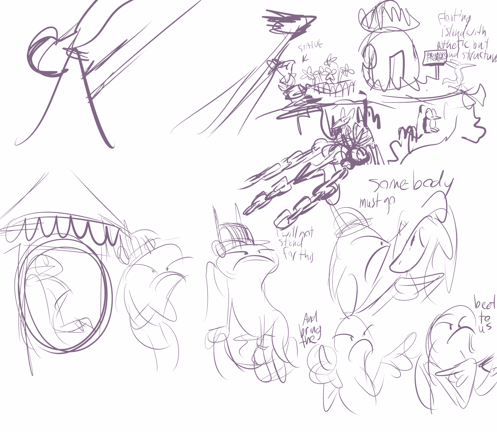
my original plan, as in the idea stuck in my mind for the past six years was to have the crony get tossed out a window and bounce down an existing chain, then bounce a couple two three more times on the purple rocks before landing in or making a hole. i did it like this instead because it took a lot more work and figuring and didn’t match the music at all.
there is another bit of talking to sketch out before I can get it out of this room. and then I will have to clean up and color in this whole mess, oh! I am HOPING it will be more clear and the actions less indistinct at full speed once that occurs –at the moment some are only clear when I replay and watch the right spot or advance it one frame at a time– but like with most matters I truly have no idea if the finish I am betting everything on will occur. even if a lot of it does not work I can at least see clearly that words are getting said by a creature that thinks it is more important than it is and a meeplier creature suffers misfortune, which is what is truly important.
in the last bit there may be a sound anomaly, with a split second of static around “somebody must go.” i corrected it for the music-less version i was using to “match” the mouths to the words but I didn’t replace the main version yet and it is not prudent for me to have sound coming out of machine at this time of day.
The crony needs to talk again in the next part and I don’t know whether to reuse the front view or add in another right-facing angle, since I only had that once but have had left three to four times.

a quick test of the new tablet pressure sensitivity in ASEPRITE, a feature i had looked forward to for quite a while! i drew a nemitz first because anything i made after that could only be an improvement.
“quick” as in i probably meant to draw one frame in ten minutes that transformed into two hours
Unfortunately the way pressure sensitivity is implemented in the program is, so far, more of a detriment to me than help except on larger objects, like the tail here, so I have had it turned off for most of the process on what I did next! The way that works in clip studio I like much better. but if i ever get back to my so ill it transcends pandemic-fated doom-engine-based-construction i may be able to create animated sprite graphics faster for that; I draw them large and have them scaled down in the game so to minimize pixelation
aseprite is the same program I used to make [most of] the other pixel animations that would be found under the “animation” tab had I updated at all recently and not only haven’t I, the stuff that used to be on it no longer shows up because I linked to them from my deviantart account because they were already THERE and I could. That evidently is no longer the case. Ewps. I will hopefully tend to that before 2021.
regrettably i have not been able to give this the attention it needs — i don’t like those static poses during the zoom in– because i want to conclude the terrible “free sketches-turned-needlessly-elaborate-digital-paintings I have been doing through twitter and shouldn’t need more than another two weeks for that, but this at least expresses the general idea of what this “scene” is. i will have to add more clutter and possibly draw it from different angles. i probably spend more time drawing backgrounds than animating at this point.
the recording is not good but circumstances are not always convenient for messing with noises! It at least is adequate for matching visuals to it since I presume (which usually means i am wrong) that re-recordings will have sufficiently similar pacing that the mouths won’t match any worse than they presently do.
Now that i see how pathetic that imp looks getting slapped around i want to give it a higher pitched voice. yesterday i inadvertently found a late 2016 digital interpretation i made of its vague paper sketches that i presumed existed but was not able to locate when I finally, actually got around to starting this in 2019, whose design differs from this one, so I ought to sort of which is the real one before going further. but will I? if it is a good idea, probably not.
the initial piece of animation for the third “first beet” cartoon. Hardly anything happens here. I had been intimidated by the thought of drawing this part for quite a while, more than two years evidently, even though it is not necessarily of great overall importance. Nothing beet-related is! It always looked like this in my mind, except the smoke was different and all the striking objects had spear-points, so it had to be made and included. There was not supposed to be a yeep in it, but i noticed a yeep was perched up there at the end of the second cartoon, and it is meant to transition directly into this one so this is how that went.
The view is supposed to immediately pan up to where the chains are being launched from rather than dwelling on this view, as indicated by the extremely legible scrap of a layout, but i have not drawn that part yet!