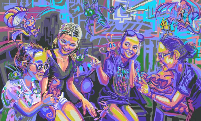
4-16-2024 whoopf i forgot i have a website this week. fortunately it is rarely remembered in general. i have another redrawn old dumb monster to show, when i get around to showing it.
///////////////////////
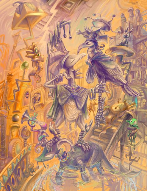
maybe too much greebling for the amount of content here. i felt mentally drained after the stupid animation and posting it to all the websites, and sought a sketch that I could computer paint over. and that was too much, so I went after this one instead, which was also too much, but since I had already dumped two days on the first one I stuck with this. the stages of production as far back as I have proof of can be viewed over there since I lack the energy to deal with them here. Yes that is an obnoxious paywall site. Somehow or another 11 or 12 still people actually pay me small bits monthly through that, out of pity or whatever other reason, and I will take that. This particular post is “unlocked.” Others are not, more so the people paying money don’t feel slighted than because I think anybody wants to steal them.
I believe it to be the picture that made me realize I was not cut out for water-color painting on physical media. I will sketch and resketch elements for ages to get them in functional balanced positions and next I will be reluctant to place colors that I might change my mind about. And so this lingered unfinished for years but still with blue tape on it as if I thought I might finish it. Obviously I FORGOT most of that when I decided to bring it out for this. At least five years had passed. It was supposed to be straightforward and mindless, and mindless often means irrelevance. but there are also always stupid challenges that need to be thought about that most people would not encounter. what is this thing swimming in? anything i want. but what then IS that any thing?
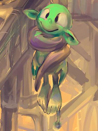
only THIS part is truly mindless.
obviously, the dope is awful. the dope is scum. nobody is denying that. yet they also will not take steps to do anything about it. the GREEN dope in this picture, does it think i will think it isn’t a bad dope since it isn’t blue? what a horrid dope! just look at those ears! it is JUST as bad as every other dope. i doubt it even KNOWS what color it is! maybe it even thinks it IS a blue dope! but i do not want to say anything appropriately abusive to it since i don’t want it to look at and smile at me.
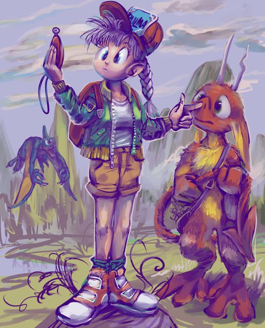
a pointless drawing in which nothing happens showing bulma from the early dragon ball comics and unfortunately nemitz from stupid garbage comics. it didn’t seem worth fussing too much over since i never finished the comics and the anime based on them apparently was largely skipped in the US in favor of the Z episodes and more people are familiar with that but i am not and i refused to become more familiar with them without finishing what happened before that story, which as stated I never did. i TRIED but i got the books as gifts, and eventually the gifters forgot which ones I already had, and I am too cheap to buy my own books, AND the various torrents i found are highly irregular, mixing in various inconsistent fan-translations (some with MIRRORED artwork) which were probably in circulation long before the official printed ones I was familiar with amidst bits OF the official printed release.
what the heapdedeep, I know much more about dragon quest than dragon ball, which is also illustrated by the lately dead Akira Toriyama, i should have drawn some dopey monsters from that. (just not healie) (ALSO I forgot I mentioned the Journey’s End Motel and it made me laugh harder today than when I wrote that)
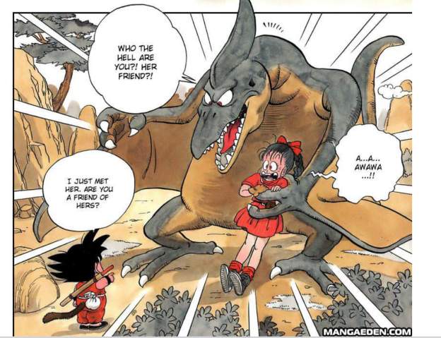
with that in mind i added the annoying blue thing on the left, which appears in the first dragon ball chapter but also is cognate with the “vampirus” monster from dragon warrior 2.
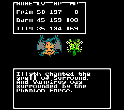
Vampirus, perennial adversary of the Phantom Force
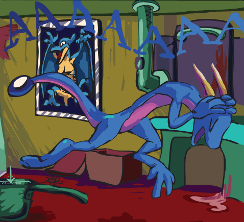
although vampirus is of course best known for participating in the decoration of a worse lizard’s apartment.
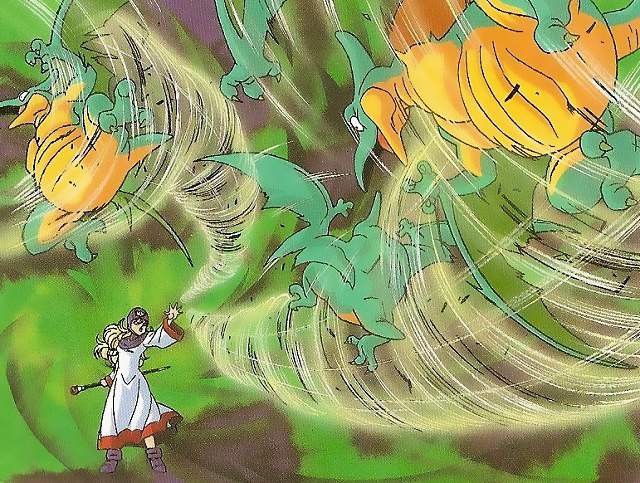
with that in mind, get those dumb vampiruses OUTTA HERE
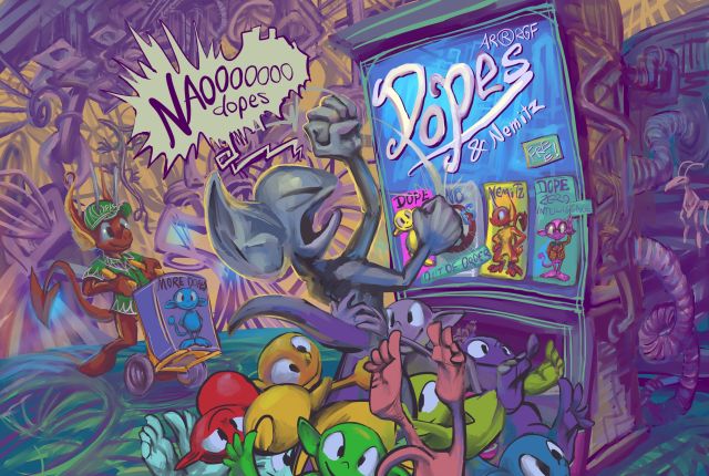
another unfortunate appearance by the dope vending machine
i would ask who was paying nemitz but i know it isn’t necessary for someone to be paying nemitz for mit to be doing something this stupid.
in the sketch it is a generic imp but when digitally handling it I was trying to warp it into the first imp I ever showed getting angry at a dope dispenser. However back when I drew that (several years before the video) I was less diligent about having a creature appear consistent between two frames, and more recently wondered if this creature was likely to be recognized by anyone even if I did come to an ultimate compromised between its two shapes. The important thing is that it disapproves of dopes. I do not think having a tantrum is going to solve the dope problem, OR the nemitz problem, but I never claimed it wasn’t stupid, just smart enough to not want dopes.
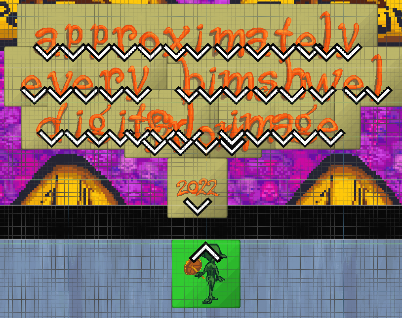
a video of every drawing from 2023. naturally i spent more time making the title animation than assembling the slide show, which itself took several days because there is apparently no program that can batch export .clip files and the keyboard shortcut for exporting singular files in xnview hasn’t worked the last few versions. Also thanking people who gave me three to eight dollars altogether and then were never heard from again and who won’t see this video ought to alienate the last few people who have made prolonged attempts at supporting me in more meaningful ways who didn’t get thanked in this video. It ought to but since none of the names are legible due to flash animating this more slowly than it appears when output most of the time and the screen being packed with irrelevant junk, some of which appears in FRONT of the names, so I hope you can enjoy this curious mess of unreadable scrolling letters.
oh! the music was mostly made in 2004-2008. It was chosen for this due largely to the length and the fact that it had not already been used in a video. Then mostly “today” i tried to rehabilitate it with drum noises, more midi trumpets and a conclusion, then also an introduction due to the extra time from the conveyor belt animation, and I swear curse and profane that it sounded REALLY nice five hours ago, when I was listening to individual parts of it through one ear bud while sharing a room with wrestling documentaries and legendary zelda tears on a moderately sized television box before going outside to do an improper superstitious year-switching ritual in honor of a dead person whose incorrect version of the ritual is inexplicably important to me to keep repeating even though it hasn’t yet worked. although since I keep doing the ritual I don’t actually know what would happen if I DIDN’T do it. I certainly won’t suddenly not have poisoned a coherent fake sitar tune with fake trumpets and sound effects
AND SO after sleeping i reduced the volume of the new trumpets and corrected one minor animation matter that I kept dwelling on, and so now THIS version is roughly adequate.
I tried to make these in recognition of my mother’s birth day since she likes pictures like this more than the regular garbage I come up with, especially these days when I get so obsessive about my real projects that even basic updates take weeks or months, so the stupid characters that I draw based on internet people or worse seem like all I am doing. I need to show once in a while that I can do far worse.
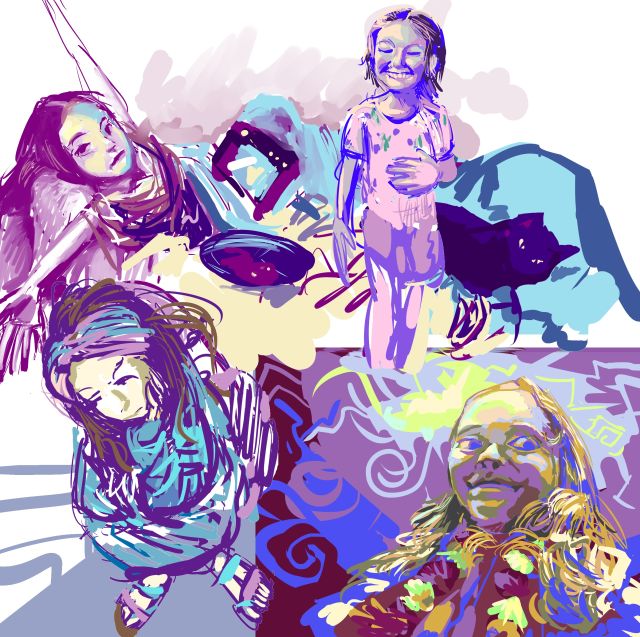
I am not sure who this is, but it looks like trouble
and now we have bigger problems. whoever these people are, they seem to be faced with challenges that I feel fortunate to avoid and I admire their attempts to persevere despite those challenges.
addendope: I changed “more dopes” to “diet dope.” It will not help with your diet but it will taste worse than a “regular” dope (which already surely tastes quite bad) and will also give you cancer faster. I do not understand how it is allowed!
///////////
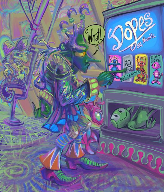
a fuller rendering of one of the cursed vendope images. I am uncertain if the sketch was intended to be the tengu bar tender from the comic strip, but I decided for this that it was not since I did not want to draw any weird back-wings. However trying to change the nose or eyes made the figure look less functionally stupid so those remain in place. Howeverer trying to draw certain that I am not entirely certain of typically results in a mess. Indeed the central figure is quite vague and uncertain. But I think I would be as well if I got stuck with a dope when I was not expecting one. Thankfully nobody paid me to draw this! Alas people have paid me to draw some pictures with dopes in the past.
Consider; you aren’t even ALLOWED to get “no dope.” what an atrocity.
and nemitz! who does nemitz think mit is holding up and pointing at “out of order”? like nemitz can read? mit can’t!
i do not know WHY anybody would put a coin into the machine. maybe the thinking is: “I will contribute money toward the idea of no dopes,” but I cannot be certain of that. *I* certainly would not try it. But would I know better without this courageous person’s example?
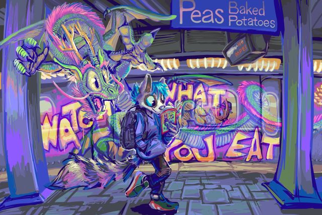
a commission drawing for a person called relaxingdragon1 in which some subway graffiti comes to life and seems interested in why a relatively small raccoon person is not interested in it. This was complicated to draw and I do not totally understand its appeal but more people seem to like it than usual. I presume most of them did not notice the nemitz.
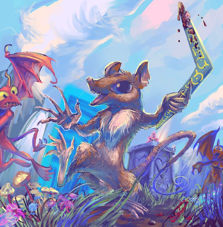
a suspicious drawing of sherry the talking mouse from several Ultima games abusing gargoyles with their own boomerang
I always liked the Gameboy game Ultima: Runes of Virtue. Attempts to directly port regular Ultima games to consoles felt unfinished and misguided, beyond even the degree to which the original non-sequel Ultima did, but Runes of Virtue was a specially crafted Gameboy action puzzle adventure perfect for the short play sessions that Gameboy was specially suited to.

DESPITE the very stupid dance that Sherry does at all times.
In frap it was only this past month that I saw enough of Ultima 6 to realize Runes of Virtue directly follows it, as back when I played Ultima: The False Prophet, its super nintendo port, I found it less unfair than Ultima Exodus, also a Nintendo system port and the only other game in the series I had tried, but still too unclear in its goals to get very far in. Nintendo versions hiding the title numbers didn’t help. BUT recognizing a bunch of the character names and concepts from Runes of Virtue helped me appreciate what I could of it slightly more than I would have otherwise. Certainly more than if I had known of and played the bewildering nes port of Ultima 5 instead.
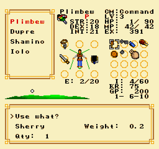
Though it turns out to be the most accurate and playable Nintendo system Ultima port, that still was not enough for me to crack, apparently. Perhaps its most egregious offense of is presenting Sherry as an isolated-use item whose only purpose is retrieving a single essential item and optionally running under locked gates to steal other treasures or move switches, provided you think to try that,
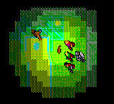
and who inherits the hero’s neon green poison aura when deployed if you happen to have one available
rather than a fully functioning combat party member whose 1 strength allows her to only wield the likes of a boomerang, but with 27 dexterity, out of a maximum of 30, for deadly accuracy.
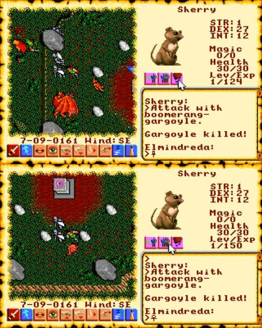
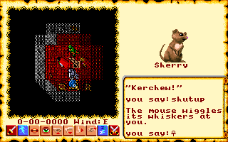
I actually have a legal copy of this game and apparently generated a character in it years ago, probably around the time that I regretted playing ultima 1, without going any further, and imagined it should be pretty easy to get to the same place the youtube video was at and take my own screenshots, since youtube pictures are ugly and the person whose video I took those from is an irritating bonehead anyhow. As hokey and annoying as Ultima is, I appreciate the progress it made across a few years and the influence even the shoddy ones had on better games, and reserve the right to laugh at them on my own terms, without condemning them. Some dork reading all the dialog aloud, stuttering half the time, and constantly interjecting snarky comments and complaining about how it is different and better in Ultima 7 makes it take longer and also me to hate him more than the video game he is suffering/cheating through.
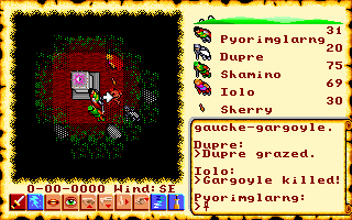
But I was today unprepared for how irritating it also was to control Ultima VI even on its intended platform and how infrequently attacks connect even with high dexterity (though more so than without), so I could not easily recreate the scene. But I had already made the dumb drawing so felt obligated to try for longer than was sensible. I thought eh it can’t be THAT hard. I just need to kill ONE big gargoyle out here to have an unblurry picture of its body on the ground and then I can edit the text to say that Sherry did it.
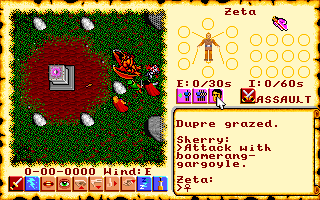
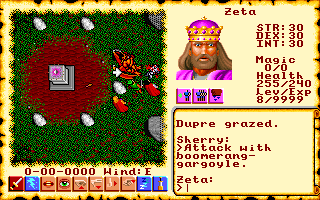
sensing my unvirtuous inclination, an invisible doppelganger of the king Lord British with no property except raw scorn suddenly got a turn and crashed the game when I tried to enter a command and then stared at me disapprovingly until I forced dosbox to quit


one of these is from 2004, the other is from a bit more recently. The usual story applies to it: I expected a certain difficulty level and it became exaggerated beyond what I could handle, foremost on the least important sections. the front view (1), the most important and most likely to be seen view, was easy. side-front (8, gets mirrored to be angle 2) was a bit harder, then side (7 (no not THAT side 7 (don’t worry if you don’t know what that is)))was horrible, and side-back (6) was a disaster. in part because I kept trying to match it to 7, even though 7 was horrible. i ought to have drawn over angle 8, but i didn’t because i was using the OLD old old 2004 version as a base, even though the old version’s angles matched even worse. i was even conscious of how poorly they matched at the time. although looking at that again did at last convince me to add stripes. Thankfully stripes have not been a disaster yet, though i have not tried to draw them on the copious amount of earlier redrawn sprites of this… thing. My best decision over the 2004 version is blocking the back muscles with that pathetic half-cape. I didn’t know how to draw back muscles then, and I STILL don’t. This new edition of the monster is old enough that I no longer recall if that was why I added a cape, but there do not appear to be other conceivable justifications.
angle 8 actually doesn’t have the far hand out far enough; trying to match angle 6 to it also held me up somewhat. Since it doesn’t look BAD on angle 8 like it does on 6 i don’t NEED to change it.
no I sure don’t.
please do not make me change it, me.
the fool (that I drew, not me) yet has no proper pain frames; in the past this motion was used both for a close-up attack and a non-violent reaction to experiencing violence. For the moment that shall continue as I am rather worn out from the length of time necessary to draw it. Going forward, assuming I am not cursed by a being beyond my comprehension to remake my own old unreleased material for the remainder of my lifespan, I want to include more expressive characters, but that will require fewer moving parts. even minimally detailed ones like this become a problem when there are so many pieces. If this gets any more frames I hope they will have the courtesy to be non-rotatable!

although mercifully and surprisingly these are still in stock so perhaps I should order one. Gosh I’ll SAVE so much MONEY!
a video of pictures I made last year set to some suspicious music.
I hope you hate pine cones, since three or four of these pictures don’t have one.

It took a ridiculous amount of time to make this considering that it is 95% comprised of stuff I had already made. My trashter plan to display gzdoom-engine material from within the gzdoom engine rather than as gifs of the source material did not help like I thought it would. I opposed gifs since while I design the graphics grouped, I have to separate them to put them into the game, and I refine them after separation, so I didn’t want the less-refined versions. and some pieces, like the launched yeep parts mentioned (but not yet drawn and so not shown) previously, were separate to begin with. howEVER, since I draw the stuff at ten times the 1993 game’s resolution, and my computer is less than top-of-the line, those graphics need to be reloaded each time the game is started, and then I am having it load extra graphics and generate extra objects on top of that, IN ADDITION to me running video capture software, which means loading all that tomfoolery in an extra window while simultaneously saving a copy of it all, the game can’t help but choke up for a few moments when stuff is exploding. and SO I spent an extra day, two days? trying to reduce that, just a few seconds of the dumb video. And I already spent an extra day drawing all those dumb letters and setting up the circumstances under which they appear and explode. originally they were to use the same explosion frames as the launched yeep globs, hence my using the same colors, but those explosions looked too uniform, unless those were themselves launching more globs, but more globs meant more lag. and SO i drew EXTRA explosions for the letters I and O that would prevent them from needing to launch globs.
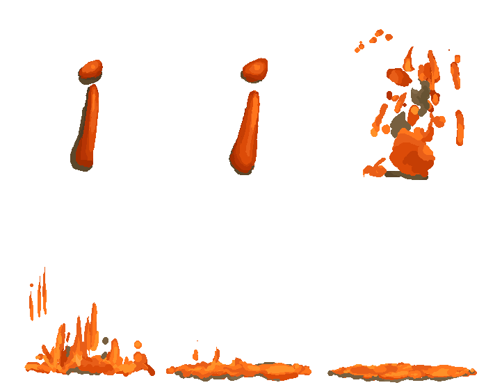

but that still means loading extra graphics so it doesn’t reduce THAT much lag. I also had the letters L and F turn into I and G into O as they explode, and that still wasn’t enough! For the yeep section near the end, I had all the pertinent graphics pre-load before I started recording, but that wasn’t an option with the letters because they FALL FROM THE CEILING as soon as the level starts. I COULD have preloaded all the graphics if I had thought to suspend the letters on disappearing floors or had them teleport into the room, but I was too busy to be thinking! I also forgot to set the level to change the colors to something other than orange, so that the aftermush looks less like a nickelodeon logo family reunion but if I had, I would probably still today be trying to optimize or fix it in some way and I am glad to not be doing that.
I can’t even show this picture without needing to explain it. the level editor shows a 2003 dope rather than a 2018 dope because it assumes the player character uses PLAY-named sprites, but the newer dopes have DOPE-named sprites, and I simply never took out the old sprites. the weird background is irrelevant; it is the first graphic in the definition file, since for some arcane reason that graphic shows up invisible in the game, but not in the editor. I needed it invisible so that the background shows through it. there are other hacky ways to make the ground and walls invisible but everything I do is already hacky so I preferred something that worked consistently.
these are off-center relative to the player character’s viewpoint because they seemed to my own viewpoint to be showing up offcenter when I placed them IN the center. However by the time I made the video that seemed to no longer be the case but I was too tired from the endless re-records hoping for less lag and more interesting random splat locations, then inserting that into the video, cropping out the wrong takes, then moving it to the front, then dumping it all that since I wanted to go back and change something else in the setup and then need to re-record again, that I left the positions alone.
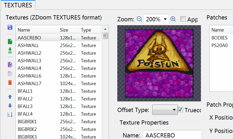
“AASCREBO” will go to the top of most lists. It is not necessary for the list to be alphabetical, but I was trying to amuse myself. Regular Doom2 calls it
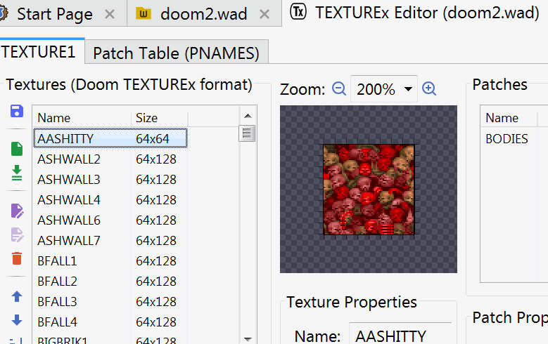
which I dislike seeing in the list, and regular regular Doom calls it
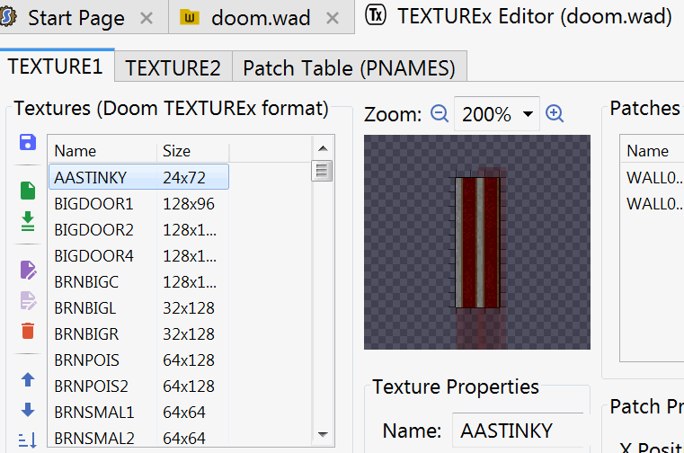
which I hate even more, and not just because the base-2 display system means you aren’t actually ALLOWED to make 24-length wall textures! Even if that worked it wouldn’t work! screbo is stupid garbage that nemitz says, and I had already changed the poison logo to feature nemitz, so it fits. I placed it over the pile of skulls that is shown by default after coloring them purple. I don’t want any of the base game’s graphics in this, even edited ones, and nemitz endorsements of rubbish are anachronistic within this project’s complex chronology of being set before nemitz, but as noted previously these don’t actually show up! but even THESE are a problem since floor graphics are backwards on the ceiling. If I want to control invisible objects that it is possible to move beneath, I risk seeing not only a backwards S but a backwards nemitz inside the level editor’s 3d view mode. What could be worse than that? I probably won’t find out until I try to make next year’s video.
and after all that, I today realized: the ORDER of the primary content is terrible. It starts on a snake comic strip that nobody cared about and then ends on generic wall textures that nobody SHOULD care about. I should have started and ended on stuff with meaning. I too more concerned with irrelevant nonsense to consider the marginally more relevant nonsense. There is probably an important life lesson there but I am too concerned with complaining to process it right now.

a yeep floats in five directions

a yeep has a problem in five directions

a yeep explodes in five directions
its tentacloids and eyeballs disappear because they launch as separate objects that are not necessarily coherent in gif form. the body dissolves since i want to have an all-directional mass of glop appear in its place, since non-moving, irregular objects can look really awkward with extra angles. Which I know because several monsters larger than this one DO have multi-directional bodies when punished and can look quite awkward. And I will likely leave them like that, but I can be cautious about creating more like them. sometimes
this latest yeep differs from past yeeps in that it lacks a darker colored midsection. I tried to sort out what that was and how it worked and could not, and so now it is not there at all. Much like several components of this website, except for once I took out something I didn’t understand on purpose.
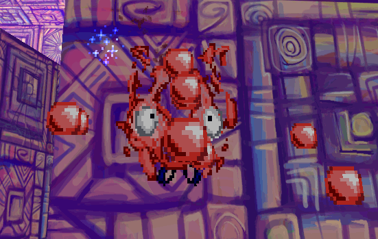
the old exploding yeep did not need to launch the tentacloids since it only exploded from one direction and did not need its body to dissolve and be replaced. In trying to solve one problem I continue to create one or more others. And I yet do not know how i will sort out the tentacloids. The present single one in the south-east angle may not be viable since it does not take into account the possibility of the yeep exploding while off the ground. ALthough the old yeep didn’t actually finishing exploding after being beaten and launch its eyeballs until it landed, so perhaps this way IS viable. i think overall whatever result i get this time will be superior to what I had.
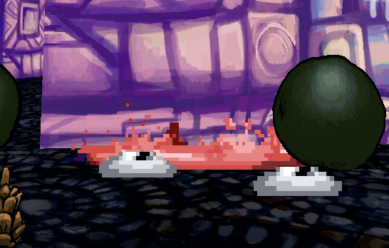
the old exploding yeep is actually not nearly as old as its other sprites; I drew the explosion in 2017. prior to then its body only had a single dissolve frame and i considered the pink blobs launched from it to be sufficient. I actually changed that because it looked really depressing if the sprites were browsed outside of the game, or pog forbid if somebody warped to level 30 and tried to force the original doom 2 monster roll call to appear, where none of this stuff looks right, that one would look especially not right.
NOW if somebody tries that the game will show sprites too big for the screen, or just show the regular game’s monsters, or crash completely, so REALLY I can get away with doing LESS for the yeep now instead of more. But I seem unable to do less unless it truly matters that I don’t.
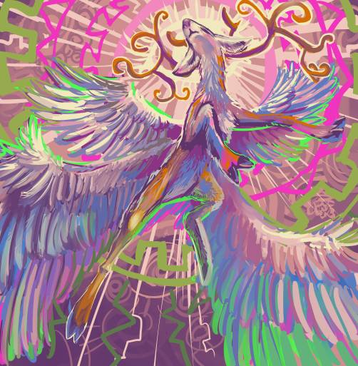
a commission drawing for sigarette fawn teeth of a deer like creature with angel-like features. I was concerned I would not be able to execute it adequately but I may have.
The large version of this picture currently linked is from an embarrassing website but that is reliable for such hot linking because its code is notoriously outdated and its security features notoriously absent.
because I still have not looked into replacing the “coppermine” gallery display software. I probably didn’t install that, but I do not expect that would help with something that waited until 2022 to break down, and so it MIGHT. When I will get to a position where I can look into checking on trying out attempting to figure out what I can do with that is similarly ambiguous.
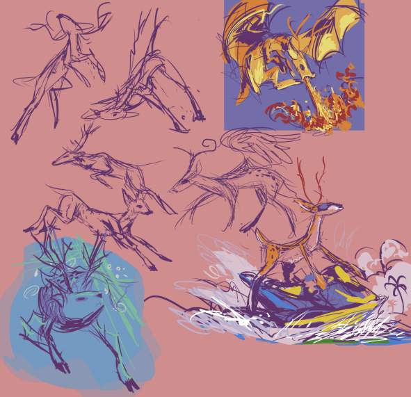
it is more probable I will work over my lower right unused pose suggestion before I do anything useful.
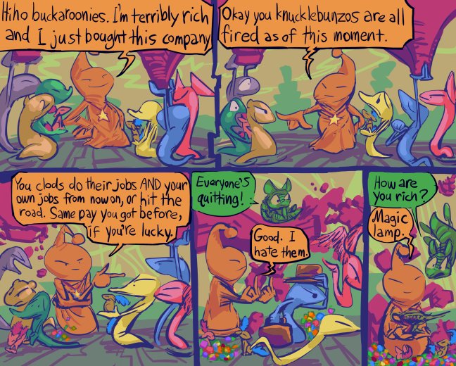
I avoided knowing or caring who Elion Muskzales was for years, and he suddenly became relevant enough that psychopaths I was within the pretend internet social radius of started talking about him and I still don’t understand what is special about him because there are a lot of shoddily managed businesses out there. Yale New Haven hospital is full of nonsense like this; it bought every other hospital, and then had freedom to make everything worse, charge customers more, give them less, promote more boneheads, cut benefits to and assign absurd shifts at random psychologically damaging hours to the actual good people working for them, and all that sort of thing. And as far as I can tell that is the ultimate goal of capitalism and it is all the rage hatred and fury right now. Any business entity that ISN’T that WISHES it was that. It just doesn’t always have a singular funny-looking billionaire mascot with a stupid name at the top to adoringly attribute every asinine and or misanthropic decision to. Of COURSE Trump fans love that creep. They WISH they could have that much money and so little regard for humanity. I don’t understand that at all either, but again it appears to be common.
I am not sure what the rainbow grunk is. Initially it was all green, then I added more colors, and wondered if I should change it into gummy bears, but I don’t think i could make anything that small read as bear-shaped if I dumped the time into trying. but this is progress, for me, since in the past I WOULD have dumped that time and had nothing of value to show for it. Which is not to say I have time to spare, now. I merely incurred less time debt.
I still haven’t fixed the broken image gallery system. I suspect that I cannot. The descriptions for how to do that, as is typical, assume I didn’t just run some automated installer years ago and then edit stuff AROUND that in order to just barely get it to work, and actually understand code or am paying someone else who does. Does this LOOK like a website that has enough going for it that its owner can afford to pay people?
I also don’t have time to keep making these dumb little comic strips. When am I going to be able to get back to my dumb big comic strip if ideas for these that seem manageable enough to try and make keep coming to me?
as always, it needs more refining, but is far along enough now that I was able to remove the sketch and tracing paper layers for this part which allows me to get more control over the rest of the layers since flash has an appropriately outdated interface on which losing track of numerous layers is quite easy. The next section does not involve these two dorks sharing space with each other and more importantly doesn’t have them both in front of and behind any detailed scenery that I need to break into pieces and across yet more layers so ideally that will require 3 and a half months instead of 4 to get through.
I recorded, hopefully, better voices a few weeks ago but have not had the proper mood to go into the music editing program recently to attempt to implement that or check its adequacy for implementation. I may also have said that weeks ago. I no longer have the energy to verify what I said when since I use so many stupid websites now. I try to keep this one as the most special but it tends to get the scraps, unfortunately, though these days my scraps are often more dignified than my finished pieces.
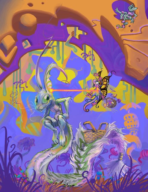
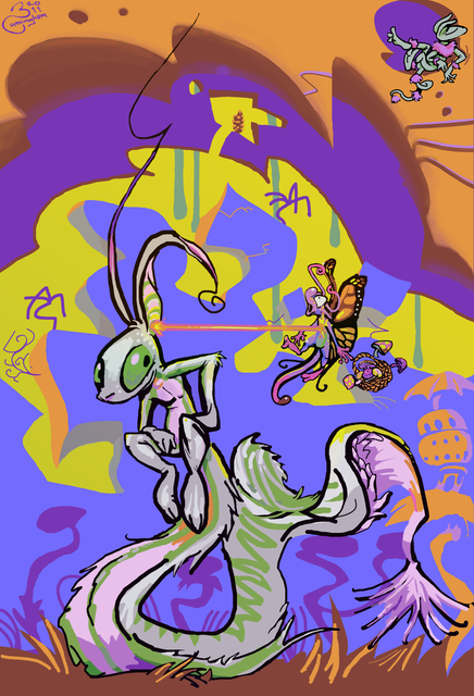
I was trying to sort out what prints I had, and saw an old picture that I thought was funny but could be improved. It wasn’t this one, but when trying to find the image file for that one I found this one first. As with that, I thought it was funny, and finally saw what was wrong with it that I couldn’t make sense of years ago: the two primary figures have different line weights. ha I know how to fix that, just make the lines thinner on the bigger character. BUT since I saw the resolution was lower than my present standard, despite being more than high enough to make an 8.5×11 inch print, and me not INTENDING to print this anyway, I redrew the whole thing, but still couldn’t be at peace with my way of using lines from years ago, and so started blending it up, and the more it changed the less what hadn’t changed still worked, and now it is a mess. And it is the only thing I worked on today. a FEW parts are better but the primary part is not. Bad bad bad.
this also reminds me
An unimportant non-player character in some dragon-warrior-looking nes (I think) video game proclaims “Good good good.” when talked at by the player, possibly after some objective has been met. I thought this was in Star Tropics but that seems not to be the case. Whatever was it?
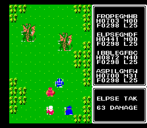
am concerned it might be Ultima Exodus. I don’t think I have it in me to seek out all the inanity-spouting imbeciles of that Sosaria in the near future.
I last played Ultima Exodus so long ago that the blue-armored dork here is literally the first time I used the name “Elpse.”
Inexplicably a text dump of supposedly all the dialog in the game has been made, and “good good good” was not in there,
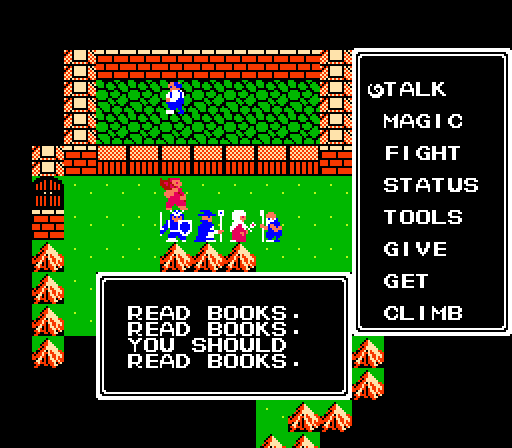
though this is almost as dorky a thing to say. Within the context of the game, surely I am too BUSY failing at saving the realm to read books. Within the context of somebody playing a game, obviously I am not reading books nor likely to any time soon if I expect to complete this game without cheating. Though I question if it is possible to play “properly” and not lose. There may be a larger message here, but I am not playing real life properly and such a message may seem like an excuse. But even trying and failing to improve one’s singular, limited skill is more productive than trying to crack NES ultimas or regular ultimas. Unfortunately I already determined that nearly ten years ago, so even learning from that I haven’t really gotten better at.
