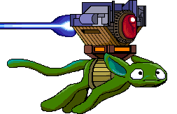
there isn’t enough bad news in the world so i made some of my own

you can click on it to try and get a better look if you need one, but you probably do not need one
sometimes i worry that it is not my place to criticize contemporary entertainment offerings since that is not made for me. But a long time ago it WAS, ostensibly, made for me, and i STILL didn’t like it
A scene perhaps not a whole lot more inspired than the envelope art sections in the magazines where I used to see these characters but probably more ambitious
If you recognize all or most of these there is something seriously wrong with you, but hopefully not enough for you to draw a similar picture.
i thought about having a contest to see who could name the most, but no reward I can offer would make up for the trauma you would have to go through in order to be able to do that
I had to exclude humans and post sega-saturn-era characters to ensure that I could eventually stop, though a few mild exceptions may have slipped through anyway.
I like a few of the characters and a few of the games even, not necessarily at the same time, but by and large they deserve what they get. They probably have some extra lives lying around anyway.
![I don't know about the mouse but the white line underneath the third image is putting ME in a [worse] mood](/rew/claynomore.jpg)
globmeister is easily the dorkiest claymate but i swapped in the mouse, instead since the only reason it exists was so the phrase “faster than a hedgehog” could be used in promotional material, Despite this speed being about as practical as a hedgehog’s at best, and usually less so. The gopher’s fire power is much more useful, from what i recall of claymates.
still i should have approached this with the expectation that most people who see this will not know most of the characters, and yet less will they know the hokey calculations behind any of the worthless beasts’ creations.

Initially I included both the terrible 1993 skunny that i wrote an appropriately terrible 2003 webpage about and also the 1995 “special edition” skunny that i did not learn of until years later. eventually i merged them into the left side figure so there would be space to draw in aero the acro bat. i decided that despite having insulted aero on previous occasions, again any person seeing the picture might well never see any other picture i ever made, and my disdain for aero and its games soars above most of the other characters, especially when i was refreshed on how much aero 2’s cut scene artist wanted aero to look like mickey mouse. and is certainly more LIKELY to be recognized than either skunny, so why have two of them? i also shortly afterward remembered that donk the samurai duck bears a D and that i could place it beside the other two to spell SAD. wonderdog has a W but while i can spell SAW and the stupid puppet from saw looks SORT of like one of these characters, I do not know it from its association with video games and so it would not qualify to appear.

bronkie health hero/the bronchiosaurus looks like croc because both of them are bare minimum creativity character designs. bronkie came several years before croc but who else knows that? the second health hero character “trakie” looks less like other better-known characters and so is more difficult to be mistaken for one, and so I added that one instead. In addition to removing the floating eyebrows from radical rex. As awful as they are, they interfere with the next lame dinosaur’s space.

i also used the blue character the one time that i played the game. i think the game is substantially better than aero the acrobat and the protagonist much less loathsome, even the one which looks like croc. Though it raises the question what my criteria is for inclusion, if I put characters I hate everything about amidst ones that I think were just stuck with a crummy company or set of directives. I didn’t add the cool croc twins either, and their game is probably worse than aero’s. Not because it is too limited in scope, as “zoom” also has extremely little for the player to do and I tossed that game’s moron in as soon as I remembered it existed.

And it wasn’t about space constraints because I added in billy the shell (Rmadillo), spanko, sally the blind cave salamander, who doesn’t even star in its own game, and psycho fox AFTER that. The only thing I can say for certain isARRHRHRHRHRGHH I’VE BEEN OUTFOXED

It is funny to think of people who never heard of me (or it) trying to identify the dope. All it does is cause problems.

this is not funny at all!
and LATER i added those dumb crocs anyway. it probably doesn’t need BOTH but I couldn’t choose one and had gotten it into my mind that they were really small so they seemed to both “fit.” Quik the Thunder Rabbit, while looking rather inflated in game still probably shouldn’t be so LARGE but its oversize was less apparent when there were fewer characters. Curiously i made both Brian the Lion and Oscar the [thing] smaller to accommodate WHIZZ, yet didn’t think of reducing quik. until now. oh fiddle dee dee.
after this i look forward to drawing more characters who do not have clown noses, buck teeth or eyes that touch


No comments ever.
RSS feed for comments, for they hunger.
This here`s me trackback!