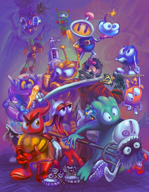
I had hoped to present this as printed art-work for the october art show i keep worrying about but not really doing anything solid to prepare for, if anything can be done at all, but it may need to be reconfigured as a horizontally oriented piece, or a thoroughly print-incompatible square, since it continually mutates. When it started it only had five characters!
if you had told me that including final fantasy auron would have made this picture take so much longer I would have believed you, but I wasn’t going to ask you about that! but his shiny belt trinkets give toejam something to look at once I finally looked up its original game and realized it is not a prankster sort who would be tripping whirloxandra (pitchfork-bearing swamp beast) on purpose, at least not without making it look like an accident. Not that anyone knows Auron has belt trinkets but he certainly looks weird enough to be accepted as having belt trinkets if you didn’t know he did. But does shining force domingo fit in here? Not really. but having domingo small on the left (where shining force gaiden’s pink clone amigo presently is) just because I thought of it late didn’t seem right since I like Shining Force more than most other video games. Maybe I will think of 12 more mouthless video game heroes and hero-adjacents that will make this setup totally dysfunctional tomorrow and that will save me from believing it can work.
I worked on a few cheap commission drawings this week. “commission drawings” being pictures that other people paid me money to produce.
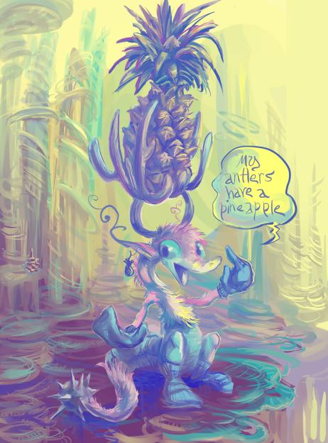
this is not one of them
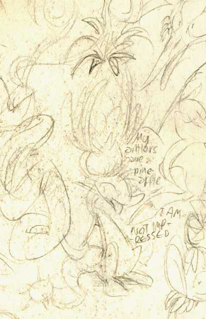
I am still not impressed but I am content to use more civilized text entry to say so. I need not reduce myself to this imbecile’s level.
I will however unfortunately need to widen this picture if I want to put it on instagram. I do not want to do that. This moron does not deserve more space.
/////////////////////////
an addendumb: I did widen the picture. it was still not wide enough to not have the upper and lowest edges obliterated by the instagram machine, but i decided it deserved to have harm come to it, even if the affected portions of the image were relatively innocent.
thursday june twenty third: a prolonged serious of miscalculations means that an intended wednesday update can happen friday at the earliest
///////////////////////
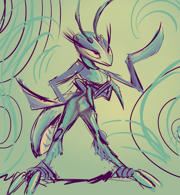
a mantis person for goldquiver
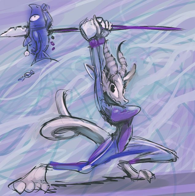
a shiny lizardoid for mallac721
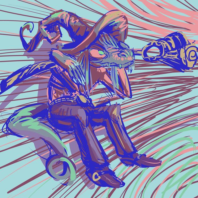
a cowboy wizard lizard or something person for derse. the arms look very strange to me now even though I only drew this two or three days ago.
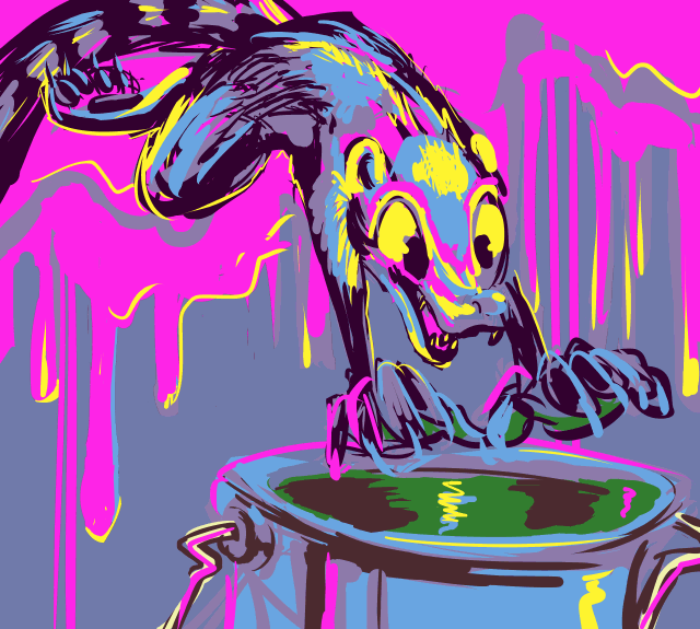
a paint-loving coati-sort for austin dern
these are getting out of control and non-sketchy already!
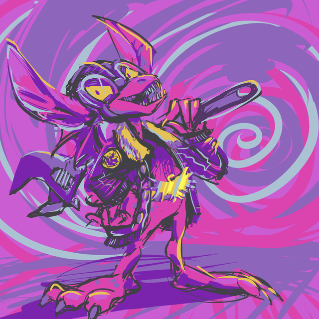
and a gremlin a person identified as woot master
this also got a bit complicated, but I like gremlins.
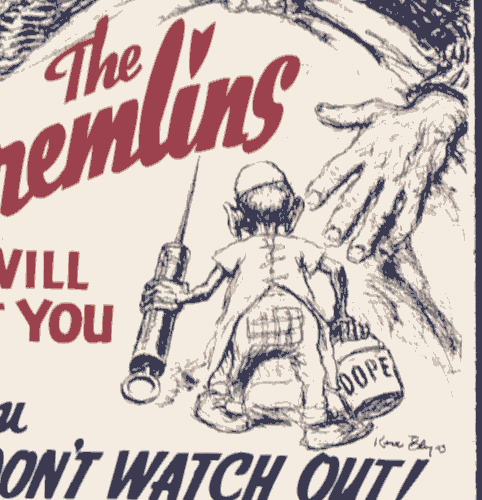
I mean that I like some of the typical visual characteristics of gremlins, but I do not like having my airplanes sabotaged with buckets full of dope juice
I have not given people the choice of suggesting difficult to draw content or that additional characters are fundamental to the picture being acceptable, but the bigger problem is always that I will take it upon myself to complicate matters.
I did it free “sketch” give-aways twice before, and both times before long I started putting far more effort into the pieces than I had initially intended to. I took steps to prevent that this time. My steps were erroneous but I didn’t agree to draw for nearly as many people; only ten or eleven so far rather than 100-112. I still lost count but it is a loss much more easily covered.
I really should be making comic strips or beet cartoons, which is potentially why the urge to initiate this sort of offer keeps arising, so my best hope is to let it rise and then flatten it as soon as possible.
Howdy I added more words beneath this. It has many links. You should ignore them, they are just there so I know that I know what I am talking about.
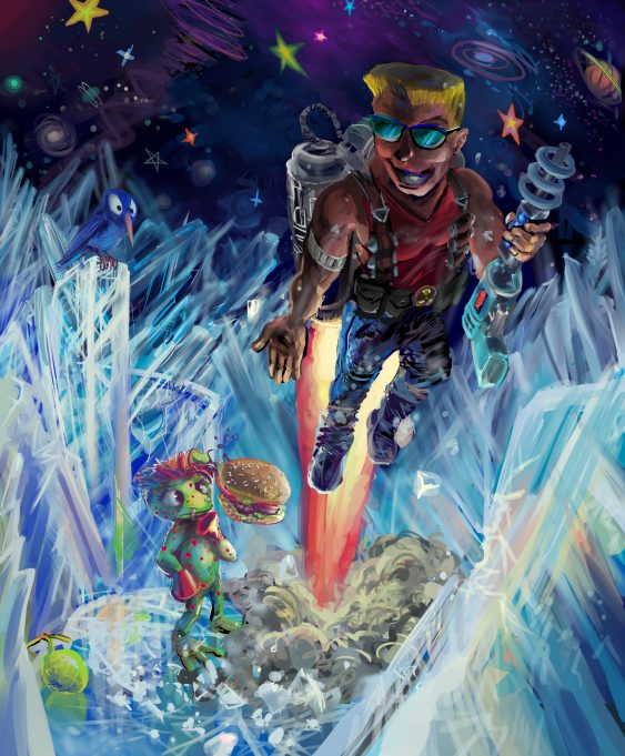
a picture I am prepared to provide context for, and possibly improve, time permitting, but time was only just barely permitting me to make the picture as it is.
oh jolly good here it is.
in 2004 i wrote a spiteful web page about the old even then Apogee computer game cosmo’s cosmic adventure despite taking enough of a liking to the game to complete the full thing, a feat i only managed with one other apogee game (arctic adventure). I thought it was obvious that I actually did like the game based on the amount of screenshots I took and my meticulously title-taggging every single one of them, but it wasn’t and I rather annoyed more people than I entertained with the page, I fear, and after my fashion amitz that period was not very pleasant about it. I entertained myself plenty, fortunately. I totally forgot some of the strange junk I made for and following that.
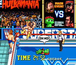
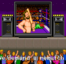
I wouldn’t put forward such effort to abuse a character I hated. The original appearance of this is somewhere in November 2005 and only makes slightly less sense outside of that.
In case it also wasn’t obvious from some odd bits on the page like the side border, I DID in fact find the full version for free at that time and had played through some of it, but must not have reached the ending since it is frustratingly daft. I do feel bad about calling $10 for the game “laughable,” it really isn’t that much money and i enjoyed the game plenty more than some sandwiches i paid more than $10 for on more than one occasion. After starting on this drawing I finally went ahead and did pay for the game just to feel less like a creep, ALTHOUGH the price NOW is only $6 and i don’t even know if Apogee actually gets a cut of it at this point since they are selling it through Steam and Gog and have casually placed some deviant-art person’s labored, if somewhat out of character illustration as the listing page’s header without credit, but not altered the page text at all in the 18 years since I last looked, if ever, thus retaining the moronic line “who has an overbite like Bart Simpson?” like they don’t care, like they ever did. anyway now i just have 300 video games and 3000 soundtracks to pay for and my conscience is clean. if i ever actually played it again i would probably still use the setup from 2004 that i already have, though.
BUT THE IMPETUS for all this was me recently having occasion to view somebody yet else’s videos of playing through the game and was reminded of a truly iconic and strange moment from video game history, in which cosmo saves duke nuk[e]m from certain death and only receives a hamburger and a plug for Duke’s then-upcoming sequel in return after hoping for help from duke’s substantial firepower and longer life bar collection. (I also mentioned that on my own 2004 web page but I only re-checked the page after watching the video)
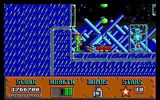
the hamburger IS one of only two items in each episode that increases the amount of green health Now-and-Laters from 3 to 4 to 5 and does make a big difference in the context of the game, but Duke starts with 8!
the original duke nukUm did not wear sunglasses and for whatever reason in the cosmo cameo has a blue shirt after wearing a pink one in the first game, but my skills are limited in such a way that this just looks like a weird George Takei if i omit the sunglasses. in fact even the present official release of 1994 Duke Nukem 2 has been altered so every picture and sprite of Duke has sunglasses, because otherwise it looks like nobody specific.
Jet-packs don’t work the way I have drawn this, but I couldn’t find a picture of how Duke’s works, since in the game you don’t see it since you are supposed to BE Duke, and when I tried to use a moderately “realistic” jet pack here it looked worse than this, if you can believe it,
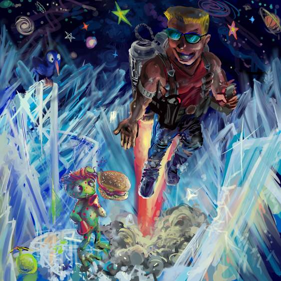
and besides that I couldn’t fathom somebody being able to run around and effectively fire large guns while equipped with one.
yes I spent a substantially longer period drawing and trying different things with the secondary character here than anything else.
have you noticed that the things i think about and spend the most time on are almost always the least relevant? have i asked you that before?
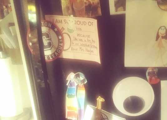
a great deal of junk has been affixed to my refrigerator by other parties, and I rarely pay close attention to it. As someone who uses the appliance to store food and also eats food periodically, I am more concerned with its interior regions. However recently however by chance I happened to more closely examine a bit of the out-side and was rather disturbed
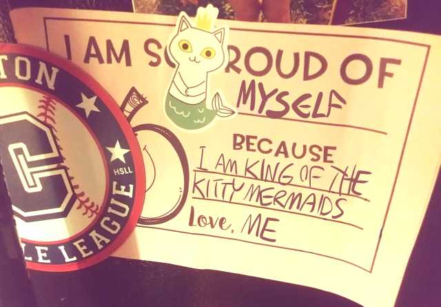
I don’t understand why I have to put up with this nonsense in my own house.
the magnet for “clinton little league” and also some boat club were still on the refrigerator from its previous owners when we moved into this house. The punchable cat mermaid was not. These things seem to follow me around. I can’t stand it. It looks like it should be wearing a bowtie. no! no, it shouldn’t. never-mind. i didn’t mean that. PLEASE…
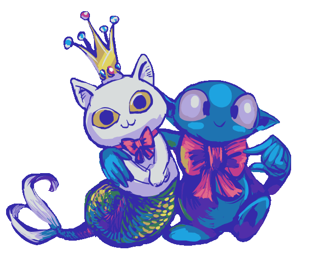
oh fiddle deef deef I fell for it again.
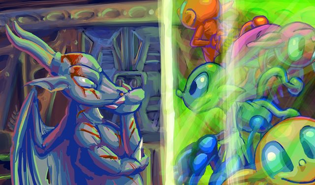
a commission drawing for a person called Kynikos dragon, whom I drew a picture for previously but evidently never bothered to post here so that is how it goes. But this time in any case it features an unreal degree of foolish impudence, because the scene is ostensibly based on a screen capture from a video game called “unreal,” hence my titling it “unrealenting dopiness” on art-focused websites that I use and that also demand titles. People probably just think that I spelled “unrelenting” incorrectly. Or maybe do not even realize that I used an unorthodox assemblage of letters. My website content may overall be getting dumber and more hurried, no thankage to dopes (they contribute to dumbness but I would never thank dopes), however my spelling is not!
time-lapsed trashterpiece of indecision.
i presume this feature was not made with my sort of thing in mind since it can space the video to 15 seconds, 30 seconds, 60 seconds and “all,” which in my case comes out to
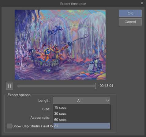
18 minutes and 4 seconds, and it is more like when I no longer felt capable of continuing than “finished.”
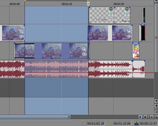
I cheated this video to some degree since I went and made yet more changes after exporting the first 60 second lapsoid, then exported a second lapsoid, rather than replacing the first (though the second was replaced numerous times), so it has an additional twelve seconds of changes, but at an even faster speed since the second video still contains the entire contents of the first lapsoid, just condensed even further, and then I set those twelve seconds to play after the first sixty seconds. then I had to adjust the length of the music, formerly almost exactly one minute long, to fit that, and from the sound of things I perhaps should not have, because you can’t just add a few seconds to an existing composition and have it sound like it belongs there unless it is proportional to the length of music that is already there or make it seem like it is going to be and then fade it out, and I hate fadeouts, so I did something else that is awkward and perhaps similar to what happened with the drawing itself after the first 60 seconds. Doing all of that, then explaining that I did all of that isn’t important except to emphasize that I am seriously mentally ill. And that isn’t even important to do since you already knew that. But I am no dope. Dopes thrive on what is wrong with them. I do not thrive on what is wrong with dopes, I merely attempt to present it honestly.
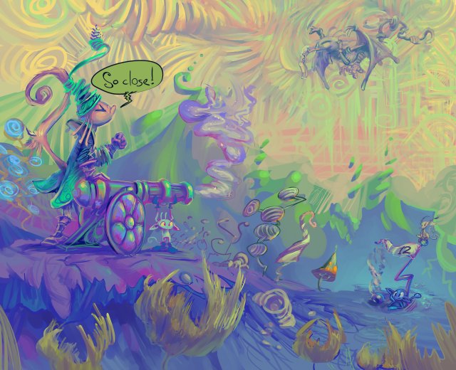
a 2013 sketch that I thought had an important message and so i have adjusted it to be more presentable. The title “partillery” is unfortunate but I am lacking both of adequate knowledge and further interest in both warfare and golf to come up with a better merging of relevant terminologies than that.
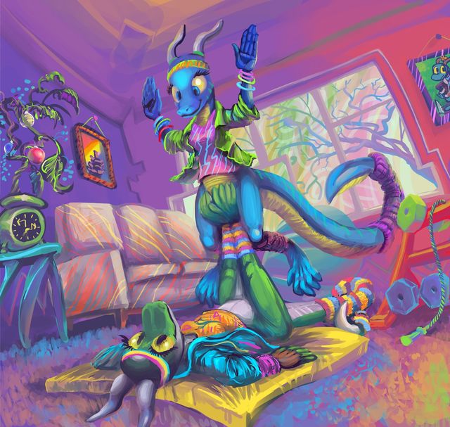
a robision, possibly finished, but not necessarily. for Grom-PE (keeper of the blue lizard) and Casas (with regard to the green, and who may also have drawn the pose sketch and later showed me what furniture should go where), because that is in fact the most coherent thing I have this week that I might exhibit here without needing to explain it further. In which lizard people do something strange, because lizard people rarely do anything sensible, if their choice of frameable folk did not make that clear.

a marginally less than complete and half-sized robision animation for a person known only as nafradorf fumblewip, in which a strange imp poses on some blue orb creatures that are strange in a different way, because that is what I have to show this week.
It may need to slowly crawl through all 42 frames before it will play at a reasonable speed. That is your chance to check for blemishes and mistakes that I missed!
because I do not manage my time at all well lately, spending too much of the past week drawing and adjusting bells on the subject of the past week’s website post, and have yet to conclude that task, here from several weeks before then is
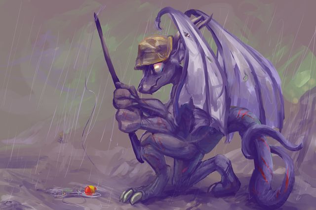
a robision drawing for a person called Kynikos of a creature also named Kynikos[s] who seeks the attention of fish in an unorthodox manner while wearing a strange hat. Kynikos has also helped me to locate several more archive pages whose formatting had gone totally screwy once entries on them migrated from the main page, which is evidently less pedantic about unclosed < center > tags, and I was able to correct that formatting. I cannot verify that they were also hiding in a puddle or required a special hat to find, but that would explain how I missed them until now. Few of my hats are special.
I seem to have neglected to state that “the wizard of squawk” from several weeks ago was also a robisioned piece! I have now added text to explain that, but I felt it prudent to explain that I failed to explain that. In fact I initially failed to explain it altogether; I only remembered to add an additional comment that was meant to follow the bit that I forgot wasn’t there yet. But now it is.
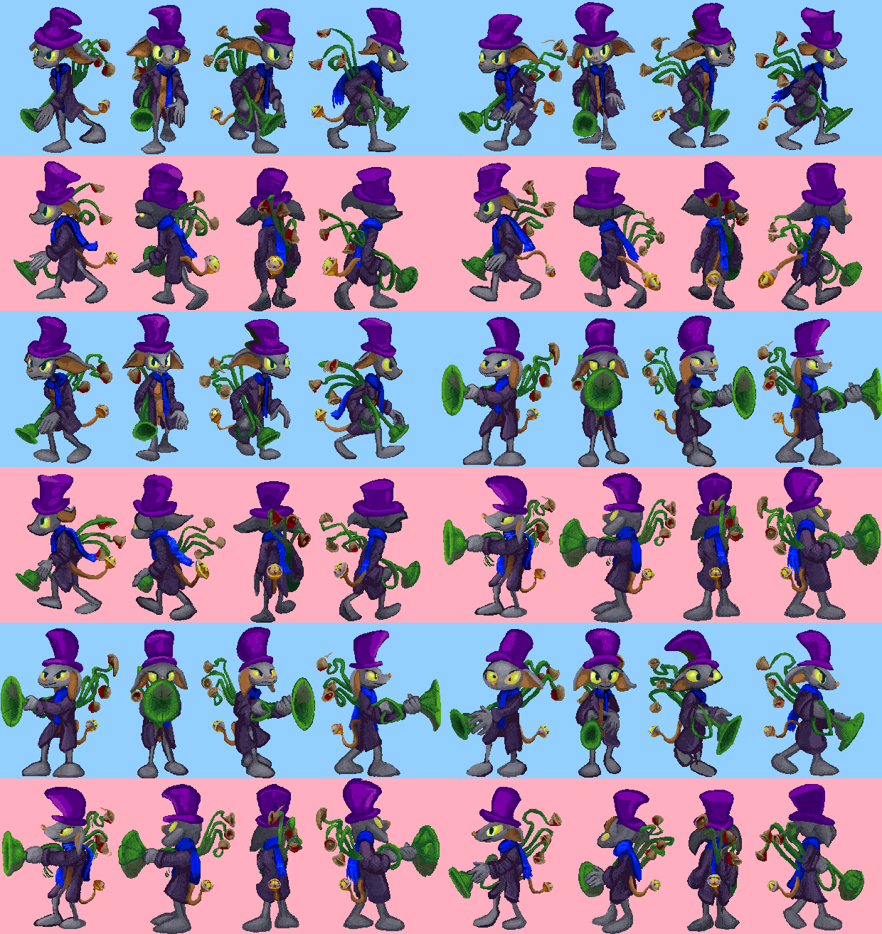
this idiot again. still not done, even with these frames, with additional motions yet to be started on, but I am no longer concerned that the object being carried is too boring or looks too much like I think it looks like a gun. A trumpet plunger with bells or hershey kisses hanging off the back is indeed preferable, yes.
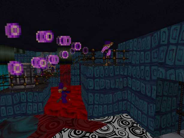
I presume the fired-out bits will be similar to the old version, but I think that every time and change my mind after I already started trying to keep it like the old version.
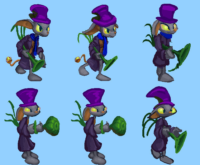
An earlier attempt that is less like a plunger but I was concerned it might instead be compared to a body part popularized in a famous Kurt Vonnegut illustration.
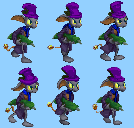
holding a frosting tube
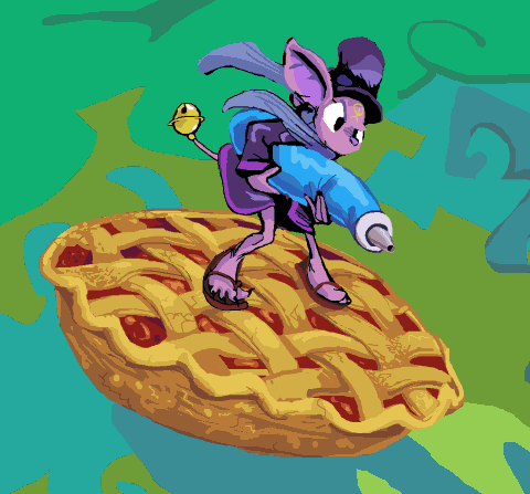
like I drew in cholesteronslaught (except too small and not riding a pie) after making the very old sprites, but then forgot about until after I had already started on the new sprites. this looks alright for the moment but I would need to redraw the arms for every angle, rather than creating a stringy monstrosity that needs to be drawn around the arms and that unlike a tube has no real world counterpart so that I can never know if it really looks correct or doesn’t and may spend an indefinite period trying to bring to that point.
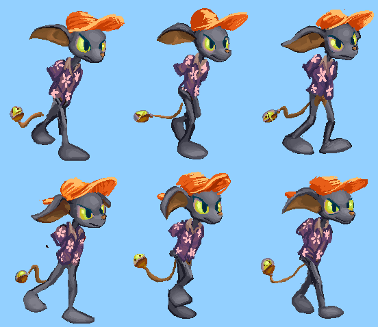
armless (and yet toeless) variant, wearing something more like what the less violent, tattooed version of this creature had on in my december 2006 website header, and as is typical i didn’t bother to consult what that was since I was surprised to see that I included such a classy flower all those years ago when I finally got around to checking, and I only checked so I could have the correct link to it.
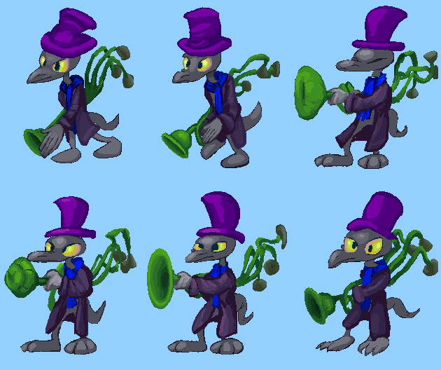
the first head variant. i thought i could include a leg variant also, that makes the creature slightly shorter. Neither really works! If you look closely, I mean. Most people never look at anything closely, but I cannot help doing so. I can try and fudge their positions in the sprite assembler but if nothing else and I can’t ultimately recycle any parts inside the game it is a foundation for a separate idiot. what is the fun of giving two different foes the same weapon? because they aren’t meant to be different, they are meant to be of equalish rank but look different despite that.
The line weight looks different simply because my drawing tablet of 4.6 years told me last night that it was done so I did this up to now with a mouse again. I’m worried this might actually look better and I have made things worse by freaking out so much lately when the tablet increasingly refused to work without being done, so that I needed to stop and restart the whole system, wasting time and rage in the process, but for any other sort of drawing the non-rodenty way is preferable.
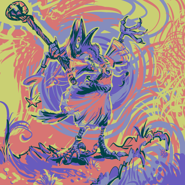
a fancifully-colored commission for MordecaiPants of a contrarily-dressed sorcerial bird-person
because, as is increasingly the case, that is what I have this week, not because there is anything especially noteworthy about it. I am “glad” I can say it is because of spending a majority of my time trying to but not necessarily accomplishing anything, at least not of personal benefit, rather than simply because I am lazy. My laziness is very complex!
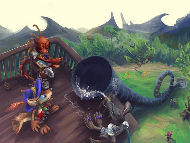
a gift commission from a person called RelaxingDragon1 to a person called QuentinCoyote (but drawn by me) featuring a stylishly-hatted individual also named Quentin Coyote at a somewhat less stylish location, pondering whether a round trip is in order.
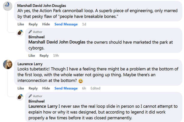
truly divisive, replies to this picture on various websites have run the distance from figuring I don’t know about the slide and explaining it to me, talking about it like everyone knows about it, and explaining to me that the slide absolutely could not exist as if ’twere my idea, sometimes immediately beside each other.
If the scene looks barren of attractions and unlike a proper amusement park, I should clarify that the real Action Park that I was instructed to evoke did in fact look like this, at least as best I could tell, since I was unable to turn up a photograph of the ostensibly notorious loop slide from any beneficial angles.
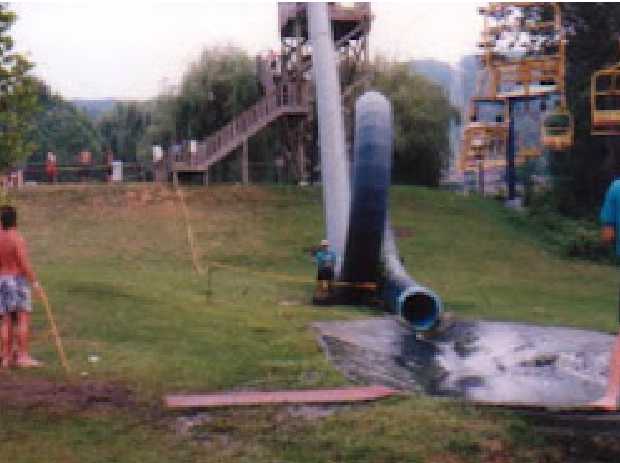
At the end of the slide was what appears to be a piece of dark plastic or rubber in a shallow hole, with water running off into the grass, which creates an unpleasant marsh like environment, which is why that helpful plank has been placed beside the plastic. Truly, no expense was cared. I don’t know how the water gets up to the top of the slide platform to go through the tube; a garden hose seemed a reasonable guess, given the production quality. I probably should have made the ski lift chairs bigger but than I would have had to actually detail them and I wasn’t asked to draw them, much less paid to do so! Yet I felt inclined to make this as accurate as I was able to until late in the process, by which point the only area that felt safe to mess with was the mountains and to a lesser degree the trees, since the best way to do that would have involved having them not be green, which seemed somehow less appropriate than faking up their shapes did.
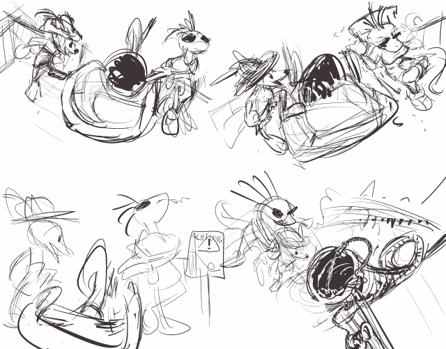
I personally thought it was funnier for the protagonist to approach the slide willingly and smiling, but humor is subjective and not always beneficial to horror narratives. I do wish however that I had remembered about that “achtung” sign idea; I only remembered it just now when I sought these early sketches. I had at one point meant to incorporate it into the setup that was eventually chosen, since I don’t like all the plain unadorned brown and troublesome straight lines here, which are a natural byproduct of me having no intuition or references for a wooden structure I have only seen from the side in tiny, pixelated photographs. a few more props could make the space more interesting without requiring unremarkable fake trees. I also finally see that my difficulty with the perspective on the slide that makes it look more like an enormous shofar than a tube of consistent circumference was that I didn’t diminish the shadow beneath it as it went up. Ewps. The ride attendant was also supposed to be wearing sunglasses, and those DID look like sunglasses at one point but I failed to notice when my layer shenanigans left them no longer doing so. Maybe I will fix such issues if I ever feel sufficiently wronged by the owner of the hat-wearing figure here. Unfortunately he didn’t ask me for the picture and never watched any of my pages, meaning he can’t unwatch those pages either, so I would have to direct both of us quite out of our ways to facilitate all that, which means even more extra work! oh
