


moron the large trousered monster shown not long ago
I said before that i was not sure if this thing should be a monster or just a moving decoration but even as I said that, I was thinking about this.


This is a “organic” monster meaning it is not made of the same colored glop as dopes and therefore should not melt. however that does not mean it cannot fold up like a pile of towels.
durian seems like a good upgrade from lemon because durians are already covered in spikes and widely feared and regulated for their intense smell. But perhaps those are TOO dangerous for a low tier non-“boss” monster to have access to. To the player and also to other low-tier monsters that a dodging player could try to get hit by such a thing. The durian should explode into a damage cloud like the cleric flechette in hexen, something already particularly powerful (and dangerous) for the player and that can’t even be launched across a distance an unlimited number of times.
in fact that should hurt monsters but NOT the player since the player is a dope and I have years ago stated that the dope’s nose has no practical function and is only there to look stupid. But dopes might also be too stupid to realize that they can’t smell something unpleasant. Yes sure hurray problem averted. and maybe i can restrict what other monsters are damaged by it, or make them become more dangerous if they ARE damaged by it, to dis-incentivize the player trying to hit them with durian clouds on purpose. Or maybe accept that they have it coming if they are dumb enough to get tricked by a dope.
I started to draw a pineapple for a second variant but did not get far enough on any frames that it is worth showing. I thought that pineapple might be considered played out and expected from me. or maybe i just want to reserve it as an upgrade for a monster that attacks with pine cones. And so I switched to a potted cactus instead.
but THEN i thought that cactus is good to swing at an adversary in a close-up attack, and it seems wasteful to make two animations with the same item. But I haven’t started on drawing a close-up attack yet. not every monster needs one. this creature might just awkwardly try to hop out of the way to return to projectile distance. I have not drawn the projectiles yet either! ideally i will decide on the cactus’ fate before drawing one in flight because once I do draw that i will be reluctant to not use it.
I like the idea of pulling out a big clock for a near proximity attack but i ALSO have had for a while an idea for a minotaur-like monster that carries a grandfather clock as a multi-purpose weapon. then yesterday the name “minute-taur” struck me. which doesn’t mean i have to use that; letting puns control the flow of design leads to an idiotic product.

maybe i should change it to a lizard-person since lizards amuse me more and then it no longer has taurine-traits that make the pun “work” and seem like that came first, and 1994 Heretic already has a minotaur in it.
the escaping into the hat “death” i have a misgiving about since the hat looks like it should be collectible, especially by a dope that picks up/absorbs stupid things, but I want there to still be evidence that the monster had been there if the hat is collected. Maybe a lemon will appear underneath it. Functionally stupid! But there could perhaps randomly be a durian which will explode momentarily with an effect similar to the launched type. And then THAT can leave a lemon behind. The dope cannot pick up lemons. Or at least I have never seen one attempt to.
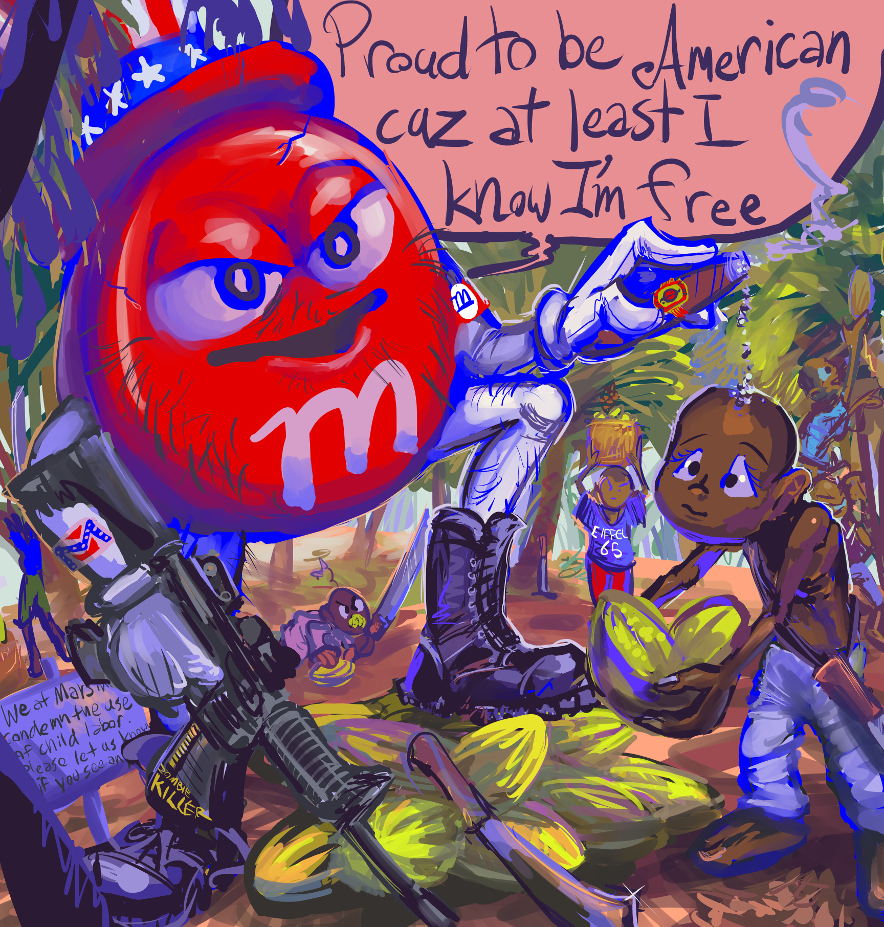
Initially I was making a picture picking on a stupid old sonic the hedge character named “hershey” for this setup. Although I think Mars makes better candy, they also seem mildly less concerned about child slavery in their supply line,while m&ms in particular are overpriced, and anyway this is a truly horrible character even without the dipwit patriotism advertising it appears in. I added confederate imagery based on the attitude alone but sure enough while hershey in a pennsylvania company, mars is headquartered in virginia. only as of 1984 but that certainly gives plenty of time to soak up local sentiment, considering how many racists are on the internet who were only born in 2009 or so.
a few years ago i saw a supermarket display that proclaimed something like “m&ms are for americans” and i wish i could find a picture that i probably took of it but i sure couldn’t find it for this website entry. o hwell.

I was reminded of it less than a month ago when I saw this package for sale…how DARE you put the stupid all american hat on this scumbag mascot when you know child slaves harvest your beans? It doesn’t matter how many.
I had hoped to get the drawing out by july 4, and didn’t quite do that but it is entirely possible that americans have bigger new bad stories in scumbag patriotism to worry about this independence day.
that character is SO awful. Aye dohKNOW, I never MYET the guy! awful
i hate the line “proud to be an american where at least i know i’m free.” the grammar is totally wrong and stupid. It doesn’t come across as a stylistic choice, just a stupid one, and is utterly uncalled out (that i could find, apart from http://www.amiright.com/names/bad-grammar/greenwoodlee.shtml) despite the song’s higher profile under the likes of trump, in line with other emperor’s new clothes elements of his political career. sure boss, as long as you codify persecution of alphabet people into law I’ll pretend you’re a genius even if absolutely everything gets worse for everyone who isn’t a billionaire but by a slightly lesser amount. It’s like nfts but for old and poor jerks instead of just the young rich ones.
It is also plausible that this creature simply does not know the correct words to the song, and there is no logical system whereby a person might assume the correct ones actually are since grammatically they aren’t.
I wouldn’t trust the horrid character change the line deliberately but ME using the word “where” here would imply that chocolate bean harvesting happens in the US, but if it did a lot more americans would know that children are being used for it and have long since prepared excuses for why that is good for them and better than free medical coverage.
ALTHOUGH my setup confounds the story a bit since while there are some legitimate 100% trafficked children doing the work, many of them “merely” toil on farms owned by their own families and aren’t necessarily being threatened with violence beyond what is inherent in hard labor done with massive maiming tools and the sort of encouragement and disciplining that might come from impoverished parents who would require their children to do that and probably had to do themselves as children. In america we only feed them fatty sugary poison made from the crops. It’s about time they had to WORK for it!


five direction walk animations for creatures that i have not yet decided if will do other things apart from walk around providing stupid atmosphere. the second angle on the fish is probably too wide but i will wait until implementing it to assess if that actually makes a difference amidst how awkward it is apart from that.


not all details have necessarily carried across coherently but they aren’t necessarily all necessary
Here is the airplane stuff I did not post a month ago. Really not any less depressing now! even though it is mostly about the always-on electricity-wasting, fare-raising screens stuck to the seats immediately in front of passengers

first of all I refuse to Enter [My] Seatback Experience nor call it that except for the purpose of showing how stupid it looks when i type out that label myself.


ESPECIALLY if you aren’t a heteronormative white guy who never had an organic or fact-informed opinion on anything unrelated to what genitalia someone has and how to persecute them on account of that while ignoring their actual merit, even while “merit” has become a bizarre code word for “heternormative white guy.”
Apart from THAT, the statement “the world awaits” assumes that climate-change related freak weather events caused by regulation cuts instituted by the same sort of people who want you locked up without explanation or justification don’t get your destination airport shut down for a prolonged length of time because it isn’t safe to fly through them and pog forbid the weather freakoff starts while the plane is in flight since air traffic controllers are getting laid off all over the place.

this picture is a lie. i have the computer open right now* and this space does not exist. i cannot extend my arms or open the screen fully without pulling the machine closer than that. The person in the photograph has two full window lengths of space. i have about 1.1, 1.2 MAYBE.
*it was right now when i wrote it but last month by right now

there is plainly not two windows per seat. even with the tray fully extended it is not possible to use the computer non-awkwardly, and forget about having any surface to use a mouse on. Thankfully I learned to use it against my right leg years ago in other uncomfortable locations. But after so long stuck on the plane during hours of delays with no place to charge it even if my charger weren’t stuck in my carry-on bag that got tossed into the baggage compartment by the staff anyway to cut 2 minutes off of the boarding process prior to the four hours of delays there isn’t enough battery left in the thing to use anyway except for awkwardly typing out some gripey notes.

i have NEVER had this facial expression while on an airplane, if ever. This is only plausible if it accompanies an internal realization that life has no meaning, reality is imaginary and leads directly to brazen criminal acts that i assume this presentation is not intended to endorse.
This journey was the first time i had to put in barely adequate earbudpodphones just to block out top 40 radio hits being pumped into the cabin prior to take-off. i assumed delta paid extra for the “right” to make my experience worse, but then the audio feed advertised spotify so maybe spotify paid for it. Somebody else paid somebody else to diminish the bearability of this situation. Soon after i heard mouth-whistling breaking through my block-out and was glad to be missing the full context. No corporation-approved music with whistling in it has ever been not awful. During the outgoing and return flights it was necessary to take a smaller, dinkitier airplane between Tallahassee and Atlanta. Most advertised features were missing on the smaller plane but it STILL had the crummy music imposed on passengers, though with shoddier, mufflier sound quality and I was unable to determine if it being harder to hear made the experience worse or better since I would still prefer just engine noise.

If you love a brand it is only because you do not know that brand because not one of them has any of your best or even good interests in mind. If you don’t own it, it aims to own you.
And I think having this awful rubbish presented to me is supposed to be a “perk” of the “sky miles” membership program that the trip organizer belongs to. I don’t know for certain that people in the back of the plane have access to these wonderful bonus advertisements for corporate mediocrity. I can verify that the wifi DID function but again there wasn’t much i could do with it in a cramped tiny space and hardly any battery left over except type out complaints, but LIVE to my pathetic discord chat server and wow jeeplies how exciting to get whining about airplane delays in REAL TIME.

wheeeeeee

Coca cola specifically is formulated to be drank rapidly and repeatedly and NOT savored, and possibly is the first consumer product that was. I drink coke, because the brand owns that piece of me. I don’t want it to, but i can taste when a similar drink is not coke. There is worse coke to have a chemical dependency on but better than worst is worse than good.
I do drink iced tea with more regularity than coke but foremost drink water and GOSH isn’t this fascinating to read about! And that is a bimshwel.com exclusive; i have never said that in the chat server. I need to provide incentives to not look at both.

popeye is considered public domain now so legally me showing pictures from the comic strips is not participating in corporate mediocrity
i was yesterday struck with the memory that in one of falcom’s ys computer games, the hero adol can transform into a dopey yella animal, willingly even. Already foolish enough, but I tried to find proof of what it looked like and had some difficulty

yes sure say all that and show a big stack of magic wands instead
eventually i did find a picture of one and made a worrisome discovery:

why is the blue one c-c-CURSED?

it makes me angry how cursed this thing is. no wonder the prisons are full of them

i presume adol was in prison for transforming into one, or possibly just for conspiring to meet with one that he might not have realized was in jail, but he ought to have assumed the creature was a criminal.

the adols on the same sprite sheet do NOT have a cursed variant; only the dumb animal gets cursed, as if just looking that way to begin with ISN’T the curse. And in such a case, why does it walk around normally like it ISN’T cursed? Does it think i don’t know? i am NOT fooled! That thing is NOT normal!

I am NOT putting up with cursed roos today, and neither is the king.

I tried to warn people about this problem on the bluesky website but unfortunately, perhaps on account of its sky being of such a hue as to indicate it may also be cursed, my message had difficulty getting through to those who may need it most. possibly part of the curse is not being able to notice the curse. It is a stupid curse.
and that is another issue; roo is an incredibly stupid name for a dopey animal, cursed or otherwise.

oh gree golly beets THANK YOU for explaining!

i have been wondering about this ever since i played final fantasy 9. which came out years after ys2 but ys2 generally came out on stupid game systems, as befits its curse.
stupidest of all, the folder i have been uploading pictures to since january is

rew

what how DARE you forbid me to browse a folder on my own website? Is that a crime? It isn’t like I transformed into a yellow dork and got cursed. I do NOT turn blue under stupid circumstances nor do i associate with any other blue, stupid individuals

just because they get in my business and smile at me does not mean i invited them

i drew this thing years ago but never gave it a way to explode. Now I have. However it appears that it was only immediately after drawing the original sprites for this creature that i standardized the [minimum] scale that i was drawing these at so i spent a needless fraction of the past week slowly awkwardly upscaling many of its frustratingly intricate sprites in an effort that approximately nobody will notice except in the form of extra seconds spent loading yet more oversized sprites in-game if it ever actually reaches a releasable stage of development which seems as likely as ever, which is not very.
a lot of its glop goes missing, something that used to bother me about similar animations in heretic and hexen, but i plan to have this also shoot out a number of glop objects separate from itself (including the eye balls, probably, although i like how the pink glop covers them) that will successfully land and remain on the ground. See there IS some good news this week.

An animated commission drawing for an unknown entity about a vaguely defined creature who enjoys video games and is not bothered by lacking arms
This was actually based on an existing four-frame drawing of a different person’s character doing each of these things:
picking out a nes game
blowing in the cartridge
putting it in the system
flopped on a cushion with the tail holding a drink
but from whom permission had not been acquired (nor i think sought) to use which is why its design has pretty much nothing going on apart from lacking arms and having fur; it was difficult enough to figure out how to link all these actions together without diddling about trying to “create” a new character at no extra cost. I don’t consider this a ripoff since those actions are so mundane and corporate-homagey though i still didn’t copy them outright.
hey speaking of going to great lengths to exhibit a preference for overexposed nonsense

it took hours to sort out as the dumb xbox hasn’t turned on for years, even after i bought a replacement power cable, and the box-to-personal computer data transfer tools are sketchy but i now can put my 2010s era skyrim character “Germuduwuru” into a proper windows (7) version of the game. I don’t have TIME to play this rubbish again but it is nice to know that i could.

contrary to a 2013 report, the creature is NOT named “germerduwugu,” although i got my own name changed between then and now so perhaps this corny lizardoid could also. theoretically I could use “console commands” now even to facilitate that. newer versions of the game also have a lot more colorful nonsense to decorate hero characters with but generally you don’t see any of that unless you are deliberately eschewing helmets as it appears i was doing during the second screenshot from a much older save file off of the xbox flash drive, which was substantially easier to access than the main drive, hence why the more desirable data wasn’t on it.

one assumes i could add extra colors also with console commands anyway but in practice it still just looks brown under standard game lighting. This is a “new” hero made since I needed the game to generate an auto-save just to find out what folder to place the old save data into and i couldn’t resist playing with the new lizard features. Plainly i am easily enough entertained that I don’t need games at all.
This latest development also means at last that I can install the “nude argonian patch” and therefore can more thoroughly exhibit my unwillingness to do so.

and this post wasn’t from me

welcome to bradley international airport

a restroom only for people with capes and no arms

Bradley can’t get you a direct flight from connecticut to florida but the center of the earth is apparently viable.
i started to write about the actual airplane experience but it got depressing again so i will put that off for later/never

these are the only sort of books allowed in florida now. And even these are mostly missing with the rest shoved behind a curtain.
Which is ALSO depressing but it is more plausible for florida to stop being depressing than the entire world’s aviation industry

do not ever ask me to sign a card. I will probably undo any inspirational effect the card is meant to have.

I often have difficulty getting “work” done during family trips since I can easily feel discomfortingly scrutinized

even when i am not working on anything this may seem to occur

I suspect that this mobile device quiz game may use artificial intelligence generated content. However i appreciate that “bible characters” and “fictional characters” are represented by the same person.
still the bootleggedness of the creature in the middle is rather surprising considering that tallahassee florida’s international airport

has a pokeball right in the center of this enormous compass design on the floor in recognition of all the directions you can look in to find dunkin donuts kiosks and also places it doesn’t have flights to or from.

Bradley airport sure doesn’t have one, which is why I was so understanding when i saw this in a gasoline station a few days before the trip, and also too self conscious to take a picture of it. and a week before that i saw that not only is A-Team plumbing still in business and under the same name, it actually has a truck with the same unauthorized fake-anime mr t drawn on the side of it driving through New Haven, connecticut’s most police-actiony city. Plainly the anti-china tariffs have been a long time coming which is why america has been stepping up its shoddy arbitrary copyright infringement.
I really want something other than that ugly ripoff pikachu to be the last picture or ripoff mr t pitying stool to be the last thought

hey! make sure you always cut up your N before disposing of it so fish do not get stuck in it. this fish doesn’t appear to mind but this fish is probably a moron. Most fish are. That doesn’t mean they deserve to get trapped in N.

the decapitated shadowmen appear to be demanding a human sacrifice

that may be worse! Especially if “like cowboys” is intended as a separate thought and a command rather than a clarification on the first one. I REFUSE to like cowboys.

am I going to prison?

and it isn’t even hard to edit mickey mouse into a nazi uniform or simply draw one.

not that i have a particular problem with felix the cat beyond my usual aesthetic frustration with characters that are all one color except around parts of their face and inaugurating minstrel show stereotypes in animation, but the picture i edited (and that I can’t for the moment find posted on any of my better accounts) already had felix in it. but i think this is consistent with mickey mouse being a ripoff of felix. in an alternate situation where mickey mouse’s fascist views were more outwardly expressed, that would only happen because felix did it first.
more to the “point,” as what seems to be usual, AI-generation’s foremost appeal is to the laziest, selfishist, basest, most hateful people who might as well be wearing those uniforms themselves.
The right wing vendetta against disney is pretty stupid because for 99% of its existence the disney corporation exclusively pushed conservative values:
-virtue is hereditary.
-wealth is deserved — if not by nobility, CERTAINLY the monarchy above them, provided it is the prettiest members of the monarchy.
-hetero normative whites are the only people who matter, in the event other types of people exist.
-corporations are OWED not just business but loyalty.
-corporations are not subject to the laws of common folk.
-if you can buy something you deserve the right to claim creative ownership of it and charge other people to look at it. if you can claim it without buying it, even better
Disney helped pound that stuff into the brains of lazy, selfish, base, hateful people. And it’s STILL doing that, but since those boneheads turned on it, gladly wasting luxembourgs worth of electricity just to regurgitate non-jokes about it, it somehow gets credit for being progressive, and its usual agenda continues to go virtually unscrutinized by anyone with credibility. Me having no credibility is implicit in that statement.

credibility may be overrated

based on something that happened actually to someone other than me. Somebody who didn’t trust doctors in the past due to legitimate bad experiences more recently had issues discontinuing a medication at the same time as getting caught up in a misinformation vortex meant to discredit scientists so to funnel support toward republican political candidates with no regard for people who actually need help and aren’t ever going to vote for scumbags, now distrusts doctors harder than ever and keeps getting worse mentally due to not trusting doctors so to get help with the medication issue but then also cannot be guided out of that due to continually getting stuck with doctors who seem less than trustworthy. In fact it is rather an ongoing matter but i think, i hope, the worst is over with, so i can justify posting the comic strip in the absence of anything else remotely coherent.
Now I need to take this computer apart to try and replace the “thermal paste” within it due to my other ongoing crisis that people getting paid loads of money could have prevented and saved trouble for countless common folk but didn’t. If I succeed at this I still will only have scrappy website updates but will have a substantially reduced chance of blowing up the computer and setting my home on fire if I ever get back to attempting to create better updates.
/////////////////////
ah nope, worse than ever. i definitely have to pay somebody to fix it or buy another one now. which i partially expected but i was never psychologically prepared to deal with. taking that thing apart and especially putting it back together, then dismantling it and remantling it again and only getting this is more than i can do a third time and potentially STILL get… this. plenty of videos showing how to take everything out but you are mostly on your own when it comes to putting stuff back in.
most of your screws are just not in or the wrong place. one is wrong and ruined and unremovable and thus the power port will forever after be lopsided AND i didn’t even need to remove that one
the screws DO NOT WANT to go back in. they want to stick to my fingers. they want to fall into different places and roll around unvisibly. they want to get stuck sideways and then fly to oblivion when freed.
and after all that, when it simply shuts off after a few seconds, it gives no indication of what thing that i did wrong was the culprit. I have been doing things wrong my whole life, possibly even beans on toast, i can’t work with something that needs all things done correctly.
i have my data, but i can’t do anything with it on this crummy backup computer that i bought for my mother that my sister then commandeered. it has TWO (2) usb ports, and i need 3, for mouse, keyboard, and tablet, not counting the one connected to the

hard drive toaster thing. and i also “have to” go on a week long “vacation” and nothing is less relaxing to me than being stuck in some other place on someone else’s conditions and not about work on my personal stupid nonsense. there certainly isn’t time to order a new machine then and i don’t trust any place to fix this fast and not charge moreforfeoieroufreefropfrupidorfrupefrupefrupelope
was trying to use ptm 7950 instead of paste like reddit dorks insisted was better the problem? would it be working now if i had just used paste? is someone that i pay $200+ just going to use paste? I don’t know. any time i open it up another screw goes missing and every time i have to reconnect the blorks to the wifi card i think i lose a year off my life.
i swear this comic strip is not about me. I have ISSUES but they aren’t new or freshly medicated.
/////////////////////
ah! it lives! I had not screwed the fan in tightly enough. One of the guides I looked at warned against screwing the fan in too tightly and as usual i drew the wrong conclusion from advice that i probably would have been fine without receiving. Good thing i dared to look back inside; i almost had a nervous breakdown when i resigned myself to using GIMP on a backup computer for the next twoish weeks. How do I move a selection? I don’t know! I thought just KRITA made that stupid. I am glad it doesn’t have to be my problem.
I don’t know if i actually solved the INITIAL problem of overheating but i seem to have alleviated the apparently more serious problem of me touching the computer inappropriately. It has more screws outside of it than in and the keyboard is on my bed since I got tireder and tireder of hooking stuff like that back up just for nothing to happen. Ideally I will sort that out before getting on an airplane because this thing presently looks almost as dangerous as four ounces of water with its insides and wires exposed.
and my mind state is like I have been “away” from using the computer for a week or longer when it was just a single day. Maybe this is a sign of mental illness. I will add it to my collection

GREAT. It’s about time. We’ll finally have Hitler on the ropes.
I like The Guardian, generally, but why is this news? Modern technology being able to beat up less-new technology is not impressive and is not related to any of the reasons that this particular technology is noteworthy or criticized
I don’t think anybody assumed present artificial intelligence couldn’t do that, or even PONDERED if it could, and that it CAN doesn’t justify its rampant undesired incursions where it doesn’t belong, much less the obscene amounts of electricity that it wastes.
What is AI doing about our present 2025 nazi problem apart from generating meme videos, self-published book covers and fake “evidence” against perceived enemies for them?
the actual article seems to be about showing how far artificial intelligence has come since its origin but as often happens, the headline makes it seem more sensational and obnoxious. Although sometimes that isn’t possible

in a different story about a totally ludicrous circumstance presented as if it is normal that i already saw being mocked before the guardian reported on it,

If it is “ai-generated” it is NOT evidence. That is called forgery. Fabrication. Fraud. It also has nothing to do with the incredibly absurd and creepy “victim impact statement” that this story is actually about, and this proves it isn’t just the headline-smith making things stupider.
I don’t understand how a legitimate newspaper can be pro-ai-generation or even neutral on the topic when that’s precisely what the right wing creeps they generally report on the flagrant immorality of want to use to put true journalists, if not all writers and artists, out of business. Though admittedly some should be easier to put out of business than others.

are you making beans on toast wrong? And also speaking IMPROPERLY? How is it even POSSIBLE to put beans on to toast and have it not be correct if any way is correct? That seems even harder to screw up than beef stew over biscuits. And if i like it that way, why is that anyone else’s business? Or news? Unless you take money to run trash stories like this? And if you do, how much are AI creeps giving you, and will it have been worth poisoning your very livelihood?

perhaps some people simply enjoy being poisoned

This made sense when i went to bed last “night” and maybe it doesn’t but I managed to dwell on something that might not make sense for less than a day which might constitute a form of progress.
i used to end up at a lot of bad local comedy shows because my brother was involved with them, and the worst comedians invariably became his close friends and also had the worst opinions. None of them have been recruited into the government as of this time but surely that is something to aim for.
then i eventually remembered that fringo and the belligerant gnomes and their preferred hang-out spot were directly inspired by having to attend those comedy/band shows and the awful people i encountered there, so i might as well have drawn fringo as the comedian here. plainly i was going for the same traits. The gnomes may have slightly elevated senses of fashion.
i don’t know if this is funny at all –possibly this video showing the individual parts used to assemble the kraft mario bros macaroni commercial accompanied by a completely deadpan voice naming each of them is funnier– and the script is so old that bob hoskins was still alive when i first wrote it, and screwing with cdi cartoons was old then, yet i still would think about this in 2025, so i had almost no choice but to deal with it
the one person i have had any comment from about this so far seems to think it is not screwy enough, perhaps needing more repetitive editing and speaker-wrecking volume. I am not looking to compete with or join with people who engage in or enjoy that. A bit later a second comment simply announced “gay” and I can’t quite manage that either. There hasn’t been a “community” yet whose rituals I was able or willing to imitate well or long enough to belong among them. As usually is the case, i just like a few specific components, in this case imitating the mario actor’s voice and stupid written correspondence, and stuck with that. i do not have any more “videos” “planned” so presumably i will find worse things to do with my time again.
another video mix of sega genesis voices and arguably relevant pictures that absolutely has a reason to exist. People kept asking me to make a video like this for dynamite headdy or sonic cd so i did it for gley lancer

i regret that i had to remove this picture. There isn’t time to read the text on it which is the main reason it is funny to me. back when the genesis fan-translation came out i had never heard of monster world 4 and i must have tried to look up information about it but it was only in japanese, and i ran this page through google translate, and fixated on “you will defend with the shield.” you WILL. you have NO CHOICE but to DEFEND with THE shield. Don’t try to get out of this responsibility
The “doodily doodily doo” came from some “sprout” machine preloaded with stupid videos produced by the same company that my niece was carrying around 7 years ago, and that i probably meant to put in a ristar-related video and then simply forgot about when I actually made a ristar video, so now it gets to make even less sense than it would have otherwise.

it is redrawn from a 2003 picture (on that page, but also immediately below on this page) which various recent circumstances of my existence unrelated to utterly unnecessary federal aviation control funding cuts made me think of.
sorting out the roofs is the hardest part. i am never quite sure what all the nonsense on roofs IS. I don’t know that I did enough to make the turbine vent stand out since it is hard to communicate how stupid those look when I can’t show it in motion, even with a bird on it.
WHAT a STUPID bird! That looks like the world’s dumbest bird. Except there are numerous videos of birds doing that and they can’t all be the single dumbest bird but they are likely in the dumbest category of birds

ideally its past appeal didn’t in part come from its cheapo 2004 pixel rendering or the absence of that obnoxious WAH creature in one of the windows. i like to imagine that knowing the building was inhabited by those makes the thought of a flaming aircraft bumping into it less worrisome

WHAT??! i REFUSE to WAIT for dopes! If they have a house, I evict them immediately, and failing that, i throw a helicopter at them. ARRRRGHF and i already wasted it on the dumb wah beasts! What a fool I’ve been! This isn’t right, having to choose between the dumbest birds teamed up with the third dumbest imps and the unquestionably dumbest imps. And with helicopter prices what they are now I can’t afford a second one.