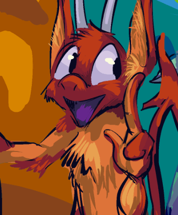
page 46 of that. a bit cramped, hopefully not to the degree that it is confusing, since it may be confusing anyway!
urk 100% of the words out of nemitz’s mouth are trash. in fact if mit literally said “trash trash trash trast” it would communicate more information than mit typically does.
i keep forgetting that having the elpse lope and nemitz in the frame together messes with my usual way of plotting out pages, and with the giant stupid sack there also it will only be intensified.
i fear that I shamefully copy-pasted the scraps of the automobile. but i fear that the car has not been shown full frame recently enough that this clearly IS the car. it is such a distinctively poorly-designed car that surely anybody who had been keeping up with the “story” up to this point would know when a car is mentioned and a piece of that one is shown that it is being referred to. i hope.
i also hope that giving this quality to nemitz is not a mistake. it seems very mundane. it in fact was not planned. it seemed like a way to follow up elpse refusing to move the bag and also allude to something from earlier that i never gave an explanation for, the curious three blue electricity-looking shocks that nemitz experienced during the hospital section. instituting a major character revelation primarily to resolve a circumstance that only occurred in an attempt to be funny feels unwise, but resolving something old that I didn’t know what else to do with is better than simply forgetting. i see plenty of fictional media where a problem like this — such as a large object that no one can move — is resolved offscreen without an explanation. if i just cut to the imps in the car with the bag you could assume they found some way to get it in that might have taken a while but was not incredibly important. i may have to limit nemitz’s sphere-activation-shock-strength ability in an odd way or make the energy work differently depending on circumstances. super strength is just too common, especially if i indicate that elpse also already has it on account of the kumquat injection and is just too deep in self-pity to use it.
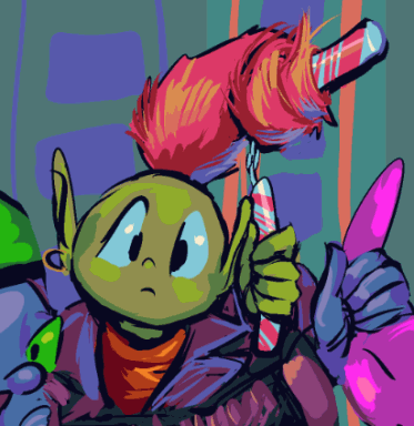
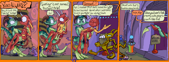
page 45 of the inexplicably ongoing comic strip
it features copious views of areas where i really don’t know what is supposed to go in them, like the blue part of the building’s outside wall. apparently the only other time i showed this area was page 3-2, where i didn’t make it blue and put yellow grass there in a way that makes no sense, and it wasn’t zoomed in close enough that there was massive void like here filling the void here with lines and angles seems to work but it feels really lazy.
3-1, the page before it shows that there is a sort of tunnel in that spot but I recall in a previous update noticing the inconsistency about the tunnel and resolved to just not have a tunnel there because there are more pictures without it than with it and they are all small. I ought to edit the pages where it DOES appear so i stop rediscovering this inconsistency re-evaluating which way is correct because eventually I will choose the other way and that will make an even more longwinded stupid problem.
Out of nowhere between 410 and 420am i decided the green elf should have one earring, and once that was enacted it instantly seemed like i should have made this gnome be the less wimpy of the two here. The script seems to have them trade off which one is more aggressive than the other, which is probably frustrating as a reader. None of the gnome stuff was well-planned or “planned.” i established previously that gnomes with hats that point straight up are aggressive but pathetic, so I don’t want to have this one also be like that. Really one of those should have been in this pair instead but I ALSO established or at least implied that these two specifically have some sort of partnership, so they should be together, without considering that there might not be any justification for it other than me having put them together the first time before I knew anything about them or that they would be appearing again. in fact they are part of a group of three but i ADDITIONALLY established that the third one isn’t in the gang and so would not be out searching for creature-imps to beat up. oh!
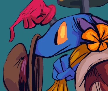
bimshwellian comic strip page 3-44 featuring some rare views of the weird tv thing here, one more component of the room “designed” on a thoughtless whim that has continually thwarted my ability to draw this room without a hassle. Followed up by characters designed on a thoughtless whim
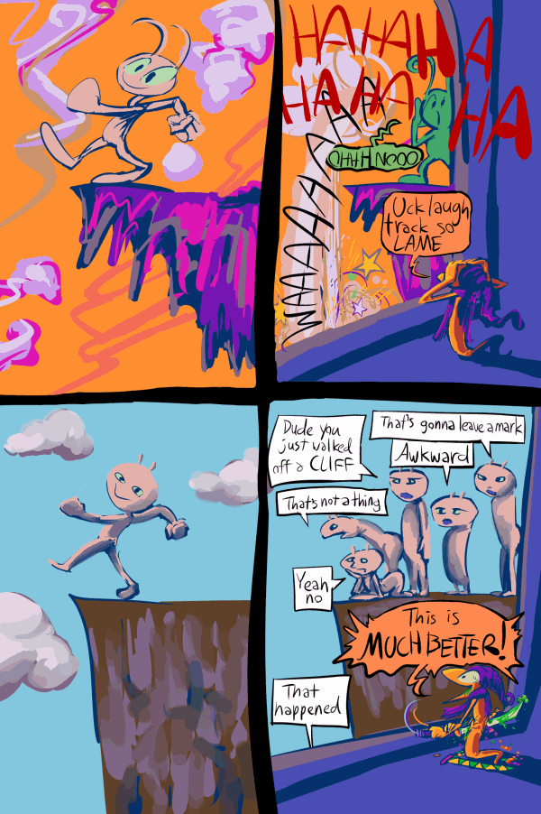
fiddle dumpkin i summed up my last six months, possibly years, of written posts in four pictures
my end of year post seems to almost always happen the next day. whoopth. it is just a rapid slideshow of every drawing i made. Of course I found a way to make that take hours and hours to assemble!
///////////////////////////////
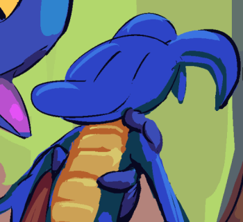
comic page 43 ! its artwork is possibly even worse than the previous page’s but something does almost happen on this one.
other pages are here!

lope seems most disinclined to throw anything out!
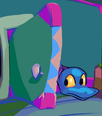
page 3-42 of the comic strip. I fear this may have been the longest delay between two pages that was not due to me slacking off. And not a whole lot happens on this one!
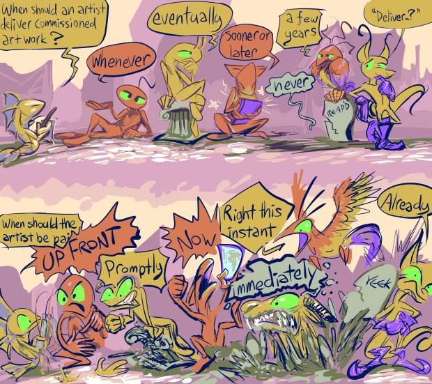
this is something that should make no sense to normal people, but I don’t know any of those anymore. if you have no idea what this is about I have deduced that you are better off continuing to not know than this website is with my attempt at explaining it present.
of course the picture is an exaggeration; only two people have actually become dead before they delivered on what I paid them for, and it probably seems callous to put their entire lives beneath some stupid garbage that I paid $30 or less for but it was funny before I thought about it at length and that was the only time anything about my relationships with those people was pleasant so I will take it.
that I can be systematically unable to update the website for this long and not be stressed out of my mind about it is surely a positive indication. I have been spoiled by all the automated websites where I can just select a picture and it shows up. For this I have to manually upload it and put in the code for it and somehow or another I cannot spare the mental change to go through with that at the moment. After sorting out some prolonged nonsense with the comic book printing website I assure you I will get to posting filler trash that I already put on twitter a week ago.
I have been relettering what turned into pretty much the whole first comic book based on the same offhand remark that had me meticulously relettering book two in 2018, amidst also relettering book 3. It is a somewhat automatic mode, just very time consuming. I am not even necessarily checking for unintelligibility; if one bauble from before is readable but blatantly does not match another on the same page that I just did, I have to change that one also. If it looks too much like I was trying to imitate a font in the version that was printed in 2015, I have to redo it. If a word is HYPHENATED and on two lines, I started making myself redo all of that, which often requires restructuring the area around that. If the bauble’s shape is wrong, because I only decided lope’s should always be circular midway through preparing book 1 the first time and didn’t care that some didn’t match until THIS time, obviously I must redo that. I also decided kumquat’s shouldn’t be in that bad tintin pastiche shape midway through relettering book 2, and again let it slide if it was on a page I had already redone, but since I am re-checking every page, that means everything is up for
look see I am a sick sick person. I can’t draw well enough to be a good artist, but I can make the text readable, of nearly uniform thickness, I can make the containers balanced, consistent shapes.
Apparently I believe that so it is going to eat two weeks of my time every time there is one thing in a book that I want to change which leaves me vulnerable to witnessing other things that are no longer acceptable. I am glad I don’t have the energy to no look I’ll show you whatever beets I am here anyway.
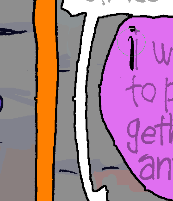
Can you see what is wrong with this little section here? Probably not. At much smaller size on the page you definitely couldn’t. That is even worse! I hate knowing a small problem is there and nobody else seeing it, and just pretending isn’t there. Tiny little pieces of paper stuck to the carpet, I can’t live with that. The little stickers with a number on them stuck to new clothing. When somebody “cuts” off a tag on a piece of clothing, leaving tag residue which is not only worse than a full tag, but much harder to remove since you can’t (and I won’t) grab tag residue to pull the strings out so they can be cut. It has to go. Only I can destroy it.
Part of being able to make the fixes I “need” to make requires separating formerly flat pages, that I had been PROUD to be able to do flat, into multi-layered setups. I would select the color of the text containers, move those up, then expand the selection and fill that in with black. Which works theoretically but since in actuality I was not sick enough to need things to be totally smooth then, expanding the selection makes tiny little one pixel blemishes into these horrible skin diseases that I have to scratch out of existence, then I need to fill in the space on the base layer that I moved this stuff off of because it still has the old outlines which will show through if I move or change the shape of anything. I should be in a hospital. My brain should be connected to a computer as part of a circus sideshow because they can’t elephants anymore and it is not proper to call people with physical deformities “freaks” anymore, but I admit I am a freak and if somebody wants to pay to see a brain melt into porridge amidst the most tedious and pointless fever dream tasks ever taken on voluntarily by somebody whose life has no meaning, they don’t even have to pay since plainly I will do stuff for free just to feel like I matter to an ever less reputable class of people since nobody doing anything with their own life would stick around this one. And sometimes not even then; I could probably name 50 people with no skill or inspiration who watched my pages, acted like they cared, then abruptly didn’t despite still caring about the same brain dead hacks they cared about before and after me but you would not have heard of them and deservedly so. Including the one whose ultimate life advice was ‘let it go.gif’ if I have one undeniable attribute it is my fragrant inability to let any it go. If it will be my death, it was a life I could not have lived while attempting to let its go on the counsel of people who have less value than monopoly money which is at least pretty and distinguishable from other sorts of money.
I actually made a SECOND picture for somebody since I worked so hard on the first one that it was terrible even though that person has no bearing on my existence and probably already forgot about it. There are people who come to me every time I offer to do stuff for money and ask for something even though I know they have no money so I would have to do it for free if I did and sometimes I do. I am already buried in projects I will never finish that will haunt me until my death. Me offering to do work for money guarantees in the near future I’m going to be doing extra work that neither further my goals or gets me even the most pitiful organ grinder monkey money.
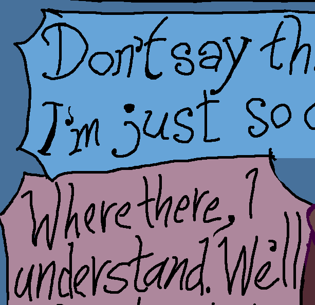
And apostrophes! I drew them vertically mirrored for years! I was so proud of myself to be drawing real typewriter apostrophers instead of ‘ those stupid things, even though I wasn’t drawing them properly and nobody cared except for me, later, when I realized they were wrong. It shouldn’t really matter since I have to rewrite all the text, apostrophes included, but a month ago I thought I wouldn’t and could get away with just changing the apostrophites.
But I feel a little better now.
on that page
older version
very older version
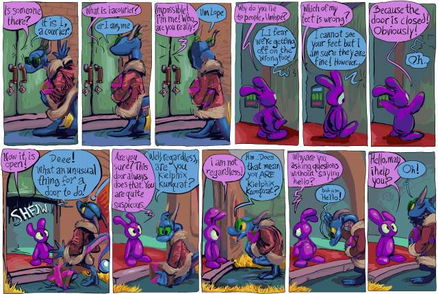
what better way to honor the recently ceased publication that was one of my major influences in artwork and comic strips than by removing the most blatant reference to it?
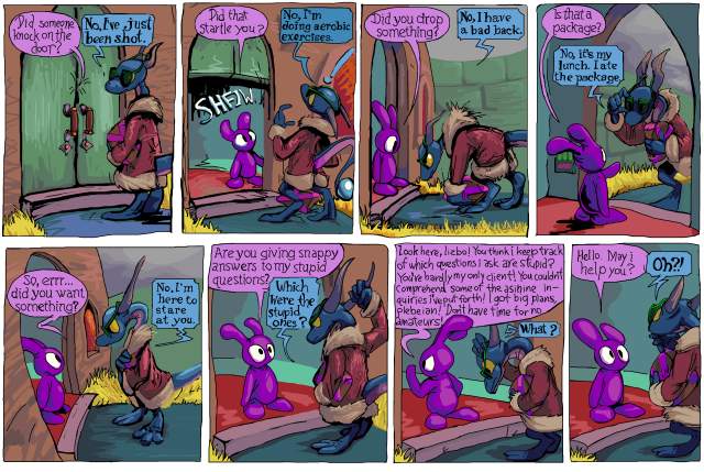
I wanted to renovate the text on a lot of older pages because somebody who doesn’t actually care about the comic that i inexplicably wanted to and thought that I COULD impress with a printed version of it, casually suggested to me replacing the hand-drawn dialog with fonts, not aware that I had taken considerable effort replacing fonts with hand-drawn letters. It prompted me to obsess beyond any past level over the legibility of the text in the second book. And I thought while I was at it I should deal with this old thing.*
I have seen some people (other than that one) in person enjoy this section, after being indifferent to the first few pages, but while it works for pog, overall it is terribly out of character for lope, especially when i introduce the concept that without its hat the pitiful lizard will not take bold action. I had worried about this prior to the first printing in 2015 but eventually decided it did not matter. However the more i saw it the more it mattered to me! At last year’s alternative space weekend art show, I was telling people who laughed at that page that it was out of character! As if I didn’t WANT them to like that page. Soon they will not be able to! Ha HA! That means I win!
And then for christmas last year a different person who I don’t know offered the first criticism of that page, which was enough to finally inspire me to remove it. But looking now I see that he is only criticizing the number of exchanges and not the logic of that sequence of exchanges! The person also called the package “the MacGuffin,” kumquat “the main antagonist,” and pog “his side kick” even though each of those takes longer to type and say in addition to being less specific, and maybe I should not give too much weight to what he says, positive or otherwise. But something good came of it which is what matters [if i am a reasonable person, which i am not]. Also up to that point I always thought of kumquat as the protagonist of that section. Being told the opposite does not mean I have to change anything but it gives me rare insight into how other people might interpret a work that I wrote so long ago that its content has become in part abstract to me. Except on this one one part that I specifically worried about. It works better in an inconsequential pencil drawn comic strip made without a plan, before the lizard was assigned a personality or existence outside of that minor role.
I also ended up having to remove a view of the door that I really like, in the frame where pog says “did you want something?” but obsessive compulsion of course has made this a referendum on the artwork as well as the text so I end up changing a whole bunch of pages, again, I may [mentally un]well end up replacing a blander view of the door on another page with this one.
On a later page pog alludes to one of lope’s comments, saying “didn’t you eat the package?” which i now also had. I like that line; it only works BECAUSE the question and answer part is so inappropriate. Outside of that interlude it makes no sense for lope to claim to have eaten the package, and it is possible to imagine that you only imagined seeing lope say that, or retroactively interpret that as a silly thing that didn’t “really” happen, like when I show inanimate objects talking or transforming between panels, and directly acknowledging that sort of thing is an act that characters apart from pog could not commit without being distracting, and now pog cannot even do it! Tragic!
I have a personal “rule” that no significant part of this comic strip should be dependent on a person’s awareness of other media. On a much later page, elpse mentions “an ethnic sidekick from a lame Indiana Jones ripoff,” in foreground dialog, but no other character acknowledges that elpse said that and it has no bearing on anything else, though I still may drop that line when I get to reworking that section simply on the basis of my personal assessment that the indiana jones series is rife with lameness and unoriginality already and more importantly my not wanting to imply that elpse, it of green and greenish skin, has a perspective on what is and is not ethnic in movies that don’t even exist where it comes from, EVEN THOUGH to ME it is obvious that the INTENT of the line is to have be implicit that the ethnicity of the sidekick is relative to the protagonist, which in the case of Indiana Jones is definitively established, ethnicity and protagonistship both.
Howdy.
*And also replace every instance of “keilphix” with “kielphix” since the second way implies a more accurate, kielbasa-like pronunciation even though i no longer like that name at all and have shown kumquat being annoyed by it on newer pages, which of course means it cannot be changed! Even though only a few pages earlier lope announces that it changed its name from scragthrax so it seems like I am being redundant by having two characters that dislike their given names. However, lope, who is a little bit like me, definitively changed its name, whereas kumquat, which is much more like me, would not commit to doing so, and I likewise have not! ALTHOUGH kumquat lives outside of the law of any remotely functional society and really could call itself whatever it wants, but I only need to think further than hypothetical people who might criticize the comic strip, not ahead of myself thinking ahead of myself. But I will anyway so in four years I will probably change every pertinent page again to have an entirely different name than kielphix and also have kumquat not be annoyed by it.**
**Howdest.
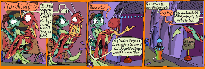
this is the dominant project of the moment. Trying to make awkward comic strip pages from ten years ago look slightly less awkward by surgically extracting as much of the rigidity, bad mouse-done “ink”work and bad anatomy out of them as is feasible by some arbitrary point that is likely still too late to get new books printed by when I want to have them. My anatomical rendering skill and general awareness are still terrible but I am considerably less likely now to commit to a weird guess. This example shows some unusually bad dialog flow, which is why I chose it, even though it is not one of the problems I cited. This is also a problem! There is no sense in mentioning it twice!
Ostensibly it should not be that hard but there are a few hundred drawings in here, if i estimate 13 panels per page and 30 pages it comes to 390 which is likely a bit low. Also I “have” to separate the panel boundaries and word baubles –in the event it isn’t necessary to rewrite the text entirely, which is frequently the case with elpse, or redraw the bauble shape, which I do for pog and nemitz since I decided that less serious characters have less serious bauble shapes after this point– to maximize my ability to correct awkwardness on them, which is also a bigger job than it would be to a reasonable person. In 2009 I obsessive compulsively used hard black for all outlines and more shading than was called for, so getting the components separated is tedious but necessary for reasons too tedious for me to explain. what it amounts to is that I have a heirarchy of sicknesses and in order to live with the chief sickness I must endure some less prodigious sicknesses that both necessitate that I do strange needless work and that I do the work very strangely, to a needless degree. A long time ago I was proud of the fact that I could arrange and complete these things all on one digital layer. Also of using pure black for all outlines and text. Now I definitely wish I had not been so insistent on those things!
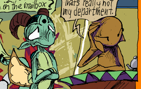
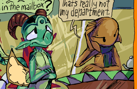
Why did i think it was a good idea to use solid line shading on skin? I imagined it would blend into a smooth grey but in the end it looks like a bunch of scratches. It looks good on wood. I felt so empowered to be using real ink from real pens at that I thought it could solve all of my problems! It looks better than my bad mouse pretend ink but then I kept adding more and more of it so it was still a mess. page 20 has some particularly bad examples but I have not gotten to altering that one yet! But I “need” to make a website update today so this is that.
comic page 3-41
all other pages are of course there.
i am not at all satisfied with the backgrounds; they are incomplete and have hardly any silliness lately, but i must keep going. I am likely quite past the point where I can have a third comic printed in time for the one art event that I attend in early november but it still would be prudent to resume the task of furthering my progress on that.
in MY mind this page makes sense, but based on one person’s comments, seeming to consider kumquat to be at risk of what elpse experienced on the previous page even though kumquat has already brought that on deliberately and then blatantly explains that elpse will have a different reaction to the formula since I correctly assumed just showing it would be inadequate. Absolute clarity has always been a problem with this comic strip, since I do not like to overstate things, since that dilutes their effectiveness, and even when I do overstate things it still is not clear enough! (in another example I added the word “flavor” to the end of the mouse-over text on the above image so it was more obvious I was referring to the nerds candy and not just social nerds of unusual colors) This specific matter is not of great importance, however, I primarily want to tie up loose ends from the first two sections that I wrote before I had even the meager “plan” that I do now. This page, to me, finally resolves one such end, the extremely brief appearance of kaklabesk in part 1-2 that is seemingly never followed up on. I must have thought I would do something more meaningful with it but the time in which to do so has elapsed so the longer I wait to explain it the worse it is. Of course 60+ pages on likely nobody even remembers that kaklabesk ever appearred, but I do, and so I must tend to it. There is yet another unsorted issue that the blue loser lizard will have to handle, which it is not yet aware of, and which will be slightly more important than this one.
I would refer to the creature as a “loserd” or “lozerd” but the pronunciation is not intuitive and with “loozard” or “luzard” the meaning is not intuitive. Yet one more way the creature is a loser, there is not even a convenient way to refer to it!
7-1-2019 nobody actually cares how regularly I update this, right? I am at Eng Land right now and following people around constantly and have no energy to do much more than issue a warning that
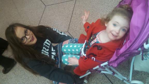
violet (the one on the right) is a human nemitz and should be avoided at all costs.
//////////////////////////////
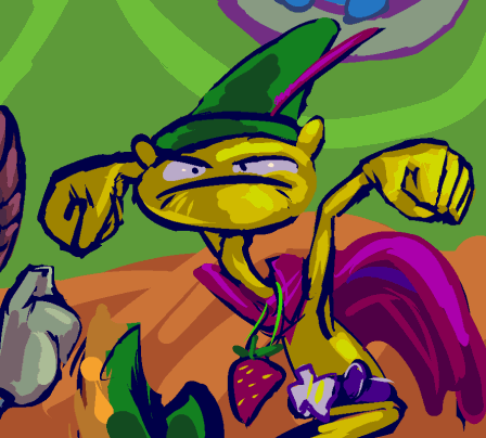
page 3-40 of that old thing. inexplicably squirb is one of the hardest yet characters to draw. and despite making its design deliberately stupid i don’t want to leave that creature behind once i finally get done with all these parking lot scenes. and the blue moron who yells out the window also amuses me more than the other creatures at points. But I am not going to turn this into a pathetic mitz-com that never goes anywhere. It might not go FAR but this will continue to go.
the pink-mustached gnome i apparently gave a full beard to in its first two panels but changed it to this in the third frame even though that was on the same page and same row even as the first two. This will probably not be important in the future or the past or the present.
Do not worry about when fruznit sleeps or has its own life, either. I considered placing another creature there but i like the idea that fruznit HAS no life, and just sits behind a desk reading awful magazines and not providing service all day. or maybe lope come in before at the start of the creature’s shift and it will be leaving shortly afterward. perhaps the shifts are irregular and not the same every day. perhaps i worry too much about things that do not matter! But I am not going to change it either so i certainly could be worrying more than this.
BUT with a front desk attendant who [is supposed to] keeps keys, does this mean lope’s apartment is actually a hotel room? I don’t know. somebody should have asked me that years ago, and so far still nobody has!
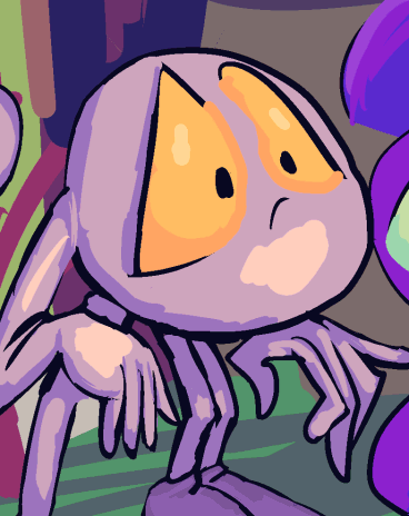
page 3-39, of the questionable comic strip. One of those pages whose construction caused me to question if I really have any business making comics, but it is almost all related to drawing the environments. At least there are more interesting colors on this page. Looking back, I generally can’t tell which older pages also made me feel that way, but comparing the dates between them is often alarming. The first time I drew the gnomes was seven years ago on a page which was only about half a day ago, “story”wise!
I must have made hundreds of character “designs” over the years, and many of them have appeared in pointless illustrations. so why is it that whenever i introduce a new character in the comic strip i end up having to figure out how it looks on that very page?
When trying to figure out what squirb looked like, my goal was to draw something that would make sense for elpse to want to beat it up. Hopefully I will think of a properly stupid thing to have hanging from its neck rather than a green gold medal, but for the moment it seems of minimal importance! The creature itself is yellow, and indeed most of my secondary characters end up being yellow, presumably since none of the primary ones are, but I do not always plan in advance for them to be.
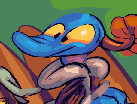
comic page 3-38 of that is here. As usual I expect to clean it more later.
This is the fastest I have gotten a new one out in quite some time, but of course hardly anything happens here! And worse, there may seem to be a bit of a time anomaly since nemitz seems to be very nearby on the previous page, yet is unseen by elpse on this one, but I did not explicitly indicate how far away nemitz had gone. But this will always be confusing, i fear, but I have been majorly confused by less excusable things than this in Tintin and even Garfield comics and people who hate those comics don’t over this.
amitz this page i realized that the building i have been drawing behind the fence has a largely different design (although still a bland rectangle) when i have drawn it visible from the “street.” as that design appears in the first printed book i wonder if i will make myself change the views of it here in section 3, prospective book 5 (or 6?) or just the one view of it in section 1 and hope that nobody who got one of the first printed books cares that much. hm i suppose i will go with whatever takes more work and provides less benefit.
the same section 1 view and also a section 3 view based on it show that building as being much too far from the fence for elpse’s second-biggest fan (after the dope) to have such a good view of the proceedings. unless it is actually a very large creature roughly twice the size of elpse. but i like the idea of it being meeply. also i implied it was afraid of having nemitz thrown at it ON THE VERY SAME PAGE. which means AT LEAST the blame for screwing this up is on the me from a few years ago who drew the buildings far apart AND then indicated they were actually pretty near each other. Although the blame for shifting the creature’s window considerably further from the back of the parking lot goes to the more recent me. But a meep like that may be friends with and have access to the apartments of other meeps. That blue character is very important because apart from its remarks i have thoroughly run out of background “gags” for this scenery.
Another matter: if I were a more vulgar person I could show lope “disposing” of the toilet paper note after eating all the muffins in the first section. But I do not like to think of anybody using toilet paper in that “world,” especially “clean” characters like lope. I think toilet paper (and toilets) are funny in appearance and name but not in their function. There is stuff wrong with me!
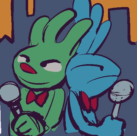
page 3-37 of the comic strip, one more where the layout changed way too many times to be time-efficient, and the backgrounds are increasingly turning into mush, even apart from the roads. But I have sorted through my mess of a script document where there was a considerable pileup of overlapping and redundant dialog setups so it should at least be relatively smooth going forward until the next disaster zone.