2-22-2025 oh borf was that ten days? too many dumb projects, i lose track of days.
there is a weird crisis in my house right now, someone else’s problem for once.
//////////////////////////////


They don’t make ’em like they used to
maybe you even think pit fighter makes it redundant oh ho ho ho
i realize it has been common for cleaning products to label themselves as “grease fighter” or “stain fighter” for a long time but I feel like this presentation would have neither been approved by the product company’s own research much less the primarily FOOD-selling store displaying it on shelves in the not terribly distant past. I suppose that is pre-emoji thinking; visual depictions of it have been on adhesive bandages for over six years by now. ALSO apparently one of the pictures on that site entry has been broken and not showing up for an equal length of time and my comment about “spot cleaning” beneath it totally incomprehensible, and nobody noticed despite this site actually having a few readers I hadn’t personally alienated back then because my comments have always been incomprehensible.

[more] Useless information! the “pit fighter” image is seemingly randomly mirrored depending on the whim of its user/no reason. so i wondered: which version is forwards? Assuming the money hands weren’t digitally inserted, the more common orientation seems to show BACKWARDS vintage $20 bills!

It is hard to tell since the picture is somewhat blurry, US currency tends to be symmetrical in layout and a backwards 2 can resemble a 5, or even itself when the slanted part is obscured. However only $20 units have the column/scroll effect on the left and right.
Proving the foreground hands are part of the original photograph rather than added and possibly cloned later is more complicated since Pit Fighter is so cheap that it can be difficult to believe the set director had TWO handfuls of twenties lying around

I forgot I made this stupid rom hack and consequently assumed I had no kid icarus screenshots whatsoever rather than pictures from this one and was about to look up a youtube video from which to take a picture of this text. It still looks better than most ports of pit fighter. I have a stupid life.
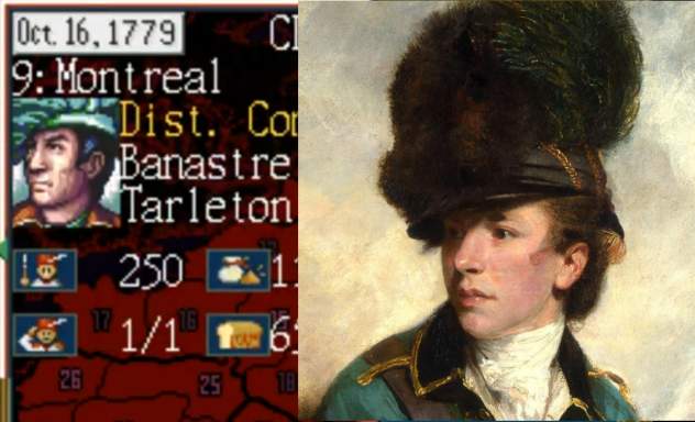
in its 1993 release Liberty or Death, the computer game company Koei recognized that preserving the essence of Banastre Tarleton’s stupid hat was a crucial priority, above even getting his nose and eyebrows correct.
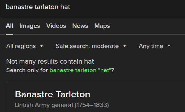
Why is this no longer deemed important three decades later? What were our founding fathers and uncovering uncles fighting for if not freedom from foolish haberdashery? I bet kids these days aren’t even taught that Benedict Arnold switched sides exclusively so he could wear a sillier uniform. I also wasn’t taught that but I was in special education so I wasn’t taught anything else either

apart from “the length of this bus puts you at the bottom of even the dumbest and wimpiest of adult baby social hierarchies for the rest of your life,” which is what made it so important for me to determine the facts on my own.
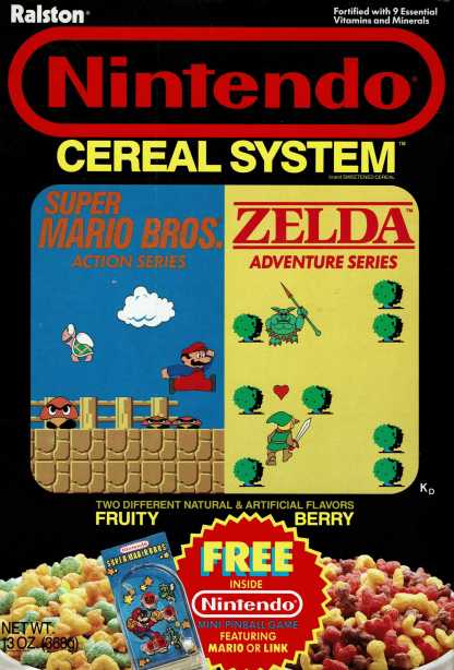
I got/was allowed to get this cereal one time. I remember not being able to tell the difference between the two sides. Even description-wise I am not totally certain how berry isn’t fruity. Maybe it is just describing mario’s pose.

What I did not know until now was that it had multiple box designs. I wonder what is going on with the weird KICKING Link figure which Ralston kept recycling; it shows much less awareness of what link looks like in-game, or in anywhere, than the first box’s. The geru serpent and scenery in the zelda 2 boxes are accurate, and presumably weren’t part of the original plan, so why didn’t they draw a new Link, too?
only one of the marios is recycled.
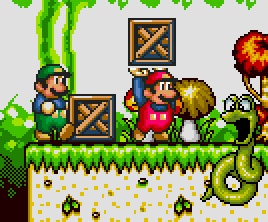
i notice the marios somewhat resemble the ones from the “super mario world” bootleg of a bootleg sega genesis “super mario world,” possibly due to their consistent lack of necks
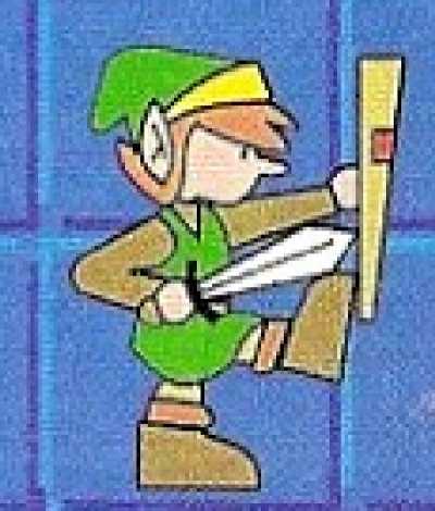
There isn’t anything to retroactively explain this link, though. In breath of the wild he can do all sorts of things he couldn’t in the past but kicking still isn’t among them. Is he auditioning to be a rockette? He would never pass the rigorous auditions, isn’t tall enough anyway, and he’d probably get better pay continuing to scavenge for rupees people dropped in tall grass. Maybe he accidentally glued his boot to his shield. Which would be pretty pathetic. I assume considering that and weeping is what Tears of the Kingdom is about.
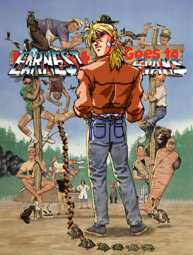
I am fascinated by Earnest Evans. I have been on the internet so long that I have developed aversions to other people’s hive mentality about what “retro” games are “good” and “not good” and worth hoarding the original ephemera for and trying to impress your grandchildren with.
or even simply stating awareness of an old game as a point of your religion,

and it wears on me beyond reason.
Evans is hilarious to me, but since I never knew of it before I saw internet folk mocking it, I have worried that me thinking it was funny was inorganic to me and hypocritical, since I find their cycles of praise and mockery equivalent to what the previous generation of media did with the likes of britney spears.
However basic taste isn’t necessarily any individual’s fault. And also the judgement toward me tends to not be as harsh as my judgement toward others or myself, because while a lot of people think dumb things are important I generally think different dumb things are important.
[!].gif)
However I refreshed myself with it and despite its interesting programming it still feels fairly irredeemable. Even save state cheating I apparently couldn’t get anywhere years ago, and trying it now* I still couldn’t.
*in september
but the important thing is I had an excuse to post that image I started with and also this stupid gif, since initially I made it after dwelling on my declaration of evans as “horrible” in response to arguably more worthless content on the twittor website. I give far too much effort to the crafting of remarks and imagery that nobody will see on there. I would much rather nobody see it here, where I can actually find it later.

And where I don’t risk losing followers for saying “obsequious mario fans aren’t just scum but also extremely boring” because the I don’t have followers here, and in fact the concept doesn’t even exist. But the real question, is it possible to be an obsequious fan of anything without also being scum and boring? probably not but that is what I get videos shoved at me about, generally. I should be glad their idiot fandom economy is largely created by them rather than the entirely corporate papacy that exploits obsequious american football fans or the crypto currency criminal pseudo-psience-pselling aspiring murderers who exploit obsequious mixed martial arts fans, but I don’t know any of them on twitter now that my brother is banned again. He also moved into my basement yesterday so I suppose I will know if he sees this.
oh beans
Worst Selling Video Games volume 8
featuring fantastic items that I didn’t think were good enough for previous entries, such as
dinette set willy
peter crack habit
dynamite dukakis
Baldur’s gated community
the winding of a clock
wing orderer
blister mister
resident emu
alex kidd in rehab
deadly howards
wild armpits
dino dini’s teeny dinosaur diner
ultima quest of the salad bar
chester cheetah too mutilated to be recognizable
mavis beacon lettuce and tomato
shining the holyoke massachussetts
the hypertension heist
Snoop Punky Skunk
kid incarcerated
battle of a limpet
rub-a-dub-dub-terrania
pirates of duck water
metal ear
god of chores
red dead loaf of bread
beyond ore ida
renegatorade
befrienders of the crown
knights of the clown
Cheerios of the Lance
backgammon arkham asylum
| Huggy Bear and the Ho Gang Bang
Antonio Fargas is Missing Mario Vargas Llosa’s Time Machine One Maywether and his Floyd pie by the sorbet kirby’s well-trimmed yard pizza tower can’tra wobble wagon |
 |
part 1
part 2
part 3
part 4
part 5
part 6
part 7 wasn’t that long ago!
can it be mere coincidence that Tucky Carlson was terminated from Fox News only days after I linked him to mortimewde stapleton meepmire? Yes, but I shall pretend otherwise until I can get meepmire somehow terminated from existence.
hey look it’s
Worst Selling Video Games volume 7
bravely default on your mortgage
a boy and his job
bengazi warriors
david crane’s amazing dentist
stop & shop’n music
space partitioners
super smash bronchitis
profoundly mediocre giana sisters
the guardian nemitz
shining whores
phonograph recca
schtickmaster
charlie cristalis
marvel super sneeros
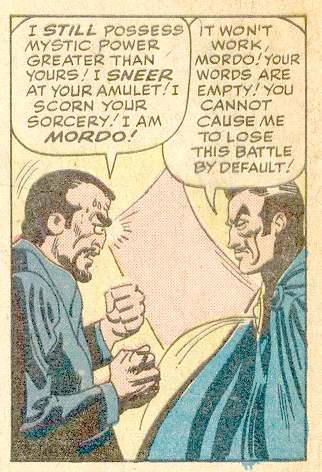
fantastic dentures of dizzy
bad dudes vs good dudes
papal mario
super mario land 2: six geese-a-laying
Hey Punk! Are you MARK A RUFFALO
uncharted wafers
road trash
nobunaga’s air conditioner
argylevania 2: simon’s sweatervest
catch it and spank
lode punner
kuros: delusions of grandeur
jazz jack
chortle kombat
simshanty
shitty connection
aghast ninja
nincompoop gaiden
shinobee 52
revolution eggs
arby’s baseball
yie arby’s kungfood
Rygarby’s
Jackie Chan’s Action Tomfoolery
sylvan failure
desert strike: return to the picket line
blake scab: planet strikebreaker
Bubblo the Relaxobath
bubble bible
Chrono Sauce
part 1
part 2
part 3
part 4
part 5
part 6 I can’t believe I used Five Weekends at Bernie’s already
part 8 comes after this one!
Worst Selling Video Games part 6
Yoshi’s Snory
Paul of Duty
Slop ‘n Twinpee
Unpeel Tournament
Mutual Followknight
Low Cheese Man
Pluto Nash TV
Double Chuckwagon
The Bitcher
Sandusktiny
Fontra: Hard Kern
Legacy of the Gizzard
I can’t believe i didn’t use legacy of the gizzard before
Policesnots
Gunstar Hearing Aids
Mario Divorpg: Legend of the Seven Year Itch
Paper Mario: The Thousand Island Dressing
Monty on the Bus
Saturday Night Graham Crackers
Demon’s Crest Toothpaste
Liver City Rancid
Five Weekends at Bernie’s
Fetal Fury
Caillou: Mark of the Worst
Afterbirther
Doki Doki Pandemic
Sonic and Mario not at the Olympic Games that Were Cancelled due to Covid and besides just LOOK at Mario no chance he qualified
Arby’s Dreamland
Quilty Gear
Ernest goes to Evans
Crash Team Irrigating
Unfair Fortress
Starfox News
Gun Snac
Great Giana Blisters
A Corn and His Cob
Jungle 2 Jungle Strike
Moraff’s Morejong-un
Simsettee
Die By The Sod
Adventures of Lolowell Weicker
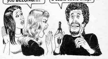
I have far too many of these
part 1
part 2
part 3
part 4
part 5 I can’t believe I used “turriduccan” before
part 7 comes after this one
part 8 comes even afterer this one
worst selling video games part 5
part 1
part 2
part 3
part 4
Hasslevania
Phantasy Starve
Lentil Gear
Cruel Spot
Turtles in Grime
Sash TV
Sucking Crew
Leafal Inforesters
Margaret Snatcher
Recliner Dash
The Lost Vicodin
Darrow the Aclubat
Chakan: The Piano Man
Breathalyzer of the Wild
Turok Dinosaur Stumper
League of Ledgers
Chunderpail
Mario Quaker
Felt-a-nun
Epic Hickey
Ruffle Knight
Twattoon
Overwatched
Tandy Crush
Call of Snooty
Yoshi’s Crackhead World
Eldercare Scrolls: Daggerfallen and I Can’t Get Up
Pants vs Zombies
Super Floors ‘n Grouts
Turriduckan
Plaidical Rex
Mega Man Aches
Sonic and the Black Lung
Kirk Fogger
Leggo my Eggo Star Wars
Putt Putt goes to the Loo
Forgotten Wurst
Chrono Floss
Kingdom Ozarks
Bart Vs. the Space Heater
Comma and Conquer
Lemons 2: The Limes
No Man’s Pie
Tales of Sweater Vestiny
Resident Emo Phillips
Stunt Racism FX
Defender of the Jim Crown
Clean Your Room: Total Chore
Lowell Name: Weicker

why did the people who did graphics for 8 bit games think this looked good? it didn’t!
have you ever seen a drawing by a small child, where most of the background is white but then suddenly there is a strip of blue across the top? this reminds me of that. but i excuse that. to them, the sky is blue, and the sky is UP. anything beneath that varies.
But an adult getting paid shouldn’t think like that. Hey, the sky is not suddenly weird and different after you go up a certain height! the fact that they almost always happen right at the top of the screen makes them much worse. It seems like that is the end of the universe. most likely this is only done because that is the only way to ensure, in games with only one background layer, that the lines never collide with background objects that need to have consistently colored backdrops. Usually the player character can’t get all the way to the top of the screen so there wouldn’t be objects up there. But that doesn’t mean it looks GOOD!
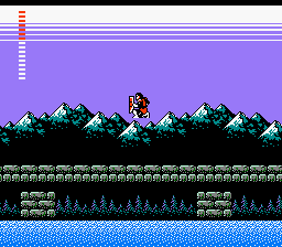
Konami’s castlevania 2, my first encounter with lines. they contribute to the creepy atmosphere, I would say beyond anything else. The secondary title is “Dracula’s Curse” and I consider the mysterious appearance of the lines to be the primary indication of the curse.
It is a more extreme stylistic liberty than anything else in this game. castlevania 2 is supposed to be totally serious, and that effect is so strange. Thankfully Simon Belmont is never at risk of touching the lines. Then he would truly have no hope.
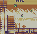
Aw naw! In Castlevania: the Adventure, for gameboy, Christopher Belmont can indeed TOUCH the lines, and live! However his sluggish pace and awful controls may be indicative of lines-poisoning.
from this page
“the iconic two-color sky gradient. Just wonderful.”
the only definitive evidence I can find of somebody acknowledging it is sedate and positive. Where is the outrage?
Yes sure that guy makes almost three thousand dollars on patreon and i do less than fifty but that is because i am saying what others dare not.
Does it look like a gradient on certain televisions? do the light and dark, at varying levels, blend to look more like the blocks common in early snes games? that was never my perception. It was always just LINES to me.
The fact that nobody else noticed the lines or mentioned how creepy they were also amplified my fear of them. When only YOU are scared of something, that makes it scarier, since you get no sympathy or protection.
Lines were even on the konami BOXes of this period. In fact I could only hold one of these boxes in such a way as to not touch the lines. Maybe the effect was chosen to give the label art a feeling of urgency and dread.

I presume jack gets jumped by werewolves if he takes too long to putt.
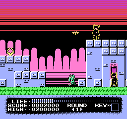
monster party had some of the most egregious lines of any video game, even if they are all seen before the second level. You would need to torture yourself to get to the second. Of the three credited graphic artists, mobygames (which is ALWAYS right) suggests only one worked again, Taka Saito, who next toiled on “The Adventures of Gilligan’s Island” and THEN stopped. while the adventures of gilligan’s island lacks the lines, it also lacks any adventures on the part of the island.
I first encountered Monster Party when a rare instance of child-hud era friend whose house I visited regularly had rented the game and all I noticed or remembered about it was the creepy lines, the unintentionally (presumably) creepy background music and how impossible control it looked. I do not recall attempting to play it or being offered the option; it may just have been present incidentally. This was the same friend with whom I co-created Joey and Ian Gettin’ Dead, about our two younger brothers, and it is entirely possible that Joey was using the game and and only gettin’ dead in the context of the game’s terrible controls and the low threshold of abuse that corresponds with the onset of what is commonly considered “death” in video games.
I was quite surprised years later to see monster party mentioned on the internet with regard to how zany it was and how heavily censored it was from the japanese version. I couldn’t believe people had really gotten past the first level, much less willingly sought out alternate versions of the game in which to do that again, and had anything to say about the whole thing unrelated to the lines.
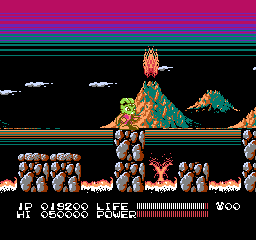
this is similar to monster party’s; gratuitous and coming out of black, but i don’t mind it as much here, possibly since this game is actually fun and has good music.

megaman 3 has this intermission screen but it is balanced out by having lines going the opposite direction so the effect seems more cylindrical and not implying that they are representative of the sky.
and so after 3 games safe comes megaman 4 aka megadope, a terrible graphic hack of megaman 4 that I made for no reason at a time of my life when I did a lot of things for no reason, unlike today.
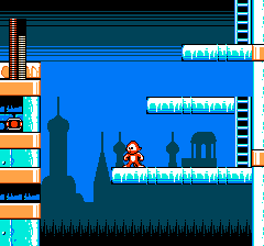
the lines are so intense that even megadope won’t smile at them.
Bear in mind that on an actual 1970s-80s television screen wouldn’t necessarily be able to see to the actual borders of the display. That generous area of uniform color at the top in a lot of these here might be in practice much smaller.
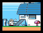
megaman 5, dr right knows something terrible is about to happen since LINES have attacked his home. although these lines appear in the middle of the SCREEN, the introduction sequence crops the view to just the middle of the screen and the lines are still at the edge of the visible zone! And the “generous” area I alluded to is not allocated here because it is not meant to be seen!
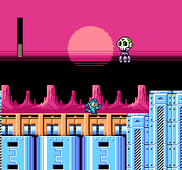
megaman 6 brings back the lines yet again but finally puts them in the middle of the viewing area where i can handle them. it still doesn’t make SENSE since the only things that should be black in front of it would be scenery at the horizon which the sun would be setting “behind,” which i suppose would be the rocks but they are separate from and beneath whatever is black here.
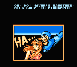
this isn’t a megaman game at all, it is an unlicensed chinese game about a little guy who throws boomerangs that they pretended was megaman to try and trick people. in which event i would ask why not just use the full megaman game if you undervalue your own work so much but whatever the case, there are those lines.
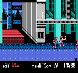
actually I like the one in double dragon since it simulates a perspective and uses its whole, limited space. only by chance does it go to the top of the screen.
double dragon uses it in all 3 nes games, but each example is unique and artistically done. Even double dragon 3 which is terrible in every way. other games will reuse the lines across large spaces in a manner similar to each other.
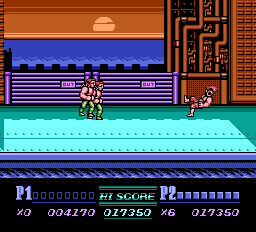
not as interesting but at least the presence of the sun implies a reason why the sky color would shift considerably in a small area.
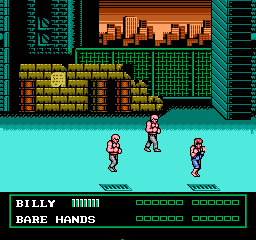
however these look like apocalypse lines since they go into black. the sky above a sunset is not black!
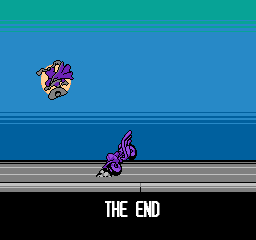
darkwing duck! ending. These at least are neutrally placed and have more than two colors.
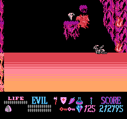
not on the sky, but needlessly near a screen border. as a small child i did not understand what this weird substance was that kuros could walk on but be damaged by. but it didn’t matter since you have unlimited “lives” in this game. as a slightly less small child i realized it was lines and became more afraid of touching them than the meager damage penalty could bring about.
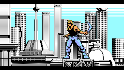
Power Blade! It of course gains its energy through power lines but THAT is not what i meant! Also the lines blatantly go behind a non-rectangular object which means they could have been placed further down in the image so they looked less creepy.
a brief collection of games that use it more neutrally
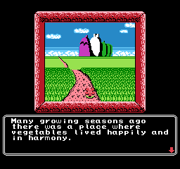
princess tomato’s very first scene. fairly tame! really not threatening at all, but I sure REMEMBERED this was here for years after seeing a picture in, again, nintendo power magazine. I remember thinking it was a racing game at first.
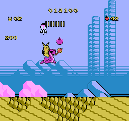
adventure island 2 has lines going UP. when i saw pictures of this in nintendo power magazine it bothered me but i can handle it now
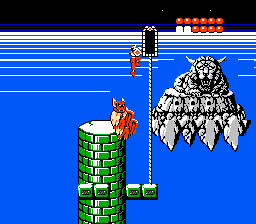
rygar falls somewhere in the middle because the lines are scary, and it goes into space, and I was terrified of this screen, but I was creeped out by the weird face foremost. I didn’t even realize it had a body. I would see it when i closed my eyes. I was SCARED of that thing. As for the lines they go into white, and then abruptly to black, and it is just strange.
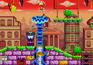
dynamite headdy uses lines extensively, but they are often dithered which makes for a less harsh effect. Even when they aren’t, there is lots of other stuff going on and there are always intermediate colors. the clouds being larger above the lines creates a mild perspective effect which make the lines seem more like curving of the atmosphere above us in the distance than the end of the world immediately in front of us.

treasure land adventure also uses many lines but that is far from the only unsettling thing going on
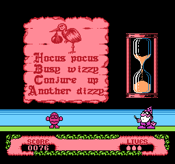
fantastic dizzy. terrible game. don’t believe british 1980s computer nerds. they are sick. everything in the game maims dizzy, you only get 3 “lives” in which to win a game as long king’s quest 5 with as fragile a hero without saves or even intermediate goals to use as personal concepts of progress. these creepy lines, mercifully on this slide puzzle screen only, are about the only thing that WON’T destroy dizzy.
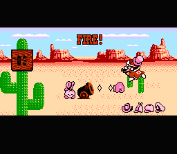
right near the edge! why? and this is a game that otherwise uses its colors really well to add a lot of detail to a fairly simplistic world.
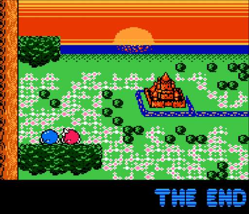
adventures of lolo 3, also from the Hal Laboratory company. They used their mad science to devise a way to put the sun BEHIND the lines. It actually comes down from the top of the screen and the lines never change where the brightest point is nor move aside to let the sun in front. The neat effect of the water starting to reflect the sun as it appears closer is meaningless because the lines are so incorrigible. They really have to go.
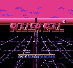
Yet another from Hal, Rollerball. This one is really odd in that the upper edge of the lines leads to a color that matches one of the interior colors, so possibly this is supposed to be the edge of the horizon, yet it couldn’t be because the vanishing point is about midway up the second R in “roller.” The only conclusion to be made is what I have been saying all this while, lines are bad news.
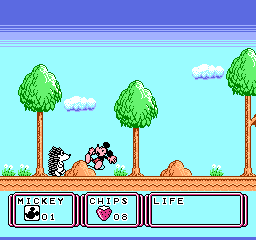
this is the very first stage. unlike monster party, this is supposed to seem welcoming. there are animals out to destroy mickey mouse but you aren’t supposed to be afraid of them. not yet anyway.
this game was localized as “Kid Klown in Night Mayor World” since it was published by Kemko and Capcom had exclusive rights to release disney video games internationally at the time.
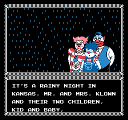
there is something deeply wrong when you have a story about a kid who is a klown, with a k, from a FAMILY of capital k-klowns and i still find horizontal bands of dark blue more upsetting.
Kid Klown is also noteworthy for having loads and loads of intermission text which doesn’t explain any of the things that need explaining.
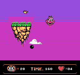
a very capable alternative to lines oddly enough occurs in a bootleg felix the cat game. Which is not to say this game is good or that there aren’t better things that could be done with all this space.
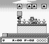
mickey mouse again! and not even the same developer. Mickey’s DANGEROUS Chase by capcom. Which I also only know about from nintendo power
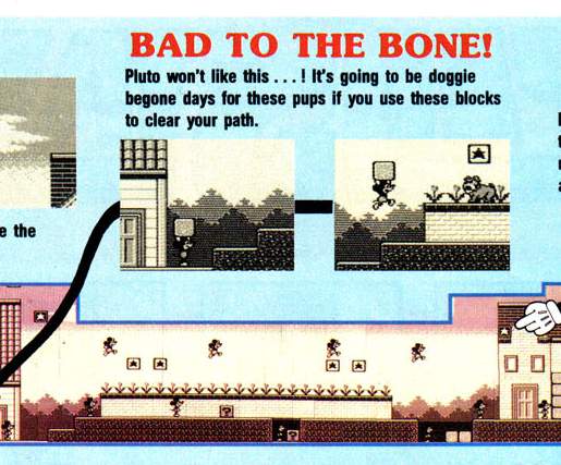
i couldn’t figure out why that effect was in some screen shots but not others. now i see: the screen scrolls up to gradually reveal it as you progress, which is unsettling in its own way. even though these aren’t LINES, the color difference is high and this really doesn’t belong here. the presence of the word DANGEROUS in the title (and apparently only in the US release) and the blood-like red tint may also have had subconscious effects on me.
also unsettling, nintendo gives full maps for the first, easiest, self-explanatory levels and wimpy paragraphs for stages you might actually need help in.
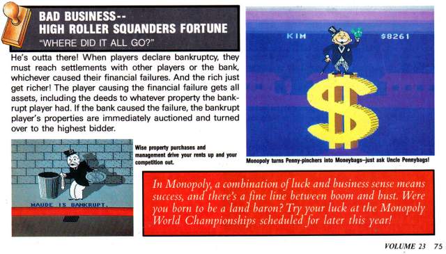
scrubbo in the same issue, this i totally forgot about. Again not lines but creepy with the same intention. It looks like the monopoly guy is about to be abducted by aliens or crushed by a meteorite, nevermind the trauma caused to anybody in those barely visible purple houses in the distance who would see an enormous self-illuminating BACKWARDS DOLLAR SIGN. Also Nintendo Power gave six pages of coverage to this.
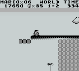
this can’t be too far a drop since there is a little tree down there. surely it would be SAFER to go that way!
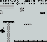
but the lines abruptly end so they aren’t real, right?
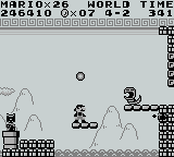
I am uncertain if these are supposed to be lines with the same intention. while this is indicated to be outside, there is a pattern ABOVE the lines.
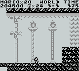
also an earlier level uses the exact same 8×8 pixel tile as something like a support beam for a fancy place that is plainly meant to be INSIDE. Lines have no power inside.
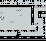
oh no more creepy lines, undeniable this time, going into BLACK, consuming the clouds, and i have to TOUCH them! Or Mario does. I sure am glad I am not mario.
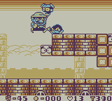
Always the ne’erdowell, Wario tortures a creature by making it touch the lines.
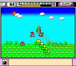
In the demonstation mode of mario paint you can see somebody CREATING the lines! Somebody making the deliberate decision to add this. And that may be the only super nintendo game i have seen it in, at least as far as the creepy top-of-screen usage goes
The mario paint example is curious because it shows the sun amidst darkening. would the sun not cause a lightening?
a number of staff was shared between mario paint and super mario land, super mario land and wario land, but nobody was on all three games and I would be reluctant to point at any specific person for this.
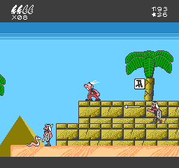
the first two game worlds do an admirable job of recreating the sort of skies that uderzo put in actual asterix comics then suddenly in egypt it gets this hokey effect and bright turning abruptly to dark. instead of creating a feeling of vastness it is an eerie claustrophobia. and look at all that grey space at the bottom edge of the screen wasted! if they put that ABOVE the lines and made it the darker blue it would… STILL be too dark but it wouldn’t be as much of that weird edge effect. They also could have opted for a more subtle color changing effect across a larger area.
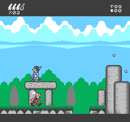
here earlier in the same game, that is actually pleasant and one of few things in the game to evoke the source material and not just look like a quick cheap crummy licensed video game created by a company chosen because it was European and no other reason (“Bit Managers” in this case). Ironically it is a possibility that a similar cloud formation was the original visual inspiration for the lines, which i say based on having seen even more line-like clouds and wondering if those were the inspiration for lines.
I will say that a co-founder of the Bit Managers company, Alberto Gonzalez, did ambitious and well-programmed music on the better but still horribly misguided super nes game “Asterix and Obelix” that they also developed. He was uninvolved with the first Super NES Asterix game which seems to be based on the same design document as the nes one with additional questionable decisions but at least lacks the lines.
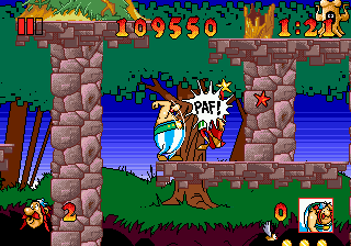
In the interest of making this more confusing, here is the superior if still impossible Asterix and The Great Rescue on the Sega Genesis, developed by Core Design, better known to people other than me for making the Tomb Raider games. This uses sky-lines but in a relatively innocuous manner. Don’t tell anybody I rented this in 1992-3ish and couldn’t get past the second stage because I didn’t know you could make little platforms appear for jumping on.
It also has better music than a crummy licensed Europe game deserves, and I can’t think why the followup Asterix and the Power of the Gods is full of dinkity synthesized awkwardly looping covers of public domain cliche “classical” dentist office music beyond that somebody found out they gave a crummy licensed Europe game better music than it deserved. That apparently is the power of the gods.
lines in real life:

chocoteague virginia, the shadow on this boat railing

mystic connecticut: look at this orange arrow on a sign

deviantart user domobot posted this image. similar to mario paint there is a sun but the light part is NOT radiating out from it! Also the creature appears to be wearing the legs-sticking-out-of-the-ground from the Monster Party screenshot
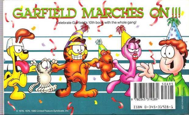
garfield makes it big, back cover. This is also the same book that featured the inexplicable traumatic head-first dropping garfield horrifying cuckoo clock reaction. (the linked page describes another instance of it happening and then briefly mentions garfield) Garfield is suffering from a similar ailment to the batman bee, in which oversized eyes enter into space conflicts and the artist doesn’t care, resulting in sketchy facial expressions. Arlene can wear the hat properly. However Arlene also suffers from shoddy tsereotype design traits and i presume the hat doesn’t want to mess with them. Also troubling and artist-not-caring-related here is that most of Jon’s body is missing. The other characters have their feet below where Jon cuts off so it isn’t like they reached the edge of the document space. I presume his body was sliced in half by the bar code sticker and the blue substance is actually his alien body matter spilling out and creating the lines as a punishment against humanity, until crummy merchandise and eventual braindead hipster memery could grow into adulthood to avenge him.
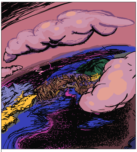
I found this in another terrible comic strip, thankfully i cannot remember which but whoever is responsible for it ought to be in jail.
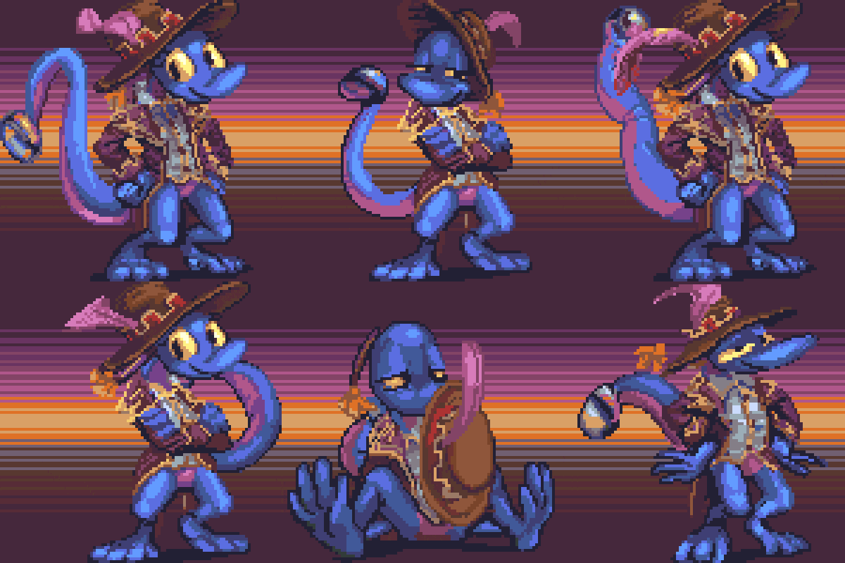
there may be many people who need to be in jail but i would at this time request separate jails.
At last, the non-awaited fourth installment to “Worst Selling Video Games.” This is, incidentally, my worst selling recurring feature.
Kirby’s Dream Lard
Space Hairier
Tim Meadow of Honor
Arrrgh-Type
Sadius
Remembered Worlds
Resident Weeble
Pocket Protector Knight Adventures
Ristard
Biosmock
Havest Moron
Super Nap Brothers Snawr
Embrionic Commando
Megamap
Tacky Wheels
Magic of Cher
Kilnation Instinct Breakfast
Prince of Purses
Street Fighter Tuba
Grand Theft Auto on Ice City
Nightquack
Tomb Waiter
Tears for Fears of War
No One Lisps Forever
Capital Gains Taxanadu
Knuckles Arthritix
Earthbrown
Sim Gritty
Raid on Bumbeling Bee
Tetanustris
Shiren the Wonderer
Whining in the Darkness
Landsquawker
Secretion of Mana
Skyrofoamrim
King’s Kvetch
Contrabass Effect
Blaster Mustard
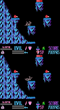
I should not openly disparage the graphics in early Rare-brand games because some of my earliest bad comics were about guys in armor standing on icicle covered platforms with diamonds floating around them who only didn’t look like Kuros
of Wizards and Warriors because I was incapable of drawing them that way. Also, the sequel Iron Sword heavily influenced how I drew clouds for years and some of that is probably still evident.
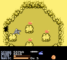
It also helped me get through Catholic school because it affirmed, for the time being, my hope that there was fried chicken in heaven.
I can say about Ironsword, however, that it was made by the Plok people and not the Battletoad people so it might not even count.
Also, I consider my ability to complete this game on a real nintendo machine one of my few decent video game accomplishments, and this was before I had useful facks from the internet
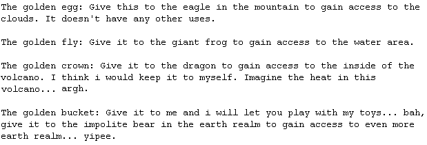
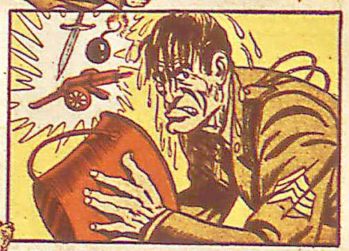
I shouldn’t have to make such a choice!

Well sometimes that’s just the way it goes, sonny mah boy!
On the subject of Don K. Kong…
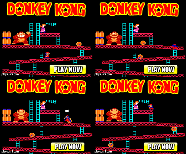
Guess what happens next:
A: D. Kong grabs Pauline and climbs to the next stage, like in the real game
B: The ad loops over from the beginning
3: Mario installs some pipes so that the building can be finished since he’s supposed to be a plumber or something, right?
IV:
The correct answer is W:

Donkey kong jumps in the air, spins 180 degrees and FALLS for NO REASON. Pauline continues to call for help. Kong remains emotionless despite the massive brain trauma certain to occur once he lands. I wouldn’t even mind this so much if Kong fell while upright or adopted an expression that acknowledged how horrible it is to suddenly be falling and rotated for NO REASON.

The vertical version is even worse because the graphic dork put as much effort into formatting the layout as you’d expect, so you don’t even see Mario reach his destination, and thus there’s even less than no reason. He scampers beyond the image boundary and a few seconds later kong falls for ever no-er reason than before! The amount of reason that there is cannot exist in physical space and requires hypothetical mathematics to express.
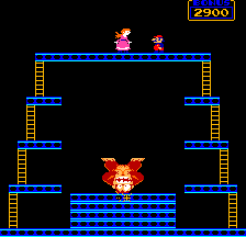
The proper D. Kong DOES inexplicably fall on his head, but only after the platform he’s standing on collapses and in any event we get to see that he acts surprised when this happens. I’d like to imagine that the kong in the ad jumped off deliberately, and he’s diving into a pool of pudding just below the image edge that was prepared specifically for such an occasion, but that possibility only occurred to me now and I don’t presume that’s what the ad designer had in mind.
This sort of thing has always bothered me. Like when
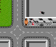
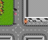
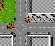
Roger Rabbit in the NES game gets stolen by an object meant to resemble a bird and then the detective guy just DROPS DEAD because he failed in whatever his task was.
The filename of the picture I started this with is kongarrrrrrrrrrrrrrgh.png I wondered why I insisted on putting an H at the end, the old Garfield way of spelling arrrgh, which then reminded me of how the Roger Rabbit game reminded me of a specific garfield cartoon.
I was TERRIFIED of this. I could not look at this page. I had no friends so I would re-read those little books all the time, memorized which strips came before this one and I’d worry when I saw them, not sure just how close I was. I would have to only look at the left side of the page and if I saw that clock oh oh oh! (It’s magic)
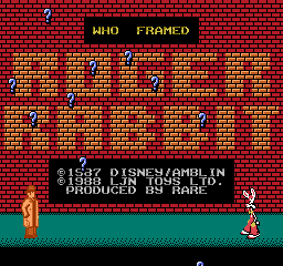
Oh, here’s the problem. The Roger Rabbit game was developed by the Battletoads people before they hired the person who could draw nice. I talk a mean trash about Battle Toads but it is one of very few Rare games I’ve seen that I consider to have any legitimate aesthetic appeal. This includes the Battle Toad sequels and Kong Country and actually I haven’t seen most of their games. But
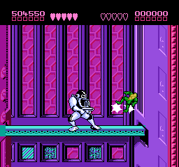
the battletoads, featuring the most superfluous life bar since Rolling Thunder.
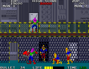
And SPEAKING of stuff happening for no reason
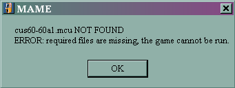
MAME DEMANDS TRIBUTE. I hadn’t used it in a while so it decided that I needed to pay it in new roms for old games that used to work.
Also, in trying to get pictures of the rabbit kidnapping; I didn’t realize the bird only starts chasing you down after a few minutes, so I had to also be reminded that there is an 8-bit police siren (that’s a .wav, watch out) that sounds anytime you’re outside of a building scene for longer than a few seconds, after which some cartoon rats appear and make you lose.
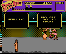
This is scary. If the rats just appeared it wouldn’t be so bad, but the noise announcing their presence speaks to my psychological errors. I have a deep fear of being arrested for a crime I committed accidentally or without realizing was a crime.

Such as standing really close to the highway. (although I was merely searched and escorted back to the road this time) Oops, you were in the wrong place! You have to go to jail forever.
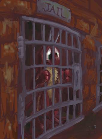
Which I meant to imply was a bad thing, even if this is a poor example.
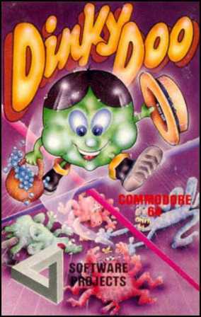
Which is pretty good for the 1980s.
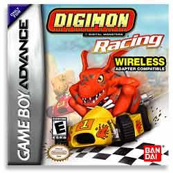
Or ever.
Hello there. Busy busy busy.
============================
Don’t read this, but…
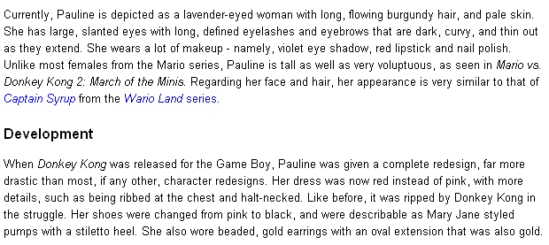
Is there something wrong with me for thinking the Super Mario Wiki’s description of Pauline, from Donkey Kong, ‘s physical appearance is really creepy? The one for Princess Toadstool is similarly alarming, but there’s so much more silly rubbish on that page prior to that point you’d be unlikely to come across it unless you were looking for it, for comparison purposes. I can’t even get past the “contents” section. In my case, I had merely taken to wondering what Nintendo had done with D Kong’s preferred kidnap victim since the first game, since I know Nintendo loves to reuse old characters

(except for them), and before I knew what I was reading I had found that. With the princess, her being one of the primary Mario series characters, and this being the internet, it is not surprising that over the years someone with spare wiki-writing time would have developed a weird obsession (in contrast, I failed even to notice that her hair color changed between games). I didn’t think anyone could possibly care about Pauline. The writers are content to state that Mario himself is “a short, plump man.” If I was the sort who got into the businesses of others who have business, I would take it upon myself to edit that page to say something like
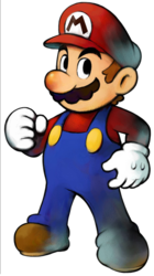
Mario is a rotund Italian American. He is approximately three feet tall but can grow to twice this by ingesting a magic mushroom. His mustache is composed of a brown arc with 6 humps along the convex side. He appears to be turning to stone. He often has four fingers on each hand but sometimes has five. The buttons on his overalls serve no apparent function.
I have a follow-up to this but it changes the subject entirely and I have a headache. Wondering what color nightshirt Mario’s father wears isn’t helping. Actually the more I think about it the more I think this information is presented in such a manner entirely as a joke. However, “the more I think about it” is further than that sentence should have gotten because I really should not be thinking about this.

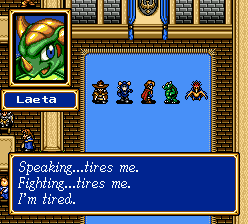
Maybe if you’d shut your mouth once in a while less people would try to fight you and then you wouldn’t be tired, dumb turtle.
\/\/\/\/\/\/\/\/\/\/\/\/\/\/\/\/\/\/\/\/
If you would like to “register” at this site for the purpose of posting comments and potential other yet highly unlikely features in the future, you may do so at this link.
Howdy.
Non-registered persons may still post as freely as before. I forgot to mention that. The only benefit to going through with such a hassle seems to be the ability to post images in comments. I think. That still might not work.
You may “log out” and try to forget it ever happened at this one.
Anti-howdy.
I have not tested this much (I didn’t even change the default messages) and for all I know you may end up with the power to delete the whole site, so you can’t claim it’s not worth a try. Why not log back in?
Howdy II: The Demon Darkness
\/\/\/\/\/\/\/\/\/\/\/\/\/\/\/\/\/\/\/\/

I just realized I placed the text “THE ADVENTURES OF BAYOU DIZZY!” in the opening to the last comment I wrote. It was, in actuality, a separate note to myself observing the similarities between two different NES game’s unnecessary game start voice samples. A note which I happened to accidentally copy along with the intended, unrelated comment text simply because I had typed them consecutively and the proper comment had a lot of line skips in it already and I was weak from rereading it / not being able to fix it.
As most of my notes, excepting those I show to others, amount to nothing and are quickly forgotten about, often not being read over but once before I add new notes above them in my note file, I didn’t notice that bayou dizzy had gone missing. How I additionally did not notice the curiosity hovering near the top of my web-site in all capital letters, for two days, it no doubt in search of the attention my notes are so often deprived, is rather typical of the sort of thing that goes on around here.
Although I am now fully capable of correcting the error in the comment, it seems needless to do so at this point, and doubtlessly I will be astounded anew by it at some point in the future when I come across it again in search of something else that I failed to keep track of the position of.
I felt suddenly inspired to resume my old experiments with rising from graves but when I could not locate the mixes I had made with the America Online voice I was quickly demotivated. That may be for the best. Similarly on the eluse are the English accented samples that came with the AOL 2.5 “international (yet still America) edition” software that was inexplicably included with one of my previous computers.
Huh?
Hwah?
Evidently I have [got] post.

You can go now.
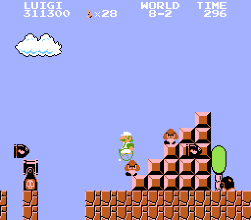
On the subject of Super Mario Brothers and invalids, in that thing which I wrote yesterday and not two years ago, I thought I would treat you to my favorite retarded rom-hack of that game, Super Wheelchair Mario. Not even brothers, just [Super] Wheelchair Mario. That Luigi is also available is an added bonus. Unlike the version I’ve had for years, which would only run in Nestical, because that’s the best, classiest emulator of all the times, I copied the changed graphics into a closer-to-functioning rom and passed the amazing on to you. It seems appropriate that a game about a guy in a wheelchair needs special assistance to be more accessible. I would commit a disservice to show numerous pictures of it with my special witty commentary when the game itself can be downloaded, played, and forgotten about in fifty-seven seconds.
Like so. Of course it’s zipped; Do you think I am made of kilobytes?!
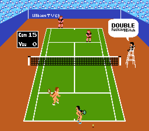
Another of my favorites, though I don’t find it nearly as profound, is “Lesbian Tennis,” in which the women tennis players have their clothing drawn off, with large black pixel rectangles about their nipply and crotchal regions. See, you know they’re lesbians because they’re naked! It reminds me of a story Weekly World News printed maybe about 1997 (I actually have a stack of the things, never having thrown one out, but I fear to look through them (and not just because they themselves are beneath a stack of turn-of-the-century MAD magazines)) about a gay cow-boy. How can you tell he’s gay? Because he rides a horse while just wearing underwear, and, to a lesser extent, from his mustache.
Regarding the famous Super Nakio, he HAS to be naked. It’s part of his name. Naked is all he knows. He is impervious to clothing. Quite finkly, it would disgrace his family heritage were he to not be naked.
As an unfortunate post-script to this thing I wrote today and not one year and 364 days ago and did not forget about, I decided that you really needed a picture of Super Nakio in action, and I could not find it among the huge archive of asinine mario hacks I downloaded [fairly recently]. I then looked-over a presumably more recently updated rom site, and giggle-searched for the phrase “super nakio” or just “nakio” itself, perhaps hoping to find it mentioned in someone’s online resume. Ehhh, no dicks dice.* The only result I could find for it was this page in which somebody complains about someone searching for super nakio. I am always glad to help. But it is my sad conclusion that Super Nakio does not, in fact, exist. Not that there is a shortage of hacks in which Mario is naked, just none called “Nakio.” Alas.
First brought to my attention eight years ago on this page, it seemed to me perfectly reasonable to assume Nakio was real, and all this time I never for a moment considered the possibility that maybe, just maybe, he was not to be. There may be Super Naked Badminton, Naked Little Mermaid and Super Nazi Penis Cartel Freedom Fighters 3 (and there are), but no nakio. It is but a legend, a story of hope passed down from a harsher yet somehow more optimistic time. Nakio lives in our hearts, at least. Now I am upset and desire ice cream. *I also am ashamed and desire eggrolls.
***************************
It was never my intention to have a Nakio eulogy at the top of my page for longer than a few hours, much less two days. But sometimes that’s just the way things are.