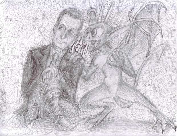
why did the people who did graphics for 8 bit games think this looked good? it didn’t!
have you ever seen a drawing by a small child, where most of the background is white but then suddenly there is a strip of blue across the top? this reminds me of that. but i excuse that. to them, the sky is blue, and the sky is UP. anything beneath that varies.
But an adult getting paid shouldn’t think like that. Hey, the sky is not suddenly weird and different after you go up a certain height! the fact that they almost always happen right at the top of the screen makes them much worse. It seems like that is the end of the universe. most likely this is only done because that is the only way to ensure, in games with only one background layer, that the lines never collide with background objects that need to have consistently colored backdrops. Usually the player character can’t get all the way to the top of the screen so there wouldn’t be objects up there. But that doesn’t mean it looks GOOD!
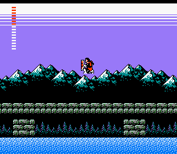
Konami’s castlevania 2, my first encounter with lines. they contribute to the creepy atmosphere, I would say beyond anything else. The secondary title is “Dracula’s Curse” and I consider the mysterious appearance of the lines to be the primary indication of the curse.
It is a more extreme stylistic liberty than anything else in this game. castlevania 2 is supposed to be totally serious, and that effect is so strange. Thankfully Simon Belmont is never at risk of touching the lines. Then he would truly have no hope.
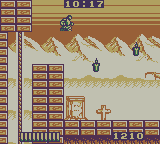
Aw naw! In Castlevania: the Adventure, for gameboy, Christopher Belmont can indeed TOUCH the lines, and live! However his sluggish pace and awful controls may be indicative of lines-poisoning.
from this page
“the iconic two-color sky gradient. Just wonderful.”
the only definitive evidence I can find of somebody acknowledging it is sedate and positive. Where is the outrage?
Yes sure that guy makes almost three thousand dollars on patreon and i do less than fifty but that is because i am saying what others dare not.
Does it look like a gradient on certain televisions? do the light and dark, at varying levels, blend to look more like the blocks common in early snes games? that was never my perception. It was always just LINES to me.
The fact that nobody else noticed the lines or mentioned how creepy they were also amplified my fear of them. When only YOU are scared of something, that makes it scarier, since you get no sympathy or protection.
Lines were even on the konami BOXes of this period. In fact I could only hold one of these boxes in such a way as to not touch the lines. Maybe the effect was chosen to give the label art a feeling of urgency and dread.

I presume jack gets jumped by werewolves if he takes too long to putt.
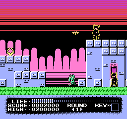
monster party had some of the most egregious lines of any video game, even if they are all seen before the second level. You would need to torture yourself to get to the second. Of the three credited graphic artists, mobygames (which is ALWAYS right) suggests only one worked again, Taka Saito, who next toiled on “The Adventures of Gilligan’s Island” and THEN stopped. while the adventures of gilligan’s island lacks the lines, it also lacks any adventures on the part of the island.
I first encountered Monster Party when a rare instance of child-hud era friend whose house I visited regularly had rented the game and all I noticed or remembered about it was the creepy lines, the unintentionally (presumably) creepy background music and how impossible control it looked. I do not recall attempting to play it or being offered the option; it may just have been present incidentally. This was the same friend with whom I co-created Joey and Ian Gettin’ Dead, about our two younger brothers, and it is entirely possible that Joey was using the game and and only gettin’ dead in the context of the game’s terrible controls and the low threshold of abuse that corresponds with the onset of what is commonly considered “death” in video games.
I was quite surprised years later to see monster party mentioned on the internet with regard to how zany it was and how heavily censored it was from the japanese version. I couldn’t believe people had really gotten past the first level, much less willingly sought out alternate versions of the game in which to do that again, and had anything to say about the whole thing unrelated to the lines.
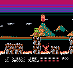
this is similar to monster party’s; gratuitous and coming out of black, but i don’t mind it as much here, possibly since this game is actually fun and has good music.

megaman 3 has this intermission screen but it is balanced out by having lines going the opposite direction so the effect seems more cylindrical and not implying that they are representative of the sky.
and so after 3 games safe comes megaman 4 aka megadope, a terrible graphic hack of megaman 4 that I made for no reason at a time of my life when I did a lot of things for no reason, unlike today.
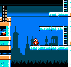
the lines are so intense that even megadope won’t smile at them.
Bear in mind that on an actual 1970s-80s television screen wouldn’t necessarily be able to see to the actual borders of the display. That generous area of uniform color at the top in a lot of these here might be in practice much smaller.
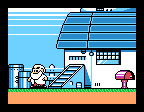
megaman 5, dr right knows something terrible is about to happen since LINES have attacked his home. although these lines appear in the middle of the SCREEN, the introduction sequence crops the view to just the middle of the screen and the lines are still at the edge of the visible zone! And the “generous” area I alluded to is not allocated here because it is not meant to be seen!
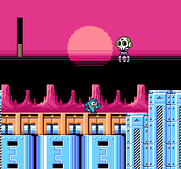
megaman 6 brings back the lines yet again but finally puts them in the middle of the viewing area where i can handle them. it still doesn’t make SENSE since the only things that should be black in front of it would be scenery at the horizon which the sun would be setting “behind,” which i suppose would be the rocks but they are separate from and beneath whatever is black here.
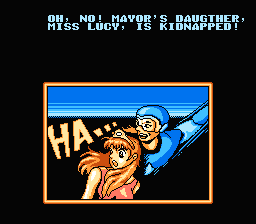
this isn’t a megaman game at all, it is an unlicensed chinese game about a little guy who throws boomerangs that they pretended was megaman to try and trick people. in which event i would ask why not just use the full megaman game if you undervalue your own work so much but whatever the case, there are those lines.
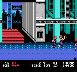
actually I like the one in double dragon since it simulates a perspective and uses its whole, limited space. only by chance does it go to the top of the screen.
double dragon uses it in all 3 nes games, but each example is unique and artistically done. Even double dragon 3 which is terrible in every way. other games will reuse the lines across large spaces in a manner similar to each other.
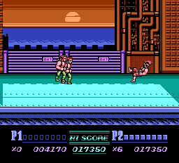
not as interesting but at least the presence of the sun implies a reason why the sky color would shift considerably in a small area.
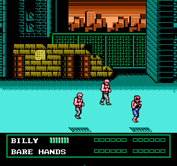
however these look like apocalypse lines since they go into black. the sky above a sunset is not black!
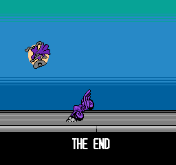
darkwing duck! ending. These at least are neutrally placed and have more than two colors.
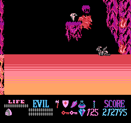
not on the sky, but needlessly near a screen border. as a small child i did not understand what this weird substance was that kuros could walk on but be damaged by. but it didn’t matter since you have unlimited “lives” in this game. as a slightly less small child i realized it was lines and became more afraid of touching them than the meager damage penalty could bring about.
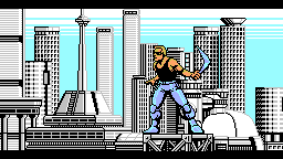
Power Blade! It of course gains its energy through power lines but THAT is not what i meant! Also the lines blatantly go behind a non-rectangular object which means they could have been placed further down in the image so they looked less creepy.
a brief collection of games that use it more neutrally
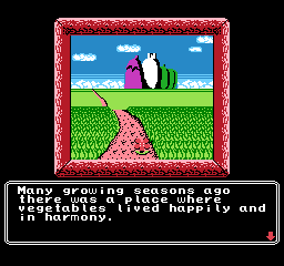
princess tomato’s very first scene. fairly tame! really not threatening at all, but I sure REMEMBERED this was here for years after seeing a picture in, again, nintendo power magazine. I remember thinking it was a racing game at first.
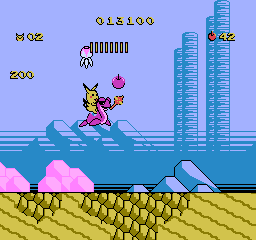
adventure island 2 has lines going UP. when i saw pictures of this in nintendo power magazine it bothered me but i can handle it now
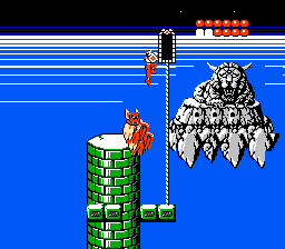
rygar falls somewhere in the middle because the lines are scary, and it goes into space, and I was terrified of this screen, but I was creeped out by the weird face foremost. I didn’t even realize it had a body. I would see it when i closed my eyes. I was SCARED of that thing. As for the lines they go into white, and then abruptly to black, and it is just strange.
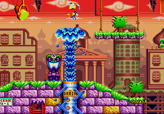
dynamite headdy uses lines extensively, but they are often dithered which makes for a less harsh effect. Even when they aren’t, there is lots of other stuff going on and there are always intermediate colors. the clouds being larger above the lines creates a mild perspective effect which make the lines seem more like curving of the atmosphere above us in the distance than the end of the world immediately in front of us.
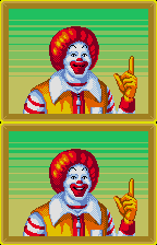
treasure land adventure also uses many lines but that is far from the only unsettling thing going on
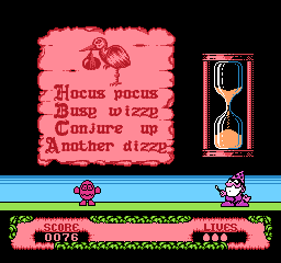
fantastic dizzy. terrible game. don’t believe british 1980s computer nerds. they are sick. everything in the game maims dizzy, you only get 3 “lives” in which to win a game as long king’s quest 5 with as fragile a hero without saves or even intermediate goals to use as personal concepts of progress. these creepy lines, mercifully on this slide puzzle screen only, are about the only thing that WON’T destroy dizzy.
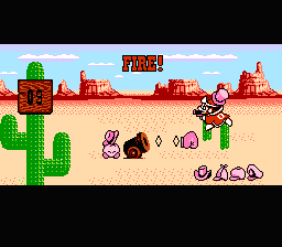
right near the edge! why? and this is a game that otherwise uses its colors really well to add a lot of detail to a fairly simplistic world.
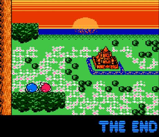
adventures of lolo 3, also from the Hal Laboratory company. They used their mad science to devise a way to put the sun BEHIND the lines. It actually comes down from the top of the screen and the lines never change where the brightest point is nor move aside to let the sun in front. The neat effect of the water starting to reflect the sun as it appears closer is meaningless because the lines are so incorrigible. They really have to go.
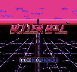
Yet another from Hal, Rollerball. This one is really odd in that the upper edge of the lines leads to a color that matches one of the interior colors, so possibly this is supposed to be the edge of the horizon, yet it couldn’t be because the vanishing point is about midway up the second R in “roller.” The only conclusion to be made is what I have been saying all this while, lines are bad news.
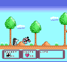
this is the very first stage. unlike monster party, this is supposed to seem welcoming. there are animals out to destroy mickey mouse but you aren’t supposed to be afraid of them. not yet anyway.
this game was localized as “Kid Klown in Night Mayor World” since it was published by Kemko and Capcom had exclusive rights to release disney video games internationally at the time.
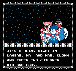
there is something deeply wrong when you have a story about a kid who is a klown, with a k, from a FAMILY of capital k-klowns and i still find horizontal bands of dark blue more upsetting.
Kid Klown is also noteworthy for having loads and loads of intermission text which doesn’t explain any of the things that need explaining.
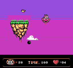
a very capable alternative to lines oddly enough occurs in a bootleg felix the cat game. Which is not to say this game is good or that there aren’t better things that could be done with all this space.
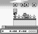
mickey mouse again! and not even the same developer. Mickey’s DANGEROUS Chase by capcom. Which I also only know about from nintendo power
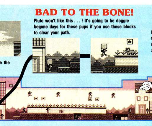
i couldn’t figure out why that effect was in some screen shots but not others. now i see: the screen scrolls up to gradually reveal it as you progress, which is unsettling in its own way. even though these aren’t LINES, the color difference is high and this really doesn’t belong here. the presence of the word DANGEROUS in the title (and apparently only in the US release) and the blood-like red tint may also have had subconscious effects on me.
also unsettling, nintendo gives full maps for the first, easiest, self-explanatory levels and wimpy paragraphs for stages you might actually need help in.
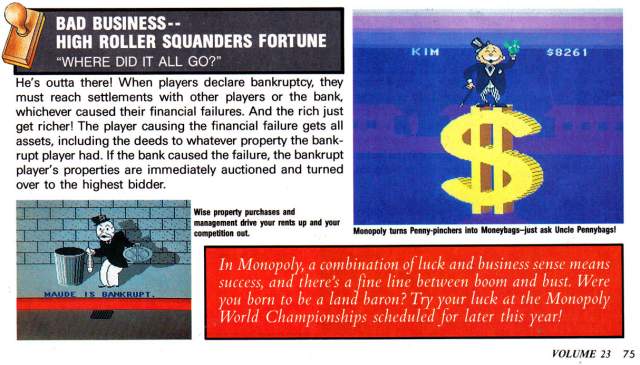
scrubbo in the same issue, this i totally forgot about. Again not lines but creepy with the same intention. It looks like the monopoly guy is about to be abducted by aliens or crushed by a meteorite, nevermind the trauma caused to anybody in those barely visible purple houses in the distance who would see an enormous self-illuminating BACKWARDS DOLLAR SIGN. Also Nintendo Power gave six pages of coverage to this.
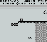
this can’t be too far a drop since there is a little tree down there. surely it would be SAFER to go that way!
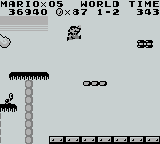
but the lines abruptly end so they aren’t real, right?
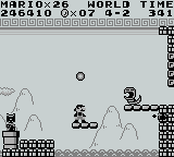
I am uncertain if these are supposed to be lines with the same intention. while this is indicated to be outside, there is a pattern ABOVE the lines.
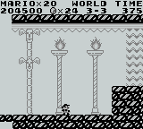
also an earlier level uses the exact same 8×8 pixel tile as something like a support beam for a fancy place that is plainly meant to be INSIDE. Lines have no power inside.
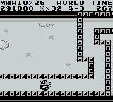
oh no more creepy lines, undeniable this time, going into BLACK, consuming the clouds, and i have to TOUCH them! Or Mario does. I sure am glad I am not mario.
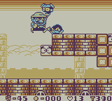
Always the ne’erdowell, Wario tortures a creature by making it touch the lines.
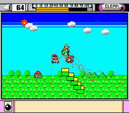
In the demonstation mode of mario paint you can see somebody CREATING the lines! Somebody making the deliberate decision to add this. And that may be the only super nintendo game i have seen it in, at least as far as the creepy top-of-screen usage goes
The mario paint example is curious because it shows the sun amidst darkening. would the sun not cause a lightening?
a number of staff was shared between mario paint and super mario land, super mario land and wario land, but nobody was on all three games and I would be reluctant to point at any specific person for this.
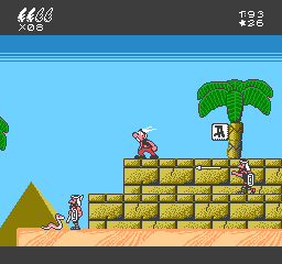
the first two game worlds do an admirable job of recreating the sort of skies that uderzo put in actual asterix comics then suddenly in egypt it gets this hokey effect and bright turning abruptly to dark. instead of creating a feeling of vastness it is an eerie claustrophobia. and look at all that grey space at the bottom edge of the screen wasted! if they put that ABOVE the lines and made it the darker blue it would… STILL be too dark but it wouldn’t be as much of that weird edge effect. They also could have opted for a more subtle color changing effect across a larger area.
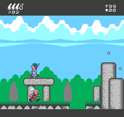
here earlier in the same game, that is actually pleasant and one of few things in the game to evoke the source material and not just look like a quick cheap crummy licensed video game created by a company chosen because it was European and no other reason (“Bit Managers” in this case). Ironically it is a possibility that a similar cloud formation was the original visual inspiration for the lines, which i say based on having seen even more line-like clouds and wondering if those were the inspiration for lines.
I will say that a co-founder of the Bit Managers company, Alberto Gonzalez, did ambitious and well-programmed music on the better but still horribly misguided super nes game “Asterix and Obelix” that they also developed. He was uninvolved with the first Super NES Asterix game which seems to be based on the same design document as the nes one with additional questionable decisions but at least lacks the lines.
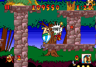
In the interest of making this more confusing, here is the superior if still impossible Asterix and The Great Rescue on the Sega Genesis, developed by Core Design, better known to people other than me for making the Tomb Raider games. This uses sky-lines but in a relatively innocuous manner. Don’t tell anybody I rented this in 1992-3ish and couldn’t get past the second stage because I didn’t know you could make little platforms appear for jumping on.
It also has better music than a crummy licensed Europe game deserves, and I can’t think why the followup Asterix and the Power of the Gods is full of dinkity synthesized awkwardly looping covers of public domain cliche “classical” dentist office music beyond that somebody found out they gave a crummy licensed Europe game better music than it deserved. That apparently is the power of the gods.
lines in real life:

chocoteague virginia, the shadow on this boat railing

mystic connecticut: look at this orange arrow on a sign

deviantart user domobot posted this image. similar to mario paint there is a sun but the light part is NOT radiating out from it! Also the creature appears to be wearing the legs-sticking-out-of-the-ground from the Monster Party screenshot
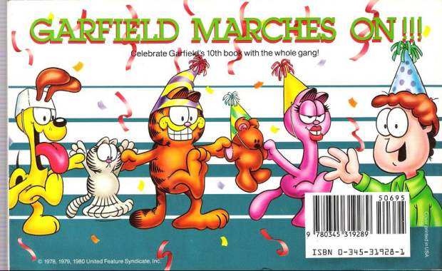
garfield makes it big, back cover. This is also the same book that featured the inexplicable traumatic head-first dropping garfield horrifying cuckoo clock reaction. (the linked page describes another instance of it happening and then briefly mentions garfield) Garfield is suffering from a similar ailment to the batman bee, in which oversized eyes enter into space conflicts and the artist doesn’t care, resulting in sketchy facial expressions. Arlene can wear the hat properly. However Arlene also suffers from shoddy tsereotype design traits and i presume the hat doesn’t want to mess with them. Also troubling and artist-not-caring-related here is that most of Jon’s body is missing. The other characters have their feet below where Jon cuts off so it isn’t like they reached the edge of the document space. I presume his body was sliced in half by the bar code sticker and the blue substance is actually his alien body matter spilling out and creating the lines as a punishment against humanity, until crummy merchandise and eventual braindead hipster memery could grow into adulthood to avenge him.
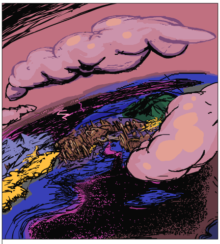
I found this in another terrible comic strip, thankfully i cannot remember which but whoever is responsible for it ought to be in jail.
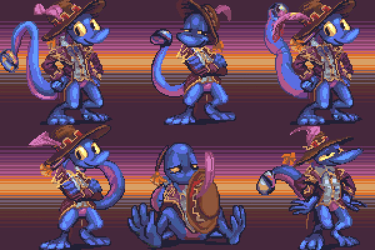
there may be many people who need to be in jail but i would at this time request separate jails.
It is possible you have seen this picture before, but I have lately typed a heap beneath it.

A series.
I had some difficulty putting this on to stupid art sites. There are no smart art sites. Deviantart, one of the stupidest, with a maximum preview size of 150×150 pixels, displays it like this before it is clicked on:
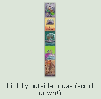
Most people will NOT click on something that looks like that. Additionally, most people will not click something that I put up, and those two facts work toward a common goal.
The preview image is generated automatically by reducing the image enough that its longer dimension (vertical or horizontal) is 150 pixels long. For an image whose proportions overwhelmingly favor one (vertical in this case) the reduced edition is totally unintelligible.
A custom thumbnail option would be nice. I would make my own preview that showed much of the first section, with a bit of text to indicate that there were four more images beneath it. I believe there used to be such an option. What happened to it?

People would fill their gallery completely with obnoxious icons that gave no information and only said “full view only!” because they were more obsessed with controlling people and increasing their meaningless “page view” total than actually helping people look at their art, because scumbags always win. Instead of visitors having enough information to decide if they should look or not look, they were forced to look just to find out what the ding dang thing was, if they dared to care. In this case, where the privilege was revoked, they won by making other people lose. I prefer to make fictional people lose. I included “death by ice” in this example but somebody else might call it “Frapbi’s frozen frustration” just to ensure it was as unenticing as possible. It also assumes that you know who frapbi is (frapbi is a loser).
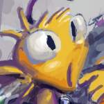
These days most minimally informative thumbnail enthusiasts fixate on a face from within the image, giving a viewer a scrap of context but still not enough to know anything apart from “yes this image includes a being with a head.” This is considered an improvement, for some reason, by many people, but I do find it much more helpful. I am not fond of faces out of context. I do not always like faces in context. I may prefer context to faces. If I follow one person and see one new face a day, alright, I can look at that. If I get five hundred faces I do not have time to personally investigate the agoraphobic potential of each. And sometimes the “full” version would just be the face again but bigger! Rage!

Shut your mouthstache, you torsoless hatlump!

One especially gorkly individual used the exact same “full view!” dead-eyed, spider-lashed varmint icon on every picture regardless of what it contained. I presume. I never dared to check what they were hiding. Perhaps it was worse.

Additionally, I had made that recreation there based on my memory of the real one, but with that memory I gradually recalled that long ago I had saved a collection of utterly nonthreatening animal/anime people off of deviantart or worse drawn trying to be edgy or abusive toward their viewers –that is how you build an audience, after ehhh– and that the creature in question was featured therein, and that I should take the opportunity to make my facsimile horribler. The one I drew first looks like rather a reasonable chap by comparison. Although in the interest of fairness I should disclose that it was addressing a remark at “faggots” and not exhibiting a central digit, and that specific the full view demand icon was doing neither of those things, although it might as well have been.
I should make a public exhibition of my collection, although I reckon that some of these pictures are more than ten years old and it is mildly possible the artists realize what silly behavior that is by now. Alternatively, they could be now far worse and would interpret my exhibition as “art theft” and evidence that I wish I had the capacity to be so middle-fingery myself. This would then inspire them to draw more pictures of cartoon characters being angry at all real people, necessitating that I add them to my collection and I do not necessarily have time to make that a full time task.

Also, at some point my awareness of it makes me look bad. I should really leave that without further comment, but
The only thing harder core than drawing/paying someone else to draw an animal shaped like a human adult meant to represent you shoving a middle finger at the viewer is if this character is wearing a plastic disposable diaper and no trousers over the diaper. Folks fantasize about this. “oh MAN I WISH i could take off my pants, put on a diaper and then go around picking fights with people.” They find some acceptance for their personal habits and eventually it becomes a way of life intent on waging war with other ways of life. Coexisting peacefully is not an option. Diaperus iacta est.
I didn’t think all the words in this were boring enough so I also included numerous pictures of words.
=-=-=-=-=-=-=-=-=-=-=-=-=-=-=-=-=-=-=-=-=-=-=-=-=-=-=-=-=-=-=-=-=-=-=-=-=-=-=-=-
If there’s sexism at the Daily Show, most of it’s on the website and written by people who aren’t actually employed by it. Cartoon sleaziness is still the first instinct for men on the internet.
I first heard of these startling accusations when Stephen Colbert mentioned on his show that I “probably already heard.” So maybe you have, also and I needn’t mention it. I wish you’d told me that before I mentioned it. The article accuses the show of discrimination for hiring a lady named Olivia Munn who didn’t come across while on the air as terribly humorous to the writer so there must be some deeper motive. Another moderately recent addition Josh Gad was also less than impressive to complainy viewers despite being a man and fat. I suspect there the explanation is that the show merely deliberately auditioned and hired a non-funny person just to annoy us. I don’t see how this is a huge problem; I remember when Stacey Grenrock joined the show. Because I’m really really old. People hated the first 20 or so reports she did. By the last two, though, she seemed to be getting it.
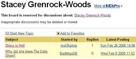
It ultimately didn’t make a difference. Don’t worry, these both go out of their way to mention that Samantha Bee is less visually appealing to them, and she wasn’t even pregnant then!
We’re getting off-topic, though, I think. From the thing I linked at:
I can’t take seriously any quest for decency or social equality which makes use of the terminology “but-thurt.” I’d rather not attempt to track down its etymology by typing it [anywhere] but at worst it’s mildly anti-gay and at best I just think it’s ugly. I also can’t seriously take the phrase “we geeks,” and while that might be construed as some sort of discrimination on my own part, I am at least aware of this and not lazily tossing around language I picked up on the 4thchan and calling myself a “big think”er.
Munn, whom I had not heard of, was apparently famous despite my not having heard of her on the Cops Channel for being the sort of person who is hired by the Cops Channel, prior to being on the Jeff Dunham Channel. While there definitely continues to be huge potential for any non-male whom pictures exist of (or even somebody of ambiguous gender who merely draws pictures of ladies) to develop a fanbase merely by not being repulsed by the sleazy men who compose a majority of vocal audiences, my first thoughts were of these very oafs themselves. The article laments Munn’s lack of legitimate comedic ability but I don’t reckon most of the viewers have noticed.

This one isn’t any worse than what other late night hosts do in the actual presence of ladies, but I don’t like it when they do that either.

To be fair, the vague, John-Doey default avatars make just about anything seem unsettling. Why is this presumed to be better than no avatar at all?

The Facebook icon explains this, though it stops short of excusing anything.


Well I’m glad you said it nicely. Cacofraginstaple, Confederated Creeps of the Covered Keyboard, is it truly so hard for you to locate video of skinny ladies accompanied by open comment fields online? I assure you you’ll find most of them just as unfunny.
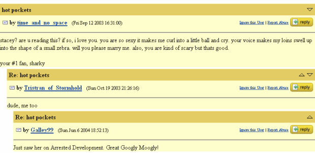
Well that’s certainly-
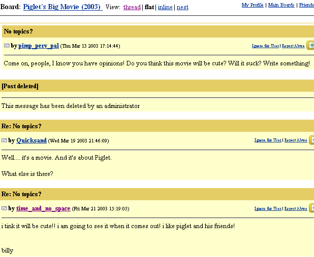
Oh how about th-

This site entry has to end now.
=======================================================================
Hey That Daily Show is back from a two week hiatus! And with it a fresh shipment of message board creepism arrives! This is actually pretty nasty, but so is the entry I’m appending this to.

Is it “irony?” Do I care?
Additionally, apparently this is the original article that was controversial. In that case I have no idea why I came across that other one and thought it was what I thought it was –this is even linked from within the other– but apart from that I don’t think anything I said before is less valid than it was, presuming any of that was valid. I wrote it all but didn’t feel like reading it.
It is somewhat less about Olivia Munn and even mentions Miriam Tolan, who was last seen apologizing for not being on the show and then never was again but supposedly married Frankenstein at some point.
Evidently I was not done wednessing and missed my imaginary deadline again. Neither of us was surprised.
===========================================================
Wednesday: I did so much wednessing yesterday that I had no time to update this website. If only I’d known it was just Tuesday then. Whoopth.
===========================================================
Do you remember when I said I am one of the most boring people in the world? No, of course not; it was so boring it could not possibly be remembered.
===========================================================
After overwhelming public demand, which I ignored, here is my own incest story:
Once upon a time Hansel and Gretel lived together in a house in the forest. The end.
===========================================================
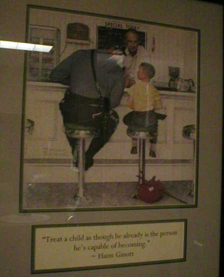
However…
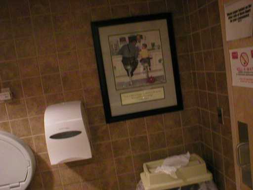
I don’t think the proper place for this message is the inside of a public restroom. Nor the outside, for that matter. “You may only be twelve years old, but yer a MAN to ME.”
And so I propose we train our children to become killing machines.

I wasn’t intimidated until you clenched your fists.

Thankfully there is an entire section in some stores devoted to the purpose. America must be the greatest country in the world to have invented the plastic helmet aisle. The only thing stealthier than a ninja is a shiny one that clunks a lot. The plastic helmet and assorted armaments aisle, ah yes. Unlike normal munitions, which have a history of exploding when fired upon themselves, these just deform and produce toxic fumes. So they’re safe. And they’re discreet about it. Apart from being brightly colored and shiny and clunkity, I mean.
I had been under the impression that one of the factors in the effectiveness of terminators was that nobody could tell they were murderous cyborgs, because they disguised themselves as humans, but realistically, I suppose when you’re a nigh indestructible machination of death it doesn’t much matter how well you conceal yourself among the puny frail beings it is your goal to eliminate. A human disguised as a cyborg makes a lot more sense.
Incidentally, despite nearly eight years of more or less regular updates I still apparently type things, “cut” them to paste elsewhere and then forget to do that, but not to ‘save’ the document I cut them out from. In this case of jokes about predators-of-children, however, it may merely have been an intervention by the decency fairy. However, it’s not an effective defense, because I sometimes remember what I wrote the first time, and in any event I’m getting this stuff from all sides:

Well I’m certainly not going to PAY you for my FREE incest pics, regardless of how mature and responsible they are. I’m also not interested in incest content that does not depict interfamiliar dealings. It seems wrong somehow.

At LAST, the sequel to
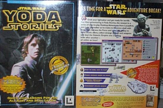
As usual, George Lucas makes us wait and doesn’t give us quite what we expected.
Also, as long as you’re here, with all this confusion about, don’t forget to wash the hand part of your hand.

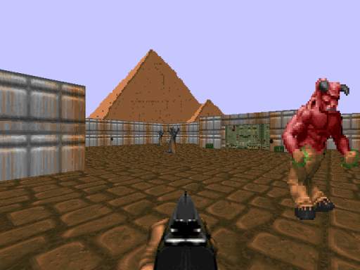
Go on, gyit. Don’t give me that face. You know you’re not supposed to be here. You’re not washing off that glowy green stuff in MY sink.
$$$$$$$$$$$$$$$$$$$$$$$$$$$$$$$$$$$$$$$$$$$$$$
Apparently, updating this page once every five days is even too frequent.
There is clearly much more important business to tend to, besides.
![]()
Poliglotery sounds horrible only to dumbs…
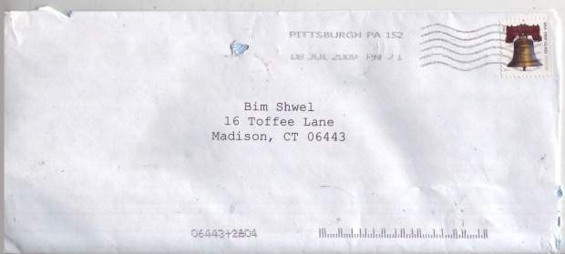
From: “Heart Attack Jones” <[email protected]>
To: “Diane Sawyer” <[email protected]>
Date: Fri, 18 Sep 2009 6:01 AM (5 days 11 hours ago)
Esteemed M. Fabrax,
As you may well know, the G-20 summit will be taking place next week here in Pittsburough. You of course do not live in Pittsburrah, but in light of the recent economic brouhaha, I understand this has been quite a topic elsewhere, as well (or at least Deutsche Welle news gives me this impression). Avid social commentator as you are, I thought that perhaps you might be interested making a work of art to commemorate this event. Ah, but of what subject matter? Well, I personally can’t help you there, but perhaps there’s a chance some third party may have given you a suggestion at some point in the last few weeks which might somehow be thematically appropriate…?
Hmm…
– A retarded samurai
Seven brides for seven brothers
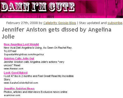
I remember, a few weeks ago, there was this big News headline to the effect of “Jolie disses Aniston” above all other things and I was utterly baffled by it but not curious enough to attempt reading it. Even now that I accidentally deleted the last month of pictures I saved off of websites I remember it, but only because I dictated an angry complaint through my fingers to my keyboard about it.
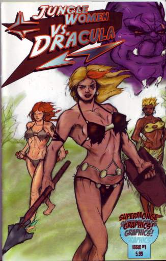
Sure, the “news” service had “yahoo” in its name… in fact “yahoo” was its name, but apparently we’re not supposed to consider that any more than we are meant to associate selectively non-naked rain forest ladies who battle Grimace-esque Draculas with the sale of books.

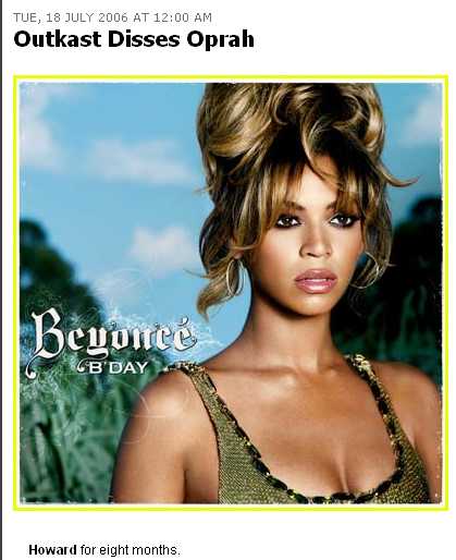
Here, though, is a totally different diss-themed headline involving the popular kids. Nevermind why, nevermind when, just know that it happened, and somebody with a better google rank than me noticed.
Boysenberry! Ambush!
Ah hass! Reinforcements!
I don’t even remember why I came in here.
What are disses? If you actually read some of the stories attached to these titles, the “diss” invariably turns out to be something utterly trivial and unworthy of bringing to so many peoples’ attentionses. Capcom did not “diss” X-Box, as much as I’m sure it could stand to be dissed once in a while. Somebody employed by Captaincommando expressed a concern for the state of the former Box’s online service but in such a way that suggests he expects it to improve. This did not need a graphic. No obliterating blue fireball was thrown. Use of diplomacy suggests a desire to avoid dissing. Not disrespectful in the least!
November 30, 2008:
Roneldo Disses Disses
This is of even less consequence than that time Danny Devito choke-slammed Presidente Bush
through a table and bashed him with a steel ring bell.
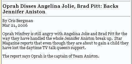
Just jolly Jolie herself has achieved Paris Hilton levels of mention-on-tv-without-justification-ability simply for, as far as I can figure out without specifically looking her up, adopting a couple kids. Isn’t it good to adopt children? Isn’t that preferable to them not having parents? Even if the new parents happen to be diss-drunk doibydickleses? I’m sure Joliebean was in some movies at some point, but either I never saw them or did and just didn’t find anything about her particularly memorable. Eh, eh, I’m receiving a transmission… I hear that she has fat lips. Is that it? I’ve seen people with big lips on screens before.

And then at some point she was acquainted through the six-syllable name club with Jennifer Aniston, who also supposedly did something, but now they hate each other for some reason, and it’s assumed that I know that. Actually, I’m sad to admit that I figured out right before The Friends Show was canceled or whatever that Anniston was on it. And Matt Leblanc, Matt Perry or Luke Perry was also on it and oh, such good times they had. I either need to stop watching television or watch a rumproastload more of it.

A helpful robot provided me with this. It is everything I need to know. I wish I could have Jack Perkins read it to me.
I’ve been hearing about Angelina Jolie and Brad Petunia for… maybe 8 years now? I seriously don’t think about them. I don’t find jokes about them funny. They have failed to matter even in a mocking way within muh mind. They’re barely boring.
I seriously just [three months ago] saw Bradd Pitt in an ad for a movie with Brad Pitt in it and couldn’t figure out who he was. I eventually settled on Val Kilmer, TV’s Madmartigan/Air Bite Guy From Top Gun before being corrected by onscreen text that it was the Pitt fellow I’d heard so much about.
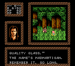
Oh, much longer than so! I would never forget! We madmarted before, and we will madmartigan.
May 17, 1999:
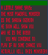
Roneldo invents sixth l33t way to spell name. Chatrooms take notice.
![]()
Monday, July 30, 2007, 12:39:54 am, East Haven Standard Time:
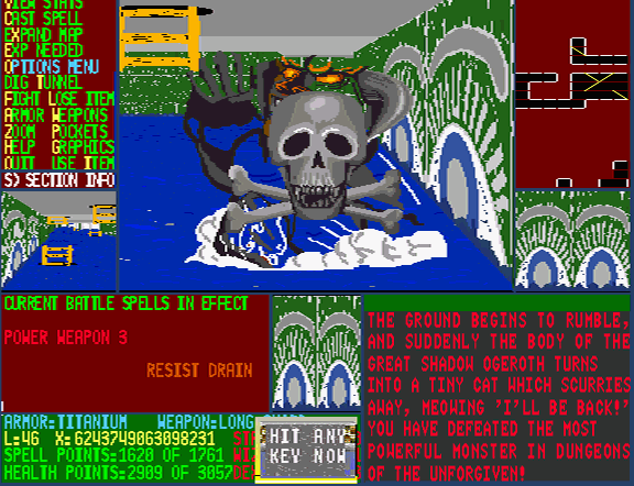
Roneldo survives Dungeons of the Unforgiven actually playing the game properly.
Sounds like a plan. Several plans.
Roneldo is feared and respected.

Werther wasn’t original, Werther was a HACK. Werther was about as original as a Disney channel original movie. Und so ve haf another stunning rediscovery from the Dead Sea Scronelldos:
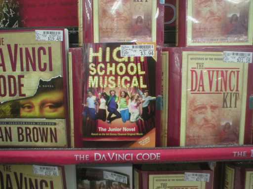
High School Musical, the book. Or rather, The Junior Novel, which in addition to sounding twice as stupid, suggests there is a senior novel. Some kind of parent version that’s just as bad, but with a considerably stronger sense of entitlement, not to mention a Denny’s discount. I suppose Da Vinci code cash in books would meet that need, though they have a ripeload more pages. Probably better songs, too.
Those little yellow letters do indeed spell out Based on the hit Disney Channel Original Movie.

See? Ehhh well, that’s why I read it to you!
The orange triangle bears “With 8 pages of photos of the stars!” The stars surely being the proofreaders, the typesetters, the screenplay goons and the adaptation cronies. And also the wizard who made those rainbow kids in the cover picture float like that.
I love a book with illustrations, but I suspect these photographs would leave me disappointed. Similarly, there must be better ways to keep angsty teens quiet than to convert their noise to print.
I discovered some time I after this book that not only was the actual High School Musical –that is, the musical version– quite popular, it was extremely popular. I don’t know if it was any good, nor do I presume as much; considering that one of the most beloved of the genre is the extremely wretched Grease, I wouldn’t put much faith in it.
Yeah, well, you’re not far behind.
And any thing which depicts standard high schools as properly functioning, nevermind harmonious entities is reprehensible in additional ways.
Disney didn’t even bother to give this thing a title. They just used the category genre slot label they built before any filming, writing or thinking was done. “Hey, the boss wants a high school musical by Thursday. You two thousand, get on it. I need jocks and geeks obsessing over matters of passing importance, STAT.” Meanwhile, my masterwork, a rocketship made entirely out of corn has dawdled almost unfinagled for over a year.
During my requisite needlessly complicating research, I learned that the subject was sufficiently succussful to allow for a high school musical 2.* Yet save for a few misplaced artifacts like this one (I may have actually moved it from elsewhere, but I no longer recall doing so), I would never have known about either. Just like Lindsee Lohan and a wide assortment of Duffs, who I long refused to believe were actually famous. That’s the power of the Disney machine. It can cultivate these genetic, generic horrors in total secrecy, advertise the hamburger helper out of them yet manage to have them only be seen by the specific people who will love them unconditionally and buy all things associated with them, which apparently includes novelized music. And somehow this is a lot of people. This and the STAT function on calculators are my current top two non-understood things. It’s true I’m not in contact with the public at large, or even the public at small, but I know things! I caught wind of facebook, I knew about Sour Skittles, I learned about Halo 2, I heard about nights out in the school yard, I found out about yoooooooou.

No! Only 25 on the Hot 100! Like, gag!
*to anyone who insists Disney will make a sequel to anything, I remind that there has never been a Meet the Deedles 2. Still, we ought to be aware that for sixty-three years there also was no Bambi 2.


