9-5-2021 3isham oaf now the comments aren’t working? I don’t expect them but I happened to glance down there on another entry that already had some and nothing but errors there. what a dumb few weeks!
///////
9-5-2021 329am the comments work now but they are in the ugly default style since I had to copy code out of the “default” theme that updated itself during the overall wordpress “update” that I didn’t want but thought would fix the site when it was broken, which it didn’t even do! hopefully I can work out the syntax of whatever “ereg” got replaced with since that suddenly being “deprecated” is what broke the comments form and have slightly-less-ugly comment boxes again but I am tired and have other things to do! and I just noticed another broken thing in the side-bar. beets
///////

this is one of the more eerily fake-looking “photographs” I have encountered. Have you ever seen water which looks like this? The blue is as if somebody dumped a load of toilet bowl cleaner pods upstream. This looks like an amateur colored pencil drawing or a video scene from a playstation game. This looks like the ghost of deceased water.

i tried turning it grayscale and and the substance still looked like glowing crest toothpaste more than water, particularly on the left. which makes me more inclined to believe this picture initially had no water in it, rather than more naturally colored water. and yet where it makes contact with standing water on the lower right looks real. the web page it came from only identifies it as “free stock photo” without any context of where it might have been taken or what was done to it.

the links at the side of the page indicate that for a fee you too can try to put water where it doesn’t belong and color it unnaturally. I don’t know why you would, what satisfaction you would get from making an ugly fake scene from elements of real ones, but other people are already doing it and likewise looking to charge for access.

even the blatantly blue-dyed water at one of the numerous inexplicably pirate-themed miniature golf courses I saw in Queensbury, New York didn’t look that queentoony.
this PHOTOGRAPH is terrible; I may have taken it from across the street or behind a fence. it was the same day as this borage. I didn’t use this photograph in fact because the result wasn’t as cartoony in the picture as it was in person. Stock photography vendors clearly see this as a pressing problem.
AND I was looking up pictures of water tumbling down mountains because to make a long story spork i couldn’t solve my computer problem with what I ordered and waited for, so have ordered and need to wait for something else. Consequently I am still using the backup computer, and consequentlier STILL haven’t finished that rygar picture, of which a tiny, almost irrelevant part of the drawing features just the category of scenery that I was speaking of, and consequentliest I wanted references for it.
for really no good reason I thought I should try and incorporate less-cartoon-looking scenery even though every figure amidst the scenery is exactly as cartoonesque as in the dumb nintendo game. ultimately it comes down to I never developed an instinct for what corners of realism can be cut and still have a corny fake drawing represent the real version. this applies especially heavily to blue-colored water which always looks bad and fake to me except where it naturally occurs.
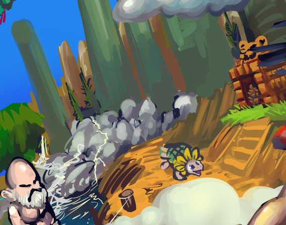
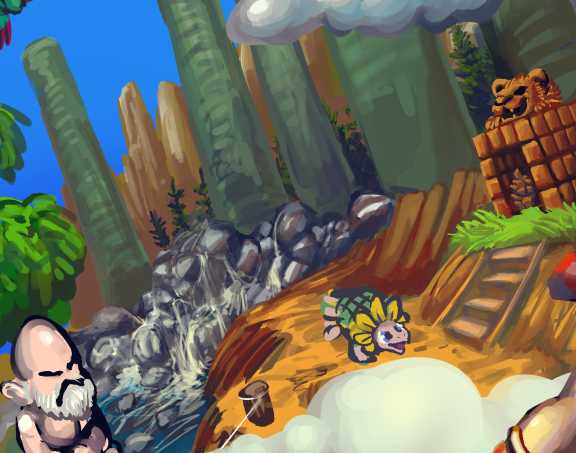
Notice how the recent changes don’t improve the image but does make the characters present that are more important yet that I have not gotten around to checking on now look worse than before compared to the increase in background detail.
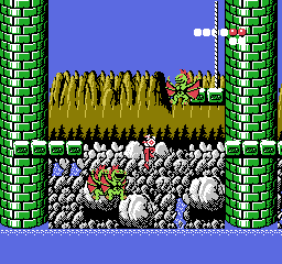
I thought I wasn’t doing justice to THIS. Even though the whole reason I like Rygar imagery is because of the specific weird, often stupid look it has. Why shouldn’t I interpret it literally? The answer to that doesn’t matter since I already didn’t and am more likely to spend another day working around a bad decision than revert it.

some bad decisions I have spent decades working around.
i should have a drawing to post on tuesday. I should also have had it on sunday but it is a tricky drawing. everything is tricky these days! even that nemitz picture which was simple became very tricky and unpleasant once I attempted to talk about it so ideally i will say very little on tuesday.
////////////////////////
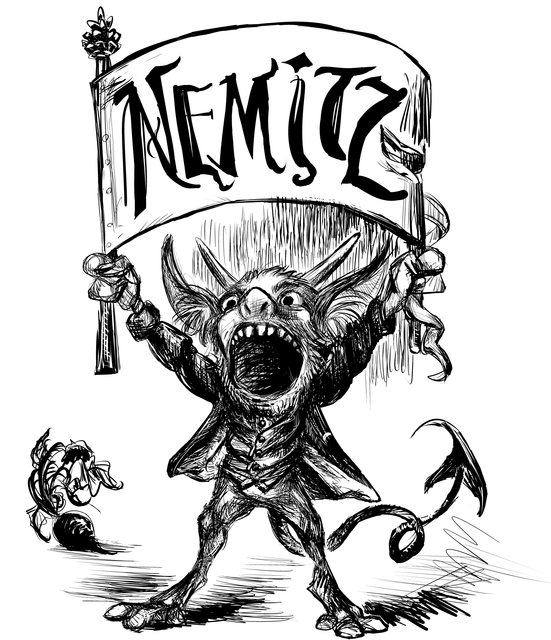
a needlessly nemity variation on a widely circulated image of uncertain origin
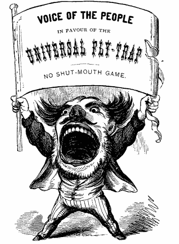
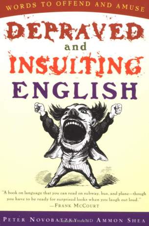
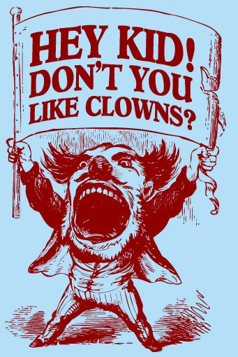
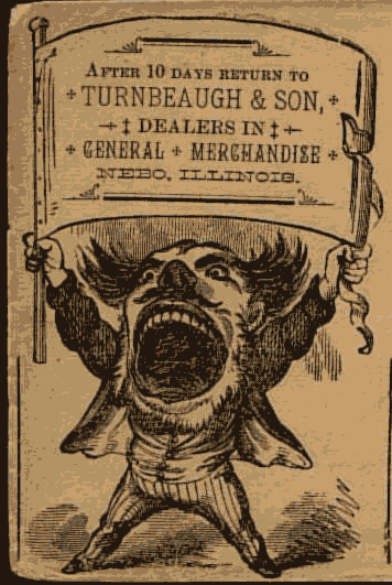
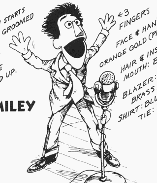
I am fascinated by this image, and plainly a lot of other people also are, often altering it to suit their needs. The envelope is apparently from 1895! I found this using the tineye reverse image search. Once in a while that actually works, yes. So I presume the picture is from before then, though how much before then I am unaware.
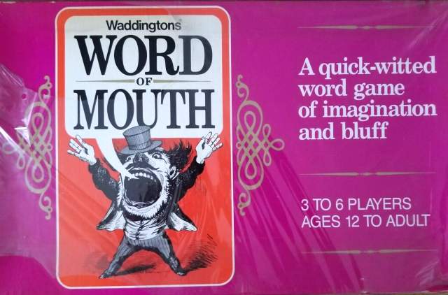
At my home from 1985 to 2001 this game was in a bathroom closet that never seemed to be closed, maybe it couldn’t be closed. I never saw the game be played, in fact I don’t believe I even saw the back of the box until I found it for sale on e-bay, but I always remembered the drawing.

I see now that Word Of Mouth’s is the only version to have a hat and non-clenched hands, and after comparing them I saw that its hands indeed had a more casual 1960s low budget school house rock animation sort of style to them than the rest of the drawing.
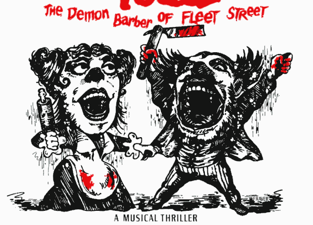
It was only years later, some time after the feature film was released, that I became aware of Sweeney Todd using a very similar drawing. I was only able to compare them recently, and saw that Todd’s is drawn by a different hand. I appreciate that Frank Verlizzo’s Sweeney Todd version redrew it outright to make the alterations less out of place and to match the Angela “Murder She Not-Yet Wrote/Did” Lansbury mutant that had to be drawn fresh. Also back in the 1970s fewer people assumed you could just change something on another person’s drawing or song and copyright it exclusively for yourself forever.
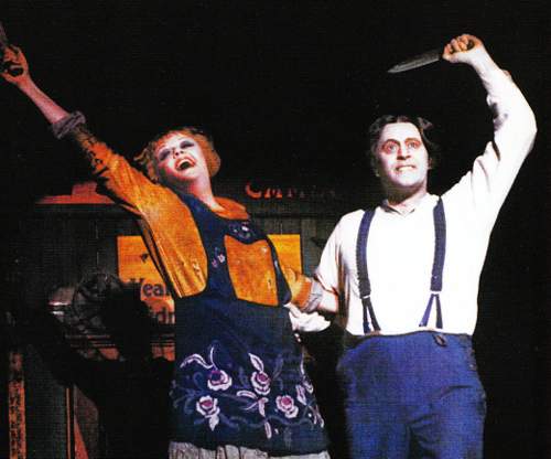
Another odd bit is that the one on the left was drawn to resemble Angela Lansbury but obviously the one on the right just is that same guy it was before. He does VAGUELY resemble the drawing but only as much as any other large 19th century man with his hair parted in the middle would, and yet that was enough. Verlizzo didn’t even incorporate the suspenders and nobody ever thought to ask: does this drawing actually look like the character?
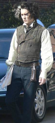
Ironically, the Johnny Depp Todd DOES look like the drawing, wearing a vest and striped pants with messier side hair but the film never used that artwork in promotion. Presumably there was concern that Helena Bonham Carter looked less realistic than the cartoon Angela Lansbury.
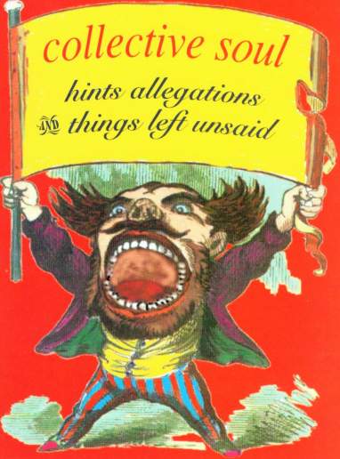
unlike Todd’s, the collective soul version of the very angry man edits the ah imprint directly and poorly and it is obvious (and the print itself is somewhat shoddy, as if somebody scanned a t-shirt that it had already been printed on). The whitish glow and white (or actually green)-tinted shadow against an inappropriate-colored backdrop resembles a vintage geocities gif and the mouth looks like somebody drew it with a mouse in GIMP. However, gimp and geocities didn’t exist then. Somebody had to work much harder to make an edit this bad in those days.
My older brother Colberon had this album and I had to ask him what album it was that had the Word of Mouth man on the cover, and fortunately he remembered. I don’t know what the MUSIC sounds like; it probably isn’t good if they think this cover looks good.
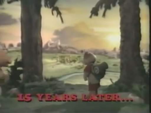
ohhhhhh it’s THAT song, the heaven let your light shine down band.

yeah
I forgot Colberon used to listen to slightly more palatable garbage off the radio before he was actually in bands. I figured it was some mopey cheaply produced garbage like I used to find in our shared Kazaa folder years afterward. “Sparta’s” singer sounds like a sick puppy and the music sounds like what I hear while passed out when I am sick myself.
ehhhnyway, wikehhhpedia sez:

The title is claimed to be just lines lifted from that annoying Paul Simon song about wanting me to be his body guard. Why name your entire debut album after irrelevant lines in somebody else’s song? How can you have any respect for a band about which you believe that? That would mean the bums weren’t even trying. And the “fact” has been on the page so long that obviously loads of folks are quite willing to believe it is true, while I seeing that statement for the second time knew I needed to look it up. AND the actual Simony lyrics, apart from being fairly strangleworthy, don’t include the “and things left unsaid part.”
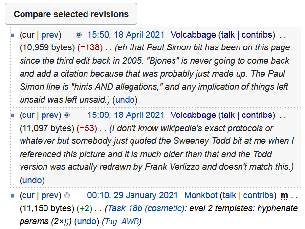
I am tired of garbage like this. I used to think it was funny when I found dumb lies on wikipedia but now it just makes me mad because people who know nothing will paraphrase those lies to prove they are smarter than and dismiss someone like me when they don’t know a ding dang thing, and then hundreds of other fandom wikis and automatically generated clickbait landfills will copy all the same junk and then after being established long enough each can be cited as sources by any other.
I don’t even care about this album and I easily proved both these statements to not be provable. I went there because I was angry about one thing and then became angry about something else in the same paragraph.
I don’t need my edits to be permanent, but I like knowing that anybody who goes to revert them will have to become aware of how annoyed I was. I was in a bad enough state to not realize I derisively used the word “bit” twice. I haven’t been that angry since somebody claimed [adventures of] Lomax was voiced by Kath Soucie, even though Lomax has the exact same voice as every other character in the game and only says things like “oh no!” and “let’s go” that sound like the same pitch-shifted probably sound-effect guy voice samples used in Lemmings 2.

I was kidding, sort of, with the manner in which I present these objections, yet this sort of thing really is a problem.
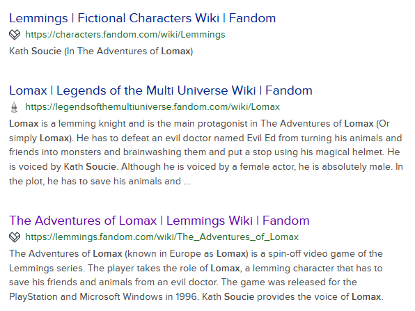
Soucie is an actor popular for squeakily voicing female often animal-based cartoon characters that became the target of lascivious affections from viewers, some of them extending their taste in animated wank fodder on to soucie herself. I don’t know WHY such a person NEEDS her to be Lomax’s voice, but now it is phrased countless different ways out there, so that each is harder to identify as copied from a casual falsehood on wikipedia, and I doubt Soucie remembers every single character she has given a voice to and every name that character has been known by, and maybe eventually she will also believe she voiced something called “Lomax.” But she didn’t! True enough, real lemmings don’t voluntarily run off cliffs to kill themselves, but 70 years ago Disney’s crew filmed some lemmings being deliberately shoved off a cliff just because they thought that was interesting, and real people younger than me still believe that happens so in comparison the lomax matter perhaps seems like a relatively benign invention.
Some people just NEED trash like that to be true for their lives to have meaning. And I get angry about it because my life also has no meaning because everything is run by imbeciles who trust fiction written by nobody to dismiss real people in their own orbit. msg, gmo, qanon, nft, sjw, inherited lies and stupid abbreviations everywhere. Even over stupid inconsequential trivia. Perhaps especially over that. I am a pariah across all the lands because I don’t trust anyone who tries to tell me who to trust, and that is typically a condition for peaceful coexistence.
I of course blame nemitz.
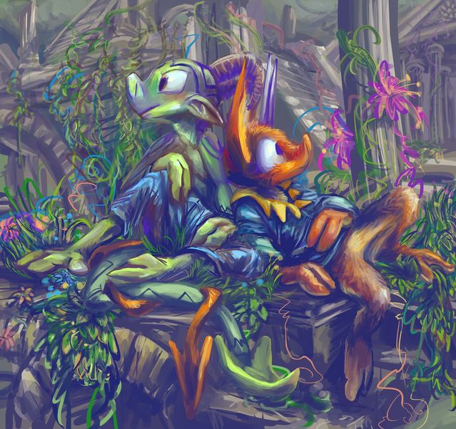
commission drawing for dookingplaza of the twitter website. Which is to say I was given money to make this, which is probably just about the silliest thing to spend money on. Imagine not being able to buy a pizza because you spent that money buying a nemitz instead, truly tragic The elpse is there also but I am more experienced blaming nemitz.
Yes indeed the scene shows this edition of these two suspicious imps resting in this manner in roughly this sort of place.
I seemed to like drawing some of the foliage here. The fooliage however is more difficult to justify.
it is frustrating to see the date on that page and realize I posted it almost five years ago and have only just inched past that section of the “story” in the 36 subsequent pages! However I have in the finished pages and the adequately legible scripted bits sorted out numerous dangling chad “plot” points so theoretically I should be able to move forward more concerned about what is going to happen than what already has, even if my speed and cultural references continue to be two or more decades behind.
I forgot to include elpse’s rope belt, but even after I noticed it I forgot it again, and Mr. Plaza didn’t seem to notice it either so it might not be important, at least not to those who are not elpse. Ordinarily I find rope belts funny and it is possible this scene was not supposed to be funny so it might be best not included anyway, apart from sparing you the unspeakable boredom of reading about how I forgot it.
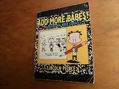
I got this back in fourth grade, which was probably roundabout 1993, from a school book fair or something because I would buy ANY book of comic strips that appeared in a weird place, and the character looked sort of like Calvin of “and Hobbes” fame anyway, and I had all the books with actual Calvin in them. I had never seen this big Nate that is smaller than a pencil before and have not seen it since,
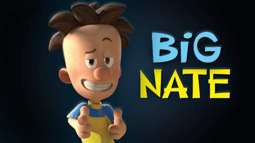
but apparently it found an audience somewhere eventually among influential scumbags.
I don’t know how you make a tv series about a kid who draws comic strips in his note books, or why you need to save money by making it 3d since it would probably cost 2 cents to animate the notebook sections, which easily comprised about a third of the natebook that I had, assuming the tv series doesn’t just opt for static images.
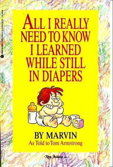
I still had the book, along with this from the same book fair, a large hard cover edition of Roald Dahl’s The Minpins, which wasn’t actually mine and I don’t know how I ended up with it, but had HAD it so long i stopped mentally being aware of it, and several Cracked Magazines in a trash bag where they’d been at least ten years as I was always weird about throwing things away, but amidst trying to get the house sold last June I finally did, and I guess this tv series being made is revenge. I don’t know anything about it except for that picture, but I don’t really need to; I am 80% assured to hate any animated series whatever it is, this just happens to be a character that I recognize.
But it does go to show, if you stick to your craft, 30 years later a soulless corporation may commission an ugly computer mockery of it while desperate for new material not spun off from stuff they’ve had on the air almost as long or produced by sexual predators they finally had to fire after too many people found out they were covering up predation.
All this is not to say I hated the comic strips; I preferred the Nate book to the Marvin book, and it was my first experience with the expletive “dang!,”
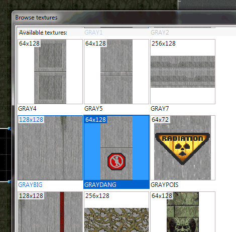
which prepared me to encounter GRAYDANG in doom some time later, but I didn’t care enough to make an effort to track down more of Nate’s biggery. Meanwhile I eventually acquired each Calvin volume, though admittedly those were more common sights in book stores and finite in number.
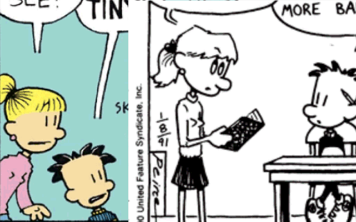
I remember being really bothered by the way Lincoln Peirce drew the breast zone on Nate’s sister Ellen and apparently later other characters. I do not understand how this is preferable to not detailing a character’s chest at all.

However the bignate fandom wiki, which exists, features graphics which indicate this specific matter was toned down at some point. Peirce still draws mouths on the fronts of the heads regardless of what way they are facing.

the wiki also features up to the minute updates about which characters’ hair is pulled too close to their faces.
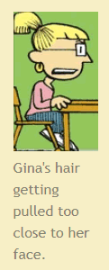
you are missing the bigger picture that Gina is a living cubist painting.
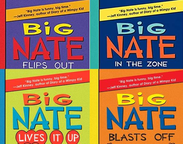
I additionally learned there was a big nate novel series by the same author that is REALLY banking on one remark from Jeff Kinney, whose “ugly comic strip about dork going to school excused by being ostensibly drawn by character in the comic” work actually came out a full 13 years after Lincoln Peirce’s and made heaps more money, and I wonder if Peirce knew the publisher was putting that line there. It is on all eight of the books,
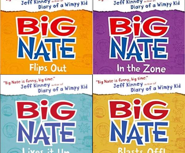
and is also on reprint editions even less subtly. He definitely knew by then, I suppose.
Ah I said I hadn’t seen “big nate” since reading that book I had, but then I remembered I looked at its syndicate website at some point because I found and saved this extremely tacky strip from 2011.
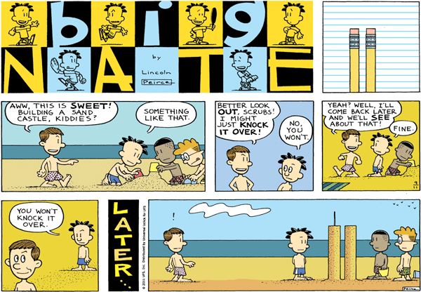
I wonder how this works; how is a perpetual 12-year old commemorating the tenth anniversary of a national disaster that occurred when he was two years old? Or does this serve to acknowledge that he is in fact much older than that and simply not aging visually, like an elf?
Perhaps every moment of Nate’s life exists in its own separate timeline where he had been two years old ten years before, and in this one he has been surrounded by stories of heart-rending tragedy about nine-eleven and, unlike my cousin Delainey, about the same age, at the 9-eleven museum in New York City, or myself, mildly older than that on the actual nine-11, experiencing disillusionment and social terror at just existing every single day, totally over with being ordered to care about the one time people older than them experienced it, and got interviewed about it, and got validated in feeling that way, Nate REALLY relates to IX-XI. Alright that bully kid is STILL going to wreck that dopey pair of mounds, because the only thing bullies hate more than you standing there looking like that is you trying to get out of what’s coming to you. The only way to make bullies respect you is to beat them in a fight or make them laugh, and Nate, as the title character of a daily syndicated comic strip, is never going to substantially alter his behavior to get tougher or become funny so obviously those are both out. The only way that sand sculpture stays up is if bigger kid has mega right wing parents/guardianship that have hammered into him how SACRED 9-11 is, and new york’s FINEST, and the MEN AND WOMEN OVERSEAS, and PEARL HARBOR, and BOOTSTRAPS, in which case he is going to murder Nate and threaten Nate’s buddies into hiding the body for daring to invoke the divine power of 9-11. He will then call the newspapers, tell them he made the sand towers, get an award from the mayor and the city will make a bronze cast of it and display replicas at every intersection.

also: who the heck does this? places the end of their tongue out one side of their mouth to show how hard they are working. It is also in the title logo and apparently numerous other nate strips even without considering the logo. I sure don’t do that. I hate the feeling of tongues on my skin, whose-ever they may belong to. I would definitely have to scrape-wipe that part of my face afterward with tissue paper. I don’t think I have ever seen somebody outside of a comic strip or my mother’s description of a Norman Rockwell painting do that. And I don’t know what it’s called and searching for pictures based on the description is getting me way too many photographs of gross mouths so I cannot research this further. But my belief is that nobody really does this.
It is like talking while pointing one finger upward.
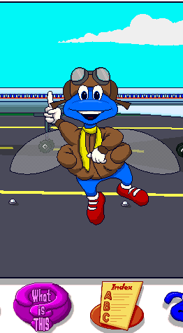
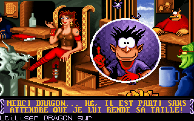
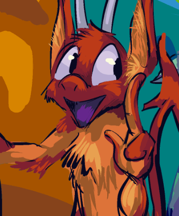
None of them are real people! I drew nemitz (orange annoying imp) doing it because nemitz does stupid things that are annoying, and even mit doesn’t engage in side-tonguing.
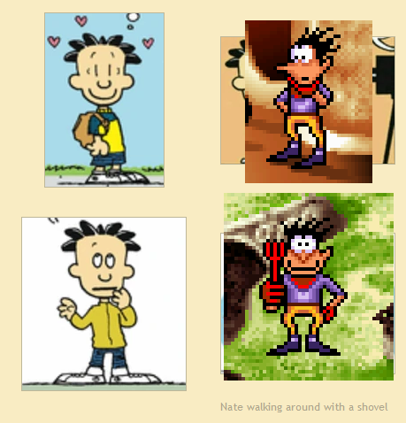
actually now that i think of it, the dork from goblins 3 looks sort of like nate (but not at all like calvin). they both have weird gravity-defying black spiked hair that looks more like grass and hold both feet in the exact same direction when facing to the side but only turn one of them and all the way around to face frontward, marking a considerable, charlie chaplin-esque posture change.
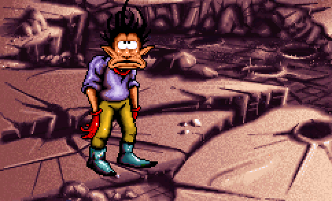
well THAT is the sort of thing i notice! too late to try and change it now.
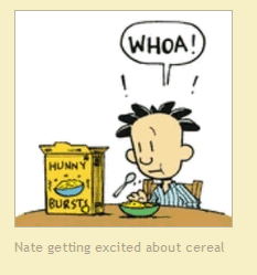
some people notice other things.

this has no relevance but it is the specific inspiration for me referring to dopes as “decadent” on one or more occasions.
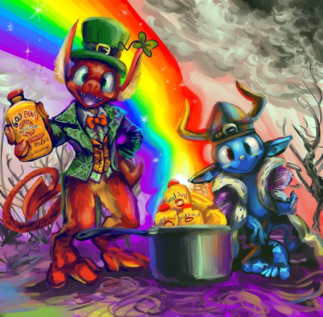
the end of the rainbow seems pretty overrated these days
this is less topical than it would have been had I been able to post on march 17, but Gold Bond fortunately does come in a topical variant. I don’t actually know what it does but nemitz probably doesn’t either and the dope absolutely doesn’t.
I acknowledge that this is rather similar to the stupid sketch I added on the previous entry.
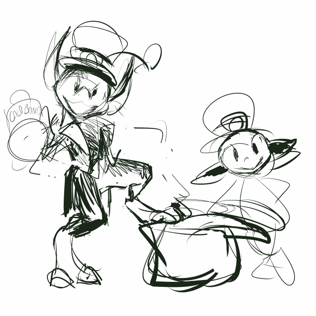
initially mit was stepping on the pot with one foot but the pose was not functional. nemitz is not functional but mitz distribution of weight usually is. The bottle mit is holding in the final version is still out of scale with the ones in the pot because it seemed too stupid to bother correcting; plainly this scene does quite enough bothering on its own!
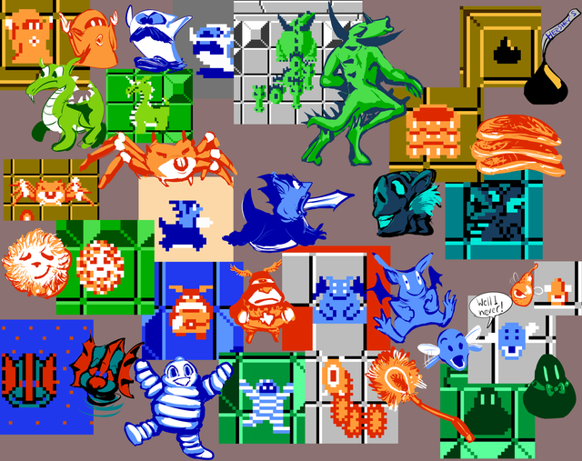
The initial “idea” of this was to redraw legend of zelda sprites based on how i remembered interpreting them as a child looking at a blendy television screen, so they don’t all have a point, and then the idea itself got somewhat warped as I added more figures.
my elder brother used to refer to the lamnola as “the toilet flusher,” as in “here comes the usher, the ol’ toilet flusher,” and I didn’t really know what that meant but I thought it was funny and always remembered it. Years later I realized he probably meant “toilet brush,” and so I took the initiative of drawing it as one. He had also at one or more junctures declared that Rudolph the Six Gun Shooter had a very shiny gun, and that if I ever saw it, I would drop my pants and run, even though I would run far more effectively without the preceding action.
The “gel” blobs were my favorite monsters when I originally played the game and I made up a dumb song about them. I do remember the tune and it is not worth reproducing, but the words to it were
We fat men
we like you
we bouncy bouncy bouncy bouncy
you kill us
we bounce on you
cuz we fat men we like you
but you keep that between us
I didn’t see any way to misinterpret the form for this but wanted to include one anyway!
I also remember playing the game one morning and was in level 3 quest 1, with the blobs, and my father saw this going on, attempted to sing the song, and I yelled at him for it because kids are jerks, and I also recall precisely how he got the tune wrong, and I today wonder how different it would have been had he been permitted to finish. We should have collaborated on an album about stupid nintendo monsters, and then he would at least deserve to get yelled at.
I don’t know why I didn’t think to include a “peahat” in this (or 2019’s very important hat video, especially considering i inadvertently put one hat scene in there twice) because as soon as I learned what it was called, I think from a television advertisement for the game, I always thought of peahats as actual sentient, wrathful hats, possibly with bladder issues, since I didn’t see it spelled out and couldn’t read and that makes as much sense as associating them with little green vegetable balls, and that is very much in the spirit of the drawings up there, even if more mentally than visually.
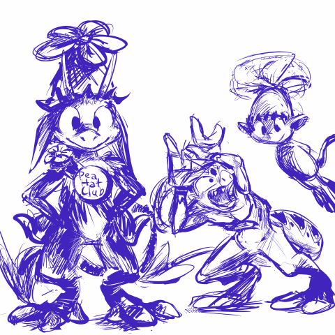
And alas now this has to happen instead.
the fbi should start its own peahat club and then arrest everybody who tries to join. yes nemitz would definitely attempt to join additional peahat clubs apart from mitz own. It now occurs to me that any hat nemitz wears while posing proudly instantly becomes stupid and incarceration-justifcation.
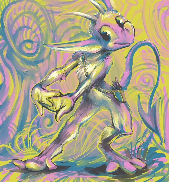
a creature known as nemitz preparing to do/possibly already doing something annoying. nothing new. There may be other components of this scene which are also not new since I drew it over somebody else’s character that I drew last year and felt inadequately appreciated for. That doesn’t mean I LIKE nemitz, but I am accustomed to the person responsible for nemitz not liking me, and I know at least that is one dislike that I deserve! I have many massive character flaws, for example, drawing flawed characters, foremost nemitz.
i have returned at last to working on the comic strip but had unfortunately left myself months ago with a complicated page to figure out, though at least it lacks nemitz. hopefully in the remainder of 2021 I will do more things that I only regret once!
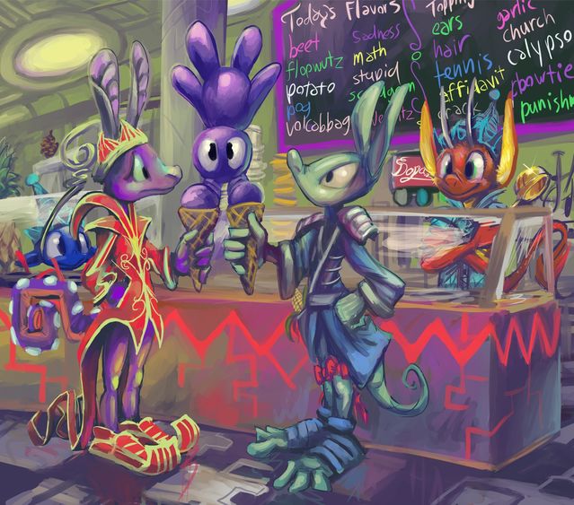
I scream you scream we all scream for nemitz’s immediate and unconditional termination
I can tell nemitz is VERY proud to have served that. Of COURSE nemitz owns a GOLD scoop. which is to say, nemitz STOLE a gold scoop. or stole a regular scoop and painted it gold. Or most likely stole a scoop and gold paint and annoyed somebody else into painting the scoop gold. What a thoroughly stupid and complex sequence of occurrences.
However, why would anybody go to a store where that thing is behind the counter, much less initiate a transaction? and then why would you stand there and watch while nemitz delivers this ludicrous order, and THEN have a problem? Those customers should be fired also.
I had “chris” under toppings section early on in production because the father of my niece is named Chris with the actual last name of Topping but it seemed improbable he would see this, and most of the people who will see it likely do not know who he is. Of course chris is still a strange thing to have on your dessert so please do not go and do that just because nemitz isn’t offering to do it for you. There are more stupid possibilities than nemitz can possibly get to, which is one of mits few redeemingish qualities.
something on thursday, is not christmas themed. It takes me so long to do anything, it is impossible for me to expect to have them done by specific dates, unless I simply do them months before they are relevant, and then I would have to wait to post them, and then I would suddenly feel very behind having spent that time on something I couldn’t use, and so I simply would not spend that time on that!
///////////////////////
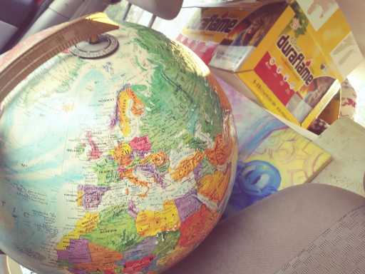
no more googol maps for me! I finally got a real navigation system in this car. there is just something suspicious about it.
as it happens i was taking these things out of a storage unit, but why did the dumb dope have to be RIGHT there? it almost looks like I staged it that way, as if i noticed the painting was in my shot of the globe and then i turned it around so the dope would be there, which is ridiculous. And then later when i was unloading the car’s contents and returning from placing one set of things into the garage, there is THIS:
dope AND nemitz. i shouldn’t have to put up with that. why was I “storing” this anyplace but a dumpster? And why is it inside my house now?
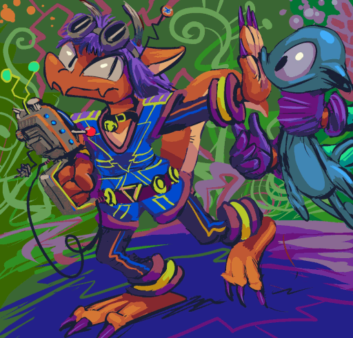
free ‘sketch’ so to speak 2-76 in which the character of lyraderg refuses the services of a dope. how does this dumb clothes-wearing anthropomorph lizard manage to keep dopes away but I cannot? most of the free “sketches” have not had dopes or nemitzes in them, but the ones that do ironically tend to be better than the ones which do not. This being the case does not mean that i approve of dopes or nemitz. I believe they may have sabotaged the entire endeavor to make themselves seem less stupid overall, even though I simultaneously REFUTE that they are smart enough to do that. They wrecked everything by accident but while intending to have accidents. I am fortunate I got them out of the car when I did.
I was attempting to prepare a popeye update but unfortunately this occurred.
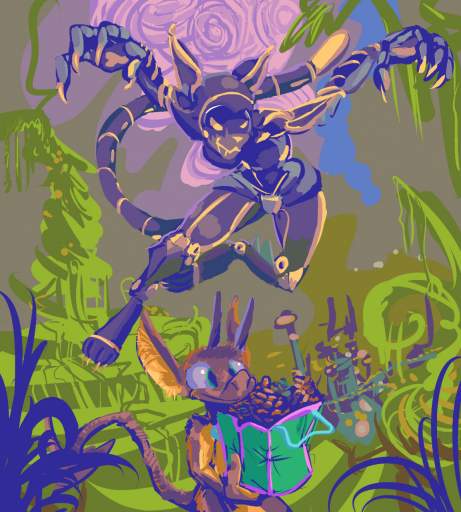
free ‘sketch’ section 2, item 79, on this occasion for Nova4Cooper, moments before Sigm4 steals nemitz’ groceries for a good reason.
I have abstained from posting most of these here, but goodness gracious the nemitz in that picture, it should be illegal to smile that big.
And even though I said “groceries,” that was for the description I put on other websites. I know that is in fact a bag of pine cones. I am just too disgusted to say anything more about it. That weird robot was difficult to draw but at least it is doing a good deed. I know it is not stealing those pine cones because it WANTS pine cones, but it does recognize the importance of separating nemitz from pine cones.
i can’t stand it. you know if elpse went out and came back with a suck full of pumpkins it would never hear the end of the matter from nemitz. What a mitzocrite.
nemitz should be put on trial. or really, that is not necessary. i hereby proclaim this imp guilty of being nemitz. case closed.

a quick test of the new tablet pressure sensitivity in ASEPRITE, a feature i had looked forward to for quite a while! i drew a nemitz first because anything i made after that could only be an improvement.
“quick” as in i probably meant to draw one frame in ten minutes that transformed into two hours
Unfortunately the way pressure sensitivity is implemented in the program is, so far, more of a detriment to me than help except on larger objects, like the tail here, so I have had it turned off for most of the process on what I did next! The way that works in clip studio I like much better. but if i ever get back to my so ill it transcends pandemic-fated doom-engine-based-construction i may be able to create animated sprite graphics faster for that; I draw them large and have them scaled down in the game so to minimize pixelation
aseprite is the same program I used to make [most of] the other pixel animations that would be found under the “animation” tab had I updated at all recently and not only haven’t I, the stuff that used to be on it no longer shows up because I linked to them from my deviantart account because they were already THERE and I could. That evidently is no longer the case. Ewps. I will hopefully tend to that before 2021.
oh fleeps I never made a website entry out of this
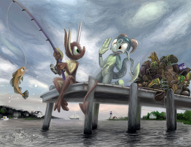
Obviously we are collecting boots today. I don’t see how you could have POSSIBLY messed that up. Hey, fool! We are not catching fish here. And yet you caught one. You couldn’t even catch cholera by ingesting the Vibrio cholerae bacterium, and still you caught a fish. Good job. “Good” as in “opposite of good.”
Atrocious. Typical nemitz move.
tennish years later
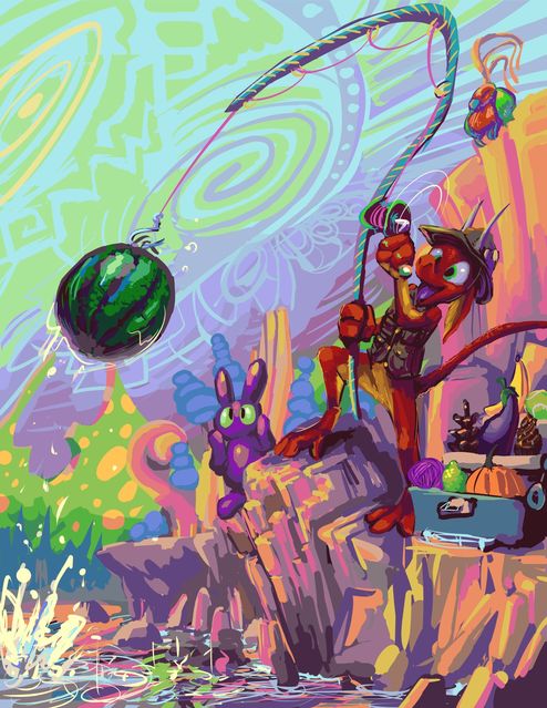
nemitz (orange imp) seems to be improving mitz skill at fishing. improved for nemitz, i mean. Presumably elpse (green imp) has something better to do. I hardly think there could be anything worse to do.
meanwhile I have I have not gotten much better at drawing!

page 46 of that. a bit cramped, hopefully not to the degree that it is confusing, since it may be confusing anyway!
urk 100% of the words out of nemitz’s mouth are trash. in fact if mit literally said “trash trash trash trast” it would communicate more information than mit typically does.
i keep forgetting that having the elpse lope and nemitz in the frame together messes with my usual way of plotting out pages, and with the giant stupid sack there also it will only be intensified.
i fear that I shamefully copy-pasted the scraps of the automobile. but i fear that the car has not been shown full frame recently enough that this clearly IS the car. it is such a distinctively poorly-designed car that surely anybody who had been keeping up with the “story” up to this point would know when a car is mentioned and a piece of that one is shown that it is being referred to. i hope.
i also hope that giving this quality to nemitz is not a mistake. it seems very mundane. it in fact was not planned. it seemed like a way to follow up elpse refusing to move the bag and also allude to something from earlier that i never gave an explanation for, the curious three blue electricity-looking shocks that nemitz experienced during the hospital section. instituting a major character revelation primarily to resolve a circumstance that only occurred in an attempt to be funny feels unwise, but resolving something old that I didn’t know what else to do with is better than simply forgetting. i see plenty of fictional media where a problem like this — such as a large object that no one can move — is resolved offscreen without an explanation. if i just cut to the imps in the car with the bag you could assume they found some way to get it in that might have taken a while but was not incredibly important. i may have to limit nemitz’s sphere-activation-shock-strength ability in an odd way or make the energy work differently depending on circumstances. super strength is just too common, especially if i indicate that elpse also already has it on account of the kumquat injection and is just too deep in self-pity to use it.
———————-
10-4-2019 337am: really not a good week! and not cheap either.
////////////////////////////////////
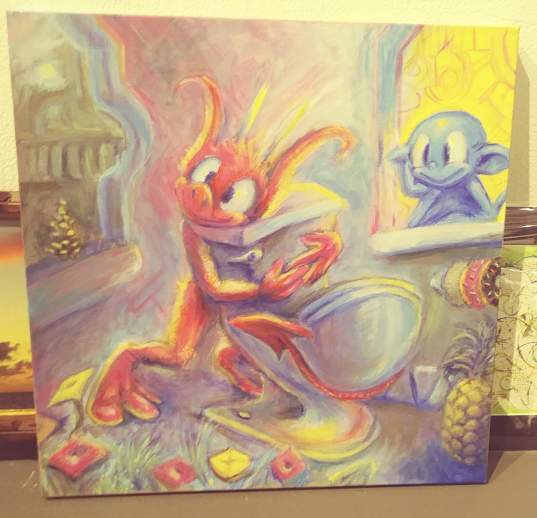
a suspicious painting about which I have too much to say to say it at this time. What is important is that for the time being mit is someone else’s problem.
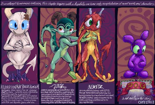
I prepared all the pages for the [proof copy] of the next comic book and sent away for the proof print. I do not consider the work finished and probably will not have time to make a full order for the November 2 + 3 art show, even if i do inexplicably finish by the time the proof print comes and I do not find anything with it that is wrong beyond what I continued to poke at meanwhile, but at least for the time being if something goes wrong it might not necessarily be my fault. Additionally I have updated all posted pages with my 3 months of changes and they can be viewed from this point onward.
Regarding that up there, it initially started the chapter, but I thought it was more “professional” to start the chapter with a view of scenery, and also establish kumquat and pog’s presence. Also, I like the idea of the comic strip having no narration whatsoever, but i also MADE this dumb thing and have always had it between the end of one part and the start of another, even though at THAT time, part one was in a state of disarray and the whole point of my redrawing all that was to render further explanation of what it shows unnecessary. However, obsessive compulsion states I must include it if I am able, and so for now I am doing so.
Kumquat still looks awkward, but the other three characters look slightly better. Elpse no longer has fish whisker things protruding from its face nor stripes on its thigh regions. I LIKE those details, but if I have them here, then I risk forcing myself to include them everywhere else like I did after I added little zigzag stripes next to its feet and hand areas. Also, nemitz is still a crumbag. THAT would be truly impossible to fix in time to get the books printed.
This is only a half page, but i used the second half to cram in my various website urls. Of course I still have people asking if I have a website while looking straight at my business cards that only exist to show urls for my 500 different websites, so this may be irrelevant. Yes so I have tentatively placed this on the inside front cover. I will of course scrutinize that text’s legibility. I do not yet have something for the back cover or a preview of the next issue’s front cover for this one’s inside back cover. I have a lot of cover left to cover.