


It is one of my long-held personal beliefs that if you need to ask others if you should take on a creative endeavor, then you probably should not. Additionally, if you ask anyway and people make every effort to not give you a clear response, then their answer is “no” but they think you are too emotionally unstable to handle criticism or dissuasion. They may be right, in which case I will resent their positions of superiority and continue making uncomfortable liars of them.
I proceed despite all evidence implying that it is a terrible idea. This can mean two things: I am a visionary individual, destined for great success, or I am truly insane and destined to lose much money and what little optimism I had left for my creative endeavors. Perhaps it is not surprising that the box office record-breaker Delgo looks like what would happen if I paid a “serious” artist to draw an elpse.


People didn’t believe in that property either, and it went on to earn a historically low amount of money. It shows that if you believe in yourself and persevere amitz adversity you too can get the world to mock your life’s work. I feel motivated to one day produce an even bigger disappointment than the character I at one time called “the unnatural clone baby of Abe from Oddworld and Jarjar Binks.” (That is slightly more apparent through the “leather pants with bare feet and vest” aesthetic that is not evident in the picture I used here and I am not going to look up another and risk having to draw another elpse that creepy this soon)
True, worse movies with uglier characters that cost twice as much to assemble have stolen billions of dollars from customers but they had corporate backing every step of the way, which is apparently the sole valid factor. Delgo is a rare example of a computer animated horror getting precisely what it deserves and for that it should be recognized (even if it is mistakenly recognized as elpse). Is it wrong for me to desire recognition?
Whatever happens, the ambiguity that surrounds everything I do will dissipate at last. (Which therefore means I will never actually get to that point).
I must do it, even if only to crush the desire to do it. My goal was always to print the comic. That is why I forced it into such a rigid shape all these years. Despite all the printing I have done for non-sequential “art” pictures, I never considered how inappropriate my colors were until recently. Typically the printout maintains the relative contrast pretty well. The only problem is that it often seems too dark, and I hate having to guess at that sort of thing. Different printers or softwares convert my frightful RGB computer colors to CMYK ink colors differently and I can never know how it will go, and the employees working the printers often seem to know less than I do, and unmistakably care less than I do.
I considered that the faded colors I get when vectorizing my old, low resolution drawings in Adobe Illustrator is probably best to not rebrighten too much over, since the reason they are being faded in the first place is because Adobe Illustrator only uses CMYK ink colors. Paint Shop Pro, that I draw the comic in, only uses RGB, meaning the color gets converted three times before the end and sure to be degraded considerably, but effect of the final degradation will be less extreme and easier to predict. Some of my pictures are garish anyway, but I do not on my own think to tune them down, ordinarily. The colors that are ugly on a computer are often impossible to reproduce in ink! My creation is literally too abominable to exist.
It is apparent between 24 and 25 that much less redrawing is being done on the updated pages, than in the past, perhaps less than is called for. I underestimated my ability to find something ugly. Printing in color is expensive, so I will probably just do the first 32 pages for the first book attempt, which gives me a functionally arbitrary stopping point. Once I get there I will look at it as a whole for the first time and fix the art up better, within reason, provided I can afford reason and the printing costs. The text needed to be completely redone, however. It flagrantly crossed barriers and performed unorthodox actions, and I risked it being more interesting than the characters.

It probably is not any easier to read now, but if you glance or squint at it, it seems like it would be if you looked closer.
But why would people pay money for a comic strip they can get for free on the internet? I do not know! But apparently some people do. I know that when I have, at stupid art shows, shown people printed out samples of the comic, and they seemed interested, and I told them they could find it on the website, I never heard from them again. This then also knocks out another excuse. It will be there in front of them, to not buy or care about instead of not buying or caring about my art prints. With just the prints to sell I feel silly, since I would not buy art prints myself. But comic books, I have bought a few of those, willingly, usually. Eventually people will have no choice but to admit they think I am marginally talented and delusional. Victory at last!


page 2 of part 3 of this is now available. In fact it has been available for a few days but I was trying to implement a new website for reasons that will probably not amount to anything.
I had not designated the beginning of part 3 as that when I did it, but I do not expect another good beginning point in the near future and I imagine it is good to have one now and then.
The new display system is sort of working. It is now possible to remark on individual pages and for me to upload bigger pages that will be reduced to fit smaller viewspaces without causing scrollbars. That may not be necessary, but I spend much of my life seeking out the least-necessary things to do.
And did I not say it would be the last real-inked drawing last time? Maybe I will mean it this time.
I had to give it in and start drawing on it in photoshop with blendy color mode on. Staying inside lines I was not totally sure of seemed silly, and having to make new lines seemed wasteful when it would be easier and look better to simply use colors. In a sense I reneged on my renege. I rereneged. Or perhaps I merely neged.
I tried out having bigger drawings, also. I am not certain it is an improvement. The nemitz-half in the large drawing looks especially pummel-worthy, however, which is always important for me to maintain. However, this passage is ultimately irrelevant. Maybe when I am dead somebody else can “arrange” the drawings I did so that they are more functional and meaningful, like Rimsky-Korsakov did with Night on Bald Mountain, originally composed by someone whose name I forgot. That will be me, the person everyone forgets or never knows to begin with.
I wrote something terribly boring. I will look it over on Sunday and see if I can make it any worse.
———————————

page 23 of that
Another redraw, but with an added technological development. Adope Illustrator (and flash, to a degree) can “trace” low resolution images and convert them to vector mode, which can be endlessly upscaled. It is a corny, obvious conversion, but it is less obvious than a simple pixel upscaling. So if I only draw over important areas, something that I miss will be less obvious. This is thus theoretically faster than my previous redraw method. It is still not as good as a totally fresh, non-traced redraw, but by this point I like the old drawings, so am in less of a hurry to re-interpret them. This way can also preserve some color, but I forgot to increase the number from the apparently default value of 6, and I considered that having contrast and shadows emphasized would be sufficient and I would only add color sparingly to have more striking and less garish artwork. That was incorrect, since this still took forever to work over and I absolutely need to have yellow green and purple everywhere. Next time I will try keeping the original color, or at least Adobe Illustrator’s cmyk conversion of that so I can reach full ugly more quickly.
That it seemed like it should have been easier ought to have been my first clue that it would be harder. Or perhaps just so dull a task that it seemed harder. The next page I make, whenever that occurs, will be for the “newer” part. it is about the only thing in my life that is not fixed in place, cyclical or getting worse, and I find it highly suspicious, and therefore intriguing due to that.

page 22 of part 1 in that.
Maybe it is time to embrace that I cannot draw interior scenes rather than fight it.
another redraw page update! I need to order more paper before I can draw a new page. I cannot order more paper because I am trying to unload this house in ancipation of moving. I cannot do that becaues there is half a century’s worth of other people’s forgotten fiddle-dee-doodle in the attic here and nobody else on the planet but me will go up there. Some of them are even still alive. I do not see why the Grinch needs to steal Christmas from Whoville; I have several decades of christmas right here that can be had free of charge. In fact he can come by any day of the year and make off with whatever seems relevant.
I have however added a new cast page, to assist in identifying important details since I go so long between updates.
addendor:
yestorday someone else visited the attic and I realized this illustration board can hold ink on both sides and I had merely not re-evaluated that situation since I stopped using regular paper.
So I just do not have time, then! Do not think I will not find a way to experience difficulty!

redrawn page 21 of that
One of my so-many problems is that I sometimes have a different idea of what I am trying to do than I did when I last looked at it, and then the NEXT time I remember something that I forgot on the previous occasion.
One of the reasons for the walls, I think now, is so that somebody visiting one house is not aware of the other houses, and how close they are. But somehow on numerous occasions I have made a neighboring house visible while a visitor is beside its front door. There is supposed to be a big hill and imperceptibly narrowing space so that visitors do not realize the road is a circle and the houses are all directly beside each other. In fact at one point I considered that maybe there is just ONE house but that was twice as unworkable as the present idea. I suppose it is like the old saying: you win some, you spend the rest of your life trying to recreate those circumstances and eventually give up in disgust at yourself and the world.
I dropped the “space” gag. In this situation this could be legitimately misconstrued as space travel occurring. Nobody has brought this up to me yet, but perhaps no one who would has yet gotten far enough with a fresh memory of this to wonder how elpse walked to the other planet that lope drove to. Also, following that with another view of the houses would be jarring regardless of how the gag was interpreted. However, I think this view is important. I am unsure why I left it out before, because I think even then it is what I meant for people to understand. At least by the first round of redraws I did. This may still fail to communicate what I meant it to, but now I will remember when I see it and stay on the same page with myself in the future. Unless I insert another one somewhere, which will increment the number.
This now offsets things by half a page, but pkzipfix suggested an additional elpse nemitz interlude to explain them better than I at present am explaining them in the future. I like them to be forgotten, or not known at all, and then to appear, and for readers to only realize later that they have been seen already, but maybe it is not as special as I think. This is hardly watchmin; my indestructible naked blue being is much more feared by the Russians.

Regardless, I have half a page to fill.
============================
an addendoy: the next part can be cramped into one page. It is lacking in visual detail or dialog so this should not be the problem I usually make it into. But where will the christmas duo go, then?
page 20 of that. it is fundamentally unchanged from before. The only difference is that it is better drawn, even though it is mostly the same drawings. Theoretically it should be much faster to redraw these now that the layouts already fit, but a comparison reveals I will still find a way to make new problems for meself.

One surprising development: When fiddling with this frame, I spoke aloud, to nobody/everybody, “I bet it would be really stupid to be lope.” Of course it would be, but why would I wait so many years to place an open wager on the expectation? Anybody who might think otherwise has surely long since lost all the money they were going to over such ignorance.
I meant to have a new update Saturday. I also meant to have it Friday, but I was attacked by skeletons.
—————-
page 63 of this.
I meant for this to occur earlier in the “story,” but I could not find a good place to insert it, as I thought of it quite a while after I should have. All position candidates disrupted what little narrative flow I have or conflicted with another k-interlude. It breaks the flow here as well but I can push it to yet later. What matters is that it exists now, so if a good place appears I will be ready for it. It once was disruptive enough that I drew panels out of order; now even the pages are transient vagabonds.
Anyway it looks too much like I drew it recently, due to the heavy abstraction and flagrant purple. I meant it not to, but my meanings often go foul. I simply could not think what solid, identifiable objects would be in this hallway. Lights, decorations, plants? All eluded me.
I was reluctant to place it here, at the “end,” because I have no idea to call back to nemitz’s outburst in the near future. I think it would be best to explain that around when it happens so that it can be forgotten until it becomes important. Why remind people of it so long after it happened if it is not going to happen again? Just to prove that I did not forget I did that? Apparently so.
It is my destiny to go all-digital with artwork. Jules Feiffer is better at inking than I am. In fact I had meant for this to be all digital, but since I intended to insert it earlier I figured I should put ink on it.
This is probably the quickest, slobbiest, least obsessive-compulsive, ink-job I ever did. Not the worst, but only because I have a better pen than when I did the worst (I had the sense to inadvertently delete the other half of that page). The most recent outside scene was not so bad, because I love to fill space with clouds and building outlines and all that sort of thing. This page is inside a place I have presumably drawn before, so that meant I either had to look up an old page and figure out how it worked or fill in things later, and it appears I did neither. When I am drawing on paper, my computer access is compromised, due to the small space, and my system of obtaining references is terribly disorganized.
I do like to fill in corners with cross-hatching and thatching and splatching but I forgot to do that this time. I thought I might want to add another frame on the last row, and avoided putting in anything I would be too compulsive to remove later, but I mostly forgot.

I did end up taking out
*I never told you who that is but meant to on several past occasions.
Howdy.
page 62 of part 2 of this.
Or perhaps it is page 1 page of part 3. If I do not conclude part 2 immediately before here, I may not have another “destination” point for a respectable amount of while, so this is a good point, if for no other reason than it leaves part 2 comparable in length to part 1, which also ended without a resolution and appeared to actually be two parts. I do need to insert an additional kumquat page that I have not drawn but determined to be precisely 16 frames in length and lacking in action. However, it does require me to draw a mechanical apparatus, and I still have not fully recovered from drawing bicycles.
I could also force in an additional section about Treco (chair with arms) choosing a bomb courier for the following “day” but I have not determined anything about that delivery apart from that it will happen tomorrow.
The lizard should consider fashion accessories that do not fly off it every time it gets surprised, as it gets surprised frequently.

Based on a ew story.
page 61 of that is now available. And I swapped 60 with 59 again. What fun!
This comic takes a surprisingly long time to color considering that every page is purple.
Why do i keep making sequences in which the viewpoint and character positions do not change? drawing something twice is not one of my talents. Although observing my talent deficits is.
Can you determine which of these frames does not quite fit because I drew it separately from the others and then fortified with dialog from the frame I did draw but removed because it did not accomplish anything and I lacked space for both? Probably, but that question may have been so confusing that you do not actually know what I asked and so do not answer, and therefore I win!
It seems that I like my characters better the more mentally screwed up they become, even though this results in them having fairly interchangeable, and inconsistent personalities. All three of these dwobos here have some issue that the other two think is insane/imagined.
page 60 of this. Yes that yellow font truly has to go.
Peh, there still is not time to talk about this at length; I have a prompt appointment with aimlessly walking outside in the rain.
I like this page better than the one before it. Also, it “works” (the creatures are layabouts; only I work to put them here) better if you have not seen that one yet. Whoopth. I started this one, then realized I forgot to make that one, but should soon since it follows immediately after the last time the gnomes were seen, and rerealized I had better get on that, and later reallyized it was less urgent than I thought. In fact the last time we saw them, we were jumping ahead a few minutes into the future, since as I said at the time, there was no way they could have reached their [location] so quickly. Now they have had time to get where they are going and we can rejoin them at their proper position in chronology.
page 59 of this. Look at it, if you like, before you read what is beneath here, if you dare.
Excessive “hatch” detail is secret code for “I do not feel like drawing a background here”
If I had known how many pages were going to have these gnomes on them I probably would have made them lizard or camel people or given them a meeting place that was more interesting and easier to draw.
And now I have enough gnomes for half to split off and form a rival gnome gang. It seems a bit more like an army than a gang with that many members, although they are at a birthday party.
the rightmost characters in the last frame I added very late, since there was too much space free (and then after I tried to add them there was not enough space!) and I did not know where the drink had come from. It struck me that the one with sunglasses would be much more appropriate to have objecting the comment about bad attitudes.
The last row is not necessary, and i like that it is evenly on one row, so it can easily be removed. However, I wanted this to fill one page, since I think that saves less trouble later, if scenes do not mix in such a way.
Herge did that a lot in his later Tintin stories that were not made on weekly deadlines, but they also were planned out in full before they were drawn and forced into a restrictive 62 page format that required them to be economical. Restrictive for him and his team, anyway (from my viewpoint, at least, but I never read any official statement about that); some Frencho-Belligerent comic folk went with a 47 page format and still had lots of space. My space is imaginary and unlimited and I still run out!

Indeed, such was the vexation caused by this page that I barely drew it on paper at all. I feel like I am forgetting how to do that. Very little was coming together like that, and I used no ink. I never really knew how to do that.
However, compared to the first “bar” scene from, somehow, a few years ago by now (also known as about an hour ago), the coloring is much better. I used such subdued tones before, and the pictures look covered in dust. If it was deliberate, I must have been trying to account for my instinctual garishness, but I did not quite succeed. The garishness will always escape, as the current state of the page link page reveals. I will only defeat it by learning its tricks and shame it with my superiority into compliance. As the defacto parent of the comic strip I will make it think its rebellious preferences are “uncool” by pretending I share them. One message I should have taken from video games is that “sealing” an evil is never sufficient and it always come back. I am ineligible for real procreation so I cannot rely on descendants to finish paying off my evil-slaying debts.

This makes me think that I should drop the pretense of black outlines for part “3” and produce new pages as I have been producing the redrawn old pages, by forming objects out of colors, which is closer to the “normal” process I use for making imagery. Actual ink looks very good, but if I no longer use it then ultimately nothing is gained from pretending to, once consistency with preceding material is not a factor. I was not pretending at first, but on this page I most certainly was.
Outlines are good if you hire someone else to color or you make outlines very fast, or very well, but I make them slowly, badly, and probably spend about as much time coloring regardless of their presence. My outlines are generally incomplete when I start coloring, and continue to change as my perception of the page changes through its stages. I certainly do not make enough money from all of this to hire others to form my half-brained mush into something solid, but I can probably make more presentable mush.

In any event the next page should have more smiling blob people that my skills are better adapted to on it.

I get ideas when I go for walks. I think “maybe I could execute a backflip right here” in the street, and then I think that I will probably fail, and so badly that it kills me, and then people will wonder why there was suddenly a dead person in the road. Perhaps investigators could determine that I had fallen, but would they be able to figure out that I had tried to jump in a stupid way first? By the angle of damage and apparent velocity of the impact? Or would it just be “ruled an accident?” Why am I considering so far beyond my inevitable foolish death? I would hate the populace to think I had become dead for no reason. I was TRYING to DO something specific! I hate to be misunderstood, especially when I am dead.
This comic will run on your Amstrad system.

Oh hooray. And now for the first time, unlike the previous occasion on which I suggested it, every page of the questionable bimshwellian comicoid is now colored. It took a surprisingly long time, because every year I become a bit more adept at finding things wrong that nobody else would have a problem with that are ultimately beside all points, unless they are completely remote from the points. If my skill at amending these imaginary errors also increases it is at a rate which is not substantial. This looks better than it did overall than before, anywhy. Better overall; I am becoming conscious now of some non-contained text that is rather hard to read against the now non-white, surroundings. In fact they seem surprisingly dark when viewed at this size.
Also, a perhaps superfluous twiddler page that will only announce matters specifically related to the comic, or possibly other things with pertinence to brightly colored imps, but withold my abbreviated, frustrated summaries of things that are better said in full in places where no one will see them (here), in contrast to the no no absolutely no-torious zinkugel.

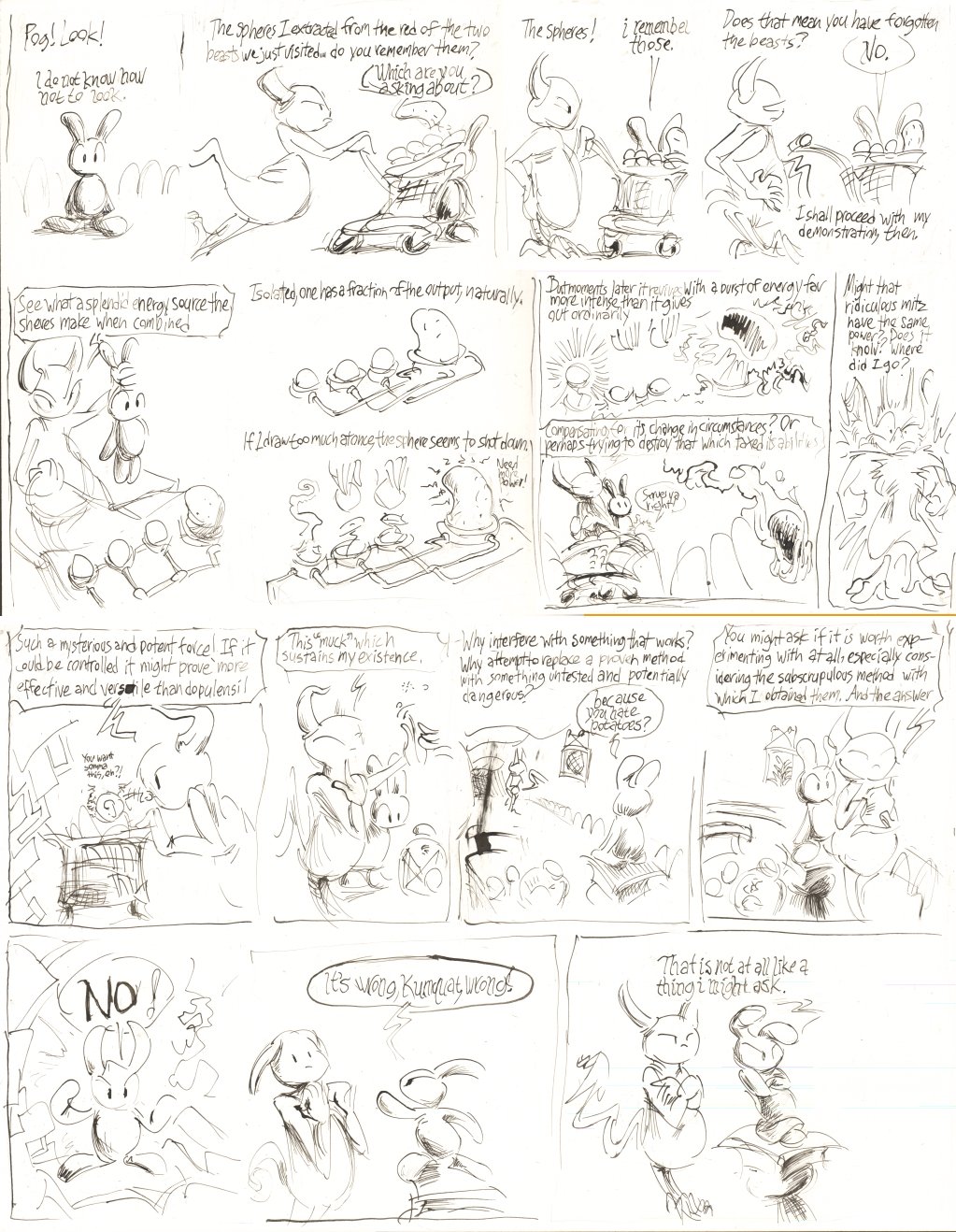
page 19 of that
I made some questionable decisions here, but i am trying to question them in advance more than in some previous days. I decided to add in some space-filling nonsense rather than aim for maximum efficiency, which would have resulted in some frames currently planned for the next new old page to be on this page. This also allows me to, for now, have perfect continuity link-up with the old old pages. After the last few updates, the following non-redrawn page would contain redundant or contradictory material. Further, in an event that surprised everybody (with the only person paying attention being me), all the extra material on these 19 pages balanced out perfectly with the smaller, inconsistent size of the old 19 pages, so that the next page is still 20.