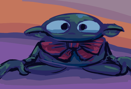
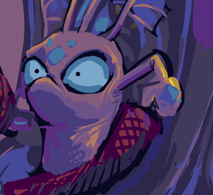
and a third: this may result in the sparsest “year in pictures” yet but i WILL get that dumb cartoon out. or outer than it was. I finally got annoyed enough at the beet beast’s flat face to try and make it more angular. i may have subconsciously been channeling kumquat when i should have been thinking about more of a rotund lope. maybe i was sub-subconsciously averse to that since I still have not concluded or explained the rotund elpse in the comic strip for the past few years / hour of comic strip time.
///////////////
and a second updirt: i underestimated how treacherous the larger character’s whiskers have been. the rudimentary way I have them drawn the first 30 seconds look more like “whiskers” but less like whatever weird bulb-ended things I decided to draw them like in the later 30 seconds more recently. And now I must choose one!
///////////////
indeef, now that I am looking at the animation from even two years ago it confounds me that i ever thought it was acceptable! even on the easy-to-draw purple imp, some of the movements are awful, and I have no choice but to improve them. I wish that meant I was good at animating now, but it only means I was worse at animating before.
///////////////
more of this. it feels to me like cheating to use this as an update since the effort I put into cleaning the animation and backgrounds is mostly obssive compulsive in nature and impossible to discern unless you have been seeing the dirtier yet once-acceptable contents constantly like I have. AND i still need to apply that habit to whatever perceptive dirtiness may have accumulated since the last time I had the first half open for editing.
as possibly previously mentioned, I needed to separate 3beet.fla into two files some time back, since it was taking prohibitively long to make saves, with auto-saves a particular nuisance but that I did not dare disable since flash has historically been the most crash-prone program I use as of 2006 when I stopped being able to use Ben Morris’ Doom Construction Kit in after I switched to a windows xp computer and could no longer use dos applications except through emulation and decided I finally needed to learn how Doombuilder worked.
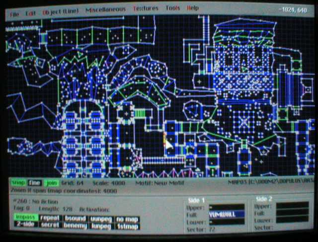
goop lorp was that 17 years ago?? how old AM I? And this level still isn’t finished.
I definitely need to re-record the audio, even if it is destined to eventually be re-recorded by someone else because the line “roundabout this time” especially sounds bad. I don’t have underbreathed enunciation issues when I practice singing it in the bathroom so presumably I could do it better now. i could even just re do that part and paste it in where it belongs. But I haven’t yet because audio editing requires, from me, a different state of mind than tedious image editing does, and asking other people to record is several layers worse. But I try to optimistic; I always believe a situation can get worse.
I tried to make these in recognition of my mother’s birth day since she likes pictures like this more than the regular garbage I come up with, especially these days when I get so obsessive about my real projects that even basic updates take weeks or months, so the stupid characters that I draw based on internet people or worse seem like all I am doing. I need to show once in a while that I can do far worse.

I am not sure who this is, but it looks like trouble
and now we have bigger problems. whoever these people are, they seem to be faced with challenges that I feel fortunate to avoid and I admire their attempts to persevere despite those challenges.
11-23-2023
oh nuts I totally lost track of what day this was updated. i had best force something out
////////////////////
yes this again, but now all its movements are filled in! not all fully shaded and I would like to make them look more cohesive and fish-like, but for now i can focus more on the beet crony. and also displace that text heap from last week that was not meant to be such a heap or have a week’s worth of prominence. i occasionally worry that this blue creature looks too much like the gobliins 2 character winkle even though i feel like i have considered and dismissed this before. i don’t want it to be yellow because then it looks related to the larger creature. green and red feel too generic, though. meepwhile grey and brown are too boring and orange simply doesn’t suit it.

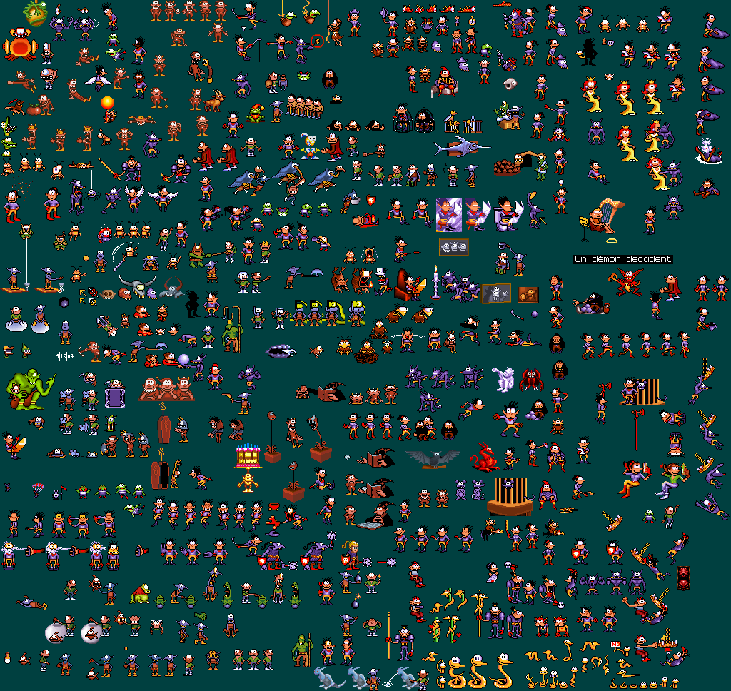
winkle has a similar skin tone, head point and sharp nose, although its nose is not a beak, it lacks a tail and wears clothing. winkle has a mischievous nature and of the two heroes is the one more likely to annoy another character and be physically abused on account of it. Although the frog in my example yells at both of them. I used to collect sprites from this game a long time ago in windows 95 before the dosbox emulator existed, and goblins 3’s odd use of the video mode made them too scrambled to grab when windowed, but the collection was one of few pictures I accidentally deleted! I attempted to remake it via proper screenshots once I knew how to do that but I did not feel as inspired and consequently it is lacking in gobliins 2 poses.
indeed
Sheeran was exonerated for copyright infringement, or something of that nature, supposedly. I certainly hope so, I can’t fathom that he heard songs this bad and decided THESE are what I will lie about having made.
But that is fine if YOU like them, if you actually bothered to read any of this. You are real to me and i appreciate you for that.
//////////////////

JOHN LEGEND
AN EVENING
WITH
A NIGHT
OF SONGS AND STORIES
when I saw this last week my eyes rolled so hard i almost went off the road. It is trying so hard to seem folksy and humble that it is obviously neither. he gives his stage name as “legend” for fleep’s beep. yet he isn’t creative enough to not be john.
I went to the website for foxwhoops (the casino at which this event is to occur) trying to find a picture of the billboard since, at that time, I thought it would be unsafe to take a photograph while driving, and later realized it was just ineffectual. but THAT says

JOHN LEGEND
AN EVENING WITH JOHN LEGEND
which comes across as somewhat less pretentious, if redundant.
However it shows the same “humble piano player with back to viewer in monochrome” photograph, and makes sure I know how many egots he won. and also that he is the first African American Man to win one

obviously I am not in the target audience, since even with Johnny Leg’s disco graphy in front of me, I don’t recognize any songs. That may even be in his favor to a degree but I still don’t want to pay twenty four thousand dollars or less for the right to hear them in person.
it reminded me of when I ended up on a terrible “screenrant” page last week
“the room is terrible” says conan o’brien
what a vague bizarre headline. it tricked me. it was designed to trick people and shove ads at them, not inform or entertain them. i disapprove of that business model. then the content of the story is like:
conan o’brien, the iconic, award-winning talk show host, sat down with the iconic, award-winning musician ed sheeran to discuss the iconic, award-winning cartoon series the simpsons
the simpsons, the iconic, award-winning cartoon series, has had many writers over the years, such as the iconic, award-winning talkshow host conan o’brien, who sat down with iconic, award-winning musician ed sheeran recently.
ed sheeran, the iconic, award-winning musician, recently sat down with the iconic, award-winning talkshow host conan o’brien and turned the tables on the iconic, award-winning talk show host to ask a question about the iconic, award-winning animated series “the simpsons.”
the phrase “award winning” instantly turns me into a skeptic if I wasn’t already. It is very much a phrase for marketing and for bad writers to fill space with. Do you have nothing to say? Just verbally lick the hindquarters of celebrities and list off their awards and other celebrities they have met, and you’ll have six intellectually barren paragraphs to surround your one scrap of new frivolous information in doh time. I even like Conan and have taken inspiration from him in some ways but I know from direct experience of hearing an offensively low effort generic bad song, looking it up out of pure anger and learning Sheeran was responsible, multiple times, that Ed is aggressively talentless.

breaking news: marginally talented irritating charlatans have a vested interest in keeping each other’s gravy trains going
I might become a “flat earth” adherent just to protest this piece of global news.
Everything about this guy has the aim of conditioning people to accept and pay for mediocrity. In 2019 in a london tube station I saw an enormous poster presented in this exact manner, presumably regarding the same product, but I did not photograph it since I didn’t want to seem as if i approved. also i was following nine other people, hauling excessive quantities of baggage and likely holding somebody else’s coffee cup and/or water bottle with the hand that should have been free and definitely wasn’t going to hold everyone up for dumb old ed sheeran when he doesn’t even care.
Why doesn’t he? And why should thousands of people trying to get to their trains have to be told that he doesn’t care? What he DOES care about is getting his name and the name of his mediocre cronies listed as frequently as possible.
He cares so little that he just “drops” shoddy songs and expects me to pick them up. I appreciate him linking himself to bruno mars though since the last time I heard a bad sheeran song in the supermarket I assumed Mars was responsible and only when seeking proof learned it was sheeran. it is extraordinary that I can see photographs of them beside a supposed musician wearing a cowboy hat and I complain about them instead. I assume the headline has been truncated and he doesn’t simply have the stage name “Chris,” but I am not angry enough at him to look it up.
I can appreciate that Mr. Legend can play a pianoforte instrument. I do not know if he does that especially well but there is definitely POTENTIAL there that Ed’s brand of bland unaccompanied acoustic guitar sappy moaning lacks. My Sheeran references happen to be several years old since it was precisely encountering songs like his that extra-emphasized the need for me to carry earphones in my personal satchel at all times. even if I do not take the satchel out of the house for a few days and need the ear phones for other tasks, I always store them in the bag because when I DO go to a place where I am at risk of hearing those songs, I WILL bring the bag, and if the ear phones fail to be in it I will quite lose my mind when struck by unblockable audio awfulness in public. It happened this summer with the beyonk “halo” song and that was hopefully enough to scare me straight for another few years. That and Sheeran’s too cohOOold outside crumbling like pASTEries are absolutely the worst songs I have ever heard that I remember right this moment. But Sheeran is a man with white celtic lineage similar to my own so there is no cultural or social “privilege” anyone can accuse me of having benefat from that he didn’t also so I feel more confident in declaring that he is absolutely horrible and without merit. Also Beyonce can dance or could at one point in her career. I don’t think I’ve seen a picture of Sheeran verifiably standing up.

look at that smirk. why stop with one cut?

hey guys we’re all unblemished rich privileged chums who get paid to be lazy together and call ourselves beautiful. I hope everyone involved with this dies immediately. But I know they didn’t because I saved this picture in January 2021 and I know at least Sheeran is still alive since the screenrant article that mentioned him was from more recently. It also didn’t mention him being permanently scarred by a sword attack so I assume that didn’t amount to anything either.
in retrospect I think he had no involvement with this but the convention of listing as many singers who need their faces looked as possible in the title confounded me initially. I only see two in the picture so the other two in the title are there for name-drop purposes foremost. And also perhaps so you don’t assume it is the beautiful people marilyn manson song, even though I would be more likely to listen to it if I thought it was the case that these ai-generated-looking forklogans were covering that raspy absurdity than whatever low energy misery Ed approved of, assuming “Khalid” didn’t bring anything new to that table, and really Sheeran has no financial incentive to allow that and I have no auditory incentive to consider that he might have. It might haven taken less time to check the song than to explain why I did not, but I would then be at risk of remembering it which I prefer to reserve the right not to. Good night!
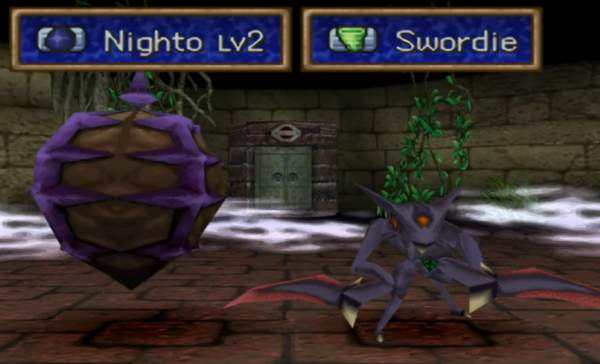
I presume accidentally getting cut by nighto is even more embarrassing.
november 8 updeet: another wordy site entry is coming, which means it is late
////////////////////////////
generally I am disinterested in decorating but halloween suits the awkward old toys that tend to accumulate here fairly well.

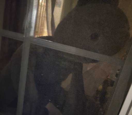



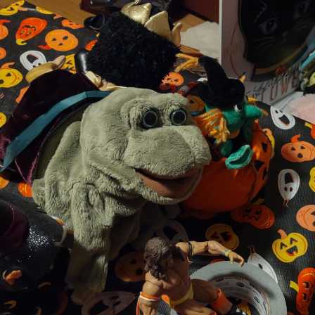


There were also some proper decorations but I did not take any decent pictures of those.

however I have a shot of this rotting pumpkin that my niece carved or assisted in carving. she had kicked it off the front steps to get rid of it on account of its recent mold harboring but I thought that made it eligible for an upgrade to the front of the walkway.
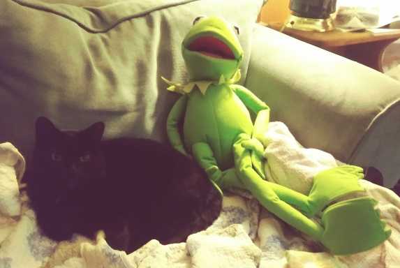
the kermit is debatably creepier without the mask but that would not fit on most of the display candidates
Another scrap of beet beast animation. I believe I am more than half done with this creature and after that theoretically progress could be if not faster at least more linear, with fewer multi-layer characters using multi-layer furniture that they are both in front of and behind. This seems a bit out of synchronization with the audio. as long it is out of synch consistently, moving it back in is simply a matter of dragging rectangles on a grid. the bootleg sony vegas that I use for video assembling –crucial, since the flash video data is presently in four different files, and two just for this part– tends to stutter at the start of clips so it is hard to match video to audio with precision without a few tries.
HM and that black spot in the center I thought was on my screen when I first noticed it a few minutes ago but evidently it is in the video! I wonder when it appeared. I hope it doesn’t mean what it does in Treasure Island, that pirates are coming to murder me, because I don’t want to die with my bedroom so untidy.


gosh what a monster

and I can hardly comprehend what an anti-semite my nine year old niece must be to own TWO of these.
for context I have never bought into the media cult around Thunberg, but rallying people against greed and corruption is ultimately doing something good. So when someone else looks at that work, ignores the actual message and evidence and seeks only what nits can be picked from it in order to dismiss it, I am disinclined to give their remarks much weight. Ha HA! An OCTOPUS which doesn’t resemble this in the slightest was used to discredit jews a long time ago! Therefore climate change is a hoax and one government which has Jews in it deserves to claim whatever territory it wants any way that it wants for all time. And if that comes from the same person who always says after a mass shooting is “too soon” to talk about gun control– no it is too soon for me to talk about this!
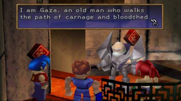
You can say that we need to consider that Hamas struck first, cruelly, without regard for the most basic human decency, but that doesn’t justify indiscriminately eradicating the population kept in the same scrap of land as Hamas as revenge. And this isn’t the first time for this unbalanced revenge. This conflict did not START two weeks ago. This is the same Gaza whose notorious stripping constantly dominated news I didn’t pay attention to growing up. No, the people who started it are all dead and we ought to be able to do better than to continue it forever, cheering for whichever “side” we were born into to “win,” like it’s championship figure skating or badminton.

when he says “both countries,” he means Israel and the US. He and the Israel government doesn’t consider Palestine to be a country and will do and say nothing in support of it becoming one, because that would require both admitting any level of fault in its policies and also ceding territory it claimed unjustifiably, which “both countries” here never do.
A criticism I see of Israel criticizers is that they don’t condemn Hamas. My initial thinking was, it isn’t necessary to condemn hamas, it was widely condemned immediately. The first and easiest reaction is to condemn hamas. But I also know there are people out there, too many in my own family, who believe in “the deep state” and will gladly tell you the evils of “the Rothschilds” and all that involves. So just to be clear, I now today condemn hamas, I curse hamas, I sneer at hamas. You can’t cure systemic oppression by beheading and raping people who have nothing to with it any more than you can cure a headache by punching someone who doesn’t appear to have a headache over your frustration at being unjustly denied ibuprofen.
Hamas has been funded by crypto currency since 2019. That alone is reason enough to shut it down.
this continuing text goes around in circles. I could cut it off here but I want to know it is SOMEWHERE even if it is repetitive. I put something roughly equivalent into facebook but evidently that was inadequate to getting me over it. There were no reactions whatsoever to it, even critical ones, which made me suspect the facebook machine simply hid my remarks since I mentioned a divisive topic but without being particularly inflammatory despite the large quantity of words used, so eventually it all came out of me again.
An irony with the gripe against Thunberg is that by insisting that someone who criticizes Israel must be attacking jews in general, it is you who makes the association, the same way someone who attacks jews in the US might accuse them of being agents for Israel just by the basis of their religion. That is absurd, and that would happen even without the stupid cephalopod there.
It needs to be possible to consider one separately from the other. Just as it is necessarily to consider people in Israel, many of whom are not Jews at all, separate from the government of that country, whose actions are not approved of by a staggering amount of those people. Not being able to differentiate these groups, or not caring to, is a big part of how these stupid conflicts get so intractable. so many ignorant belligerents live for nothing more than symbolic revenge against what they consider to be representatives of what has actually wronged them. The bosses who order soldiers into war are not harmed by nasty guerrilla attacks on civilians perceived to be symbolic of the bosses, and instead the bosses gain more leverage for their own bigger symbolic re-revenge.
Personally, I think the entire area should be vacated. That will never happen. Muslims, Christians and Jews all consider that “the holy land” and their least rational behaviors can always be traced back to ludicrous scriptural notions. A harmonious world will never be achieved when men with guns think god or gods told them they are right. And it’s usually men because god is usually also telling them to dominate and punish women much as they do heathen men. The Chinese communists ostensibly eschew religion but the government acts in a way that is consistent with one directed by religion.
The US had its own big terrorist attack in 2001 that you might have heard of, and also like Israel ignored reports it received that such an attack was coming. In fact the US just spent two decades trying to get revenge for that, and that made everything worse (though deliberately confounding the facts so George W Bush could cram in his own bonus revenge against Saddam Hussein did not help), and now the US is supporting another country trying to do the same, but with more volatile potential consequences. Stupid stupid stupid.
As much as idiots who voted for him may have WISHED for it, Bush was never going to and lacked the authority to blast Iraq off the map, even while that war killed hundreds of thousands of civilians. The Benji Netanyahu gang on the other appendage have a much smaller target entirely within their country’s border and are entirely capable of killing everybody in Gaza and have tried to sell that as an admirable outcome. That’s not good! Even if it ended there it wouldn’t be good but it won’t possibly end there. These wars cannot be “won.” And if they inexplicably destroy just Hamas it won’t end there either since they’ve already ensured the next generation of revenge-seekers whose existence they will use as justification for more oppression. It’s too late to stop this one. But it might not be too late to prevent the next one.
A sickeningly common right wing mantra after mass shootings is that it is “too soon” to talk about gun control. But they were disingenuous and meant to never talk about gun control and just hoped for another topic to come up, and sure enough we never talked about gun control. Now we have mass shootings every week now, meaning it is perpetually “too soon” after one. But it is never too soon for them to talk about gun USAGE.
I am glad to see more people unafraid to stand up to that thinking but I worry it might be too late.
Israel’s treatment of its own citizens, notably women, is superior to many of the countries in that region, and plenty outside of that region. I don’t see stories about Izzy trying to kidnap travelers at airports and as far as I know it is not punishable by death to renounce the state religion. But that is stuff NO country should be doing, so being better than them is not enough.
Hamas is a terrorist organization, and we condemn it. So regarding it as we do, we ought to hold ourselves to a higher standard than them, not merely exterminate them whichever way its fastest and say it’s done. Nothing is ever “done” just because a loud person declares it is.
This website entry probably isn’t even done, but I am trying to be quiet about it.
addendope: I changed “more dopes” to “diet dope.” It will not help with your diet but it will taste worse than a “regular” dope (which already surely tastes quite bad) and will also give you cancer faster. I do not understand how it is allowed!
///////////
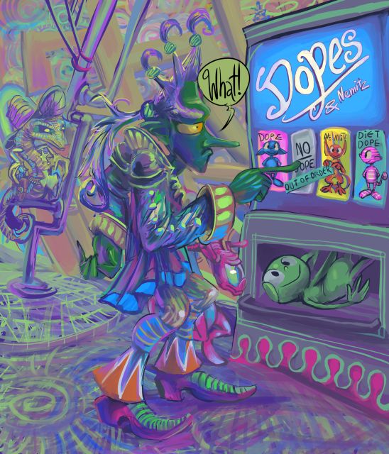
a fuller rendering of one of the cursed vendope images. I am uncertain if the sketch was intended to be the tengu bar tender from the comic strip, but I decided for this that it was not since I did not want to draw any weird back-wings. However trying to change the nose or eyes made the figure look less functionally stupid so those remain in place. Howeverer trying to draw certain that I am not entirely certain of typically results in a mess. Indeed the central figure is quite vague and uncertain. But I think I would be as well if I got stuck with a dope when I was not expecting one. Thankfully nobody paid me to draw this! Alas people have paid me to draw some pictures with dopes in the past.
Consider; you aren’t even ALLOWED to get “no dope.” what an atrocity.
and nemitz! who does nemitz think mit is holding up and pointing at “out of order”? like nemitz can read? mit can’t!
i do not know WHY anybody would put a coin into the machine. maybe the thinking is: “I will contribute money toward the idea of no dopes,” but I cannot be certain of that. *I* certainly would not try it. But would I know better without this courageous person’s example?
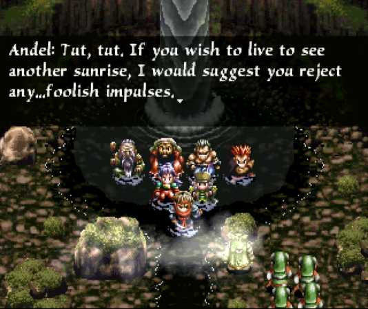
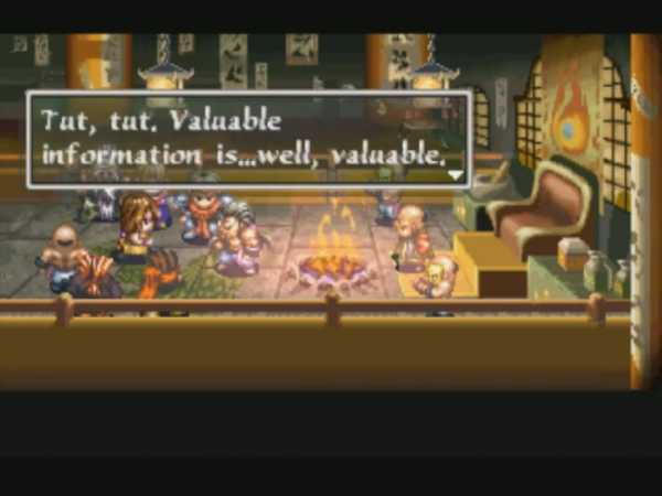
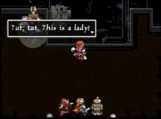
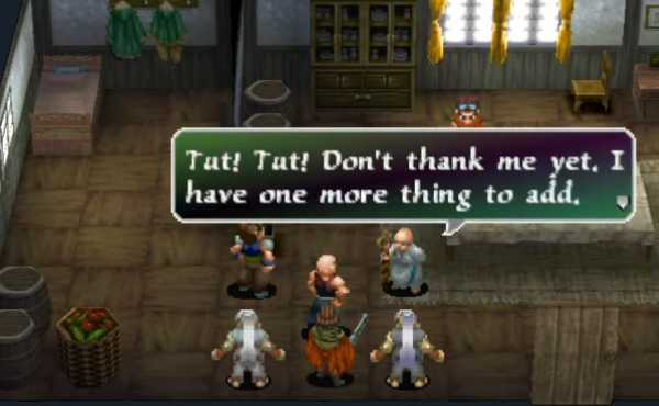
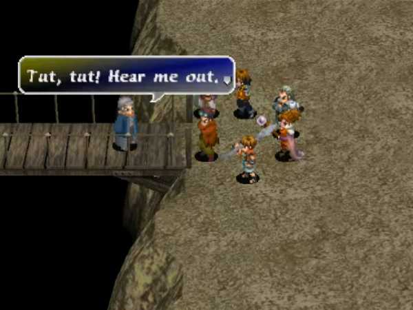
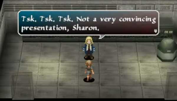
excuse me sir, I think you mean
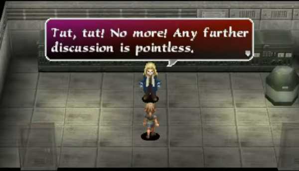
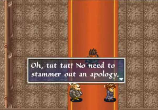
ARRGHF I was kidding!
I never in my life heard somebody say this but whoever translated Arc the Lad Collection, reportedly Victor Ireland and C. Sue Shambaugh, but probably mostly Victor Ireland on the actual localization, seem to have heard it constantly.
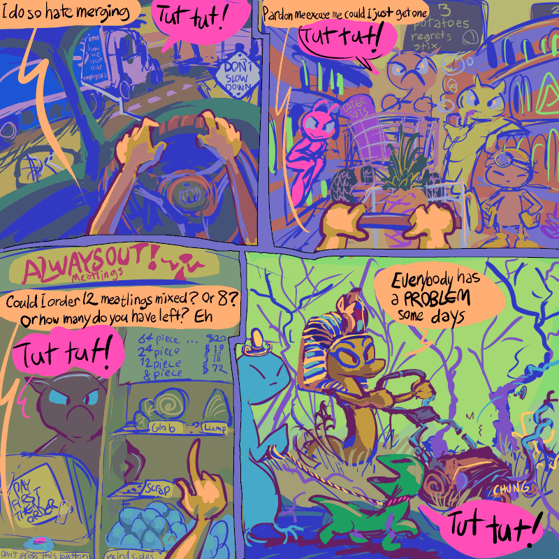
I tried imagining how this might apply to my life in a comic strip (via the pathetic snake) but it does not seem quite right, which is rather just about right for one of these.

october 11 addendork: this music arose in my music playing list while I was operating an automobile today and it struck me as suspiciously tut-tutty.
another addendoy: I wanted to replace this before next week but it doesn’t look like I did.
///////////////////////////////////
an addendoy: I suppose this does not make a whole loaf of sense; why free orange sketches, and why would non-orange be a problem? That is probably why I am still making comic strips also for free.
///////////////////////////////////
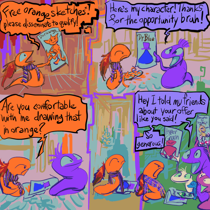
I do not even remember HOW to log in to the section of the website where I had started posting these, so this one is not there yet, much less the ones that should come between this one and the most recent other one that I did post. However, I intend to remember!
Ah! I did. I added four more, including one that I missed before. Somehow this this is a harder job than it seems like it ought to be and so is yet incomplete! I also need to determine which number in the styles.css is causing those ludicrously large numbers at the right side of the page which I was unable to do even before I forgot how to log in. The world has many mysteries.

an unusually hued nemitz wants to show you this pine cone mit found but you don’t have to look at it

Plus a few differently rendered variants, just to be extra annoying. The fool seems unaware that the pine cone escaped amitz this.
or that is what i said on my instant grampage.
it was in fact drawn different ways in an attempt to explain, more coherently than in the past, to people who want to buy drawings from me, what styles I can draw them in. However nobody has asked for one since then, which leads me to suspect that people have interpreted that as me only being able to draw nemitz, and not even consistently. TYPICAL nemitz skulduggery. I also didn’t mention it on my instant gram page because my mother sees that page and whenever I mention selling dumb drawings within her range she wants to help by telling me about Jobs, most recently sending me a link to a dubious advertisement for free instant high paying Jobs testing software that are actually just introductory seminars that try to sell you access to more seminars. Nobody who does buy drawings from me comes from instagram anyway. I don’t know WHERE they come from, quite honestly. Canada, maybe. I always complain about doing them anyway, and I have other things to do! It isn’t surprising I don’t have more customers. I am uncertain to what degree that is deliberate self-sabotage. nemitz however is conspicuously, consistently blameable, which I would thank mit for were that good rather than a deferment of bad. argf now I am conflicted again! About whether it being nemitz’ fault rather than mine is good! I can’t believe nemitz would wage psychological warfare against me! And yet it is so awful that I feel like I ought to believe it, so I am conflicted about that as well! But that does not contribute to my well-being at all! I should shove nemitz into a well. But then there would still be five nemitzes left, so I would have to shove them into different wells to ensure that the well remained unobstructed and that they did not pile up in such a way that the top most mitz could escape and seek a means of rescuing the others. I really do not deserve problems like this.
page 63 of part 3 of this
you will believe i still cannot draw the lopemobile without looking at my own references from over ten years ago
ALSO I neglected to check that the title tag on the previous page 62 “This is one frame too many with nemitz in it” showed up properly and failed to notice that it didn’t due to a repetition of 61’s :”I hate this page because the bowtie meep does not get beaten up during it.” As the bow tie meep does not get beaten up on either page it is very possible to believe that this duplication was deliberate. In the future I will strive to have the bowtie meep get beaten up on every page so no such confusion can occur.
i ALSO failed to notice that the “comic strips” link at the top of the page did not work, making that one tab out of six with any reason to be there. The url WAS valid before all the security certificate shenanigans of the past few years. It should work now although I still have yet to upload the other pathetic snake comic strips from where I stopped with them during the initial announcement that I had made a page for them in 2022. Thankfully this is not pathetic enough to have an additional comic strip made about it and added to the badcklog.

no thank you
this generation’s mascot scientists face a complex issue: how can they improve upon the previous generations’ creepifying efforts? Every benign forgettable character from the 1950s that hasn’t been excized has already been over airbrushed and 3d rendered and sapped of all remotely organic elements. What possibly remains to be done that can make them worse? the keebler company, a wholly owned subsidiary of the Kellogg company, decided to have the creepler elf give up its long standing sideways glance in favor of a horrifying straight ahead stare.

here, at the same store, in a picture taken AFTER the previous two, is a vintage keebler elf on

captain crunch, a long time veteran of my posts fixating on the packaging of products I do not buy, doesn’t look quite 3d rendered but mysteriously rather like an attempt at a two dimensional drawing OF a 3d rendered captain. the question here: is the box on the right the previous design or the aftermath of people seeing the box on the left and filing complaints?
another possibility: the left side character is actually a different Captain. Consider that he needs to order himself to crunchatize himself even though all crunch scholars know that “he” has done that already. However, the management saw

“oops! All Mega Berries” and finally realized the previous Captain Crunch had been all these years filling boxes with his personal berries (and donuts) on purpose while trying to pass it off as production errors. but as is too often the case, the corruption goes all the way to the top. Or to slightly below admiral, anyhow. The yellow box does not even bother to say “oops!” I never accepted the oops but its absence shows that the captain believes he is entitled to all berries, and his hubris level has become uncontainable. On that note, he ran out of cereal containers, and had to put the berries into little pouches instead. What would have been next? “oops one berry in a thimble” ? That Captain had to GO. Perhaps the previous elf has also been replaced for the same reason.

Now I have to go as well
oh beans
Worst Selling Video Games volume 8
featuring fantastic items that I didn’t think were good enough for previous entries, such as
dinette set willy
peter crack habit
dynamite dukakis
Baldur’s gated community
the winding of a clock
wing orderer
blister mister
resident emu
alex kidd in rehab
deadly howards
wild armpits
dino dini’s teeny dinosaur diner
ultima quest of the salad bar
chester cheetah too mutilated to be recognizable
mavis beacon lettuce and tomato
shining the holyoke massachussetts
the hypertension heist
Snoop Punky Skunk
kid incarcerated
battle of a limpet
rub-a-dub-dub-terrania
pirates of duck water
metal ear
god of chores
red dead loaf of bread
beyond ore ida
renegatorade
befrienders of the crown
knights of the clown
Cheerios of the Lance
backgammon arkham asylum
| Huggy Bear and the Ho Gang Bang
Antonio Fargas is Missing Mario Vargas Llosa’s Time Machine One Maywether and his Floyd pie by the sorbet kirby’s well-trimmed yard pizza tower can’tra wobble wagon |
 |
part 1
part 2
part 3
part 4
part 5
part 6
part 7 wasn’t that long ago!
