i filled the last 40 seconds better than before, but still not especially well.
///////////////////////
I made a patreon page for no other reason than that new users are to be charged 8% instead of 5% of what they supposedly take in from this point onward.
If you are not familiar with patreon, I envy you! It is a website about trying to convince people to donate meager amounts of money at you just for existing. it can be very annoying to see people constantly promoting their own pages so I aim to be cautious in how I do so.
Is there any realistic reason that I should expect any great amount of success from this? Not at all, but I sure beat my self up making a stupid video, just because the site heavily implies you should have one and I was worried the page might not be approved if I didn’t, not realizing that the “review” you submit your page for is instantaneous and probably just a filter looking for words to indicate you are a drug kingpin or Jared Fogle. Meanwhile I had almost no thought left over for what I could do with the page that would be worth attempting to charge people different amounts of money for.
this post contains the sort of description that ensures I stay obscure, so I wisely sort-of-hid it, which is the closest I come to deleting. No, nobody has to sign up for that. I just need to know that I put it there.
Also note that the video is one third irrelevant because I didn’t want to cut off the music, even though the music isn’t complete, particularly the part that occupies the filler section, and so it might as well not be there!
Gosh if I were organized enough that I could make good use of my “skill” or internet fame generating schemes I would have what’s it called a “career” and not bother with dumb old paytreeon which seems to combine them all. Your worth expressed via a number beside your name? An utterly non-functional method for sorting posts? People being encouraged to think of and express themselves as if they are “brands?” It is all there.
I can replace the video since it is “unlisted” and not being shoved at anyone who did not request it. I probably shouldn’t. I probably will. And I probably won’t mention this anywhere else until after I do that! Which means I can expect more email from the website pestering me about how little activity the page has had, because it means no five percent for them.
They all but admit that you can’t become popular unless you look like you already are. “Organic” might as well just be adjective to describe an organ.
If I had ten close friends or family members, I think this would be a rude way to treat them! What sort of person even has an “inner circle?” Cult leaders? Socialist dictators? Well that is who the ideal patreon user aspires to be. ME sending links in email is a REALLY good way to make sure that email doesn’t go anywhere, and I never know because usually people don’t reply to me anyway, and I don’t want to ask because then if they DID get it then I look impatient and pushy even WITHOUT asking them to give me money. I literally have to describe a url on the telephone if I want to send it to anybody. “aiche teetipee colon slash slash… Yes two slashes. No no not back slashes… You know the one that goes back. The upside goes back. Yes exactly. NOT that one. didn’t you get my email? No of course not.”
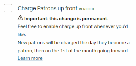
A few people told me I should activate the mode that charges users immediately rather than at the start of the next month, because otherwise someone can sign up, save all your pictures and distribute them. Gorby I have been trying to get people to do that for YEARS! If leaving this unchecked is what it takes then consider it taken.
Whup this seems sad again. I am not sad! Just tired.
that seems like a rather defeatist moral to take from this.
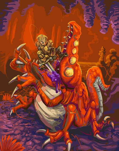
Brienne of Norfair
i had meant to draw Brienne (from some book or tv show or something) with Samus (from some computer doohickey the kids like) years ago, but this came out instead, and more effectively distracts from my deficits drawing non-creature people.
i imagined the blood should be yellow but it doesn’t look like blood when i do that. and crocomire of course is not defeated like that, but it does insist on being attacked in the mouth.
I wrote an in-depth report explaining numerous reasons why this pictures was not functional and why I should have expected that to be the case. Exhibiting the report would likewise not be functional! None of it is anything new.
The lesson to be learned from all this is that there is no lesson because anything good that happens is a fluke occurrence. The only LOGICAL course of action is ignore all precedent and hope for magic, which I did and will likely continue to do. OR accept that I will never get anywhere and not try anything, which is not a viable option until I get on to some serious medication that makes me not care. For now, caring is inevitable.
Eh I posted it as a comment on the entry. It is not funny or trying to be, just sad and analytical.
A few hours later I removed that comment, but then I put it back. I am embarrassed merely that it exists, not due to any specific thing I said in it.
I am too mentally ill to make comics. Usually, on the internet, being mentally ill is good for comics, if you are mentally ill in a relatable fashion and it manifests in such a way where you don’t care how shoddily you draw. It may even be the case that the WORSE you draw, the more liked you are. Or if you are ill to such an extent that you have no idea you are and are extremely prolific in that. I have an illness of indecision, inability, hyper-awareness of inability and regret. Nobody on earth has any need for that manner of illness.
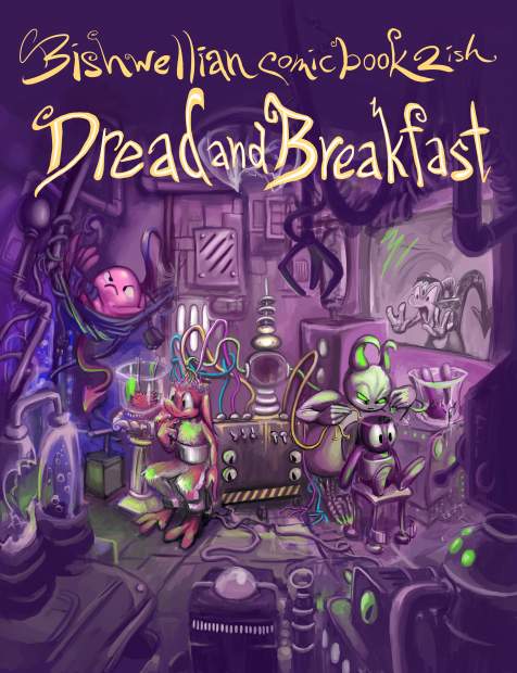
After relettering, respacing the same dialog boxes and redrawing the same negligible details ad-implausium I finally sent off the comic book order a few days ago. I won’t see them for a month but I sure can’t change them now! Consequently it is imperative that I do not look at any of the page images that I sent before the books get printed and sent to me. Or even after that point, just to be safe.
Ironically, the main person whose off-hand remark about the first book, that I should consider using fonts, looked over one my next to last proof copy inside a dark restaurant and said it was much easier to read the dialog, which meant I had done enough that I could stop, but I did not stop! I am like the text grinch; my scrutiny over my handwriting’s legibility grew three sizes that day when it was criticized. However instead of becoming a hero to the town i became a total outcast since I needed to scorn all other activity and contact so I edit speech baubles for months. Of course Madison Connecticut town would prefer not to have me in it so that suits them.

the first version of this cover image appears as the inside back cover of the first book, which was printer in 2016. Up until the most recent proof of book 2, this part of the image looked JUST FINE to me. But the night I was preparing to send the final set of updated pages, suddenly it did not! The line of motion was inconsistent with the image around it, and the bug was not sourced at all. I thought I could draw it better than that, and I did, but it still was not good enough. I remembered I had some insect references I had used recently, so I used them again and got a yet better looking bug, but I decided those were not good enough because all my references showed bugs not in-flight. And were moths, anyway. It is already bad to use a standing bug as reference for a flying one, and using a moth as a reference for a fly is worse! Amateurish! I found a very good fly reference! But the angle was wrong. And was perhaps too detailed! It looked too aggressive, too fast, too big (this version was not preserved so it is not in the montage). The viewer should be able to see the wings, not the legs, much less six multi-jointed legs. But I couldn’t just NOT include the legs because then it looks like I don’t value accuracy. I made it smaller and blurrier, so there still ARE legs but only really visible if it is your destiny to make sure that I gave the fly legs. but at some point the details stop being distinguishable, since there are too many of them. The first bug looked gentle, which is funny, and the simpler design reads more easily, since it is a very small creature in a very small part of the image! I decided to try a proper flying moth reference but none of them looked like what I wanted. I went back to the fly, simplified it a bit, so I could make it let smaller. Being too realistic can harm the joke, anyway. But what even IS the joke?
The “joke” hinges on it being obvious that pog has no brain, and something flying out of there implies that the space is empty because i don’t know why but it does.
Suddenly I had to think about it, and I didn’t see any logical reason why a fly indicates an empty space, which means it must be based on a stereotype or a cliche which has become far removed from whatever base sense inspired it. I could not even remember where I first saw an example of a fly coming out something empty, but for some reason knew it was probably a wallet, so I looked that up, and while I gained no insight as to WHY, i learned that it was in fact supposed to be a MOTH coming out of wallets specifically. Since I have already moved the logicless stereotype from its roots, which are purely symbolic, changing the insect type also cannot be done! It would HAVE to be a moth! *I* had been misled because the cartoon in which I observed this, presumably Pink Panther –based on most the panther’s situations are instigated by him being a lout and him specifically therefore needing a host of ways to indicate a lack of money without speaking– of course didn’t care what the bug looked like and nobody else, the entire staff of the cartoon, the production company, the distributor, the networks which aired the cartoon decades later, cared either, and nobody watching it did, including me.
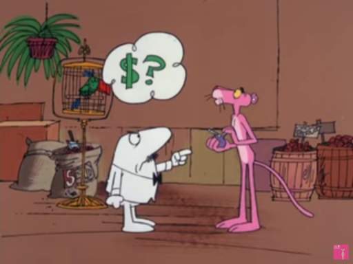
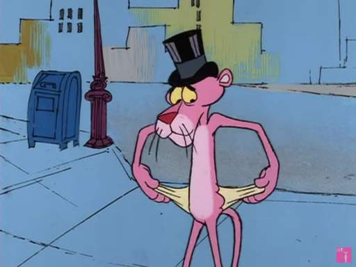
Well maybe it was a garfield comic. That much is irrelevant! What matters is that drawing a generic unsourced bug is a-ok when thousands, millions of people are going to see it. But when only me and maybe 14 other people are going to see it, such negligence is UNFORGIVABLE.
Now please try and imagine that with 40 images I will probably have this sort of stupid problem over and over on every one of them. I am a very sick person. I need to make a full print book order not because anybody else wants these books, only so that the production of the books no longer holds me irrationally captive.
Anyway, I went back to the moth version. A miracle occurred so that I found it acceptable, as awkwardly posted as it was, with the matter of the motion trail still not resolved, so I saved the image, reduced it to the print size, collected it with the other pages I was uploading, into a 167 megabyte zip file, started uploading it, went to the bathroom. this was approximate 3:38am. I was misled, however. The tyrant was not satisfied, it just had changed its focus. I began to panic because I considered that I had, during this session, because I was zoomed in and having problems with everything, also absentmindedly applied a cartoon-derived stereotype to the left-inside of pog’s space (vertical lines) to imply it was metallic. Even though the inside of pog is NOT metallic and if I wanted it to look metallic I should not rely on hacky shortcuts anyway.
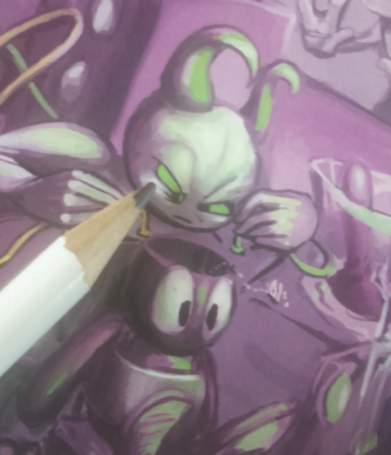
Even though it does not matter because this is an area smaller than the tip of a pencil. Without using the toilet I came back down, cancelled the upload, made a very minor alteration, exported the image again, checked that every other image was the right size, made a new zip file, and began uploading that again, and then I realized I had made the alterations WITHOUT reverting the image to its full size! Which means if I at this point decide to go back and change it again, as looking at this has made me sincerely, profoundly, want to, since I am now VERY conscious of the light colored streak on the right-inside of the space, I will have to first blow up the pertinent region and then draw over it to make sure it is a full fidelity image, even though is almost 0 zero chance across my lifetime or anyone else’s that there will be any need for a full resolution version of this picture, and then once I do that it may not necessarily have the desirable qualities of the pre-blown up and redrawn version.
And
and
and
nobody on earth will know that I did or did not do it!
An update for august 31:
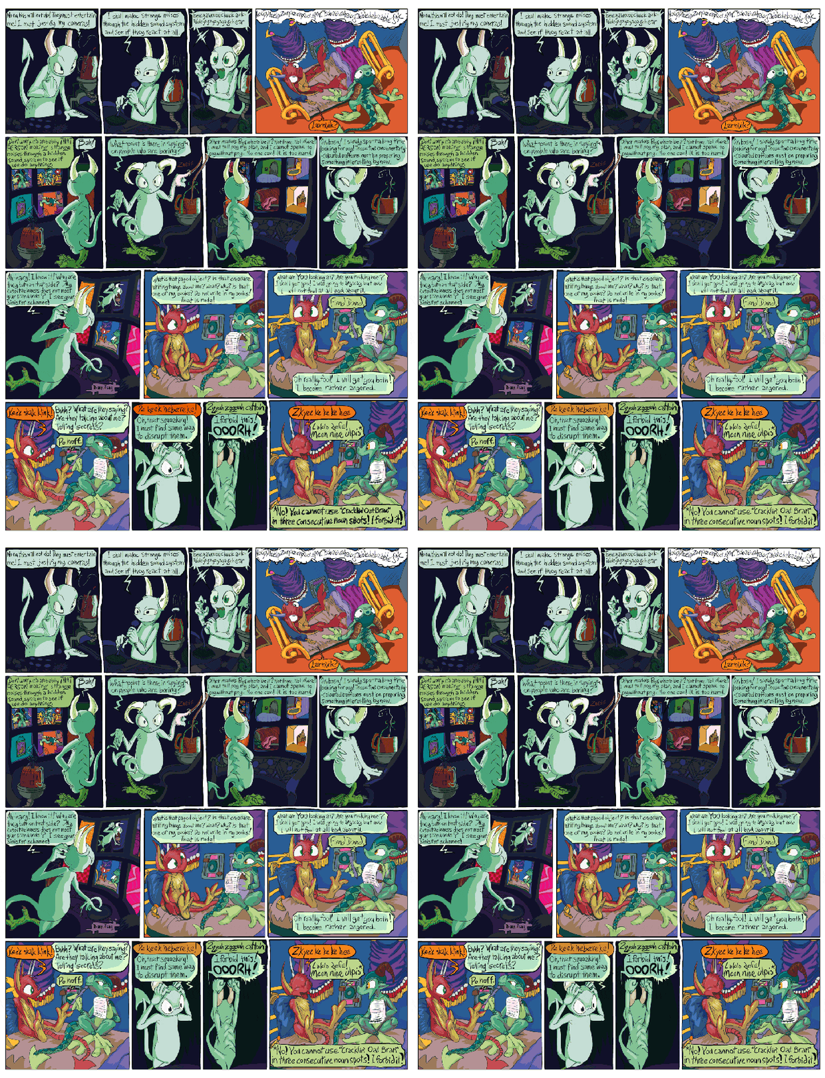
Here is or should be a big slow-loading gif which shows a vague version of the state of one page at the time of each of the three example prints and the final print (which does not yet exist). All of them AFTER incessant pre-print redrawing, remember. The point is that after waiting several weeks, I looked at every part of every page, three times, saw something incredibly minor, after I thought I was done, and had to open it back up again. On only nine of the pages I restrained myself from making more changes, even though I wanted to! The point the point the point is that I lost my mind and have evidence. I did not regain my mind, I simply was too tired to meet its demands.
Observe that the upper and lower left frames were changed with each printing but other places changed fewer times. This means I was able to look straight at something, on paper, think it was acceptable (after having looked at it prior to then numerous times across years and thought it acceptable), then look straight at it again at a later point and find it inexcusable beyond all reason. This means there could have been fifth, and sixth, and seventh prints, and I could still find fresh problems, just on the dumb letters. Letters too close together, too close to the bauble edge, WORDS too close together, veering too much up or down, not aesthetically balanced within the bauble. At no point, after no period of time, can I look at what I made and be satisfied with it. Even when logically I know that the longterm benefit of spending more time on it, rather than on anything at all else, no longer exists. Not only am I too mentally ill to make comics, I am too mentally ill to read comics.
And in the lower right can be observed my attempt to amend a minor legibility error by rewriting the dialog in a new temporary image layer above the base layer, but forgetting to delete the letters on the base layer before merging the temporary layer into it, and then forgetting to look in that space again until after the book was printed, thereby creating a MAJOR legibility error that would be impossible to overlook! This means that for each subsequent print I needed to look at every space of every page to ensure I had not committed that error anyplace else, even though such investigation would increase the possibility of me finding and obsessing over yet more imaginary problems. And then I ended up doing that in at least four other places anyway.
Seeing this gif now, it bothers me that I made kumquat’s dialog green-tinted when kumquat is out of view, against a non-tinted room. This is confusing and makes it look like elpse is talking. I thought, for years, and then afterward, it is quite obvious from context and precedent who is speaking, but people always find a way to miss all my points, so they could well claim to be confused. But if they are confused by that then they couldn’t possibly understand anything else, so I leave this green. But I will go back to the first fear, and have to explain to myself why this fear is unjustified, repeatedly. I know this is not entertaining. I need to make this understood as clear as I can make it so that in the future I can refer back to it rather than attempting to explain it again!
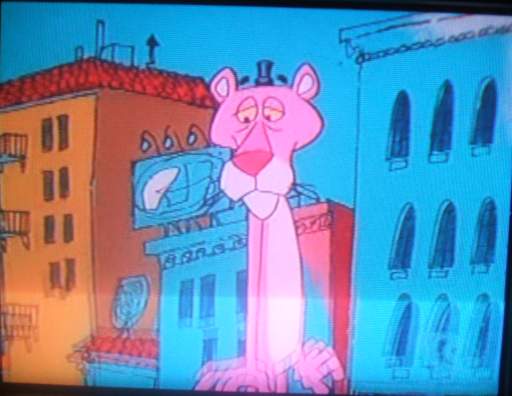
OH the windows and other details on the buildings are misaligned, the design on the billboard is indistinct, there is a little black speck just under the right side structure’s roof, the eyebrows float off the panther’s head and that hat is WAY TOO SMALL! How did this cartoon get made?
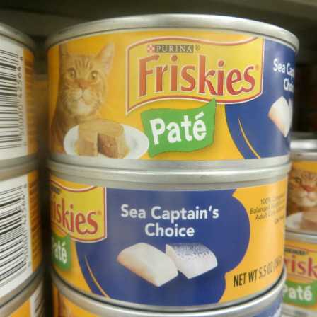
The sea captain’s choice! or rather, I think, the sea captain’s choice of what not to eat since it looked like cat food. Why should I assume that somebody who works on a ship is an expert on fish as food? There isn’t a culinary standards component of the officer training, is there? I once knew a US Marine captain who told me he had to learn how to waltz to complete the certification, which DID strike me as somewhat out there, but his favorite food was gummy worms. However, a captain in the marines is a lower rank than captain in the navy, even though navies operate in marine environments, so maybe things get more specialized as you go up. Maybe to become an admiral you need to be able to knit your own socks.
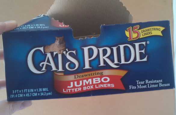
on that topic (cats, not socks): are cats really PROUD that they defecate into a box in my house?
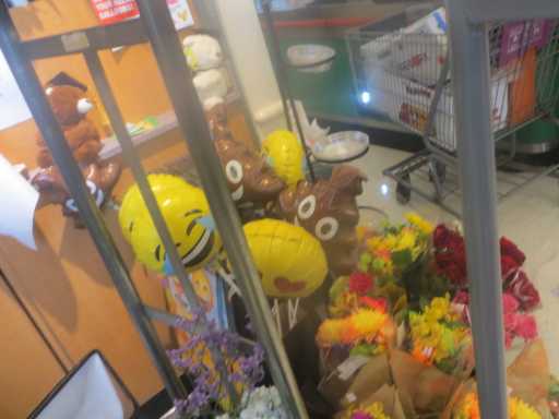
They would make much more money doing it in public places of business.
I remember when it was considered SHOCKING for the tv show south park to have a smiling, talking, singing, anthropomorphic lump of excrement, and now this is something you are allowed to display in a place that sells food.

That is just unsanitary. I saw them on adhesive bandages also. I cannot find the picture I took. Probably for the best. That seems like the opposite of what you want to do to disinfect a wound.
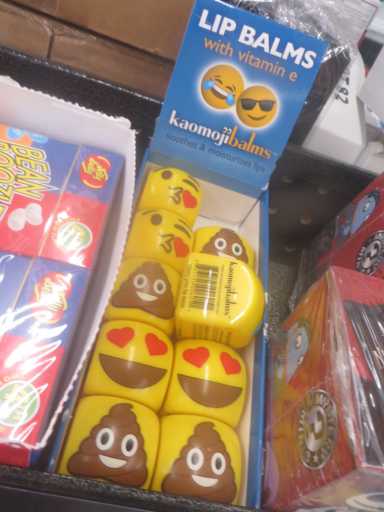
Where I really want to put that: my mouth.

in general i want to wallow in bowel residue.
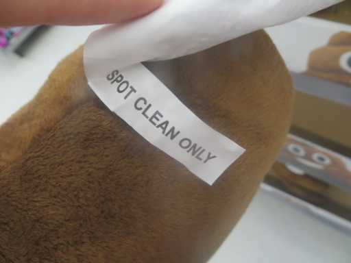
how can you even tell when this is clean? When there are no worms crawling through it? The captain will be especially worried if they are gummy.
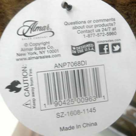
Made in china. this is taking jobs from American toilets. I call on consumers to stop buying Chinese sh|t.*
Wonderful now i feel ill. Why is there no smiling lump of dried vomit emoji? There is nothing so gross that you can’t put a a face on it and make it grosser. Or grocery, even.

*Astute readers will see that I did not actually put an i in that word and therefore have not officially “said” the word that it looks like. My friend and colleague ms-dos will attest that all i committed was a syntax error.

This picture is a LIE. that is NOT who makes these, and the honey nut cheerios wand is NOT employed in the process.
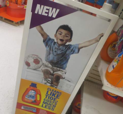
The assembly line of workers who make the Lindor lumps probably look more like this, if we assume it is not entirely machine automated.
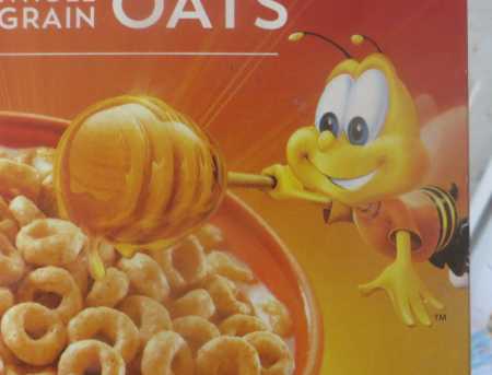
But since you brought it up, this this this THING, this striped lump on a stick, is ALSO a lie. Who, that buys honey cereal, even knows what that honey rod is SUPPOSED to do? It may “bee” beyond our ability to understand.

Honey Nut Chex is slightly more honest about it. The magic wand exists but it is just lying on the table unused, making a mess. It looks as if it has been murdered.
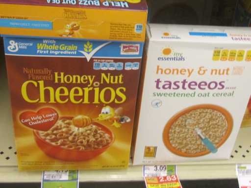

I have additionally observed that generic store brand honey cereals are only allowed to use the magic honey wand if the multinational brand doesn’t want it. Assuming my web host’s recent unannounced, extortionesque demand that I pay an extra $40 annually to obtain a “security certificate” for a totally invented, unsupplied non-reason and firefox’s subsequent sabotaging of my site’s functions has not damaged my ability to display the images, seen here are Food Lion Honey & Nut Tasteeos and Stop & Shop Honey Crunchin’ Oats. They can’t call it BUNCHES, but they MUST say something that rhymes with bunches, or else people will notice the ugly generic store brand label.
Also I acknowledge that the latter picture is from 2008 and that Stop & Shop has a much better store brand logo now, as can be seen on this page about Shop Rite, which, admittedly, makes every aspect of Stop & Shop appear superior. Firefox thinks it needs to prevent me from logging in and viewers from commenting to keep this website from being relevant, but that was never a risk.
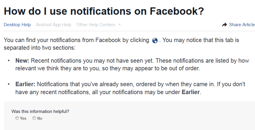
That of course assumes “relevant” is a word that has an identifiable meaning. The one expert on what is relevant to me does not disclose the criteria nor the option to even know what has NOT been deemed relevant so that I may gain insight into the system or check its accuracy, only that this is so very important that material may be visibly not in ANY order. And then they are put into a different order after they have been seen, so that a specific one will be hard to see on purpose a second time. The people in charge maintain order by PREVENTING order. The fact that I know my next post is also going to be about honey nut cheerios suddenly seems uncommonly disciplined and of great magnitude. Yes I suddenly feel very important and well prepared to face the year ahead.
That will be all. Good day.
Another ten+ year old lingering matter:
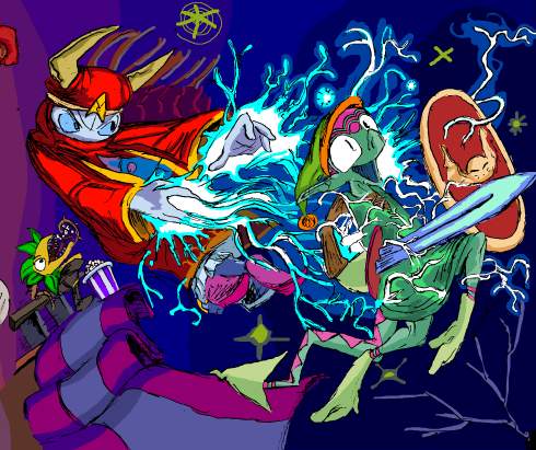
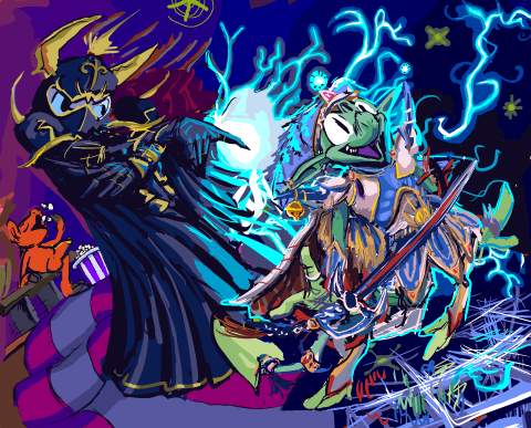
from that page, this to this. As with my last such comparison, the actual changed page has not yet been uploaded, since that seems to require a different mindset than working on them does, and the work is not finished! I hope to pog I do something about that ugly carpet. And I said not long ago how unimpressed I was with “*gets popcorn*” as a response to rambunctious activity. I did try to draw the plant thing from the initial image looking at a map to indicate it was confused at being in the wrong version of the picture, but then that means you would always need to have seen the old version of the page to “get” the new one, and the whole point of the new one is to let the old be forgotten, and also then that means I would always need to have the old one available somewhere, and for THIS? Ridiculous. Also its body makes no sense so I couldn’t actually draw it in a way where it looked like it had a map.
You will believe I can spend longer on one frame than some people do on entire comic books, and then spend as much time writing about it. This requires that I accept most “24 hour comic book day” offerings as entire or books, which I generally do not, but the statement felt superficially profound when i thought of it.
The old drawing of course looks more consistent with the style I was using in less-altered frames, more effortless and un-self-conscious, but I am too eaten by obsessive compulsion to handle this in another fashion.
I am sick to agony of Mario, Sonic and Link. In ten years Nintendo went from a video game company to a religion. In all honesty I never need to play Street Fighter or Mortal Kombat, the series alluded to in the preceding frames, ever again either, but I don’t know anybody who lives their life around homaging those games. Perhaps they exist but I do not know them. Oddly enough, my initial Zelda 3 reference was itself a protest to indicate my dislike for Zelda 64, which was by then nearly ten years old and being lauded by not-yet-religious nintendorks as the pinnacle of human accomplishment. And I STILL protest that, but Aganhim is not iconic in the way that Link is, so somebody might just think this means I drew any old weird Link variant with a generic wizard. Neither is especially funny to me, also, unlike the Kombat and Street fighting allusions in the other frames. However I “needed” the replacement to also include a wizard who uses lightning and a hero who uses a sword. Even though I ultimately totally redrew them both. But if I changed the layout, that potentially meant I could change the entire page’s layout, and if I did that I might as well NOT have a page full of irrelevant video game references, but I didn’t want to spend two more weeks on this.

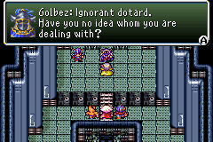
Regarding my replacement, Final fantasy fandom IS overdone, but not to the same degree that anything first party Nintendo is, and certainly not with dumb old Golbez or Cecil. Although the TROUBLE with drawing any Final Fantasy playable character is that the version in the game is different than the far-from final one in the concept art. And in the case of Cecil, also substantially different from the one in the DS Remake.
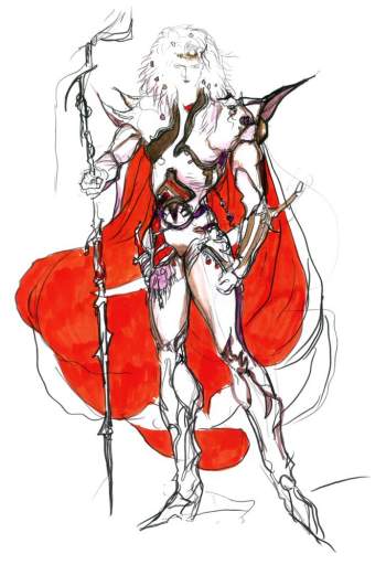
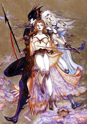
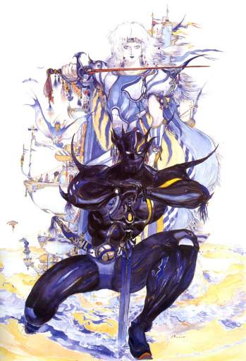
Cecil even looks different from concept art to concept art because Yoshitaka Amano never adds keychain trinkets and circus stripes the same way twice.
also: there are two different flamboyant dark-armor people shown in these drawings and neither is Golbez. They are irrelevant to the present matter!
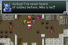
Also I OBJECT to the DOPE EARS on that one’s helmet.
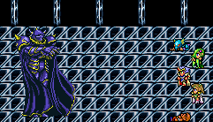
It seemed most sensible to match Elpse to the Cecil that I recognize, but in fact that looks almost more like the Actraiser hero when drawn in here, and somehow it mutated into this gaudy mix-match that is not quite any version of Cecil. But whatever, Golbez, by virtue of being 50 feet tall, is sufficiently detailed in sprite form for my imitation to be identifiable and Elpse does NOT look like Link, apart from my forgetting to change the dingle-ball that I had attached to elpse-link’s hat, which arguably fits in better here. I would have liked to put a Shining Force allusion in there, but none of the prime antagonists use lightning, plus quite honestly the demonic character designs are too on-the-nose for this, and this is not about my favorite video games, besides; bubble bobble, hinted at two rows down, sure isn’t. This page is about whatever I was thinking ten-or-more years ago except for that one thing that really bothered me which had to go, and so it did.
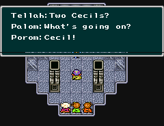
you don’t know the half of it, buddy! To think I didn’t draw elpse in Tellah garb because I thought it would look too weird. (Also Golbez is afraid of Tellah’s Meteo)
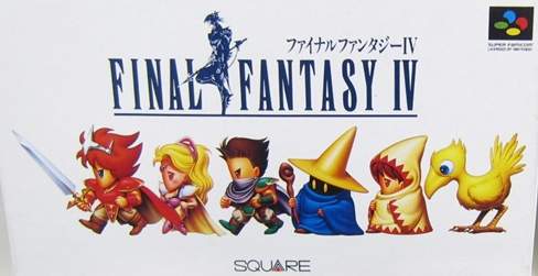
If I lived in Japan I would be even more confused since the sword-wielding homecoming queen hero on the game’s box has had his colors swapped around to an even more extreme degree, likewise with his two companions, and the two people following THEM are generic nameless wizards that you merely encounter loitering around various places. I have NOTHING to say about the bird.
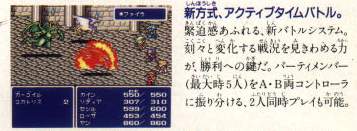

the back of the box, as well as that of the “easier” rerelease from a few months later shows this non-accessible party lineup against a monster groupings from the Mt. Hobs stage against the inside a town background. In fact the players and their positioning is identical to this other rumored fake screenshot.
Presumably the idea was to not spoil certain aspects of the characters’ identities. Yoips I WISH marketers took that approach more often, especially with the way Star Wars junk is promoted.
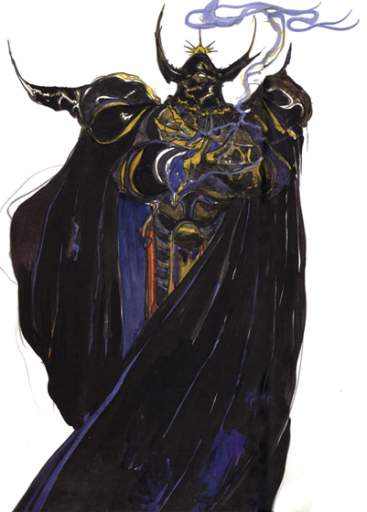
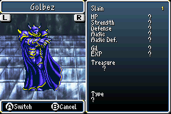
Slain: ONE golbez
For goop measure, here is Yoshitaka Amano’s Golbez concept art, which the version put in the game is about as consistent with as anybody could hope for in 1991, apart from the sprite artist just having to say screw it and force in the appearance of feet and not translating the arms to semi-profile view very well. I never even noticed the feet until maybe ten years after the first time I saw this. I always imagined golbez was floating and turning, casually pointing a finger at his enemies while turning away because he knows they are already done and he has more pressing business elsewhere, rather than just standing there rubbing his wrists together. This gameboy advance version is slightly condensed compared to the original super nes version, so golbez almost looks like he is posing in a bad rap video or doing the macarena.
In any event I think we have seen the last of Golbez for a while.
The animation I posted previously got way out of hand. As did my text description of how that happened. Neither of those should surprise you! However, it became somewhat inflammatory and it seemed unfair to have accompany a piece that I was paid for and was not hideous.
my usual method of illustrating is somewhat sculptural. I add material, subtract it and smush it around, until the shape looks correct, and only then fill in small visual details. Some things may be a bit off until the very end, but the important matter is that the ideas and gestures and all are clear early on, so that the buyer can trust me (or I can finishe me) to finish the piece. At the example stages of this animation, I operated in a similar fashion, which was not good!
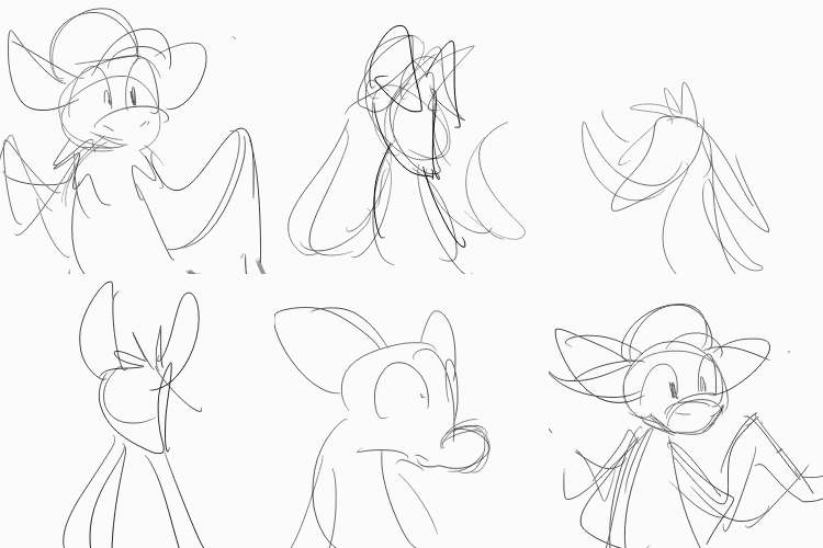
I prioritized making sure the sequence was legible, and not that all details were accurate or that shapes were consistent, saving that for later. But in animation, every object needs (at least to me) to flow into the other. Having the flow function before the details are correct is minimally meaningful, because every instance of any detail may need to be altered, and that may change how it moves. For example, if one aspect, such as the wings, is the wrong size or shape, that would require much correction, and may even need new frames. But if another aspect, such as the ears, were already correct, adding in new frames may mess with their flow! AND getting too strict with the flow in some places may disrupt areas where it had previously been casual (and already approved of by the instigator, Goldquiver, mind you), such as the leaf-arms. When I added the spots toward the end (and Goldquiver had already not cared that I hadn’t included them), their movements were very smooth from frame to frame, and suddenly the casual leaves were unacceptable to me! But moving the leaves meant messing with the area where I had lain the spots. AND I had already drawn the shading on top of it, so the shading had to move
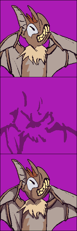
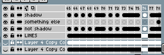
Oh yes, the shading type is new. For each individual frame, another layer is above it with translucent shadows. In the past animation I always shaded directly on the base drawing. I thought this would be faster! However, I had already, for clarity, used two different shades of green to differentiate the sides of the leaves, so some point there are competing shadow methods!!! oh! And it still does not look as natural or tight as adding it directly, since I tend to refine the edges while shading, and I would use all included colors in order of their values. In aseprite, the software I used for most of this, adjustment layers function independent of the set color palette. Which looks more “realistic,” since the shadows fall consistently, but cartoons are not supposed to be realistic, and pixel art looks more competent and orderly when the colors are limited and used to maximum efficiency. The dark brown that covers the light brown is not IN the color palette, so I cannot use it in a full orderly value sequence!

At this stage from 5 days before I declared it “done,” and probably a week before I was actually done with it, I had already started to color it, even though the details were not all in. Unfortunately I often cannot see if something is wrong or correct until after I have begun coloring it. A pruhfeshinul animator might tell you that after the first version of the sequence you need to make a fully realized sketch version, and ONLY after that do you go BACK to the first frame again and put definitive lines on that. I never do that! I always think it will take too long!
Or they might tell you something else entirely; I only knew one person who worked in animation, and could not find steady employment or just hated it and didn’t actually draw all that meticulously since MOST cartoons are ugly these days since they are all designed by people who can’t draw at all and I think that person works at a pet supply store and likes it better. As much as I complain about them, I still find illustrated animal folk easier to deal with in my own home than real ones.
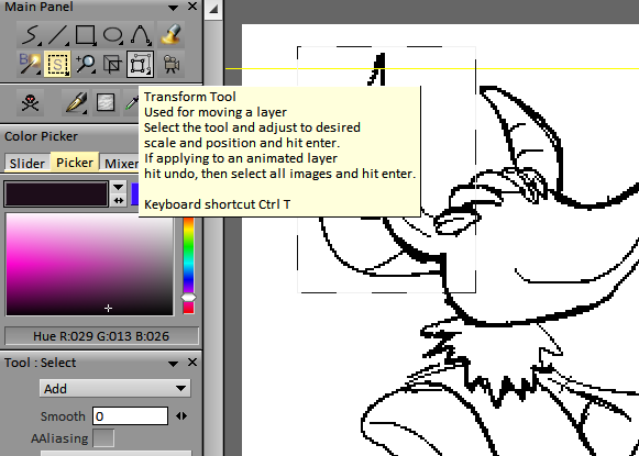
I had, for this animation, been testing an unusually-designed bit of software called Tvpaint. Its animation mode is great but everything else is weird, like arbitrarily so. It is designed, or rather “developped” by French people and more importantly, probably in Linux. Linux software is unintuitive since the programmers think they are “avante-garde,” which is French for annoying on purpose. TVPain’s selection tool is separate from the well-disguised selection movement tool, making movement a sub-function of “transform” rather than transform AND move sub-functions of selection, even though you can’t transform without selecting first, and you cannot select with the transformer!
Hey! I am saying BAD things about you! I am NOT complimenting you! Vous ette un homme ridicule! (Oui vrai)
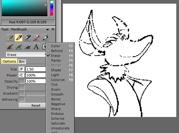
And Tvp has “Erase” as a toggled mode on drawing tools instead of a dedicated tool which covers more ground than drawing tools, which I have only seen prior in Krita, which is also for Linux. Imagine if you used a pencil and the eraser was also sharpened to a point. You would have to trace your wrong lines exactly to remove them. I have used Krita, since somebody once gave me a Linux computer with Gimp installed on it, and Gimp is worse than that, unless you want to draw stuff that looks like velvet. Krita is good for drawing but laughs in your face if you want to correct a mistake.
Also I am still using computers from that person and I like those computers but I find linux to be very silly.
TVPaint additionally has its view-adjustment mode require you to press ALT instead of SPACE, contrary to everything else ever made, including Krita and Gimp, and it cannot be changed to space. I can assign something else to space but there is no point because I am just going to do it by accident when trying to move the view because I forgot I have to press alt. But TVPaint’s animation mode is good, though it is not designed for making GIFs, so I had to export it to Aseprite for coloring. Aseprite is not good for detail correction, since it has no tablet pressure sensitivity! And the wings were full of details! Oh oh oh!
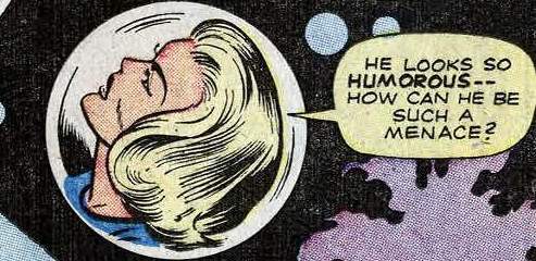
But every challenge is an educational experience. Requests like I have had in the past should be easier by comparison, since I know yet more mistakes to avoid. Or perhaps people will continue to ask me for more complicated things, which would also be good, since completing them means I have become more capable. And if nobody asks for anything that is also good since I have loads of other things to do! I shall have the last laugh whatever the case!
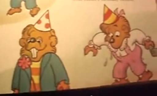
I actually like TVPaint better than a program highly recommended among the people I sort of know but don’t talk to me that I don’t talk to called “Toon Boom,” and I like TVP better first of all since it doesn’t have “boom” in its name, which is a sound effect that should never be used as a word except to describe the sound-effect unless you are a scumbag.


Krippendorf, if I had actually BOUGHT the thing I would be furious (except you can’t buy it because it is subscription only).
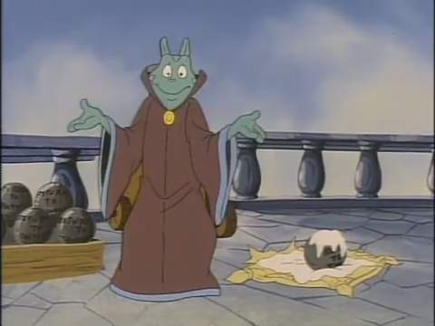
Anyway, overall I think it went well!
Although another program called “Opentoonz” with a Z is totally free and has a similarly incomprehensible interface, and that also makes me angry. It makes me almost as angry as a slinky with one coil section that is off for no knowable reason and that can never be corrected.
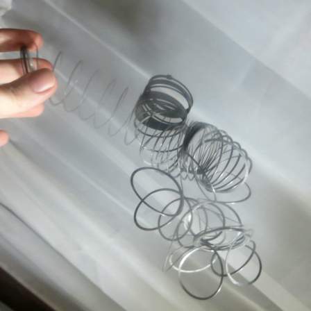
So i have to do this to it and make it a total loss to stop from spending hours absentmindedly fiddling with it and making no progress. Software with no physical component that I can download for free legally repeatedly gives me no such luxury!

A commission animation “icon” for goldquiver, showing a bat creature which transforms into a plant creature, and then back again, and then unback again, and on like that for a very long time. Feel free to wait.
I have proved with my comic pages that I can spend a week and show very little. With this I dedicated to show even less happening!
They ALWAYS smile at the end. They NEVER think whatever painful thing they just experienced will EVER happen again, no matter HOW many times it repeats. Fools!
Concurrent with the 512×512 pixel matter, I offered drawings at smaller sizes, with 100×100 resolution being the most common request. I did not realize what a big deal it was to be able to draw like this until I realized how many people could not. Eventually they started paying me to do it. Not enough that I could feel like I had done something with my life, but at present I can buy more pizzas than I can eat, which feels important.

Icons that I initially used for myself. None is especially excusable.

Fastest gun in the wasp, November 2013
A character called Miso for a person called Miso but who presumably does not look like this, stuffed into a tiny 100×100 pixel box but not at all deterred. This was before I gave people many/any options so theoretically I could come up with a better pose than this.

You shall meet with my raccs, 2014 or sooner
Relaxingdragon wanted these at some point. Rare examples of the 200×200 size, which is still small enough that I do not totally lose my mind with it, although I did not develop the habit of losing my mind on pixel-level work until 2016, so that may be a presumptuous statement.
Icon see you’re upset June 9, 2016
pengosolvent recently inquired about a new representative 50×50 pixel symbol but something alarming has occurred. These are smaller, only 50×50 pixels, because the deviant-art website restricts user representations to that size. And I drew four because I usually give people 2-4 different layouts to choose from, but need to color them in, to some degree, for them to be legible, and on this occasion colored in all four fully without being asked to.
The pickax papers, December 17, 2015
A newer Miso, also for Miso. I had been asked to make an icon similar to the old one, and took that as permission to be equally boring with the poses. And again I could not restrain myself from finishing all example versions! The upper left is the one we went with, and therefore it is slightly more “finished” than the others. Appropriately enough it is considerably more proud of itself. The creature this is derived from is called a tawny mining bee, and I took THAT as permission to add mining implements, including an all important flannel shirt, even though those are more stereo-type associated with logging, because it seemed unlikely somebody would send a logging bee my way any time in the near future.

Clippity-clopsicle October 20, 2016
For kinn-katze, a horse creature named Ryno ponders something likely unrelated to being named after a different species, since that is the type of thing you generally have to sort out early in life.

who do lu think lu are? November 17, 2016
100×100 and 50×50 pixel icon robisions of a flagrantly asymmetrical creature called Lulu known to Fairyartery
I just realized I use that “finger touching mouth” gesture way too often. Although I always give people the opportunity to request a different gesture!

is that who i think tiz December 8, 2016
Ah yes, ’tis Tiz, from something called Bravely Second, for boooey.
After this I decided every icon I make should have something resembling a backdrop, even if the buyer personally uses a version that doesn’t, because some sites are very stupid about transparency. And some sites aren’t but stuff looks bad on them anyway, hint hint.
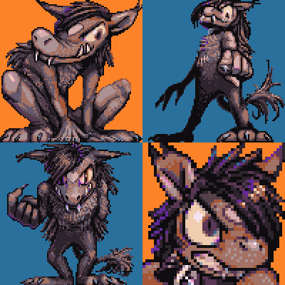
robb from the pix to give to the four, December 22, 2016
a hoofless yet horsely creature named Robbie, unrelated to Ryno’s horsely creature, in fact for boooey again. The hair changes its mind based on whatever eye it feels is more fashionable to show at any moment. Also, after examining the previous two items, it became conscious of the possibility for vision problems resulting from prolonged obscured vision of a single eye.
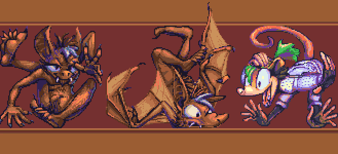
hotel kotel holiday inn, January 5, 2017
for Kotel First is a bat creature also called Kotel, with and without wings, and a more opussummy figure called Obeah whose enthusiasm has been taken out of context to pertain to the winged bat’s error, potentially a consequence of trying to escape from a 100×100 pixel space.

therefore four hares, January 19, 2017
100×100 pixel icons of a hare creature named Lewis for Arito, who was pleasant to work with; I wish I could say the same for this devious dirt-dweller.
After THIS point I realized that flat colors were inadequate for “something resembling a backdrop.”
A progress video of a sort, showing approximately how I colored this

goat tell it on the mountain, January 26, 2017
A goatly creature called Lutka, pixel-styled for trufours. Seems to be having a rough day.
![MUST... DRAW... [most]... TEETH....](/puy/xiueh6.png)
let that synx in, January 26, 2017
another pixel drawing for :icontrufours: of Xiu, who is a synx, and apparently there are more synxes in the world than I thought! Initially there was somebody called Chimerasynx who came up with and drew these things and they have no spines and can twist in silly ways and have more teeth than is reasonable, and at some point they got franchised out, I suppose. This one looks friendly enough, fortunately.
I hope you are not getting sick of these; there is another bigger one coming!
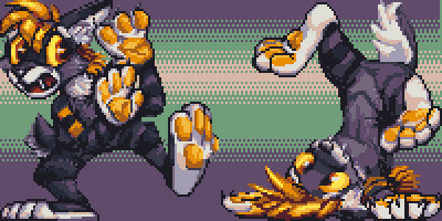
well-financed flop, February 2, 2017
More pixelry for arito, this time of Shani, an apparently easily-worried saber cat. Plus a rinkity dinkity background I added quickly at the end for reasons already cited! Of course I don’t have a video showing this, the one part people have expressed to me sincere bafflement at how to produce.

do the rat thing, February 16, 2017
For kjorteo. There looks to have been some disconcerting events recently! And then this happened.

rats and beans, February 16, 2017
also for kjorteo, whose requests’ shape necessitated separating it from the other one! This looks to be alarming news for the protagonist. Although clearly it had been seen from quite a way off!
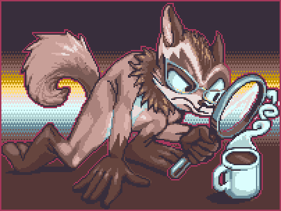
tanuki tea look-see, April 20, 2017
For perikaryon, showing a raccoon-dog investigating a hot drink. It is probably coffee but there is a chance it is tea. Possibly there is a better tool to use in determining the drink’s nature.
Amitz all this people started asking me for animated icons, which take 4-8 times as long to make, but I can charge 3 times as much for them without potential buyers recoiling in horror and abandoning the idea! That is real progress. Still less time than it takes to put one of these website entries together, but nonetheless I am done with this one for now, and hopefully for some time afterward, and so I shall exhibit those here on another occasion.
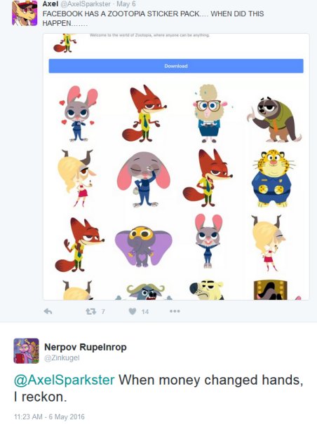
As long as I am going to have no friends in social media I had better deserve it.
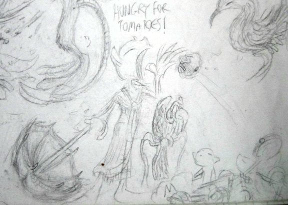
Rotten Tomatoes went from a website for people to identify ROTTEN films to one for corporate entities to imply that average films are exceptional. Which is, essentially, the OPPOSITE of its intended purpose: to sort through the rubbish hype.
If I hear one more movie ad reference its Rotten Tomatoes score I am going to punch the tv, And that is going to hurt my hand, which will not be productive!
I NEVER heard that happen in the 170 years of Rotten Tomatoes’ existence, then this year suddenly I have heard it at least five times. And I do not expose myself to television deliberately. It is probably much more rampant than that.
“95% on rotten tomatoes” just means 95% of reviews didn’t say the film was TERRIBLE. There is more to great than a lack of worst.
I think I heard it first for Spot-Light, then Zutopia and I lost track after that despite the scores being so ludicrously high that the described items should be immediately unforgettable.
I actually saw Spoflight, and while it has an interesting story, it is not a stellar cinema experience. I didn’t even think Mad Max Fluffy Robe was stellar, and while it predated the rotten tomatoes fad, It was apparently the only action movie ever allowed to win awards. I appreciate that it got fight to the point and didn’t fixate on irrelevant non-participants for half its run-time like the Transformers movies did, but its action portions were just as cluttered, zoomed in, camera-changey and indecipherable. And I resent any adventure that turns around and goes back the way it came. I don’t even go back the way I came when I go for a walk. I have compromised my personal safety to not be bored in this miserable overpriced dead-end boat town. In a movie whose base premise is the absence of safety, you can find a different route! Or else what were you running from?
The tomato system is not any more accurate and inarguable than the thumbs-up/down system that once was a ubiquitous citation in movie advertisements, but it SOUNDS like it is, since it has a specific number. Wow that is 95 out of 100 instead of 4 out of 5 or 2 out of 2! That is so statisticy!
Additionally, the thumbs at least belonged to certain people. I do not consider any film critic a general, unimpeachable authority on entertainment, but it is possible to personally trust the opinion of an individual human on individual matters. Those tomatoes could be anybody. And a percentile does not indicate the total number of people who voted, either. I suppose to get to 99, depending on how you round it, requires at least 34 participants, since I have never seen a decimal score. But still we don’t know that 33 of those 34 thought toozopia was GREAT. Maybe most of them did, we don’t know, but I don’t believe 99% of zootopia viewers thought it was better than 99% of every movie they have seen, which is what I am intended to think. That it is one minor scrap away from perfection, and I can tell from here that it isn’t. My guess is it is more j-j abrams brand minimum level of effectiveness that doesn’t offend anyone in its intended audience. I have so little faith in the current culture to create stellar films that advertising which implies it happens constantly, to near PERFECTION, is suspicious to me.
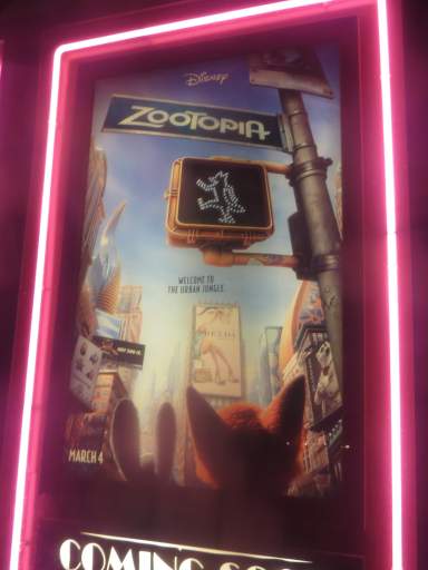
undoubtedly no effort was spared in creating a city essentially identical to a real one except with every human shape changed to a humanized animal shape with an accompanying stupid animal pun to refer to it, but that just does not appeal to me Especially not after Pixar, now a wholly-owned subsidiary of the disney company and indistinguishable from it, has already done this about fifteen times, with monsters, insects, automobiles, or whatever. I’m even tired of remarking on how unappealing I find it! I was going to keep it to myself, because honestly I don’t have time to make my thought coherent but my rotten tomato gripe flowed into it and I have no choice.

My biases did not develop independent of the world. they have validity, somewhere. i did not choose to cringe when stuck in a cinema showing a preview for this. Ha ha ha! They are at the D M V and they hate it! Just like YOU hate it! Right? Therefore you RELATE and you feel validated by this experience and demand nothing more from it!
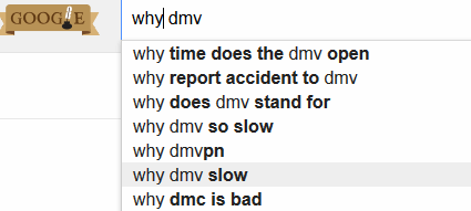
I am open to the idea that there is more to the film than that, but it makes no effort to imply that there is, nor do any of the fans of it whom I have encountered, even two months on. I certainly do not accept that it is one point off from perfect. Of course by now its score is only 98 percent! ha HA! also, Hoodboy, from 2014, has 98%, and I actually saw that and had more problems with it than I hypothetically anticipate having with zootopia. The Wrestler, my personal quintessential critically acclaimed aimless misery –literally the first movie I cite when the topic comes up– also has a solid 98% on rotten tomatoes. I wouldn’t even give The Wrestler a rotten pineapple. Toy Story 3, which I found bearable but frustrating and objectionable has 99% points. The two before it both have 100 despite being built on the same “don’t acknowledge master” premise that I can’t get past.
Singing in the Rain, which I do like, better than most films I have seen, having been able to see it without considerable hype that I was aware of preceding the viewing, is on there with a 100% score as well. But I hate that “Moses Supposes” song and the 1-dimensional treatment of the nontagonist Lina Lamont, and Donald O’Connor yelling out “mammy” several times for no clear reason. The “Gotta Dance” segment is incongruous with the rest of the picture, and doesn’t even make sense in the movie-within-a-movie-context it is presented as belonging to.
SO I like the film better than most I have seen, certainly better than its contemporary iThe Band Wagon, in which EVERY musical number is annoying and/or incongruous, but 100% implies perfection, which it is a long way from.
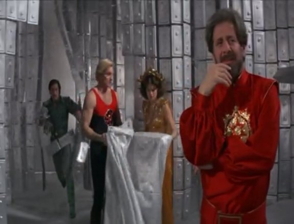
To contrast, the film I have watched within the past few years that I perhaps enjoyed best, 1980’s Flash Gordon, has a tomato score of 82%, which is probably about right; I am sure it has just as much stuff wrong with it as Singing in the Rain, and 82% is a pretty good time, for me. I can’t really hope for more than that, knowing me. Maleficent, which I found totally loathsome, and had just as much paid promotion and dumb fan hype as Zuzutopia, possibly slightly less porn fan-art, has 47% tomato points. However its “audience score” of 71% is higher than Flash’s 69%. What does all this mean? It means nothing! That’s my point! None of these figures have any value behind them. If a movie that real people LOVE has a low score from purportedly more valid people, and a movie that only I like has a high score, and a movie that is not really any better has a yet higher score, then the scores are garbage.
The television ad for zootopia literally says “residents of zootopia are just like you.” as if there is literally nothing else going on than another hideous 3d animated allegory of society with a few superficial things changed. The announcer doesn’t even add a big EXCEPT like game over 13 years ago. Why then are these residents interesting? Their appearances are, apparently, superficial. How does this remain fun and new to people?
The other cinema poster, that I didn’t take a picture of, because I hated the idea of somebody seeing me take that picture and assuming I just thought it was clever, shows a restroom door with different sized inset doors for animal people of different sizes. I do not want to watch a movie about people “just like [me]” going to use the toilet. Meanwhile, despite forcing all these differently shaped species into one excretion chamber, the sexes are still segregated down a strictly this or that line. They choose their human fashions based on binary sex rather than a limitless multiplicity of species that ought to create more specific needs. Maybe that is even addressed in the film. Although “addressed” does not mean “resolved,” or even “addressed in a meaningful fashion.” And the promotion implies that it is a-bcdefghijklmn-ok anyhow. I received enough addressed-without-resolution gags in Deadpool, where they work because that movie doesn’t think it is telling me something about society. Also its smug scumbag main character gets plenty of abuse for being one, which I appreciate.
With that said, telling me the zootopia fox takes a bullet through the rectum isn’t going to change my plan.
Nor will telling me the rabbit is actually the main character. It would be most implausible to shoot them both that way with the same bullet.
A matter begun here
And continued here:

As implied earlier, this weekend I will be participating in Artspace City Wide Open Studios’ Alternative Space Weekend, which certainly seems like a long title when I make the whole thing a link.
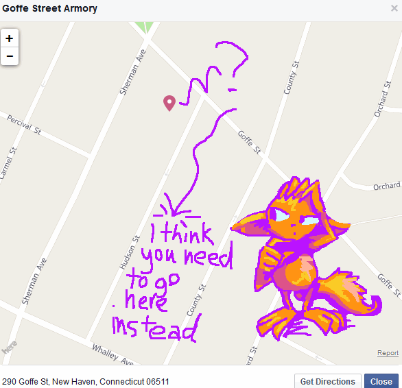
Of note is that while the official address is 290 Goffe Street in New Haven Connecticut, United Statia, you actually enter via Hudson “One way that is probably not the direction you will be approaching in” Street,

through a gate adorned with signs warning you not to go through it, plus generous helpings of razor wire across the prison’s perimeter on the right. Or maybe I just have to enter on Hudson Street while hanging things up, and the front gate will have been breached by the time guests arrive. Honestly I am unsure, but I assure you it is possible to get in there since I have succeeded on 2 out of 3 attempts.
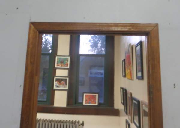
I will be in room 216c, on the first floor obviously, available to receive complaints noon to 6pm both days.
Observe how the view from outside the room highlights the windows and the radiator, where I cannot hang anything up. I don’t want to creep anybody out until they are in too deep to change their minds. There are numerous other artists also who will, with any luck, be more interesting and/or creepy than I am, so come to see them also in case I am not doing it for you.
I will be attempting to sell original artwork, digital art prints, greeting cards, and any other thing I can grab that legally I have some creative claim to and can also fit on the $30 folding table I just bought.

That’s right you get to see a BRAND NEW folding table fresh off the Wal-Mart rack where, judging by the condition of the others I had to move to get to this one, they have been waiting unpurchased about eight years.

This is from the Autism Services & Resources Connecticut Walk for Autism back in May, where people walk to raise money for more autism. This scene proves that I can fill eight feet of table with stupid junk. These tables belonged to the event organizer and I only have a four foot table now, so imagine how exciting it will be to see all this crammed into half the space.
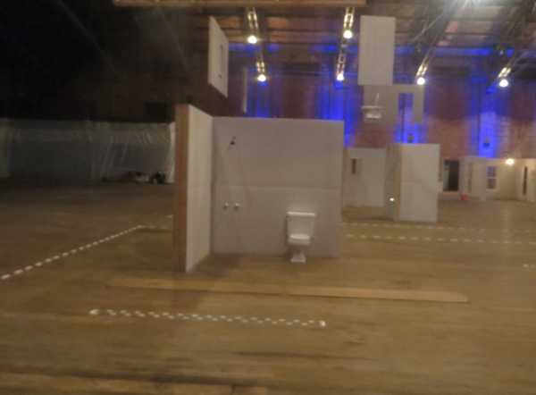
Although there is no rest room, there is a toilet on the premises. Because, you know, art. But think of how much more artistic the installation will be if you use it during the exhibition.
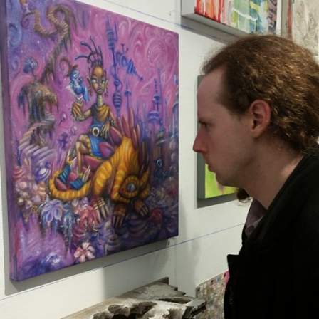
In fact I deliberately abstained from putting a toilet in my painting because I was so certain toilets would be in abundance among other participants’ works. I am not one of those people who wants to abuse society by declaring you should give me money because I just found something gross in the street and wrote my name on it. I just think toilets are funny. But I do not think things that go in toilets or people on toilets are funny. As this is my first time at the Open Studio, I decided to not risk being misunderstood.

Obviously this abandoned toilet I saw in Paris would not count as finding something gross in the street since in France people make sure their toilets are clean and not-at-all gross before tossing them out of windows. Truly this is a city of fine art.
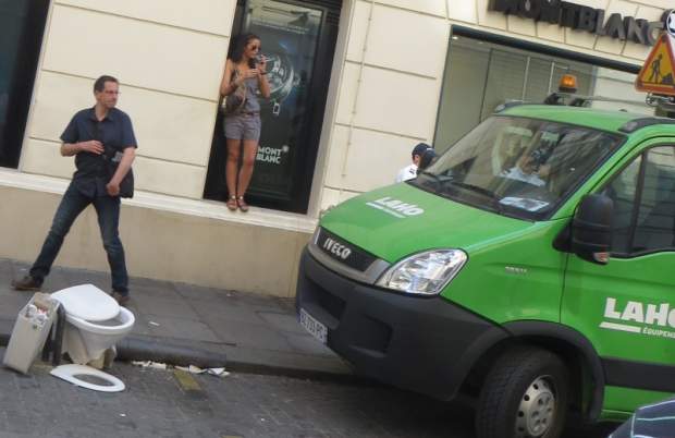
But they keep this sign nearby just in case.
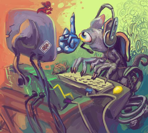
Wordpress, the system that manages this website content, is agony.
Do you see the list of recent posts on this page? That truly basic, unimpressive list? It took me all yesterday to implement. I thought it would surely be faster to find an automatic method to make the system check for new posts and order them by date than for me to manually manage that list myself.
I sought out the wordpress forums, and turned up old posts on the topic. At each stage I found an existing request for help with my problem:
Everybody gives the scantest possible amount of information to get rid of you, and then the junk still does not work. At that point I would need to find a post that simultaneously requested a solution to the base problem, the sidebar problem and the appearance problem, as a prior request does not exist. In the case when I asked about a problem for myself, nobody answered and the topic was closed despite being unresolved, because they only have easy answers and would rather ignore something that confounds them than admit to not knowing. Or maybe I seemed like somebody who would call out an easy answer for being useless.
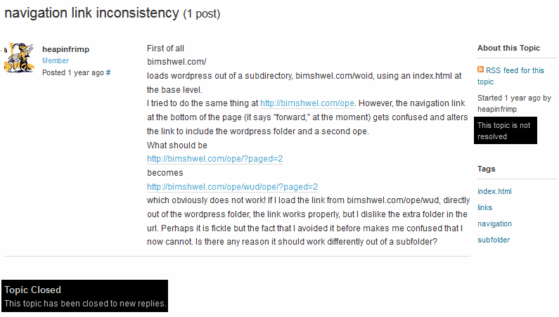
I should explain that wordpress uses “themes” to allow users to change their sites’ appearances easily from a guided-user-interface, without editing code. But that only allows certain basic changes. “Widgets” were a later addition to themes that allowed even more changes, but could not themselves be changed. And still only worked on sidebars. “Plug-ins” are different from widgets, because they are not integrated into the wordpress code, which ironically makes them easier to force to work WITH wordpress the way I want them to. So I need to dig into the code anyway, every time, for everything, and test it 800 times until it works or I find a disappointing but functional compromise to fall back on, which I hate doing, which is why I use the same graphics for months or years at a time instead of one month each like I formerly did before I installed wordpress. The whole thing barely works and needs constant encouragement.
Why is a basic reasonable thing: having a list of posts NOT be on the SIDE of the page, so improbable and impossible that the developers did not anticipate it being necessary and none of the dorks who understand this stuff in their spare time ever saw a need to figure it out? The exact same garbage happened for my automated comic strip site-section (although it was over the number of pages displayed at once and not the folder issue), and the coppermine art gallery mechanism. And for Zdoom, ten years ago, which is why I never finished the dingdang thing and still mentally fixate on it. Every time every time every time. the thing I want is always just outside of permissible, for no reason that is apparent. So I have to figure it out or leave it behind.
I have had various diagnoses throughout my life; tourette syndome here, asperger syndrome there, high functioning autism, disco fever, what-have-you-ever. These mean that I need help with some things. But if nobody can provide help, is it really me who is disabled? Outside the internet, I am surrounded by people who drink themselves sick, smash their expensive telephones, misplace their cars, will not read their own mail, will not let themselves become aware of their bills, stereotype and condemn anyone whose opinion differs, adopt pets they cannot look after (and dump those pets on me), buy junk they cannot afford, and then do not use or return the junk. Am I disabled just because I cannot instantly bond with any yahoo off the street over my own screwups? Hey I broke my wrist assaulting a piece of architecture too! That makes us normal! Let’s go spend $300 on two cups of beer!
Technology that is supposed to make life easier and be so “professional”-looking becomes itself such a massive burden that we give up on things that we might have finished had the technology not insisted on becoming so gosh darn convenient. And when I persevere it is only through hacky patchwork repairs that look uglier than if I had just stuck with the outdated thing I was replacing. The outdated thing that has all its data in one file, in one folder. Then a useless idiot happens along and tells me I should have been using this or that BETTER miracle system from the beginning.
Once again the only way to get what I want is to edit the actual wordpress files outside of the theme stuff. Which are in different folders, and inevitably lead to copies downloaded and new versions uploaded to the wrong folder amidst all the folder switching I will have to do trying to bring the css and php into accord. And when wordpress has a new version, it updates itself, quite without asking, and thinks nothing of overwriting my changes outside the theme folder, even if it has not itself changed the files that I edited. So I may end up needing to fix it every time the version changes. But I am capable of changing it! I am capable of fixing it! For the time being I have control. That is what life is about for losers: you find a way to co-exist with things that are set up to make you give up. You do not win, but you keep yourself from losing completely. And watch out for widgets that pretend to be your pal but just want to hold you back and expect rewards for it.
And I may in the end decide that the “page” view does not work for me anyway, and opt for something outside of wordpress, to which I can add some customized mechanism that reads wordpress excerpts without messing anything else up because it is not itself built on wordpress. But I will have dropped the wordpress option because I thought it looked bad, not because dorkhnical support refused to support me.
This is not a mopey entry. This is how I conquer mopiness.

Apparently I had “published” this at some point prior to completion and not realized it, since the primary clue is that the word “publish” has switched to “update” in an inconspicuous location. Since it was necessary to edit an older entry that I linked to, I had been using the update button on that one, and so probably mistook the publish button on the new entry for the update button it did not yet have, when I should have clicked on “save draft,” which is in a different place, even though it has the same purpose on a non-public entry as “update” does on one that is visible, on which the old save button vanishes. Does that make sense? No, it does not!
Anywuh,

breaking news [a week ago]: arbiter of notability has opinion on arbiter of history.
Jimmy Wales is the founder of wikipedia, the encyclopedia that anybody can put an article on that any administrator can delete on the grounds of it not being “notable.” Proof of notability is typically determined by appearances or references to a topic in advertising and cartoons. So if you want to make something notable, rob a bank and buy an ad on a cartoon that wikipedia administrators watch. Or go back in time and insert it into an obnoxious compuserve chain letter from 1993.

The only arbiter I trust is Bjorn Skifs,
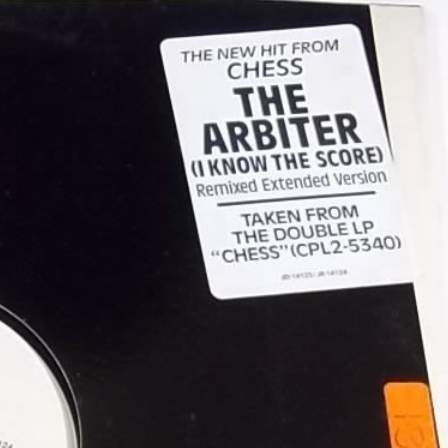
for, you see, he knows the score.

Skifs only became the Arbiter in 1984, ten years later, and it did not bring him the same level of recognition due to the song being less horrible. By then he had spent most of his Hooked on a Feeling money on extra zippers, height implants for his boots and one night in Bangkok, so his powers of arbitration were kept under control.
But now, with his old song in a hit movie, he must be getting big royalties. I estimate that every time an advertisement for the film airs on television, Bjorn Skifs gets one cent. By this point he probably has enough money to see the movie for free. Maybe even a 3d screening. How is that fair? He thinks he is such hot stuff now, we will probably never get rid of him.

Oh, OH, like this is my fault? What a trick! Now any time I walk near a brick building I need to worry that Bjorn Skifs will be lurking about in a camouflage brown 1970s suit, ready to step out of a doorway with just one leg so I need to slightly adjust my path to get past him. And fleepsy forbid I want to go IN that doorway, right? You think just because you won the second annual Karamelodiktstipendiet (Gold Neckerchief) that you can do this to me? I am not going to stand for… what? Oh gosh. Oh dear oh gosh

With no one left to arbitrate our dispute, I had no choice but to do as Bjorn Skifs demanded, and take advantage of his sporting head start to seek safety. At some point I managed to lose him, by running past a building made of concrete, and took refuge in my stylishly dilapidated 1920s apartment for several days. I think… yes I think it is safe to go down now. He would have gotten me by now, surely, if he was going to.

And then Bjorn Skifs murdered me. The end.
Oh, so much to say. Which means I cannot focus enough to say any of it.
================================
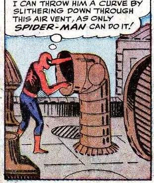
Only Spider-Man, or Scooby Doo.
Gosh can I think of a more absurd and inexplicable cross-over?
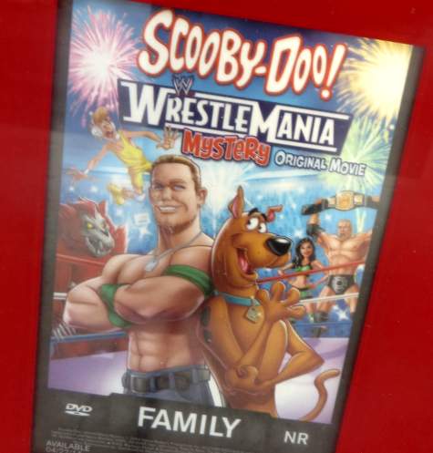
Scooby Doo Wrestlemania Family. This seems absurd, but it fits in perfectly with our culture of pretending we are beyond the advertainment of previous decades while continuing to engage in it. This may even be less synergistic than John Cena’s previous subject, since this does not also involve a cereal company. I assume this film ends with Fred pulling off Rey Mysterio’s mask to reveal he was Oscar Gutierrez all along.
Upon further reflection, I must consider that these things are so self-referential now that some mask-related remarks are almost certainly in the script.
Purplespace, in a comment, reminded me about The New Scooby Doo Movies series named such due to the hour-long length of the episodes (and you can be certain those have enough action and plot development to fill a whole 10 minutes). I had forgotten about the precedent set there, although in that situation the guest stars were usually out of place, since their professions were typically not conducive to scooby-doing. The Gang would be at a carnival or an undersea research laboratory and then suddenly “Hey gang, look! It’s Laurel and Hardy! Even though they’ve been dead for 30 years!” Or maybe just Hardy was dead, assuming he is the fat one. They certainly were not an ACT at that point.
I assume Scooby Doo at Wrestlemania involves meeting branded, living wrestlers employed specifically by the WWE at the time the film was made. Andre the Giant and Ludwig Borga won’t just be standing around waiting to be invited to help solve a mystery that has nothing to do with wrestling or promoting Vince McMahon’s current whims.
In fact this film is a decade and a half overdue; I thought it was a joke, but Space Jam was big money, right? I don’t know why there weren’t more weird mergers of old style white people cartoons with new-style not necessarily race-exclusionary sporting culture. Apart from all the weirdly-racist imagery in those old cartoons, naturally. Scooby Doo is not known to be racist and The World Wrestling Ederfation also has that potential, so maybe this is progress in the realm of high profile athletic competition/ half century old animation franchise crossover. Suddenly thinking about Space Jam has caused me to ponder that yet again now that Scooby Doo at Wrestlemania seems sane and sound by comparison.
If you are less than familiar, Space Jam is about the classic Looney Tunes characters (Daffy Duck, Gabby Goat, Benito Mussolini, et ar) challenging tiny space aliens to a regulation non-tune, non-alien basketball game with the fate of all mankind at stake (obviously; why play at all otherwise?) and then getting Michael Jordan’s help to win the game when the aliens suddenly became much taller, indicating inherent prowess at transferring balls to baskets. It made no sense, but people treated it like it was normal, and it made a few hundred millions of dollars in profit. It did so well that its lone billed human, Michael Jordan, appeared in advertising for MCI, a totally unrelated telephone company that he already had an advertising contract with, beside the looney tune characters for years afterward. It no longer even mattered that Jordan was the most dominant, well known basketball player, if not general sports-man in the world. He was just some man who talked to Tweety Bird on a yellow cartoon telephone from inside an adobe illustrator document.

The first few ads had him open with an aside to the camera “MCI Five cent Sundays helps me keep up with my Space Jam buddies,” and apparently that was supposed to be enough explanation. Let us not debate whether he means Space Jam the movie or Space Jam the incident or even Space Jam the fruit paste preferred by astronauts*, because he didn’t even mention space jam after that.

There was no need to say “
The writing and voice work are, of course, horrible. I am so accustomed to associating those traits with Looney Tunes produced in my lifetime that I almost forgot it was worth mentioning. To his credit, Jordan makes every effort to be as watered-down and dull as they are so to not make them look bad.
Anyway I think there is a great deal of potential here.

*I lifted that line in its entirety from this 2003 page because nobody is ever going to read it again. Since that time I have still not seen Space Jam. I had an opportunity to view it in 199x but declined because it seemed like such a ludicrous idea. These days I thrive on ludicrous ideas, now that all my opportunities to get good use from them have passed, and I feel inclined to seek out and view the film. If it kills me, this message is here to explain what happened.

I think I may have found the internet’s most ludicrous numeralless alias. In fact I saw this months ago but I noticed that my previous two posts here had diapers in them, and it became clear that there is a great/awful deal more casual diaper use than most people realize or will acknowledge.

I object to many things about face-book, and this is one of them. I disapprove of a permanent, unsanctioned diaper on my page, even one that is formed by the absence of matter. I further object to this misrepresentation of how my parents dressed me. I know it seems like a far off barbarian time to some of you, but though we had to stay in a specific set place to use a telephone and could not take terrible self-indulgent pictures with one, we DID have baby sized clothing in 198x.
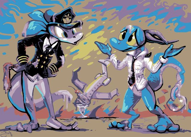
a typical stupid animal-person drawing like I did a few years ago. My original description:
Koshizu needs a new kopilot.
I seem to like drawing stupid things happening to lizards, evidently. Can you tell me with sincerity that they do not deserve it?
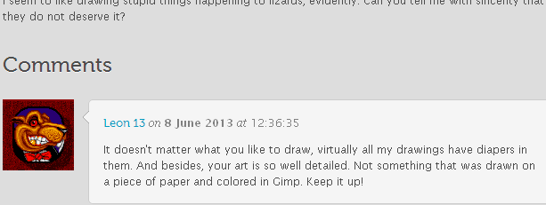
This guy probably HAS to mention diapers inappropriately on the internet to keep from blurting out the topic while interacting with real people.
I understand the need to express one’s secret shame. If you try to keep it contained it will destroy you I LISTEN TO THE MUSIC FROM SPINDIZZY WORLDS AND FACEBALL 2000 IN MY SPARE TIME. Is it proper for me to make fun of people who give me compliments? Yes! They are the most suspicious of all. Clearly they have faulty judgement so I need to supply some more.

This sign appears to denote a location for diaper-focused worship. And like Scientology it has some big money behind it.

This seems contrary to the aims of pants, square or otherwise.

Things are getting serious. A blockade in the diaper aisle.
Fortunately I did not come here to talk about this. Alas now I am too tired to finish what I was writing. Can anybody help me out here?

What!!!
My response will be influenced by people from a time before diapers were invented.
—————————————-
Websites with sponsored content seem quite certain I am excited about the World Cup this week.