


whewish! It sure is good to know that no police were injured when they casually executed someone for being homeless, owning a knife and acknowledging their presence while pope fascist, o he of the bandaged ear, was in town.
people have been threatened, banned from websites and terminated from their jobs already for making light of the trump shooting, largely by self-described advocates of “free speech” who openly endorse the murder of immigrants, and probably homeless people also, if not through bullets than through public policy that deliberately harms them. It is socially acceptable to joke about Trump dying but it has to be from natural circumstances like choking on a pretzel or getting shot accidentally by the vice president while hunting for tiny little birds.

I personally favor him getting hit in the head by an errant golf ball or suffering an allergic reaction to the peanut butter he gets rolled in every morning. It is very hard to blame that on “The Left” except as a description of a relative point in space and frame Trump’s receipt in a heroic light. That won’t kill the willfully stupid movement that he appropriated into his political viability but no one in his sycophant army has successfully made such a lifestyle out of overtly avoiding accountability. Some of have tried, and a bunch of them were eventually sent to prison or placed under court orders. People are willing to believe that God personally intervened and stopped Trump from getting killed. They wouldn’t believe that about friggin Giuliani. For “his” part God apparently didn’t care if innocent audience members got killed or injured, nor was willing to suggest to the assailant to NOT buy a gun, climb on a roof and fire into a crowded venue, or maybe even just transform the gun into pudding. Believing in divine intervention, this or any time, only makes sense if you believe that God is an erratic spiteful jerk, which admittedly is consistent with scripture, but if that is the case God doesn’t care about your devotion either and will gladly throw a tornado at you just because he came in under budget this quarter and needed to spend the surplus to avoid cuts.

an alternative suggestion: God exists, and he’s American. And blue and naked.

and we all know how that turns out. Thankfully HBO’s newer management doesn’t like cartoons and will not be making a television series following up on this.

I thought I was done but the creepy oddly-shaded weird-eyed trump picture kept reminding me of someone and I couldn’t quite determine who. I now think it might be the character Colossus from Goblins 3 who manages to knock himself out by sneezing so hard he hits his head on what I always in the past interpreted to be his boots but I think now is meant to be the metallic control-box beside his hammock. I made this terrible gif out of screenshots I took 14 years ago, presumably knowing I would eventually find a weird public event to display them in the context of. I presume Colossus survives but if Trump sneezed so hard that he passed out repeatedly that might prevent him from issuing regressive policies. Much has been made of the vengeance Trump has vowed to issue in a second term, but he also said he would “drain the swamp” and get Mexico to pay for the wall meant to block itself in, and neither of those happened. Really, nobody knows what he will do. He doesn’t even know. Maybe he will build a wall around the swamp.

captain dope deserves only your scorn and derision! it is NOT a real captain!

unless if by “married” you mean “infuriatingly smiled at for an indefinite period” captain dope has no power, much less authority to assist you.

exclusively for the purpose of annoying me, nemitz replaced the bottom of this boat with a screen door and then rowed unwelcomely toward me while smiling.
as to HOW nemitz replaced the bottom of that boat with a screen door, which surely should be beyond mitz capabilities, I know not, but I do know that were it a useful thing to do nemitz could not have done it. when nemitz is around stupid things just HAPPEN.
including captain dope. I had hoped to never see captain dope ever again. Perhaps there is still time not to.
just two days ago i noticed the furnace in the basement here said “granby” on it, which reminded me that nemitz once said “eestgranby” and that I even called mit out on the deed.
the very idea, the absolute audacity, for it to even be plausible that nemitz would DARE declare “eestgranby” in my presence is itself unforgivable.
potentially but not necessarily forgivable, me attempting to integrate leaf shadows for the first time ever across the front of snikpel (angry creature at fore of boat) several minutes before posting this.

why would you name your steel tank company after a nemitz quote unless you were producing military grade tanks because you wanted to remind yourself to shoot nemitz with them?
you will absolutely need to click through to the larger version to have any hope of reading the text on this

this is not remotely finished but I am uncertain of the internet situation at the place(s) where vestigial family obligations intend to hold me hostage for the next ten days and I thought this was important. I will replace this with a more legible version if opportunity thinks that is necessary. in reality I and the shirtler did not speak, i never found out what it said and I am not actually a snake. however I was able to find the full text from 500 different vendors, which states “If you don’t like Trump then you probably will not like me either, and i am okay with that,” which I think encapsulates the nihilistic spite of the american spirit appropriately for independunce day. the land where so many are ready to pay for the right to tell strangers “i want you, whom i haven’t even met and may not meet and in fact cannot confirm exist, to NOT like me” that there is a wide-ranging market specifically for it. Alas I could not find the specific variant of ugly corona beer velcro sandals, so perhaps I was looking at vintage collector’s items, the mark of a true enthusiasthole.

no i do not reckon i am getting much work done at this 19th century fischer priƒe pretend desk. I should think it nice to have something resembling a desk at all, a rarity on these trips, but since there is just one bathroom for all four people and it connects to this room this is unlikely to be an efficient room even with a work surface not made for and by elves. the chair TOUCHES the desk.

lerd again, this time to amend its aggressive motions.
oh boats; my most recent edits to angle 2 fixed some unusual erratic movements but I realized afterward that i was meant to leave those movements in place and just draw them better, to imitate the lunge of angle 3. whoopth. i may have to put them in as they are and see which looks less awkward to decide which to change to match the other. or just leave them alone since nobody who isn’t me could possibly care.
////////////////////////
i like blue electricity better but i do not want to use the same palette section as the tail segment, EVEN though I will probably need that split off into separate object(s) like with the move around frames. I would prefer to set all color changes on the main object (the lerd’s body) since additional objects created by it (such as its projectiles and its trail of body parts) can inherit its color swap settings, and thus i will only need to designate one color change for each base lerd type. I need at least two lerd types; one that crawls on land and one that hides underwater and jumps out like a seaworld captive to throw abuse and then promptly resubmerges. And later a third that, more like a Hexen stoker,

never leaves liquid and uses a more powerful attack that also doesn’t, since I presently don’t know a way to have a creature check what sort of floor it is on before attacking, but i CAN set a creature to not leave the floor it is on. It is probably possible to issue a floor-check command but it isn’t necessarily necessary that I know how to do that at this juncture since I don’t even have the main two that I DO know how to make implemented yet. And then like with the jumping fyip I will probably come up with a buggy half functional way of doing it, then ask for help on the zdoom forum and get an embarrassingly more efficient way that actually works explained to me by someone else, assuming north america hasn’t melted into the sea by the time I get around to that.

historically it has been able to launch two wimpy projectiles from its hands on that “ball” frame. It would also, and still does, throw a single larger shot when it crosses the arms. throwing magic out of your hands or mouth is not original, but from head protrusions is less common. i decided thus that i should have the twin shots launch directly from the electric appendages (using additional frames that are yet less complete than these) rather than the hands. Arms needing to cross in order to launch a blast is also unusual so I kept that. it is still dumb old doom engine which is inherently limited to stuff that has since been done in thousands of other games but i aim to do my best with the fate i have set for me. even if it kills me, though i won’t know if it has done that until probably right before it does.

also i call the hexen stalkers “stoker” after how kan naito pronounces “land stalker,” because I think dumb things are funny. and more recently after how the 1999 playstation port of final fantasy 5 supposedly refers to the wendigo monster, because this wiki proclaiming that fails to explain that stoker means stalker, not wendigo, since the later localizers opted to change the name entirely rather than correct the silly romanization of the original name that was simply a Japanification of an english word.

but admittedly it is easy, 25 years later, to look back and say OBVIOUSLY this naked blue horned steroid man with a club is too busy jumping stupidly and tickling his arms to waste time wendigoing about stoking, and I envy the optimistic ignorance of those days somewhat.

of course he was. they didn’t have cars back then.


but in all seriousness you’re telling me this guy doesn’t take guns on film sets seriously?
I think I made this “joke” a long time ago but I can’t find evidence. I realized I should do it here because just as many people care about my non-drawings here as on twitter but at least I can locate these later and don’t risk alienating people who might want to not pay me to draw embarrassing animal people cartoon drawings later.

instead I found this older gripe about people jumping on the opportunity to mock the topic not because an innocent person was killed due to the negligence and possible arrogance of multiple parties but because the actor involved made fun of their favorite treasonous rapist felon amidst a totally different project. Surprisingly none of them came looking for me (as we have established that this post is findable) to say “What about crooked Shillary Clinton? What about Bengazi? What about Ben gay grooming Our Kids? What ever happened to the other four Ben Folds Five? Think about it.”

and it reminded me that I have a reason to not like matthew broderick apart from my simply not liking him. Not that the killing was deliberate but it was negligent and he never did anything to raise awareness about shoddy driving and presumably never shared any of the millions of dollars he has accrued for being non-lethally-insufferable with the people he affected with the shoddiness of his driving. And indeed Baldwin has inexplicably continued to get hired for non-job jobs since he accidentally man-slaughtered a woman. Gosh consider that he should have already been in prison just for letting Boss Baby happen.

page 3-“54” now of the bimshwellian comic strip.
most of june twelfth was spent adding in pog and yibrick to the frames where I had not yet determined what they were doing. I thought about kumquat trying to shove yibrick in where the dope was and yibrick objecting but it did not work with any of the views of kumquat already there. this backup strategy does make me consider that yibrick’s “hair” was added primarily as a thing by which to grasp the ball-like creaturoid.
this page shows the back door, which is why the colors are different. i have done a horrible job keeping up with my various changes to location designs since I often draw something with a plan the first time, put more thought into it the second time, forget about it, and then look up the first version as a reference when I draw it a third time. at that point I may have been sick of my past self and decided to simply show another side of the building that I could not contradict a previous edition of.
the characters are more important, so naturally i spend even less time designing those.
june 13: I should have another comic page update at some point this day. it has a lot of stuff wrong with it and i should have prepared something else instead of thinking I could get it out yesterday. fortunately I do this for free and nobody except me looks at it until I announce it elsewhere so failing my imaginary deadline also does not matter to anyone except me. What is your problem(s), me?
///////////////////////

page 3-pre-65 of the bimshwellian comic strip
i forgot that i wrote this before posting the most recent page. it needs to occur at some point prior to that. There is also another to be displayed immediately after this one but evidently not to be finished immediately after and thus it is not here and there is for now a gap in the revised numbering.
i additionally need to do something about the gorf gnome pages ago reporting the location’s address as “dumpling and drab,” as that would seem to indicate a place on a corner, which this structure is not, and already was not before I wrote that. the building’s name could be “dumpling and drab” but if i am going to name buildings i might possibly be able to think of a better one than that. But I also thought the same about the possibility of naming me the humanoid mutant “bimshwel” after this website url and so put off doing that for years and eventually went with bimshwel anyway. The important thing is that Richard Krippendreyfuss is no longer at the top of this page.

Richard Dreyfuss did some stupid garbage recently that received publicity and outrage.
does nobody involved remember or care that Richard Dreyfuss starred in the Disney-financed/distributed Krippendorf’s Tribe in 1998?

OR that this was the poster image? Dreyfuss was an embarrassing corny old man even then, at the rumored age of 51 years. He can only be more embarrassing, corny and old by now. I sure am. I derisively labeled persons whom I considered to have low quality opinions and tastes as “krippendorf”s for years and then seemed to forget to do it.

Plainly I need to do more of that.
i have another comic page nearly ready but i would rather post this first and that tomorrow and not have nearly naked megasquatting richard dreyfuss at the top of my page for a week, however likely someone else provided a body and Drey’s head was pasted on to that one. Mercifully even right now the legs get cropped out at my present screen resolution and interface-zoom level.
We can’t even blame France for Krippendorf’s Tribe like with 1997’s Jungle 2 Jungle. ALSO produced and distributed by Disney, and not even pretending to be Touchstone Pictures. Fiddle dee doodle. Richard Dreyfuss did not appear in Jungle 2 Jungle but he DID star in and executive produce Mad Dog Time, the only movie that Siskel And Ebert collectively determined was was than Little Indian, Big City the english-dubbed French movie that Jungle 2 Jungle is a remake of, in 1996. However they also like a lot of movies that I think are awful and I have more of a problem with bad movies when crtics think the movies are good, and thus this dilutes my complaints about Richard Dreyfuss appearing in movies that paid, quoted critics don’t like. How dare they agree with me! I hope they die.
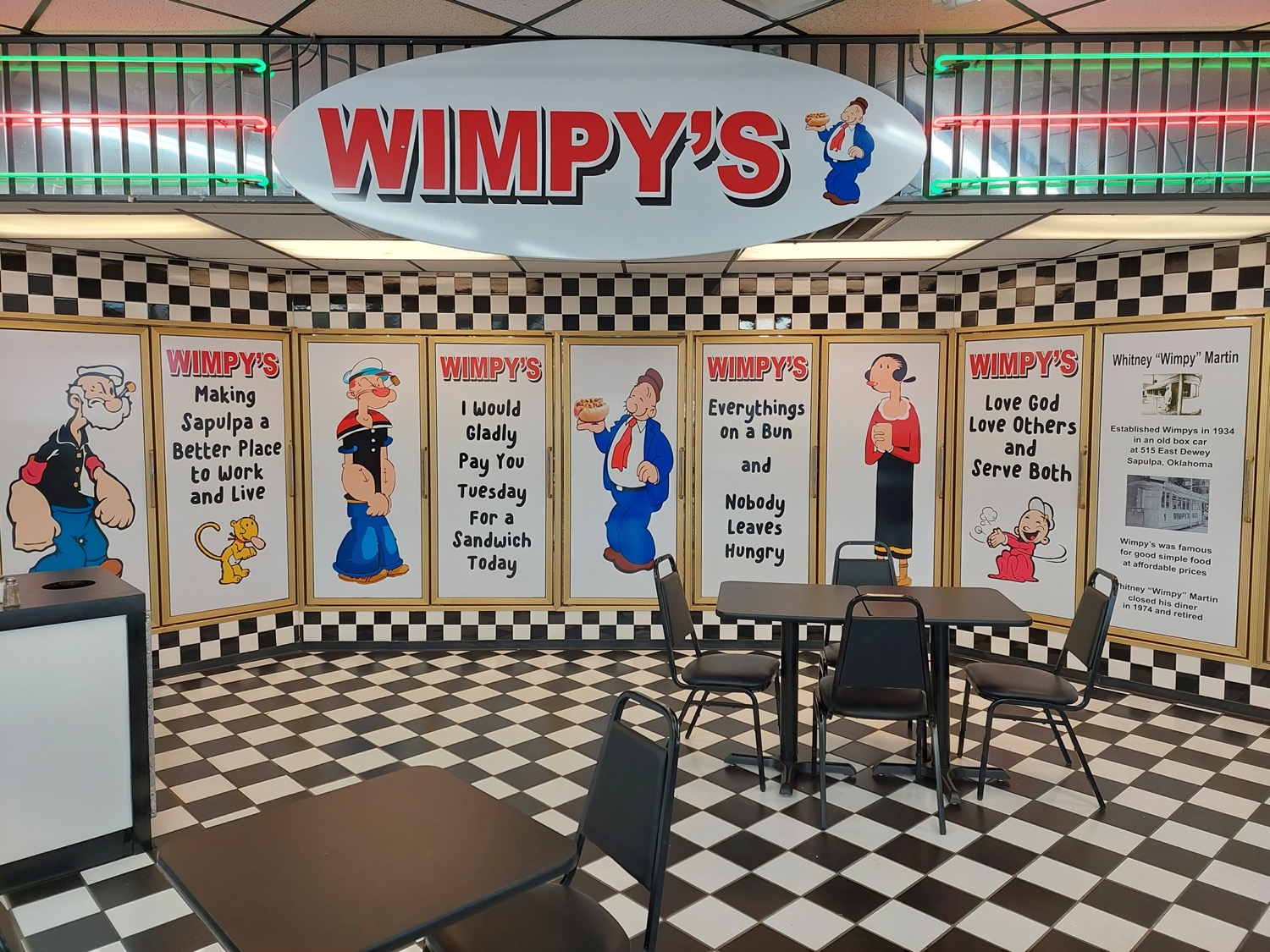
i am greatly amused by this terrible 1975, supposedly, popeyes fried chicken television advertisement. it was from a bizarre period during which the cartoon character popeye, after whom the restaurant is NOT named, appeared in its advertising anyway.
It is named after Popeye Doyle from the French Connection. (don’t try to read that old 2003 page, just know it is there) Popeye Doyle was based on real police personality Eddie Egan who in life was nicknamed “popeye” presumably after the cartoon character, but nonetheless until it can be determined that cartoon popeye was named after the restaurant, then accidentally time-traveled to and got stuck in the 1920s I will consider there to be no direct connection between them.
I do not know what is the “rice dressing” that olive demands “lots” of but this may be irrelevant since she is not given any, doesn’t seem to notice, and also doesn’t notice that she is singing a different, worse version of the “love that chicken” jingle which already wasn’t good than the servers are.
concerning the visuals, popeye and olive revert to the outfits they wear in comic strips and old fleischer studios cartoons but still have the oversized eyeballs they have had in cartoons since the 1940s, along with olive having conspicuous eyelashes that seem to switch between middle or side oriented depending on how wide her eyes are open. Popeye has re-lost the eye that had also been restored by post-fleischer animators.
He refers to the wares of a popeyes restaurant as “some of me chicken” as if it IS his restaurant, when we know it is not. perhaps he does not know it is not. as a famous cartoon character –animated by a studio called “famous studios,” even– he is probably accustomed to there being many things with “POPEYE” written on them that he never heard of or authorized but accepts that they exist, are in some way related to him and on some level his property even if he never sees residuals from their business and thus has to keep running penny arcades, diners and one-man construction companies and getting into physical altercations with Bluto to try and claim a single customer who never seems to pay for anything despite frequently pledging to do so. It is rough being Popeye.
popeye distinctly asks for a bucket of chicken but the non-cartoon attendant, who knows popeye by name and isn’t surprised to see him despite him being, essentially, a creature from another dimension, promptly fetches a BOX of chicken. popeye doesn’t seem to notice the error.

his single eye seems to be fixed on the ceiling the whole time. I momentarily thought maybe that is where the cue cards are held, but that assumes Popeye can read, and it would also mean a real three dimensional person with no excuse had WRITTEN “bucket” into the script instead of “box.” I am inclined to believe that on the first few takes Popeye said “gives us a can of chicken” and once he diverged to bucket he had at least successfully evoked the idea of fast food fried chicken, if from a competitor. He might have been thinking about how Colonel Sanders signed away his entire business including his own likeness for a single one million dollar payment and consequently had to appear in its ads just to get ANY further benefit related to the situation despite thinking the company ruined the product and inadvertently said bucket when he meant can. during his 30 years as a seaman third class in the US Navy chances are Popeye visited Blackpool, the site of UKland’s first kentucky fried chicken and perhaps was familiar with that. he probably considers the bootleg “Popeye’s Takeaway” restaurant also in blackpool to be no less legitimate than the american joint calling itself “Popeyes” and also not giving him royalties, and as a cartoon character popeye probably sees what he is thinking about floating over his head and very likely is looking at that.

he is also probably trying to respect the chain of command considering that an army or air force colonel is equivalent to a navy captain and honor the colonel’s service without realizing that “kentucky colonel” is only an honorary title and Sanders does not actually outrank him, at least not in the other 47 states that Popeye is aware of.

I also know that this is canonical to Popeye at Popeyes related promotions because an undated photograph from 2008 that I saved in 2019 off of some other webpage that is no longer there shows J Wellington Wimpy also looking, as best he is able, at a thought bauble. presumably in disbelief because he most certainly is NOT thinking about fried chicken.
Curiously in unamerican nations there is to this day a hamburger joint chain named Wimpy, with a signature offering more line with the character associated with the name and equally not authorized by king features syndicate. ironically even Popeye himself strikes me as more likely to go there because prior to his spinach fixation, comic strip popeye ate hamburgers (and huge unseasoned chunks of raw beef), but also never fried chicken. Yet curiouslier, the wimpy hamburger chain actually started in the US, in 1934, despite being much more overtly ripping off King Feature Syndicate’s intellectual property, while the GOOD cartoons were still being made even, and “the chain vanished within the United States after [founder Edward] Gold’s death because no one had purchased the rights and trademark to the Wimpy name from Gold’s estate.[2]” even though Gold himself never purchased the rights to Wimpy in the context of hamburgers. And then in the late 1970s the surviving british Wimpy invented a character for advertising called “Mr. Wimpy” dissimilar in appearance to J. Wellington. But which still seems like it should be a copyright violation, to me because there is no reason to call someone “wimpy,” as a last name, even, exclusively over their fondness for hamburgers EXCEPT when referring to popeye’s old frenemy. curiousest, in 2023 there apparently appeared, in the united states, a Wimpy’s sandwich restaurant full of bootleg-looking artwork of Popeye characters in addition to Wimpy, but is otherwise 1950s themed despite Wimpy specifically dating to 1931, and thus not organic to a 1950s setting and via the mickey mouse rule still under copyright.

ALSO according to the header picture that they uploaded at a size larger than they meant to display, its name is inspired by a totally different 1934 hamburger restaurant named after Wimpy than what became the multinational chain and is overtly religious in its marketing a la Chick Fil-A, which is more a competitor to the restaurant named after Popeye. All this is curious but not enough for me to try and figure out who actually owns or licenses what or deal with adding more pictures because I do not like hamburgers that much. They never get any better yet cost more and more money. There is a dump chain “wayback burgers” that also wants to evoke the 1950s even though it’s cheapest, smallest, most basic hamburger costs $7.19. I also must travel out of my WAY to get there and so choose not to go BACK. ah ha he.

i do not remember clearly but evidence seems to suggest that i used the word sequence “as more time elapses” and thought elapses looked like elpses and so i drew one and then more time elpses.
the main problem with this is that elpse is acting like nemitz usually does in these pictures, coveting or presenting something stupid while smiling at someone, usually me, who has no need for it. Does that one at the lower left REALLY think that *I* think that *IT* invented clocks? I am NOT fooled! And gork that clock is so huge and awkwardly labeled that inventing it specifically is nothing to seek praise over! Truly unfortunate that the most reliable way I can think of to prevent time elpse from smiling is to introduce a time dope, but then that would become MY problem as well.

the robot variant seems to have first appeared, though not necessarily exhibited anywhere, in 2010ish after I encountered this web page while seeking, I can only surmise, bootlegged elpse content. I have no recollection of drawing it but it showed up when I sought out the sketch for the more recent time elpse event. Thankfully due to having animal-style digitigrade feet, elpse’s legs cannot accommodate boots. I did once draw, on paper, an elpse standing, possibly in a pose like the one with the clock here, beside an enormous boot, while a rotund business person offers “I would buy your big boot” and the elpse simply says “NFS” with a BIG smile, arrogantly assuming that people who aren’t on the internet know that NFS means “not for sale,” and it is extremely stupid but fortunately I do not have a way of text-searching old sketch books so that picture will probably never show up here. for rootbie’s sake, elpse, NOBODY is ever going to offer you money for that dumb boot EVER again. TAKE the offer NOW.

I was trying to draw a picture of my mother for the mother’s day occasion but I screwed it up and did not finish in time. I am still am not done but this is the general “idea.” I was concerned enough about it to seek approval in advance of putting it on websites. I had also pondered replacing the baby with a fish but as I had already drawn the baby when I thought of that I asked about that also, and was told that I should keep the baby. It seemed to me later that the baby wanted spaghetti, or maybe lo mein, or maybe nothing if that looks like nothing.
oh fleeps I forgot that there are two extra pages with kumquat that I MEANT to draw and add in somewhere before this point. so I will definitely have to do that and amend the page numbering accordingly. OR show it later as a flash-back scene but i never established that flashbacks exist in this story except briefly and narrated by a character and this part isn’t that. I could NEVER make this comic strip as a profession.
another bit to mention, when rendering this page, the first order of business was to check the previous page these gnomes appeared on, 3-49, so i could be sure of what lines from the script they had already said, and i found their dialog quite hard to read. i recall being concerned about its legibility before but i am surprised now that I then allowed it to be that bad if i was concerned about it. and it got WORSE across just the eight frames on 3-49. Thus I spent some time fiddling with that and it SHOULD be improved now, but i initially drew that page AFTER cleaning up text on older pages than that, at LENGTH, for printing. how could i still produce such unreadable letters and leave them that way?
in editing that text i have forgotten whatever distinctions i originally intended for the two gnomes’ letter styles, but legibility is probably more important than that. As long as the speech container baubles are distinctly colored and or clearly identify which figure is meant to be emitting them it isn’t necessary for the letters to look different in each.
ANYWAY

page 3-65 of that is tentatively the last page of this section and available. this page has loads of problems but seems legible enough for the moment.
ironically elpse could probably join this club since biv also hates dumb little critters yet loves clobbering [th]em, but alas is cursed by looking sort of like them, and by occasionally getting followed by the worst of them
i identified “rootkit and pipkin” a few pages ago without having a plan for what they looked like or what they were going to do, though the essence of this scene has been around a while. i have also an old idea of an antagonistic duo that are always referred to as a pair despite one of them only ever standing around and doing nothing, maybe not even speaking, but I am not sure if this is the place to use that, if anywhere there is. that is the real reason the last frame is vague; I am not 100% certain of what figure is being shrouded there. i HAVE sketched the next page with one in mind and this shape presently correlates with that, sort of, but I might change it!
a perhaps needless clarification: I do not hate religious people. I hate when religions themselves seek to control people with threats and encourage them to hurt each other, which as far as I can tell all religions do, and I have no respect for that.
//////////////////////////

this time of year i see manishevvitz products more prominently at the grocery store. i recognize the name because some dumb late night show(s) I used to watch would make jokes about “drinking manishewitz” –because as the wise philosopher Adam Sandler once pointed out, “so many Jews are in show biz”– so I knew it was some kind of wine that you have to drink if you get jewish. But apparently Manischebbitz isn’t the wine itself but the brand which sells the wine, and they have stuff other than that because in Connecticut and theoretically other places, it is illegal to sell wine in a supermarket, and the Manicshevorlet company thus needs some way to remind Jewish people that they have to go buy the Manischewbacca wine at another store before it’s too late.
Thankfully i am not afflicted with religion so I do not suffer such a fate. Religion is like diabetes for your personality. The authorities want you to endlessly pay for and suffer through dumb traditions that you will never be free from, be too busy worrying about what rules you might violate to consider if the rules have any practical purpose, much as pharmaceutical and food companies pay off the american diabetes association to recommend insulin and disgusting splenda that they can charge whatever they want for rather than recommend eating fewer carbohydrates so you never stop having to buy insulin and splenda from them. maybe that is a stretch of a metaphor but the important thing is that unfortunately seeing Manishevitz reminds me that it could easily have been Manishnemitz.

(trashover is a sorriday in which there is a lot of trash going on and you want it over. manishnemitz is one of the leading suspected causes)
When you are serving manishnemitz, don’t bother opening the door and pouring a cup for Elijah since you know he isn’t showing up. a shut door also discourages more fuzzy imps who now think they are welcome from entering.
if i see a bottle of manishnemitz at the store, i smash it on the ground! it isn’t fair to the store staff who have to clean it up but the store itself should never dared to have stocked it. what a horrible idea. what’s next, manishdope? i don’t mind telling you, I REFUSE to drink manishnemitz. i won’t even drink womanishnemitz. I don’t know what the difference is in that context but more people want me to draw men than women characters and the men ones are usually designed grosser and fetishier.
the worst part about manischnemitz wine: it isn’t even kosher. if it is made by dumb imps, particularly ones with pig noses, there is no way it is “clean.” do you think people drink manishewitz because it tastes good? it probably tastes awful! you just HAVE to drink it. i bet 4 out of 5 sederers say the WORST part about passover is having to drink manishewitz, you just DO because it is kosher and a gang of rabbis will pull themselves out of your hats and circumcise your fingers if you don’t drink it, and you ALSO have to wear hats. I learned that from Fiddler on the Roof. That is almost as scary as laser wolves.
and i worry if someone at the supermarket hears me mumbling about manishnemitz and thinks i am being anti-semitic. no i am only anti-nemitic. i realize this is anti-semite fluorish season to give slightly less-right-wing-creeps something to point at as an excuse to keep equating middle-east-except-israel-residency-or-ancestry with terrorism and continue not being held responsible for decades of trooping, shooting and looting wherever they feel like over there and causing such a disaster that leaving and letting the goshdang taliban come back seemed relatively prudent long enough for them to do it and wash their hands of it, but I am here to talk about something much more important, how a brand of wine’s name sounds sort of like that of a cartoon character that I draw.
And i can’t just THINK about manishnemitz, *I* need to hear me complaining to know how it sounds and to stop thinking about it. But I also had to remember it so I could tell you about it. Very important.

a recurring and stupid problem.
this is not the new comic strip page that I threatened last time! That is complicated. It will be better than this. Still probably underwhelming. But building it is complicated.

finally back to lerd,

another of the very old 2003 monsters, redrawn at ten times the size with slightly more competent animation.

marginal progress, major reminder of how stupid my life is, which I do not need, because I do not forget.
the movements of the tail appendage do not match on each angle, but they do not have to, merely not look terrible, and only the back facing one does, along with the arms, that look more like a low-impact exercise than a motion to pull the body along a floor but it looks better than the old version, to me, and inside that game the old one looked fine so I will be impressed to see how this ends up being worse.
the mid-section is a different color now but I can palette-swap it to green in-game. And I can also NOT palette swap it to green, in case you were wondering why I’d bother to discolor it at all. the colors only need to be distinct, not specific.

keeping the color zones distinct and mapped to indices on the game’s 256 color “palette” means they can be changed separately from each other, to colors which are not necessarily on the palette but for the purpose of preparing this example quickly they are.
There was never a reason for lerd having four breast orbs before, as it only had two arms. maybe it looks unique but I don’t want people to think I have a fetish for bare cartoon breasts considering how much other fetishy junk I have attached to my name in the intervening years. ALTHOUGH if, as today’s commenter suggests, having just two makes the problem worse, I can change them back or try something else entirely.
i will start the next non-snake comic strip page next. probably. you might think i have spent some of the long period since posting the most recent page figuring out what is going to appear on the next page but you ought to know me better than that!