


A highly not-yet-finished picture called “hats coming to visit.” there is an accompanying music piece… or rather i made some stupid minimally remarkable music, absentmindedly named it that, and then constructed a picture of a literal interpretation of those words. It is easier to post unfinished drawings and not feel bound to them than it is with unfinished music. The only reason the music is unfinished is because that dumb comic book is also
I have a heap of resentment for people that I don’t consider to be “real artists” who post loads of drawings with minimal thought, effort or restraint on to the internet. By perhaps not chance, several of them play musical instruments or engage in digital audio tomfoolery. Sometimes I wonder if I am a hypocrite, for being a visual artist and occasionally pretending to be a musician. But I’m not because I assure you I spend loads longer on my noises than they do on their scribbles. You can’t be a popular music artist just by having an ugly squirrel/raccoon/dog thing for a mascot.
No actually probably you can; if you buy the expensive version of fl studio there are enough default filters that sound exactly like trash off the radio with minimal user input that an actual squirrel could probably design a hit track but I am obviously not doing that because those are all marked “demo” (and rather difficult to purge from and wholly unwelcome in my USABLE instrument list) in my version so it isn’t the same.

I do not mind there being demo versions of fancy music effects; I object to them not being able to be removed from a version of the program that is NOT a demo.
Try to imagine a middle finger in my face that cannot be removed from the vicinity of my face, that I paid $160 for, dangling a sign that says “gimme another hundred!” If you successfully imagined that, you may have a future in software development.
This is also the one year anniversary of my father’s demise, and the ten month anniversary of my not finishing the second post I wrote about that. although that isn’t really significant for an unposted piece around here until it reaches the ten year mark. In any event I think he would be glad to know I am just as unaccomplished and unfocused in my pursuits and just as inclined to blame people who did not cause my problems as when he was alive, were he alive, because that would mean he proved the impermanence of death, a matter sought after and never attained through the entire known existence of humanity, if not all life as we understand it. Of course THEN I would be disappointing by comparison to THAT, but everybody else would be, also, and my shortcomings would be less acute.

Look, there! He is imploring us to look there at a windmill. How could he do that if he were dead? The crushed ant corpse that I evidently neglected to notice was stuck to the photograph until a year after scanning it, THAT is what a dead being looks like.
The First Steps Toward Worship

featuring Adol “Born Again” Christin. There is no way that Adol’s deliveries can be over.
The lizard of two evils

in the disrespect that it looks very stupid and is also animated.
The dumbest thing is that the lizard thinks it has to change its pose to a broader stance with its arms crossed, like that will impress people, which is NOT the case. What that absurd moron fails to recognize is that nobody on earth or elsewhere is impressed. Not elpse. Not even the dope! nemitz, maybe, but i think we should all aim for better than that. It also seems unaware that its head is disproportionate to its body until it falls down since the square boundaries are difficult to optimize for an upright-standing figure. Or even a degenerate bow-legged dork like this one.
i absolutely did not need to make this. I considered that i had not animated anything recently, and also that my most-appreciated overall artwork have been low resolution pixel icons.

And apart from one that made before I knew what I was doing, they all feature other people’s characters. Some of which I do not like at all. Not necessarily any of those, though not necessarily not NOT any of those. And those that I dislike inspire other people with equally bland or worse requests to come to me instead of ones I could potentially find a mutually beneficial situation with. Which is not to say that i APPROVE of either of the morons that I am showing today, but i disapprove of them in a way that amuses me. Nor do I mean to suggest that I think drawing dumb garbage like this and then waiting is going to solve any problem, but I was starting to think that anything by me with wiggling creature toes being used as even a remote representation of myself, as I had done with the second icon here, was creating problems.

I could not tell you WHY there even is a problem that exists which is caused by that. I have lived a strange and unrealistic life, and that has its consequences.

If only life could be such a fantasy! It would surely be my final, were i to believe in it.

As the internet’s first, foremost/only authority on Moraff’s Dungeons of the Unforgiven, I felt it prudent that I should also have the foremost/only unofficial terrible illustration of it.
That secret of mana picture did not quite sit well with me. In fact i never finished articulating specifically how it did not. This here i probably also could have done better, but nobody else would have tried at all! And the chance that this will completely make sense to anybody is also almost nonexistent, which I can live with, because when I try to be understood, people find a way to understand the opposite and I spend hours trying explain what I meant and by the end nobody really cares. It is more efficient to start there!
I still managed to push out a small novel’s worth of moping text about it, and so I have pushed that even further! As much as bimshwel.com is at home written on restroom stalls, the website is not meant to function as a thought toilet.

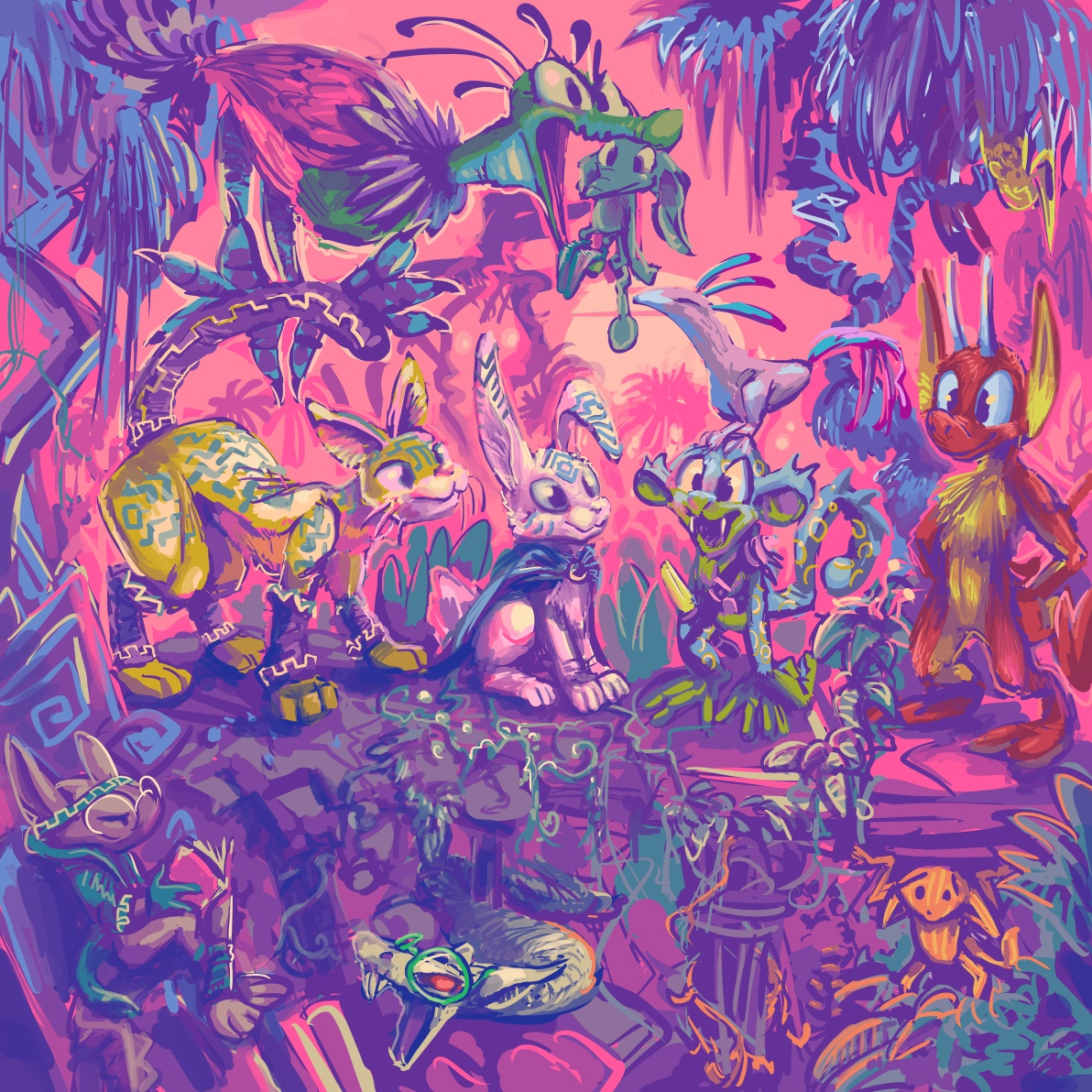
As a child (despite the maturity level I exhibit I am in fact quite older than that) i loved looking at pictures of castles and thinking about them, and for most of my life it bothered me that i could never draw them however hard i tried. now I realize I can, so long as I keep them implausible. I made this “quickly” in the past two hours so I would have something to upload this week. Practicality and scale were not major concerns.
I am not totally sure what this is, but it is the most sincere drawing I have put on the internet in some months. It needs some more creatures, but I could add creatures all night, and I am already committed to adding unnecessary details forever to a more pressing project.

I checked and could not find any drawings, official or otherwise, of the two kids who let the Secret of Mana hero just fall down the waterfall, then run off and tell nobody, and are ANGRY when he survives. With friends like that, I am not surprised he starts slaughtering little yellow legless rabbit-things the first chance he gets.
I made this a bigger job than it needed to be, for something so stupid, and I screwed up much of it, but it is good practice, I have to hope. I am not terribly fond of it but I don’t have the energy to create and post something better, and the last brief entry I posted due to a lack of energy apparently didn’t work at all so this is here to distract from that. I meant to get into detail about what I screwed up in this picture, why I drew it to begin with and also show the basest sketch of it but somehow the topic turned into other Mana series games, namely Sword of Mana, which always leads to angry run-on sentences and precisely the sort of thing I am incapable of writing at the moment in a way that is the slightest bit amusing, so I will cross that bridge when I come to it and hopefully not be disappointed by the adventure that ensues once I fall off of it.
a drawing i started absentmindedly while my niece Violet was climbing on me, which limits the range of things I can work on, since Violet may want to bang on buttons or scribble something pink at any moment. This was never at risk of becoming WORSE.
I like to think the lower right one knows what it did to deserve that, but I have been so absentminded lately, I possibly forgot to inform it.
But why must NEMITZ be there, approving? the world does NOT need nemitz approval! Nemitz is also disproportionately larger than the other figures. Classical art analysis would indicate this to mean that nemitz is the most important person in the scene, and I absolutely assure you that is NOT the case, even in a case where nobody is important. In fact, especially so.
This is hardly a great illustration; it is extremely regressive, composition-wise, with all the figures on the same two dimensional plane

but the comic book matter is yet ongoing, continuing to consume much of my not-necessarily-wasted time, and the commissions I do (more than I exhibit here) remain somewhat homogeneous, and so I feel a need to show this thing that asserts I am not the person I look like I am if I only post commissions. People reached the exact same wrong conclusions about me in the past when I only made personally-directed stand-alone “art”work like this, as now when I rarely do, but now I have more of those people reaching. Which is “good” since it means more money and marginally more influence for me, provided I do not express any opinion on anything, which I accomplish by avoiding learning about anything that was made recently unless I have a connection to it which predates social media, such as star wars, or I learn about it off the internet, such as who Aunt Bee hated. I also have to avoid talking about my avoidance and what led to it because I start writing more or less the same manifesto that I have posted here repeatedly since whenever people started using tumblr, and I do not have the energy to make it funny to me anymore. I don’t think it much deserves the help, either!

I assure you this comment is just as weird when not removed from its original context

I drew this on a whim back in October. It felt unfinished but I posted it anyway o the deviant art website because I am obsessive compulsive and “need”ed to upload something that day and had nothing else prepared.
Which is ludicrous because I am taking just as many pictures of just as much dumb stuff, if not more so, than 13 years ago when I probably updated this most often. But cataloging it seems less and less possible, and less worth the trouble since nobody reads anything that isn’t text captioned in a video anyway, even if the video is just still images. As if reading is hard unless you can only see ten words at a time, and then you can spend 6 minutes on one paragraph. That picture has no words at all which theoretically makes it easier to read. These words are not the image’s and they resent the implication that they do not belong to themselves.


Three 100×100 pixel icons for Sherymon.

One more for beepy isopod plushcub.
Anything else I am doing right now is boring and not worth mentioning. I know because I just typed it all out and it sure was! I am not going to post something long and negative again unless it is negative in an interesting way or I forget that I said this. Of course I believe I have said that before and forgotten it.

even Superman sometimes forgets that there are thousands of other garishly-dressing idiots with super powers on his version of Earth and also the simultaneously existing alternate versions of earth that also have alternate versions of him on them. And also to put on a shirt, or to NOT wear glasses and a goshdarn belt buckle identifying his alternate identity when forcibly evicting trees from his property.
Following from that old thing, here is the sort of material people have been asking me for lately. You may be better off not reading the text!
mitz opportunity
I drew the initial 6 frames in paint shop pro version 6 circa 1999, as separate images. It worked for this but felt inefficient.

boxed bot
I tried to make edits in photoshop after I had already assembled it, and that is a terrible program to edit gifs in because there is no way to look at the next frame and also activate the next frame for editing without moving the mouse and clicking on two different things every time. Rubbish!
I hear that the newest photoshop has a less stupid animation mode. However, it is also subscription only, which means you pay for it until you die and never really own your copy of the software, and adope can arbitrarily cut you off from it whenever and for whatever reason it feels like. It probably won’t but it could.

aki-breaky bug


I’ve Fallen and Icon Get Up
Nonethless I did these, for Trevor-Fox and also Tachisalopex. They are plainly quite busy so I will try not to say too much.

pip my ride

infern vermin
As soon as I learned the details of the task I realized I needed better software to be able to pull it off, and found aseprite shortly thereafter. I gave up on making this work as transparent. Aseprite handles it better, but eh website, furra finity, cuts of user avatars at the intuitive size of 55 kilobytes, and this would blatantly go over, since gifs are stupid. Thankfully I discovered that I like colors better anyway.

murid murderer
For mightyrat, also in aseprite. Showing a friendly creature named Twitch the Plague Rat, jumping and then toe-exhibiting, all while clutching a mysterious, presumably lethal beverage in such a way that suggests it may be tossed at somebody whose company is not desirable.

the fox in our stars
A fox person with magical powers meditates in a space-sort of location.
I have a lot to say about this one, and so I shan’t.

microsurgeon

the good, the bad, and the bowtie
Why larger, I do not know. I was able to keep this under control a bit better than the non-animated large pixel drawings, but those were still twice the size of this one. I was not asked to include a background, and I should not have included one that inadvertently mimicked the shape and color of the ears. There are enough inexcusable ears on this page without me implying more of them.

rodentia brush yer hair?
for Akvo, in which a rat person endures a hairrowing ordeal. People do love their rat folk. I do not know why people want ME to draw their rat folk, but I like those better than bears or otters.
This suddenly looks under-animated to me; the pieces do not have an extra settling frame after the abrupt turns, but the amount of things TO animate here is higher than usual, and I tend to give more than I need to, so I must have felt haggard up if I did not.
The fur trim on the jacket and the pink hair especially were difficult to get looking right, and I had to paste them into Clip Stupido to work on, and then paste back into aseprite. Clippo’s animation mode is terrible but its drawing mode is great. Aseprite’s animation mode is great and its drawing is terrible. It does not use pressure sensitivity in tablet pens and is inexplicably slow and lagful even though I tend to work on pictures that are lower in color depth and one-fiftieth the resolution that I work on in other software. Is there a program that accommodates bitmap drawing AND animation well? Probably, and it most of a certainly does something else more important disgracefully for no reason, like it will have passwords instead of saving, or you can only use shades of beige or you have to guess a magical gnome’s name in order to access the full version.

deflotter
For Jazz Otter, of a rather exhausted air-filled creature. I doubt I could sleep so peacefully knowing that there were scissors in the world.
Twitter seemed to like this, which makes sense: nothing is happening, I did not draw it especially well nor especially enjoy doing do. I did like making the movements, though there were not many, and in fact I had to un-do some of the excessive movements that I added. But it is all good for something: several relatively influential people that I think are complete garbage but who my situation render inescapable, who would never ever directly acknowledge me in a coherent medium where they could tell that it was me who had made these things, have “like”d or retwutted some of them, so even though I still feel like a drimpy sub-human pudding being that will never reach a substantial audience with the work that is meaningful to me, I can at least feel like I “beat” some irritating forklogans in an incredibly petty and stupid way that is exactly what we both deserve.

Second-Hand Dork
I think it has more and better movement than most of the others, though it has no shading. Truthfully, getting the lines solid and smoothed out is most of the work. However, most of the recognition, apparently, is in the shading (as well as most of what I charge, like an idiot, like a usual). Or perhaps people object to cigar-smoking. Or perhaps they object to inaccurately-drawn cigar-smoking: I realized after I made this that real cigar smoke goes everywhere and takes its time leaving, quite the opposite. People should be GLAD I sent it off so fast. Although smoke can look elegant. Perhaps people wish the rest of it looked as elegant as the smoke!
So what have I learned through all this? That I can always learn nothing in a new way. My shoe is off, my foot is cold, I have a bird I like to hold. My hat is old, my teeth are gold, and now my story is all told.

This is the only thing I know how to draw now!

An unnatural consequence of sharing a residence with compulsive television watchers of disparate ages. Apart from that it is perhaps not worth thinking about at length, nor explaining in brief!
Gosh I am not good at drawing this badly on purpose. The peppa pig program is extremely badly drawn, but in a very specific way. I spent two days! somehow getting it just right. So then I HAD to shade the background like that just to not feel dead inside, even though that ruined the desired effect of drawing poorly so specifically, to make it look JUST right. Because it sure doesn’t, now! This doesn’t help me toward my goal at all, doing stuff like this, and spending that long on it. But once these ideas get in my mind I have to do them as soon as possible; elsewise they eat away at me like everything else. there are boneheads out there who do NOTHING BUT asinine cross-over fanart. Really I should leave this to them. When I do it I just look like a goon, and I haven’t cultivated a goon’s audience. Still I think this is funny.
My father might have appreciated this. He was there for all of that. Fictional British fathers that bad things happen to remind me of him, apart from that, especially if they wear glasses. I had meant to draw it back in January but ehh well hm.

I had placed this illfrustration at the end of the “video” I posted last week without realizing I had not prior to then exhibited it on this website, even though it seems to originate in August 2015.
Initially inspired by editing wordpress themes (what this website runs on), but it could as well apply to trying to use hulu, trying to use linux, trying to install windows over linux, trying to use a Hewlett Packard printer, trying to use toon-boom software, or any number of things that don’t work while priding themselves on how well they work.
This may have been the first middle finger on the deviant art website not being directed at the viewer.

This goes back to 2006. What have I done with my life? And how is it that many of the artists I have observed these from over the years have done more with theirs?

Additionally, this image and

this image appeared, for a deliberately short period of time, because they are pretty bad if you have time to analyze their details, but I did not have any other “character” for which drawings existed both of wearing earphones and of pressing down on a ridiculous cartoon detonator.
Concurrent with the 512×512 pixel matter, I offered drawings at smaller sizes, with 100×100 resolution being the most common request. I did not realize what a big deal it was to be able to draw like this until I realized how many people could not. Eventually they started paying me to do it. Not enough that I could feel like I had done something with my life, but at present I can buy more pizzas than I can eat, which feels important.

Icons that I initially used for myself. None is especially excusable.

Fastest gun in the wasp, November 2013
A character called Miso for a person called Miso but who presumably does not look like this, stuffed into a tiny 100×100 pixel box but not at all deterred. This was before I gave people many/any options so theoretically I could come up with a better pose than this.

You shall meet with my raccs, 2014 or sooner
Relaxingdragon wanted these at some point. Rare examples of the 200×200 size, which is still small enough that I do not totally lose my mind with it, although I did not develop the habit of losing my mind on pixel-level work until 2016, so that may be a presumptuous statement.

Icon see you’re upset June 9, 2016
pengosolvent recently inquired about a new representative 50×50 pixel symbol but something alarming has occurred. These are smaller, only 50×50 pixels, because the deviant-art website restricts user representations to that size. And I drew four because I usually give people 2-4 different layouts to choose from, but need to color them in, to some degree, for them to be legible, and on this occasion colored in all four fully without being asked to.

The pickax papers, December 17, 2015
A newer Miso, also for Miso. I had been asked to make an icon similar to the old one, and took that as permission to be equally boring with the poses. And again I could not restrain myself from finishing all example versions! The upper left is the one we went with, and therefore it is slightly more “finished” than the others. Appropriately enough it is considerably more proud of itself. The creature this is derived from is called a tawny mining bee, and I took THAT as permission to add mining implements, including an all important flannel shirt, even though those are more stereo-type associated with logging, because it seemed unlikely somebody would send a logging bee my way any time in the near future.

Clippity-clopsicle October 20, 2016
For kinn-katze, a horse creature named Ryno ponders something likely unrelated to being named after a different species, since that is the type of thing you generally have to sort out early in life.

who do lu think lu are? November 17, 2016
100×100 and 50×50 pixel icon robisions of a flagrantly asymmetrical creature called Lulu known to Fairyartery
I just realized I use that “finger touching mouth” gesture way too often. Although I always give people the opportunity to request a different gesture!

is that who i think tiz December 8, 2016
Ah yes, ’tis Tiz, from something called Bravely Second, for boooey.
After this I decided every icon I make should have something resembling a backdrop, even if the buyer personally uses a version that doesn’t, because some sites are very stupid about transparency. And some sites aren’t but stuff looks bad on them anyway, hint hint.

robb from the pix to give to the four, December 22, 2016
a hoofless yet horsely creature named Robbie, unrelated to Ryno’s horsely creature, in fact for boooey again. The hair changes its mind based on whatever eye it feels is more fashionable to show at any moment. Also, after examining the previous two items, it became conscious of the possibility for vision problems resulting from prolonged obscured vision of a single eye.

hotel kotel holiday inn, January 5, 2017
for Kotel First is a bat creature also called Kotel, with and without wings, and a more opussummy figure called Obeah whose enthusiasm has been taken out of context to pertain to the winged bat’s error, potentially a consequence of trying to escape from a 100×100 pixel space.

therefore four hares, January 19, 2017
100×100 pixel icons of a hare creature named Lewis for Arito, who was pleasant to work with; I wish I could say the same for this devious dirt-dweller.
After THIS point I realized that flat colors were inadequate for “something resembling a backdrop.”
A progress video of a sort, showing approximately how I colored this

goat tell it on the mountain, January 26, 2017
A goatly creature called Lutka, pixel-styled for trufours. Seems to be having a rough day.

let that synx in, January 26, 2017
another pixel drawing for :icontrufours: of Xiu, who is a synx, and apparently there are more synxes in the world than I thought! Initially there was somebody called Chimerasynx who came up with and drew these things and they have no spines and can twist in silly ways and have more teeth than is reasonable, and at some point they got franchised out, I suppose. This one looks friendly enough, fortunately.
I hope you are not getting sick of these; there is another bigger one coming!

well-financed flop, February 2, 2017
More pixelry for arito, this time of Shani, an apparently easily-worried saber cat. Plus a rinkity dinkity background I added quickly at the end for reasons already cited! Of course I don’t have a video showing this, the one part people have expressed to me sincere bafflement at how to produce.

do the rat thing, February 16, 2017
For kjorteo. There looks to have been some disconcerting events recently! And then this happened.

rats and beans, February 16, 2017
also for kjorteo, whose requests’ shape necessitated separating it from the other one! This looks to be alarming news for the protagonist. Although clearly it had been seen from quite a way off!

tanuki tea look-see, April 20, 2017
For perikaryon, showing a raccoon-dog investigating a hot drink. It is probably coffee but there is a chance it is tea. Possibly there is a better tool to use in determining the drink’s nature.
Amitz all this people started asking me for animated icons, which take 4-8 times as long to make, but I can charge 3 times as much for them without potential buyers recoiling in horror and abandoning the idea! That is real progress. Still less time than it takes to put one of these website entries together, but nonetheless I am done with this one for now, and hopefully for some time afterward, and so I shall exhibit those here on another occasion.

A reminder to all you retcon-resenting star warfare enthusiasts out there

that George Lucas never got around to removing Sebastian Shaw from the 1997 comic book Star Wars: The Last Command issue 1

in which Princess Leia gives birth and looks like this.

Although on that note if I were force-sensitive I would be wary about doing anything near a window, knowing that a giant creepy judgmental ghost Yoda could be watching me at any time and that I would never be able to stop it or prove to anybody else that it happened. Hey, Yoda, Ben is a family friend but none of the people in there even KNOW you.

In fact I have been generally concerned about Yoda’s mental state recently.

All good? Great, I trust you.


Beside the point but I take issue with this comic book for exaggerating Mark Hamill’s acting skills

although I praise the depiction of his elegant fingers.