


Somebody wanted a scene at a specifically named bar with a few specific items in it, in addition to “[my] characters.” But why? I can only presume this requester works for a competing institution, which these reprobates are absolutely not welcome at.

Our department’s latest questionable deed. There is a story to it, in the sense that me typing about roughly the same topic for a long time constitutes a story, but I lack the linguistic coherence to put it together at the moment, and recent history has shown that “the moment” often does not arrive, so you are just going to have to look at this and deal with it.

Sometimes I wake up with an idea and think “that will be quick. I can do that and worry about other things. It will be so quick that it will not matter if the idea ultimately makes no sense or is more alarming than funny.”
.")
I planned to make this with oil paint two years ago. I think if I had tried I only would have finished it now anyway, though the nature of paint mixing (especially with the way I apply it) may have resulted in better color cohesion. But I would like to figure out how to have that come along more naturally without mixing, because I do not enjoy using actual paint a whole lot.
I feel like this picture is on the verge of working, and you may have observed that I have posted other pictures on the same verge. I still have hope this will be the year I murder the verge.
More recently I had this waiting for two weeks since I was not sure what to do with the “pathway” in the foreground. I added that [today] and now I like the rest of the picture less. That is an improvement, though, since usually I like the last thing I did least.
Having all my big stupid pictures hosted locally now makes it a slightly more logical and justifiable process to make “normal” website updates of them. That text is cloned, however; the gallery entry can say something totally different. There is probably a way to make that specific data show up here, but I do not know how to do that, and it probably looks less unprofessional if I keep this sort of inconsequential rambling out of the official matters that we might presume people will see someday. Not today, though, hopefully. Probably not tomorrow, either. I have the patience for CSS editing approximately once a year and evidently it was last week.
There was a time when writing became an overwhelming burden, because I made the job too difficult, and I resorted to posting pictures I made in the absence of long written pieces, and then later I realized that, owning the website, I was entitled to do that, and later still I felt bad about it again and posted neither words nor pictures. Those were some tough times.

You should always bring a hat to protect against burns.
I think this fulfills my blue sky quota for the year.
Feel free to use this as the title screen to your terrible 1992 super vga shareware game.

a “bear” because the original sketch 9 or so years ago had a similar looking creature in it. I could change it but I have not thought lately. What I did change was the potential victim to ant, instead of a rat. I thought the rat was more stylish but was of improbable size and presumed quickness to suit this pasttime. And then I drew the replacement ant at the size of a rat because I was still hurting from my loss. I wish somebody who otherwise had no sympathy for humanity would take pity on me.

And I suppose you could say ah ha! Obviously nazis dislike gays so this is a JOKE. Like

Fortunately that mental acrobatics isn’t necessary because, like this one who has reported on a previous posting by me of the previous image, there actually are people who think adopting Third Reich names and symbolism is stylish and acceptable [for their otherwise stylish and acceptable misanthropic animal personas], which requires totally different but more publicized mental acrobatics to comprehend. Either they have no concept what real National Socialists actually were, and willingly keep themselves from knowing, making them morons, or know full well and have no problem with it, and I don’t understand how somebody raised in this country in this time period can get to that position.
In fact I have been more closely acquainted with at least one person who thinks neo-nazi-ism isn’t a big deal so long as the culprit draws cute kitty-cats.

And I probably don’t help it by changing the subject away from condoning Nazis,

because I was concerned I was being too hard on my conversation opponent because I knew I was annoyed at him already, for other reasons, such as liking other artists I had different problems with. But thinking now (glad I thought of it), I shouldn’t silence myself to preserve a relationship where I must constantly silence myself, for it is always the same reason: these people don’t care/notice how horrid or infantile anyone else is so long as the cute distribution operation is maintained. The fur-folk crum-bummunity thrives on that, but it is symptomatic of society in general. We treat babies like royalty (because they are “cute” to someone) and if they have a marketable talent then they may get to grow up feeling entitled to special treatment. Noisy, abrasive, uncontrollable, but they draw/sing/wear/remove clothing nice so they get away with it. People who are aware it is horrible say nothing because they can make money for themselves by filming and producing television programs about it. The fantasy of entitlement is “reality.” This “cute” nazi fan artist has nearly 1900 known regular observers, a majority of whom may be presumed to condone the whole thing. There’s no incentive there to alter the behavior. There are 14-year-olds who aren’t necessarily nazis but have 3 times the following and it’s just normal to them that whatever awful they thing they do, if even 3% publicly support them or think they stand to gain something by seeming to, there will be 90ish people to say “great job living!” If I said “that person is a Nazi!” in any other context I would look like a hyperbolic kook, and now that I can say that, the response is “I know, isn’t it cute?”

Anyway, the point is that sometimes it is better if people like me just post drawings without saying anything.

All this is not to say there aren’t individuals who deserve the gas chamber, but that needs to be decided on a case by case basis.
The topic continues over here.
Somebody called Kiki-Uma drew this. Ordinarily I do not post drawings by others here. Not out of principle, merely that I rarely do it. However I must protest on this occasion. Not the non-policy; in fact if it were a real thing I would be prevented from showing this image and then would have less to protest.
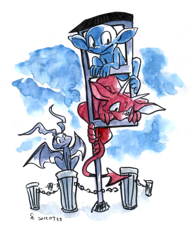
I protest dopes. This is notable for featuring an imp that once proclaimed its feet splendid while amidst danger. Here it has no feet or conceals them out of shame and it is rightly served. Of course on the previous occasion it was also decapitated, but perhaps it will only learn if the punishment is directly tied to the wrongdoing. It is rare that an artist so effectively captures the utter stranglobility of these useless wretches. I cannot stand it. But I must, because my chair was so disgusted at the sight of them that it went for a walk.
I want to punch them! They are so proud of themselves! They love having large ears and being absurd. The dope’s ears were pretty gosh darn big before but this is beyond inexcusable, refusable and disposable. These fiends have interfered with road traffic through their aimless game. Luckily the dope is too dumb to realize that it isn’t green and surely any motorists who aren’t dopes will also notice and suspect that something is amitz. Amiss, pardon me (but not them). As for nemitz, how can we possibly punish something that likes beets and likes dopes? This lot is incompetent. They are unfit to stand trial. Rather they should be jailed and executed immediately. I initially wrote that last remark about the bow tie creature but it probably applies to these as well.
Everything dope related is a sabotage of decency. I should not be surprised that they have upgraded to actual mechanical sabotage.


attention populace, nemitz has issued a thumbs up rating on the topic of nemitz. I cannot stand idly by while nemitz is tolerated. I pledge to fidget uncontrollably until justice is done.

I was recently in such a place that a tremendous fuss was made over me placing a hat on a table. I consider that classy compared to a big fuzzen nemitz foot. The trouble with nemitz is that everything it does is troublesome
nemitz has a master’s degree in crumbummery from bob dopes university. and it thinks it’s better than me because it has a degree and I don’t. But its wrong; I have many degrees of rage-induced heat which while not adequate to boil nemitz alive will surely aid its discomfort. I will toss nemitz into a landfill. sooner or hopefully even sooner it will stay there.

In response I drew this picture with that artist’s characters: the frogoid Chiro in the center and the two “mist twins” Yaku (red) and Yakuma (blue) who appear together sometimes. However, something stupid happened and several more dumb imps appeared. They really have few scruples. When I engage in picture-swapping it is my personal policy to give too much or too little so that the other party is as uncomfortable as possible. It is the only way they will learn.

Somebody evidently called Cody whose primary online presence that I am aware of is tumbly seemed to want, for a reason I could not discern, a picture of the imp Topaglior, the dope ripoff I ripped off for the illustrations for the text to a baffling “play” I “wrote” in 2004. So I drew six instead. Even more baffling is that I posted them here. They are not doing anything of consequence. Neither am I. I hope that they feel welcome.
===========================================================
This was made for somebody called bowrll for some reason at some point.
Also it loops forever. Don’t expect anything to happen.
===========================================================
An amazing discovery detailed In May’s Journal of Biological Chemistry: Scientists have isolated the gene that causes loneliness.
===========================================================

I intend to release a statement regarding armor on Friday.
————————————————————-
I inadvertently entered a public restroom of type apart from what I had been traditionally instructed to enter. As the room was lacking for other patrons my first visual cue was the character of the graffiti.
————————————————————-
I am surprised to realize that I cannot recall the theme song for Darkwing Duck, but I am not rushing to remedy this.
————————————————————-
I can say already I probably won’t have something prepared for April 8!
=============================================================

Two hours later it seems kind of derivative

catch of dismay
Yellow Dr. Octopus boots advertise your wealth to the world. Don’t wear them in dangerous places unless you are prepared to defend yourself.
This is accurate to the best of my firsthand knowledge. With that knowledge in my mind I am afraid to go fishing and thus I never have.
The green stuff was supposed to be sky but something went wrong.
This is the sort of picture that makes me think I’m losing my mind. Or perhaps I have found it and merely lost someone else’s. I hope whoever that is does not come around looking for it. The person will be in no mental condition to search effectively.
I suspect I am bored by my own ideas now but not sure what to do about it.
Are those people on The Office at all concerned about this documentary crew that’s been filming, following and interviewing them for eight years? Isn’t that a tremendous drain on productivity? Are they curious as to when this movie is coming out?
=====================================================

A lot changes in a year.


I hardly consider that sufficient warning!

I would hire a note-taker but it would not be fair to impose this on anyone else.

The idea here is to show four major playing cards from a hypothetical complete set based on a theme, and I chose dangerous or lethal fruit. Fruit amuses me, as do unfortunate happenings befalling pitiful beings. A full deck might include, as opposing “suits,” dangerous vegetables, or fruit which has qualities other than danger, such as safety (throwing a lemon at a button across the room which deactivates a doomsday laser) or repulsiveness (lemons look kind of dumb). I am optimistic about the great amount of possibilities.

Regardless of some questionable design decisions and standards compliance on my part for this project, I found the Adobe Illustrator experience to be useful. It is an effective tool for making basic art look more complicated than it is.

The “apple” shape was chosen based on no research which determined apples to be the quintessential generic American fruit. I experimented with making the apple into a lit fuse bomb or a medieval spiked ball, but these were deemed to create an outline which was needlessly difficult to manage in large quantities. In the end, a simple, unaltered apple seemed best, for that allows for minimal cutting, plus the crucial element of surprise. Nobody should expect the horror that lurks on the other side. One focus group member reported being so unsettled by the experience that even the innocuous apple on the safe side began to develop fearsome attributes such as intimidating sharp teeth and devilish glowing eyes.

Pears are fired through an automatic ball-pitching machine at a tube-nosed vagabond.

A pineapple is vigourously scraped against a restrained generic lizardoid.

A watermelon is involved in a hiking accident.

A tangerine is used to soil the garment of a respectable citizen, whose gesture of shock assists a large-eared bystander in acquainting itself with a barrel of an acidic substance.

And now you know.
I invented fallopian tubes.
===================================

This is why capes are essential in everyday life.

Now you know the full story.
=============================================
The thing that is currently blocking wikehhhpedia is really wimpy and easy to turn off. Or am I missing the point? Or does my going to wikipedia with the intent to see what its blocking measure looks like and if I can get around it exhibit a fundamental missing of many potential points of my existence?
============================================


I recently learned that some people were blacking out their internet in protest tomorrow of SOAP, the notorious remover of blessed and peaceful blackness through the centuries. Well it’s about time I say. With that in mind I upload some particularly grimy watercolor objects from last year, confident that as few people as possible will see them. Although I keep up the fight every day by washing my hands in the dark, I’m used to people taking years to catch up to my trendsetting ways.
Notice that neither of these is doing anything but they’re both not doing it in approximately the same fashion, and both deserve our harshest retribution for it. The one on the right is probably only slightly worse.
Every thing it does is an atrocity. Every act is reprehensible. Every deed is dirty. The bow tie animal could be one of the spaceballs. All it does are dirty deeds. This is interfering with my right as a citizen to protest cleanliness. It is outrageous that that THING is still on the streets. I mean, it should be on the streets. It should be tossed out of a window onto a street. Perhaps out of several windows onto several streets, and perhaps motor vehicles will more closely acquaint the animal with the streets. It’s THAT bad. The thing is horrid. HORRID. horr-id. Can it be stopped? I honestly do not know. Every day it gets horribler and horribler. Truly it is atrocious. Can anything really be THAT bad? Yes. But a little stupid animal? Yes. Do not give it any appreciation. Do not even pretend, to get it to shut up. It will not shut up. It’s so dumb it will think you mean that and think that means it should continue talking about its bowtie or its feet or whatever stupid thing it might talk about. You can only win by not letting it win.

How about this: I’ll cut them off and toss them in a field and then you’ll have to find feet. The bowtie animal is a bozo. i would call it a bonehead, but i suspect it lacks a proper skull. It looks too punchable to have a skull, and if it has a brain surely a skull would have prevented the extensive damage which has no doubt occurred. Oh mushrooms I’m over the deadline by a minute. Now I’m a traitor and don’t support not supporting censorship. All because of feet. In fact I do support censorship but primarily of the elements close at feet at hand.

I know pretending I think SOPA is “SOAP” is really lame and obvious. I assumed it was, thinking I might have a decent angle on it. However, I legitimately do wash my hands in the dark and like imposing my weird habits on people. I have showered at least twice. Interpret that sentence any way you like.
This is a primary reason why I talk about pointless topics others don’t care about; I can have all the dumbest jokes to myself and not be concerned what lazy idiot I’ve never heard of already did it poorly and annoyed someone else I’ve never heard of in some never ending, never starting MC Escher gauntlet of unplacatable judgment of crimes which don’t matter (stop me if someone else on the planet has mistaken Escher for a rapper from the 1980s at some point in history). In fact the less people I’m aware of, the less I want to scream at. I’m a worse judge than anyone and can’t handle it very well, since I’d rather not yell at anyone louder than me. Additionally, when I see “hurr” or “derp” in a simulation of another human I lose my ability to consider it in a rational manner.
I don’t understand how people can reserve scorn for Justing Beepy Eeper when that “catch a grenade for ya” guy is still on the loose.
======================================
Perhaps you have wondered what, apart from my championship ego-mania and being the first person to ever have a relationship go badly have prevented me from maintaining a regular update schedule. And perhaps not; I’ve had quite enough of it.

It started out easily enough. I was to create a “series” of painted images with some sort of unifying theme. I couldn’t think of one in the time I was given because it coincided with the inadequate time I was given to do several other tasks I wasn’t qualified for. I decided to show a pointless creature going on a pointless journey, which would make the lack of a point the point. I was not enthusiastic about that idea but also figured that I could change my mind and construct a point while I was making the first. I could not.

The second image is a version I made on the computer first to assist in making the first actual painting, so in fact this came first but I chose to show it second. It occurs to me that I have referred to this image and the third image, the second painting, as simply “the second,” and that is most confusing. Ah fiddlesticks.
People on the internet statistically liked the fake unfinished one I did in a few hours about as much as the real one that I did across two weeks, but as the fake one is more directly compatible with the internet, and I’m used to not being impressed with what people on the internet are impressed with anyhow this is probably a personal triumph. Though I say “people on the internet” with a derogatory implication I am obviously not talking about you. You’re so pathetic I know you couldn’t handle it.
Nonethefewer the painting looks nice enough in person. Impressive considering that at 24×18 inches, it was four times 11×9, the size I’m used to not being comfortable working at. It even merely looks like I didn’t feel like mixing paint, rather than my having no idea how to do it.


The specifications of the second image are the same, apart from being perpendicular. I do not feel this functions as well, overall. I am accustomed to making pictures with horizontal orientations, two dimensional layouts, stage perspectives, in deserts, that have nothing to do with the pictures that came before them. I am accustomed to snow but not recently. The only things I was comfortable with were the balloon and the goat, those being the most out of place elements.
The biggest difference between this painting and the first is that regardless of art website approval points nobody but me cares about the first actually looks better than the grubby computer version I made to assist in the painting’s creation. Assisting its superiority was that I was so preoccupied with inventing a resolution to appear in the next painting that I forgot I didn’t need to compulsively obey the pixel arrangement. I made it to help and now it’s just being a jerk. Also I never arrived at a resolution.
This painting I did not even want to go to the trouble to scan in 5 parts. That does it slightly better justice than digital camera interpretations, but I do not feel it is entitled to justice. It is a reprobate ne’erdowell. I didn’t want to scan it until I had fixed the parts that I didn’t like, but once I had done that it would be another month before I could place that into the scanner without damaging one or both. Though I can’t say that neither deserves it.
Initially I wanted a sunset, but then that would mean the figures would be backlit, which I imagined was undesirable. So I had to depict the side of the sky opposite from a sunset, the boring side. It being still pinkish but less interesting. It didn’t occur to me that sunlight reflects, rather powerfully, off snow-covered surfaces, and further that nobody cares what direction cartoon characters are lit from. Also that this goat is in fact a sorceror of black magic who is immune to light sources.
The picture on the whole needs more “light.” However, at the time, I lacked the time to give it light before I started the third painting. Now I have the time but despise the deed. Anyway here comes another.

This one, thankfully, benefut a great amount from the scan procedure. I again tried to take photographs of it, but the noirish-mixture reacted to light in a consistently inconsistent manner apart from the other colors. However, the bland uniformity it takes from the scan isn’t so splendid either. Alas, lamentation, woe and whatnot.
Since it was supposed to be a “series,” and I knew I had no goal, the only way to grasp at cohesion was to put as many elements as possible in all three images. By the third, this largely prevented me from including anything else! Yet it is clear that I tried. It’s clear I tried because I said I tried and if I was going to lie about myself I’d tell better ones than that.
And now I’m annoyed at myself for not working the goat into this one. The goat seems reliable.

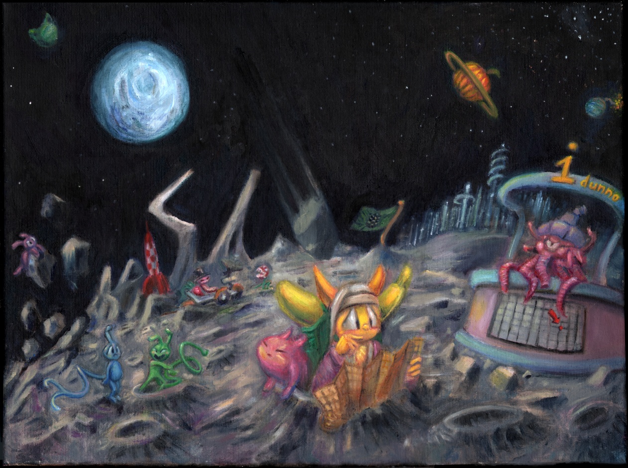
Aw beets you know you’ve run out of ideas when you have to put your dorks in space. Even the Leprechaun and the Critters didn’t take their pointy-toothed ghostly floating heads there until their fourth respective, respectable films. I can at least assure you that my fourth and fifth paintings are already “done” and neither conspicuously takes place in The Hood.

Oh now we’ve done it. Wonderful. My paintings officially remind me of Rygar. Now you know the real reason I’ve been depressed the last few weeks.

Moon scenes work when they are desolate and peaceful. My paineding is incapable of being peaceful because it is full of little objects of all different colors (and also that honorable faceless warriors the likes of Rygar are unemployed during peace time). The lighting doesn’t make sense because I imagined most of the light was coming off the earth-like planet orb, and so the shadows should go away from it. Yet if they did then the foreground figure would, once again, be backlit which wasn’t what I wanted. My solution was to light the characters from the front and the terrain from the back. Which isn’t a solution at all because it just looks like I have no idea how light works. Rather, I have a weak, ineffectual grasp. And yetter if the Earth is lit that’s only because the sun shines at it, and the earth’s light is a mere reflection, so in fact the shadows should be reversed. And yettest to face the sun directly while in the minimal lunar atmosphere would be painfully blinding and there’s no way this creature can read its map. Yes that’s supposed to be a map. Although it is lost so clearly it cannot read its map. Conclusion: This isn’t one.
As for the sky itself, again realistic references were a problem. None of them showed any stars. None of them showed any galaxies or color variation. The stuff that makes space fun to look at. The stuff that makes space fun to fill!

Here is a photograph of the stupid moon car taken on the moon. Very grey, no stars, no atmosphere, painful unfiltered light, obscure shadows.

Here is a crummy online representation of a painting that somebody more competent and compositionally imaginative than myself made prior to technology allowing cameras to go to the moon to take photographs from on it. Lots of stars, reasonable light, lots of shadow, lots of temperature. If I’d looked at this kind of thing instead of photographs I’d have done fine.

In fact I DID look at made up silliness but only for the sake of copying and didn’t consider the thought involved in the collective context within which I located the object to be copied. So I’m a hypocrite and a lousy copier. I’m also a terrible dancer.
Fahhhb. And for all I know this kind of thing is more accurate anyway and the cameras just mess stuff up when used outside on sunny days.

In which event my painting is still true to life. Life is often disappointing.

except when it’s worse.
Which being consistent with my expectations is not a disappointment at all and therefore not an exception. Which means Windows 95 isn’t going to lock up today, which is very good news, considering that I’ve already condemned myself to Rygar dreams after I post this.